Inspiration · Nonprofit

The Best Nonprofit Website Examples, Explained

Looking for nonprofit website examples? These 12 are the strongest we found — charity: water's 'Day One' polaroids, KinderGround's heart-shaped hero, Covenant House's donation card in the first screen — plus mission-driven designs you can build with Zarla, each with a breakdown of the specific move that turns a visitor into a donor, volunteer or member. A nonprofit website has the hardest ask on the internet: money for someone else. Find an approach you love and you can build a site in that spirit, free, in about 30 seconds.

Real sites + designs you can build with Zarla — free to build and preview, no credit card

What makes a great nonprofit website

The best nonprofit websites make the ask concrete and the giving effortless. They put a number on the problem (696 million people, 5 million girls, a 2027 goal), show one real face instead of a crowd, and keep the donate path within reach on every screen — often as a card with preset amounts right in the hero. The other move worth copying is emotional specificity: 'a safe place to sleep' beats 'supporting youth', and 'growing compassion together' beats 'animal welfare initiatives'. Every example below trades abstraction for a single vivid thing you can picture.

charity: water website — Water Charity design example
Real site
  • Water Charity
  • Warm
  • Cream + yellow

charity: water: A number, a scrawl and a stack of polaroids

charity: water turns a statistic into a story in one screen: 'FOR 696 MILLION PEOPLE' in tracked capitals, then 'Day One' scrawled by hand, then 'OF CLEAN WATER STILL HASN'T HAPPENED.' — and beside it, a scattered stack of polaroid photographs of real people at real wells, as if someone emptied a shoebox onto the desk. The palette is cream and yellow, the type mixes a warm serif with the handwritten line, and the matched-gift bar above the nav gives a reason to act now ('Give now, matched 2×'). The polaroids are the trick: they make a global number feel like individual faces. charity: water shows how to make scale intimate — one handwritten phrase, one photo wall.

  • The handwritten 'Day One' turns a statistic into a story
  • Polaroid photographs make 696 million feel like individual people
  • A matched-gift bar above the nav gives a deadline to act on

Steal this: Put the number in capitals and the human phrase in handwriting — the contrast is the emotion.

Visit charity: water

Opens a similar Zarla design you can make yours.

KinderGround website — Grantmaker design example
Real site
  • Grantmaker
  • Warm
  • Cream + oxblood

KinderGround: A heart-shaped photo and a dated goal

KinderGround makes a farm-animal-welfare grantmaker feel warm and specific: on a cream ground, a chunky display serif in oxblood says 'Growing Compassion Together', and the hero photograph — a farmer holding a calf — is cropped into a giant heart, so the shape says what the copy means. The single button is a goal, not a verb: 'Help Us Reach Our 2027 Goal', with a small heart inside. The nav quietly reveals the model (Partner With Us, Apply For A Grant, Donate) without cluttering the first screen. It's a small organization behaving like a brand: one distinctive display face, one custom photo shape, one dated ask. KinderGround proves a mission site doesn't need a crowd photo to feel human.

  • A heart-shaped crop turns a farm photo into the mission statement
  • The CTA is a dated goal, which makes giving feel like progress
  • A distinctive display serif does the branding on its own

Steal this: Crop your hero photo into a shape that means something — a heart, a circle, a door — and it becomes iconography.

Visit KinderGround

Opens a similar Zarla design you can make yours.

Covenant House website — Youth Homelessness design example
Real site
  • Youth Homelessness
  • Direct
  • Navy + gold

Covenant House: The donation form is the hero

Covenant House doesn't make a visitor hunt for the donate page: the first screen is the donation form. On a deep navy field, a serif headline promises the concrete thing a gift buys — 'Your Gift Creates a Safe Place to Sleep', with 'Safe Place' underlined in gold — beside a portrait of a young woman in a knit hat, and then the card: One-Time or Monthly tabs, preset amounts ($75, $111, $500, $1000, other) and a blue 'Donate Now'. A handwritten nudge above the amounts — 'Make a bigger impact with a monthly gift' — steers toward recurring. Below, a strip invites visitors to sign a welcome wall for young people arriving. Covenant House shows how to make the ask the design, not an interruption of it.

  • Preset amounts + a monthly tab in the hero remove every step
  • 'A Safe Place to Sleep' names exactly what the money buys
  • A handwritten nudge steers toward recurring gifts without pressure

Steal this: State what one gift buys in five words, and put the amount buttons beside it — not on another page.

Visit Covenant House

Opens a similar Zarla design you can make yours.

Wildwood Community Church — Adaptable Template website design you can build with Zarla
Build this with Zarla
  • Adaptable Template
  • Welcoming
  • Amber + dark

Wildwood Community Church: A community hero built on welcome

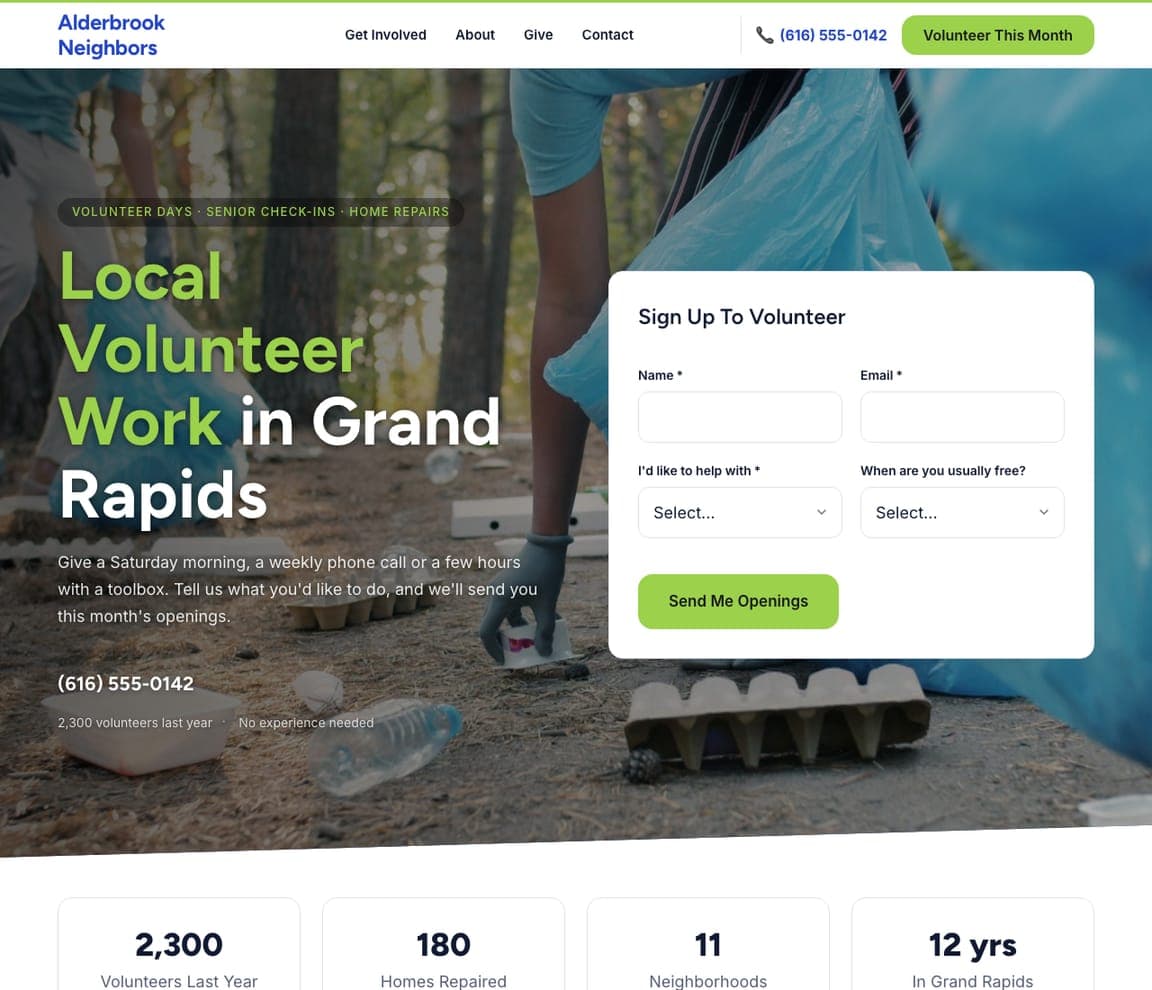
Wildwood Community Church is a Zarla template for a church, not a charity — but it's here because its hero solves the problem every community nonprofit has: making a stranger feel expected. A stained-glass photograph washed dark, a serif headline that is pure hospitality — 'You're Welcome Here' — and a sentence that removes every excuse ('However you come and wherever you've been, there's a place for you'). Two buttons, 'Plan Your Visit' in gold and 'Service Times & Location', with practical chips above the nav (Sundays 9 & 11 AM, kids and nursery every service, the street address). Clone it, describe your organization, and the AI turns services into programs and visits into volunteer shifts. Wildwood is the closest starting point for a membership or congregation-style nonprofit.

  • 'You're Welcome Here' — hospitality as the entire headline
  • Practical chips (times, kids, address) answer the nervous questions first
  • Clone → describe your cause → visits become volunteer shifts
See this template
Girls Who Code website — Education Nonprofit design example
Real site
  • Education Nonprofit
  • Energetic
  • Teal + peach

Girls Who Code: A campaign name set like a poster

Girls Who Code leads with its strategic plan as a brand: 'FIVE BY FIVE' in giant stacked type — teal and peach on a deep teal field — beside a collage of photographs of girls at laptops, then the number that explains it: '5 MILLION BY 2030', with a link to the plan. The design treats a five-year goal the way a music festival treats its name: big, colorful, impossible to miss. There is no generic mission paragraph in the first screen; the goal IS the mission. The palette (teal, peach, sand) is bright without being childish, and the nav keeps the two real actions — Get Involved, Donate — one click away. Girls Who Code shows how to turn a plan nobody would read into a headline everyone remembers.

  • The strategic plan gets a poster-sized name instead of a PDF link
  • A collage of real participants replaces one hero photo
  • Teal + peach: energetic without tipping into kids'-brand territory
Visit Girls Who Code

Opens a similar Zarla design you can make yours.

Malala Fund website — Education Nonprofit design example
Real site
  • Education Nonprofit
  • Minimal
  • White + lavender

Malala Fund: One sentence under one photograph

Malala Fund is the minimal end of this gallery: a wide photograph of a teacher leaning in among a group of children before a wall of paper flowers, and beneath it a single centered sentence in a light sans — 'Malala Fund is working for a world where every girl can learn and choose her own future.' — with a soft lavender bar and a small geometric motif as the only decoration. No stats, no buttons competing in the first screen; the classroom and the sentence carry everything, with a navy 'Donate' held quietly in the nav. It reads like the opening page of a well-designed annual report. Malala Fund demonstrates that when the mission can be said in one clean sentence, the design's job is to get out of the way.

  • A single mission sentence, centered, with nothing competing
  • A real classroom is the credibility — no logo wall needed
  • Report-like restraint signals seriousness
Visit Malala Fund

Opens a similar Zarla design you can make yours.

Playworks website — Youth Program design example
Real site
  • Youth Program
  • Straightforward

Playworks: The mission written as a plain sentence over play

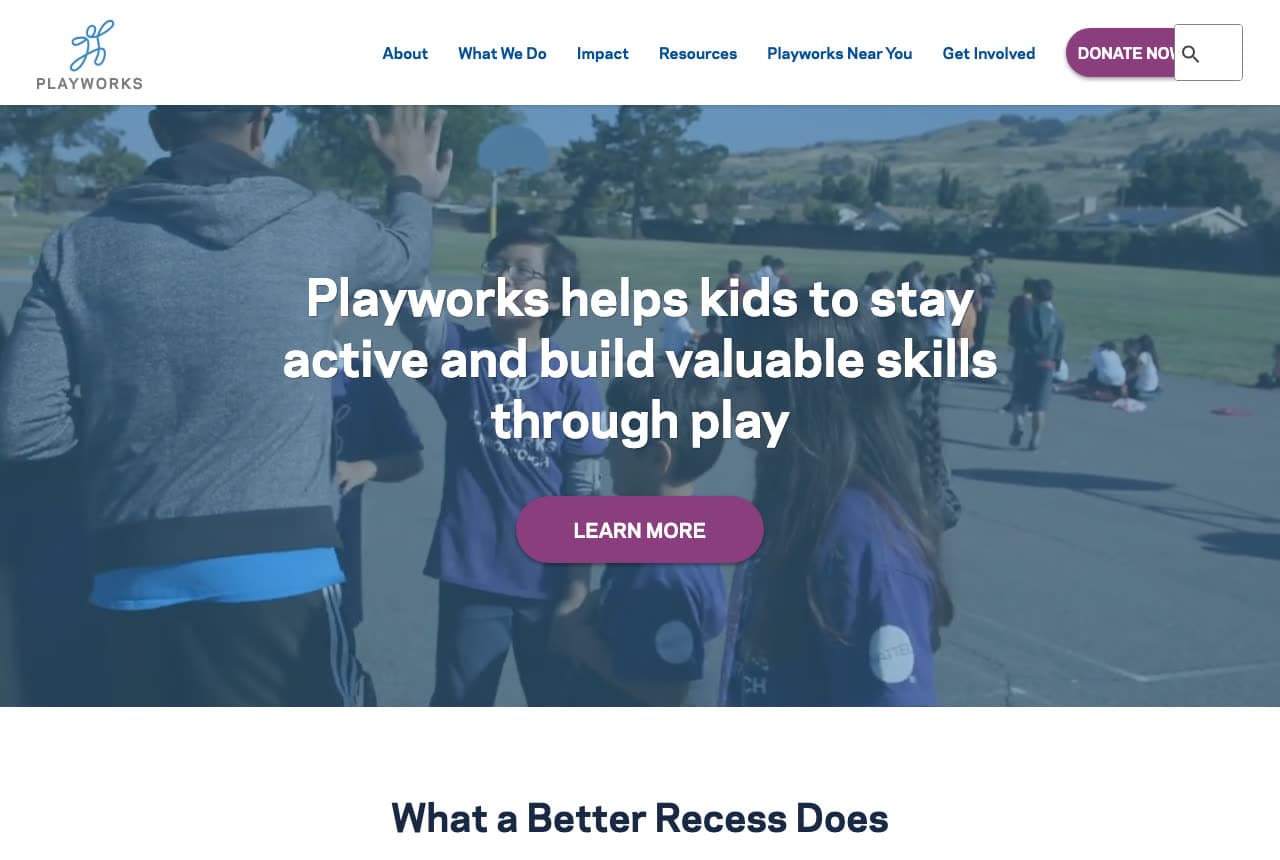
Playworks keeps the hero almost documentary: a photograph of kids mid-game, slightly softened, and one sentence over it that says exactly what the organization does — 'Playworks helps kids to stay active and build valuable skills through play' — followed by a single purple 'Learn More'. The nav carries the conversion (an orange 'Donate Now' at the far right) so the hero can stay about the kids. Directly below, a section heading makes the case in the organization's own frame: 'What a Better Recess Does'. It's a program nonprofit's ideal shape: show the program happening, describe it in one line, explain the outcome underneath. Playworks proves you don't need a manifesto when the photograph is the proof.

Visit Playworks

Opens a similar Zarla design you can make yours.

Equal Opportunity website — Youth Nonprofit design example
Real site · Toronto, ON
  • Youth Nonprofit
  • Hopeful

Equal Opportunity: Capitals, one child, two bright buttons

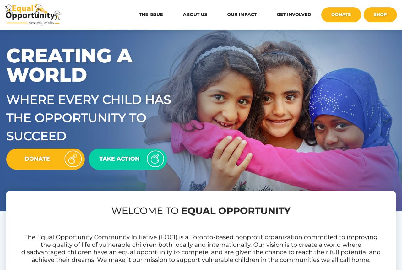
Equal Opportunity Community Initiative puts its entire vision in capitals over one photograph of one laughing child in a pink hijab: 'CREATING A WORLD WHERE EVERY CHILD HAS THE OPPORTUNITY TO SUCCEED', with the first line in white and the rest in yellow. Two pill buttons in the brand's yellow and green — Donate and Take Action — sit under it, and the nav carries the same pair plus a shop. The section below opens with 'Welcome to Equal Opportunity' and a plain paragraph about the Toronto-based organization. Nothing here is expensive; the impact comes from choosing one child's face and one sentence, then getting out of the way. Equal Opportunity is the small-nonprofit template: photo, vision, two actions.

Visit Equal Opportunity

Opens a similar Zarla design you can make yours.

The Hunger Project website — Hunger Nonprofit design example
Real site
  • Hunger Nonprofit
  • Editorial

The Hunger Project: A serif headline and a single portrait

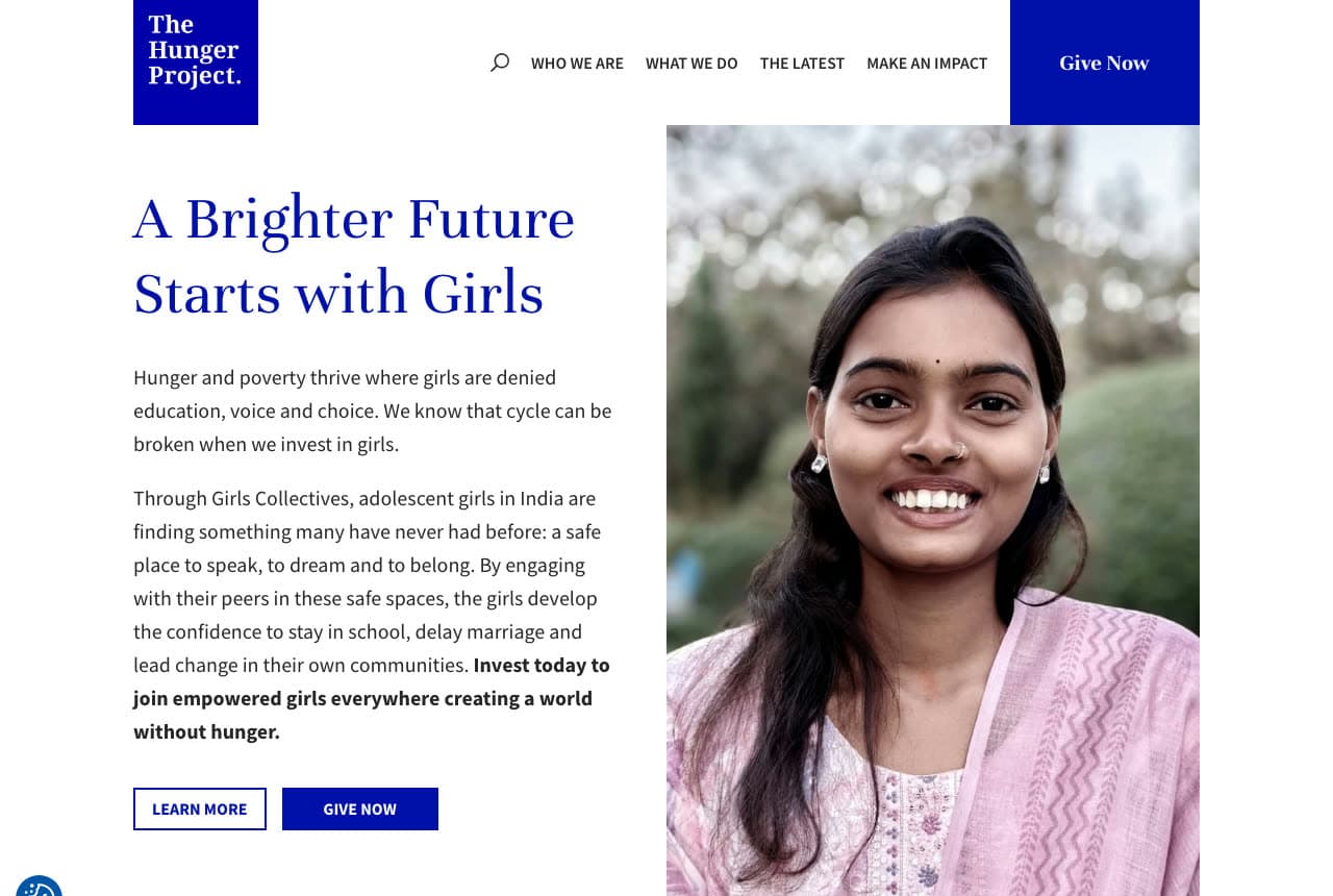
The Hunger Project presents a global organization with the calm of a magazine feature: white ground, a navy serif headline — 'A Brighter Future Starts with Girls' — two short paragraphs about Girls Collectives in India, and one portrait of a young woman in pink, smiling straight at the reader. Two buttons: 'Learn More' outlined, 'Give Now' filled navy. The restraint is deliberate; instead of a crowd or a map, one person represents the program, and the copy tells her story in plain sentences ('a safe place to speak, to dream and to belong'). It's the editorial approach to fundraising: read first, give second. The Hunger Project shows how to introduce a program through one participant rather than a statistic.

Visit The Hunger Project

Opens a similar Zarla design you can make yours.

Glacier National Park Conservancy website — Conservancy design example
Real site
  • Conservancy
  • Outdoorsy

Glacier National Park Conservancy: The landscape is the brand, the contest is the hook

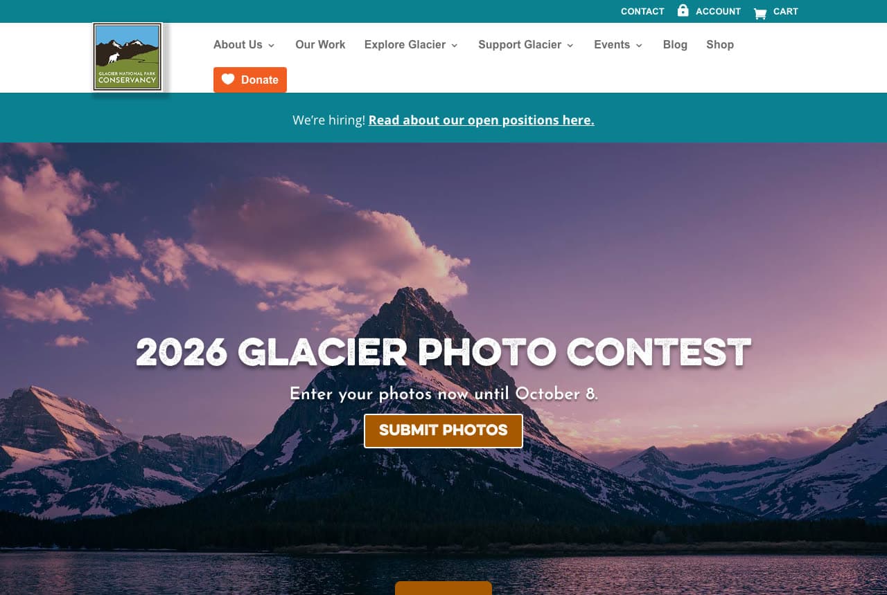
Glacier National Park Conservancy lets the park do the design: a full-bleed photograph of a mountain lake at dusk, and over it the current campaign in tall condensed capitals — '2026 GLACIER PHOTO CONTEST', 'Enter your photos now until October 8.' — with an orange 'Submit Photos' button. A teal nav holds the permanent actions (a heart-marked Donate, Explore Glacier, Support Glacier, Shop) and a slim bar above announces open positions. The hero rotates with the season's campaign, which keeps a conservancy site feeling alive rather than institutional, and a photo contest is a smart ask: it invites participation before it invites money. Glacier Conservancy shows a place-based nonprofit how to let the place be the hero.

Opens a similar Zarla design you can make yours.

Alder Lane Films — Adaptable Template website design you can build with Zarla
Build this with Zarla
  • Adaptable Template
  • Warm

Alder Lane Films: Storytelling as the service

Alder Lane Films is a Zarla template for a video studio that films nonprofits — not a nonprofit itself — but its hero is the closest thing in the catalog to how mission organizations should introduce themselves: a serif headline about outcomes ('Stories That Move Missions'), a photograph of volunteers handing over supplies, and proof in the language of impact (60 nonprofits served, $18M+ raised at screenings, 'filmed with dignity, always'). Two buttons, 'Tell Your Story' in green and 'See Our Films'. Clone it, describe your organization, and the AI turns the studio's services into your programs while keeping the story-first structure. Alder Lane suits a nonprofit whose strongest asset is the stories it can tell.

See this template
Lantern Learning — Adaptable Template website design you can build with Zarla
Build this with Zarla
  • Adaptable Template
  • Encouraging

Lantern Learning: The education program's proof-first layout

Lantern Learning is a Zarla template for a tutoring center, and it's here for education and youth nonprofits: a bold headline ('Where Students Find Their Spark'), a trio of photographs — a tutor with a child, a student with a backpack, a desk — and a yellow 'Book a Free Assessment' beside 'See Our Programs'. The proof band underneath is the part worth stealing: four tiles reading Est. 2015, 2,500+ students helped, +180 average SAT point gain, 4.9★ across 400+ reviews. Swap the SAT gain for meals served or graduates placed and the structure is a nonprofit impact strip. Clone it, describe your program, and the AI rewrites the tutoring language into your mission's. Lantern is the buildable version of the outcome-led youth-program site.

See this template

Frequently asked

Where can I find good nonprofit website examples?

Right here — this page curates nonprofit website examples across the spectrum: global organizations like charity: water, Malala Fund and The Hunger Project, national programs like Girls Who Code and Covenant House, and small community nonprofits like KinderGround and Equal Opportunity (each linked so you can explore the live site), plus professionally designed Zarla community templates you can clone and restyle for your cause. Every example includes a note on why the design works — the ask, the proof, the emotional focus — so you can copy the thinking, not just the look.

What makes a good nonprofit website?

It makes one problem vivid, one person real, and one action easy. The strongest examples above name a number, show a single face, and place the donate or get-involved button where the eye lands — never buried in a menu. Transparency helps too: goals, matched-gift windows and impact figures in plain sight. If a visitor can understand the cause and give in under a minute, the design is doing its job.

How much does a nonprofit website cost?

Agencies that specialize in nonprofits typically charge thousands up front, and template builders run roughly $16–$30 per month. An AI builder generates a complete, editable site for free and only charges (on the Premium plan) when you publish to your own domain — so a small organization can build and preview before spending a cent of donor money.

Should the donate button be in the hero of a nonprofit website?

For most organizations, yes — and the examples above go further: Covenant House puts a full donation card with preset amounts in the first screen, charity: water puts a matched-gift bar above the navigation, and KinderGround turns the button into a goal ('Help Us Reach Our 2027 Goal'). The donate path should be visible without scrolling and repeated at the end of every story.

What pages does a nonprofit website need?

Most need six: a home page that states the mission and the ask, an about page with the people and the history, a programs or 'our work' page that shows impact, a get-involved page (donate, volunteer, partner), a news or stories section that keeps the site alive, and a contact page. Grant-making and membership organizations add an apply or join page — KinderGround's nav shows the shape.

How do nonprofits get more donations from their website?

Make the problem specific, the impact measurable, and the gift frictionless. The converting pattern in the examples above: a number in the headline, a real person in the photo, preset gift amounts with a monthly option, and a matched-gift or goal deadline that gives people a reason to act today rather than someday.

You've seen what works. Now make it yours.

Describe your business and Zarla designs a complete, professional website in about 30 seconds — built to convert, just like the ones above.

Free to build and preview · no credit card · publish to your own domain on Premium