Inspiration · Optometrist

The Best Optometrist Website Examples, Explained

Looking for optometrist website examples? These 9 are the best we could find — standout real optometrist sites plus designs you can build with Zarla — and each comes with a breakdown of the specific design move that makes it work. Find a look you love and you can build a site in that exact style, free, in about 30 seconds.

Real sites + designs you can build with Zarla — free to build and preview, no credit card

What makes a great optometrist website

The best optometrist websites share a few moves: they earn trust fast, lead with strong visuals of the work, point to one clear action, and match the design to how their customers decide. Each example below calls out the specific choice worth stealing for your own optometrist website.

Warby Parker website — DTC Eyewear design example
Real site · New York, NY
  • DTC Eyewear
  • Clean
  • White + navy

Warby Parker: The DTC eyewear benchmark, still clean

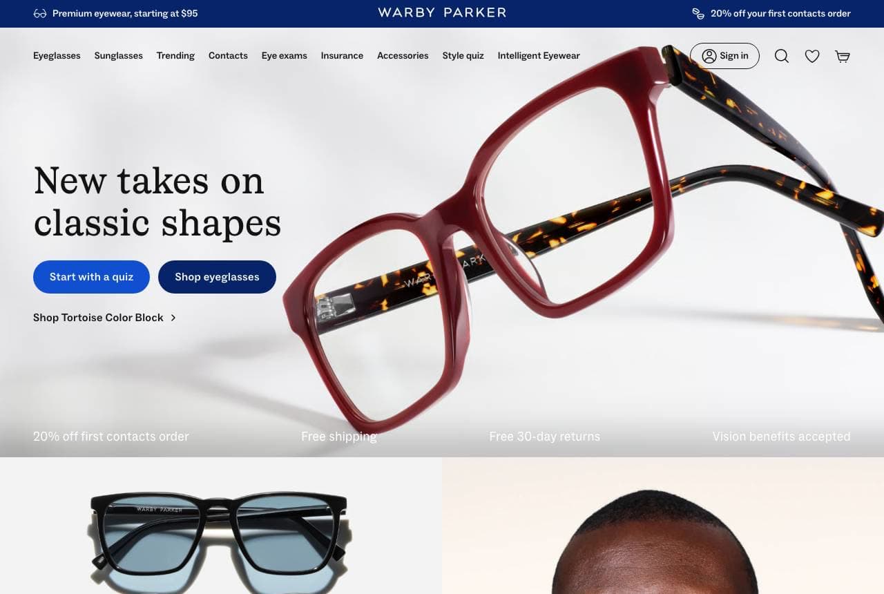
Warby Parker set the template the whole category now copies, and its homepage still shows why: 'New Takes on Classic Shapes' beside a single, beautifully-lit frame, with two low-commitment entry points — 'Start with a quiz' and 'Shop eyeglasses' — and a reassurance bar (20% off first contacts, free shipping, free 30-day returns, vision benefits accepted). The product photography is catalog-clean, the style quiz reduces the paralysis of choosing frames online, and 'vision benefits accepted' quietly bridges the fashion brand back to the medical-insurance reality of eyewear. It's e-commerce discipline applied to a formerly stuffy category: gorgeous frame shots, a guided-selection tool, and every friction (fit, returns, insurance) pre-answered. For any optical retailer selling online, the quiz-plus-clean-catalog model is the proven path — reduce choice anxiety, then remove every reason not to buy.

  • Style quiz kills the paralysis of picking frames online
  • Reassurance bar pre-answers fit, returns and insurance
  • 'Vision benefits accepted' bridges fashion to medical reality

Steal this: Add a style quiz as a low-commitment entry point. Guided selection beats a wall of frames for the online eyewear buyer.

Moscot website — Heritage Eyewear design example
Real site · New York, NY
  • Heritage Eyewear
  • Iconic
  • Warm + yellow

Moscot: A century of heritage as the whole brand

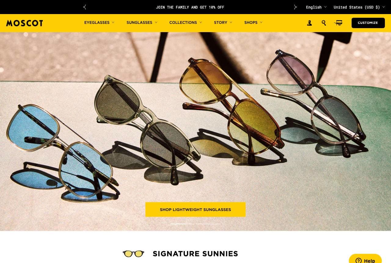
Moscot leans entirely on something no startup can fake: a 100-year New York eyewear heritage. The homepage feels like a family institution — a sun-drenched flatlay of its 'Signature Sunnies,' frames with proprietary Yiddish names (Plotz, Shtarker, Billik, Utz) that reinforce the brand's Lower East Side lineage, and a 'Join the Family' invitation. Every choice — the named frames, the family language, the warm retro palette — turns a pair of glasses into a piece of cultural continuity, which is exactly what justifies premium heritage pricing over a $95 online frame. The naming system is the standout: giving frames distinctive proprietary names makes the catalog ownable and memorable in a way generic 'round tortoise' never could. When you have real history, the design job is to make every product feel like part of that story.

  • Proprietary named frames (Plotz, Utz) make the catalog ownable
  • 'Join the Family' language turns glasses into heritage
  • A 100-year story is a moat no DTC startup can manufacture

Steal this: Give your products distinctive proprietary names. A named frame is memorable and ownable where 'round tortoise' is not.

American Eyewear website — Designer Optical design example
Real site · Dallas, TX
  • Designer Optical
  • Editorial
  • Black + white

American Eyewear: Luxury designer optical, editorial-styled

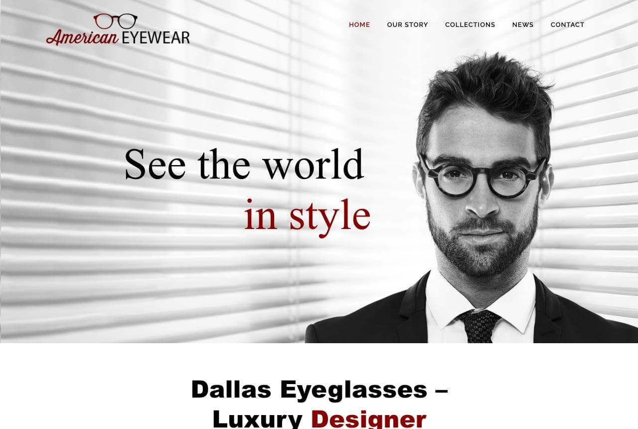
American Eyewear positions as the high-fashion end of local optical: 'See the World in Style' beside a crisp black-and-white portrait of a model in designer frames, with 'Dallas Eyeglasses — Luxury Designer Eyewear' and a copy line leaning on 40 years of local trust ('there is no doubt why Dallas has chosen American Eyewear'). The editorial photography and refined serif treatment signal that this is a curated designer-frame destination, not a bargain optical chain, and pairing that fashion polish with a four-decade local track record covers both aspiration and trust. For an independent optical boutique competing against both online DTC and big chains, looking like a fashion brand while claiming deep local roots is a strong dual position. Photograph your frames like a fashion campaign, and let your longevity do the reassuring.

  • Editorial B&W portrait signals designer-frame curation
  • 40-year local track record covers the trust side
  • Fashion polish + local roots is a strong dual position
Occhiali website — Boutique Optician design example
Real site · New York, NY
  • Boutique Optician
  • Craft-Led
  • Black + white

Occhiali: In-house craft as the premium proof

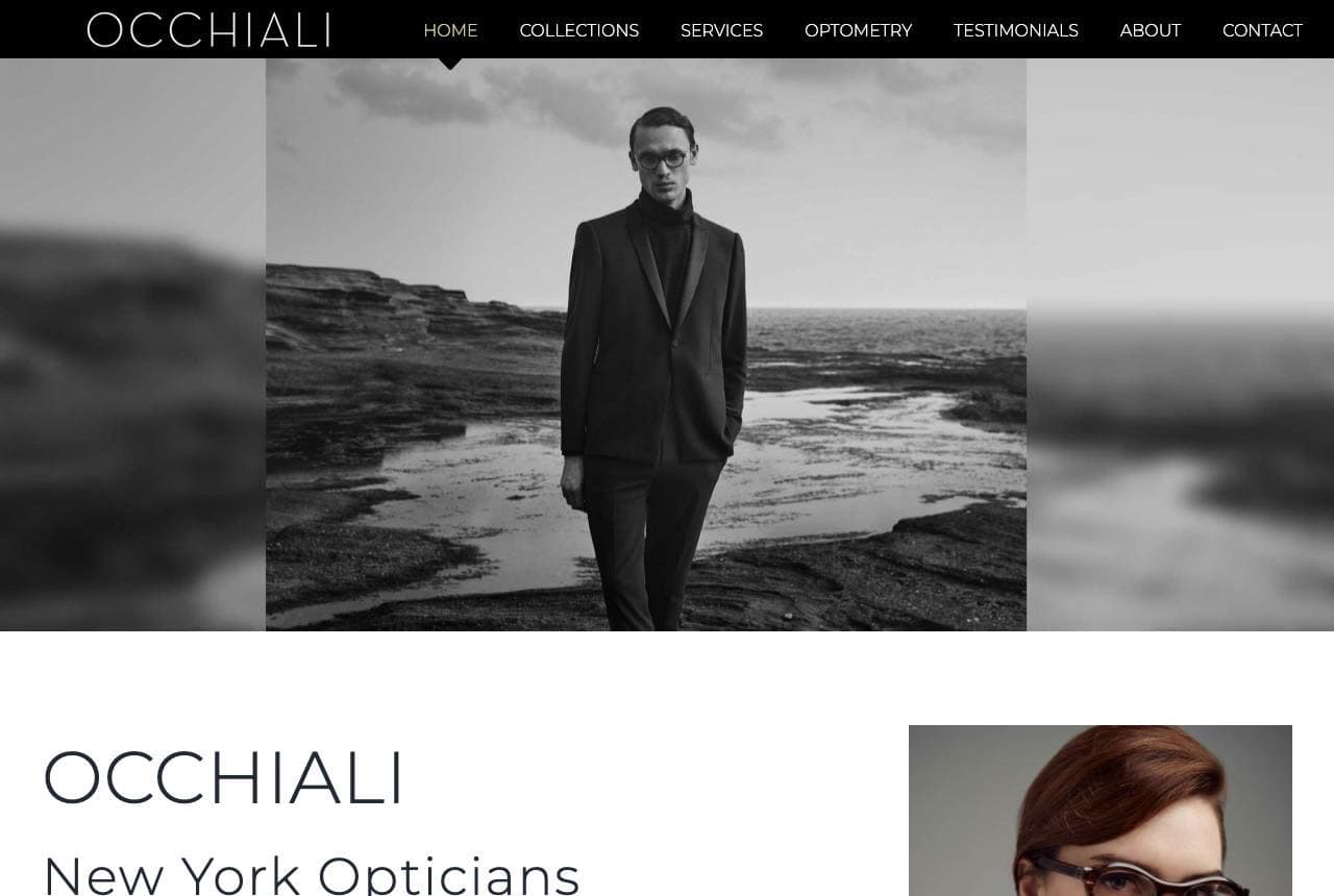
Occhiali New York sells craft and precision the way a bespoke tailor would: moody black-and-white editorial imagery, 'Praiseworthy Customer Service, Timeless Styles & Exclusive Quality,' and the differentiating detail — 'all eyewear is fabricated in our in-store lab with the utmost precision and care… some prescriptions can even be filled while you wait.' The in-house lab is the load-bearing claim; it separates a true optician from a retailer that ships your prescription elsewhere, and it justifies premium pricing with genuine craft and speed. The editorial, gallery-like art direction reinforces the boutique, considered positioning. When your real advantage is a capability competitors outsource (an on-site lab, same-day fabrication), name it explicitly and build the premium brand around it — the craft you control is the story worth telling.

  • 'Fabricated in our in-store lab' is the premium proof
  • Same-day fabrication is craft + speed competitors outsource
  • Gallery-like editorial art direction sells the boutique position
Bailey Nelson website — Accessible Eyewear design example
Real site · Sydney, AU
  • Accessible Eyewear
  • Joyful
  • Bright + editorial

Bailey Nelson: Accessible eyewear, joyfully shot

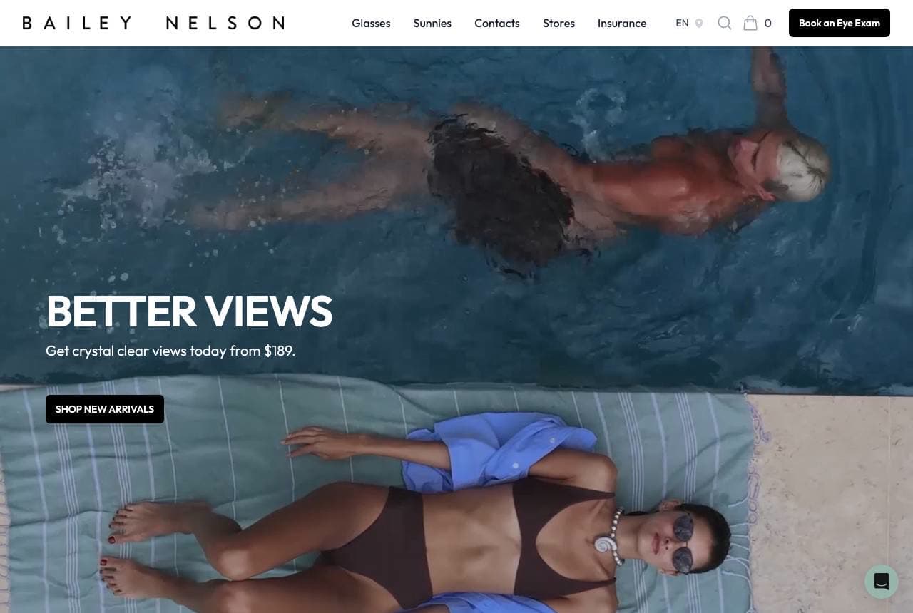
Bailey Nelson makes glasses feel like a lifestyle purchase rather than a medical necessity: 'Better Views — get crystal clear views today from $189,' over a sunny, editorial photo of someone lounging poolside, with a scannable frame carousel (Peggy in Silver, Astro in Warm Havana) beneath. The upfront '$189' price transparency and the joyful, un-clinical photography reposition eyewear as affordable fashion, and the brand offers eye exams too — quietly bridging retail and optometry. The named frames and bright, optimistic art direction keep it approachable where luxury opticians go austere. It's a masterclass in making a functional product feel aspirational and accessible at once: lead with a clear price, shoot the frames on real people having fun, and the glasses stop feeling like a grudge purchase. Price clarity plus joy is a disarming combination.

  • Upfront '$189' repositions eyewear as affordable fashion
  • Joyful poolside photography de-clinicalizes glasses
  • Named frames + eye exams bridge retail and optometry
Felix Gray website — Blue-Light Eyewear design example
Real site · United States
  • Blue-Light Eyewear
  • Wellness
  • Teal + cream

Felix Gray: Owning one problem: screen strain

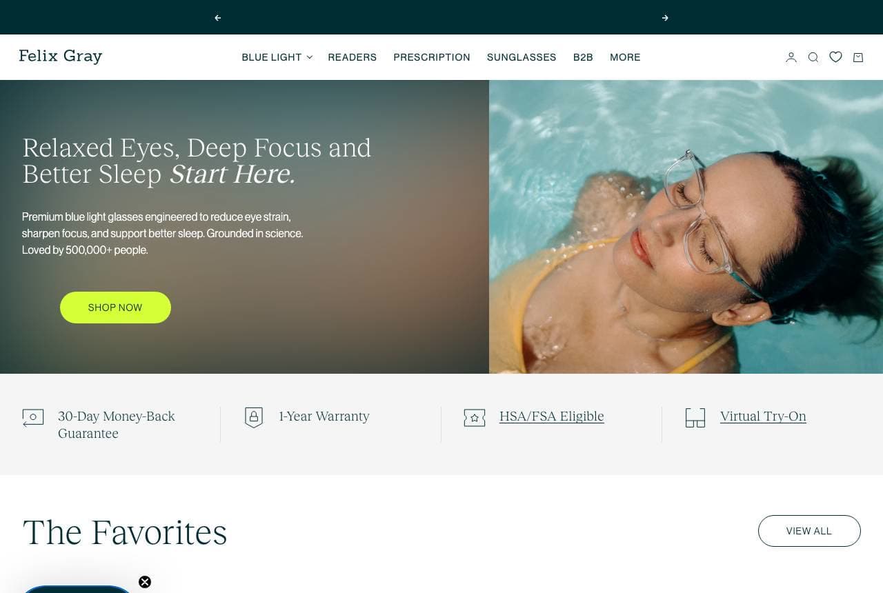
Felix Gray built an entire eyewear brand around a single modern problem: 'Relaxed Eyes, Deep Focus and Better Sleep Start Here,' selling blue-light glasses 'engineered to reduce eye strain, sharpen focus, and support better sleep. Grounded in science.' Rather than competing as one more frame retailer, it owns the screen-fatigue niche — a specific pain point every knowledge worker feels — and leads with the benefit (sleep, focus) rather than the product (glasses). A trust row (30-day money-back, 1-year warranty, HSA/FSA eligible, virtual try-on) and '500,000+ people' handle credibility. 'HSA/FSA eligible' is a clever inclusion — it frames the glasses as a health purchase. When you can attach your product to a widely-felt problem and lead with the outcome, you escape the frame-retailer price war entirely. Own a problem, sell the outcome.

  • Owns the screen-strain niche instead of competing on frames
  • Leads with the outcome (sleep, focus), not the product
  • 'HSA/FSA eligible' frames eyewear as a health purchase

Steal this: Attach your product to a widely-felt problem and sell the outcome, not the object. It escapes the commodity price war.

ROKA website — Performance Eyewear design example
Real site · Austin, TX
  • Performance Eyewear
  • Athletic

ROKA: Eyewear engineered for athletes

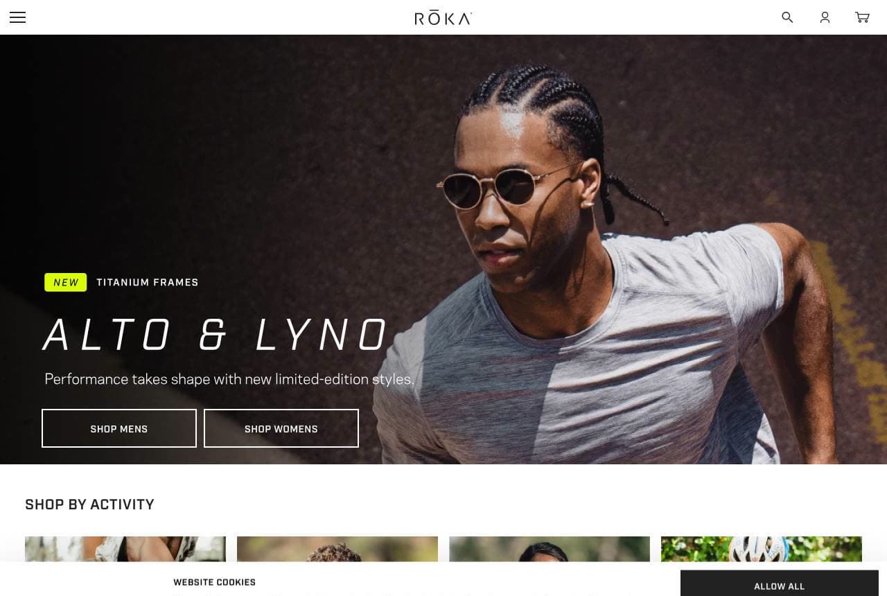
ROKA carves out the performance niche with conviction: 'Alto & Lyno — performance takes shape with new limited-edition titanium frames,' over an athlete in motion, then a 'Shop by Activity' grid (Training, Outdoor, Running, Cycling, Golf, Triathlon, Snow) that no fashion eyewear brand would build. The positioning is engineering-led — frames that won't slip during a marathon — and the design reflects it with dynamic sports photography and activity-based navigation rather than style-based browsing. By organizing the catalog around what you DO rather than how you look, ROKA speaks directly to the serious athlete who's been failed by fashion sunglasses. It's the same lesson as the other niche players here: pick a specific user and their specific need, then build the whole site (photography, nav, copy) around that use case. Sell fit-for-purpose, not fashion.

Eyebobs website — Reading Glasses design example
Real site · Minneapolis, MN
  • Reading Glasses
  • Bold

Eyebobs: Readers with an attitude

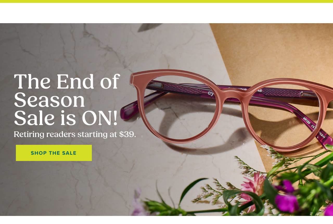
Eyebobs owns a category most brands treat as an afterthought — reading glasses — and gives it genuine personality: a warm, styled photo of pink acetate readers, 'Retiring readers starting at $39,' and a brand promise built on three pillars (Italian-Designed Acetate / Premium Fit & Finish / Look Good, Feel Good) plus the tagline 'Bold, classic, or outlandishly distinctive — we've got you covered.' Readers are usually sold as cheap drugstore commodities; Eyebobs elevates them into a design-forward accessory with attitude and confidence-led copy ('confidence looks good on everyone'). The upfront $39 keeps it accessible while the Italian-acetate claim justifies a premium over the gas-station rack. Taking a commodity nobody bothers to brand and giving it real design and voice is a wide-open opportunity — Eyebobs proves an overlooked category can carry a real brand.

Lumen Eye Care — Optometry Practice website design you can build with Zarla
Build this with Zarla
  • Optometry Practice
  • Trustworthy

Lumen Eye Care: See clearly, look incredible

Lumen Eye Care is Zarla's optometry template, and its split-image-left hero balances the field's two jobs in one line: 'See Clearly. Look Incredible.' — the clinical (vision) and the aspirational (style) that every optometry practice sells at once. The deep-navy and clear-blue palette reads medical-trustworthy without going cold, and the layout pairs the promise with warm imagery and a book-an-exam CTA. The structure carries services (eye exams, contacts, frames), an about-the-practice section, and appointment booking — exactly the path a local optometrist needs, unlike the pure-retail DTC sites in this gallery. It's built for the practice that does exams AND sells frames, bridging the medical and retail sides the way Bailey Nelson does. Swap in your own practice details and it's a credible optometry site in about 30 seconds, no designer required.

See this template

Frequently asked

Where can I find good optometrist website examples?

Right here — this page curates optometrist website examples two ways: standout real businesses (each linked, so you can explore the live site) and professionally designed Zarla templates you can clone and make your own. Every example comes with a note on why the design works — trust signals, layout, calls to action — so you can copy the move, not just the look.

What makes a good optometrist website?

A good optometrist website earns trust in the first few seconds, leads with strong visuals of the work, gives visitors one obvious action, and loads fast on a phone. Every design below leads with proof and a single clear call to action rather than a wall of text.

How much does a optometrist website cost?

A custom optometrist website from a designer typically runs into the thousands up front, and template builders charge roughly $16–$30 per month. An AI builder generates a complete, editable design for free and only charges (on the Premium plan) when you publish to your own domain — so you can build and preview before spending anything.

Do I need a designer to build a optometrist website?

No. Several designs on this page were generated by Zarla and are fully editable — you describe your business and get a complete, professionally designed site in about 30 seconds, then refine it by chatting. Building and previewing is free; publishing to your own domain needs the Premium plan.

What pages does a optometrist website need?

Most optometrist businesses need just a few: a home page that proves trust and points to one clear action, an about page that puts a face to the business, a services or work page that shows what you do, and a contact page with a form and a phone number. Local businesses also benefit from location or service-area pages that help them show up in nearby searches.

How do I get more customers from my optometrist website?

Lead with proof in the first few seconds (reviews, real photos, results), make one action obvious on every screen (call, book, or enquire), and keep it fast on mobile — most visitors arrive on a phone. The designs above each do this differently, but they all earn trust early and remove friction from the next step.

You've seen what works. Now make it yours.

Describe your business and Zarla designs a complete, professional website in about 30 seconds — built to convert, just like the ones above.

Free to build and preview · no credit card · publish to your own domain on Premium