Inspiration · Painter

The Best Painter Website Examples, Explained

Looking for painter website examples? These 15 are the best we could find — standout real painter sites plus designs you can build with Zarla — and each comes with a breakdown of the specific design move that makes it work. Find a look you love and you can build a site in that exact style, free, in about 30 seconds.

Real sites + designs you can build with Zarla — free to build and preview, no credit card

What makes a great painter website

The best painter websites share a few moves: they earn trust fast, lead with strong visuals of the work, point to one clear action, and match the design to how their customers decide. Each example below calls out the specific choice worth stealing for your own painter website.

DiVinci Painters website — Luxury Painting design example
Real site
  • Luxury Painting
  • Refined
  • Cream + walnut

DiVinci Painters: Specialty finishes sold like fine furniture

DiVinci Painters positions at the very top of the trade and every design choice holds the line: a magazine-grade photograph of a coffered ceiling and layered interior, 'LUXURY PAINTING & SPECIALTY FINISHES' in letterspaced serif capitals, then the credentials in the same hushed register — white-glove service, 60,000+ projects, 40+ years, wallcoverings, limewash, decorative plaster. Even the interior-design collaboration is credited like a gallery placard. There's no price anchor, no urgency banner; the restraint itself communicates the tier. For any painter chasing designer and builder referrals rather than lead forms, this is the register: show finished rooms, name rare techniques, count decades quietly.

  • A coffered-ceiling hero photo sets the tier before any copy
  • Naming rare finishes (limewash, plaster) claims craft territory
  • No urgency mechanics — restraint reads as luxury

Steal this: Sell the finished room, not the act of painting — luxury buyers purchase results.

Two Dudes Painting Company website — House Painting design example
Real site · Lancaster, PA
  • House Painting
  • Americana
  • Orange + cream

Two Dudes Painting Company: A sunset VW bus instead of a paint roller

Two Dudes Painting Company opens with a photograph no competitor would choose: their vintage VW bus rolling past a Pennsylvania cornfield at dusk. No ladders, no rollers — just a feeling of two friends who built a beloved local company, which is exactly the founding story. The warm orange brand color threads from the logo through the section dividers, and the services list underneath is thorough (murals, electrostatic coatings, custom signage) for anyone who needs convincing the charm has substance. The name plus the bus does what a dozen trust badges can't: it makes the company feel like people. Personality is a defensible moat in a commodity trade.

  • The VW-bus hero sells the company's soul, not its service
  • A plain-spoken name ('Two Dudes') is unforgettable by design
  • Deep service lists back the charm with substance

Steal this: Lead with the image that could only belong to YOUR company.

Soho Painters website — City Painters design example
Real site · New York, NY
  • City Painters
  • Bold
  • Ink + mint

Soho Painters: One pouring-paint photo and a city-sized claim

Soho Painters stakes the whole hero on a single macro action shot — paint pouring thick over a can's edge, a painter's boot planted beside it — under three words: 'NYC's Best Painters.' The overline chips (professional · meticulous · responsive) read like a checklist of the anxieties apartment dwellers have about letting crews in. Below, a real team photo — three painters in matching navy, arms crossed, grinning — replaces the usual stock handshake, and a claimed 5-star average across platforms carries the proof. The formula is bold claim + visceral craft imagery + faces, and it's especially right for a city market where trust and speed decide everything.

  • A macro pour shot makes the craft physical and vivid
  • Overline chips answer renter anxieties in three words
  • A real uniformed team photo beats any stock handshake
Paint My Condo website — Condo Painting design example
Real site · Toronto, ON
  • Condo Painting
  • Modern
  • Navy + white

Paint My Condo: The niche is the domain is the pitch

Paint My Condo compressed its entire strategy into a domain name: condo painting, Toronto, done. The hero — a spiral staircase interior with 'Professional Condo Painting Services in Toronto & the GTA' — then hands over to the real conversion engine: 'Get Your Exact Painting Quote in Seconds' with a Calculate Price button. Instant pricing works here precisely because the niche is standardized; condos come in knowable sizes, so the company can promise 'transparent pricing, instant results, no hidden fees' where a general painter couldn't. HomeStars ratings seal it. Pick a niche uniform enough to price by algorithm and the quote calculator becomes your best salesperson.

  • A niche-as-domain-name makes the positioning permanent
  • Instant quotes work because condo jobs are standardized
  • 'No hidden fees' answers the trade's biggest buyer fear
Stubbins Painting website — Painting Contractor design example
Real site · San Diego, CA
  • Painting Contractor
  • Professional
  • Ochre + white

Stubbins Painting: The estimate form rides beside the hero

Stubbins Painting puts a 'Schedule a Free Estimate' form directly in the hero — name, email, phone, message — floating over a golden-hour photograph of a Spanish-style SoCal home. 'SoCal Professional Painting Contractor… Licensed, Insured, and Bonded' does the qualifying while a four-logo review row (Google, Facebook, Yelp, HomeAdvisor) does the vouching. The geography-matched photography matters more than it looks: prospects see their own architecture, which quietly says 'we paint houses like yours.' Sixteen years of trade experience is stated, not shouted. It's the classic contractor conversion layout executed with unusual care — every element either qualifies, reassures, or captures.

  • An in-hero form captures leads without a page hop
  • Spanish-style photography mirrors the local housing stock
  • Four review-platform logos cover every vouching habit
Truecoat Painting Co. — House Painting website design you can build with Zarla
Build this with Zarla
  • House Painting
  • Warm
  • Sage + terracotta

Truecoat Painting Co.: A collage hero built from color itself

Truecoat Painting Co. is Zarla's painter template, and it leans into the one advantage every painter has: the product IS color. The image-collage hero arranges photography in overlapping frames — rollers, finished walls, before-and-after moments — around the promise 'A Fresh Coat Changes Everything,' with a sage-green and terracotta palette that reads more interiors-magazine than hardware-store. That palette choice is deliberate positioning: it attracts the homeowner planning a considered repaint, not the landlord patching scuffs. The collage structure also solves the small-outfit portfolio problem — four decent photos arranged well outperform one perfect one. Clone it and swap in your own walls; the layout does the art direction for you.

  • Collage framing turns four decent photos into a portfolio
  • Sage + terracotta courts the considered-repaint homeowner
  • 'A fresh coat changes everything' sells the outcome feeling
See this template
The Ladder Guys website — Local Painters design example
Real site · Bozeman, MT
  • Local Painters
  • Personal

The Ladder Guys: A founder's letter where the sales copy goes

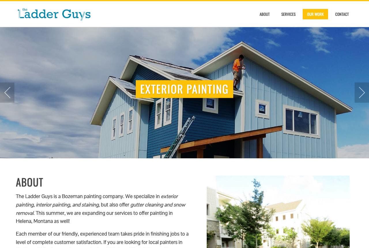
The Ladder Guys leads with a rotating project banner, then does something almost no trade site risks: it hands the page to the owner. Nobu Aoki's first-person story — growing up in Bozeman, starting the company in college, painting 200+ homes in Gallatin County with a 98% approval rate, a photo of him kneeling with his dog — reads like a letter to neighbors, not marketing. The specificity does the selling: named towns, real numbers, a business-school detail that explains the professionalism. For owner-operated companies in small markets, this is the play — people hire the person, so introduce the person before the price list.

Sydney Metro Painting website — Metro Painters design example
Real site · Sydney, AU
  • Metro Painters
  • Direct

Sydney Metro Painting: Three adjectives, stacked and checked

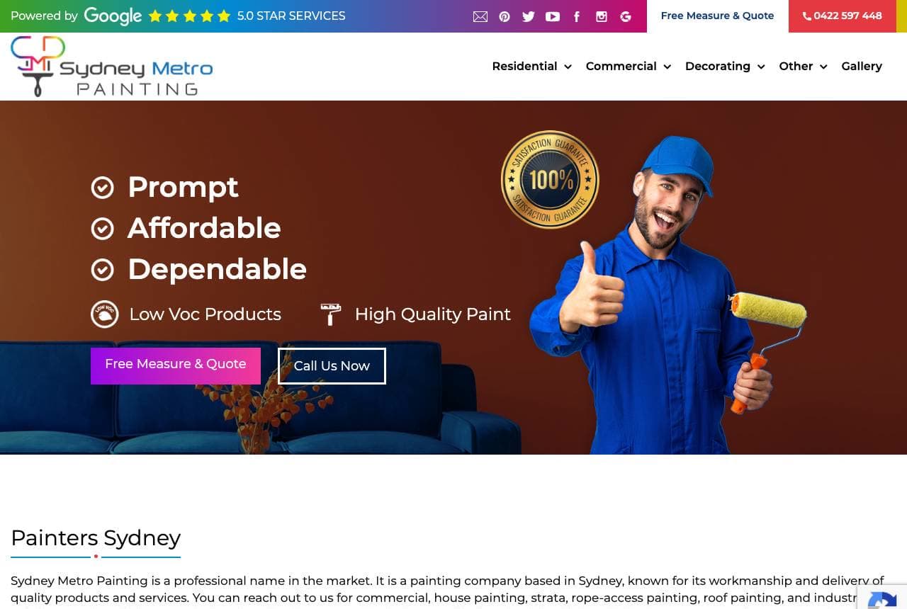
Sydney Metro Painting reduces its pitch to a checked list stacked huge in the hero: Prompt. Affordable. Dependable. — each with a tick, followed by two spec-level reassurances (low-VOC products, high-quality paint) and a grinning painter with a roller. A Google-badged 5.0-star strip rides the very top of the page, and twin CTAs split measurement-bookers from callers. Nothing about it is subtle, and for a metro trade competing on search that's correct: the visitor scanning five painter tabs in thirty seconds can absorb three ticked words. Clarity beats cleverness when the buyer is comparison shopping — write the three words you want remembered and make them enormous.

Ben & Son's Painting website — House Painters design example
Real site · Auckland, NZ
  • House Painters
  • Cheerful

Ben & Son's Painting: Rhyme, red, and a four-field form

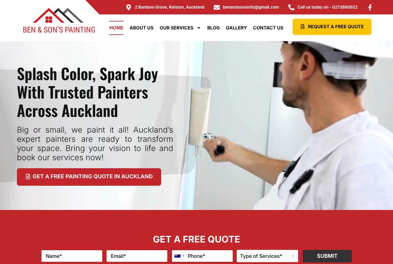
Ben & Son's Painting opens with a headline that bounces — 'Splash Color, Spark Joy With Trusted Painters Across Auckland' — and backs it with the trade's most honest scope line: 'Big or small, we paint it all!' The brand red saturates the quote band, where a deliberately short form (name, email, phone, service type) keeps the ask light, and the copy beneath works a genuine emotional arc: 'from faded to fabulous,' drab walls into pretty spaces. A family name in the masthead does its quiet generational-trust work. It's a modest site that gets the fundamentals exactly right — memorable words, one strong color, and a form nobody abandons.

Winslow Cabinet Refinishing — Cabinet Refinishing website design you can build with Zarla
Build this with Zarla
  • Cabinet Refinishing
  • Premium

Winslow Cabinet Refinishing: A new kitchen without the remodel

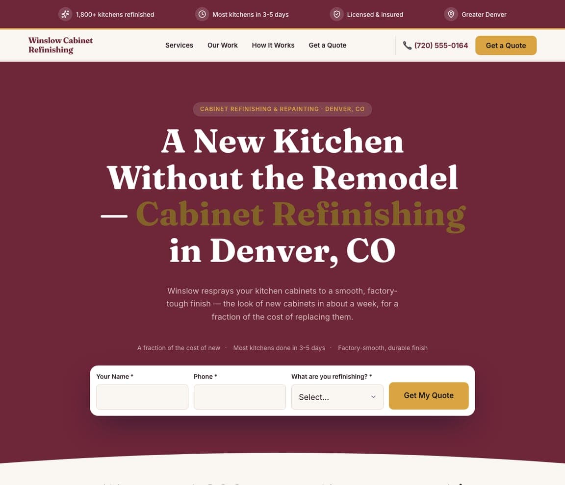
Winslow Cabinet Refinishing owns the highest-value niche in painting: 'A New Kitchen Without the Remodel — Cabinet Refinishing in Denver, CO,' in a rich burgundy-and-gold palette, promising 'a smooth, factory-tough finish — the look of new cabinets in about a week, for a fraction of the cost of replacing them.' The framing is the whole pitch: the customer isn't buying paint, they're buying a kitchen renovation at a tenth of the price, so leading with the remodel comparison (and 'most kitchens done in 3-5 days') sells against the $40k alternative, not against other painters. An in-hero quote form with a 'what are you refinishing?' dropdown captures the lead immediately. For a painter, cabinet refinishing is the premium, focused service worth its own brand — price it against the remodel it replaces, not the gallon of paint it uses.

See this template
Slabworks Garage Floors — Epoxy Garage Floors website design you can build with Zarla
Build this with Zarla
  • Epoxy Garage Floors
  • Bold

Slabworks Garage Floors: A showroom floor in a single day

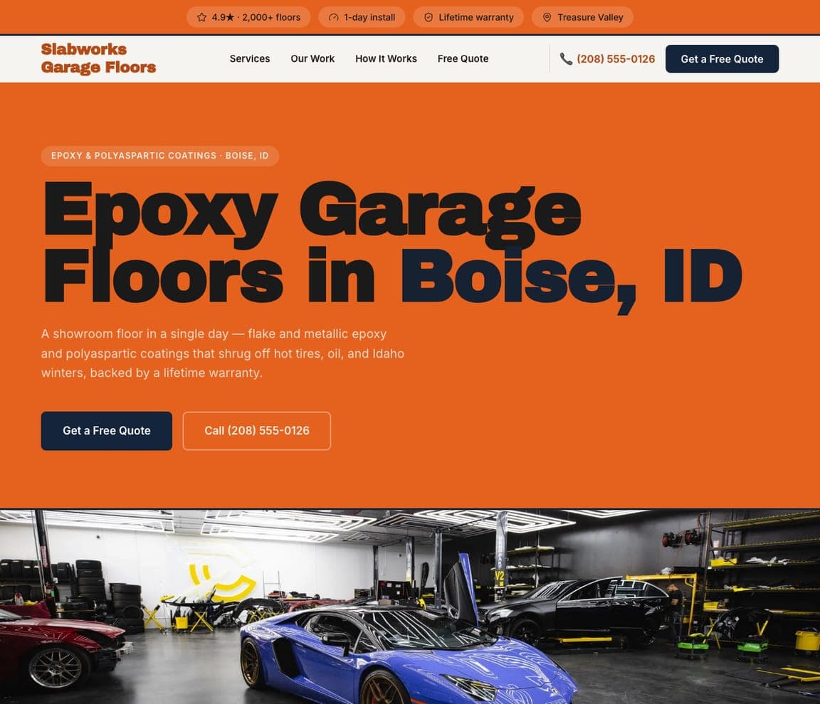
Slabworks Garage Floors turns a slab of concrete into a product: 'Epoxy Garage Floors in Boise, ID' in huge type on a bold construction-orange field, promising 'a showroom floor in a single day — flake and metallic epoxy… that shrug off hot tires, oil, and Idaho winters, backed by a lifetime warranty.' The photo underneath — sports cars parked on a gleaming coated floor — sells the aspiration (a garage worth showing off), while '1-day install' and the lifetime warranty remove the two hesitations (disruption and durability). Epoxy is a distinct trade with its own search demand, so a dedicated brand beats burying it in a painter's service list. For any coatings specialist, pair the transformation photo with the speed promise — 'showroom in a day' is the entire sale.

See this template
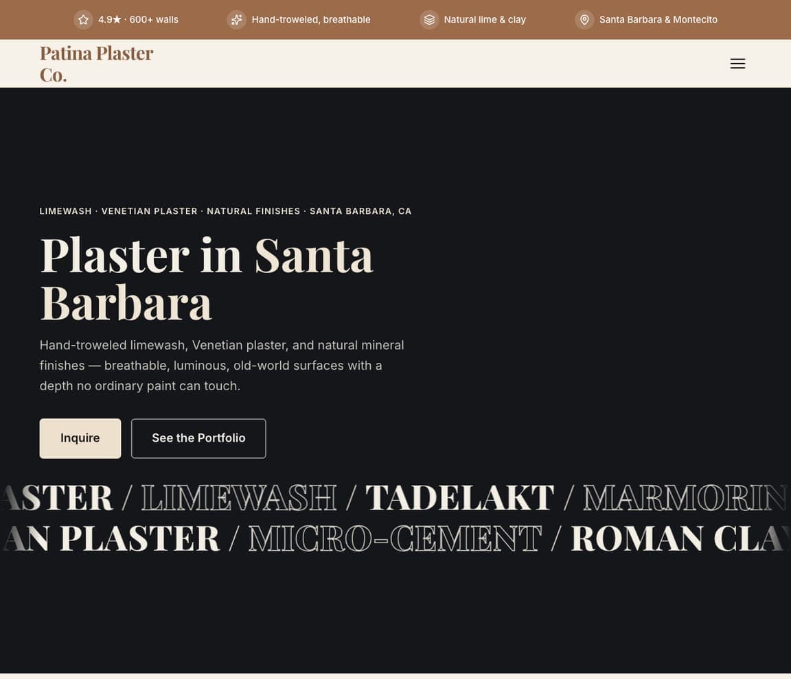
Patina Plaster Co. — Limewash & Plaster website design you can build with Zarla
Build this with Zarla
  • Limewash & Plaster
  • Old-World Luxury

Patina Plaster Co.: Depth no ordinary paint can touch

Patina Plaster Co. takes the specialty-finish positioning DiVinci proves above and gives it a dedicated template: 'Plaster in Santa Barbara,' in a dark, gallery-like design, offering 'hand-troweled limewash, Venetian plaster, and natural mineral finishes — breathable, luminous, old-world surfaces with a depth no ordinary paint can touch.' The marquee row scrolling the craft's own vocabulary — limewash, tadelakt, marmorino, micro-cement, Roman clay — filters instantly for the design-literate client (and their architect) who already knows these words. This is a luxury materials business, not a painting service, and the moody, editorial design prices it accordingly. For a decorative-finish specialist, name the techniques, show the texture, and let the design whisper expensive — the client choosing plaster over paint is buying old-world craft.

See this template
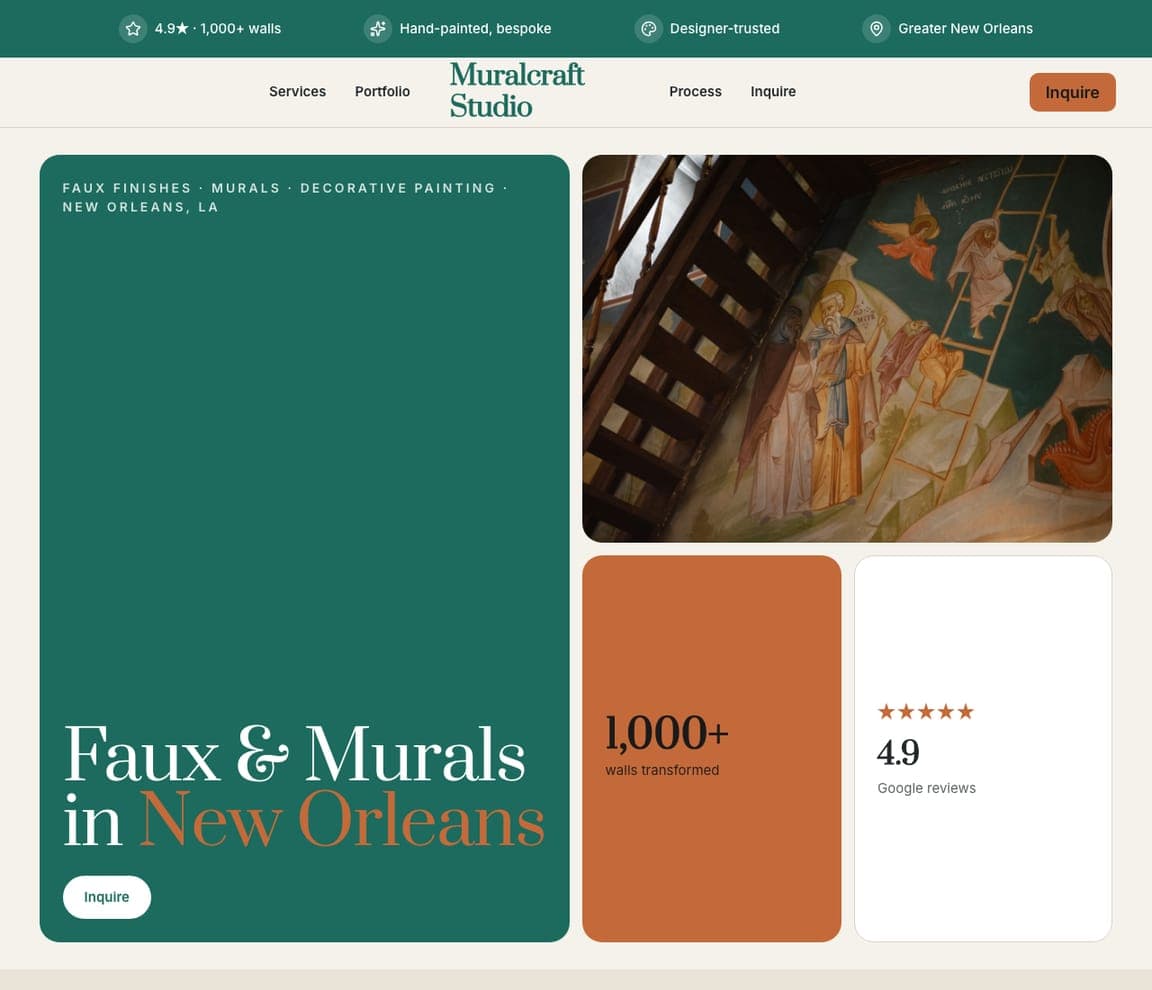
Muralcraft Studio — Murals & Faux website design you can build with Zarla
Build this with Zarla
  • Murals & Faux
  • Artistic

Muralcraft Studio: Walls as commissioned art

Muralcraft Studio positions painting as commissioned artwork: 'Faux & Murals in New Orleans,' with a portfolio-led hero showing hand-painted frescoes and gilded ceilings, '1,000+ walls transformed,' and a deep-green-and-terracotta palette that reads artistic and hand-made. A mural or faux-finish client isn't hiring a painter — they're commissioning an artist for a one-of-a-kind wall — so the portfolio leads (the work IS the pitch, as with any creative studio), the numbers prove it's a real practice, and 'Inquire' replaces 'Get a Quote' to match the commission register. New Orleans grounds it in a city famous for decorative craft. For an artistic painting studio, drop the trade language entirely: show the walls, count the commissions, and let clients inquire the way they would with a gallery.

See this template
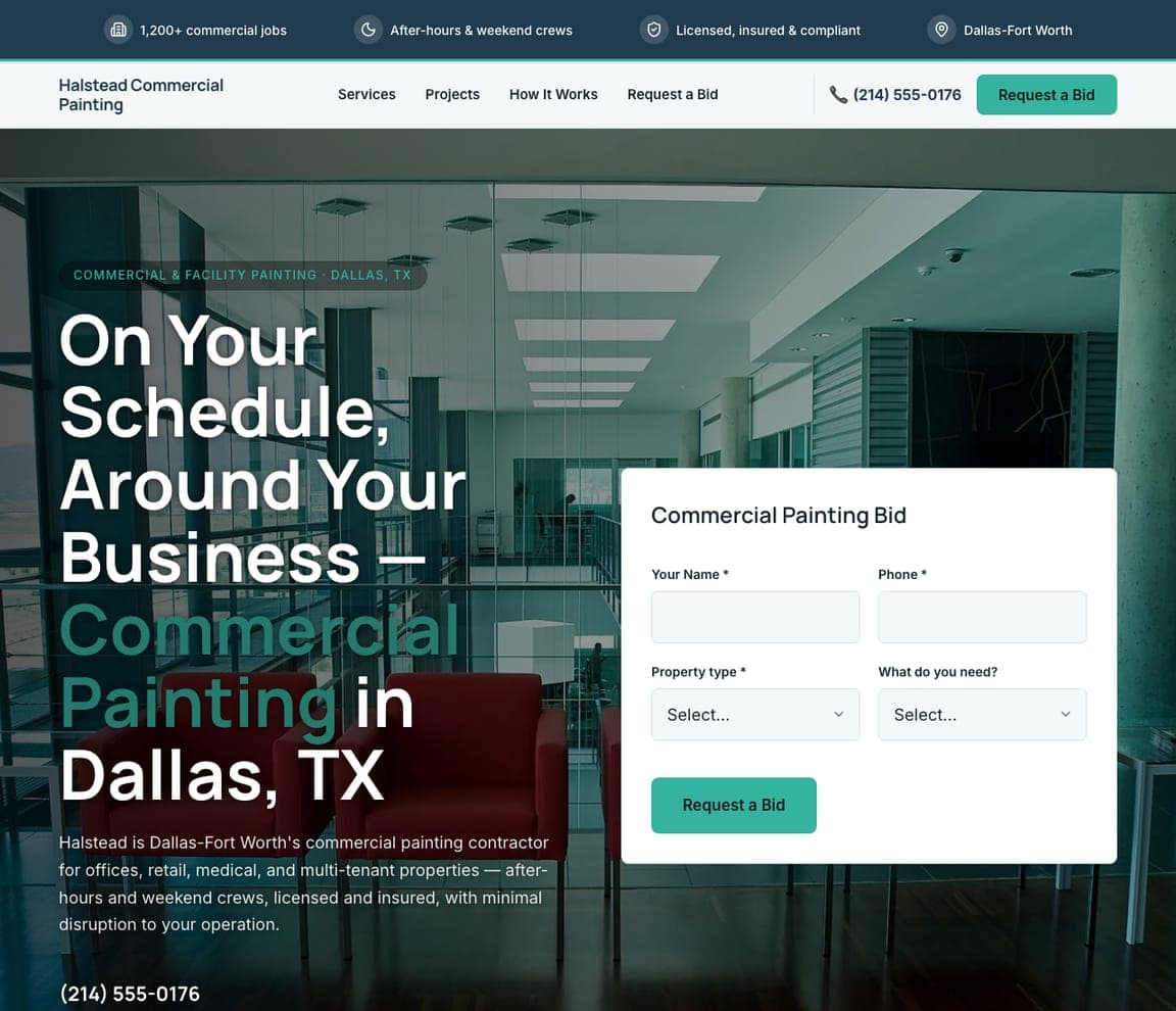
Halstead Commercial Painting — Commercial Painting website design you can build with Zarla
Build this with Zarla
  • Commercial Painting
  • B2B

Halstead Commercial Painting: On your schedule, around your business

Halstead Commercial Painting speaks fluent facilities-manager: 'On Your Schedule, Around Your Business — Commercial Painting in Dallas, TX,' with a 'Commercial Painting Bid' form in the hero (property type, what do you need) and the promise that matters to a business — 'after-hours and weekend crews, licensed and insured, with minimal disruption to your operation.' The commercial buyer's real fear isn't paint quality, it's downtime — closing the shop, disrupting the office — so leading with scheduling flexibility and '1,200+ commercial jobs' answers the actual objection. The corporate teal design and 'Request a Bid' language (not 'free quote') match B2B procurement. For a painter chasing commercial work, talk operations, not color: after-hours crews, compliance, bids — the vocabulary of the facilities manager who's hiring.

See this template
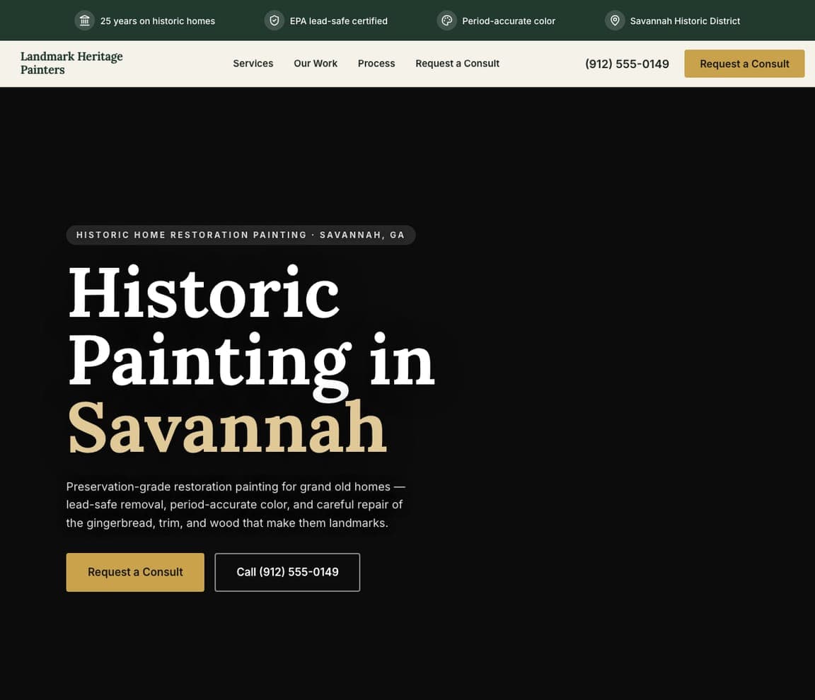
Landmark Heritage Painters — Historic Restoration website design you can build with Zarla
Build this with Zarla
  • Historic Restoration
  • Heritage

Landmark Heritage Painters: Preservation-grade, lead-safe, period-accurate

Landmark Heritage Painters serves the owner of a grand old home: 'Historic Painting in Savannah,' in a stately serif, offering 'preservation-grade restoration painting… lead-safe removal, period-accurate color, and careful repair of the gingerbread, trim, and wood that make them landmarks.' A historic-home owner has fears a regular painter can't answer — lead paint, wrong-era colors, damaged millwork, historic-district rules — so naming 'EPA lead-safe certified,' 'period-accurate color,' and 'Savannah Historic District' proves this crew understands what makes the house irreplaceable. The heritage serif and dark, dignified palette match the architecture. For a restoration specialist, lead with the credentials and the care — the client isn't buying a repaint, they're entrusting a landmark, and the design should feel as considered as the house.

See this template

Frequently asked

Where can I find good painter website examples?

Right here — this page curates painter website examples two ways: standout real businesses (each linked, so you can explore the live site) and professionally designed Zarla templates you can clone and make your own. Every example comes with a note on why the design works — trust signals, layout, calls to action — so you can copy the move, not just the look.

What makes a good painter website?

A good painter website earns trust in the first few seconds, leads with strong visuals of the work, gives visitors one obvious action, and loads fast on a phone. Every design below leads with proof and a single clear call to action rather than a wall of text.

How much does a painter website cost?

A custom painter website from a designer typically runs into the thousands up front, and template builders charge roughly $16–$30 per month. An AI builder generates a complete, editable design for free and only charges (on the Premium plan) when you publish to your own domain — so you can build and preview before spending anything.

Do I need a designer to build a painter website?

No. Several designs on this page were generated by Zarla and are fully editable — you describe your business and get a complete, professionally designed site in about 30 seconds, then refine it by chatting. Building and previewing is free; publishing to your own domain needs the Premium plan.

What pages does a painter website need?

Most painter businesses need just a few: a home page that proves trust and points to one clear action, an about page that puts a face to the business, a services or work page that shows what you do, and a contact page with a form and a phone number. Local businesses also benefit from location or service-area pages that help them show up in nearby searches.

How do I get more customers from my painter website?

Lead with proof in the first few seconds (reviews, real photos, results), make one action obvious on every screen (call, book, or enquire), and keep it fast on mobile — most visitors arrive on a phone. The designs above each do this differently, but they all earn trust early and remove friction from the next step.

You've seen what works. Now make it yours.

Describe your business and Zarla designs a complete, professional website in about 30 seconds — built to convert, just like the ones above.

Free to build and preview · no credit card · publish to your own domain on Premium