Inspiration · Personal Trainer

The Best Personal Trainer Website Examples, Explained

These are some of the best personal trainer website designs we could find — a mix of standout real coaches and designs you can build with Zarla — and instead of just showing them off, we explain why each one works. Personal training is bought on trust and belief that this coach can get you a result, so watch how the best sites lead with proof (real transformations, certifications, a real coach's face) and speak to one specific person — a lifter, a new mom, someone done with crash diets. Then make any of the Zarla designs your own, free, in about a minute.

Real sites + designs you can build with Zarla — free to build and preview, no credit card

What makes a great personal trainer website

The best personal trainer sites do three things fast. They prove results — real transformation photos, a visible track record of happy clients, certifications (NASM, ACE) — because clients are buying belief that you can change their body. They speak to a specific person (a serious lifter, a new mom, a busy professional, someone done with dieting) rather than 'everyone.' And they make the first step tiny — a free consultation or intro call, not a big signup. Everything below is a variation on those moves; pick the one that matches the clients you want to coach.

Ultimate Performance website — Personal Trainer design example
Real site
  • Personal Trainer
  • Premium
  • Dark + moody

Ultimate Performance: The global benchmark, and it looks it

Ultimate Performance backs a bold claim with a site that earns it. 'The Global Benchmark in Personal Training / Precision training. Predictable progress. Exceptional results.' over a dark, moody, high-production photo of real coaching in action — no stock, no clutter, just confidence. The premium dark palette and disciplined nav (Client Results, Locations, Your Goal) signal a serious, results-obsessed operation, and the whole design is engineered around proof: transformation results are the hero, not the trainer's personality. The lesson for any premium service is that the site's production quality IS a credential — a fast, clean, expensively-shot page tells a high-paying client 'these people are the best at what they do' before a single testimonial loads. When you charge premium prices, the design has to look premium.

  • Premium production quality reads as a credential
  • Results/transformations are the hero, not the trainer
  • A dark, clutter-free design signals 'serious and elite'

Steal this: Make the site's production quality itself the credential — a premium price needs a premium-looking page.

RNT Fitness website — Personal Trainer design example
Real site
  • Personal Trainer
  • Transformation
  • Teal + video

RNT Fitness: A video does the heavy lifting

RNT Fitness leads with the most persuasive asset a transformation coach has: a video. 'Transform Your Body. Transform Your Life.' sits beside a 'Watch this before you start your journey' player, putting a real, talking-head explanation of the program front and center where most sites bury it. It's a smart bet on the medium — a prospect nervous about committing to a body transformation is far more moved by a coach looking them in the eye for 90 seconds than by a paragraph. A confident teal palette and a 'Transformations' nav item (social proof as a destination) reinforce the outcome focus. The lesson is to use video where it converts hardest: for a high-consideration, high-emotion purchase, a real human on camera builds trust and desire faster than any amount of copy.

  • A talking-head video builds trust faster than copy
  • Leads with the emotional 'transform your life' promise
  • 'Transformations' as a nav item makes proof a destination

Steal this: Put a 60-90s coach-to-camera video in the hero — for an emotional, high-consideration buy, it out-converts paragraphs.

Heavy Mettle Fitness website — Personal Trainer design example
Real site · Austin, TX
  • Personal Trainer
  • Private studio
  • Dark + physique

Heavy Mettle Fitness: A private studio, sold on physique

Heavy Mettle Fitness knows its exact offer and shows it. 'Transform Your Physique For Life' over a photo of a genuinely fit trainer mid-exercise, with radio-button options (Personal Training in Austin, Nutrition Coaching, Private Training Studio) that let a visitor self-select their intent immediately. The dark, serious palette and the emphasis on a private, crowd-limited studio position it for the client who wants focused one-on-one attention, not a busy commercial gym. The lesson is specificity of offer: rather than a vague 'get fit' message, Heavy Mettle names the format (private studio), the outcome (physique), and the city, so the right client instantly recognizes themselves. When you offer premium one-on-one training, lead with the exclusivity — a limited, private setting is a selling point worth stating plainly.

  • Radio-button intent options let visitors self-select
  • 'Private studio' exclusivity is stated as a selling point
  • Names the format, outcome, and city up front
Embody Fitness website — Personal Trainer design example
Real site · Austin, TX
  • Personal Trainer
  • Women's
  • Dark + empowering

Embody Fitness: For every woman, at every stage

Embody Fitness commits fully to one audience and speaks to her emotionally. 'For Every Woman, At Every Stage. / Feel seen. Feel strong. Feel empowered.' over a dark, atmospheric gym photo, with copy about 'supportive coaching to help you build strength, lose weight, and confidently care for your body — no matter your age or stage.' It's a deliberate counter to the intimidating, mirror-and-grunt default of most training marketing: the message is belonging and empowerment, not shame or aesthetics. The lesson is emotional positioning for a specific audience: a woman who's felt out of place in a typical gym responds to 'feel seen' far more than to 'burn fat.' When you serve a particular community, lead with how you'll make them feel, and the design and copy become a filter that pulls exactly them in.

  • 'Feel seen, feel strong' sells belonging, not shame
  • Commits to one audience — women, every age and stage
  • Emotional positioning filters in the right client
Moxie by Lindsey website — Online Coaching design example
Real site
  • Online Coaching
  • Friendly
  • Lavender + teal

Moxie by Lindsey: Color and warmth in a sea of dark gyms

Moxie by Lindsey wins on personality where the category defaults to dark and hardcore. 'Crush your fitness goals with Moxie by Lindsey' sits in cheerful lavender-and-teal color blocks beside a warm, smiling portrait of the coach herself — a bright, approachable identity that stands out instantly against the sea of black-and-neon gym sites. A testimonial strip ('I lost 12 lbs & 21 in in just 12 weeks!') puts proof right below the fold. The lesson is that in an intimidating category, being visibly friendly is a differentiator: for the many people put off by hardcore fitness branding, a warm palette and a real, smiling coach signal 'this will be encouraging, not judgmental.' Personality and color, used deliberately, make an online coach feel like a person you'd actually want to train with.

  • A bright palette stands out against dark gym branding
  • A real smiling-coach portrait feels approachable
  • Warmth signals 'encouraging, not judgmental'

Steal this: In an intimidating category, be visibly warm — a bright palette and a smiling-coach photo out-welcome the hardcore norm.

Alison Marie, PhD website — Running Coach design example
Real site
  • Running Coach
  • Niche
  • Bright + outdoors

Alison Marie, PhD: A niche running coach, clearly framed

Alison Marie, PhD narrows to a precise niche and names its exact pain. 'Coaching and resources to help female runners ditch the cycle of injury and burn out / Get out of your head and back into your joy with running' over a bright, aspirational photo of a woman running outdoors. Rather than 'running coach for everyone,' the site speaks to a specific person — the female runner stuck in an injury-and-burnout loop — and pairs credentials (PhD, certified) with an empathetic, joy-focused message. A podcast in the nav ('The Women's Running Lab') signals a real content ecosystem. The lesson is niche-plus-empathy: by naming a narrow audience and the emotional problem they actually feel, the coach becomes the obvious choice for exactly that runner, and the specificity does the marketing that a generic 'get faster' pitch never could.

  • Names a narrow audience + its exact emotional pain
  • Credentials (PhD) paired with an empathetic message
  • A podcast signals a real content ecosystem
Strong As A Mom website — Women's Trainer design example
Real site · Cleveland, OH
  • Women's Trainer
  • Niche

Strong As A Mom: One specific mom, spoken to directly

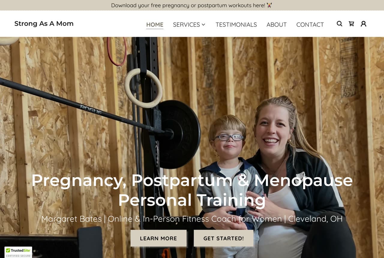
Strong As A Mom picks the narrowest audience of any site here and wins because of it. 'Pregnancy, Postpartum & Menopause Personal Training' over a warm, real photo of the coach with a child — signaling instantly that this is training built for mothers, by someone who gets it. 'Margaret Bates | Online & In-Person Fitness Coach for Women' puts a real name and face to the practice. By serving pregnancy, postpartum, and menopause specifically, the site becomes the obvious, trusted choice for a woman navigating exactly those changes — a stage most generic trainers aren't equipped to address safely. The lesson is that a tightly-defined niche is a strength, not a limitation: the more specific the audience you name, the more that audience feels the site was built for them, and the less you compete with every other 'personal trainer' in town.

Mara Quinn Personal Training — Personal Trainer website design you can build with Zarla
Build this with Zarla
  • Personal Trainer
  • 1-on-1

Mara Quinn Personal Training: The 1-on-1 promise, made personal

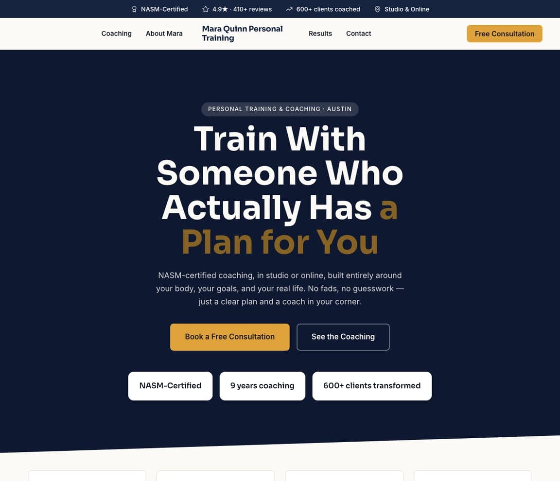
Mara Quinn Personal Training leads with the single thing a client hiring a trainer actually wants: a plan made for them. 'Train With Someone Who Actually Has a Plan for You' over a dark, focused hero, with copy that draws the contrast — 'NASM-certified coaching, in studio or online, built entirely around your body, your goals, and your real life. No fads, no guesswork — just a clear plan and a coach in your corner.' A trust strip (NASM-certified, 9 years coaching, 600+ clients transformed) handles credibility. It's the template for a 1-on-1 personal trainer who wants to feel personal, not generic — lead with the bespoke plan, the certification, and the results, and the dark, confident palette does the rest. Describe your coaching and it's yours in about a minute.

See this template
Kestrel Coaching — Online Coaching website design you can build with Zarla
Build this with Zarla
  • Online Coaching
  • Modern

Kestrel Coaching: Online coaching, minus the objections

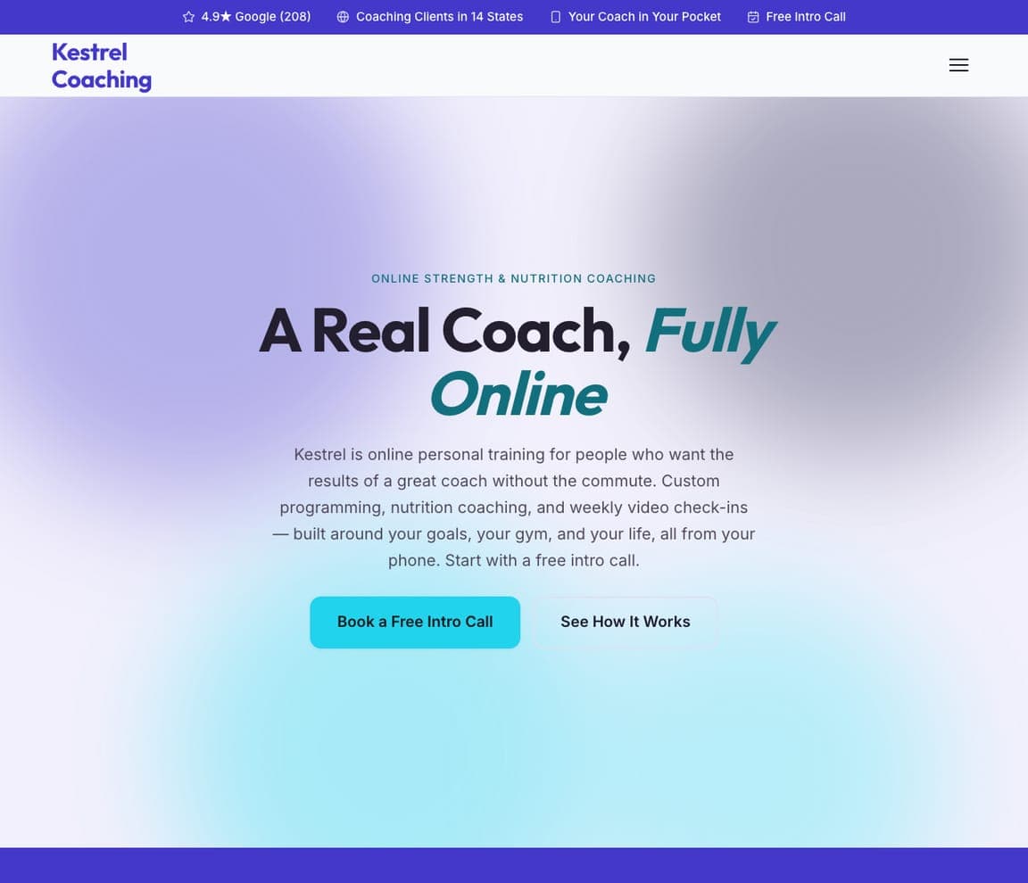
Kestrel Coaching makes remote training feel as real as in-person. 'A Real Coach, Fully Online' over a soft, modern gradient, with copy that answers the skeptic directly: 'the results of a great coach without the commute — custom programming, nutrition coaching, and weekly video check-ins, built around your goals, your gym, and your life, all from your phone.' Proof points (coaching clients in 14 states, 'your coach in your pocket') reinforce the model. The lesson is de-risking a remote service: the online-coaching objection is always 'is it as good as a real trainer?', so the template answers it head-on — a REAL coach, real check-ins, real accountability — and the calm, modern design makes the promise feel legitimate rather than gimmicky. Point it at your coaching and publish it free.

See this template
Reforge Coaching — Weight-Loss Coach website design you can build with Zarla
Build this with Zarla
  • Weight-Loss Coach
  • Results-led

Reforge Coaching: Weight loss, sold on 'for good'

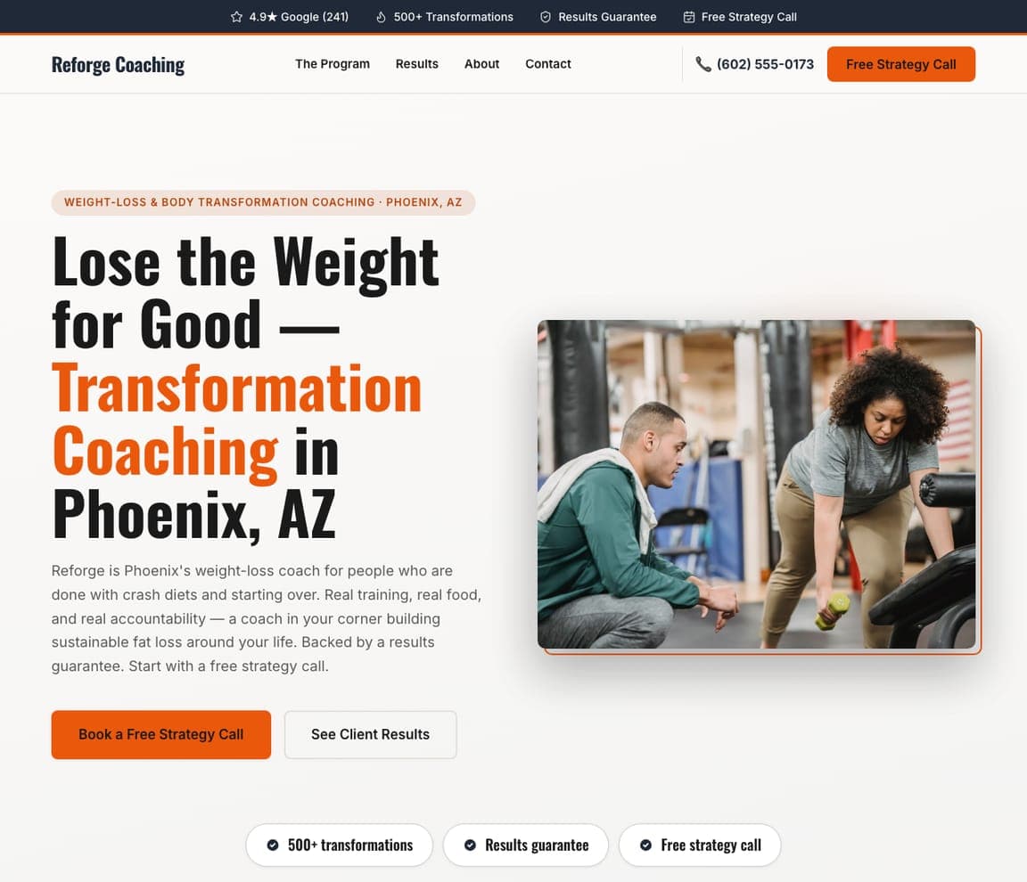
Reforge Coaching speaks to the exhausted serial dieter, and every choice reflects it. 'Lose the Weight for Good — Transformation Coaching in Phoenix, AZ' leads with the outcome that person has failed to reach before, and the copy names the enemy: 'for people who are done with crash diets and starting over. Real training, real food, and real accountability — sustainable fat loss around your life. Backed by a results guarantee.' The white-and-orange palette and '500+ transformations / results guarantee' trust row make it feel credible and safe. The lesson is positioning against the customer's past failures: a weight-loss client isn't looking for another diet, they're looking for the LAST one, so the template promises permanence and de-risks with a guarantee. Swap in your details and publish it free.

See this template
Ironframe Strength — Strength Coach website design you can build with Zarla
Build this with Zarla
  • Strength Coach
  • Serious

Ironframe Strength: Serious strength, for serious lifters

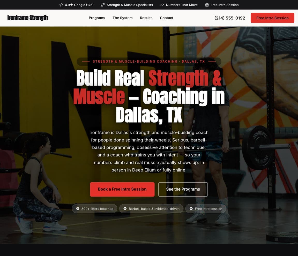
Ironframe Strength picks the committed lifter and refuses to dilute the message. 'Build Real Strength & Muscle — Coaching in Dallas, TX' over a dark gym photo with a red accent, and copy that filters hard: 'for people done spinning their wheels. Serious, barbell-based programming, obsessive attention to technique, and a coach who trains you with intent — so your numbers climb and real muscle actually shows up.' Trust points (strength & muscle specialists, barbell-based & evidence-driven, 300+ lifters coached) speak the language of someone who already knows what a working set is. The lesson is speaking your niche's language fluently: a serious lifter can smell a generic 'tone up' site instantly, so the template signals real expertise through specificity — barbells, technique, numbers. Point it at your coaching and publish it free.

See this template
Bloom & Barbell — Prenatal Trainer website design you can build with Zarla
Build this with Zarla
  • Prenatal Trainer
  • Reassuring

Bloom & Barbell: Safe strength through every trimester

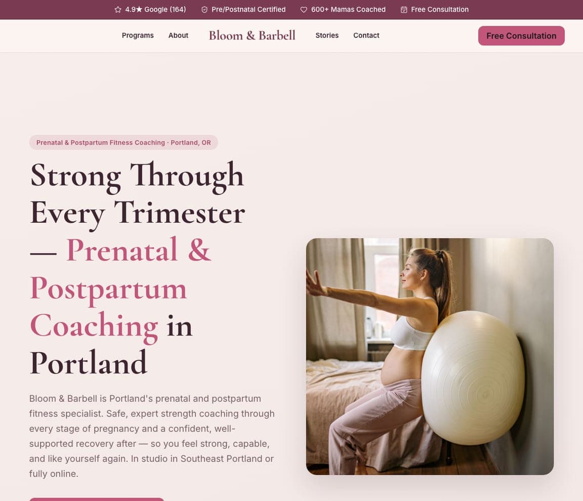
Bloom & Barbell designs for a specific, high-trust moment — training safely through pregnancy and recovery. 'Strong Through Every Trimester — Prenatal & Postpartum Coaching in Portland' over a warm, calm photo of an expectant mother, with copy built on safety and reassurance: 'safe, expert strength coaching through every stage of pregnancy and a confident, well-supported recovery after — so you feel strong, capable, and like yourself again.' Certifications (pre/postnatal certified) and '600+ mamas coached' handle the trust question that matters most here. The lesson is leading with safety for an anxious, high-stakes audience: an expectant mother won't hand her body to just any trainer, so the template leads with the exact certifications and the gentle, capable tone she needs. Describe your coaching and it's yours in about a minute.

See this template

Frequently asked

What makes a good personal trainer website?

A good personal trainer website proves results fast — real client transformation photos and stories, visible certifications (NASM, ACE), and reviews — because clients are buying the belief that you can change their body. It speaks to a specific type of client (a serious lifter, a new mom, someone done with crash diets) rather than everyone, and it makes the first step tiny: a free consultation or intro call, not a big commitment. The strongest sites also show the real coach's face, since people hire a person, not a logo.

What pages does a personal trainer website need?

Most trainers need five: a home page that proves results and points to a free consult, a services or programs page (in-person, online, nutrition, specific niches) with clear next steps, a results or transformations page (before-and-afters and testimonials — the highest-converting page for this industry), an about page with the coach's story and certifications, and a contact page with a booking form. Online coaches often add a page explaining how remote coaching works to answer the 'is it as good as in-person?' question.

How do personal trainers get more clients from their website?

The trainers who convert do three things: they lead with proof (real transformation photos and reviews beat any 'certified expert' claim), they niche down to a specific client rather than trying to appeal to everyone, and they lower the first step to a free consultation or intro call so a nervous prospect can say yes easily. Getting found matters too — a Google Business Profile plus a steady stream of reviews helps rank for 'personal trainer near me,' and before-and-after content ranks and converts.

You've seen what works. Now make it yours.

Describe your business and Zarla designs a complete, professional website in about 30 seconds — built to convert, just like the ones above.

Free to build and preview · no credit card · publish to your own domain on Premium