Inspiration · Pilates

The Best Pilates Website Examples, Explained

Looking for pilates website examples? These 14 are the strongest we found — Good Folk Pilates' 'Good moves for life.' over two women on reformers, Like Fred's giant cream-and-pink 'Pilates For Life' on plum beside a foot in a strap, The Studio Pilates' 'Find your STUDIO.' with a card for each of its two Atlanta rooms — plus studio designs you can build with Zarla, each with a breakdown of the specific move that turns a 'pilates near me' search into a first class. A Pilates studio's site is read by someone deciding whether they'd feel at home on the reformer, so the best ones here write one warm line, photograph the equipment in use, and make the button a first class or a free trial. Find an approach you love and you can build a site in that spirit, free, in about 30 seconds.

Real sites + designs you can build with Zarla — free to build and preview, no credit card

What makes a great pilates website

The best Pilates websites promise a feeling in one line and show the reformer in use. The line: Good Folk's 'Good moves for life.', Like Fred's 'Pilates For Life', Pilates Vita's 'Stronger, Freer, Better Movement', East River Pilates' 'Feel Good Movement For Every Stage of…', Powerhouse Pilates' 'Your Body Is a Powerhouse. Let's Flip the Switch.', Fuse's 'Work Hard. Have Fun. See Results.' The reformer: two women in straps at Good Folk, three pairs of legs in straps at East River, a foot in a plum sock at Like Fred, springs and coloured rings at Fuse, a woman on a mat among plants at Powerhouse. Notice the buttons — 'BOOK A CLASS', 'Book a class →', 'START MY FREE TRIAL', 'BOOK YOUR FIRST CLASS', 'VIEW OUR INTRO OFFERS' — and the two studios that name their neighbourhoods: The Studio Pilates' Emory Village and West Midtown, Pilates Vita's Russian Hill. Every example below tells you whether the studio sells calm, strength or both.

Good Folk Pilates website — Reformer Pilates Studio design example
Real site
  • Reformer Pilates Studio
  • Friendly
  • Green + lime

Good Folk Pilates: 'Good moves for life.' in white serif over two women on reformers in a plant-filled studio

Good Folk Pilates is the cover because it says everything a studio needs to in four words. The dark green header sets a nav — About, Classes, Pricing, Timetable, Contact — the lime 'GOOD FOLK PILATES' wordmark and a lime 'BOOK A CLASS'. The hero is a photograph of two women on reformers in a bright studio with wood, plants and a mirror, both smiling at the camera, holding the straps at chest height; across the middle, the white serif 'Good moves' with 'for life.' in italic. A lime band beneath begins: 'Good Folk Pilates is a feel-good reformer studio for every body. Energise your day with uplifting classes focused on…' 'Pricing' and 'Timetable' sit in the nav, which is where a Pilates customer looks first, and the photograph has two people rather than a model. Clone the four-word serif line over a studio photograph for a reformer studio that wants to feel friendly rather than elite.

  • Four words, one in italic
  • Two members, not a model, on the reformers
  • Pricing and Timetable in the nav

Steal this: Write 'for life' — or 'for every body' — into the headline; it tells the nervous beginner the studio isn't only for the already-strong.

Visit Good Folk Pilates

Opens a similar Zarla design you can make yours.

Like Fred website — Reformer Pilates Studio design example
Real site · Victoria, Australia
  • Reformer Pilates Studio
  • Playful
  • Plum + pink

Like Fred: 'Pilates For Life' in giant cream and pink on plum, beside a foot in a plum sock wrapped in a strap

Like Fred gives a Pilates studio a personality and a colour. A pink strip runs a marquee — 'Kensington, Victoria opening October 17th ✦' repeating; the plum header sets the pink script 'like fred' logo, a nav — Classes, Timetable, Locations, Pricing, Fred Who, Smart Fred — and a pink pill, 'Book a class →'. The hero, on plum, opens with a pink eyebrow — '/ REFORMER PILATES · BUILT FOR THE LONG GAME' — the huge cream 'Pilates' over the pink 'For Life', a paragraph ('Strength, flexibility and freedom, designed for every body and every age. Not just another Pilates studio. Pilates, taught properly. It's time to move Like Fred.') and a pink 'Explore classes →' beside an outline 'View timetable →'. On the right, a photograph of a pair of legs in plum socks, one foot raised and wrapped in a reformer strap. 'Fred Who' in the nav is the brand's own joke, and the socks match the page. Clone the one-colour-everywhere approach if you have a colour to own.

  • One colour on the strip, the header, the page and the socks
  • 'Fred Who' — the brand's joke in the nav
  • A new studio announced as a marquee

Steal this: Dress the model in your brand colour — plum socks on a plum page make the photograph part of the identity instead of a stock shot.

Visit Like Fred

Opens a similar Zarla design you can make yours.

The Studio Pilates website — Two-Studio Pilates Brand design example
Real site · Atlanta, GA
  • Two-Studio Pilates Brand
  • Retro
  • Cream + orange

The Studio Pilates: 'Find your STUDIO.' with a teal card for Emory Village and a rust card for West Midtown

The Studio Pilates makes choosing a room the whole homepage. The dark header sets 'The Studio PILATES', a nav — ABOUT, EMORY, WEST MIDTOWN, OUR APP, STUDIO MERCH, CONTACT — social icons, a 'YOU'RE LISTENING TO' label over a yellow 'PICK YOUR STUDIO' selector and a 'LOGIN'; a dark teal strip reads '$15 Same-Day Drop-In available at both studios today, no membership needed. Grab a pass'. The cream hero opens with a small 'THE STUDIO PILATES · ATLANTA · EST. 2022', the italic 'Find your' over a huge orange 'STUDIO.', and a line: 'Two Atlanta neighborhoods. One very good feeling. Choose Emory Village or West Midtown and step inside.' Two cards follow: 'A' — a photograph of a studio with a neon sign and a teal panel, 'OUR ORIGINAL · EST. 2022 / Emory Village / Warm, neighborhood energy · four rooms · free parking / ENTER EMORY'; 'B' — a wood-panelled studio and a rust panel, 'THE BIG ROOM · EST. 2024 / West Midtown / Industrial light · tall ceilings · room to move / ENTER WEST MIDTOWN'; a yellow round badge between them reads 'THINGS WILL Workout. PRESS PLAY'. Clone the two-card chooser if you have two rooms with two personalities.

  • A card per studio, each with its own colour and three traits
  • A same-day drop-in price in the strip
  • 'YOU'RE LISTENING TO' — the studio as a radio station

Steal this: Give each location a colour and three traits — 'four rooms · free parking' versus 'tall ceilings · room to move' — and let the visitor pick a mood, not an address.

Visit The Studio Pilates

Opens a similar Zarla design you can make yours.

Powerhouse Pilates website — Virtual & In-Studio Pilates design example
Real site · North Vancouver, Canada
  • Virtual & In-Studio Pilates
  • Fresh
  • Photo + sage

Powerhouse Pilates: 'Your Body Is a Powerhouse. Let's Flip the Switch.' beside a woman on a mat among plants

Powerhouse Pilates turns its name into a promise and a pun. The dark header sets the mandala-mark 'powerhouse pilates' logo, a nav — HOME, ABOUT, ONLINE STUDIO, NORTH VANCOUVER STUDIO, CONTACT — and a sage 'START MY FREE TRIAL'. The hero is a photograph of a bright room full of plants — palms, an orchid in the foreground, pots on the floor — with a woman in white leggings on a mat, legs raised, on the right; on the left, a small 'VIRTUAL PILATES STUDIO', the white 'Your Body Is a' / 'Powerhouse.' and, in italic serif, 'Let's Flip the Switch.', then a cream 'START MY FREE TRIAL →'. The nav splits the online studio from the physical one, and the eyebrow says which this page is selling. The plants do what a stock reformer shot can't — they make the room somewhere you'd want to be. Clone the name-as-promise headline if your name has a second meaning.

  • The studio's name as the promise, with a pun
  • Online and physical studio split in the nav
  • Plants as the set

Steal this: If your name has a second meaning, use it — 'Your Body Is a Powerhouse. Let's Flip the Switch.' sells the brand and the workout in one breath.

Visit Powerhouse Pilates

Opens a similar Zarla design you can make yours.

The Daily Pilates website — Pilates Studio Brand design example
Real site
  • Pilates Studio Brand
  • Serene
  • Beige + white

The Daily Pilates: 'Transform Your Body and Mind with The Daily Pilates' in italic serif over a beige-toned photo of a woman lying along a plinth

The Daily Pilates keeps the whole first screen in one tone. The pale header sets the thin 'THE DAILY PILATES', a small caps nav — SELECT YOUR STUDIO, WHERE TO START, ABOUT, OWN A STUDIO, TEACHER TRAINING, Menu — and an outlined 'BOOK YOUR FIRST CLASS'. The hero is a beige-toned photograph of a smiling woman in a beige set lying along a plinth, legs in a split, a sculpted stone shape and an arch beside her; centred over it, the italic serif 'Transform Your Body and Mind with' / 'The Daily Pilates', a line — 'Where expert guidance and intentional movement deliver lasting results.' — a paragraph ('Whether you're just starting your journey or a seasoned practitioner, our classes are designed to help you make real progress at every level to reach your wellness goals.') and a white 'JOIN' beside an outlined 'LEARN MORE'. 'WHERE TO START' first in the nav is the beginner's door; 'OWN A STUDIO' says the brand is a franchise. Clone the single-tone treatment if you want calm before strength.

  • Everything in one beige tone
  • 'WHERE TO START' as the first nav item
  • 'OWN A STUDIO' — the franchise in the nav

Steal this: Put 'Where to start' in the nav — the first-timer's question deserves a page, not a FAQ entry.

Visit The Daily Pilates

Opens a similar Zarla design you can make yours.

Pilates Vita San Francisco website — Boutique Pilates Studio design example
Real site · San Francisco, CA
  • Boutique Pilates Studio
  • Understated
  • Photo + lime

Pilates Vita San Francisco: 'Stronger, Freer, Better Movement' over a dimmed reformer photo, with a lime marquee of benefits

Pilates Vita San Francisco writes three comparatives and a marquee. The dark header sets 'Pilates Vita San Francisco' in white, a nav — About, Classes, The Space, What is Pilates? — and a lime 'BOOK NOW'. The hero is a dimmed, blurred photograph of a person lying on a reformer; centred over it, the white 'Stronger, Freer,' / 'Better Movement', a line — 'An award-winning boutique Pilates studio in Russian Hill, built for strength, mobility, and the way you live.' — and a lime 'SCHEDULE A SESSION'. A lime marquee runs beneath: 'Enhance flexibility ◻ Prevent injury ◻ Move better ◻ Feel better ◻ Build strength ◻ Improve mobility'. The neighbourhood is in the first sentence, 'What is Pilates?' has its own nav item, and the marquee lists the outcomes without a paragraph. Clone the benefits marquee for any studio that wants to say six things in one line.

  • Three comparatives as the headline
  • Six benefits as a marquee
  • 'What is Pilates?' in the nav

Steal this: Run your benefits as a marquee under the hero — 'Enhance flexibility · Prevent injury · Move better' reads in a second and never needs a paragraph.

Visit Pilates Vita San Francisco

Opens a similar Zarla design you can make yours.

East River Pilates website — Community Pilates Studio design example
Real site
  • Community Pilates Studio
  • Gentle

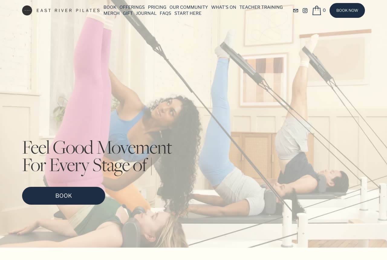
East River Pilates: 'Feel Good Movement For Every Stage of…' typing itself over three pairs of legs in straps

East River Pilates lets the headline type itself. The white header sets the round-mark 'EAST RIVER PILATES' and a two-row small caps nav — BOOK, OFFERINGS, PRICING, OUR COMMUNITY, WHAT'S ON, TEACHER TRAINING, then MERCH, GIFT, JOURNAL, FAQS, START HERE — with mail, Instagram and cart icons and a navy 'BOOK NOW'. The hero is a washed-out photograph of three people on reformers with their legs raised in straps — pink leggings, blue, grey — in a white studio with framed prints; over the lower left, the serif 'Feel Good Movement' / 'For Every Stage of' with a text cursor blinking after 'of', and a navy pill, 'BOOK'. The unfinished line is the point: the page cycles through what the stage is. 'OUR COMMUNITY', 'JOURNAL' and 'GIFT' in the nav say the studio is a place, not a timetable. Clone the animated headline if you serve several kinds of member.

Visit East River Pilates

Opens a similar Zarla design you can make yours.

Fuse Pilates website — Reformer Pilates Studio design example
Real site
  • Reformer Pilates Studio
  • Energetic

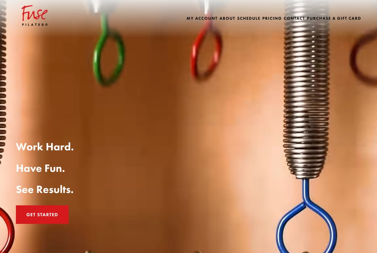
Fuse Pilates: 'Work Hard. Have Fun. See Results.' beside reformer springs and green, red and blue rings

Fuse Pilates photographs the equipment instead of a body. The cream header sets the red script 'Fuse PILATES' logo left and a small caps nav — MY ACCOUNT, ABOUT, SCHEDULE, PRICING, CONTACT, PURCHASE A GIFT CARD — right. The hero is a close-up photograph of reformer hardware against an orange wooden wall: a green ring, a red ring, a chrome coil spring and a blue ring hanging on their straps, the focus soft. On the left, in white bold on three lines, 'Work Hard.' / 'Have Fun.' / 'See Results.', and a red 'GET STARTED'. Three two-word sentences and a picture of the springs say the method without a model. Clone the equipment close-up if your photographs of people aren't good enough yet — the rings always are.

Visit Fuse Pilates

Opens a similar Zarla design you can make yours.

Kinesia Pilates website — Alignment-Based Pilates Studio design example
Real site · Seattle, WA
  • Alignment-Based Pilates Studio
  • Purposeful

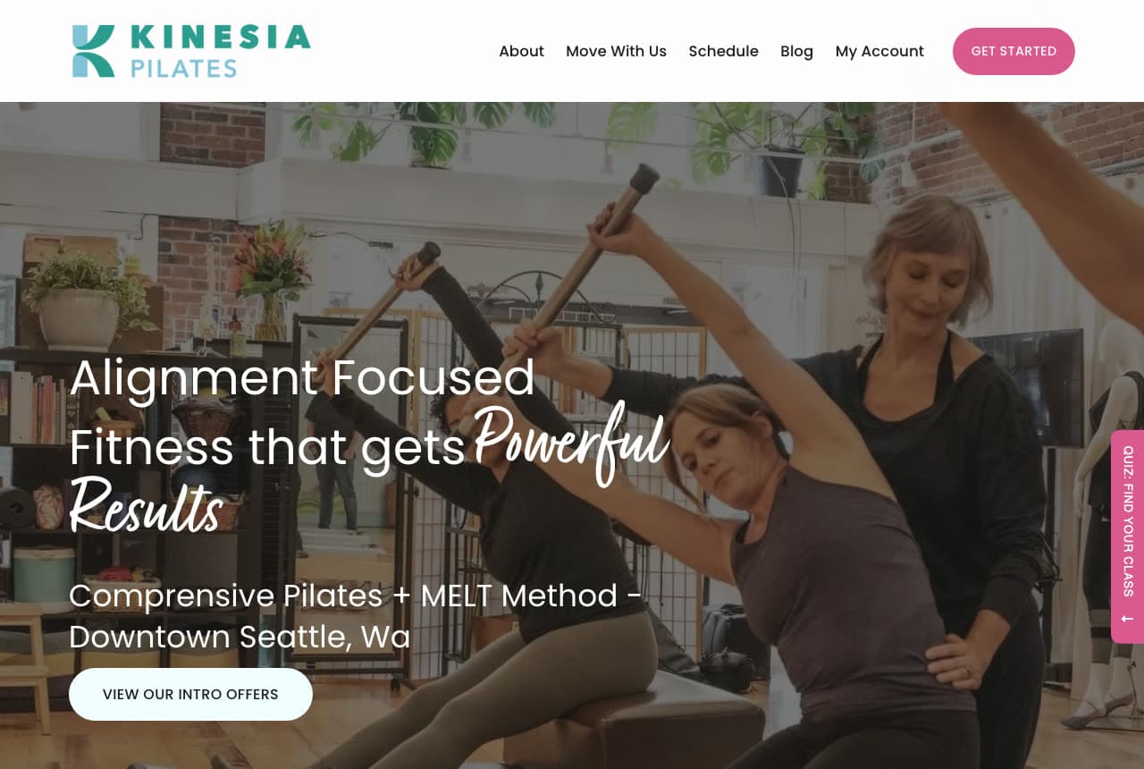
Kinesia Pilates: 'Alignment Focused Fitness that gets Powerful Results' over women stretching with wooden poles

Kinesia Pilates names its method and its neighbourhood in the first screen. The white header sets the teal 'KINESIA PILATES' logo, a nav — About, Move With Us, Schedule, Blog, My Account — and a pink 'GET STARTED'. The hero is a photograph of a brick-walled studio where two women stretch sideways holding wooden poles overhead while a grey-haired instructor in black guides one of them; over the left, the white 'Alignment Focused' / 'Fitness that gets' with 'Powerful Results' in script, a line — 'Comprensive Pilates + MELT Method - Downtown Seattle, Wa' — and a white pill, 'VIEW OUR INTRO OFFERS'. A pink vertical tab at the right edge reads 'QUIZ: FIND YOUR CLASS'. The quiz tab is the detail — a studio with several methods routes the visitor with a question rather than a menu. Clone it if your class list is long.

Visit Kinesia Pilates

Opens a similar Zarla design you can make yours.

Aria Pilates Studio — Pilates Studio Template website design you can build with Zarla
Build this with Zarla
  • Pilates Studio Template
  • Composed

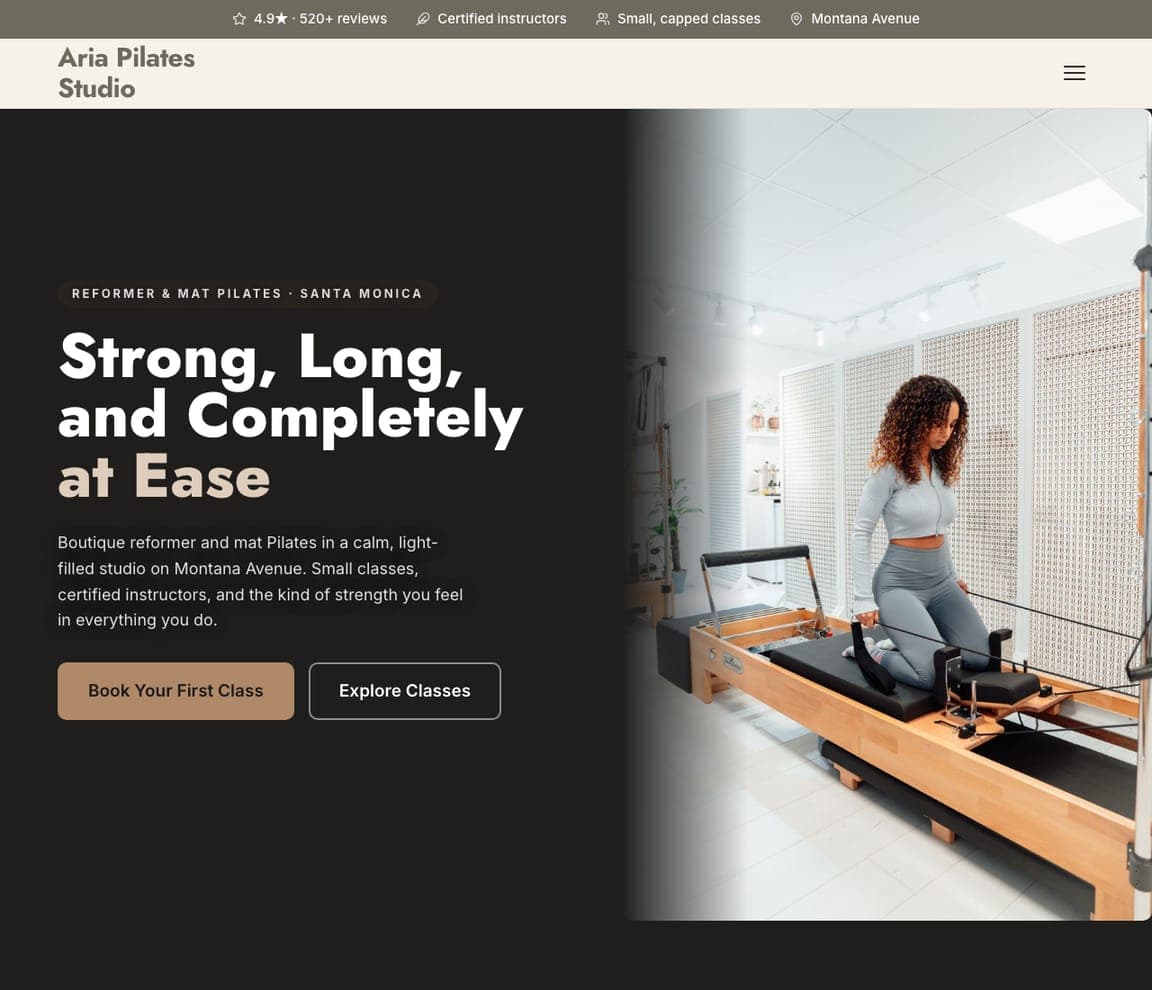
Aria Pilates Studio: 'Strong, Long, and Completely at Ease' beside a woman on a reformer in a white studio

Aria Pilates Studio is the Zarla Pilates template. An olive-grey top strip carries '4.9★ · 520+ reviews', 'Certified instructors', 'Small, capped classes', 'Montana Avenue'. The cream header sets a bold sans 'Aria Pilates Studio' and a hamburger. The hero is a split: on the left, a dark charcoal panel with a pill — 'REFORMER & MAT PILATES · SANTA MONICA' — the heavy 'Strong, Long, / and Completely / at Ease' with 'at Ease' in tan, a paragraph ('Boutique reformer and mat Pilates in a calm, light-filled studio on Montana Avenue. Small classes, certified instructors, and the kind of strength you feel in everything you do.') and a tan 'Book Your First Class' beside an outline 'Explore Classes'; on the right, a photograph of a woman in a grey set kneeling on a reformer in a white studio with slatted screens. 'Small, capped classes' in the strip is the promise every reformer studio is really selling.

See this template
Poise Barre Studio — Barre Studio Template website design you can build with Zarla
Build this with Zarla
  • Barre Studio Template
  • Elegant

Poise Barre Studio: 'Long, Lean, and Strong — Barre Studio in Charleston, SC' in a light serif

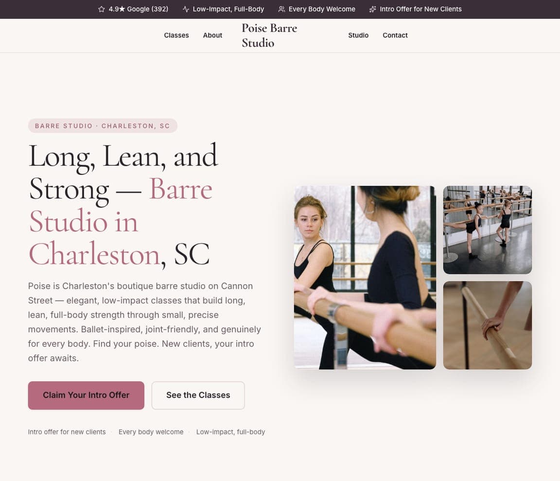
Poise Barre Studio is the Zarla barre template, and the closest sibling to a Pilates studio in the catalog. A plum top strip carries four pills — '4.9★ Google (392)', 'Low-Impact, Full-Body', 'Every Body Welcome', 'Intro Offer for New Clients'. The white header centres a serif 'Poise Barre Studio' between Classes, About and Studio, Contact. The hero, on white, opens with a pill — 'BARRE STUDIO · CHARLESTON, SC' — and the light serif 'Long, Lean, and / Strong — Barre / Studio in / Charleston, SC' with 'Barre Studio in Charleston' in dusty rose, then a paragraph: 'Poise is Charleston's boutique barre studio on Cannon Street — elegant, low-impact classes that build long, lean, full-body strength through small, precise movements. Ballet-inspired, joint-friendly, and genuinely for every body.' On the right, a three-photo collage — two women at a barre, a row of dancers at a mirror, a hand on a barre. 'Every Body Welcome' is the pill to keep.

See this template
Willowmere Yoga — Yoga Studio Template website design you can build with Zarla
Build this with Zarla
  • Yoga Studio Template
  • Unhurried

Willowmere Yoga: 'Find Space to Breathe — Yoga in Boulder, CO' beside a woman meditating in a sunlit studio

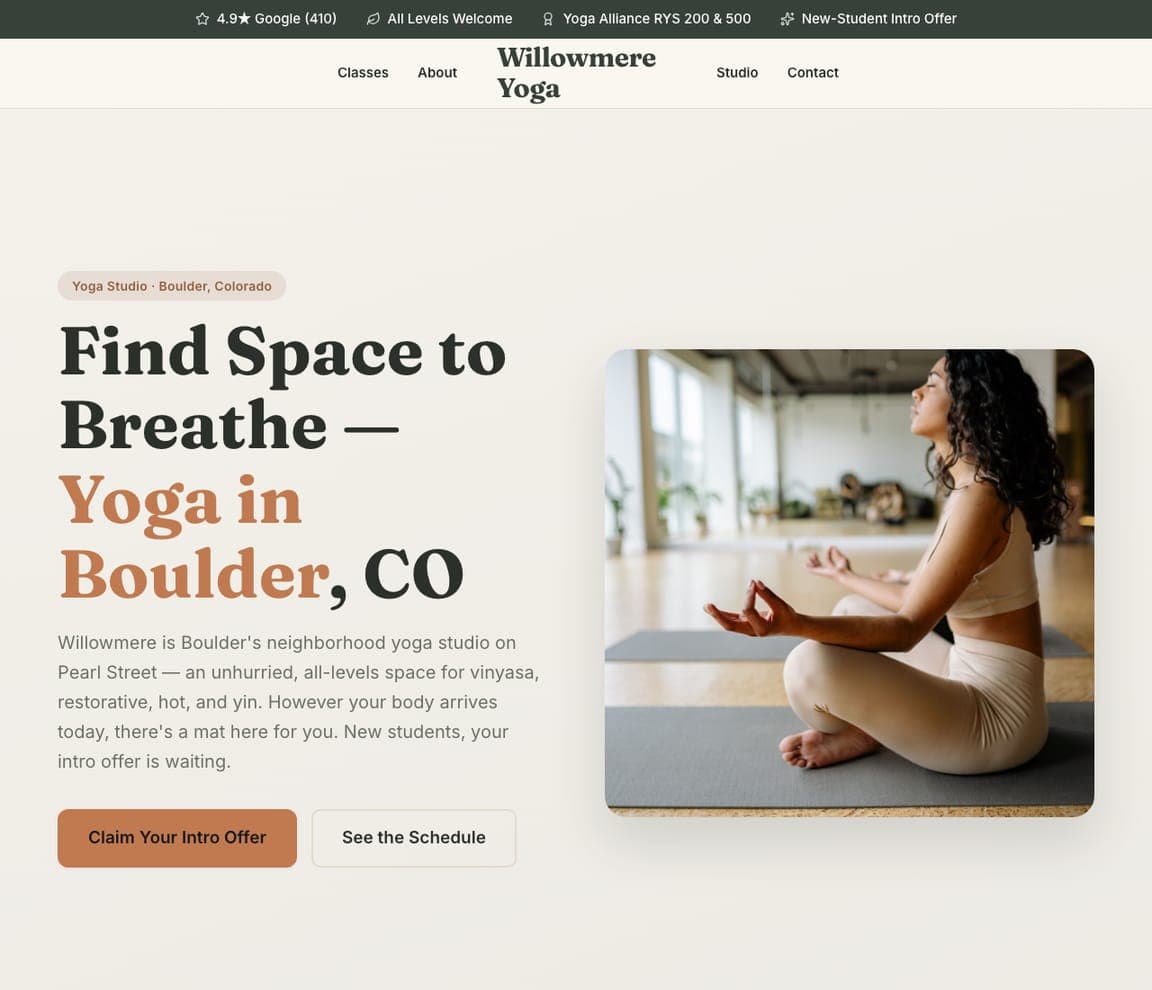
Willowmere Yoga is the Zarla yoga-studio template. A dark-green top strip carries '4.9★ Google (410)', 'All Levels Welcome', 'Yoga Alliance RYS 200 & 500', 'New-Student Intro Offer'. The cream header centres a serif 'Willowmere Yoga' between Classes, About and Studio, Contact. The hero, on cream, opens with a small pill — 'Yoga Studio · Boulder, Colorado' — and the heavy serif 'Find Space to / Breathe — / Yoga in / Boulder, CO' with 'Yoga in Boulder' in terracotta, then a paragraph: 'Willowmere is Boulder's neighborhood yoga studio on Pearl Street — an unhurried, all-levels space for vinyasa, restorative, hot, and yin. However your body arrives today, there's a mat here for you.' On the right, a rounded photograph of a woman in cream meditating cross-legged in a sunlit studio. The four styles named in one line is the move a Pilates studio copies with reformer, mat, tower and chair.

See this template
Willow & Vale Yoga — Yoga Studio Template website design you can build with Zarla
Build this with Zarla
  • Yoga Studio Template
  • Serene

Willow & Vale Yoga: 'Find Your Flow' over a woman balanced in a crouching toe-pose beside a potted palm

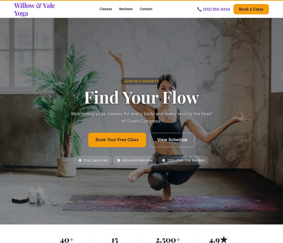
Willow & Vale Yoga is the Zarla serene-calm yoga template — the photo-led version of the pool. The white header sets a violet serif 'Willow & Vale Yoga' against Classes, Reviews, Contact, a violet phone and an orange 'Book a Class'. The hero is a full-bleed, dimmed photograph of a woman in a black top crouched in a toe-balance with her hands raised beside a potted palm against a dark stone wall; centred over it, an orange pill — 'AUSTIN'S FAVORITE' — the white serif 'Find Your Flow', a paragraph ('Welcoming yoga classes for every body and every level in the heart of South Congress.'), an orange 'Book Your Free Class' beside an outline 'View Schedule', and three tick pills — 'First Class Free', 'All Levels Welcome', '200+ Five-Star Reviews'. Three words and a free class is the whole ask; clone it for a studio with one great photograph of a pose.

See this template
Freeform Mobility — Mobility Coaching Template website design you can build with Zarla
Build this with Zarla
  • Mobility Coaching Template
  • Gentle

Freeform Mobility: 'Move Better, Feel Better — Mobility Coaching in Santa Fe, NM' centred in serif on cream

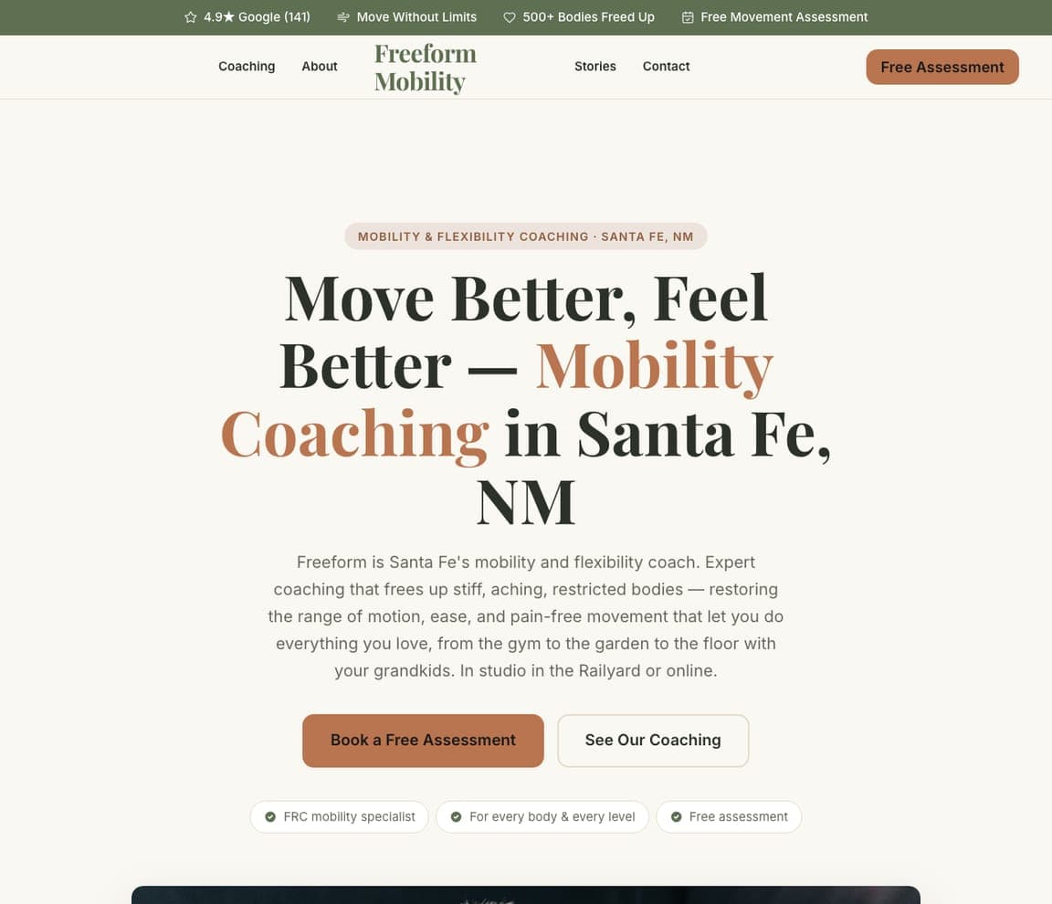
Freeform Mobility is the Zarla mobility-and-flexibility template — a Pilates studio that sells posture and pain-free movement can use its language. A sage top strip carries '4.9★ Google (141)', 'Move Without Limits', '500+ Bodies Freed Up', 'Free Movement Assessment'. The cream header centres a serif 'Freeform Mobility' between Coaching, About and Stories, Contact, with a rust 'Free Assessment'. The hero is centred on cream with no photograph in the first screen: a pill — 'MOBILITY & FLEXIBILITY COACHING · SANTA FE, NM' — the serif 'Move Better, Feel / Better — Mobility / Coaching in Santa Fe, / NM' with 'Mobility Coaching' in rust, and a paragraph: 'Freeform is Santa Fe's mobility and flexibility coach. Expert coaching that frees up stiff, aching, restricted bodies — restoring the range of motion, ease, and pain-free movement that let you do everything you love.' '500+ Bodies Freed Up' is a count written like a person; steal the voice.

See this template

Frequently asked

What should a Pilates studio website show first?

The reformer with a person on it, and one warm line. Good Folk Pilates shows two women in straps on reformers under 'Good moves for life.'; East River Pilates shows three people with legs raised in straps under 'Feel Good Movement For Every Stage of…'; The Daily Pilates shows a woman stretched along a plinth in a sculptural set under 'Transform Your Body and Mind with The Daily Pilates'; Like Fred shows a single foot in a plum sock wrapped in a strap beside 'Pilates For Life'. Fuse Pilates shows only the springs and rings.

How should a Pilates studio write its headline?

As a feeling, in a few words. 'Good moves for life.' (Good Folk). 'Pilates For Life' (Like Fred). 'Stronger, Freer, Better Movement' (Pilates Vita). 'Work Hard. Have Fun. See Results.' (Fuse). 'Your Body Is a Powerhouse. Let's Flip the Switch.' (Powerhouse Pilates). Kinesia Pilates adds the method — 'Alignment Focused Fitness that gets Powerful Results' — and The Studio Pilates makes the headline the choice: 'Find your STUDIO.'

What should the button on a Pilates website say?

A first class or a trial. Good Folk: 'BOOK A CLASS'. Like Fred: 'Book a class →' with 'Explore classes' and 'View timetable' below. The Daily Pilates: 'BOOK YOUR FIRST CLASS'. Powerhouse Pilates: 'START MY FREE TRIAL'. Kinesia: 'VIEW OUR INTRO OFFERS'. Pilates Vita: 'SCHEDULE A SESSION'. The Studio Pilates sells a '$15 Same-Day Drop-In … no membership needed' in its strip and makes the buttons 'ENTER EMORY' and 'ENTER WEST MIDTOWN'.

How do multi-studio Pilates brands handle location?

The Studio Pilates gives each room a card — 'Emory Village · Warm, neighborhood energy · four rooms · free parking' and 'West Midtown · Industrial light · tall ceilings · room to move' — under 'Find your STUDIO.' and a 'PICK YOUR STUDIO' selector in the header. Like Fred runs 'Kensington, Victoria opening October 17th' as a marquee and has Locations in the nav. The Daily Pilates puts 'SELECT YOUR STUDIO' first in its nav. Powerhouse Pilates splits ONLINE STUDIO from NORTH VANCOUVER STUDIO.

Can a Pilates website work without a photograph of a person?

Fuse Pilates proves it can: the hero is a close-up of reformer springs and green, red and blue rings against orange wood, with 'Work Hard. Have Fun. See Results.' in white and a red 'GET STARTED'. Like Fred comes close with a single foot in a strap on plum. The rest show people, but always in the equipment — Kinesia's women stretching with wooden poles, Pilates Vita's blurred figure on a reformer, Powerhouse's woman on a mat surrounded by plants.

Can I build a Pilates website like these with Zarla?

Yes. Every real site here has a 'Build a site like this' button that opens the closest Zarla template in the editor — Aria Pilates Studio for a charcoal-and-photo split with a reformer, in the Good Folk and The Daily Pilates spirit; Poise Barre Studio for a light serif page with a photo collage like Like Fred and East River; Willowmere Yoga for a warm, neighbourhood-named studio page like The Studio Pilates; Willow & Vale Yoga for a full-bleed photo with a three-word headline like Powerhouse and Pilates Vita; Freeform Mobility for a method-first page like Kinesia and Fuse — and you swap in your reformer, your neighbourhood and your first-class offer. One person on the reformer, one warm line and a first-class button is the Good Folk pattern, and it takes about 30 seconds.

You've seen what works. Now make it yours.

Describe your business and Zarla designs a complete, professional website in about 30 seconds — built to convert, just like the ones above.

Free to build and preview · no credit card · publish to your own domain on Premium