Inspiration · Restaurant

The Best Restaurant Website Examples, Explained

Restaurant websites have one job before anything else: make a hungry visitor feel the place and want a table. These are some of the best restaurant website designs we could find — a mix of standout real restaurants, cafes, breweries, and caterers plus designs you can build with Zarla — and we break down the specific move that makes each one win diners. Look for the patterns that repeat: appetite-first photography, one obvious next step (reserve, order, find us), and a real point of view in the copy. Then make any of the Zarla designs yours, free, in about 30 seconds.

Real sites + designs you can build with Zarla — free to build and preview, no credit card

What makes a great restaurant website

The best restaurant sites share a few moves: they lead with photography that makes you hungry (or with the room's atmosphere), they make one action obvious — reserve a table, order online, or find the cart — and they let a real voice in the copy do the selling instead of generic descriptions. Whether it's a 70-year-old Southern cafe or a brand-new food cart, the design's job is to set the mood and then get out of the way of the next step. Each example below calls out the specific choice worth stealing for your own restaurant website.

The Loveless Cafe website — Restaurant design example
Real site · Nashville, TN
  • Restaurant
  • Heritage
  • Red + navy

The Loveless Cafe: Heritage sold through process, not plates

The Loveless Cafe has served Nashville since 1951, and the homepage makes that history the entire sell. Instead of a plated-dish hero, it leads with hands cutting biscuit dough — process photography that says 'made from scratch' louder than any caption. Opening hours appear as a hand-lettered note card pinned to the hero, a homespun touch that reinforces the heritage brand, and three CTAs (View Menus / Order To-Go / Reservations) route every visitor type in one row. Below, the 1951 origin story names the founders, Lon and Annie Loveless, turning seven decades into a differentiator competitors can't copy. When your edge is tradition, show the craft and tell the founding story — both beat a glossy food shot.

  • Process photography (biscuit-making) sells 'from scratch' better than a plated dish
  • A hand-lettered hours card reinforces the heritage personality
  • A named 1951 origin story is a differentiator rivals can't copy

Steal this: If your edge is tradition, show the craft and name the founders.

Osteria Solviero — Italian Restaurant website design you can build with Zarla
Build this with Zarla
  • Italian Restaurant
  • Warm
  • Warm terracotta

Osteria Solviero: A warm Italian table you can clone

Osteria Solviero is the Zarla template for a classic Italian restaurant, and it leans into warmth rather than minimalism — a signature-dish menu laid out so the food does the selling, a photo gallery of the room and the plates, a private-events section for the high-value bookings, and a table-reservation form as the single clear action. The palette stays warm and appetite-forward, the type classic, so it feels established the moment it loads. It's the trattoria approach: make the visitor feel the room before they read a word, then make booking a table the obvious next step. Describe your own restaurant and you can have this exact layout, fully editable, in about 30 seconds.

  • A signature-dish menu lets the food carry the page
  • A private-events section captures the high-value bookings
  • One reservation form keeps the next step obvious
See this template
Molly Rose Brewing website — Brewery design example
Real site · Melbourne, AU
  • Brewery
  • Casual
  • Black + yellow

Molly Rose Brewing: Every space sold as its own bookable experience

Molly Rose Brewing, a backstreet brewpub in Collingwood, Melbourne, opens on a black-white-yellow palette and a photo of people socialising in the beer garden — community, not product, as the first impression. The move worth stealing is structural: it presents four venue spaces (Beer Garden, Dining Hall, Taproom, Private Dining Room) as individual carousel cards, each with its own capacity, a weekly special (trivia Wednesdays, steak-night Fridays), and a direct Book link. One brewpub becomes four distinct reasons to visit. A floating 'Book Now' side tab keeps conversion always within reach as you scroll. For any venue with multiple areas or event nights, treating each as a bookable experience with its own identity multiplies the reasons a customer picks you.

  • Each venue space is its own bookable card with a weekly special
  • A floating 'Book Now' tab keeps conversion always in reach
  • Black + yellow keeps a casual brand looking sharp
Nacheaux website — Food Cart design example
Real site · Portland, OR
  • Food Cart
  • Bold
  • Cyan + black

Nacheaux: A food cart that brands like a headliner

Nacheaux, a Cajun-Southern fusion food cart in Portland, proves a cart can out-brand a restaurant. A cyan-on-black palette and a distressed graffiti logo give it the energy of a music poster, and the tagline 'Southern flair at it's boldest' sets the tone before you read further. Three circular service cards (Book Our Carts, Find Us, Cater With Us) handle the mobile-business basics — and 'Find Us' simply links to a Google Calendar of pop-up locations, a free, smart fix for a cart with no fixed address. The brand story doubles down: the name is a portmanteau (nacho + Creole 'eaux'), and a husband-and-wife, LA-meets-Louisiana marriage is literally the fusion concept. A Food Network appearance seals the credibility.

  • A graffiti logo + cyan/black gives a cart headliner energy
  • 'Find Us' → a Google Calendar is a free location tracker
  • The founders' story is literally the fusion concept

Steal this: Personality out-brands square footage — lean all the way into your story.

Loro website — Asian BBQ design example
Real site · Austin, TX
  • Asian BBQ
  • Playful
  • Navy + salmon

Loro: Hand-drawn illustration as the whole identity

Loro, an Asian smokehouse from the teams behind Uchi and Franklin Barbecue, wraps a navy-salmon-cream palette in hand-drawn tiger and dragon illustrations that become the brand rather than decorate it. The hero line — 'Smoked meats, boozy slushees, rad veggies, chill vibes' — sets a confident, playful voice, and an overhead food spread does the appetite work. Behind the styling is serious multi-location engineering: Locations, Menus, Delivery, and Takeout each open slide-in drawers with per-location options, so a six-venue brand browses with zero page loads, and three ordering channels (nationwide Goldbelly shipping, delivery, takeout) sit right in the nav. Even the reviews carry the voice — 'Best. Guests. Ever.*' Custom illustration plus a real point of view can make a restaurant group feel like a single, beloved place.

  • Custom illustration becomes the identity, not just decoration
  • Drawer navigation lets a multi-location brand browse with no page loads
  • Three ordering channels live right in the nav
Cobb's Hill Estate website — Winery design example
Real site · Adelaide Hills, AU
  • Winery
  • Elegant
  • Gold + dark

Cobb's Hill Estate: Twilight photography that sells the whole evening

Cobb's Hill Estate, a wine estate in the Adelaide Hills, opens on a twilight shot of the cellar door — warm light glowing through the windows, gardens and barrels in the foreground — the kind of golden-hour photography that sells an aspirational evening, not just a glass of wine. Three full-width hero CTAs (Shop / Reservations / Accommodation) route the estate's three distinct visitors — buyers, diners, overnight guests — from the very first screen. A gold-tan-and-dark palette with wide-tracked uppercase serif headings reads unmistakably premium, and Google-attributed reviews and an events calendar build trust below. For a hospitality venue with more than one thing to sell, atmospheric photography plus clearly split conversion paths is the formula, and Cobb's Hill executes both beautifully.

  • Twilight photography sells an aspirational evening, not a product
  • Triple hero CTAs route buyers, diners, and overnight guests
  • Tracked serif + gold/dark reads unmistakably premium

Steal this: For a venue with more than one thing to sell, split the conversion paths in the hero.

Campo Juice + Kitchen website — Juice Bar design example
Real site · Denver, CO
  • Juice Bar
  • Fresh

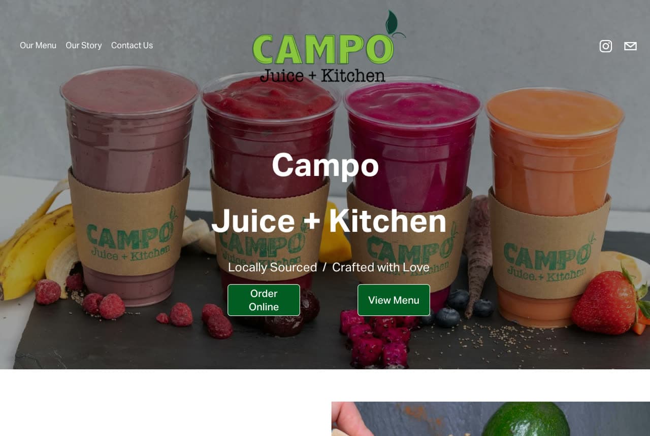
Campo Juice + Kitchen: The brand name itself teaches the sourcing story

Campo Juice + Kitchen, a juice bar in Denver's RiNo, leads with four colourful smoothie cups surrounded by fresh produce and a green-on-white palette so vibrant it reads 'healthy' instantly. The clever move is verbal: 'campo' is Spanish for the countryside where food is grown, and the site uses that etymology to teach its whole sourcing philosophy in one line. Freshness claims get specific ('produce was on the plant just a few days prior') instead of a generic 'farm-to-table,' and social proof stacks platforms — 4.9 on Google, 5 on Uber Eats, official partner of three Denver pro sports teams. A three-item nav keeps it focused. A name with a story does marketing work a tagline never could.

Halstead & Crow Coffee — Cafe website design you can build with Zarla
Build this with Zarla
  • Cafe
  • Cozy

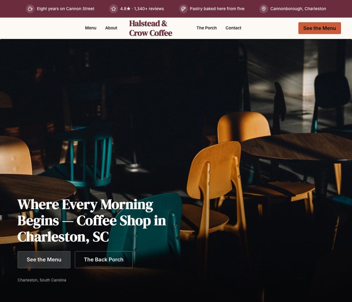
Halstead & Crow Coffee: Full-bleed photography, built to clone

Halstead & Crow is Zarla's cafe template, and it takes the opposite tack to a busy menu page — a full-bleed immersive hero fills the screen, putting you in the room before a word is read. Menu, story, the back porch, hours and location follow in a clean, scannable order, because a cafe's job online is simpler than a fine-diner's: make someone hungry, then tell them when and where to come. The warm mulberry-and-terracotta styling does the emotional work; the practical details remove every excuse not to visit. It's the neighbourhood-cafe approach distilled — atmosphere first, logistics second. Describe your own cafe and the Halstead & Crow layout generates around your photos and hours, fully editable, in about half a minute.

See this template
Thorne & Ash Steakhouse — Steakhouse website design you can build with Zarla
Build this with Zarla
  • Steakhouse
  • Upscale

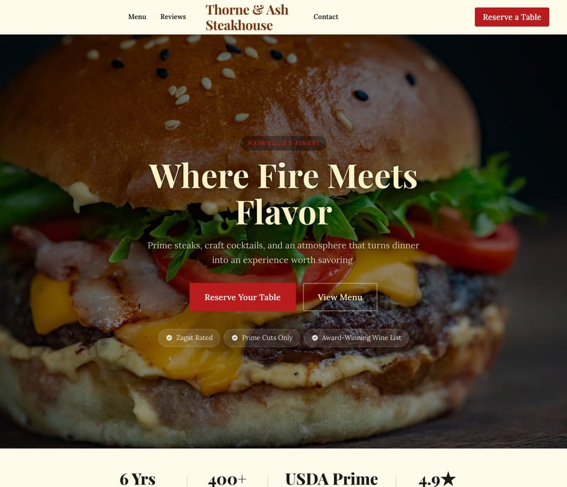
Thorne & Ash Steakhouse: A dark, upscale steakhouse you can build

Thorne & Ash Steakhouse is Zarla's steakhouse template, and it commits fully to the upscale-dark mood that fine dining expects — deep, moody tones, menu highlights presented like a tasting list, a reservation system as the primary action, and a private-dining section for the high-spend occasions. Darkness here is a price signal: by going low-light and restrained, the design tells a visitor this is a special-occasion room before they read the menu. It's the inverse of the bright, casual designs above — proof that mood should match the dining experience, and that for steakhouses and fine dining, restraint reads as expensive. Describe your restaurant and Thorne & Ash Steakhouse layout generates around your menu and photos, fully editable, in about 30 seconds.

See this template
Mellow Mushroom website — Pizza design example
Real site · Atlanta, GA
  • Pizza
  • Playful

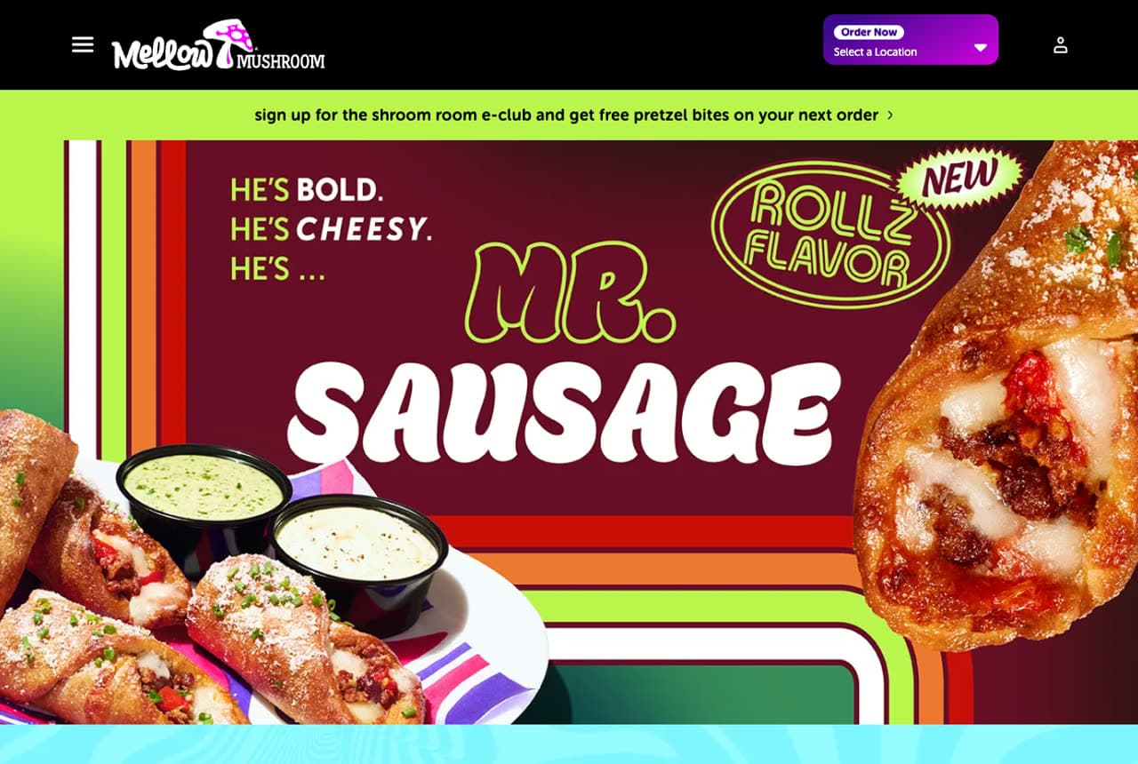
Mellow Mushroom: Maximalism that owns a casual category

Mellow Mushroom, a 150-location pizza franchise, throws out restraint entirely and wins with it. Vibrant green, purple, and magenta collide with custom graffiti-style type, a cartoon mushroom mascot, and psychedelic striped borders for a maximalist look that's unmistakable in a category of identical pizza sites. The marketing is just as bold: a new menu item gets a character and a personality ('He's bold. He's cheesy. He's… Mr. Sausage'), and the loyalty program is the on-brand 'Shroom Room' e-club rather than a generic newsletter. Location-based ordering is built right into the main CTA. It's a deliberate bet that for a casual brand chasing a younger crowd, being loud and a little weird is more memorable — and more shareable — than being tasteful.

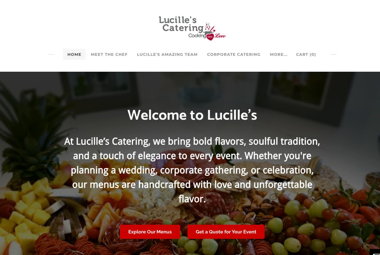
Lucille's Catering website — Catering design example
Real site · Austin, TX
  • Catering
  • Warm

Lucille's Catering: A chef's voice as the entire brand

Lucille's Catering, an Austin soul-food caterer, builds its whole brand on one voice. Chef Mertise Lucille's line — 'I cook with heart, heritage, and a whole lot of butter' — and the philosophy 'food is love made visible' do more brand work than any corporate paragraph could, framing soul food as an act of love rather than a service. A lavish grazing-spread hero sets the abundance tone, then a notable client list (City of Austin, Google, Warner Brothers, SXSW) lends instant credibility to a small caterer. Four menu categories let event planners self-select, and a 'Schedule a tasting' CTA offers a low-commitment first step before booking. For a personal, heritage business, the owner's actual voice is the most valuable asset on the page.

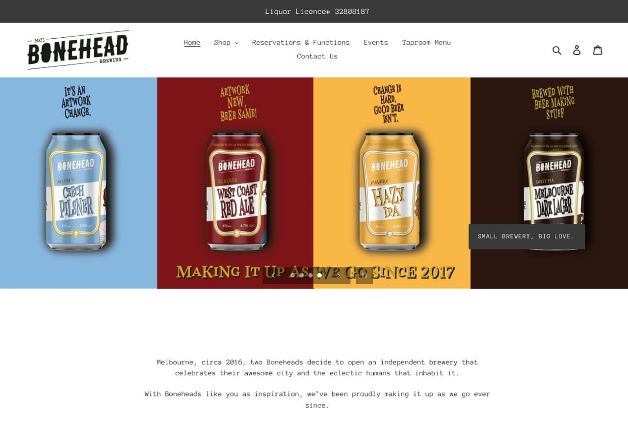
Bonehead Brewing website — Brewery design example
Real site · Melbourne, AU
  • Brewery
  • Irreverent

Bonehead Brewing: Anti-heritage positioning as a brand asset

Bonehead Brewing, an independent Melbourne brewery, turns being young into the whole pitch with the tagline 'Making it up as we go since 2017.' Where most breweries fake decades of tradition, Bonehead makes honesty and experimentation the brand — and 'After all, we're all Boneheads' folds the customer into the in-joke. A monospace, typewriter-style typeface and a hero slideshow of four bold, hand-lettered can designs give it a scrappy, design-forward look, and witty slide copy ('Change is hard, good beer isn't') keeps the voice consistent. Even the events are participatory — 'BYO Instrument' Sundays ('Play music. Get beer.') build community over passive consumption. A distinctive point of view, even a self-deprecating one, beats borrowed prestige for a young brand finding its crowd.

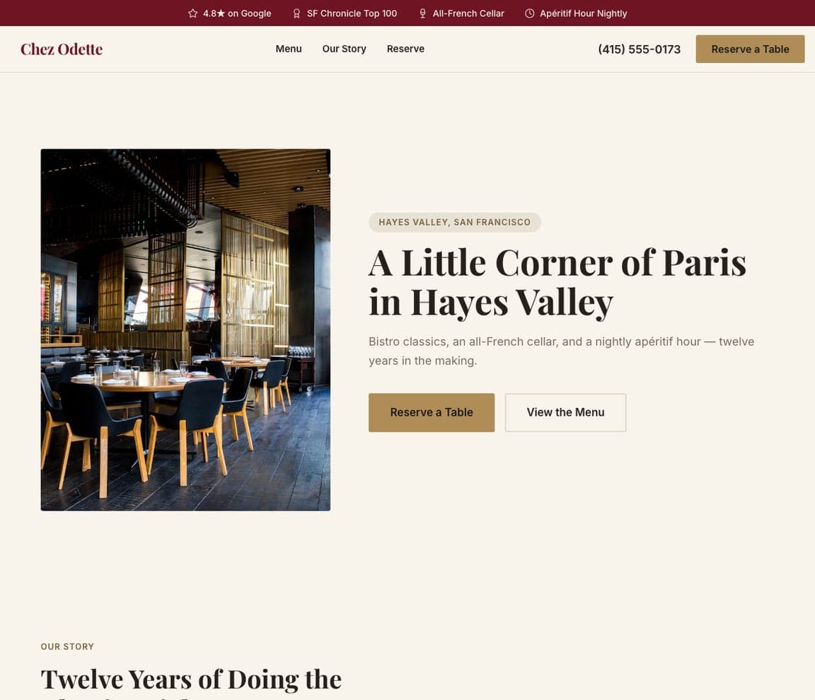
Chez Odette — French Bistro website design you can build with Zarla
Build this with Zarla
  • French Bistro
  • Warm-Elegant

Chez Odette: A little corner of Paris

Chez Odette sells a feeling of place, not a menu: 'A Little Corner of Paris in Hayes Valley,' over a warm photograph of a rattan-chaired bistro interior, with 'bistro classics, an all-French cellar, and a nightly apéritif hour — twelve years in the making.' The move is transportation — a neighborhood diner isn't just choosing French food, they're choosing an evening that feels a little like Paris, and the warm cream-and-tan serif design performs that intimate, timeless bistro mood. 'Twelve years in the making' quietly signals a beloved local institution. For a bistro or any cuisine with a strong sense of place, sell the transporting experience (a corner of Paris, a night in Rome) rather than the dish list — the atmosphere is what fills tables, and the design should feel like the room.

See this template
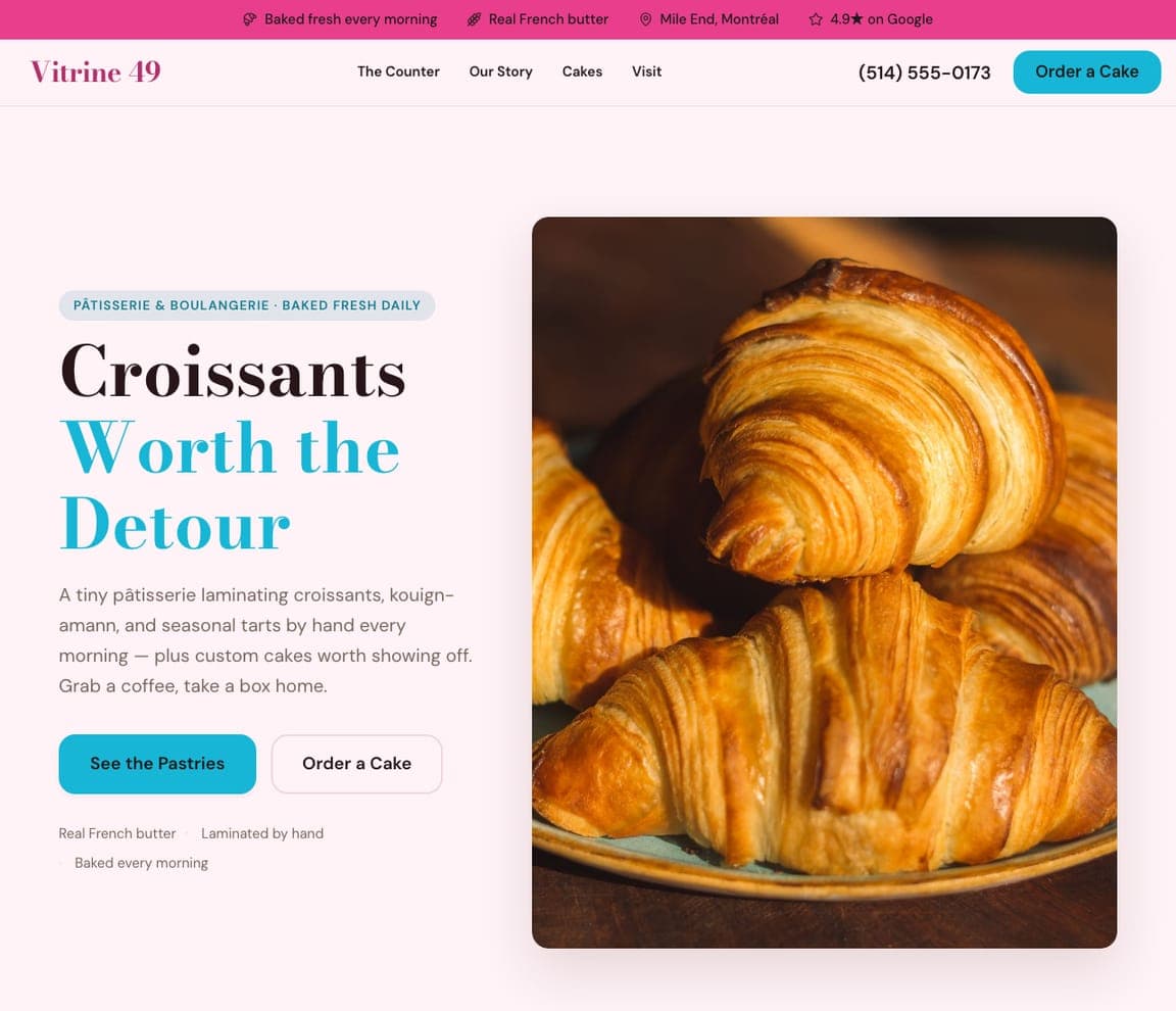
Vitrine 49 — Patisserie & Bakery website design you can build with Zarla
Build this with Zarla
  • Patisserie & Bakery
  • Bright-Charming

Vitrine 49: Croissants worth the detour

Vitrine 49 nails the charm of a neighborhood pâtisserie: 'Croissants Worth the Detour,' beside a photograph of impossibly golden, flaky croissants, with 'a tiny pâtisserie laminating croissants, kouign-amann, and seasonal tarts by hand every morning… grab a coffee, take a box home.' The light, bright palette and the hero shot of the actual product are exactly right for a bakery — pastry is an impulse of the eye, so a mouthwatering close-up sells better than any description, and 'worth the detour' frames it as a destination treat. It's a different daypart and mood from any dinner spot in this gallery. For a bakery, café or dessert shop, lead with a gorgeous close-up of the thing people crave and keep the design as light and inviting as the morning it's baked.

See this template
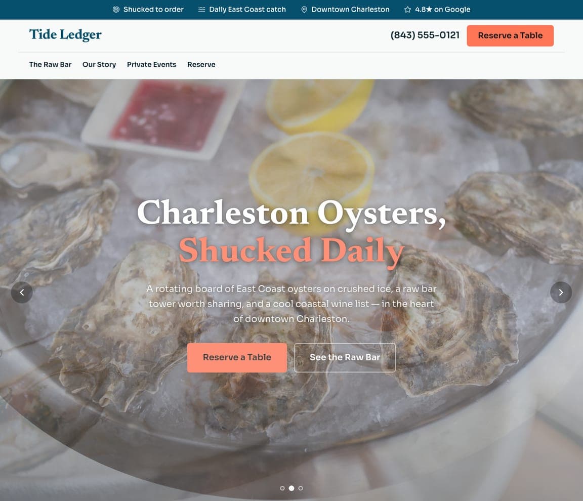
Tide Ledger — Oyster & Raw Bar website design you can build with Zarla
Build this with Zarla
  • Oyster & Raw Bar
  • Coastal-Fresh

Tide Ledger: Shucked daily, on crushed ice

Tide Ledger sells freshness as the whole proposition: 'Charleston Oysters, Shucked Daily,' over a glistening board of oysters on crushed ice, with 'a rotating board of East Coast oysters… a raw bar tower worth sharing, and a cool coastal wine list.' For seafood, freshness is the entire trust question, so 'shucked daily' and 'daily East Coast catch' answer it directly, and the icy, coastal palette with a coral accent reads clean, briny and refined — the exact sensory register of a good raw bar. 'A tower worth sharing' sells the social occasion. For an oyster bar, seafood spot or anywhere freshness is the pitch, show the catch on ice and say how recently it arrived — the customer's one worry is 'is it fresh?', so answer it in the hero.

See this template

Frequently asked

What should a restaurant website include?

At minimum: appetite-first photography in the hero, a clear, up-to-date menu (ideally not a PDF), your hours and location, an obvious way to reserve or order, and a few genuine reviews. Notice how the designs below lead with imagery and a single clear action — reserve, order, or find us — rather than burying the essentials in paragraphs of text.

What makes a good restaurant website design?

A good restaurant website makes a visitor hungry in the first few seconds, then removes every excuse not to visit: current hours, an easy reservation or order button, and a map. Mood matters more than for most businesses — a steakhouse should feel dark and special, a juice bar bright and fresh, a brewpub casual and fun. Every design on this page matches its look to how its diners decide.

How much does a restaurant website cost?

A custom restaurant website from a designer typically runs $2,000–$8,000 up front, and template builders like Wix or Squarespace charge roughly $16–$30 per month. An AI builder generates a complete, editable restaurant site for free and only charges (on the Premium plan) when you publish to your own domain — so you can build and preview the whole thing, menu and photos included, before spending anything.

Should my restaurant website take online orders or reservations?

Whichever matches how your customers actually transact — and most restaurants want one to be the single obvious action, not both competing for attention. Fine dining and special-occasion spots lead with reservations; fast-casual, juice bars, and pizza lead with online ordering; food carts often just need 'find us' and a menu. Several designs above route multiple visitor types with a clean row of CTAs, but they always make the primary action unmistakable.

How should I show my menu on my restaurant website?

Put it on the page as real, styled text or photo cards — not a PDF link. PDFs are hard to read on a phone (where most diners look), don't help you show up in Google, and can't be updated quickly. The designs above present signature dishes as photo cards or scannable lists so the food does the selling and the menu stays easy to update when prices or specials change.

How do I get more customers from my restaurant website?

Lead with photography that makes people hungry, keep your hours and menu current (nothing loses a diner faster than wrong hours), make one action obvious on every screen — reserve, order, or get directions — and back it up with real reviews. A distinct voice helps too: the restaurants above with the strongest personality, from heritage cafes to irreverent breweries, give people a reason to choose them over the identical spot down the street.

You've seen what works. Now make it yours.

Describe your business and Zarla designs a complete, professional website in about 30 seconds — built to convert, just like the ones above.

Free to build and preview · no credit card · publish to your own domain on Premium