Inspiration · Salon

The Best Salon Website Examples, Explained

Looking for salon website examples? These 15 are the best we could find — standout real salon sites plus designs you can build with Zarla — and each comes with a breakdown of the specific design move that makes it work. Find a look you love and you can build a site in that exact style, free, in about 30 seconds.

Real sites + designs you can build with Zarla — free to build and preview, no credit card

What makes a great salon website

The best salon websites share a few moves: they earn trust fast, lead with strong visuals of the work, point to one clear action, and match the design to how their customers decide. Each example below calls out the specific choice worth stealing for your own salon website.

Strange Bird website — Boutique Salon design example
Real site · Austin, TX
  • Boutique Salon
  • Editorial
  • Terracotta + cream

Strange Bird: A niche so specific it's a headline

Strange Bird owns a lane no competitor can share: 'Austin's First Haircutting-Only, Chemical-Free Salon,' set in an elegant serif over a warm, 1970s-styled interior of burnt-orange loungers and terracotta light. The positioning is the whole brand — by refusing colour and chemicals entirely, it becomes the definitive destination for a specific, growing customer (the chemical-avoidant, the dry-cut devotee) instead of one more full-service salon. The retro-warm art direction reinforces the boutique, considered feel and filters for the aesthetic-minded client. It's a masterclass in subtraction as strategy: narrowing what you offer makes you unmistakable to the people who want exactly that. When you can be the FIRST or ONLY at something true, put it in the hero verbatim.

  • 'First / only' niche claim makes the salon unmistakable
  • Refusing colour entirely IS the positioning, not a limitation
  • Retro-warm art direction filters for the aesthetic client

Steal this: Claim a 'first' or 'only' that's genuinely true and put it verbatim in the hero. A narrow lane you own beats a wide one you share.

Oxana Salon website — Luxury Salon design example
Real site · Nashville, TN
  • Luxury Salon
  • Indulgent
  • Purple + gold

Oxana Salon: Luxury plus a signature ritual service

Oxana Salon pairs an unabashed luxury claim — 'Luxury Hair Salon in Nashville, Hendersonville and Mount Juliet' — with a differentiator most salons don't have: the 'Oxana Headspa,' a named signature treatment given its own section ('refreshes your scalp and restores balance… deep cleansing, expert massage, tailored product care'). Elevating one ritual into a branded, ownable experience is smart — it gives the salon something to be known for beyond the haircut and something to upsell. The moody purple-and-gold palette reads indulgent and the multi-location subhead does double duty as local SEO. The lesson: a named signature service (not just 'we do scalp treatments') becomes a reason to choose you and a story worth telling. Brand the ritual, not just the salon.

  • Names a signature ritual ('Headspa') as an ownable experience
  • Multi-city subhead doubles as local SEO
  • Purple + gold palette reads indulgent luxury

Steal this: Brand one signature service with its own name and section. A named ritual is a reason to choose you and a thing to upsell.

Jon 'Alan Salons website — Hair + Skin Salon design example
Real site · Atlanta, GA
  • Hair + Skin Salon
  • Dramatic
  • Black + white

Jon 'Alan Salons: Two services, split down the middle

Jon 'Alan Salons splits its promise cleanly in two: 'Healthy, Shiny, Beautiful Hair' and 'Healthy, Radiant, Glowing Skin,' each with its own button (Hair Services / Skin Services), over a dramatic black hero of windswept hair. Presenting hair and skin as equal, parallel offerings — rather than burying skin as an afterthought — lets the salon capture two appointment types from one visitor and positions it as a full 'looking your best' destination. The high-contrast black-and-white photography reads premium and editorial, and the symmetrical two-door layout makes the dual offering instantly legible. When you genuinely do two distinct things well, give them equal billing and separate doors so neither audience feels like they wandered into the wrong place.

  • Hair and skin get equal billing and separate doors
  • Captures two appointment types from one visitor
  • High-contrast B&W hair photography reads editorial-premium
Blonde Faith Salon website — Premium Salon design example
Real site · Austin, TX
  • Premium Salon
  • Boutique
  • Terracotta + gold

Blonde Faith Salon: A monogram brand and a stat line

Blonde Faith Salon carries itself like a fashion label: a circular 'BF' monogram, the phrase 'Indulge in a Premium Hair Styling Experience, Tailored for You' with 'Tailored for you' in a gold script flourish, and a warm terracotta 'Our Story / Austin, TX' block anchored by two proud stats — '10 years in the biz' and '100% your hair besties.' The brand-first treatment (logo mark, consistent palette, story section) elevates a single-location salon to boutique status, and 'your hair besties' nails a warm, personal tone that the transactional booking-chain competitors can't match. The tailored-for-you message sells bespoke attention, the stats prove staying power. A distinctive monogram plus a human voice is how a neighbourhood salon reads like a brand people want to belong to.

  • Circular monogram elevates a single salon to boutique brand
  • 'Your hair besties' is warmth the booking chains can't fake
  • Two proud stats prove staying power without a wall of badges
Element Salon website — Award-Winning Salon design example
Real site · Nashville, TN
  • Award-Winning Salon
  • Friendly
  • Cream + yellow

Element Salon: An award badge and a stylist-finder

Element Salon leads with warmth and receipts: 'Hello Gorgeous!' in a friendly script over a stylist-and-client moment, then hard credibility — 'Named top 100 salons in the country by Elle Magazine 4 years in a row.' Beneath sit three action tiles that map the real customer jobs: Meet Your Stylist (find a stylist for you), Online Store, Book Now. The Elle ranking is a borrowed-authority trust anchor few local salons can claim, and 'find a stylist for you' acknowledges the industry's real truth — clients bond with a person, not a salon. The cheerful yellow accent keeps it approachable despite the prestige. Pair a genuine third-party award with a stylist-matching path and you answer both 'are they good?' and 'who will I sit with?' in one screen.

  • 'Top 100 by Elle, 4 years' — borrowed-authority trust anchor
  • 'Meet Your Stylist' acknowledges clients bond with a person
  • Three tiles map the real jobs: match / shop / book
Style House Salon website — Stylist-Match Salon design example
Real site · United States
  • Stylist-Match Salon
  • Interactive
  • Charcoal + gold

Style House Salon: A matchmaking quiz as the hook

Style House Salon turns stylist selection into an interactive experience: 'Discover Your Beautiful — and find the stylist who brings it to life,' with a 'Take Our Matchmaking Quiz' button as the primary CTA over a moody, dark salon interior. Gamifying the first step is a clever conversion device — a quiz feels lower-commitment than 'book an appointment,' captures a lead, and produces a personalized stylist recommendation that makes the eventual booking feel pre-vetted and right. It directly answers the new client's real anxiety ('which stylist do I even pick?') and does it as a fun interaction rather than a wall of bios. The dark, upscale palette keeps it premium. When your booking decision has friction, replace 'book now' with a lower-stakes, personalized first step.

  • A matchmaking quiz lowers commitment vs 'book now'
  • Answers the new client's real fear: which stylist to pick
  • Gamified first step captures a lead and pre-vets the booking

Steal this: Replace 'book now' with a lower-stakes quiz. A stylist-matching flow captures leads and makes the booking feel pre-vetted.

Two Birds website — Hair + Makeup Salon design example
Real site · Melbourne, AU
  • Hair + Makeup Salon
  • Calm

Two Birds: Two portraits, two services, one calm palette

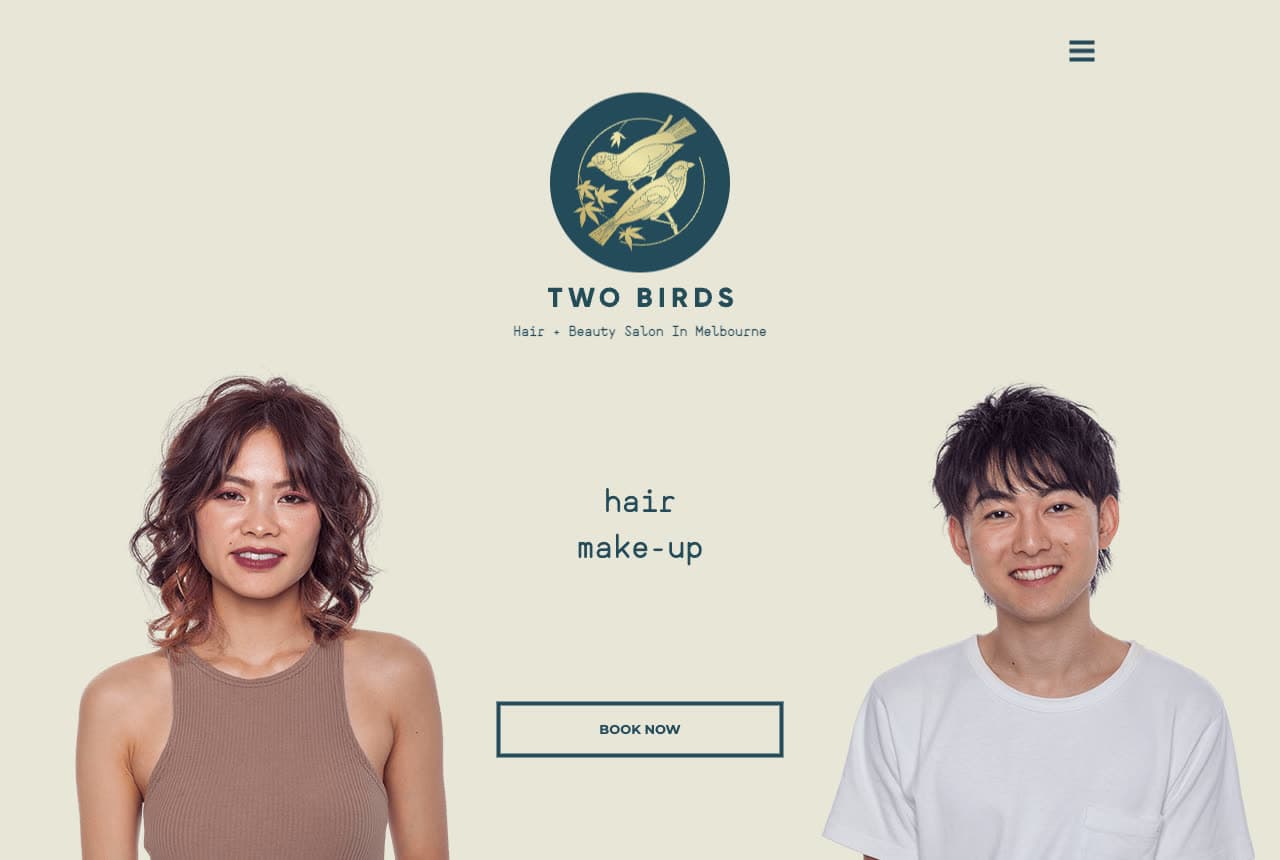
Two Birds keeps it disarmingly simple: a serene sage-green canvas, a small crane emblem, two real client portraits flanking the words 'hair / make-up,' and a single Book Now button. The restraint is the appeal — where most salons crowd the hero with promotions and stylist grids, Two Birds trusts two beautiful headshots and two words to communicate the whole offer. The soft, muted palette reads modern and calming (an antidote to the sensory overload of a busy salon), and the copy later notes a Japanese Senior Stylist and a focus on cuts that suit 'your image and lifestyle.' It proves a salon site can win on quietness: clear offer, real faces, generous space. Sometimes the most premium signal is how much you're willing to leave out.

True Blue Salon website — Inclusive Salon design example
Real site · Nashville, TN
  • Inclusive Salon
  • Warm

True Blue Salon: Warmth, inclusivity and a local award

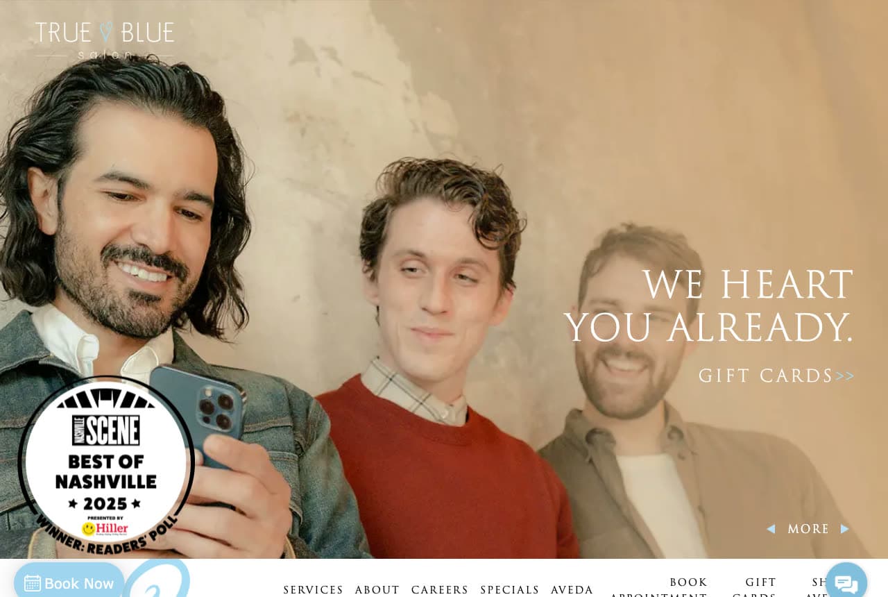
True Blue Salon leads with people, not product: a warm portrait of smiling clients and the disarming line 'We Heart You Already,' with a 'Best of Nashville 2025' badge stamped in the corner and a soft, hand-drawn heart motif. The whole tone is inclusive and welcoming — the copy explains the name ('steadfast, loyal or faithful… true to our clients') and commits to Aveda's global-responsibility mission. In an industry that can feel intimidating or exclusive, leading with unconditional warmth ('we heart you already,' before you've even booked) is a genuine differentiator that attracts the client who's been made to feel like an afterthought elsewhere. The local 'Best of' badge adds community credibility. Kindness, stated plainly and backed by an award, is a positioning most salons are too cool to claim.

Maison Lune Salon — Elegant Salon website design you can build with Zarla
Build this with Zarla
  • Elegant Salon
  • Refined

Maison Lune Salon: Lit-from-within, split and refined

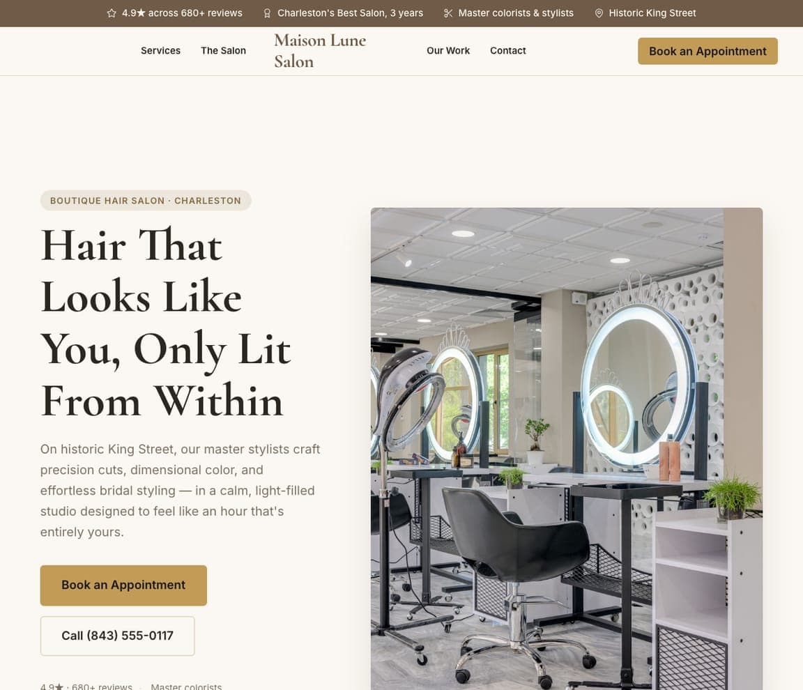
Maison Lune Salon is Zarla's elegant-salon template, and its split-image-right hero carries a genuinely lovely line — 'Hair That Looks Like You, Only Lit From Within' — in a warm taupe-and-gold palette that reads sophisticated rather than flashy. It borrows the boutique instinct of the best rooms in this gallery (Blonde Faith's premium tailoring, Strange Bird's considered restraint) and pre-builds it: a refined hero, a services menu, a stylist section, and a booking path. The 'looks like you' framing sells bespoke, personal work over trend-chasing — exactly what a premium salon client wants to hear. Swap in photos of your own space and stylists and you have an upscale, on-brand salon site in about 30 seconds, no designer required.

See this template
Verel Salon — Luxury Salon website design you can build with Zarla
Build this with Zarla
  • Luxury Salon
  • Elevated

Verel Salon: Look the price you charge

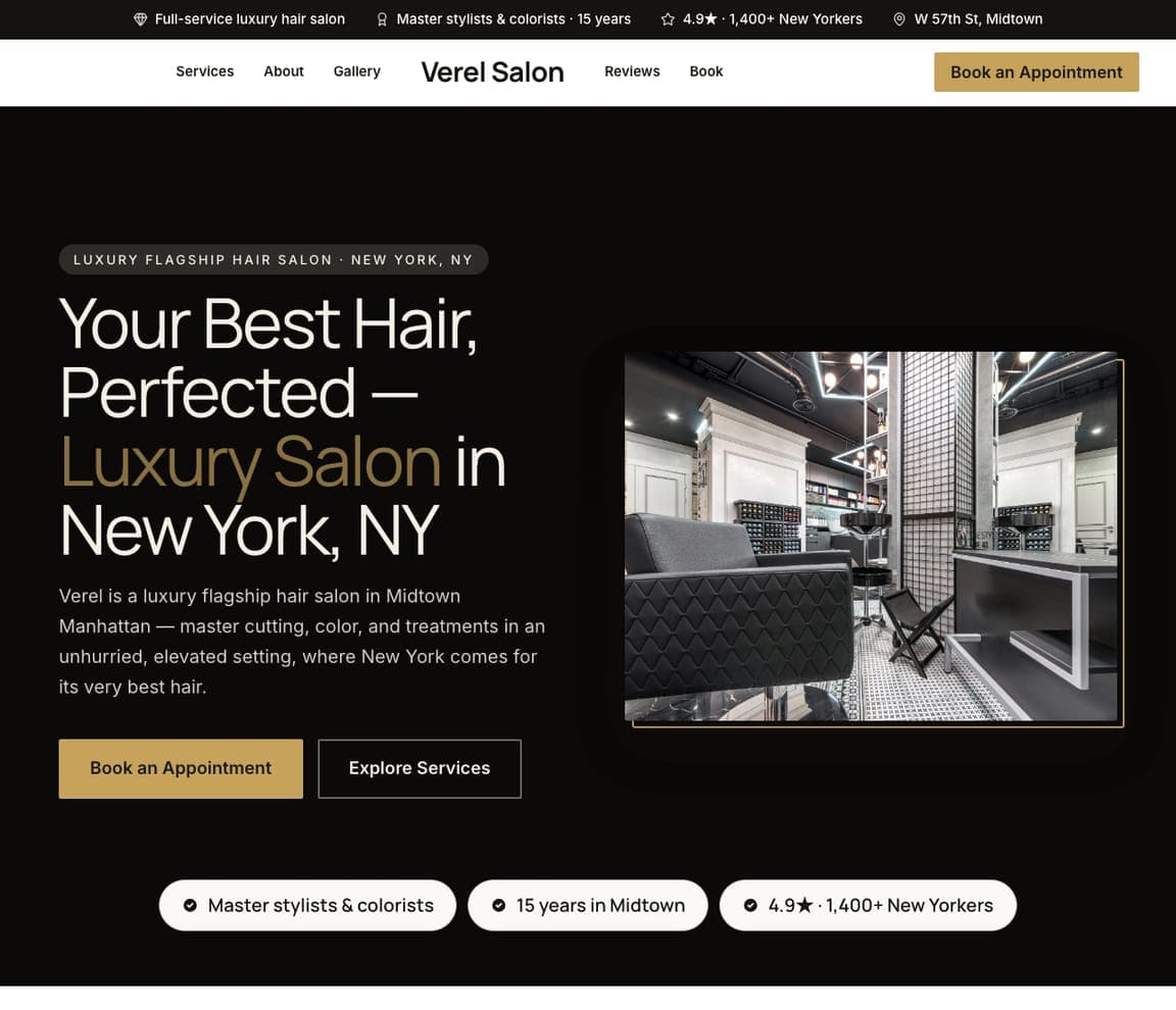
Verel Salon makes the case for a premium salon the way a luxury brand does — through restraint and atmosphere. 'Your Best Hair, Perfected — Luxury Salon in New York, NY' over a dark, elevated palette with a single gold accent and a photo of a sleek, sophisticated interior, positioning the salon as a Midtown Manhattan flagship for people who want their very best hair. 'Master cutting, color, and treatments in an unhurried, elevated setting' signals the caliber and the pace (unhurried = premium), and a 15-years, 1,400-review trust strip backs it. The lesson is that in beauty, the design sets the price point: a dark, spare, gold-accented site tells a client this is the top of the market before they see a single rate. When you charge premium, the site has to look premium. Describe your salon and it's yours in about a minute.

See this template
Blackwood Men's Grooming — Men's Grooming website design you can build with Zarla
Build this with Zarla
  • Men's Grooming
  • Upscale

Blackwood Men's Grooming: A men's lounge, not a barbershop

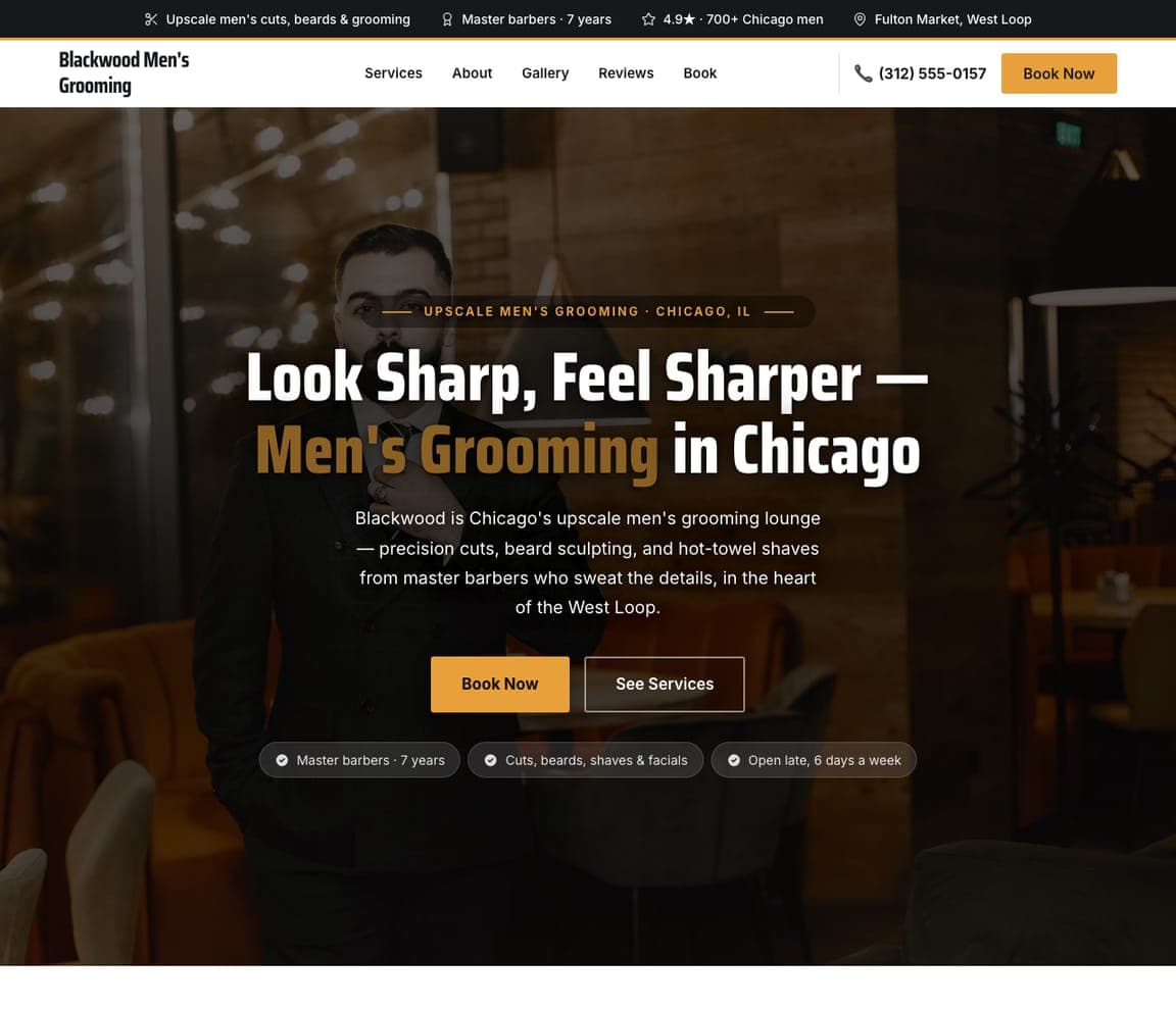
Blackwood Men's Grooming elevates the barbershop into an upscale men's experience. 'Look Sharp, Feel Sharper — Men's Grooming in Chicago' over a dark, masculine palette with a gold accent, positioning it as an 'upscale grooming lounge' rather than a corner barber — precision cuts, beard sculpting, hot-towel shaves 'from master barbers who sweat the details.' The dark, refined look and 'lounge' language target the professional man willing to pay more for an experience, not just a haircut. The lesson is repositioning a commodity service upward: the same cut costs more at a 'grooming lounge' than a 'barbershop,' and the design — dark, sophisticated, detail-obsessed — is what justifies the premium and attracts the client who wants to feel taken care of. Point it at your shop and publish it free.

See this template
Featherline Lash Studio — Lash Studio website design you can build with Zarla
Build this with Zarla
  • Lash Studio
  • Beauty

Featherline Lash Studio: Sell the outcome: wake up ready

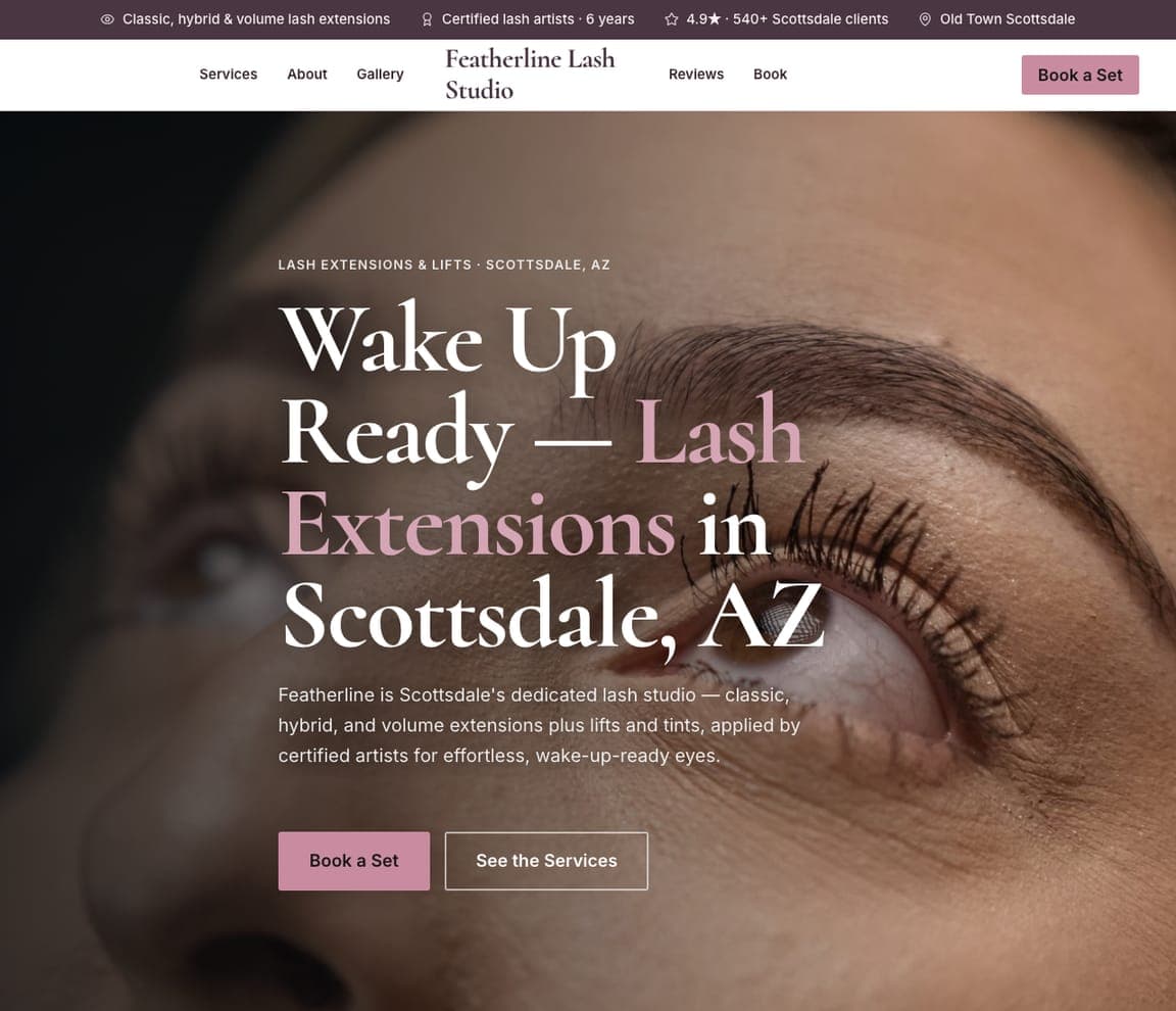
Featherline Lash Studio sells the feeling a lash client is really buying — effortless, wake-up-ready eyes. 'Wake Up Ready — Lash Extensions in Scottsdale, AZ' over a soft mauve-and-pink palette with a beautiful close-up of lashes, and copy that covers the specifics a lash shopper scans for: 'classic, hybrid, and volume extensions plus lifts and tints, applied by certified artists.' The soft, feminine palette and the outcome-led headline match exactly what this beauty client wants — to look put-together with zero morning effort. The lesson is leading with the outcome, not the procedure: nobody wants 'lash extensions' for their own sake, they want to wake up looking done, so the template sells the result and lets a soft, pretty palette carry the mood. Swap in your details and publish it free.

See this template
Solstice Color Studio — Color Salon website design you can build with Zarla
Build this with Zarla
  • Color Salon
  • Specialist

Solstice Color Studio: Specialize in one thing, own it

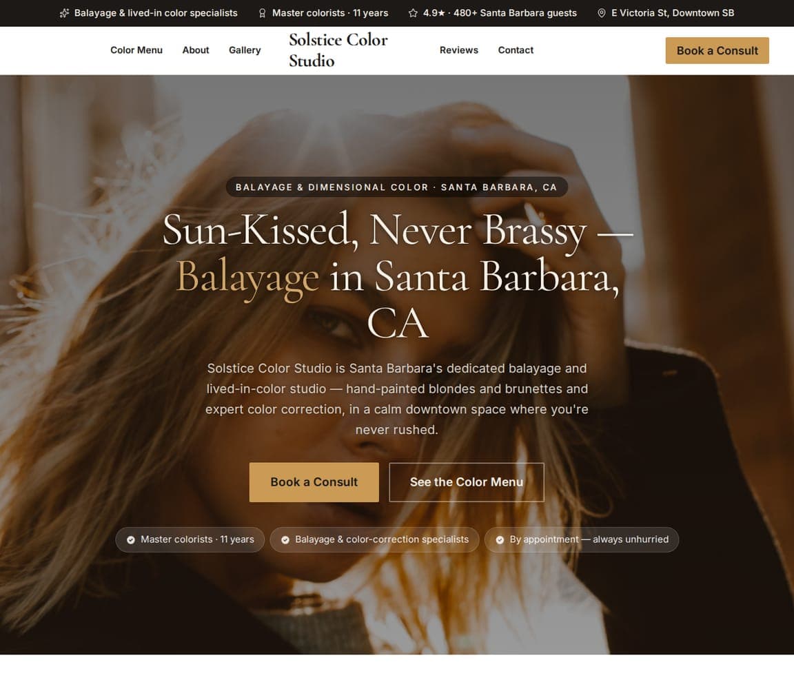
Solstice Color Studio narrows to a single, lucrative specialty and owns it completely. 'Sun-Kissed, Never Brassy — Balayage in Santa Barbara, CA' names the exact result a balayage client fears getting wrong (brassiness), over a warm palette and a photo of beautifully hand-painted blonde. 'A dedicated balayage and lived-in-color studio — hand-painted blondes and brunettes and expert color correction, in a calm space where you're never rushed' signals genuine expertise, not a generalist who also does color. The lesson is that specialization commands trust and price: a client with a big color budget wants a proven specialist, not a salon that does everything, so leading with 'dedicated balayage studio' and naming the specific worry (never brassy) wins the high-value color client. Describe your studio and it's yours in about a minute.

See this template
Kindred Natural Hair Studio — Natural Hair website design you can build with Zarla
Build this with Zarla
  • Natural Hair
  • Specialist

Kindred Natural Hair Studio: Serve a specific community with care

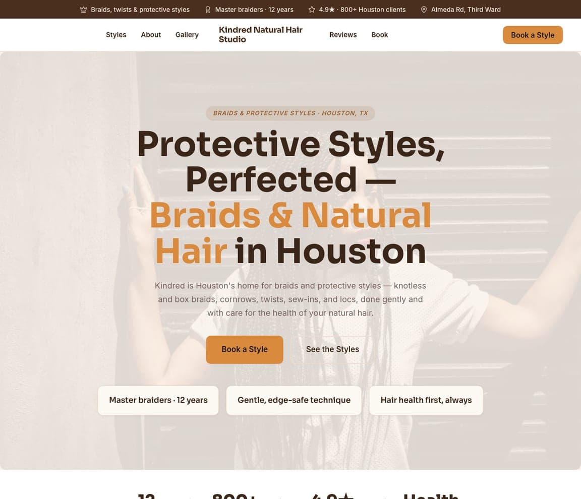
Kindred Natural Hair Studio designs for a specific clientele and speaks their language fluently. 'Protective Styles, Perfected — Braids & Natural Hair in Houston' over a warm cream-and-orange palette, with copy that names the exact services this client seeks — 'knotless and box braids, cornrows, twists, sew-ins, and locs' — and, crucially, the value that matters most to them: 'done gently and with care for the health of your natural hair.' The 'gentle, edge-safe technique' and 'hair health first' reassurances speak directly to real concerns in the natural-hair community. The lesson is authentic specialization: by using the community's own terminology and leading with hair-health care (not just style), the salon signals genuine expertise and respect, which is exactly what wins trust in a niche where generic salons fall short. Swap in your details and publish it free.

See this template
Belle & Vow Bridal Beauty — Bridal Beauty website design you can build with Zarla
Build this with Zarla
  • Bridal Beauty
  • Elegant

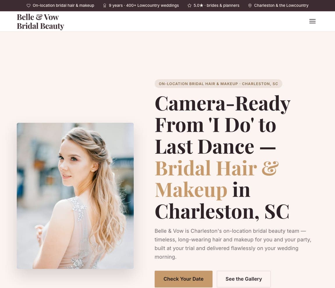
Belle & Vow Bridal Beauty: A high-stakes day, handled flawlessly

Belle & Vow Bridal Beauty designs for one of the highest-stakes beauty appointments there is — a wedding day. 'Camera-Ready From I Do to Last Dance — Bridal Hair & Makeup in Charleston, SC' over a clean white-and-gold palette with a photo of a radiant bride, and copy that answers a bride's real worries: 'timeless, long-wearing hair and makeup for you and your party, built on your trial and delivered flawlessly on your wedding morning.' 'On-location,' 'a trial,' and 'delivered on your morning' address the exact logistics that keep a bride anxious. A 'Check Your Date' CTA fits a booking driven by a single fixed date. The lesson is designing for a high-stakes, date-locked event: a bride isn't price-shopping a haircut, she's ensuring nothing goes wrong on the biggest day, so the template leads with reliability, longevity, and the reassuring trial. Point it at your business and publish it free.

See this template

Frequently asked

Where can I find good salon website examples?

Right here — this page curates salon website examples two ways: standout real businesses (each linked, so you can explore the live site) and professionally designed Zarla templates you can clone and make your own. Every example comes with a note on why the design works — trust signals, layout, calls to action — so you can copy the move, not just the look.

What makes a good salon website?

A good salon website earns trust in the first few seconds, leads with strong visuals of the work, gives visitors one obvious action, and loads fast on a phone. Every design below leads with proof and a single clear call to action rather than a wall of text.

How much does a salon website cost?

A custom salon website from a designer typically runs into the thousands up front, and template builders charge roughly $16–$30 per month. An AI builder generates a complete, editable design for free and only charges (on the Premium plan) when you publish to your own domain — so you can build and preview before spending anything.

Do I need a designer to build a salon website?

No. Several designs on this page were generated by Zarla and are fully editable — you describe your business and get a complete, professionally designed site in about 30 seconds, then refine it by chatting. Building and previewing is free; publishing to your own domain needs the Premium plan.

What pages does a salon website need?

Most salon businesses need just a few: a home page that proves trust and points to one clear action, an about page that puts a face to the business, a services or work page that shows what you do, and a contact page with a form and a phone number. Local businesses also benefit from location or service-area pages that help them show up in nearby searches.

How do I get more customers from my salon website?

Lead with proof in the first few seconds (reviews, real photos, results), make one action obvious on every screen (call, book, or enquire), and keep it fast on mobile — most visitors arrive on a phone. The designs above each do this differently, but they all earn trust early and remove friction from the next step.

You've seen what works. Now make it yours.

Describe your business and Zarla designs a complete, professional website in about 30 seconds — built to convert, just like the ones above.

Free to build and preview · no credit card · publish to your own domain on Premium