Inspiration · Sushi

The Best Sushi Website Examples, Explained

Looking for sushi website examples? These 9 are the best we could find — standout real sushi sites plus designs you can build with Zarla — and each comes with a breakdown of the specific design move that makes it work. Find a look you love and you can build a site in that exact style, free, in about 30 seconds.

Real sites + designs you can build with Zarla — free to build and preview, no credit card

What makes a great sushi website

The best sushi websites share a few moves: they earn trust fast, lead with strong visuals of the work, point to one clear action, and match the design to how their customers decide. Each example below calls out the specific choice worth stealing for your own sushi website.

Sushi Nakazawa website — Fine-Dining Omakase design example
Real site · New York, NY
  • Fine-Dining Omakase
  • Minimal
  • Black + white

Sushi Nakazawa: Three cities, total black-space silence

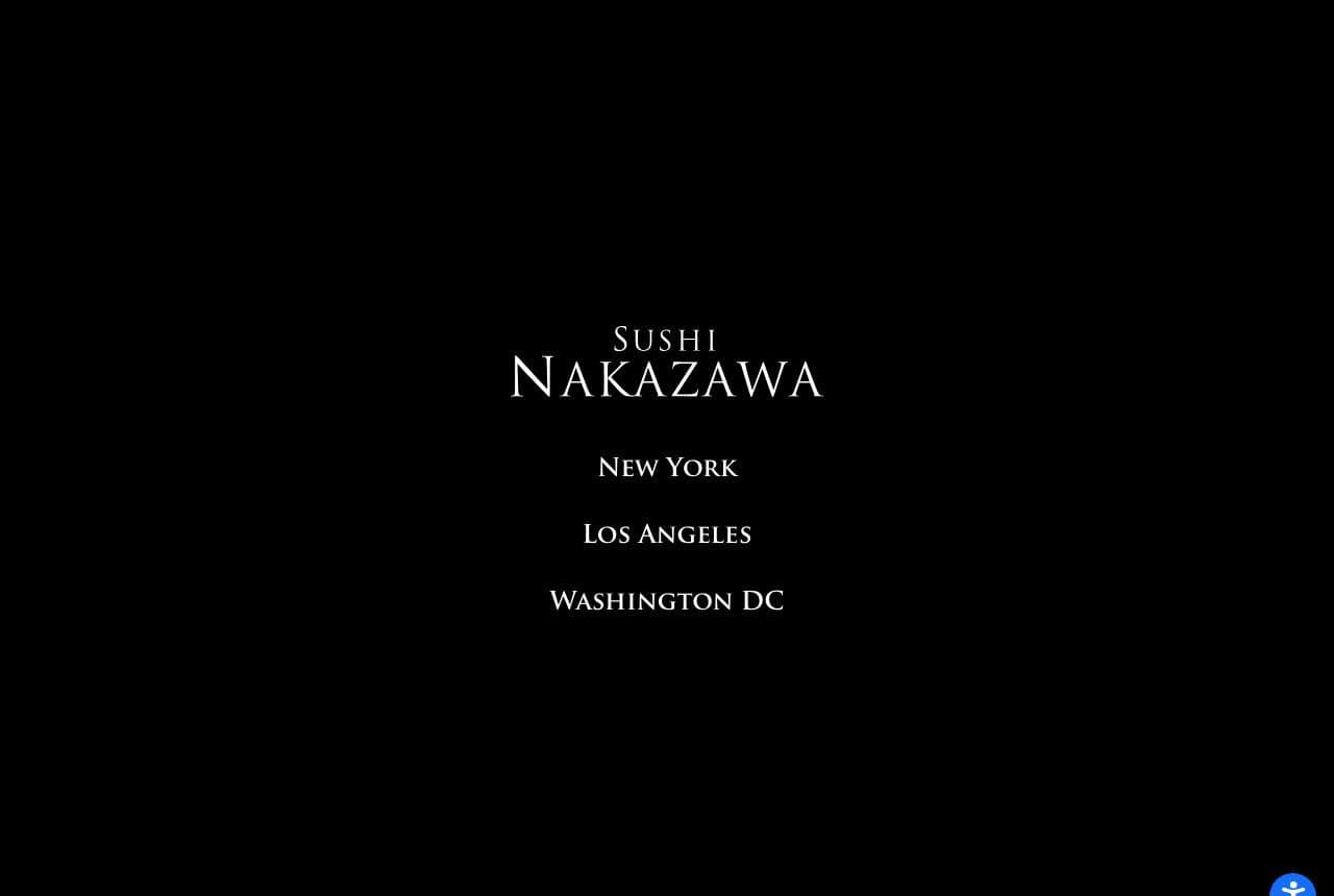
Sushi Nakazawa makes the boldest statement in this gallery by making almost none: a pure-black screen, the serif wordmark centered, and three city names beneath — New York, Los Angeles, Washington DC. No food photo, no menu tease, no 'book now' urgency. For a restaurant of this tier (the chef trained in the Jiro lineage), the restraint IS the flex — the assumption is that you already know, and if you don't, this isn't for you. The black void gives the name gravity a busy hero never could, and the three cities quietly signal an empire. It's the omakase philosophy applied to web design: subtraction until only the essential remains. When you're at the top of your category, confidence looks like empty space.

  • Black void + centered wordmark — restraint as the flex
  • Three city names quietly signal an empire
  • Omakase philosophy: subtract until only essence remains

Steal this: At the top of your category, confidence is empty space. Cut everything but the name and let it carry the room.

Sugarfish website — Value Omakase design example
Real site · Los Angeles, CA
  • Value Omakase
  • Serene
  • Ocean blue + white

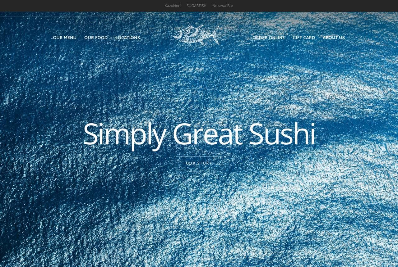
Sugarfish: Ocean, three words, a value paradox

Sugarfish drapes 'Simply Great Sushi' in white over a serene overhead ocean shot, then does something counterintuitive for a chef-driven brand: it leads with 'Old School Value — Traditional-Based Sushi,' crediting Chef Nozawa's 50 years and Tokyo training. Pairing premium pedigree with a value promise is the whole positioning — this is master-level omakase made accessible and repeatable, a chain that democratized fine sushi. The calm blue palette and minimal type keep it upscale despite the value message, so 'affordable' never reads as 'cheap.' The ocean imagery does the freshness work wordlessly. It's a lesson in reconciling opposites: you can promise both quality and value if the design commits fully to quality and lets the copy carry the value.

  • Pedigree + 'value' — democratized fine sushi as positioning
  • Calm ocean palette keeps 'affordable' from reading 'cheap'
  • Chef's 50 years does the quality proof in one line
Nami Nori website — Hand-Roll Bar design example
Real site · New York, NY
  • Hand-Roll Bar
  • Airy
  • White + wood

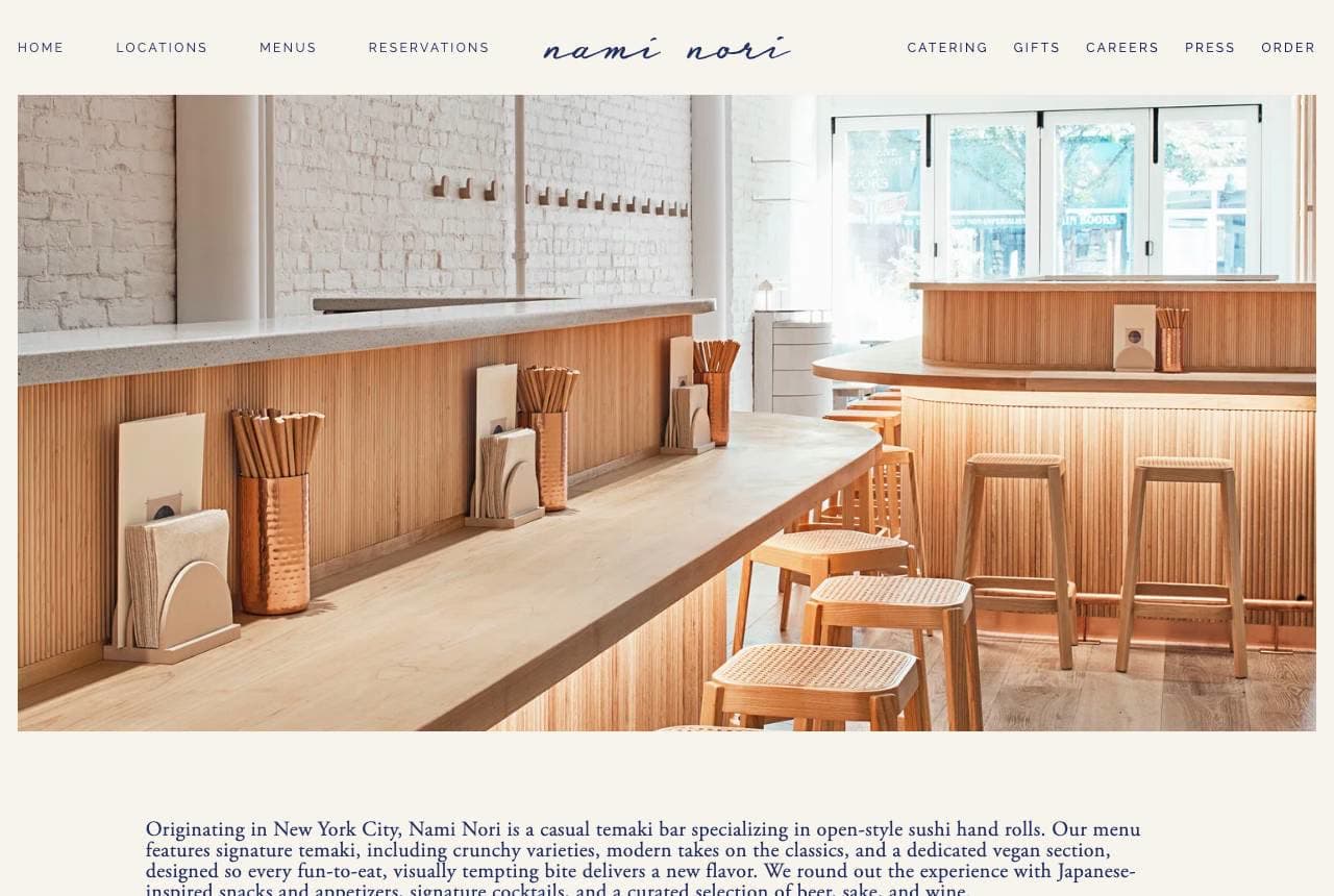
Nami Nori: One format, owned completely

Nami Nori builds its whole identity around a single item: open-style temaki hand rolls. The hero is a bright, airy photo of its blonde-wood counter, and the copy names the niche precisely — 'a casual temaki bar specializing in open-style sushi hand rolls… crunchy varieties, modern takes on the classics, and a dedicated vegan section.' Owning one format lets the brand feel focused and current where a full sushi menu would feel generic, and the light, minimalist Scandinavian-meets-Japanese interior signals casual-refined, not stuffy fine dining. A close-up of a single perfect hand roll makes the specialty crave-able. When you can be the definitive place for one specific thing, the homepage's job is to make that one thing unmistakable and desirable.

  • Single-format focus (hand rolls) reads current, not generic
  • Airy blonde-wood interior signals casual-refined
  • One perfect hand-roll close-up makes the specialty crave-able

Steal this: Own one format completely. 'The temaki place' beats 'a sushi place' — a narrow specialty is easier to remember and recommend.

Sushi Yugen website — Premium Omakase design example
Real site · Toronto, ON
  • Premium Omakase
  • Elegant
  • Black + gold

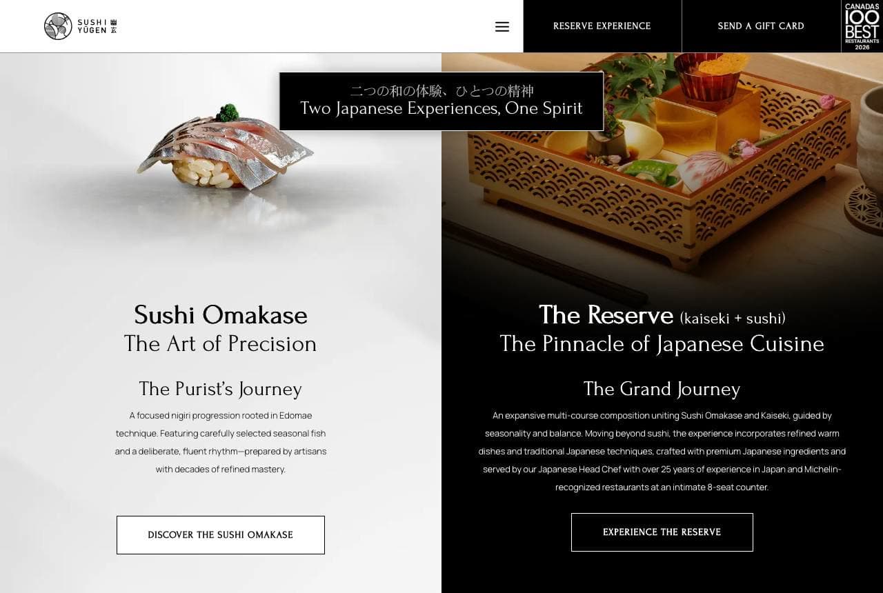
Sushi Yugen: Two tiers of omakase, side by side

Sushi Yugen splits its dark, elegant hero into two doors — 'Sushi Omakase: The Art of Precision, The Purist's Journey' and 'The Reserve: kaiseki + sushi, The Pinnacle of Japanese Cuisine, The Grand Journey' — letting the guest self-select by ambition and budget before they even see a price. Presenting two named experiences is smart menu psychology for a high-end omakase house: it frames the decision as which journey rather than whether to come, and it anchors the top tier so the entry omakase feels reasonable. The near-black palette with a Japanese-character motif and a 'Canada's 100 Best' badge signals fine dining without shouting. When your product is an experience, name the tiers like chapters and let the diner choose their own story.

  • Two named journeys let guests self-select before pricing
  • The Reserve tier anchors so entry omakase feels reasonable
  • Dark palette + '100 Best' badge signals fine dining quietly
Katsuya website — Celebrity Chain design example
Real site · Los Angeles, CA
  • Celebrity Chain
  • Glamorous
  • Black + red

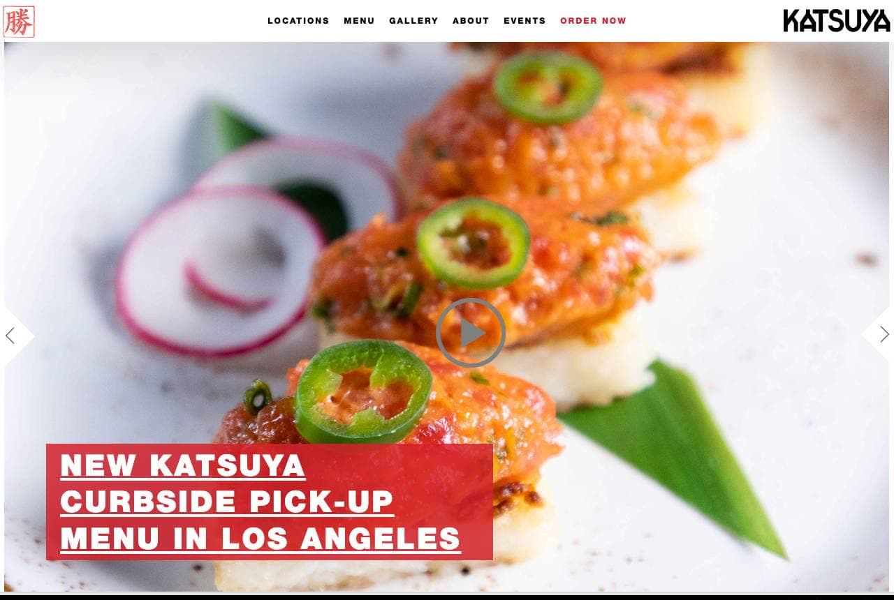
Katsuya: Food styled like a fashion campaign

Katsuya shoots its signature dishes like editorial fashion: an extreme close-up of jalapeño-topped sushi, dramatically lit and filling the whole hero, with a promo banner and a mosaic of its many locations below. This is the celebrity-chef, design-hotel end of the market (a Philippe Starck-designed, SBE-backed chain), and the glossy, high-contrast photography sells scene and glamour as much as food. The locations mosaic — Arabella, Baha Mar, Bahrain, Brentwood — flexes a global footprint that reassures the aspirational diner they're choosing a known name. Where a neighbourhood spot sells warmth, Katsuya sells cachet. When your restaurant is a destination brand, art-direct the food like a luxury product and let the location list do the status work.

  • Editorial, high-contrast food photography sells glamour
  • Global locations mosaic flexes destination-brand status
  • Cachet over warmth — the right pitch for a design-hotel crowd
Q Sushi website — Upscale Casual design example
Real site · Westlake Village, CA
  • Upscale Casual
  • Warm
  • Timber + white

Q Sushi: An offer banner over a warm room

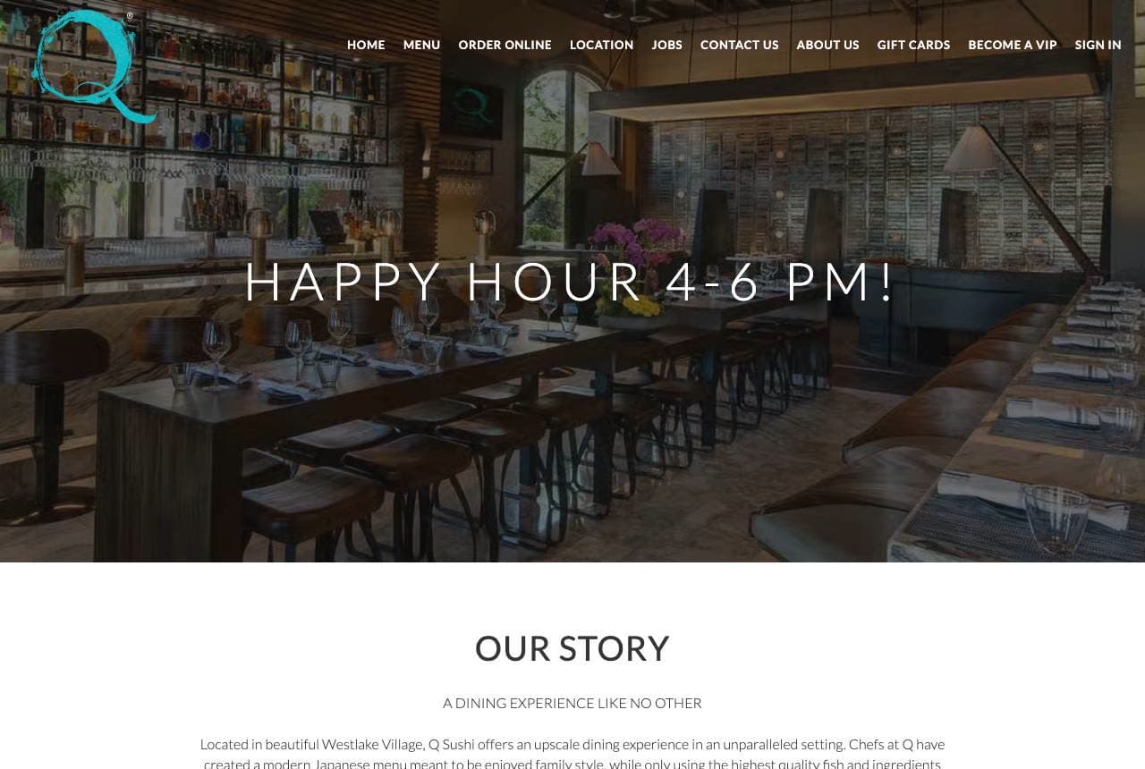
Q Sushi balances upscale and approachable: a wide, warm photograph of its modern timber-lined dining room with 'Happy Hour 4–6 PM!' overlaid — an everyday-value hook on an aspirational space. The 'Our Story' section frames it as 'a dining experience like no other… modern Japanese meant to be enjoyed family style,' and a trio of beautifully plated dishes plus a cocktails row round out the appetite and the atmosphere. The move worth noting is leading a nice restaurant with a happy-hour offer: it invites the hesitant first-timer in on a low-stakes occasion, betting the room and the food earn the return visit at full price. Upscale spaces can still lead with an accessible reason to come tonight — the ambiance does the upselling once you're seated.

  • Happy-hour hook invites first-timers into an upscale room
  • Room photo sells atmosphere; plated trio sells the food
  • 'Family style' framing softens the fine-dining barrier
Sushi Izu website — Retail / Grab-and-Go design example
Real site · Sydney, AU
  • Retail / Grab-and-Go
  • App-Led

Sushi Izu: A sushi brand built for the app store

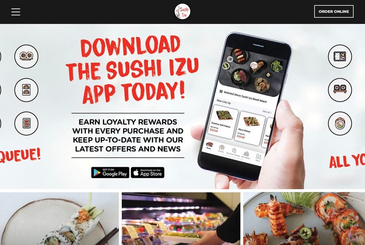
Sushi Izu runs a completely different playbook: 'Download the Sushi Izu App Today!' fills the hero, with a phone mockup, loyalty-rewards copy, and App Store / Google Play buttons — this is grab-and-go retail sushi (stocked in Woolworths) treating its website like a customer-acquisition funnel for the loyalty app, not a restaurant brochure. Three tiles route the three real jobs (Menu, Stores 'find us in your local Woolworths,' Catering), and 'we combine traditional Japanese methods with modern styles' positions the hybrid product. It's a useful counterpoint to the omakase temples above: when your sushi is a convenience purchase, the design goal is repeat frequency, and an app with rewards is the retention engine. Match the website's job to how the food is actually bought.

Tenkaichi website — Neighborhood Restaurant design example
Real site · Cardiff, UK
  • Neighborhood Restaurant
  • Friendly

Tenkaichi: Local authority, reviews and all

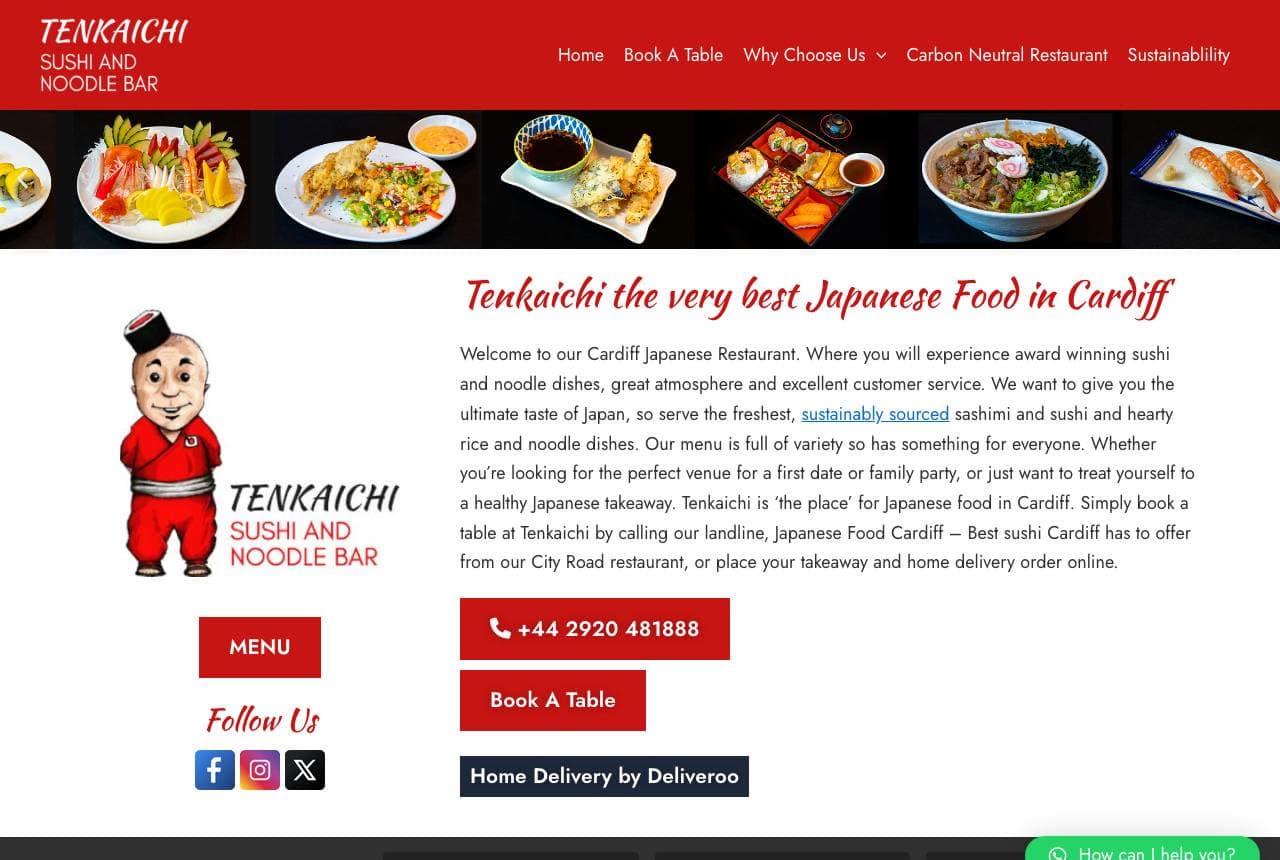
Tenkaichi is the neighbourhood favourite done thoroughly: 'Tenkaichi — the very best Japanese Food in Cardiff' in warm red, a friendly mascot, a food-photo strip across the top, and — crucially — an embedded Google reviews row (676 reviews, 4-star) plus a news feed with real posts ('Time to Treat Mum,' 'Vegan Sushi Fans, Thanks for Celebrating Veganuary'). Where the fine-dining sites subtract, Tenkaichi adds: phone number, Book a Table, Deliveroo link, sustainability page, all the practical doors a local diner needs. The keyword-perfect 'best Japanese food in Cardiff' copy plus genuine review volume is exactly what wins local search and reassures a first-time booker. For a neighbourhood restaurant, visible proof and every ordering channel beat minimalist mystique.

Aonami — Sushi Bar website design you can build with Zarla
Build this with Zarla
  • Sushi Bar
  • Minimal

Aonami: Trust the chef, split in type

Aonami is Zarla's sushi template, and its type-statement-split hero lands the register the best rooms in this gallery use: 'Trust the Chef. Taste the Sea.' — oversized type split across the frame, confident and minimal, in a near-black and deep-blue palette that reads premium Japanese without cliché. It borrows the omakase-site instinct (Nakazawa's restraint, Yugen's dark elegance) rather than the busy grab-and-go look, so it fits a chef-driven sushi bar or a considered neighbourhood spot. Beneath, the structure carries a menu, an about-the-chef story, and reservation details — everything a sushi restaurant needs to convert a browser into a booking. Swap in photos of your own counter and it's a refined, on-brand sushi site in about 30 seconds, no designer required.

See this template

Frequently asked

Where can I find good sushi website examples?

Right here — this page curates sushi website examples two ways: standout real businesses (each linked, so you can explore the live site) and professionally designed Zarla templates you can clone and make your own. Every example comes with a note on why the design works — trust signals, layout, calls to action — so you can copy the move, not just the look.

What makes a good sushi website?

A good sushi website earns trust in the first few seconds, leads with strong visuals of the work, gives visitors one obvious action, and loads fast on a phone. Every design below leads with proof and a single clear call to action rather than a wall of text.

How much does a sushi website cost?

A custom sushi website from a designer typically runs into the thousands up front, and template builders charge roughly $16–$30 per month. An AI builder generates a complete, editable design for free and only charges (on the Premium plan) when you publish to your own domain — so you can build and preview before spending anything.

Do I need a designer to build a sushi website?

No. Several designs on this page were generated by Zarla and are fully editable — you describe your business and get a complete, professionally designed site in about 30 seconds, then refine it by chatting. Building and previewing is free; publishing to your own domain needs the Premium plan.

What pages does a sushi website need?

Most sushi businesses need just a few: a home page that proves trust and points to one clear action, an about page that puts a face to the business, a services or work page that shows what you do, and a contact page with a form and a phone number. Local businesses also benefit from location or service-area pages that help them show up in nearby searches.

How do I get more customers from my sushi website?

Lead with proof in the first few seconds (reviews, real photos, results), make one action obvious on every screen (call, book, or enquire), and keep it fast on mobile — most visitors arrive on a phone. The designs above each do this differently, but they all earn trust early and remove friction from the next step.

You've seen what works. Now make it yours.

Describe your business and Zarla designs a complete, professional website in about 30 seconds — built to convert, just like the ones above.

Free to build and preview · no credit card · publish to your own domain on Premium