Inspiration · Tattoo Parlor

The Best Tattoo Website Examples, Explained

Looking for tattoo website examples? These 12 are the strongest we found — Ink & Dagger's storefront hero and flash library, Atelier Eva's dark Williamsburg studios, Temperance's female-owned collective — plus studio designs you can build with Zarla, each with a breakdown of the specific move that turns a browser into a booked consultation. A tattoo studio's website is a portfolio with a front door: the work has to be visible and the way in has to be obvious. Find an approach you love and you can build a site in that spirit, free, in about 30 seconds.

Real sites + designs you can build with Zarla — free to build and preview, no credit card

What makes a great tattoo website

The best tattoo websites do three things fast: show the room or the shopfront so a first-timer knows what walking in feels like, show the artists' work so a collector can judge the hands, and make the ask one step — select your artist, book your visit, start a consultation. Dark and moody is the default (Bang Bang, Temperance, Hidden Hand), but the strongest studios pick a register and own it: Brilliance goes light and botanical, Copperplate goes umber and private, Love Always goes red script and self-care. Every example below chooses an attitude before it chooses a photo.

Ink & Dagger Tattoo website — Tattoo Studio design example
Real site · Roswell, GA
  • Tattoo Studio
  • Established
  • Dark + red

Ink & Dagger Tattoo: The shopfront as the hero, the flash library as the hook

Ink & Dagger opens with the thing a nervous first-timer most wants to see: the actual shop. A photograph of the storefront — the hand-painted 'INK & DAGGER TATTOO' sign, crepe myrtle in bloom, the open door — carries a plain serif sentence, 'Ink & Dagger is a tattoo studio in Roswell, Georgia', and a red 'Select Your Artist'. The band underneath is the smart part: 'Find Your Style — Search for tattoos, artists, and styles!' with an 'Explore Flash Library' button, so a visitor can browse designs before choosing a date. The nav is a full business (Styles, Flash Library, Artists, Booking, Gift, Events, Learn, Careers). Ink & Dagger shows a neighborhood shop how to feel established and easy to enter at the same time.

  • A real storefront photo answers 'what is it like to walk in?'
  • A searchable flash library lets clients fall for a design first
  • 'Select Your Artist' makes the first step a choice, not a commitment

Steal this: If you have a shopfront worth photographing, make it the hero — it does more for trust than any portfolio image.

Visit Ink & Dagger Tattoo

Opens a similar Zarla design you can make yours.

Atelier Eva website — Fine-Art Studio design example
Real site · Brooklyn, NY
  • Fine-Art Studio
  • Editorial
  • Charcoal + blush

Atelier Eva: A studio photographed like a gallery

Atelier Eva presents tattooing as fine art without saying so: a dark photograph of the studio's shelves — books, ceramics, a plant — a serif headline in white, 'Brooklyn Tattoo Studios in Williamsburg', and a sub-line that names the disciplines (fine line, micro realism, botanical, abstract, fine art work). The nav bar is a soft dusty pink, and its vocabulary is the positioning: Our Artists, The Studios, Curated Collections, The Form Collective, Create Your Tattoo. One outlined button: 'Book Your Visit'. Everything is chosen to feel like an atelier rather than a shop — the word 'visit' instead of 'appointment', 'collections' instead of 'flash'. Atelier Eva shows how vocabulary and one interior photograph can reposition an entire trade.

  • 'Visit', 'collections', 'atelier' — the words do the positioning
  • An interior still life instead of tattoo close-ups sets the register
  • A dusty-pink nav softens the dark photograph
Visit Atelier Eva

Opens a similar Zarla design you can make yours.

Temperance Tattoo Collective website — Collective design example
Real site · Phoenix, AZ
  • Collective
  • Inclusive
  • Dark + mint

Temperance Tattoo Collective: Who owns the shop, stated in the second line

Temperance Tattoo Collective says the most important thing about itself immediately: under a display headline in a slab-serif western face — 'TEMPERANCE TATTOO COLLECTIVE' — the sub-line reads 'Female owned, LGBTQ+ tattoo shop in Phoenix, Arizona. Home to some of the state's most awarded and premier artists.' The photograph behind it is the studio itself, plants and framed art, and two buttons split the audience: a mint-green 'View Our Artists' for collectors and an outlined 'About Our Studio' for the curious. A snake logo anchors the corner. The design is dark like most of the category, but the copy makes it a specific, safer room for the clients it wants. Temperance shows that stating who you are for is the strongest differentiator a studio has.

  • Ownership and community named in the second line, not buried in About
  • A mint button on a dark photo — one color, total contrast
  • Two buttons for two visitors: collectors and first-timers

Steal this: If your studio is owned by or built for a specific community, say it in the hero — it is the reason the right client books.

Opens a similar Zarla design you can make yours.

Warpaint Barber Co — Adaptable Template website design you can build with Zarla
Build this with Zarla
  • Adaptable Template
  • No-Nonsense
  • Black + orange

Warpaint Barber Co: A dark shop hero that refuses pretense

Warpaint Barber Co is a Zarla template for a barbershop, not a tattoo studio — but its bones are the same trade language: a moody photograph of the shop's chairs, a headline that is attitude first — 'Sharp Cuts, Real Shop, No Pretense in Portland, OR' — with the city in orange, and copy that describes the room the way a studio would ('a shop that runs on good records, real people, and zero attitude'). Two buttons: 'Book a Cut' and 'See the Work'. Clone it, describe your studio, and the AI swaps cuts for custom pieces and the chair for the bench while the dark, no-nonsense structure stays. Warpaint is the closest starting point for a studio whose personality is straight talk and a great room.

  • Attitude in the headline, city in the accent color
  • A photo of the room, not the work, sets the mood first
  • Clone → describe your studio → cuts become custom pieces
See this template
Copperplate Tattoo website — Private Studio design example
Real site · Chicago, IL
  • Private Studio
  • Minimal
  • Umber + taupe

Copperplate Tattoo: Umber, a sigil and three lines of copy

Copperplate Tattoo makes 'private studio' a visual language: a taupe header bar over a dark umber field, a giant stippled eye-in-a-triangle filling the hero, and three lines in a condensed sans set over the eye — 'COPPERPLATE TATTOO', 'a private studio in Chicago', 'by appointment only, contact your artist to book!' — with a strip of photographs below. The nav has three words (About, Aftercare, Merch) and three Instagram icons, because for a private studio Instagram is the portfolio and the booking desk. Nothing is trying to be found by walk-ins; the design politely tells the public it isn't for them and tells the intended client exactly what to do. Copperplate shows how a small, appointment-only studio can look deliberate rather than under-built.

  • Umber and taupe instead of black signal 'private' without a word
  • Three lines of copy tell the client exactly how to book
  • Instagram icons as the portfolio — honest about where the work lives
Visit Copperplate Tattoo

Opens a similar Zarla design you can make yours.

Adored Tattoo Boutique website — Cosmetic Tattoo design example
Real site · Bend, OR
  • Cosmetic Tattoo
  • Playful
  • Black + pink

Adored Tattoo Boutique: Pink on black for a different kind of client

Adored Tattoo Boutique redraws the category's palette for its market: hot pink on black, a headline in tracked capitals — 'ENHANCE YOUR NATURAL BEAUTY', with 'Enhance' underlined — a hand-drawn pink heart and a small tattoo-style sparkle, and an outlined script button, 'Book Appointment'. The eyebrow states the niche (Bend Oregon's premier tattoo boutique) and the paragraph names it: cosmetic, restorative and decorative tattooing with a focus on natural, detailed results. A row of photographs below shows the range — a needle at work, a pink-haired client, tiny finger tattoos. Even the nav is different: Care, Training, Payment Plans, Gift Cards. Adored shows that a cosmetic-tattoo studio should look like the beauty industry it serves, not the biker aesthetic it grew out of.

  • Pink on black borrows beauty-industry codes on purpose
  • Nav items like Payment Plans and Gift Cards signal a retail mindset
  • A doodled heart and sparkle make the black feel friendly
Visit Adored Tattoo Boutique

Opens a similar Zarla design you can make yours.

Bang Bang NYC website — Typographic Studio design example
Real site · New York, NY
  • Typographic Studio
  • Minimal

Bang Bang NYC: A wordmark, an address, nothing else

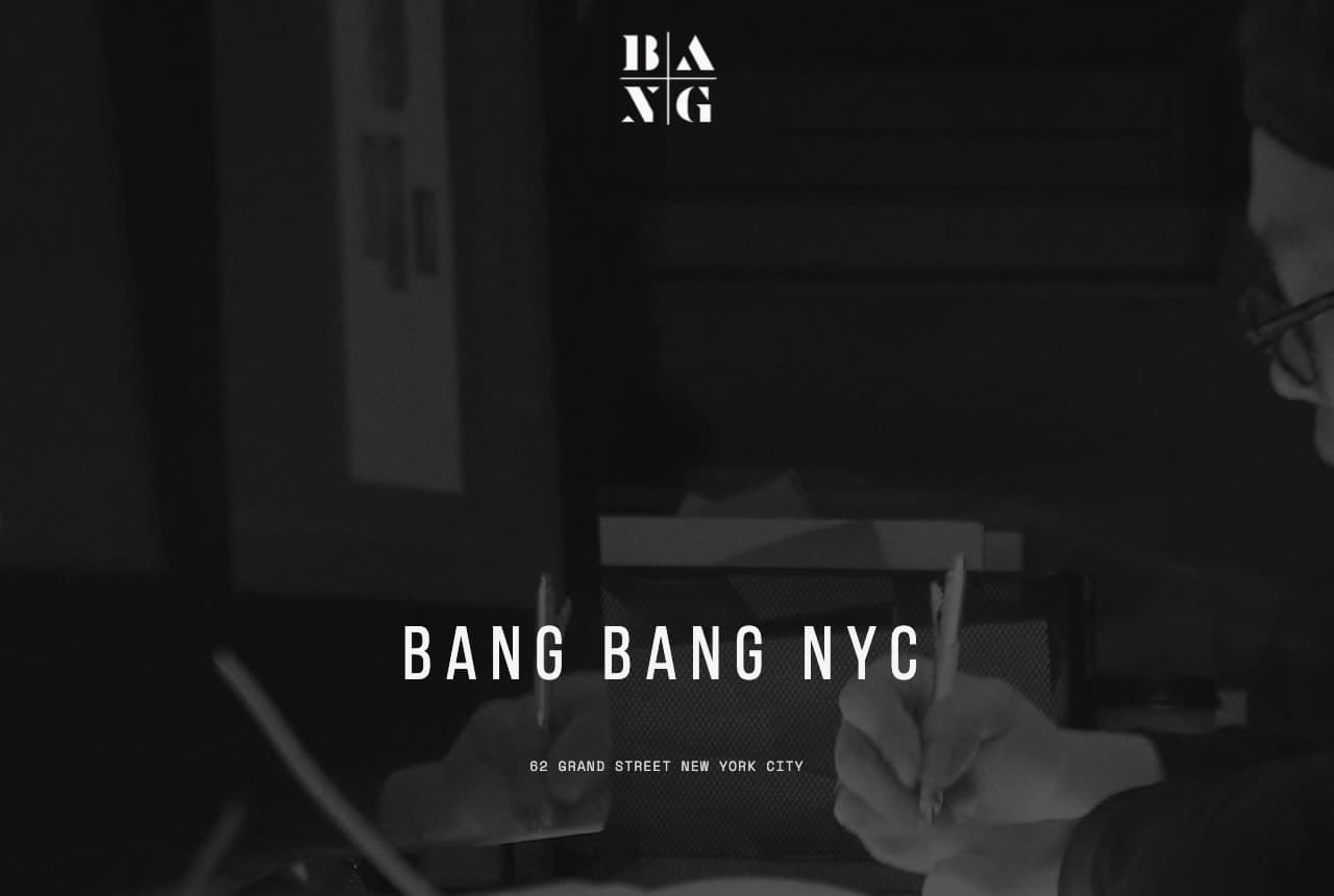
Bang Bang NYC has the most famous client list in tattooing and shows none of it above the fold: a black field, the stacked 'BANG / BANG' monogram, the name set wide in condensed capitals, and beneath it one line of tracked type — '62 GRAND STREET NEW YORK CITY'. That's the entire first screen. The confidence is the design: a studio that doesn't need to persuade you, only to tell you where it is. Every element is typographic, the spacing is generous, and the black reads as gallery rather than dungeon. Few studios can pull this off, but the lesson scales: when your reputation precedes you, restraint is the luxury signal. Bang Bang proves that an address can be a headline.

Visit Bang Bang NYC

Opens a similar Zarla design you can make yours.

Brilliance Tattoo website — Custom Studio design example
Real site · Boston, MA
  • Custom Studio
  • Calm

Brilliance Tattoo: Light, plants and thin capitals

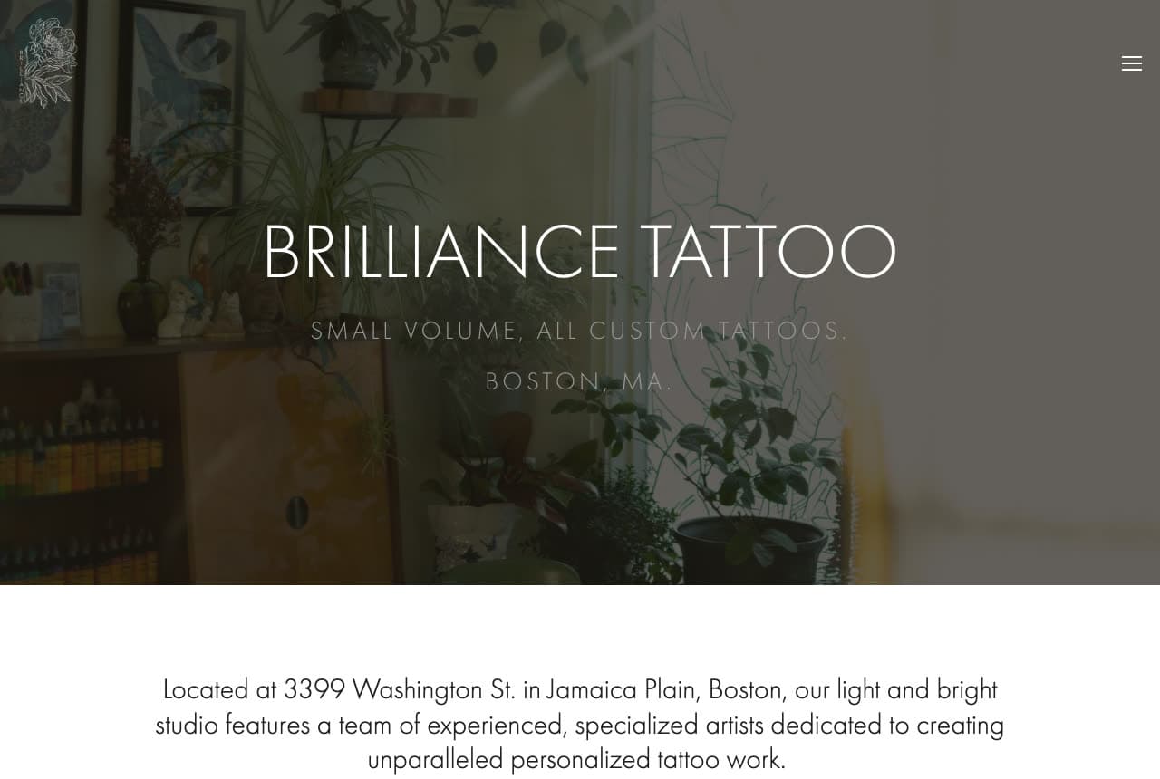
Brilliance Tattoo breaks the dark-studio convention on purpose: the hero is a photograph of the studio full of plants and daylight, with the name in thin white capitals — 'BRILLIANCE TATTOO' — and two lines that define the business, 'small volume, all custom tattoos' and 'Boston, MA'. The band below opens with the address ('Located at 3399 Washington St. in Jamaica Plain') and the phrase that matches the picture: 'our light and bright studio'. The message to a client is calm, considered, unhurried — the opposite of a walk-in shop — and the design says it before the copy does. Brilliance shows that 'custom only' can be signaled with light and greenery rather than with attitude.

Visit Brilliance Tattoo

Opens a similar Zarla design you can make yours.

Hidden Hand Tattoo website — Flash Studio design example
Real site · Seattle, WA
  • Flash Studio
  • Bold

Hidden Hand Tattoo: A logo sunburst instead of a photo

Hidden Hand Tattoo puts its logo where everyone else puts a photograph: under a yellow announcement bar (open daily 12–8, award-winning artists, the phone number) and a lean nav with a yellow 'Book Now', a maroon field with radiating sunburst lines and the hand-and-eye emblem centered like a poster, a small photograph of the storefront peeking in at the bottom corner. One scroll down comes a serif 'Book an Appointment' and the sentence that places the shop — 'located in the heart of Fremont, Seattle, The Center of the Universe' (the neighborhood's own nickname). The palette is a single deep red, a warm off-white and that one strip of yellow, and the nav is lean: Artists, About, Shop, FAQs, Blog, Contact, Book Now. It's a flash-sheet aesthetic turned into a homepage. Hidden Hand shows that a strong logo and one color can carry a hero when the work is one click away.

Visit Hidden Hand Tattoo

Opens a similar Zarla design you can make yours.

Love Always Tattoo website — Hand-Poke Studio design example
Real site · Yucca Valley, CA
  • Hand-Poke Studio
  • Gentle

Love Always Tattoo: Red script and a promise of care

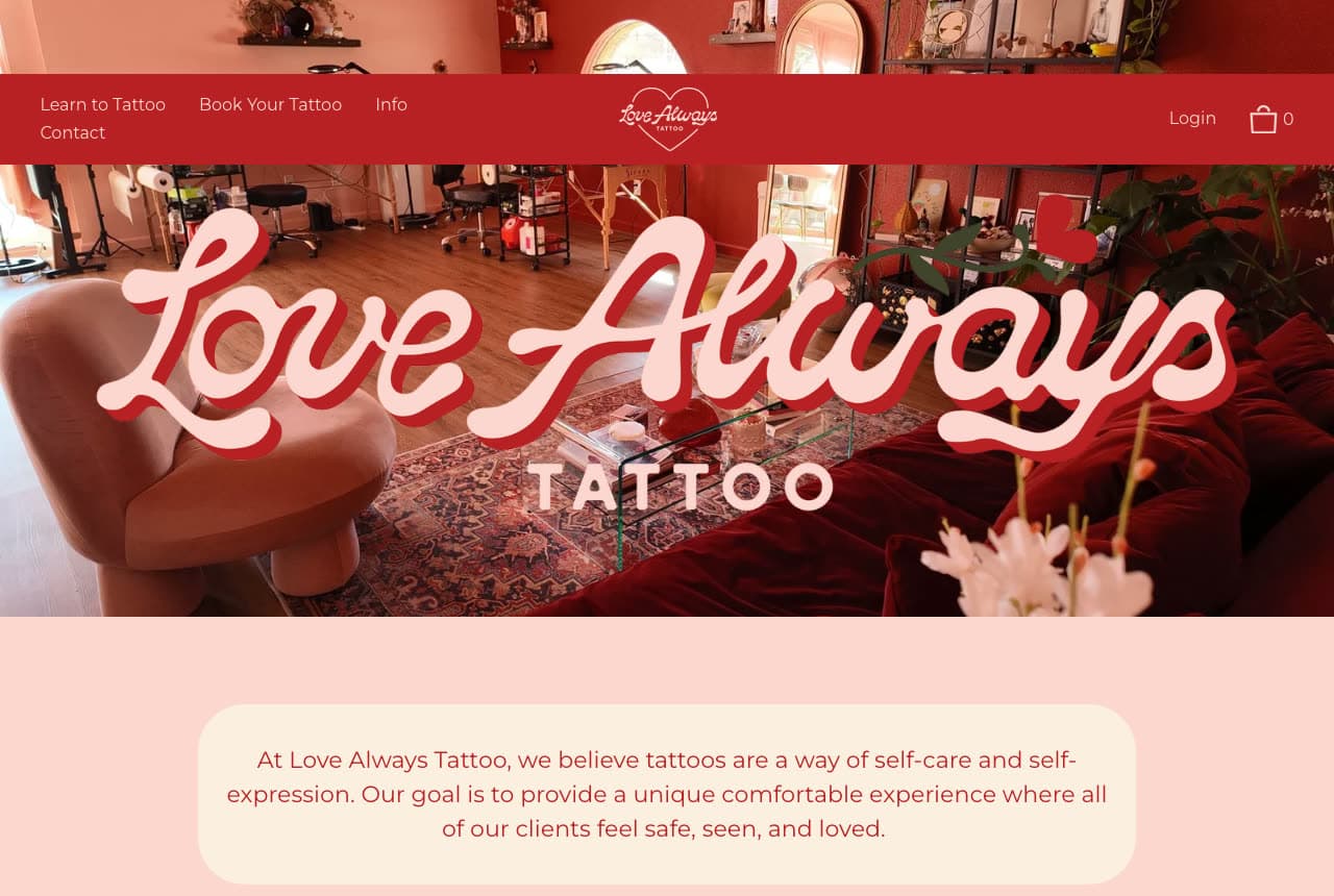
Love Always Tattoo looks like no other studio here because it means something different by tattooing: a red band with the name in looping pink script — 'Love Always' — over a photograph of the studio, then a pale pink card with the manifesto: 'we believe tattoos are a way of self-care and self-expression… where all of our clients feel safe, seen, and loved.' The nav reveals a hand-poke practice that also teaches ('Learn to Tattoo', 'Book Your Tattoo') and a shop. Red, pink and script are beauty-and-craft colors, not biker colors, and the copy matches the palette exactly. Love Always shows how a studio built on gentleness can make the whole page feel like the experience it sells.

Visit Love Always Tattoo

Opens a similar Zarla design you can make yours.

Kanvas Barber Studio — Adaptable Template website design you can build with Zarla
Build this with Zarla
  • Adaptable Template
  • Energetic

Kanvas Barber Studio: A gradient hero for design-led work

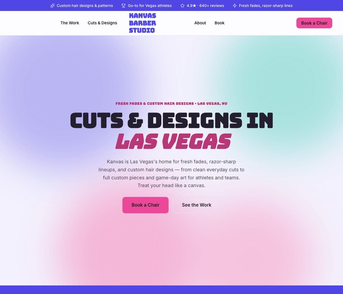
Kanvas Barber Studio is a Zarla template for a barber who does custom hair designs — the closest catalog cousin to a studio whose product is artwork on a person. A pink-to-violet gradient replaces the dark photo, the headline is set in wide capitals — 'CUTS & DESIGNS IN LAS VEGAS' — and the copy already speaks the language ('treat your head like a canvas'). Trust chips carry the proof (custom designs, a 4.9★ from 640+ reviews, 'go-to for Vegas athletes'), and two dark buttons offer 'Book a Chair' and 'See the Work'. Clone it, describe your studio, and the AI turns fades into fine line while the gradient and the design-first framing stay. Kanvas suits a studio that wants color and energy instead of black.

See this template
The Spotted Easel — Adaptable Template website design you can build with Zarla
Build this with Zarla
  • Adaptable Template
  • Welcoming

The Spotted Easel: The creative-studio hero, light and hands-on

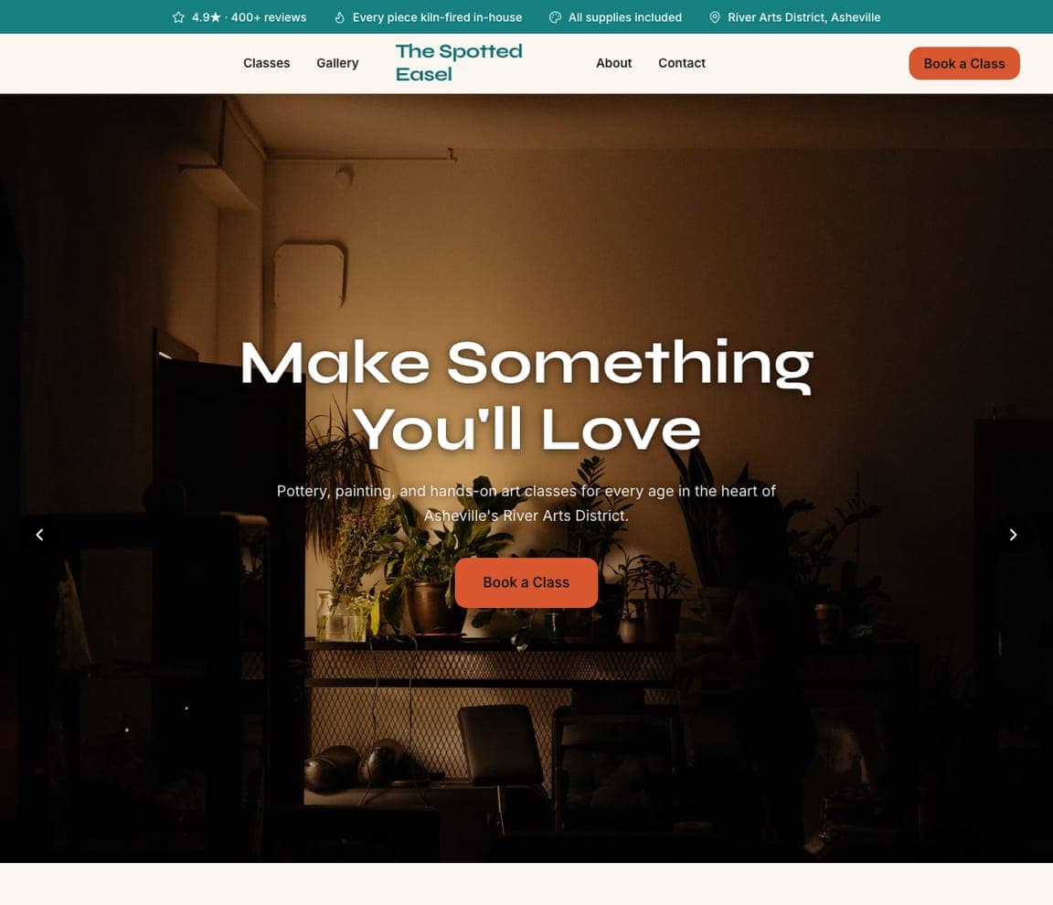
The Spotted Easel is a Zarla template for a pottery-and-painting studio — an art business, not a tattoo shop — and it's here for the studios that want Brilliance's light, welcoming register: a full-width photograph of hands at work, a headline that promises the feeling ('Make Something You'll Love'), a red 'Book a Class' button, and chips that name the practicals (4.9★ from 400+ reviews, supplies included, the neighborhood). Clone it, describe your studio, and the AI turns classes into consultations and kiln-firing into aftercare while the bright, hands-on structure stays. The Spotted Easel is the buildable version of the daylight tattoo studio.

See this template

Frequently asked

Where can I find good tattoo website examples?

Right here — this page curates tattoo website examples across the spectrum: famous studios like Bang Bang NYC and Atelier Eva, neighborhood shops like Ink & Dagger and Hidden Hand, private and boutique studios like Copperplate and Adored, and hand-poke and collective spaces like Love Always and Temperance (each linked so you can explore the live site), plus professionally designed Zarla studio templates you can clone and restyle. Every example includes a note on why the design works — the mood, the portfolio, the booking path — so you can copy the thinking, not just the look.

What makes a good tattoo website?

It shows the work, the room and the way in — in that order. A strong studio site leads with a photograph that sets the mood (the shopfront, the chairs, an artist at work), gives every artist a portfolio a collector can judge, and offers one obvious next step: pick an artist, book a consultation. The details that build trust are practical: the address, the hours, deposits and aftercare, all easy to find.

How much does a tattoo website cost?

A custom site from a designer typically runs into the thousands, and template builders charge roughly $16–$30 per month. An AI builder generates a complete, editable studio site for free and only charges (on the Premium plan) when you publish to your own domain — so you can build, load your portfolio and preview before spending anything.

Should a tattoo website be dark?

Dark is the category default and it works — Bang Bang, Temperance and Hidden Hand all use it — but it isn't a rule. Brilliance Tattoo goes light and plant-filled to say 'small volume, custom, calm'; Copperplate uses umber and taupe to say 'private studio'; Adored uses pink on black for cosmetic work. Choose the mood that matches the clients you want, then commit to it everywhere.

What pages does a tattoo website need?

Most studios need five: a home page that sets the mood and points to booking, an artists page with a portfolio per artist, a booking or consultation page with deposit and policy details, an aftercare page (clients search for it after the session), and a contact page with the address, hours and a map. Shops that sell flash or merch add a shop, as Ink & Dagger and Love Always do.

How do tattoo studios get more bookings from their website?

Make the artist choice easy and the first step small. The converting pattern above: a photo that sets the mood, an artist grid with real work, and a single button — 'Select Your Artist', 'Book Your Visit', 'Book an Appointment' — that leads to a consultation rather than a commitment. Ink & Dagger's searchable flash library is the extra move: it lets a client fall in love with a design before they've chosen a date.

You've seen what works. Now make it yours.

Describe your business and Zarla designs a complete, professional website in about 30 seconds — built to convert, just like the ones above.

Free to build and preview · no credit card · publish to your own domain on Premium