Inspiration · Transportation

The Best Transportation Website Examples, Explained

Looking for transportation website examples? These 9 are the best we could find — standout real transportation sites plus designs you can build with Zarla — and each comes with a breakdown of the specific design move that makes it work. Find a look you love and you can build a site in that exact style, free, in about 30 seconds.

Real sites + designs you can build with Zarla — free to build and preview, no credit card

What makes a great transportation website

The best transportation websites share a few moves: they earn trust fast, lead with strong visuals of the work, point to one clear action, and match the design to how their customers decide. Each example below calls out the specific choice worth stealing for your own transportation website.

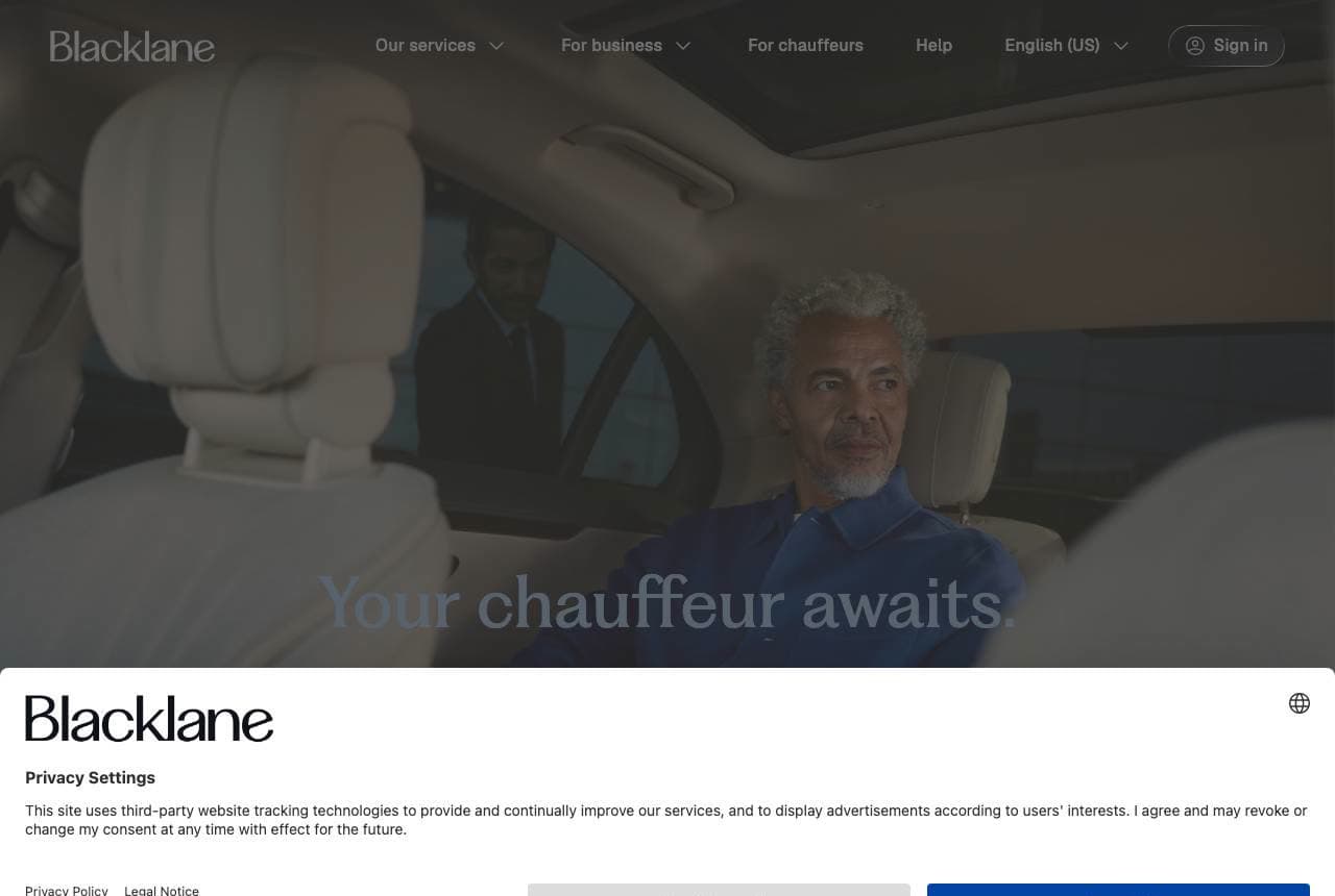
Blacklane website — Chauffeur Service design example
Real site · Global
  • Chauffeur Service
  • Luxe
  • Muted + navy

Blacklane: Luxury sold as calm, not horsepower

Blacklane sells global chauffeur service the way luxury hotels sell rooms — with feeling, not features: a serene video of a relaxed passenger in a spotless back seat, and the whispered promise 'Your chauffeur awaits… Arrive at your best.' No car specs, no price, no fleet grid — just the emotional payoff of arriving composed. The muted palette, generous space and minimal type read premium precisely because they leave so much out. For a high-end transport brand, the product isn't the vehicle, it's the state you're in when you step out of it, and the design commits entirely to that. It's the same subtraction-as-luxury instinct the best restaurants and hotels use. Sell the feeling on the other side of the ride, and let the restraint imply the price.

  • Sells the arrival feeling, not the car's features
  • Restraint and space imply premium without stating price
  • 'Arrive at your best' — the emotional payoff as the pitch

Steal this: Sell the state the customer's in AFTER your service, not the equipment. For premium, subtraction reads as luxury.

Bison Transport website — Freight Carrier design example
Real site · Calgary, AB
  • Freight Carrier
  • Corporate
  • Gold + charcoal

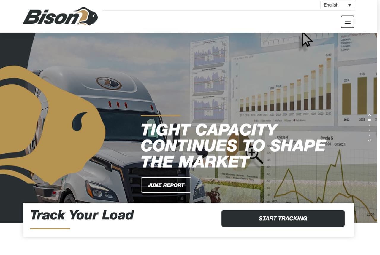
Bison Transport: Freight authority, dashboard and all

Bison Transport speaks fluent logistics-buyer: 'Tight Capacity Continues to Shape the Market' (a market-report headline, not a sales pitch) over a data-dashboard image, a prominent 'Track Your Load' widget, and a stat block that reads like a credential dossier — 350 border crossings/day, 1,300+ loads/day, 1.2M miles/day, <0.1% claims ratio, est. 1969. For B2B freight, the customer is a shipping manager evaluating reliability and scale, so the design leads with operational proof and a self-serve tracking tool rather than emotion. The market-report framing positions Bison as an industry thought-leader, not just a carrier. When you sell to professionals, the homepage should read like a capability statement: real operational numbers, a useful tool, and the vocabulary of the person signing the contract.

  • Market-report headline positions it as an industry authority
  • 'Track Your Load' self-serve tool serves the shipping manager
  • Operational stat dossier proves reliability and scale
Empire CLS website — Luxury Motor Coach design example
Real site · United States
  • Luxury Motor Coach
  • Executive
  • Black + gold

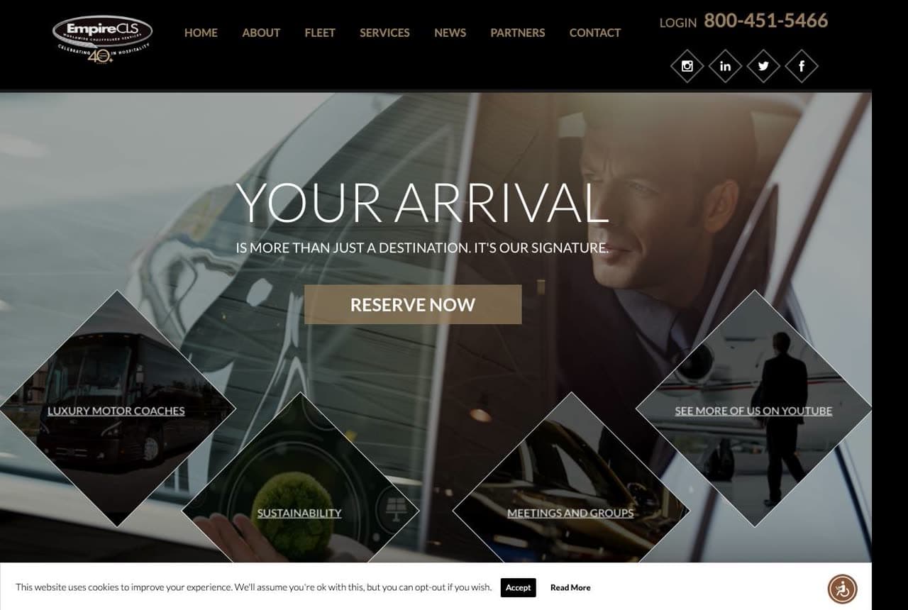
Empire CLS: Chauffeured travel as a signature

Empire CLS positions luxury ground travel as personal branding: 'Your Arrival Is More Than Just a Destination. It's Your Signature,' set over a dark, cinematic hero of a chauffeur and a diamond-shaped nav (Luxury Motor Coaches / Sustainability / Meetings and Groups / See More on YouTube). The near-black palette with gold accents reads executive and discreet, and 'Book a Reservation' with account login serves the repeat corporate client who books cars constantly. The tagline elevates a car ride into a statement about the passenger, which is exactly how you sell premium to executives and event planners who could just use a rideshare. The diamond nav signals a broad fleet (from sedans to motor coaches) for different occasions. Frame the mundane (a ride) as a reflection of the customer, and the price stops being the conversation.

  • 'It's your signature' makes a ride a statement about the rider
  • Dark + gold reads executive, discreet, repeat-corporate
  • Diamond nav signals a fleet for every occasion
DG Air Freight website — Hazmat Logistics design example
Real site · Australia
  • Hazmat Logistics
  • Specialist
  • Navy + red

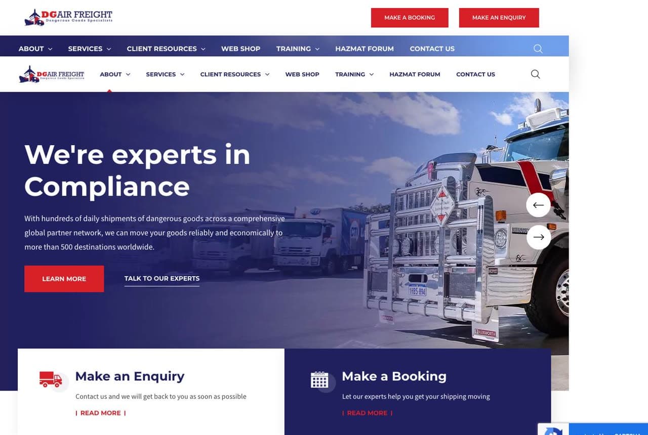
DG Air Freight: A niche most carriers won't touch

DG Air Freight owns a lane defined by difficulty: 'We're Experts in Compliance,' specializing in dangerous-goods transport — a regulatory minefield most freight companies avoid. The design leads with that specialty (hundreds of daily hazmat shipments, a global partner network, 500+ destinations), dual CTAs (Make an Enquiry / Make a Booking) for two readiness states, and an origin story that's a credential in itself: founded by ex-military Explosive Ordnance Disposal officers. In B2B logistics, the harder and more regulated the cargo, the fewer competitors and the higher the margin, so leading with 'compliance' and a hazmat specialty isn't a limitation — it's a moat. Naming the difficult thing you're certified for (and proving it with an unusual founder story) is how a freight company escapes commodity pricing.

  • 'Experts in compliance' turns a hard niche into a moat
  • Ex-military EOD founder story is itself a credential
  • Dual enquiry/booking CTAs catch two buyer states

Steal this: Lead with the hardest, most-regulated thing you're certified to do. Difficulty means fewer competitors and higher margins.

CitySprint website — Same-Day Courier design example
Real site · London, UK
  • Same-Day Courier
  • Functional
  • Blue + white

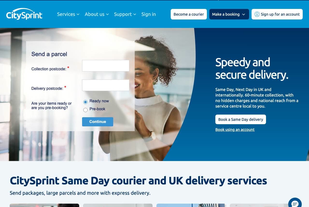
CitySprint: A booking form where the hero should be

CitySprint makes ordering a courier as fast as the promise: 'Speedy and Secure Delivery,' with a 'Send a Parcel' form (collection postcode, delivery postcode, ready-now or pre-book) sitting right in the hero, so a stressed shipper can start a same-day booking in seconds. Below, four service tiles map every delivery type (Same Day / Next Day / International / Medical) with a photo each, and 'Why choose CitySprint' handles the reassurance. For an on-demand courier, the conversion is the quote-and-book flow, so putting the postcode form front-and-centre — instead of a marketing hero — removes every step between arriving and booking. It's the same in-hero-form logic the best local movers use, applied to same-day delivery. When speed is the product, the booking form is the homepage.

  • Postcode booking form in the hero — book in seconds
  • Four service tiles map every delivery type at a glance
  • When speed is the product, the form IS the homepage
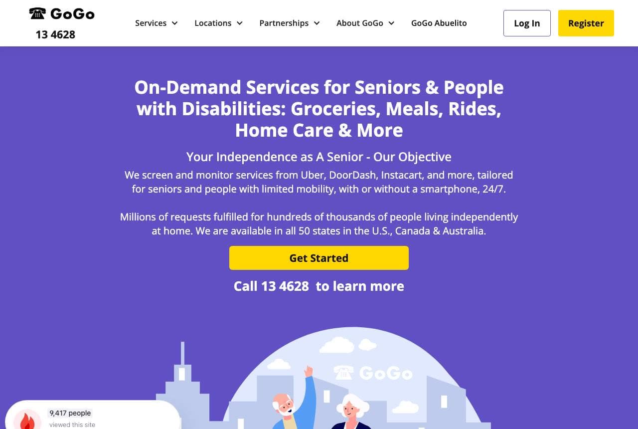
GoGoGrandparent website — Senior Transport design example
Real site · United States
  • Senior Transport
  • Accessible
  • Purple + white

GoGoGrandparent: Rideshare, translated for seniors

GoGoGrandparent solves a real gap with clarity: 'On-Demand Services for Seniors & People with Disabilities: Groceries, Meals, Rides, Home Care & More,' explaining that it screens and monitors Uber, DoorDash and Instacart 'with or without a smartphone, 24/7.' The whole design is built for the adult child arranging care for a parent — warm illustration of an older couple by a car, a phone number as prominent as the app (because many users don't use apps), and 'Millions of requests fulfilled… independent at home' plus a press bar (CBS, NYT, CNBC, Forbes) for trust. It's a masterclass in serving a specific, underserved audience by removing the exact barrier (the smartphone) that excludes them from mainstream services. Identify who the mass-market product leaves behind, then build the bridge — and put the phone number where the app button usually goes.

  • Phone number as prominent as the app — no smartphone required
  • Speaks to the adult child arranging a parent's care
  • Bridges seniors to rideshare the mass market excludes

Steal this: Serve who the mass-market product excludes, and remove the exact barrier (the app). Put the phone number where the app button goes.

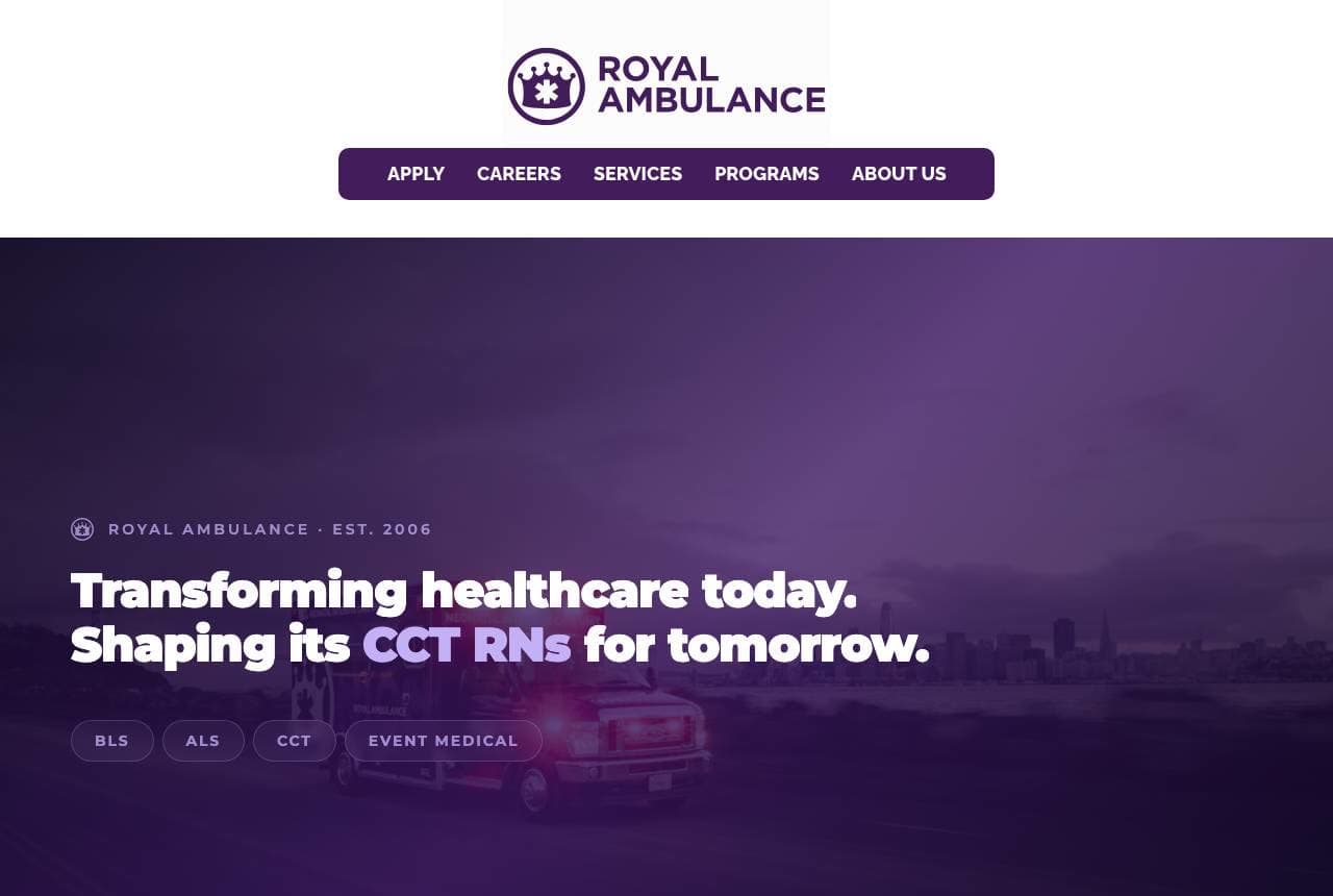
Royal Ambulance website — Medical Transport design example
Real site · Bay Area, CA
  • Medical Transport
  • Mission-Led

Royal Ambulance: Medical transport pitched to recruits

Royal Ambulance makes an unusual choice for a transport company: its homepage sells to future employees as much as clients — 'Transforming Healthcare Today. Shaping its CCT RNs for Tomorrow,' with service-level tags (BLS / ALS / CCT / Event Medical), a stat bar (20+ years, 150+ ambulances, 1,000+ team members, a live '278 transports today' counter), and 'Join Our Team' beside 'Who We Are.' In healthcare transport, growth is gated by hiring qualified staff, so the design treats recruitment as a primary funnel — a genuinely smart read of where the business's real bottleneck is. The deep-purple palette and live-counter dynamism make a serious medical service feel modern and mission-driven. When your growth constraint is talent, not customers, let the homepage recruit — the clients will trust a company people want to work for.

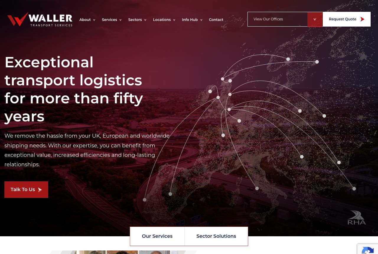
Waller Transport website — Freight Logistics design example
Real site · United Kingdom
  • Freight Logistics
  • Established

Waller Transport: Fifty years, and the people who deliver

Waller Transport leads with longevity and, unusually, with faces: 'Exceptional Transport Logistics for More Than Fifty Years' over a deep-red network-map hero, then a section titled 'The Right People to Deliver' built from a grid of real staff portraits. In freight — a category that usually hides behind trucks and abstract logistics imagery — showing the actual team is a differentiator that reads as accountability and relationship, exactly what a business shipper wants from a long-term haulage partner. The 'more than fifty years' claim does the reliability work, the network-map hero signals reach (UK, European, worldwide), and 'Request Quote' keeps the B2B path clear. Heritage plus a human face is a strong pairing for a logistics firm competing on trust rather than the lowest per-mile rate.

Metro Express Shuttle — Shuttle Service website design you can build with Zarla
Build this with Zarla
  • Shuttle Service
  • Dependable

Metro Express Shuttle: Premier shuttle, proof up front

Metro Express Shuttle is Zarla's transportation template, and its proof-strip hero lands the register a passenger-transport business needs: 'Chicago's Premier Shuttle Service' with trust markers on first paint, in a navy-and-amber palette that reads dependable and professional. It borrows the right instincts from this gallery — the city-claim specificity (like Empire and Blacklane's premium positioning, scaled to a local shuttle) and a clear booking path. The structure carries a fleet/services breakdown, a why-us trust section, and a reservation CTA — exactly what an airport shuttle, corporate transport or charter service needs to convert a booking. Swap in your own city, fleet photos and service list and you have a credible transport site in about 30 seconds, no photographer or designer required.

See this template

Frequently asked

Where can I find good transportation website examples?

Right here — this page curates transportation website examples two ways: standout real businesses (each linked, so you can explore the live site) and professionally designed Zarla templates you can clone and make your own. Every example comes with a note on why the design works — trust signals, layout, calls to action — so you can copy the move, not just the look.

What makes a good transportation website?

A good transportation website earns trust in the first few seconds, leads with strong visuals of the work, gives visitors one obvious action, and loads fast on a phone. Every design below leads with proof and a single clear call to action rather than a wall of text.

How much does a transportation website cost?

A custom transportation website from a designer typically runs into the thousands up front, and template builders charge roughly $16–$30 per month. An AI builder generates a complete, editable design for free and only charges (on the Premium plan) when you publish to your own domain — so you can build and preview before spending anything.

Do I need a designer to build a transportation website?

No. Several designs on this page were generated by Zarla and are fully editable — you describe your business and get a complete, professionally designed site in about 30 seconds, then refine it by chatting. Building and previewing is free; publishing to your own domain needs the Premium plan.

What pages does a transportation website need?

Most transportation businesses need just a few: a home page that proves trust and points to one clear action, an about page that puts a face to the business, a services or work page that shows what you do, and a contact page with a form and a phone number. Local businesses also benefit from location or service-area pages that help them show up in nearby searches.

How do I get more customers from my transportation website?

Lead with proof in the first few seconds (reviews, real photos, results), make one action obvious on every screen (call, book, or enquire), and keep it fast on mobile — most visitors arrive on a phone. The designs above each do this differently, but they all earn trust early and remove friction from the next step.

You've seen what works. Now make it yours.

Describe your business and Zarla designs a complete, professional website in about 30 seconds — built to convert, just like the ones above.

Free to build and preview · no credit card · publish to your own domain on Premium