Inspiration · Travel Agency

The Best Travel Agency Website Examples, Explained

Looking for travel agency website examples? These 9 are the best we could find — standout real travel agency sites plus designs you can build with Zarla — and each comes with a breakdown of the specific design move that makes it work. Find a look you love and you can build a site in that exact style, free, in about 30 seconds.

Real sites + designs you can build with Zarla — free to build and preview, no credit card

What makes a great travel agency website

The best travel agency websites share a few moves: they earn trust fast, lead with strong visuals of the work, point to one clear action, and match the design to how their customers decide. Each example below calls out the specific choice worth stealing for your own travel agency website.

Flash Pack website — Group Adventure design example
Real site · London, UK
  • Group Adventure
  • Community-Led
  • Navy + coral

Flash Pack: A niche defined by who, not where

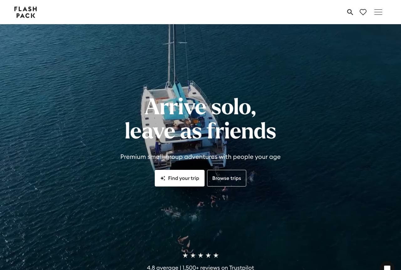
Flash Pack sells travel by defining its customer, not its destinations: 'Arrive solo, leave as friends — premium small-group adventures with people your age,' over a moody sailboat-at-dusk hero, with a Trustpilot 4.8 and a clear 'How it works' explainer (join a group of 30-49-year-olds, unique experiences, a trusted pack leader, premium stays). The positioning is razor-sharp — solo travellers in their 30s and 40s who want adventure without the backpacker-hostel crowd or a couples-only vibe — and every element reinforces it. Naming the exact age band and the emotional payoff ('leave as friends') speaks directly to a lonely-but-adventurous professional in a way 'group tours' never could. When your differentiator is the community you create rather than the places you go, lead with the people and the feeling, and let the itineraries follow.

  • Defines the customer (solo, 30s-40s), not the destinations
  • 'Leave as friends' sells the community, not the itinerary
  • 'How it works' explainer de-risks an unfamiliar format

Steal this: Define your niche by WHO, not where ('solo travellers, your age'). A named community converts better than a destination list.

Fora Travel website — Advisor Platform design example
Real site · New York, NY
  • Advisor Platform
  • Modern
  • Warm + navy

Fora Travel: The modern advisor network, in numbers

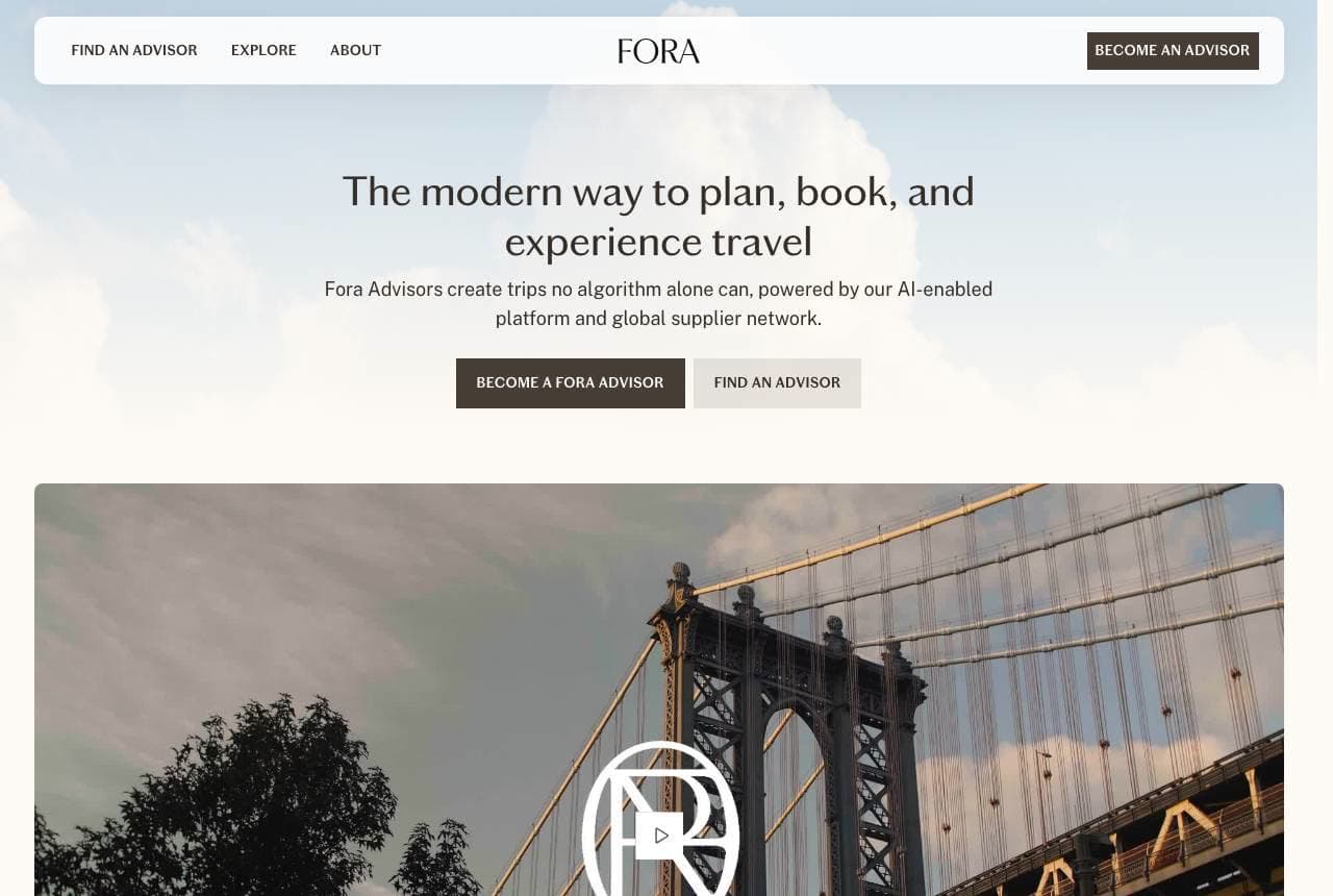
Fora Travel reframes the travel agency for 2026: 'The Modern Way to Plan, Book, and Experience Travel,' explaining that Fora Advisors 'create trips no algorithm alone can, powered by our AI-enabled platform and global supplier network.' Two audiences get their own doors — 'Become a Fora Advisor' (recruiting the supply side) and 'Find an Advisor' (the demand side) — because Fora is a two-sided marketplace, and a stat bar ($2.5B booked, 15k+ active advisors, 400k+ travellers served) proves platform scale. The 'human expert + AI platform' framing directly answers the existential question of the travel-agent era ('why not just use an algorithm?'), positioning human advisors as the premium layer on top of technology. When your business is a platform, show the two-sided value and the scale numbers, and name explicitly why humans still beat the algorithm.

  • Two doors serve both sides of the advisor marketplace
  • Stat bar ($2.5B, 15k advisors) proves platform scale
  • 'Human + AI' framing answers 'why not just an algorithm?'
Scott Dunn website — Luxury Travel design example
Real site · London, UK
  • Luxury Travel
  • Cinematic
  • Teal + white

Scott Dunn: Forty years of luxury, cinematically shot

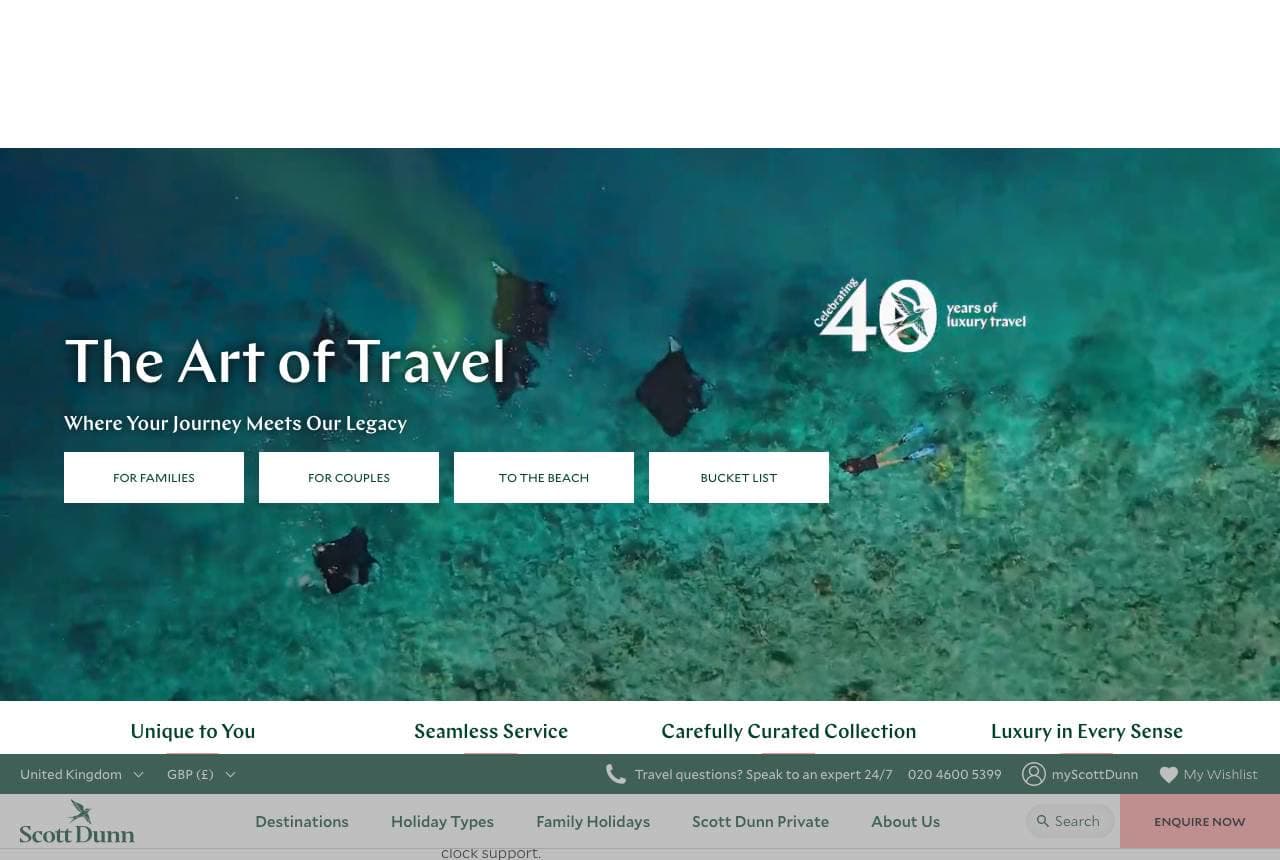
Scott Dunn leads like a luxury film: 'The Art of Travel — Where Your Journey Meets Our Legacy,' set over a mesmerising aerial of manta rays gliding through turquoise water, with a 'Celebrating 40 years of luxury travel' seal and four intent-based doors (For Families / For Couples / To the Beach / Bucket List). The extraordinary hero footage does the aspirational heavy-lifting — you want to be wherever that water is — while the '40 years' legacy and a value strip (Unique to You / Seamless Service / Carefully Curated / Luxury in Every Sense) establish trust and pedigree. Routing by trip intent (family vs couple vs bucket-list) rather than by destination matches how luxury travellers actually think about a holiday. For high-end travel, the single most breathtaking piece of footage you own belongs in the hero, with heritage and intent-based navigation right beneath it.

  • Breathtaking aerial footage does the aspirational selling
  • '40 years' legacy establishes luxury pedigree
  • Intent-based doors (family/couple/beach) match how travellers think

Steal this: Put your single most breathtaking piece of footage in the hero. In travel, the image that makes people want to BE there does the selling.

Nordic Visitor website — Regional Specialist design example
Real site · Reykjavík, IS
  • Regional Specialist
  • Practical
  • Teal + white

Nordic Visitor: Regional specialist, destination-tiled

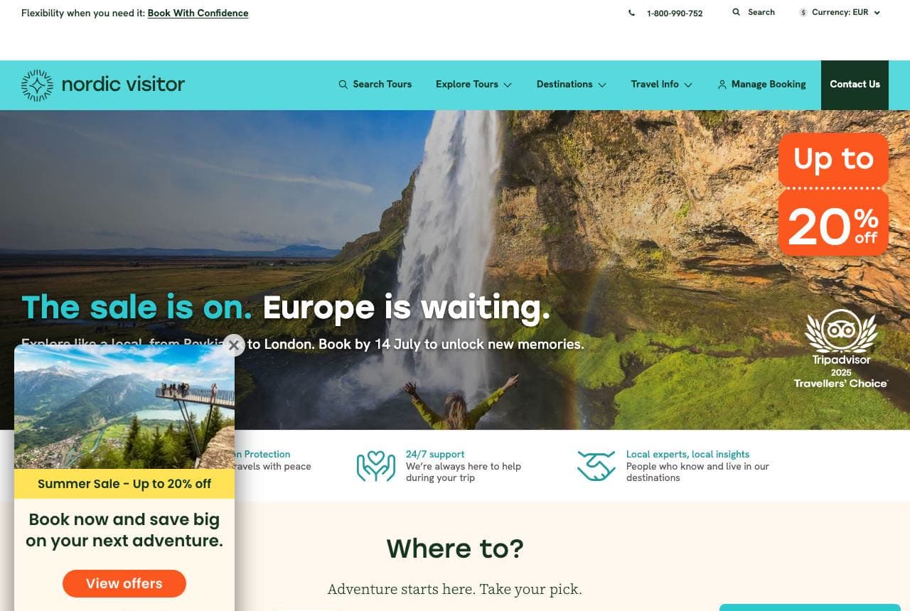
Nordic Visitor owns a geography and organizes around it: 'Europe is waiting… explore like a local,' with a row of destination tiles (Iceland, Scandinavia, Norway, Scotland, Ireland, Alps) as the primary navigation, plus 'local experts, local insights — people who know and live in our destinations' and a 'Book with Confidence' assurance. Specializing in the Nordics (rather than being a do-everything agency) lets the brand claim genuine on-the-ground expertise, and the destination-tile UX matches exactly how a traveller planning a Scandinavia trip browses — pick the place, then the trip. 'Explore like a local' plus real local staff is the differentiator against a generic global booking site. When you specialize in specific regions, make the destinations themselves the navigation and prove you actually live there.

  • Destination tiles as primary nav match how travellers browse
  • 'Local experts who live there' is the specialist's real moat
  • Regional focus beats do-everything for genuine expertise
Ciao Bambino website — Family Travel design example
Real site · United States
  • Family Travel
  • Warm
  • Soft + editorial

Ciao Bambino: Family travel, expertly and warmly framed

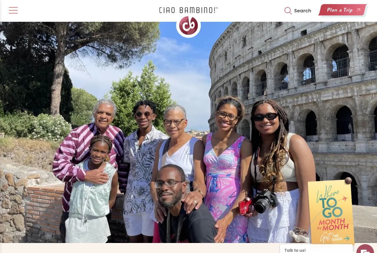
Ciao Bambino carves out family travel with heart and credibility: 'A Luxury Family Travel Agency — Powered by Human Experts,' over a joyful multi-generational family photo at the Colosseum, with copy that names the real motive — 'we believe travel isn't just about the destination, it's about meaningful moments shared with loved ones and memories that last a lifetime.' Two decades of expertise and 'design inspired, personalized getaways that widen horizons' establish authority in the specific, high-stakes niche of travelling with kids (where a bad trip is expensive and exhausting). The warm, real family imagery makes the specialty credible, and 'powered by human experts' reassures parents they're getting judgement, not a booking engine. When your niche is emotionally loaded (family memories), pair genuine expertise with imagery that shows the actual joy you're promising.

  • Owns the high-stakes family-travel niche with real expertise
  • 'Memories that last a lifetime' names the emotional motive
  • Real multi-gen family photo makes the specialty credible
Adams & Butler website — Bespoke Luxury design example
Real site · Dublin, IE
  • Bespoke Luxury
  • Refined
  • Aqua + white

Adams & Butler: Bespoke luxury, Virtuoso-backed

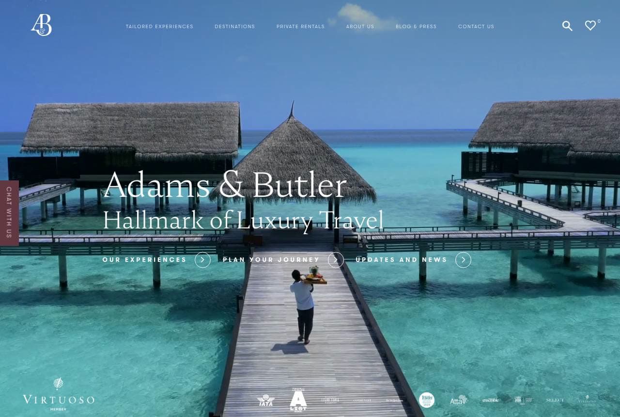
Adams & Butler positions at the very top of the market: 'Hallmark of Luxury Travel,' over a serene overwater-bungalow boardwalk, with a Virtuoso membership badge (the luxury-travel network's seal of approval) and copy promising 'magical memories, bespoke experiences… diverge from the typical tourist destinations in favour of unique, authentic experiences.' The Virtuoso affiliation is the load-bearing trust signal — it instantly tells affluent travellers this agency has elite supplier access and vetting most don't. The dreamy, aspirational photography and refined type reinforce the premium tier, and 'bespoke' plus 'diverge from typical' promises the tailored, exclusive itineraries luxury clients pay for. When you operate at the luxury end, industry affiliations (Virtuoso, Traveller Made) are worth displaying prominently — they're credentials your target client specifically recognizes and trusts.

  • Virtuoso badge signals elite supplier access to affluent clients
  • 'Diverge from typical destinations' promises exclusivity
  • Overwater-bungalow photography sets the premium tier
Aroha Tours website — Destination Specialist design example
Real site · New Zealand
  • Destination Specialist
  • Scenic

Aroha Tours: One country, privately, completely yours

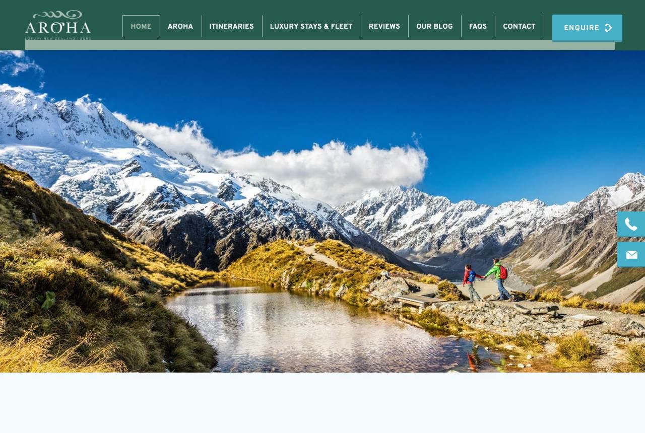
Aroha Tours specializes with total conviction: 'New Zealand, Privately Guided. Completely Yours.' over a stunning alpine-lake landscape, with 'luxury New Zealand travel with your private driver-guide' and 'we construct a creative and inspired itinerary for each individual or group.' Focusing on a single country as a private-guide specialist is a powerful position — it promises deep local knowledge and a fully personalized, exclusive experience that a multi-country agency can't match. The breathtaking NZ scenery does the aspirational work (the country sells itself), while 'privately guided' and 'completely yours' sell the premium, tailored service layer on top. For a destination specialist, letting the landscape be the hero while the copy promises private, bespoke access is the ideal division of labour. Own one country, guide it personally, and the scenery closes the sale.

River Oaks Travel website — Concierge Agency design example
Real site · Houston, TX
  • Concierge Agency
  • Boutique

River Oaks Travel: Concierge framing and a personal offer

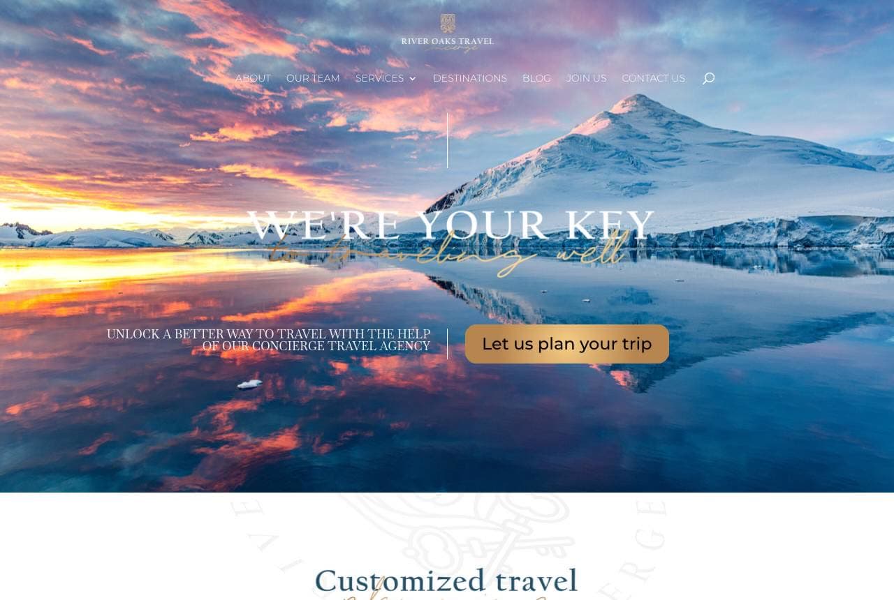
River Oaks Travel positions as a personal concierge for the modern traveller: 'We're Your Key to Travel,' in an elegant script over a dramatic sunset-mountain scene, with 'unlock a better way to travel with the help of our concierge travel agency' and a warm 'Let us plan your trip' CTA. A gold lion crest and 'Concierge Travel Agency for the Modern Traveler' establish a boutique, high-touch brand, and 'Customized travel planning is our calling card… whether you prefer to communicate by phone, email, virtual zoom meeting or in-office' meets clients however they want to connect. The 'key' metaphor (echoed in the crest) gives the brand a memorable, ownable symbol. For a boutique agency competing on personal service, the concierge framing plus flexible, human contact options is exactly what differentiates it from an impersonal booking site. Sell access and attention, branded around one strong symbol.

Wayfare Travel Co. — Travel Agency website design you can build with Zarla
Build this with Zarla
  • Travel Agency
  • Wanderlust

Wayfare Travel Co.: The world, designed around you

Wayfare Travel Co. is Zarla's travel-agency template, and its carousel hero rotates through aspirational destinations under 'The World, Designed Around You' — the bespoke, personalized promise this whole gallery proves matters (echoing Scott Dunn's 'designed around you' and Aroha's 'completely yours'). The teal-and-coral palette reads warm and wanderlust-y, and the carousel format lets one hero showcase multiple destinations, exactly what a travel business wants to sell. The structure carries featured trips or destinations, an about/expertise section, and an enquiry CTA — the consultation-led path a travel agent needs (travel is a high-consideration purchase closed by a conversation, not a cart). Swap in your own destination imagery and it's a credible, wanderlust-inducing travel-agency site in about 30 seconds — no photographer or designer required.

See this template

Frequently asked

Where can I find good travel agency website examples?

Right here — this page curates travel agency website examples two ways: standout real businesses (each linked, so you can explore the live site) and professionally designed Zarla templates you can clone and make your own. Every example comes with a note on why the design works — trust signals, layout, calls to action — so you can copy the move, not just the look.

What makes a good travel agency website?

A good travel agency website earns trust in the first few seconds, leads with strong visuals of the work, gives visitors one obvious action, and loads fast on a phone. Every design below leads with proof and a single clear call to action rather than a wall of text.

How much does a travel agency website cost?

A custom travel agency website from a designer typically runs into the thousands up front, and template builders charge roughly $16–$30 per month. An AI builder generates a complete, editable design for free and only charges (on the Premium plan) when you publish to your own domain — so you can build and preview before spending anything.

Do I need a designer to build a travel agency website?

No. Several designs on this page were generated by Zarla and are fully editable — you describe your business and get a complete, professionally designed site in about 30 seconds, then refine it by chatting. Building and previewing is free; publishing to your own domain needs the Premium plan.

What pages does a travel agency website need?

Most travel agency businesses need just a few: a home page that proves trust and points to one clear action, an about page that puts a face to the business, a services or work page that shows what you do, and a contact page with a form and a phone number. Local businesses also benefit from location or service-area pages that help them show up in nearby searches.

How do I get more customers from my travel agency website?

Lead with proof in the first few seconds (reviews, real photos, results), make one action obvious on every screen (call, book, or enquire), and keep it fast on mobile — most visitors arrive on a phone. The designs above each do this differently, but they all earn trust early and remove friction from the next step.

You've seen what works. Now make it yours.

Describe your business and Zarla designs a complete, professional website in about 30 seconds — built to convert, just like the ones above.

Free to build and preview · no credit card · publish to your own domain on Premium