Inspiration · Veterinarian

The Best Veterinarian Website Examples, Explained

These are some of the best veterinarian website designs we could find — a mix of standout real clinics and a design you can build with Zarla — and instead of just showing them off, we explain why each one works. Going to the vet is stressful for pets and owners alike, so watch how the best sites lead with reassurance — a warm photo, easy booking, and a specific promise like Fear-Free or same-day access — before anything clinical. And notice the modern practices reframing the vet as a membership or wellness brand. Then make the Zarla design your own, free, in about a minute.

Real sites + designs you can build with Zarla — free to build and preview, no credit card

What makes a great veterinarian website

The best vet sites do three things fast. They reduce anxiety on sight — a warm photo of real staff and pets, and calm colors, do more than any 'compassionate care' line. They answer the owner's real worries — access (same-day, walk-ins, hours), cost (membership, transparent pricing), and a pet's fear (Fear-Free certification). And they make booking the one obvious action, since a worried owner wants help now. The modern standouts go further and reframe the practice as a membership or whole-pet wellness brand. Everything below is a variation on those moves; pick the one that fits the clients you want.

Small Door Veterinary website — Veterinarian design example
Real site · New York, NY
  • Veterinarian
  • Membership
  • Warm + modern

Small Door Veterinary: Membership care, designed like a lifestyle brand

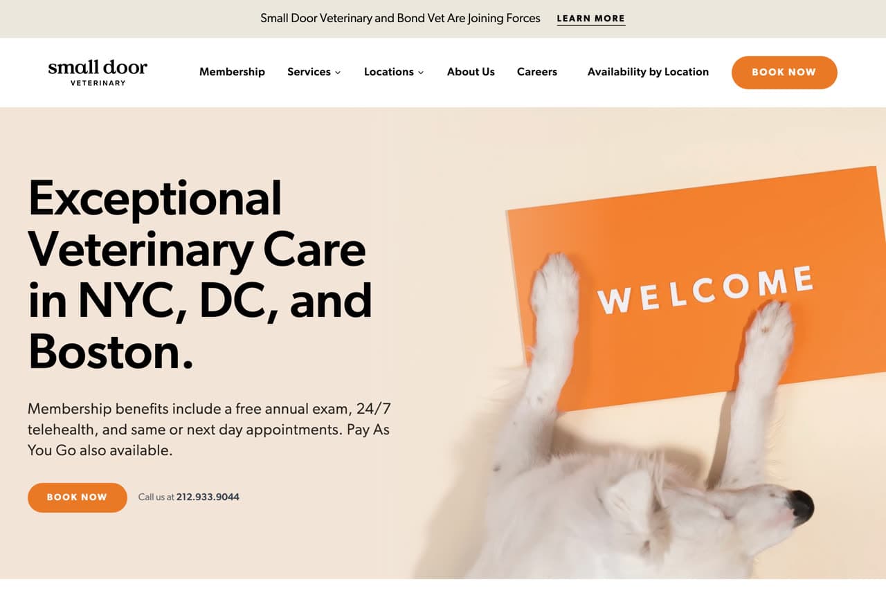
Small Door Veterinary rebuilds the vet visit as a modern membership experience, and the design sells it. 'Exceptional Veterinary Care in NYC, DC, and Boston' over a clean, warm hero — an orange 'WELCOME' mat with a dog's paws on it — feels more like a boutique wellness brand than an animal hospital. The membership benefits (a free annual exam, 24/7 telehealth, same-or-next-day appointments) are surfaced immediately, answering a pet parent's real friction: access and cost predictability. The warm palette and considered photography signal calm, not clinical stress. The lesson is category disruption through design: by looking and operating like a premium consumer membership rather than a traditional clinic, Small Door justifies a recurring fee and attracts the modern pet owner who expects a better experience. Look like the brand you want to be.

  • A membership framing, presented like a wellness brand
  • Benefits (telehealth, same-day) answer access + cost worries
  • Warm design signals calm, not clinical stress

Steal this: Present your practice like a premium membership brand — the modern pet owner expects a better experience, not a clinic.

Modern Animal website — Veterinarian design example
Real site
  • Veterinarian
  • Modern
  • Warm + tech

Modern Animal: 'For the animal people' — belonging as the pitch

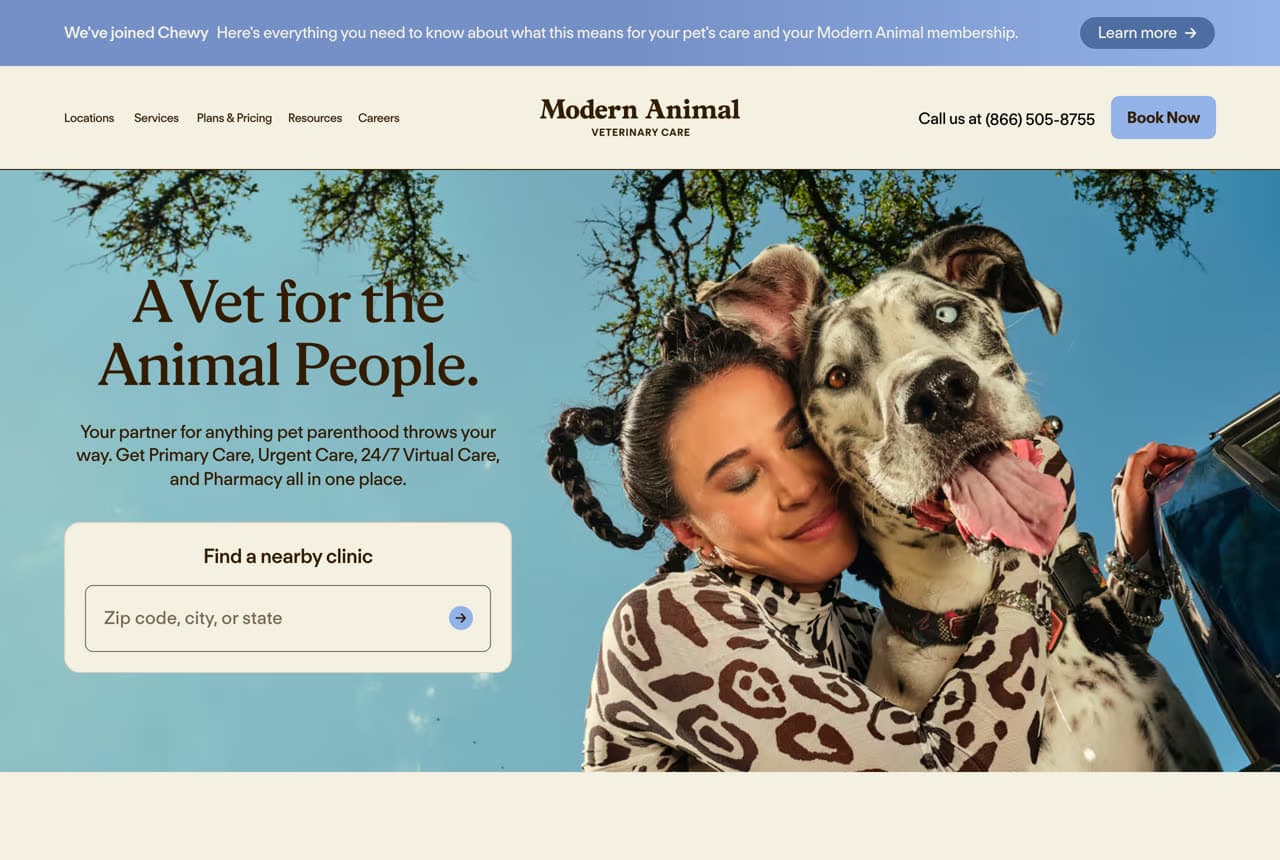
Modern Animal leads with identity, not services. 'A Vet for the Animal People' over a genuinely warm photo of a woman hugging two dogs speaks to how devoted pet owners see themselves, and the subhead bundles the whole offer — 'primary care, urgent care, 24/7 virtual care, and pharmacy all in one place.' A 'find a nearby clinic' search sits right in the hero for the ready-to-book. It's a tech-forward, membership-model practice that deliberately looks like a warm consumer brand rather than a sterile clinic. The lesson is emotional positioning: 'the animal people' makes a pet owner feel seen and understood before a single service is read, and the all-in-one bundling reassures on convenience. Sell belonging first, logistics second.

  • 'The animal people' makes the owner feel seen
  • Bundles primary + urgent + virtual + pharmacy in one line
  • A clinic-finder in the hero converts the ready buyer
Bond Vet website — Veterinarian design example
Real site
  • Veterinarian
  • Friendly
  • Bright + coral

Bond Vet: Bright, friendly, and open when you need it

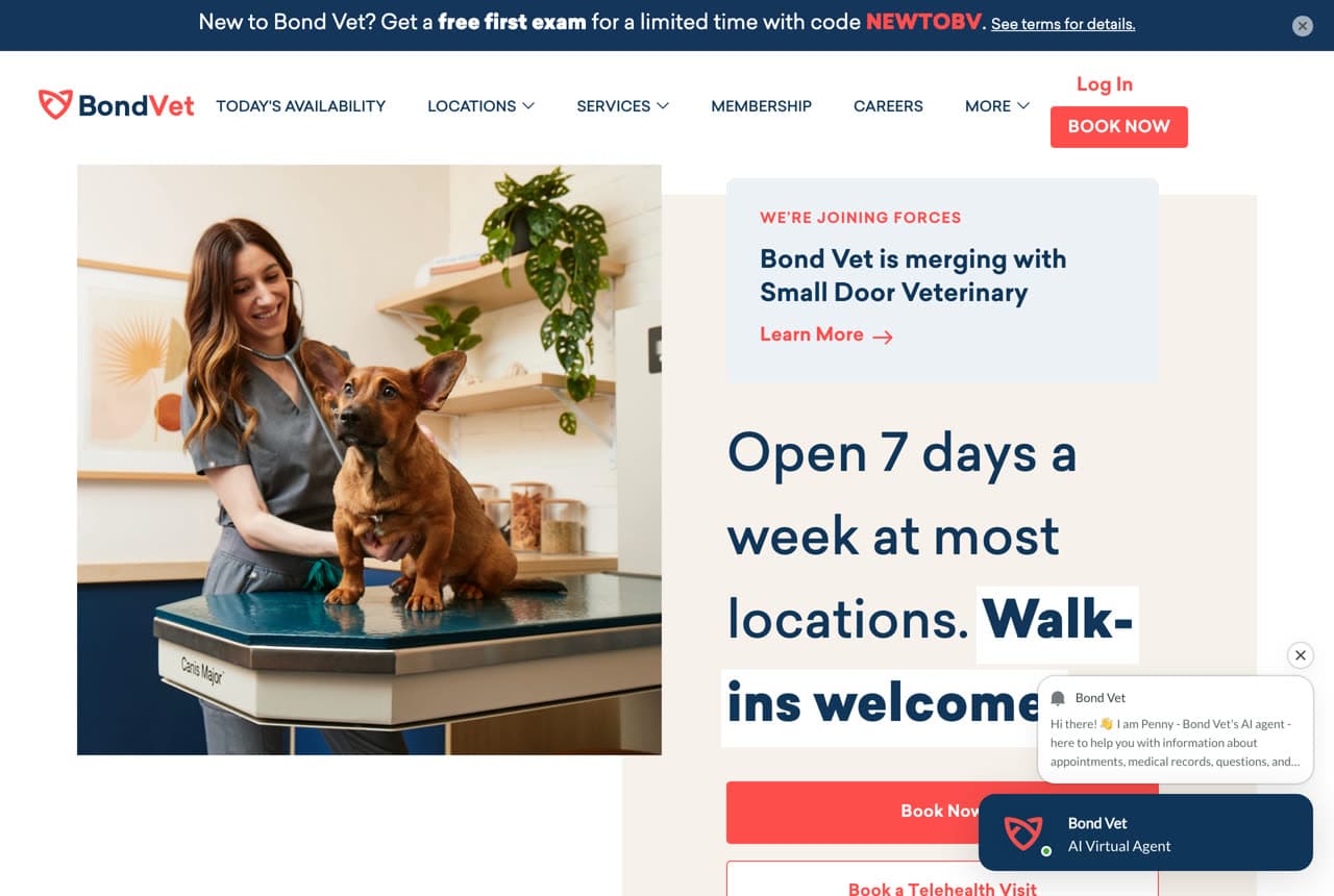
Bond Vet answers the two things a stressed pet owner cares about in an emergency — availability and approachability — right in the hero. 'Open 7 days a week at most locations. Walk-ins welcome' over a bright, friendly photo of a vet with a dog, in a clean palette with a warm coral accent that feels reassuring rather than clinical. The whole brand is engineered to reduce the anxiety of a sick-pet moment: easy access, no cold waiting-room dread, a phone that (famously) never rings in the clinic. The lesson is leading with your operational edge for an urgent service: when a pet owner is worried, 'open 7 days, walk-ins welcome' is more persuasive than any list of services, and a bright, friendly design tells them this won't be a stressful experience.

  • 'Open 7 days, walk-ins welcome' answers the urgent worry
  • A bright, friendly palette reduces sick-pet anxiety
  • Lead with access for an urgent, emotional service
Heart + Paw website — Veterinarian design example
Real site
  • Veterinarian
  • Wellness
  • Calm green

Heart + Paw: Widening 'vet' into whole-pet wellness

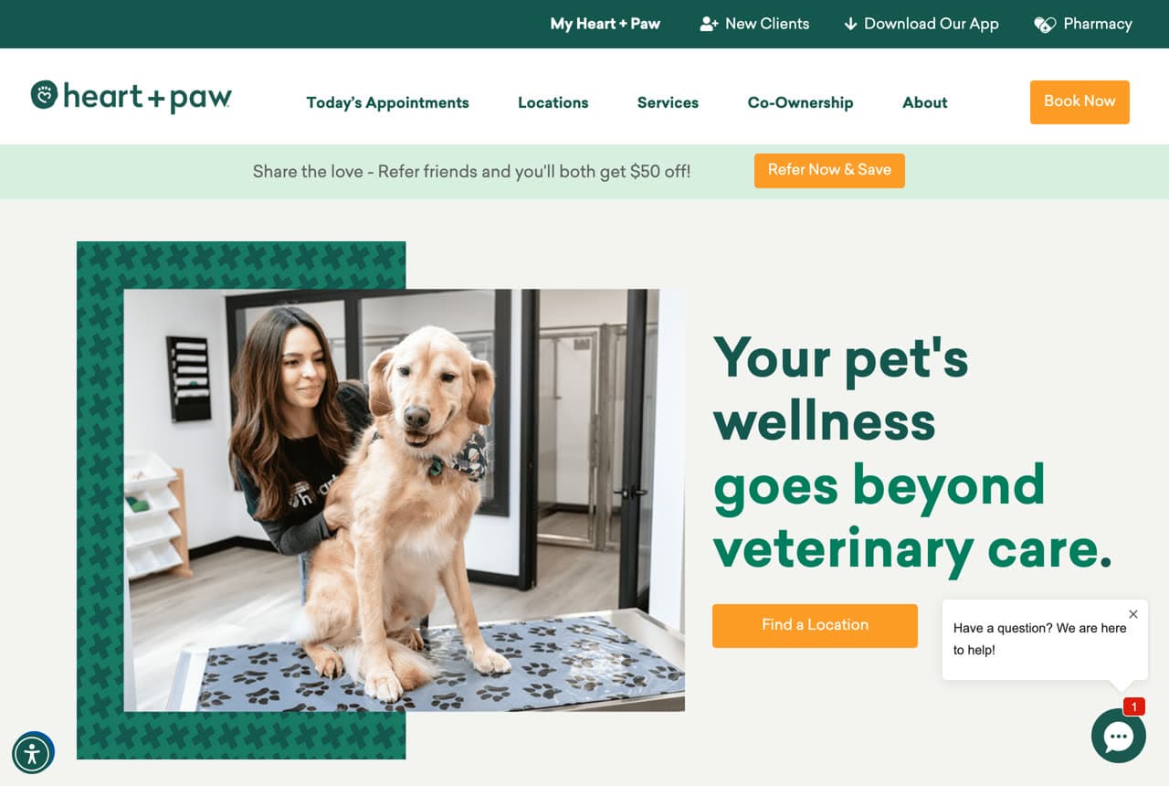
Heart + Paw expands the category from treatment to lifestyle. 'Your pet's wellness goes beyond veterinary care' over a warm photo of an owner and dog, in a calm green palette, pitches a practice that bundles vet care with grooming, daycare, and boarding — a one-stop relationship rather than a once-a-year sick visit. That widening is strategic: it turns an infrequent, reluctant purchase (the vet) into a recurring, positive one (wellness and daycare), deepening the customer relationship and revenue. The lesson is category expansion: when your services naturally complement each other, positioning the practice as a whole-pet wellness partner — not just a clinic — both differentiates you and increases how often a client comes back. Sell the ongoing relationship, not the emergency.

  • 'Beyond veterinary care' widens vet → whole-pet wellness
  • Bundling daycare/grooming turns a rare visit into a habit
  • A calm green palette signals wellness, not emergency
GoodVets website — Veterinarian design example
Real site
  • Veterinarian
  • Approachable
  • Bright + yellow

GoodVets: Built for the pet parent, not the pet

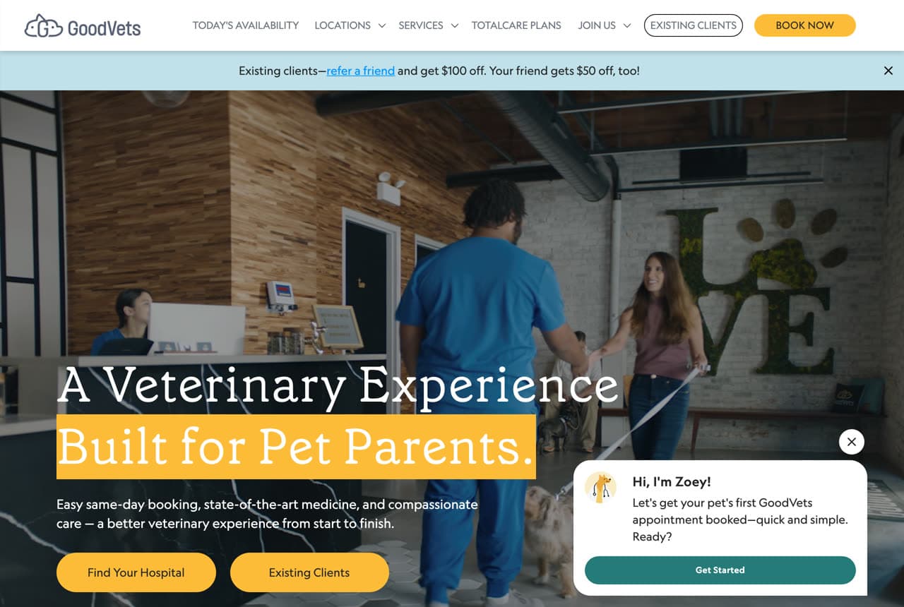
GoodVets reframes who the customer really is. 'A Veterinary Experience Built for Pet Parents' — with 'pet parents' highlighted — over a bright, real clinic photo (staff, a 'LOVE' wall) makes clear the site is designed for the anxious human, not the patient. The copy promises the things a stressed owner wants — 'easy same-day booking, state-of-the-art medicine, and compassionate care, a better experience from start to finish.' A cheerful yellow accent keeps it warm and human. The lesson is naming your true buyer: a vet's patient is the pet, but the decision-maker is a worried, loving owner, so leading with 'built for pet parents' and promising a better experience for THEM — convenience, compassion, no stress — speaks to the person actually choosing the clinic.

  • Names the real decision-maker — the pet parent
  • Promises the owner's wants: same-day, compassion, ease
  • A cheerful yellow keeps a medical service human
Austin Urban Vet Center website — Veterinarian design example
Real site · Austin, TX
  • Veterinarian
  • Full-service
  • Earthy + local

Austin Urban Vet Center: The independent that bundles everything local

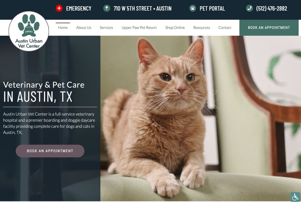
Austin Urban Vet Center shows how a strong independent competes with the modern chains: by being the full-service local option. 'Veterinary & Pet Care in Austin, TX' over a warm photo of a contented cat, with copy that names the range — 'a full-service veterinary hospital and premier boarding and doggie daycare facility.' The dark, earthy palette feels established and grounded rather than startup-slick. The lesson is owning 'local and complete': where a membership chain sells convenience and tech, an independent can win on being the one nearby place that does everything for your pet — vet, boarding, daycare — with a real local identity. For an established local practice, leading with full-service breadth and a specific city is a durable position the chains can't easily copy.

  • Full-service (vet + boarding + daycare) is the local edge
  • A grounded, earthy palette reads established, not startup
  • Own 'local and complete' against the membership chains
Livewell Animal Hospital website — Veterinarian design example
Real site · Austin, TX
  • Veterinarian
  • Hospitality

Livewell Animal Hospital: Hospitality as the differentiator

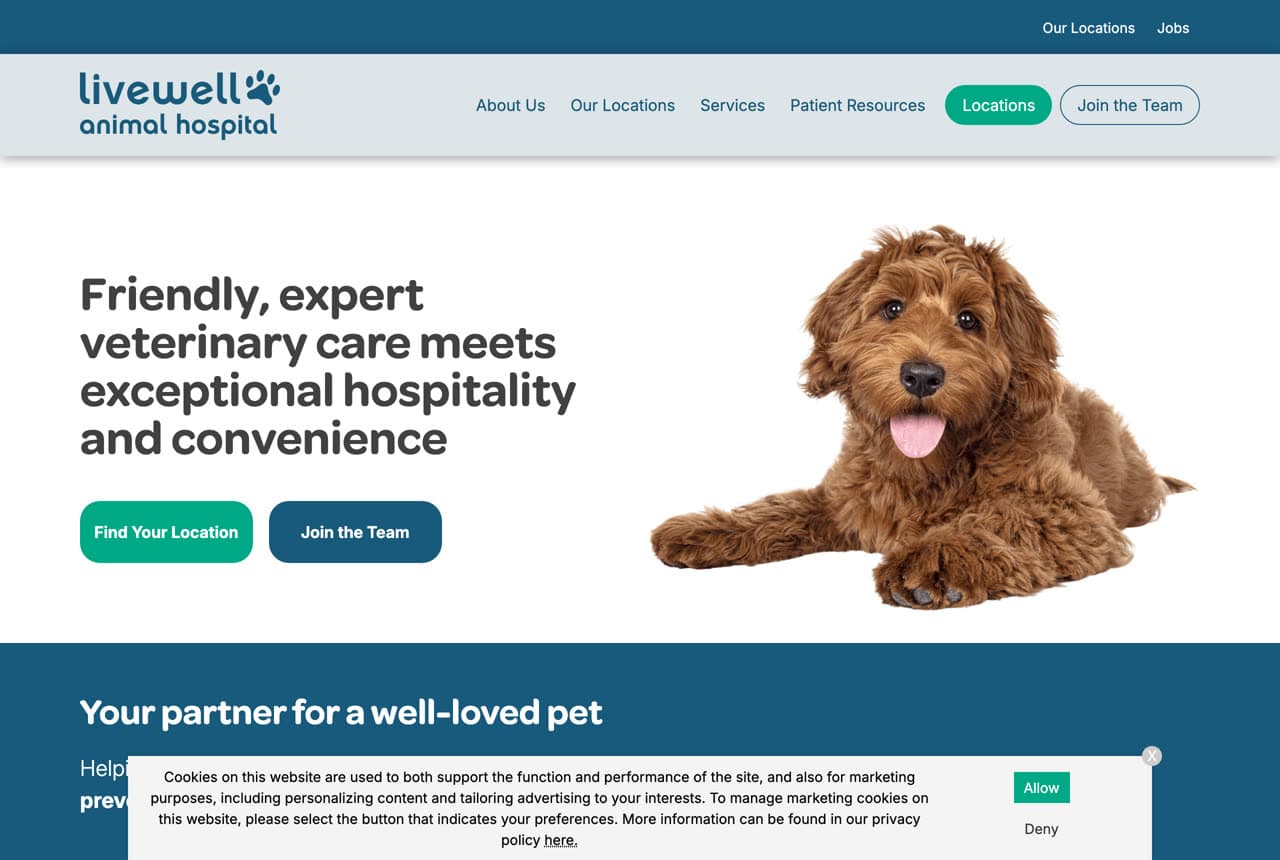
Livewell Animal Hospital borrows its positioning from the hotel industry. 'Friendly, expert veterinary care meets exceptional hospitality and convenience' over a clean, bright white hero with a cheerful doodle dog reframes the vet visit as a hospitality experience, not a medical ordeal. The bright, uncluttered design and 'hospitality' language signal that this practice has thought about how the visit FEELS, not just the medicine — a real differentiator in a category people dread. The lesson is importing a standard from a better-loved industry: by promising 'hospitality and convenience,' Livewell tells an anxious pet owner that going to the vet here will be pleasant and easy, which for many is a bigger deciding factor than a list of clinical capabilities. Sell the experience of the visit, not just the outcome.

Modern Vet website — Veterinarian design example
Real site · Nashville, TN
  • Veterinarian
  • Fear-Free

Modern Vet: Fear-Free as the whole promise

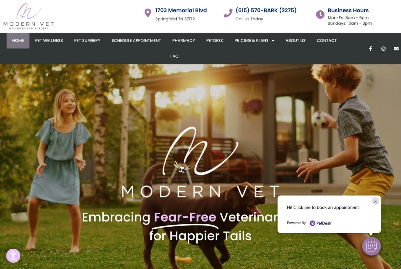
Modern Vet builds its identity around a single, resonant idea: reducing a pet's fear. 'Embracing Fear-Free Veterinary for Happier Tails' over a warm, natural photo of kids in a field pitches an anti-anxiety experience for both pet and owner — a growing certification and movement in the industry that directly addresses why people dread the vet. The warm, outdoorsy imagery reinforces calm over clinical. The lesson is owning a specific, ownable promise: 'Fear-Free' is a real, credentialed differentiator, and by leading with it (rather than generic 'compassionate care'), Modern Vet gives an anxious owner a concrete reason to choose them — their pet won't be terrified. When there's a named methodology that solves your customer's core fear, make it the headline.

Maplewood Animal Hospital — Veterinarian website design you can build with Zarla
Build this with Zarla
  • Veterinarian
  • Family

Maplewood Animal Hospital: The warm, family-vet standard, done right

Maplewood Animal Hospital captures the emotional core of the bread-and-butter local vet: pets are family. 'Because They're Family' in bold over a warm terracotta-and-cream palette and a grid of genuine photos (a vet with a pomeranian, a woman and her cat, a puppy), with copy that leads with feeling — 'gentle, Fear-Free care for every wag, purr, and member of your family, trusted by Madison's pet parents for over twenty years.' A trust strip (4.9 stars from 720+ reviews, Fear-Free certified, same-day sick visits) handles credibility and access. It's the template for an established, family-owned practice that competes on warmth and trust rather than tech or membership — lead with the emotional truth that pets are family, back it with reviews and Fear-Free credentials, and the warm palette does the rest. Describe your hospital and it's yours in about a minute.

See this template

Frequently asked

What makes a good veterinarian website?

A good veterinarian website reduces anxiety in the first few seconds with a warm photo of real staff and pets (not stock) and a calm palette, answers the pet owner's real worries — access (same-day, walk-ins, hours), cost, and their pet's fear (Fear-Free certification) — and makes booking the single obvious action, since a worried owner wants help now. The strongest modern practices go further and reframe the vet as a membership or whole-pet wellness brand rather than a clinical, once-a-year visit.

What pages does a veterinary practice website need?

Most practices need five: a home page that reassures and points to booking, a services page (wellness, surgery, dentistry, urgent care), an about or 'our hospital' page with real staff photos and credentials (Fear-Free, AAHA), a new-client or appointment page connected to booking software (PetDesk, Vetstoria), and a contact page with hours and location. Pharmacy, boarding, and membership pages are common add-ons. A Google Business Profile connected to the site is what gets you found for 'vet near me' and 'animal hospital near me.'

How do veterinary clinics get more clients from their website?

The clinics that convert do three things: they defuse the stress of a vet visit up front (warm real photos, a Fear-Free promise, a friendly tone), they make booking frictionless (online scheduling, same-day availability, click-to-call), and they keep a steady stream of Google reviews — the biggest factor in both ranking for 'vet near me' and getting a worried owner to choose you. Modern practices also win by reframing the relationship — membership plans and whole-pet wellness turn a rare, dreaded visit into a recurring, positive one.

You've seen what works. Now make it yours.

Describe your business and Zarla designs a complete, professional website in about 30 seconds — built to convert, just like the ones above.

Free to build and preview · no credit card · publish to your own domain on Premium