Inspiration · Web Design

The Best Web Design Website Examples, Explained

Looking for web design website examples? These 14 are the strongest we found — Humaan's three-word statement hero, MetaLab's client-first 'We make interfaces', Locomotive's poster-style wordmark hero — plus studio designs you can build with Zarla, each with a breakdown of the specific move that wins clients. A web design studio's own site is the hardest brief in the business: it IS the portfolio piece, and every visitor is silently asking whether you could do the same for them. Find an approach you love and you can build a site in that spirit, free, in about 30 seconds.

Real sites + designs you can build with Zarla — free to build and preview, no credit card

What makes a great web design website

A studio's own website has one job: prove the studio can do the thing it sells. The best ones commit completely to a single idea — Humaan says one sentence and lets restraint carry it, Instrument sets its own name in type so big it becomes the design, MetaLab leads with products you already know. Almost all of them earn credibility the same three ways: a plain-words statement of what they do, named clients or shipped work above the fold, and exactly one action (start a project). Copy the commitment, not the budget — every move below scales down to a one-person studio.

Humaan website — Digital Agency design example
Real site · Perth, AU
  • Digital Agency
  • Assured
  • Sage + forest

Humaan: One sentence, total conviction

Humaan opens with three words that double as a promise — 'Extraordinary Digital Experiences' — set enormous in deep forest green on a pale sage field, and almost nothing else: a slim nav, the top edge of a project frame below, done. The confidence IS the pitch: a studio selling digital craft proves it by how little it needs. The custom sans (Neue Montreal) is doing all the work, which is the point — typography, spacing and two colors are the cheapest premium signals in web design. Humaan's restraint transfers to any studio: pick one true sentence about what you do, set it huge, and resist the urge to add a slider, a counter, or a second message.

  • A three-word promise set huge beats a paragraph of positioning
  • Sage + forest green: two colors doing the work of a brand system
  • Restraint reads as confidence — and confidence sells craft

Steal this: Write the one sentence you'd want a client to remember, and make it the entire first screen.

Visit Humaan

Opens a similar Zarla design you can make yours.

Locomotive website — Design Agency design example
Real site · Montreal, QC
  • Design Agency
  • Editorial
  • Red + black

Locomotive: A wordmark treated like a poster

Locomotive turns its homepage into a piece of print design: a red-tinted portrait pixelates behind the studio's name set in a tall custom serif — 'Locomotive® Digital-first Design Agency' — flanked by little registration marks like a proof sheet from a press run. Nothing here looks like a website template, and that's the argument: a Montreal agency selling distinctive work shows distinctiveness before you scroll. The craft is in the collisions — serif over photograph, print furniture on a screen, art direction with engineering underneath. The lesson scales down: treat your studio name as the artwork. Locomotive proves a homepage can be a poster and still say exactly what the business does.

  • The studio name IS the hero art — set like a poster, not a header
  • Print-style registration marks make the screen feel crafted
  • A red-tinted portrait gives the type a mood to sit in
Visit Locomotive

Opens a similar Zarla design you can make yours.

MetaLab website — Product Studio design example
Real site · Victoria, BC
  • Product Studio
  • Moody
  • Black + chrome

MetaLab: Lead with the products everyone knows

MetaLab answers the only question a prospect really has — 'have you done this before?' — before the headline finishes. 'We make interfaces' sits in quiet serif against a black field with a ribbon of chrome glass twisting behind it, and down the left runs the client list: Uber, The Atlantic, Calvin Klein, Headspace. The design is moody and expensive, but the persuasion is plain, structured name-dropping — every client pill is a link into the work itself. For a studio with even three recognizable local clients, MetaLab's move is directly copyable: put the names where the eyes land first, and let the aesthetic whisper while the track record shouts.

  • Client names above the fold answer 'can you do this?' instantly
  • Quiet serif + black field lets the track record do the talking
  • Every client pill links to proof, not a dead-end logo wall

Steal this: Your three best-known clients belong in the first screen, as links to the work — not in a footer logo strip.

Visit MetaLab

Opens a similar Zarla design you can make yours.

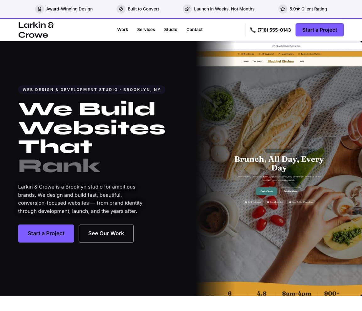
Larkin & Crowe — Web Design Studio website design you can build with Zarla
Build this with Zarla
  • Web Design Studio
  • Bold
  • Black + violet

Larkin & Crowe: The studio site that sells like a landing page

Larkin & Crowe is the conversion-first answer to this page's artful heroes: a dark split opening whose headline cycles its last word — 'We Build Websites That Convert… Sell… Rank' — a trust strip for credibility, then a masonry portfolio and a bento service grid funneling into one project-inquiry form. Where Humaan and MetaLab persuade by atmosphere, this design persuades by structure: claim, proof, work, ask. It's the right shape for a studio that wins clients on outcomes rather than aura — and it's cloneable: press the button, drop your own launches into the masonry grid, and the whole conversion path comes wired. Larkin & Crowe states the un-romantic truth: studio sites are landing pages too.

  • Claim → proof → work → ask: the landing-page spine in studio clothes
  • A trust strip buys credibility before the portfolio loads
  • Cloneable — the project-inquiry funnel comes pre-wired

Steal this: State the outcome you sell in five words or fewer — 'We build websites that convert' leaves no doubt.

See this template
Instrument website — Digital Agency design example
Real site · Portland, OR
  • Digital Agency
  • Bold
  • White + violet

Instrument: Type so big it becomes the interface

Instrument sets its own name across the full viewport twice — once black on white, once punched through a violet band — so the brand physically dominates the first screen before a single case study appears. Below, the reel does the proving: a living-room TV interface with HBO Now on screen, a film still, a rolling news ticker in the top bar. It's the maximalist cousin of the minimal statement hero: instead of whispering one sentence, shout one word. What makes it work is discipline everywhere else — flat color fields, tidy grid, tiny functional nav — so the giant type reads as intent rather than noise. Instrument's move suits any studio whose name is short and whose work is strong: scale is a style.

  • A full-viewport wordmark makes the brand impossible to miss
  • A rolling ticker rides quietly in the top bar while the type shouts
  • Everything around the giant name stays flat and disciplined
Visit Instrument

Opens a similar Zarla design you can make yours.

Bakken & Bæck website — Product Studio design example
Real site · Oslo, NO
  • Product Studio
  • Minimal
  • White + ink

Bakken & Bæck: Say the whole business in two lines

Bakken & Bæck compresses everything into an opening statement — 'a design and technology studio. We build digital products, from zero to launch.' — followed immediately by the logo row that makes it credible: IKEA, Stripe, Snap, CoinTracker. There's no hero image at all; the first visual on the page is the work itself, tiled below in live product screens. It's the Nordic school of studio site: information first, ornament last, whitespace as the brand. The two-line formula is worth stealing verbatim — what you are, then what you do, in words a client would actually use. Bakken & Bæck proves you don't need a single decorative pixel if the sentence is right and the logos are real.

  • What-you-are + what-you-do in two plain lines — no slogan
  • The client logo row sits inside the first screen, not the footer
  • The first image on the page is real shipped work
Visit Bakken & Bæck

Opens a similar Zarla design you can make yours.

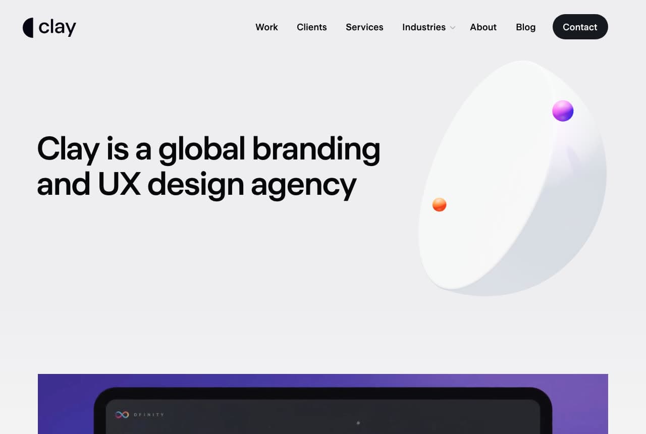
Clay website — UX Agency design example
Real site · San Francisco, CA
  • UX Agency
  • Corporate

Clay: Corporate polish that still feels designed

Clay walks the hardest line in the category: enterprise-credible without being boring. The hero states the business in one line — 'Clay is a global branding and UX design agency' — beside a softly lit 3D disc that adds dimension without stealing attention, and a work reel starts one scroll later. Everything is engineered for a procurement-stage buyer: services and industries in the nav, a contact button exactly where a fintech VP expects it, case studies immediately after. The tall grotesque type and generous white keep it feeling like a design firm rather than a consultancy deck. Clay is the reference when your clients are serious companies: design flair rationed carefully on top of total clarity.

Visit Clay

Opens a similar Zarla design you can make yours.

Significa website — Product Studio design example
Real site · Porto, PT
  • Product Studio
  • Warm

Significa: Five verbs and the awards to back them

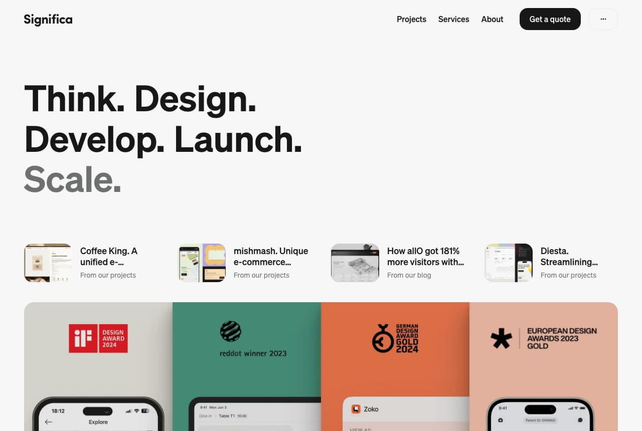
Significa structures its hero like a process diagram: 'Think. Design. Develop. Launch. Scale.' — five verbs, each a stage the studio owns — with a row of project and blog cards directly underneath and a band of framed award tiles (iF Design, German Design Awards) below that. It's the busiest opening in this set and the most reassuring: a small Porto studio compensating for name recognition with visible, checkable proof. The award tiles work because they're rendered as colorful artifacts — framed, specific, dated — not badges in a gray strip. For a young studio the transfer is direct: show the process you sell as plain words, then let third-party validation carry the trust you haven't built yet.

Visit Significa

Opens a similar Zarla design you can make yours.

Ramotion website — Brand Agency design example
Real site · San Francisco, CA
  • Brand Agency
  • Spare

Ramotion: A grid of app icons instead of a logo wall

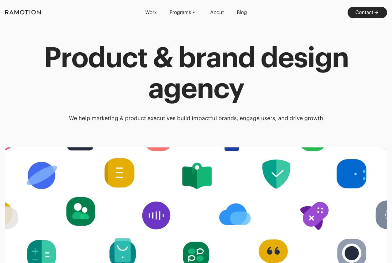
Ramotion's hero is almost empty on purpose: a centered 'Product & brand design agency', one supporting line aimed squarely at marketing and product executives, and then — given the whole width of the screen — a grid of app icons in every brand color, the studio's work shown as the tiles it ships rather than a logo wall. It's a product designer's proof: not client names, but the icons a user would tap. The page reads like the enterprise sales deck it effectively is, and the restraint above the grid (system grays, no photography, one black button) keeps every eye on the work. Ramotion's move fits a studio whose output is products: show the artifacts, not the clients who paid for them.

Visit Ramotion

Opens a similar Zarla design you can make yours.

Halo Lab website — Design Agency design example
Real site
  • Design Agency
  • Playful

Halo Lab: A galaxy theme worn completely straight

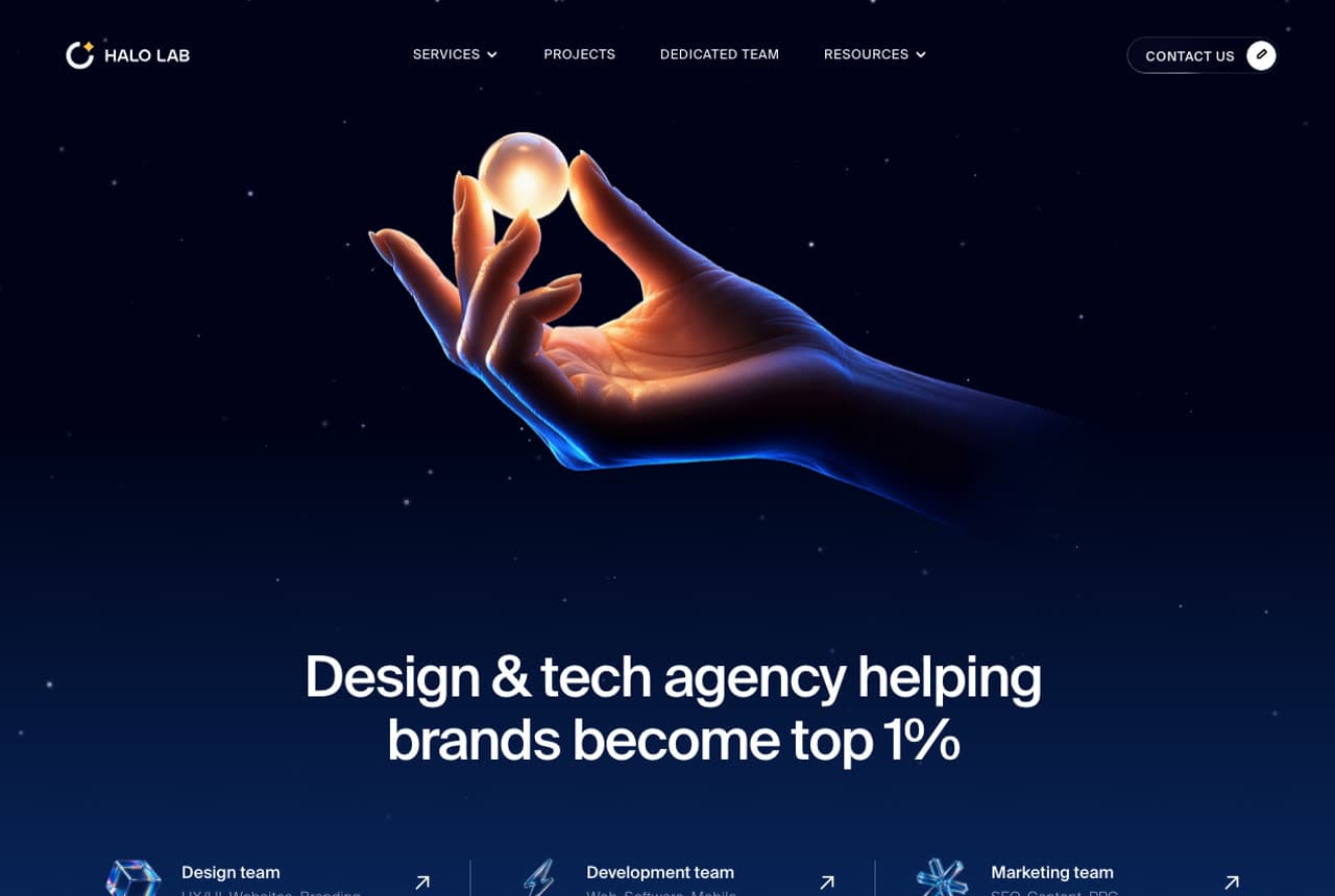
Halo Lab commits to its name with a full cosmic art direction — a midnight-blue field, stars, a glowing hand holding a golden orb — and an unmissable claim riding on it: 'Design & tech agency helping brands become top 1%.' The playfulness is load-bearing: three team links (design, development, marketing) sit directly under the hero as the actual navigation into services, so the fantasy never obstructs the funnel. This is the counter-example to Nordic restraint — personality as differentiation in a category full of white minimalism. The rule Halo Lab demonstrates: if you take a theme, take it everywhere — icons, illustration, microcopy. A half-committed theme reads as decoration; a total one reads as brand.

Visit Halo Lab

Opens a similar Zarla design you can make yours.

Wren & Calder — Web Design Studio website design you can build with Zarla
Build this with Zarla
  • Web Design Studio
  • Minimal

Wren & Calder: Restraint as the whole pitch

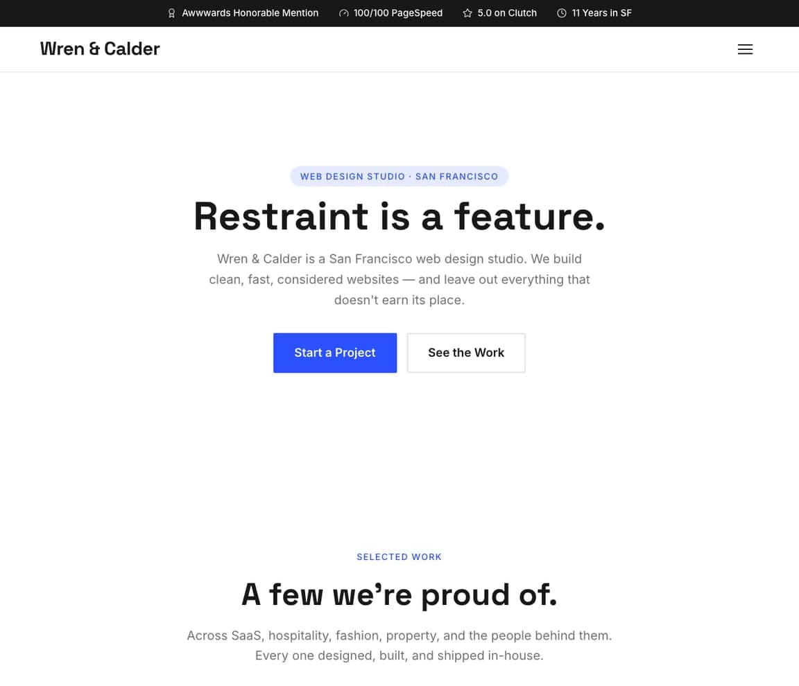
Wren & Calder is the Zarla counterpart to the quiet end of this gallery: a Swiss-inspired centered hero that argues its own philosophy — 'Restraint is a feature.' — over a top bar of concrete trust chips (an Awwwards mention, a perfect page-speed score, a Clutch rating). The portfolio grid below keeps rigid alignment and generous air, and services are framed as design systems rather than deliverables. If Humaan and Bakken & Bæck are the look you want, this is the buildable version: clone it, swap the work grid for your own projects, and the discipline — grid, spacing, typographic scale — comes pre-made. Wren & Calder suits the studio whose clients buy calm competence rather than fireworks.

See this template
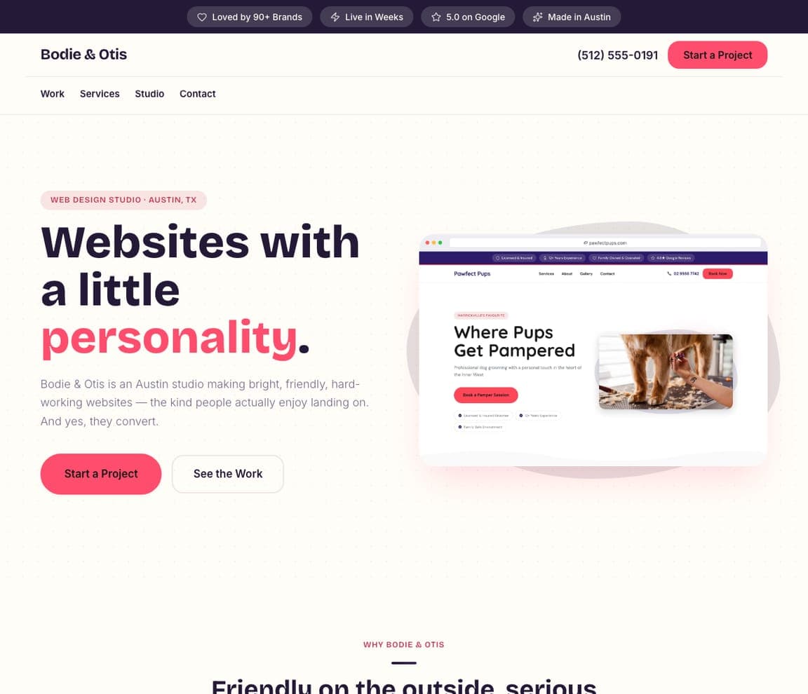
Bodie & Otis — Web Design Studio website design you can build with Zarla
Build this with Zarla
  • Web Design Studio
  • Playful

Bodie & Otis: Friendly on the outside, serious underneath

Bodie & Otis makes the case that warmth wins clients too: 'Websites with a little personality.' in a chunky grotesque with the key word in hot pink, a blob-framed project preview beside it, and icon-led services in a pill grid. Beneath the fun sits the same hard skeleton as every converting studio site — trust chips up top ('Loved by 90+ brands', a five-star rating), a colorful portfolio grid, one inquiry CTA. It's the right register for studios serving local businesses, food brands, or founders who find black-and-white minimalism cold. Bodie & Otis is cloneable as-is: keep the personality, replace the projects, and the friendliness becomes your differentiation in a sea of gray portfolios.

See this template
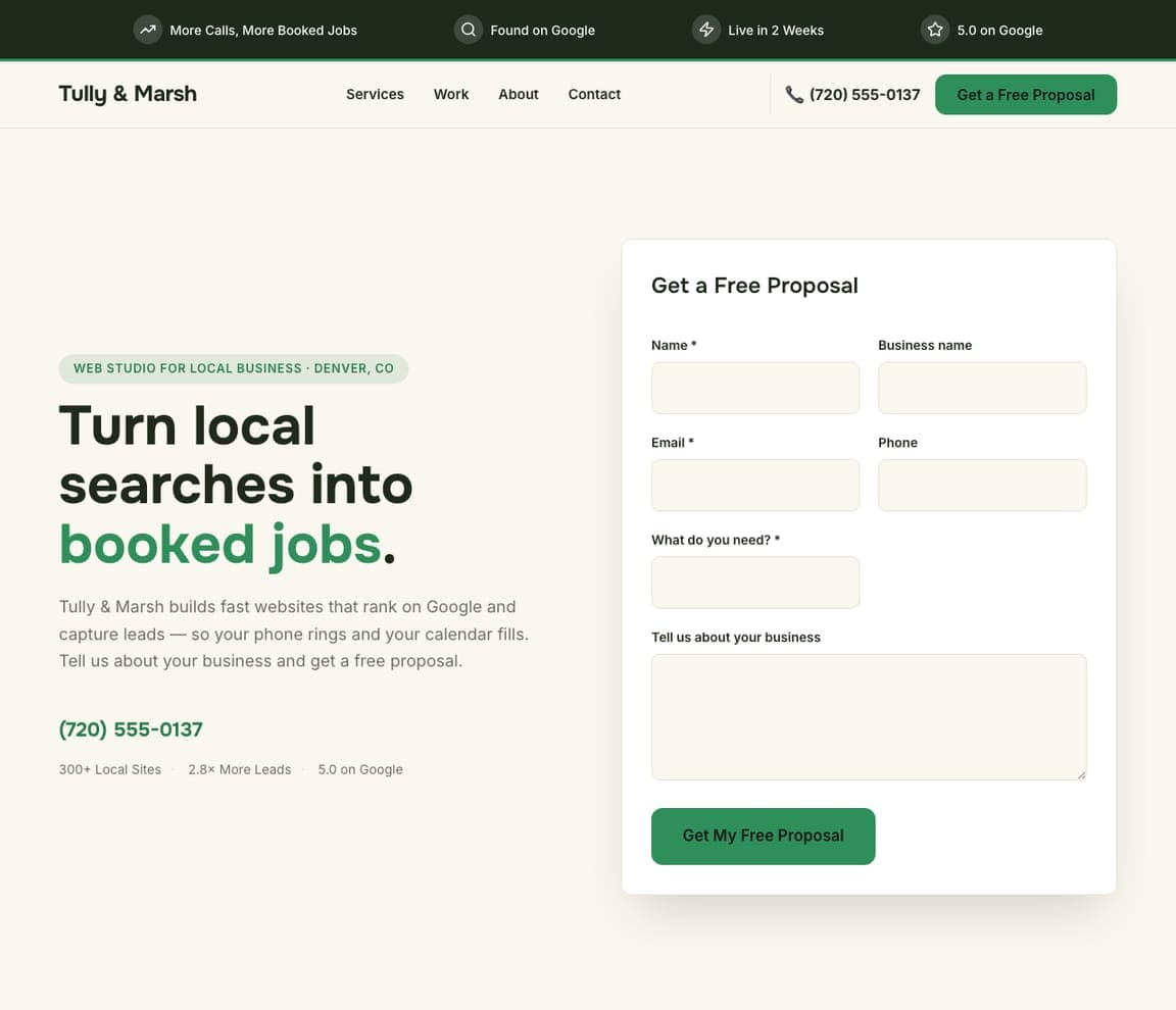
Tully & Marsh — Lead-Gen Studio website design you can build with Zarla
Build this with Zarla
  • Lead-Gen Studio
  • Direct

Tully & Marsh: The proposal form IS the homepage

Tully & Marsh optimizes for a completely different reader than the rest of this page: the local plumber or dentist who has never heard of Awwwards. The hero splits between a promise written in their language — 'Turn local searches into booked jobs.' — and a free-proposal form sitting in the first screen, with proof in the same register: 300+ local sites, 2.8× more leads, 5.0 on Google. No reel, no manifesto; the design behaves like the lead-gen machine it sells. For freelancers and studios whose market is local small business, this shape routinely out-converts portfolio-first sites. Tully & Marsh is the honest template for that market — clone it and your pipeline starts working on day one.

See this template
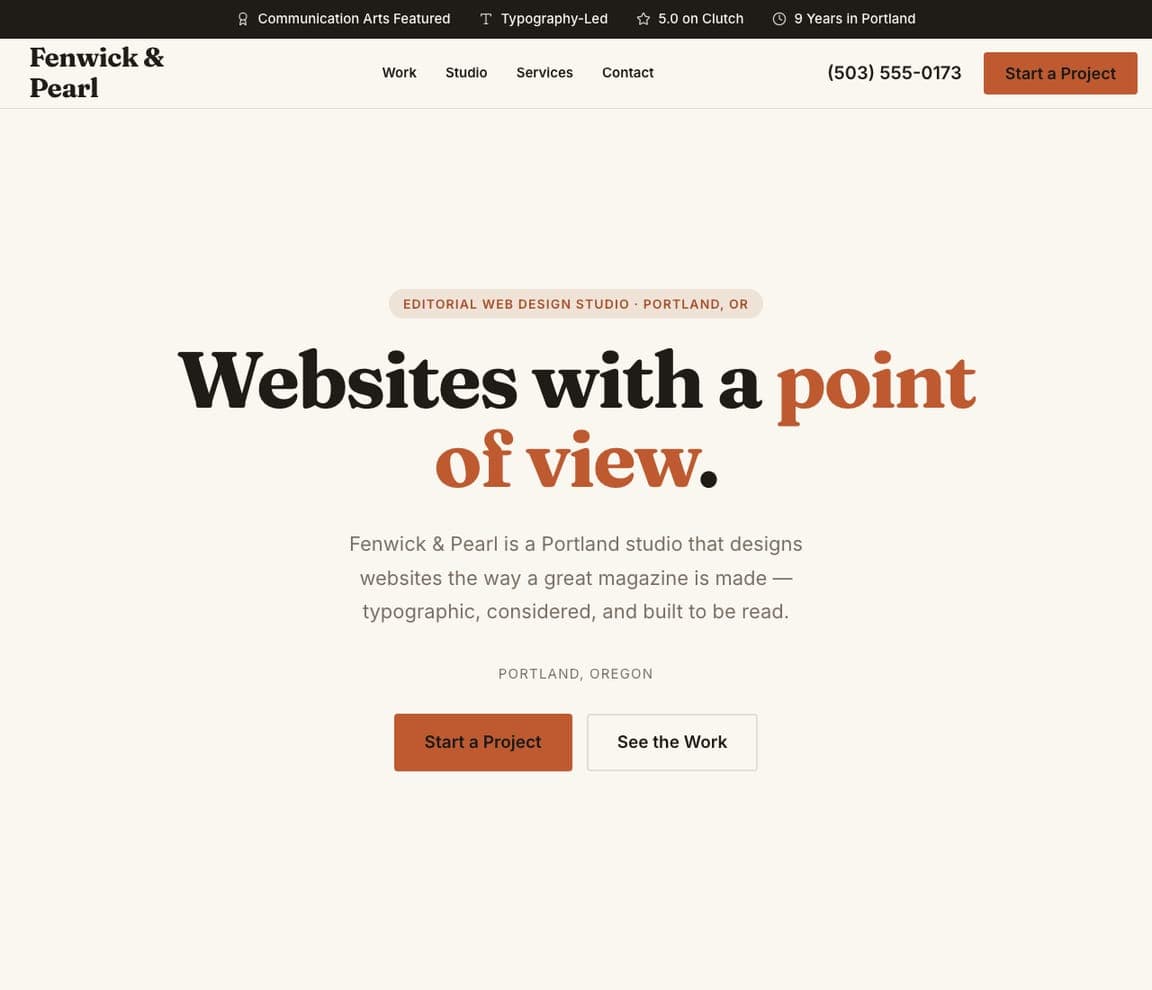
Fenwick & Pearl — Web Design Studio website design you can build with Zarla
Build this with Zarla
  • Web Design Studio
  • Editorial

Fenwick & Pearl: A magazine voice for a design studio

Fenwick & Pearl reads like the opening spread of a design quarterly: 'Websites with a point of view.' in big serif with the key phrase in warm orange, a Portland dateline underneath, and a masonry portfolio that scrolls like an editorial photo essay. Numbered services keep the magazine logic going — features in an issue, not bullet points in a deck. It's the buildable version of the Locomotive school: typographic, opinionated, print-flavored. Choose it when your studio's difference is taste and writing rather than volume — the design gives your words the stage. Fenwick & Pearl clones with the whole editorial system intact; you supply the point of view.

See this template

Frequently asked

Where can I find good web design website examples?

Right here — this page curates web design website examples across the spectrum: world-class studios like Humaan, MetaLab, Locomotive and Bakken & Bæck (each linked so you can explore the live site), plus professionally designed Zarla studio templates you can clone and make your own. Every example includes a note on why the design works — the trust moves, the typography, the conversion path — so you can copy the thinking, not just the look.

What makes a good web design studio website?

It proves the studio can do what it sells. That means one plain statement of what you do, recognizable clients or real shipped work above the fold, exactly one call to action, and craft in the details — typography, spacing, speed. Every example above passes the same test: within five seconds you know what the studio does and whether you'd trust them with your own site.

How much does a web design studio website cost?

Hiring another designer typically runs thousands up front — and building your own from scratch costs you billable weeks. Template builders charge roughly $16–$30 per month. An AI builder generates a complete, editable studio site for free and only charges (on the Premium plan) when you publish to your own domain — so you can build and preview before spending anything.

Do I need a big portfolio before launching a web design website?

You need less than you think. Three strong projects presented well beat twelve thumbnails — Ramotion fills a whole screen with the app icons it designed rather than a wall of client logos. If you're just starting, present concept work or an honest rebuild of a real local business, clearly labeled, and replace it as client work lands. Several designs above prove that a clear statement plus a few good pieces reads as confidence.

What pages does a web design studio website need?

Most studios need four: a home page that states what you do and shows the work, a work page with a handful of case studies, an about page with real faces, and a contact page with a project-inquiry form. The best studio sites above add almost nothing else — restraint keeps the attention on the portfolio.

How do web design studios get clients from their website?

The converting pattern in the examples above: state the outcome you sell in the hero, put proof beside it (clients, awards, results), and make 'start a project' the only ask. Studios serving local businesses convert best with a proposal form in the first screen — that's the Tully & Marsh shape — while brand-led studios convert through case studies. Either way, one clear action beats a clever maze.

You've seen what works. Now make it yours.

Describe your business and Zarla designs a complete, professional website in about 30 seconds — built to convert, just like the ones above.

Free to build and preview · no credit card · publish to your own domain on Premium