Inspiration · Architect

The Best Architect Website Examples, Explained

Looking for architect website examples? These 14 are the best we could find — standout real architect sites plus designs you can build with Zarla — and each comes with a breakdown of the specific design move that makes it work. Find a look you love and you can build a site in that exact style, free, in about 30 seconds.

Real sites + designs you can build with Zarla — free to build and preview, no credit card

What makes a great architect website

The best architect websites share a few moves: they earn trust fast, lead with strong visuals of the work, point to one clear action, and match the design to how their customers decide. Each example below calls out the specific choice worth stealing for your own architect website.

Olson Kundig website — Starchitect Firm design example
Real site · Seattle, WA
  • Starchitect Firm
  • Cinematic
  • Black + white

Olson Kundig: One iconic project, full-bleed

Olson Kundig, a globally-renowned firm, leads with a single, spectacular project: a full-bleed photograph of the striking LeBron James Innovation Center at Nike World HQ, with a spare caption and a near-invisible nav. For an architecture practice, the work IS the entire pitch, so devoting the whole screen to one breathtaking building — photographed beautifully — communicates the calibre of what you produce more powerfully than any statement of philosophy could. The dark, minimal chrome gets completely out of the way, and the recognizable, prestigious project (a Nike commission) signals the tier of client the firm serves. For any design or architecture firm, the homepage's job is to show, not tell: lead with your single most impressive, recognizable project at full scale, strip the interface to near-nothing, and let the ambition of the work do all the talking. The building is the argument.

  • One spectacular full-bleed project — the work is the pitch
  • A recognizable prestige commission signals the client tier
  • Near-invisible chrome gets out of the work's way

Steal this: Lead with your single most impressive, recognizable project at full scale. For design work, show — don't tell. The work is the argument.

Lyons Architecture website — Creative Practice design example
Real site · Melbourne, AU
  • Creative Practice
  • Bold-Typographic
  • Yellow + black

Lyons Architecture: Ideas, in enormous type over the work

Lyons Architecture makes a bold typographic statement: 'Made from ideas' set in gigantic yellow type over a photograph of one of their vivid, sculptural buildings, spilling onto a saturated yellow panel with the manifesto — 'Lyons is a creative practice that works design into the heart of everything we do… big ideas, subtle ideas, visual, technological, complex or practical.' Where most architecture firms are reverently minimal, Lyons is loud, colourful and idea-forward, which matches their actually-bold, colourful built work (their buildings ARE vivid and sculptural). The design performs the firm's personality — creative, unafraid, concept-driven — rather than defaulting to austere black-and-white. For an architecture practice whose work is genuinely bold, matching the website's energy to that boldness (huge type, saturated colour, an ideas-first manifesto) is far more authentic than borrowed minimalism. Let the site express the same creativity as the buildings.

  • Giant 'Made from ideas' type matches the bold built work
  • Saturated yellow performs the firm's creative personality
  • Ideas-first manifesto over borrowed minimalism
McClean Design website — Luxury Residential design example
Real site · Southern California
  • Luxury Residential
  • Aspirational
  • Dusk + glass

McClean Design: Luxury residential, at golden hour

McClean Design sells high-end modern residential with seductive photography: a stunning dusk shot of a sleek glass-and-stone luxury home mirrored in an infinity pool, lights glowing, over the firm's minimal wordmark. The copy positions clearly — 'one of the leading contemporary residential design firms in Southern California committed to excellence in modern design… connect our clients to the beauty of the surrounding natural environment.' For a luxury residential architect, the aspirational lifestyle imagery (the home as a glamorous, desirable object at the perfect time of day) is the entire sales pitch — wealthy clients are buying a dream of how they'll live. Shooting completed homes at blue/golden hour, when architectural lighting and reflections are most dramatic, makes the work look like the six-figure fee it commands. When you design luxury homes, your portfolio photography must look as expensive as the homes; McClean's does.

  • Dusk/infinity-pool photography sells the luxury lifestyle
  • Positions clearly as SoCal contemporary residential leaders
  • Portfolio must look as expensive as the homes — this does
Lemay website — Large Multidisciplinary design example
Real site · Montréal, CA
  • Large Multidisciplinary
  • Mission-Led
  • Green + white

Lemay: A mission bigger than buildings

Lemay, a large multidisciplinary Canadian firm, leads with purpose over portfolio: 'We're About Shaping a Better Future' over an aerial of a green, human-scaled urban masterplan, followed by a news/thought-leadership grid (low-carbon construction, LEED performance, GEOpark recognition). For a big firm competing on major public and institutional commissions, positioning around sustainability, social impact and thought leadership — rather than just pretty buildings — speaks to the values-driven clients (governments, institutions, developers) who award large projects and increasingly demand environmental credentials. The news grid signals an active, influential practice engaged in the industry's important conversations. For an established firm chasing significant commissions, leading with a mission (a better, more sustainable future) and demonstrating thought leadership positions you as a partner in solving big problems, not just a vendor of designs. Sell the mission and the expertise, not only the aesthetics.

  • 'Shaping a better future' leads with mission over portfolio
  • Sustainability + thought-leadership win values-driven clients
  • News grid signals an active, influential industry voice
K2 Architects website — Values-Led Practice design example
Real site · United Kingdom
  • Values-Led Practice
  • Human
  • White + accent

K2 Architects: Values named, and a human sketch

K2 Architects leads with principles and a personal touch: 'a strategic and creative design practice committed to social and environmental change,' with three guiding values highlighted in colour — Empathy, Integrity, Innovation — and, tellingly, a delicate watercolour sketch of a building rather than a slick render, credited to a named co-founder with a personal mission statement. The hand-drawn sketch is the standout; in a category of polished CGI, an actual watercolour signals a hands-on, human, thoughtful practice where real people design with care. Naming explicit values (empathy, integrity) and putting a founder's voice and hand front and centre differentiates a smaller practice from faceless large firms, appealing to clients who want a genuine relationship and shared values. For a boutique architecture firm, leading with your principles and showing the human craft (a real sketch, a founder's words) is how you win the client who's choosing people, not just designs.

  • A hand-drawn watercolour signals human craft over slick CGI
  • Named values (Empathy, Integrity) differentiate a boutique firm
  • Founder's voice + hand appeal to relationship-seeking clients
SHoP Architects website — Innovative Practice design example
Real site · New York, NY
  • Innovative Practice
  • Intellectual
  • White + text

SHoP Architects: An idea in text, and a name-drop project list

SHoP Architects opens with intellect over imagery: a spare, near-all-text hero — 'designs in the future… we are architects and craftspeople and problem solvers, trained specialists and proud generalists with global expertise in anticipating and designing for what's ahead' — followed by a clean typographic list of projects (Atlassian Central, Hudson's Detroit, Uber HQ, 55 Pitt Street). The confident, minimal, text-forward approach positions SHoP as an intellectual, forward-thinking practice, and the name-drop project list (recognizable corporate HQs and towers) does the credibility work that images would otherwise do. For a firm operating at the highest level, leading with a clear articulation of THINKING (problem-solvers anticipating the future) rather than beauty shots signals that clients are buying strategic intelligence, not just aesthetics. The restrained, editorial design reinforces the positioning. When your differentiator is intellect and vision, let the words — and a list of marquee clients — carry the hero.

  • Text-forward hero sells strategic thinking over beauty shots
  • Marquee project list (Uber HQ, Atlassian) does the credibility
  • Editorial restraint signals intellect and vision
MKCA website — Craft-Led Studio design example
Real site · New York, NY
  • Craft-Led Studio
  • Warm

MKCA: Craft, care, and warm interiors

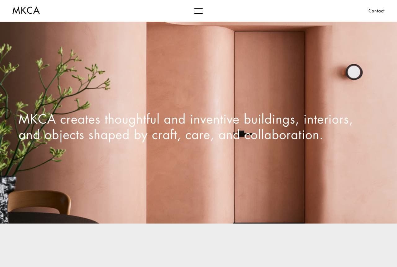
MKCA (Michael K Chen Architecture) leads with warmth and craft: 'MKCA creates thoughtful and inventive buildings, interiors, and objects shaped by craft, care, and collaboration,' set over a beautifully warm, terracotta-hued interior with a sculptural curved wall. Where many architecture firms lead with cold exteriors, MKCA leads with a richly-coloured, tactile interior — signalling a practice equally at home with buildings, interiors AND objects, and one that values material warmth and human comfort over austere minimalism. The 'craft, care, and collaboration' language emphasises a hands-on, relationship-driven, detail-obsessed sensibility that appeals to clients wanting a considered, personal design experience. For a firm whose strength spans interiors and objects (not just structures), leading with a warm, inviting interior — and naming craft and care explicitly — attracts the client who wants beautiful, liveable, thoughtfully-made spaces. Warmth is its own differentiator in a cold-render category.

Field & Form — Architecture Firm website design you can build with Zarla
Build this with Zarla
  • Architecture Firm
  • Sophisticated

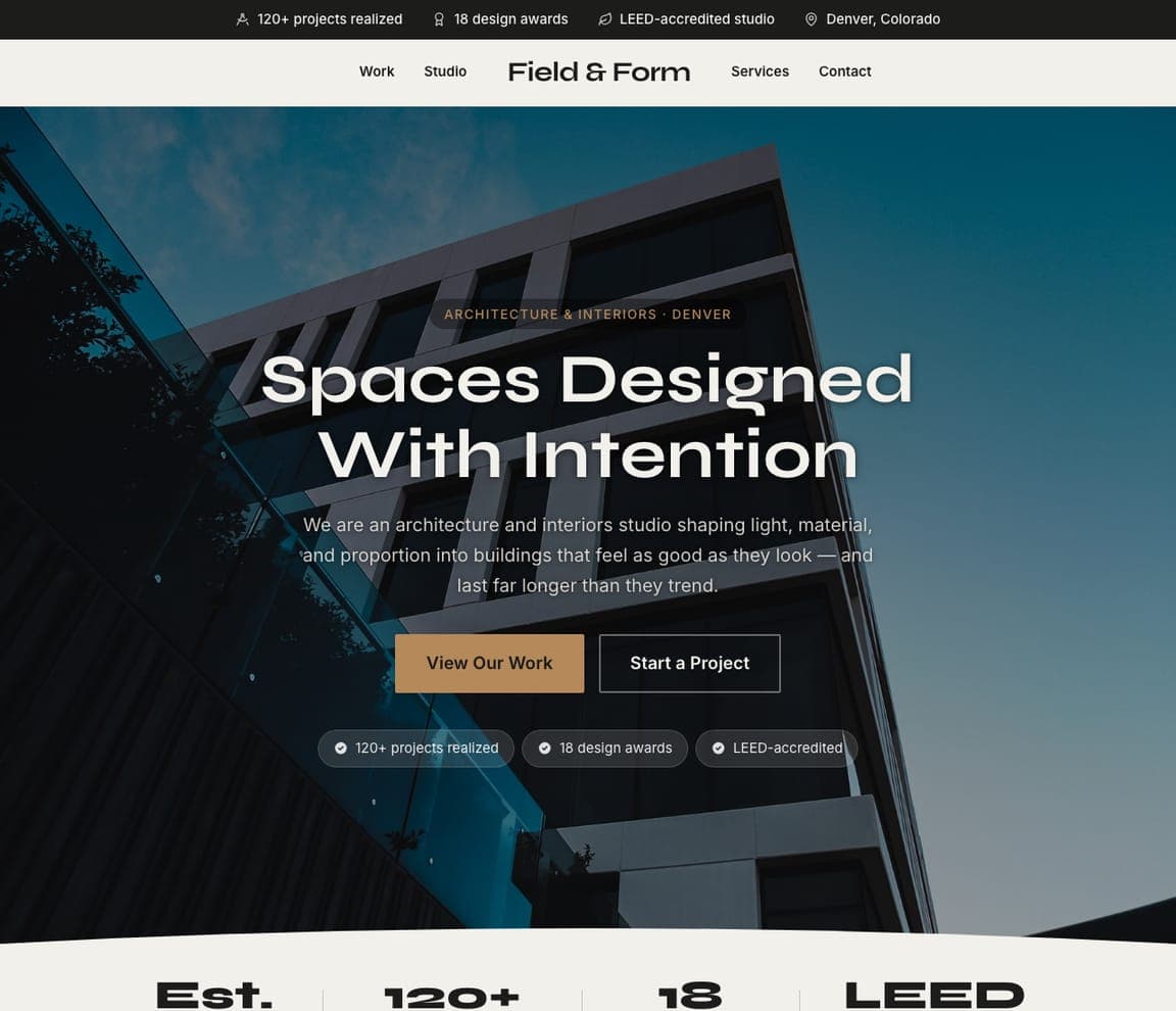
Field & Form: Spaces designed with intention

Field & Form is Zarla's architect template, and its fullwidth-overlay hero lands the register this category runs on: 'Spaces Designed With Intention' over a full-bleed architectural image, in a near-black and warm-tan palette that reads sophisticated, considered and gallery-like. It borrows the right instinct from every firm in this gallery — the work is the pitch, so lead with a beautiful full-bleed project and minimal chrome — pre-built. The structure carries a project portfolio (the heart of any architecture site), an about-the-practice/philosophy section, and a contact CTA. The refined, understated palette lets project photography dominate, exactly as it should. Swap in photos of your own projects and it's a credible, sophisticated architecture-firm site in about 30 seconds — no photographer or designer required. The gallery-grade restraint a design practice needs to let its work speak.

See this template
Meridian & Vale — Residential Architect website design you can build with Zarla
Build this with Zarla
  • Residential Architect
  • Warm

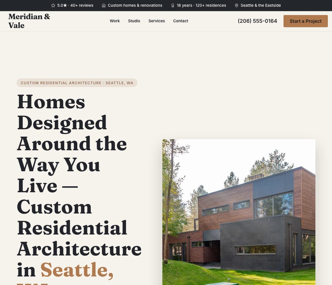
Meridian & Vale: Homes designed around how you live

Meridian & Vale is Zarla's residential-architecture template, and it trades the category's cool minimalism for warmth: a giant Fraunces-serif headline — 'Homes Designed Around the Way You Live' — with 'Seattle' in a cedar accent, set on off-white beside a photograph of a modern cedar-and-charcoal home. That warmth is the right instinct for custom residential, where the client is buying a feeling about how they'll live, not a spec sheet (echoing McClean and MKCA above). The split-image-right hero pairs the editorial type with one real project; a Work/Studio/Services/Contact nav and a 'Start a Project' CTA complete the funnel. Swap in your own home photography and the warm serif does the rest. For a custom-home or renovation architect, this is the human, liveable register that wins the relationship client.

See this template
Vantage Studio — Contemporary Architect website design you can build with Zarla
Build this with Zarla
  • Contemporary Architect
  • Bold-Typographic

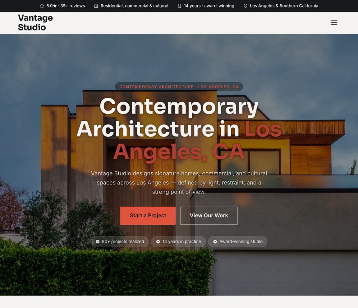
Vantage Studio: Bold type over the building

Vantage Studio shows the bold, type-forward end of the category: an oversized 'Contemporary Architecture in Los Angeles, CA' headline — 'Los Angeles, CA' in coral — set directly over a wide photo of a warm-wood contemporary building, with a coral overline pill and trust chips ('90+ projects realized', 'Award-winning studio'). It's the type-hero variant: the words ARE the hero, scaled huge, with the project as backdrop. Where most architecture sites whisper, Vantage matches Lyons' energy — confident type, a saturated accent, and a stated point of view ('light, restraint, and a strong point of view'). For a modern studio whose work is genuinely bold, this loud-and-typographic template performs the firm's personality far better than borrowed austerity. Drop in your building photo and the giant type carries the confidence.

See this template
Timber & Watt — Sustainable Architect website design you can build with Zarla
Build this with Zarla
  • Sustainable Architect
  • Earthy

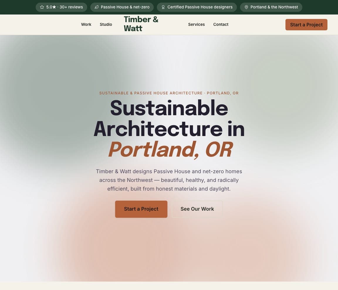
Timber & Watt: Passive House, in an aurora hero

Timber & Watt targets the fastest-growing niche in the category — Passive House and net-zero — with a distinctive aurora hero: no photo at all, just a soft green-and-cream gradient mesh behind bold near-black type, 'Sustainable Architecture in Portland, OR' with 'Portland, OR' in a rust accent. The photo-free treatment is a smart fit for green architecture, where the pitch is performance and values ('beautiful, healthy, and radically efficient, built from honest materials and daylight') as much as any single building — and the earthy forest-green and rust palette signals the sensibility instantly. Certified-Passive-House trust chips seal it. For a sustainability-focused practice, leading with a warm, natural, photo-free hero and naming the credential (net-zero, Passive House) speaks straight to the values-driven client — echoing Lemay's mission-led approach at studio scale.

See this template
Fulton & Grey — Commercial Architect website design you can build with Zarla
Build this with Zarla
  • Commercial Architect
  • Professional

Fulton & Grey: A lead form, beside the tower

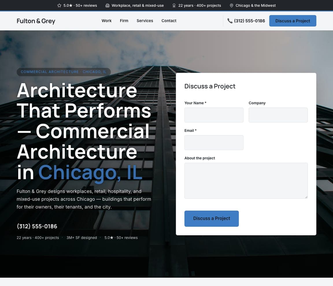
Fulton & Grey is built to convert commercial clients, not just impress them: a form-split hero puts a 'Discuss a Project' lead form (name, company, email, brief) right beside the headline — 'Architecture That Performs — Commercial Architecture in Chicago, IL,' with 'Chicago, IL' in corporate-blue — over a steel-and-glass building. For workplace, retail and mixed-use work, the client is an owner or developer running a procurement process, so capturing the enquiry in the hero matches how commercial work actually gets won. The performance framing ('buildings that perform for their owners, their tenants, and the city') and hard stats (3M+ SF designed, 400+ projects) speak the owner's language. For a commercial firm, pair an owner-minded headline with an in-hero form and let the numbers carry the credibility.

See this template
Wildroot Studio — Landscape Architect website design you can build with Zarla
Build this with Zarla
  • Landscape Architect
  • Lush

Wildroot Studio: The garden, full-bleed

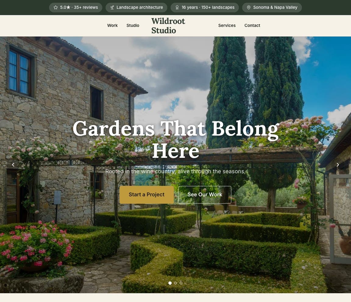
Wildroot Studio adapts the category to landscape architecture, where the medium is living: a fullwidth-overlay hero fills the screen with a lush wine-country garden — cypress, stone, flowering beds — under a centred serif line, 'Gardens That Belong Here,' and 'Rooted in the wine country, alive through the seasons.' Letting one immersive planted scene run edge-to-edge is exactly right for a discipline whose work is atmosphere and place, not architecture's hard lines; the amber CTA and carousel hint at a seasonal portfolio. It's the same 'the work is the pitch' instinct Olson Kundig uses, tuned to greenery instead of buildings. For a landscape architect or garden designer, a single breathtaking full-bleed landscape — shot in its best season — sells the transformation better than any list of services.

See this template
Ashford & Roe — Interior Architect website design you can build with Zarla
Build this with Zarla
  • Interior Architect
  • Warm

Ashford & Roe: Interiors, from the bones out

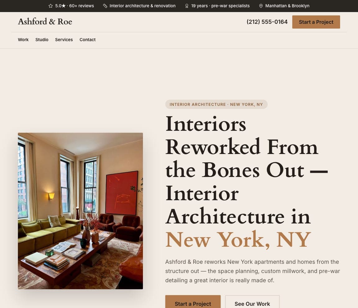
Ashford & Roe carries the gallery's warmth indoors: a split hero pairs a richly-furnished pre-war interior — green sofa, red accent chair, art, tall windows — with a giant Fraunces-serif headline, 'Interiors Reworked From the Bones Out — Interior Architecture in New York, NY,' 'New York, NY' in warm amber. Leading with an inviting, tactile room (rather than a cold exterior) is the right move for interior architecture, where the client is buying how a space will feel to live in — the same warm-interior instinct MKCA uses above. The copy stakes out real substance — 'space planning, custom millwork, and pre-war detailing' — that separates interior architecture from mere decorating. For an interiors-led practice, a warm split hero plus a craft-specific headline attracts the client who wants the space rebuilt, not just styled.

See this template

Frequently asked

Where can I find good architect website examples?

Right here — this page curates architect website examples two ways: standout real businesses (each linked, so you can explore the live site) and professionally designed Zarla templates you can clone and make your own. Every example comes with a note on why the design works — trust signals, layout, calls to action — so you can copy the move, not just the look.

What makes a good architect website?

A good architect website earns trust in the first few seconds, leads with strong visuals of the work, gives visitors one obvious action, and loads fast on a phone. Every design below leads with proof and a single clear call to action rather than a wall of text.

How much does a architect website cost?

A custom architect website from a designer typically runs into the thousands up front, and template builders charge roughly $16–$30 per month. An AI builder generates a complete, editable design for free and only charges (on the Premium plan) when you publish to your own domain — so you can build and preview before spending anything.

Do I need a designer to build a architect website?

No. Several designs on this page were generated by Zarla and are fully editable — you describe your business and get a complete, professionally designed site in about 30 seconds, then refine it by chatting. Building and previewing is free; publishing to your own domain needs the Premium plan.

What pages does a architect website need?

Most architect businesses need just a few: a home page that proves trust and points to one clear action, an about page that puts a face to the business, a services or work page that shows what you do, and a contact page with a form and a phone number. Local businesses also benefit from location or service-area pages that help them show up in nearby searches.

How do I get more customers from my architect website?

Lead with proof in the first few seconds (reviews, real photos, results), make one action obvious on every screen (call, book, or enquire), and keep it fast on mobile — most visitors arrive on a phone. The designs above each do this differently, but they all earn trust early and remove friction from the next step.

You've seen what works. Now make it yours.

Describe your business and Zarla designs a complete, professional website in about 30 seconds — built to convert, just like the ones above.

Free to build and preview · no credit card · publish to your own domain on Premium