Inspiration · Art Studio

The Best Art Studio Website Examples, Explained

Looking for art studio website examples? These 8 are the best we could find — standout real art studio sites plus designs you can build with Zarla — and each comes with a breakdown of the specific design move that makes it work. Find a look you love and you can build a site in that exact style, free, in about 30 seconds.

Real sites + designs you can build with Zarla — free to build and preview, no credit card

What makes a great art studio website

The best art studio websites share a few moves: they earn trust fast, lead with strong visuals of the work, point to one clear action, and match the design to how their customers decide. Each example below calls out the specific choice worth stealing for your own art studio website.

Adam Collier Noel website — Fine Art Painter design example
Real site · United States
  • Fine Art Painter
  • Minimal
  • White + serif

Adam Collier Noel: The work in context, minimally framed

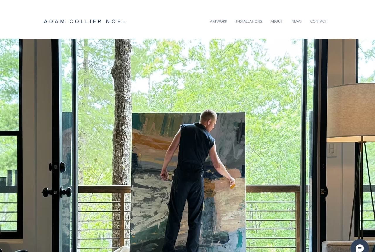
Adam Collier Noel's fine-art site leads not with a flat scan of a painting but with a photograph of the artist installing a large canvas in a beautiful modern interior — the work in situ, at scale, in a real space. That single choice does something a gallery grid can't: it shows collectors how the art LIVES in a home, communicating scale, presence and the calibre of space it belongs in. The spare serif wordmark, generous white space and restrained navigation (Artwork, Installations, About, News) keep all attention on the work, exactly as a serious artist's portfolio should. For a fine artist or gallery, photographing pieces in situ (in gorgeous rooms, at real scale) rather than as isolated images helps buyers imagine ownership and signals the premium tier. Show the art in the life it's destined for, and let everything else get out of the way.

  • Work shown in situ conveys scale, presence and where it belongs
  • Spare serif + white space keeps all attention on the art
  • Helps collectors imagine the piece in their own space

Steal this: Photograph your work in situ, at real scale in a beautiful room — not as a flat scan. It helps buyers imagine owning it.

Avery O Design website — Muralist / Illustrator design example
Real site · Austin, TX
  • Muralist / Illustrator
  • Vibrant
  • Multicolor + navy

Avery O Design: The artist and the work, joyfully

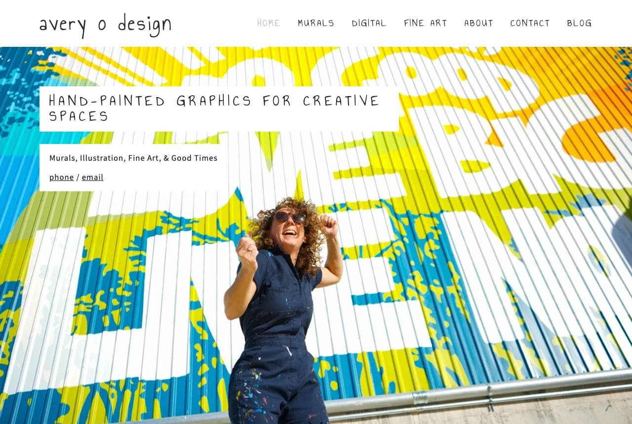
Avery O Design captures the energy of a muralist perfectly: a photo of the artist herself, paint-splattered and mid-celebration, in front of one of her huge, colourful murals, under 'Hand-Painted Graphics for Creative Spaces' and the warm 'Oh, Hello!' welcome. Below, a vibrant grid of completed murals shows the range. For a muralist and illustrator, the work is inherently big, bold and photogenic, and putting the artist IN the frame with the art conveys personality, scale and the collaborative, human nature of commissioning a mural. The playful copy ('Murals, Illustration, Fine Art & Good Times') and joyful imagery signal exactly the kind of fun, creative partner a business wants painting their wall. When you're a commission artist, showing yourself with your work — visibly enjoying it — builds the personal rapport that wins commissions. Personality plus a bold portfolio grid.

  • Artist-in-front-of-mural conveys personality and scale
  • Joyful, paint-splattered energy signals a fun creative partner
  • Bold mural grid shows range for commissioners
Katrina Swanson Fine Art website — Realist Oil Painter design example
Real site · United States
  • Realist Oil Painter
  • Photoreal
  • White + vivid

Katrina Swanson Fine Art: Let one hyperreal painting stop you

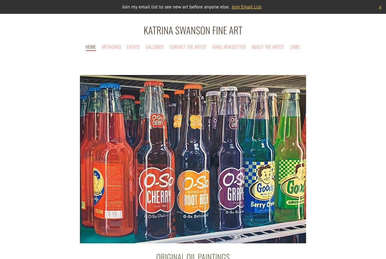
Katrina Swanson Fine Art leads with a single, arresting hero: a photorealistic oil painting of a row of colourful vintage soda bottles, so precise it reads as a photograph until you realise it's paint. That's the whole strategy — for a hyperrealist, the jaw-drop of 'wait, that's a PAINTING?' is the most powerful possible hook, so leading with the most technically stunning piece stops the scroll instantly. 'Original Oil Paintings' and a warm, personal note ('so happy you decided to check out my work') keep it approachable, and an email-list signup captures interested collectors. The clean, unfussy layout lets the work's realism speak. For any artist whose superpower is technical virtuosity, lead with your single most impressive, disbelief-inducing piece — the 'how is that possible?' reaction does more selling than any statement. Let the skill be the hook.

  • One hyperreal painting delivers the 'that's a PAINTING?' jaw-drop
  • Leading with technical virtuosity stops the scroll
  • Email signup captures the impressed collector
Marlena Myles website — Indigenous Digital Artist design example
Real site · Saint Paul, MN
  • Indigenous Digital Artist
  • Cultural
  • Geometric + warm

Marlena Myles: Culture and craft, inseparable

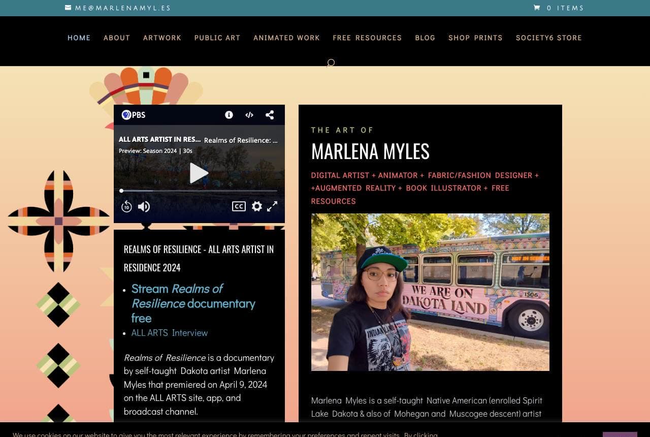
Marlena Myles' site is inseparable from her identity as a self-taught Dakota/Mohegan/Muscogee artist, and the design reflects it: bold geometric patterns drawn from Indigenous art frame 'The Art of Marlena Myles,' and the extensive practice list (Digital Artist, Animator, Fabric/Fashion Designer, Augmented Reality, Book Illustrator) plus documentary features show a multidisciplinary career rooted in cultural storytelling ('sharing stories that inspire hope, strength… for future generations'). The design isn't decoration applied to a portfolio — the visual language IS the art and the heritage, unified. For an artist whose work is deeply tied to culture and identity, letting that identity drive the entire visual system (patterns, colours, story) makes the site an authentic extension of the practice rather than a neutral container. When your art carries meaning and heritage, the whole site should embody it, not just display it.

  • Indigenous geometric patterns ARE the design, not decoration
  • Multidisciplinary list shows a career, not just paintings
  • The site embodies the cultural identity behind the work
Rose Hewartson website — Pop Artist + Teacher design example
Real site · Australia
  • Pop Artist + Teacher
  • Bold
  • Brick + pop-colour

Rose Hewartson: A three-word attitude and a studio vibe

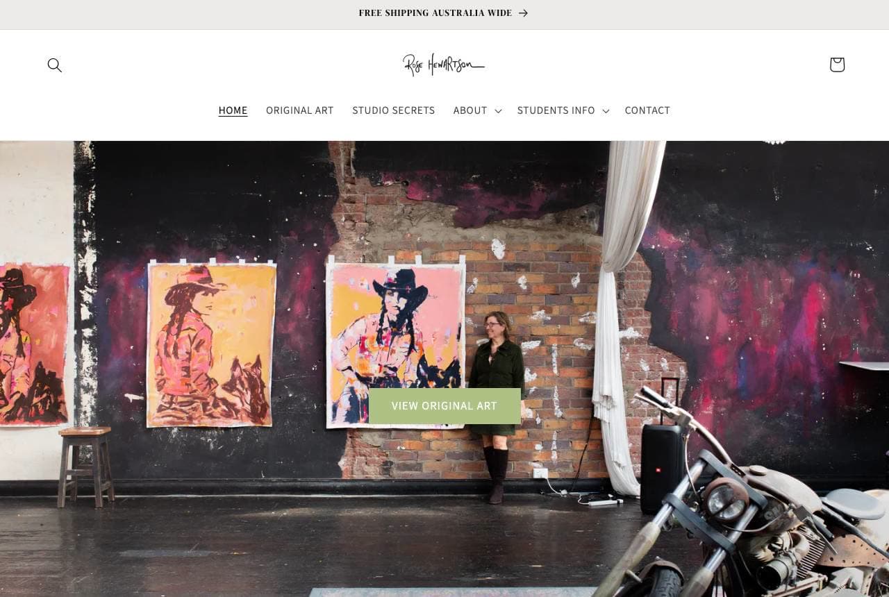
Rose Hewartson brands her bold pop-art with pure attitude: 'Raw. Courageous. Unapologetic.' beneath a photo of the artist in a gritty loft studio — exposed brick, a graffiti wall, a motorcycle, her striking cowgirl portraits on the walls. The three-word manifesto instantly telegraphs the personality of the work (edgy, confident, unafraid), and the styled studio environment sells a whole rebellious lifestyle and aesthetic, not just the paintings. Beyond original art, the nav reveals a broader business — 'Studio Secrets,' 'Students Info' — showing she monetizes teaching alongside selling, and 'free shipping Australia wide' signals an e-commerce operation. For an artist with a strong personal brand, a punchy manifesto plus atmospheric studio photography sells the persona that makes the art collectible. Attitude is a differentiator; state it in three words and dress the set to match.

  • 'Raw. Courageous. Unapologetic.' telegraphs the work's attitude
  • Styled loft studio sells a lifestyle, not just paintings
  • Teaching + e-commerce show a diversified artist business
Nola Muller website — Landscape Painter design example
Real site · Northern Cape, ZA
  • Landscape Painter
  • Earthy
  • Sand + mineral

Nola Muller: Landscape roots and a working artist's business

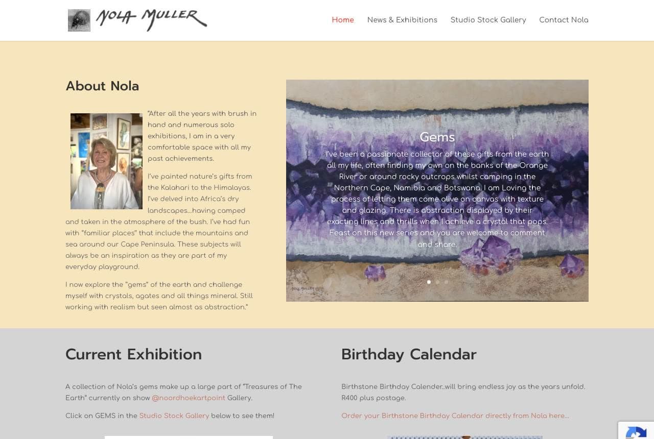
Nola Muller's site pairs earthy landscape and gemstone paintings (inspired by the South African bush, from 'the Kalahari to the Himalayas') with the practical apparatus of a working exhibiting artist: a personal about-the-artist story, a Current Exhibition callout, a Studio Stock Gallery organized into series (Familiar Places, Gems, Seascapes), and even a whimsical 'Birthstone Birthday Calendar' product. The warm, sandy palette echoes the earth-and-mineral subjects. What's instructive is the balance — the art is clearly the heart, but the site also handles the business of being an artist: showing what's currently exhibiting, letting collectors browse available stock by theme, and offering a product. For a mid-career exhibiting artist, organizing available work into browsable series and surfacing current exhibitions turns a portfolio into a functioning gallery-and-shop. Art at the centre, commerce quietly enabled around it.

  • Earthy palette echoes the bush-and-gem subject matter
  • Studio Stock Gallery by series turns portfolio into a shop
  • Current Exhibition + a product show a working-artist business
I Heart Art website — Hand-Lettering Artist design example
Real site · London, ON
  • Hand-Lettering Artist
  • Personable

I Heart Art: A personable hello and a niche product

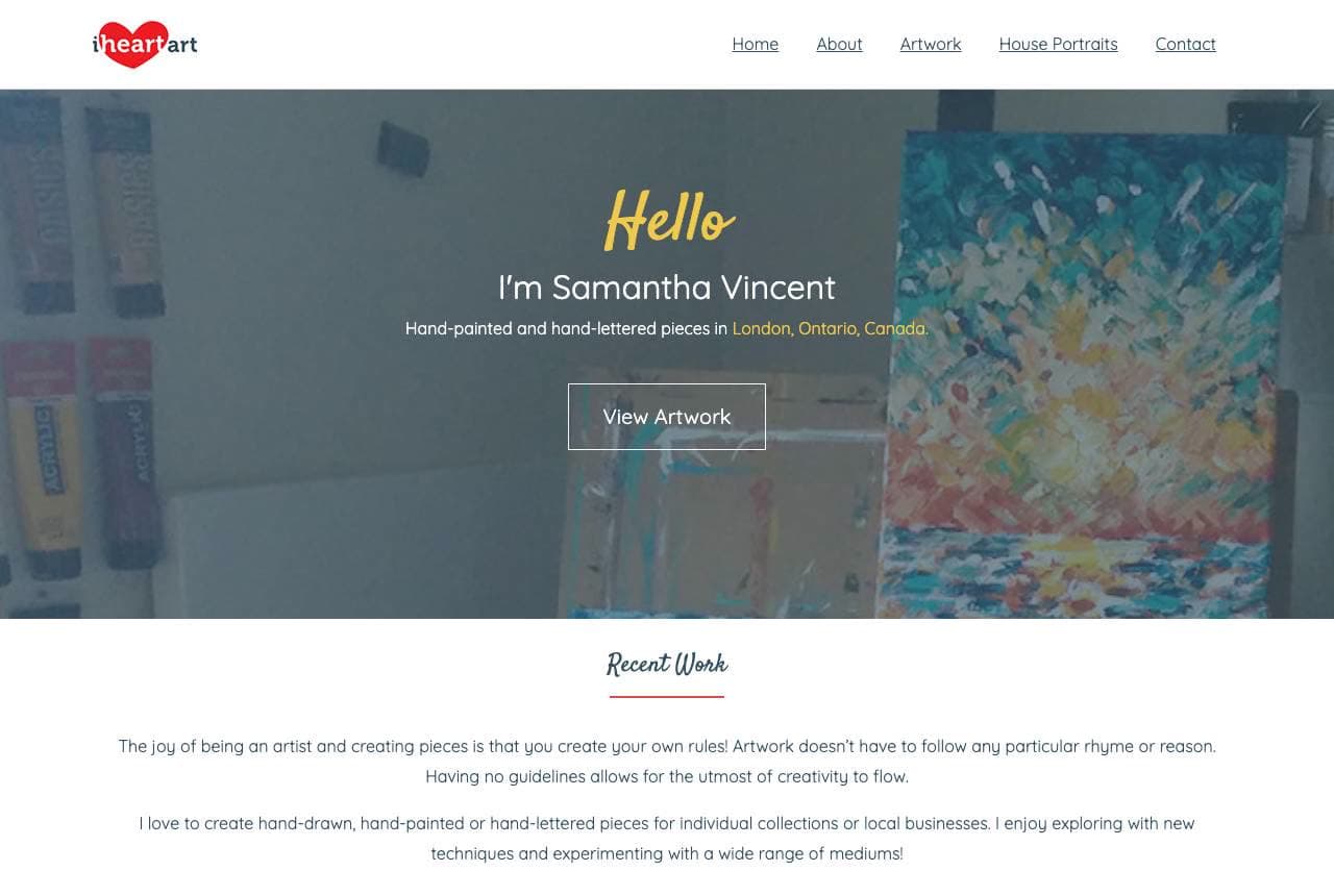
I Heart Art (Samantha Vincent) opens with warmth and personality: 'Hello, I'm Samantha Vincent — hand-painted and hand-lettered pieces in London, Ontario,' with a friendly first-person intro and a 'View Artwork' CTA. The copy is disarmingly human ('the joy of being an artist and creating pieces is that you create your own rules'), and the nav reveals a smart commercial niche — 'House Portraits' — a specific, giftable, commissionable product (a painting of someone's home) that turns fine-art skill into a repeatable, marketable offering. For an independent artist, pairing a warm personal introduction (people buy from people) with a defined commissionable product (house portraits, pet portraits, custom lettering) is how you move from 'admire my art' to 'here's something you can actually buy from me.' The friendly hello builds the relationship; the named product gives the visitor a concrete reason and way to purchase. Personable, and productized.

The Spotted Easel — Art Studio / Classes website design you can build with Zarla
Build this with Zarla
  • Art Studio / Classes
  • Inviting

The Spotted Easel: Make something you'll love

The Spotted Easel is Zarla's art-studio template, and its carousel hero takes the class-and-community angle: 'Make Something You'll Love,' in a teal-and-terracotta palette that's warm, creative and inviting. Where the real sites in this gallery are individual artists' portfolios, this template suits the art STUDIO that teaches — classes, workshops, paint-and-sip, kids' camps — so it leads with the joyful outcome of making art rather than a single artist's work. The carousel showcases different classes and creations, and the structure carries a class schedule, an about-the-studio section, a gallery of student work, and a booking/registration CTA. It's the right register for a community art space selling experiences and lessons. Swap in photos of your own studio and classes and it's a warm, inviting art-studio site in about 30 seconds — no photographer or designer required.

See this template

Frequently asked

Where can I find good art studio website examples?

Right here — this page curates art studio website examples two ways: standout real businesses (each linked, so you can explore the live site) and professionally designed Zarla templates you can clone and make your own. Every example comes with a note on why the design works — trust signals, layout, calls to action — so you can copy the move, not just the look.

What makes a good art studio website?

A good art studio website earns trust in the first few seconds, leads with strong visuals of the work, gives visitors one obvious action, and loads fast on a phone. Every design below leads with proof and a single clear call to action rather than a wall of text.

How much does a art studio website cost?

A custom art studio website from a designer typically runs into the thousands up front, and template builders charge roughly $16–$30 per month. An AI builder generates a complete, editable design for free and only charges (on the Premium plan) when you publish to your own domain — so you can build and preview before spending anything.

Do I need a designer to build a art studio website?

No. Several designs on this page were generated by Zarla and are fully editable — you describe your business and get a complete, professionally designed site in about 30 seconds, then refine it by chatting. Building and previewing is free; publishing to your own domain needs the Premium plan.

What pages does a art studio website need?

Most art studio businesses need just a few: a home page that proves trust and points to one clear action, an about page that puts a face to the business, a services or work page that shows what you do, and a contact page with a form and a phone number. Local businesses also benefit from location or service-area pages that help them show up in nearby searches.

How do I get more customers from my art studio website?

Lead with proof in the first few seconds (reviews, real photos, results), make one action obvious on every screen (call, book, or enquire), and keep it fast on mobile — most visitors arrive on a phone. The designs above each do this differently, but they all earn trust early and remove friction from the next step.

You've seen what works. Now make it yours.

Describe your business and Zarla designs a complete, professional website in about 30 seconds — built to convert, just like the ones above.

Free to build and preview · no credit card · publish to your own domain on Premium