Inspiration · Auto Repair

The Best Auto Repair Website Examples, Explained

Looking for auto repair website examples? These 14 are the best we could find — standout real auto repair sites plus designs you can build with Zarla — and each comes with a breakdown of the specific design move that makes it work. Find a look you love and you can build a site in that exact style, free, in about 30 seconds.

Real sites + designs you can build with Zarla — free to build and preview, no credit card

What makes a great auto repair website

The best auto repair websites share a few moves: they earn trust fast, lead with strong visuals of the work, point to one clear action, and match the design to how their customers decide. Each example below calls out the specific choice worth stealing for your own auto repair website.

The Electrified Garage website — EV Repair design example
Real site
  • EV Repair
  • Technical
  • Cream + orange

The Electrified Garage: Blueprint aesthetics for the EV era

The Electrified Garage — independent Tesla and Rivian repair — designs like the engineering it sells: an exploded-chassis illustration annotated with part numbers, monospace labels in the margins, and a headline that stakes the philosophy: 'Repair, engineered for the real world.' The stats row is unusually credible (1.75M YouTube subscribers, 24+ years factory-trained, independent since 2019), and the section title 'Evidence first. Options second.' extends the diagnostic ethos into copy. Everything reads like a technical document that learned graphic design. For any specialist shop whose customers research obsessively — and EV owners do — matching their analytical mindset in the design itself is the sharpest trust move available.

  • Exploded-diagram hero speaks the EV owner's language
  • A YouTube-subscriber stat is proof no badge can fake
  • 'Evidence first. Options second.' turns ethos into copy

Steal this: Design for how your customer researches — analytical buyers trust analytical pages.

Ace Mechanics website — Mobile Mechanic design example
Real site · Melbourne, AU
  • Mobile Mechanic
  • Established
  • Red + white

Ace Mechanics: The van comes to you — since 1972

Ace Mechanics leads with its actual product: a cut-out photo of the branded van, because the van going to the customer IS the service. 'Mobile Mechanic Services at your Doorstep since 1972' pairs the convenience with a half-century anchor, and dual rating badges — Google 4.6 from 1,500+ reviews, Facebook 4.8 — sit right under the CTAs where doubt happens. Three service cards (service, repairs, inspections) each get their own 'Learn more,' keeping the triage simple. The red-and-white palette matches the fleet livery, so the site and the van you'll see in your driveway are unmistakably the same company. Coherence between web and physical brand is quiet gold.

  • The branded van photo is the service, literally
  • Review badges belong beside CTAs, not in footers
  • Site palette matches fleet livery — total brand coherence
Bumper Buddies website — Mobile Dent Repair design example
Real site
  • Mobile Dent Repair
  • Conversion-led
  • Red + white

Bumper Buddies: Photograph your dent, get a price

Bumper Buddies rebuilt the estimate around the phone in your hand: 'Submit a photo of your damage for a quick estimate,' says the red hero panel, over a photograph of a customer doing exactly that beside her dented sedan. That one flow removes the trade's biggest friction — driving somewhere to be told a price — and the icon row underneath answers the follow-ups in order: we're mobile, PPG computerized color matching, serving SoCal to Arizona, three-year warranty. The hero image doubles as an instruction manual. When your intake process is genuinely easier than the industry's, make the process itself the hero — the design's job is to show step one.

  • Photo-for-estimate turns the phone into the intake form
  • The hero image demonstrates the flow it asks for
  • PPG color-matching credential answers the quality doubt

Steal this: If your intake is easier than the industry's, make the process the hero image.

Autodeutsche website — German Car Specialist design example
Real site · London, UK
  • German Car Specialist
  • Moody
  • Black + red

Autodeutsche: Fog, headlights, and one specialist claim

Autodeutsche opens on a BMW's angel-eye headlights burning through fog under a streetlamp — automotive photography with actual atmosphere — and a claim with no hedging: 'London's Leading German Car Specialist.' The specialism does the filtering (Bentley, BMW, Ford, Honda logos clarify the range below), a Trustpilot five-star strip does the vouching, and the moody palette borrows the premium feel of the marques it services. There's a subtle positioning trick here: the site looks like a German car ad, which reassures exactly the owner who chose the car for that aesthetic. Specialists should dress like the brands their customers already love.

  • Atmospheric marque photography borrows German-brand prestige
  • 'Leading… specialist' plus a city is a complete position
  • Trustpilot stars translate a bold claim into evidence
Vanguard Automotive website — Mechanic Workshop design example
Real site · Central Coast, NSW
  • Mechanic Workshop
  • Trustworthy
  • Navy + red

Vanguard Automotive: A 30-second quote form and an honest rename

Vanguard Automotive puts a quote form in the hero with a promise on the label — 'Takes Less Than 30 Seconds' — and keeps it to four fields so the promise is true. Smarter still is the banner above the headline: 'Formerly Known As Sam & Sons Mechanical Repairs,' preserving decades of local word-of-mouth through a rebrand instead of orphaning it. 'Your Reliable Central Coast Mechanic Workshop' plus 'upfront and honest pricing' talks straight to the trade's trust deficit, and 'Over 50 Years Experience' sits beneath the form as the closer. Rebranding businesses: carry your old name visibly until the new one has earned its own reputation.

  • A labeled '30 seconds' promise makes forms feel light
  • 'Formerly known as' preserves word-of-mouth through a rebrand
  • Upfront-pricing language attacks the trust deficit head-on
Anchor Automotive — Auto Repair website design you can build with Zarla
Build this with Zarla
  • Auto Repair
  • Honest
  • Slate + orange

Anchor Automotive: The trust deficit, answered in the headline

Anchor Automotive is Zarla's auto-repair template, and it goes straight at the industry's reputation problem: 'The Mechanic You Can Actually Trust.' The form-split hero pairs that promise with an estimate form beside it — claim on the left, proof-of-ease on the right — in deep slate with a signal-orange accent that reads workshop without reading grease. The word 'actually' is doing the real work in that headline; it acknowledges the skepticism every driver carries in the door. Underneath, the structure holds services, reviews, and hours in the standard conversion order. Clone it, keep the honesty posture, and let the form capture what the headline earns.

  • 'Actually' names the skepticism and disarms it
  • Form-split pairs the trust claim with an easy next step
  • Slate + orange reads workshop-clean, not grease-stained
See this template
Brisbane Automotive Service website — Car Repair design example
Real site · Brisbane, AU
  • Car Repair
  • Local

Brisbane Automotive Service: Make logos as a capability statement

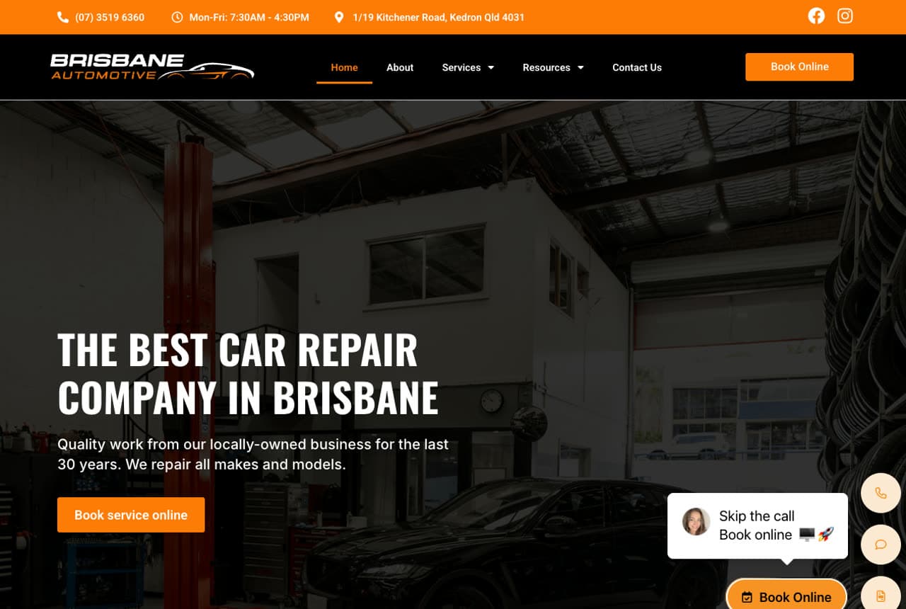
Brisbane Automotive Service states its claim in workshop-plain terms — 'The Best Car Repair Company in Brisbane… quality work from our locally-owned business for the last 30 years' — over a photograph of its actual hoists and bays, then lets a strip of manufacturer logos (Honda, Hyundai, Jaguar, Jeep, Kia, Land Rover, Lexus, Mercedes-Benz) do the technical vouching. That logo strip answers the question every caller asks first: 'do you work on mine?' A floating 'Skip the call — book online' widget modernizes the intake without changing the trustworthy-workshop tone. Straightforward, honest, and specific: the local-shop formula executed exactly as it should be.

Astra Automotive website — European Auto Specialist design example
Real site · Calgary, AB
  • European Auto Specialist
  • Premium

Astra Automotive: European specialism in black and gold

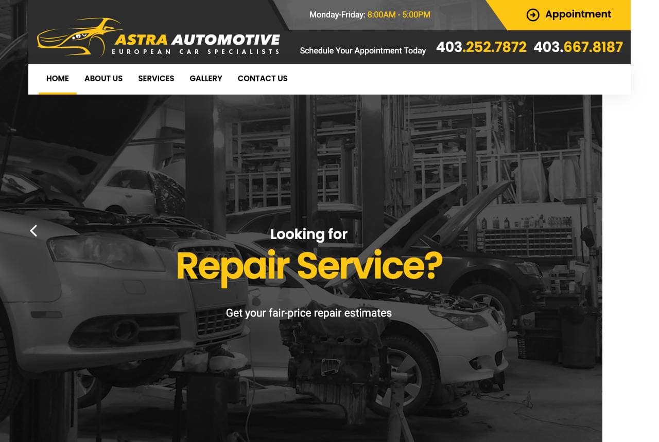
Astra Automotive frames itself as Calgary's European car specialist — Audi, BMW, Mercedes, Porsche, Volkswagen, Land Rover — with a dark workshop hero asking 'Looking for Repair Service?' and promising fair-price estimates. The black-and-gold scheme carries the premium-European cue through the page, and the split tiles beneath (Preventative Maintenance in gold, Most Common Repairs beside an oil-pour photo) organize the offer by how owners actually think about their cars: avoid problems, fix problems. Two phone numbers and posted hours in the top bar respect that repair is still a call-first trade for many. A solid specialist page that lets marque focus and dark-gold styling do the positioning.

Maddox Transmission & Gear — Transmission Specialist website design you can build with Zarla
Build this with Zarla
  • Transmission Specialist
  • Honest

Maddox Transmission & Gear: Transmissions only — the specialist's edge

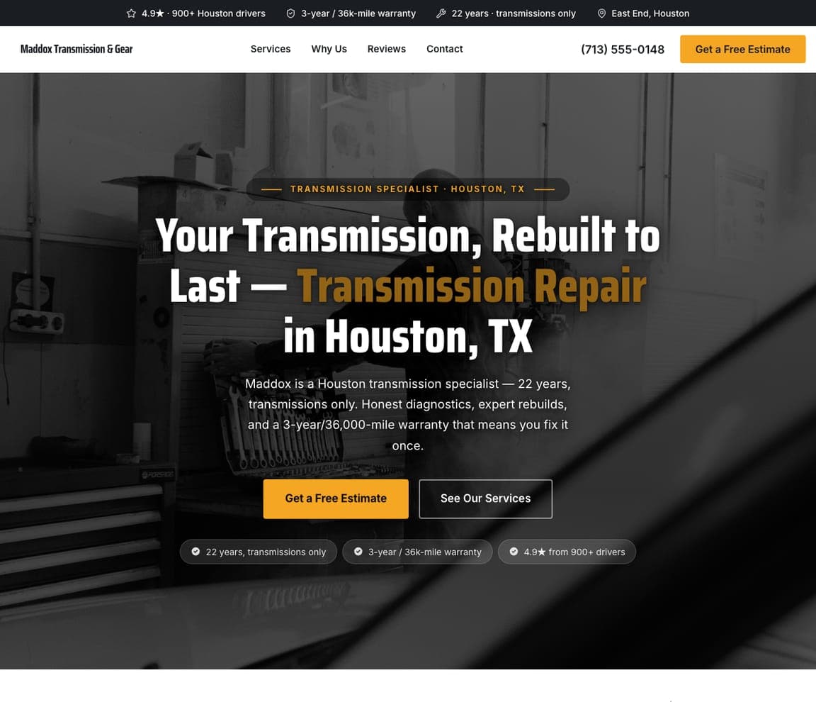
Maddox Transmission & Gear shows the power of narrowing: 'Your Transmission, Rebuilt to Last — Transmission Repair in Houston, TX,' with 'Transmission Repair' in amber over a dark workshop, and the closer that sells the whole category — a '3-year/36,000-mile warranty that means you fix it once.' The fullwidth-overlay hero keeps it plain and workshop-honest (the same posture Anchor's flagship takes), but the positioning is sharper: '22 years, transmissions only' tells a driver with a slipping gearbox they've found the one shop that does nothing else. Depth beats breadth for expensive, scary repairs — nobody wants their transmission rebuilt by a generalist. For any single-service specialist, name the specialism in the headline and back it with a warranty; 'we only do this' is its own trust signal.

See this template
Ironside Collision & Auto Body — Collision & Body website design you can build with Zarla
Build this with Zarla
  • Collision & Body
  • Reassuring

Ironside Collision & Auto Body: Like it never happened — claim handled

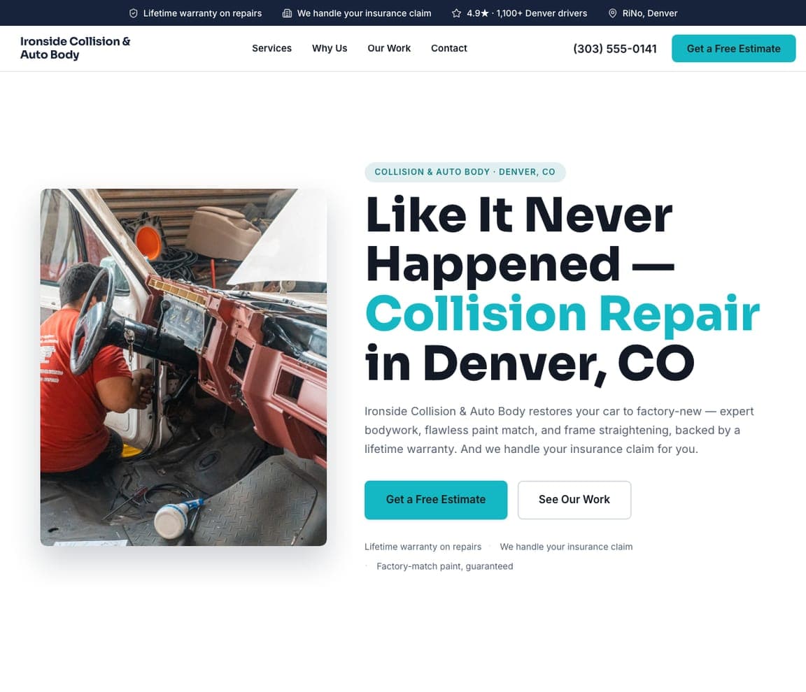
Ironside Collision & Auto Body speaks to the two things a collision customer actually fears: 'Like It Never Happened — Collision Repair in Denver, CO' promises the car back to factory-new, and 'we handle your insurance claim for you' removes the paperwork dread that follows every accident. The split hero pairs a real bodywork photo with a teal accent that reads clean and clinical — not the grease-and-red most body shops default to — reinforcing the 'flawless paint match' claim visually. A lifetime warranty seals it. For a body shop, the customer arrives stressed after a crash, so leading with the emotional outcome ('like it never happened') plus the friction-remover ('we handle the claim') beats any list of frame-straightening equipment. Sell the relief, then prove the craft.

See this template
Ironhorse Diesel & Truck — Diesel & Fleet website design you can build with Zarla
Build this with Zarla
  • Diesel & Fleet
  • Rugged

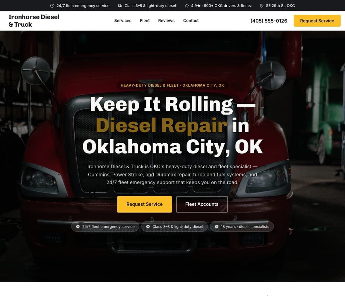
Ironhorse Diesel & Truck: Fleet accounts, and Cummins by name

Ironhorse Diesel & Truck is built for owners who lose money when a truck is down: 'Keep It Rolling — Diesel Repair in Oklahoma City, OK' over a heavy semi, with '24/7 fleet emergency support that keeps you on the road' and a 'Fleet Accounts' CTA sitting right beside the consumer one. Naming the engines — Cummins, Power Stroke, Duramax — does the same filtering job Astra's marque list does for European cars: a diesel owner instantly knows this shop speaks their language. The rugged dark-and-amber palette matches the heavy-duty work. For a diesel or fleet specialist, the buyer is often a business, not a driver, so surfacing a fleet-account path and 24/7 uptime language speaks to the real cost — downtime — not just the repair.

See this template
Dynoworks Performance — Performance Tuning website design you can build with Zarla
Build this with Zarla
  • Performance Tuning
  • Aggressive

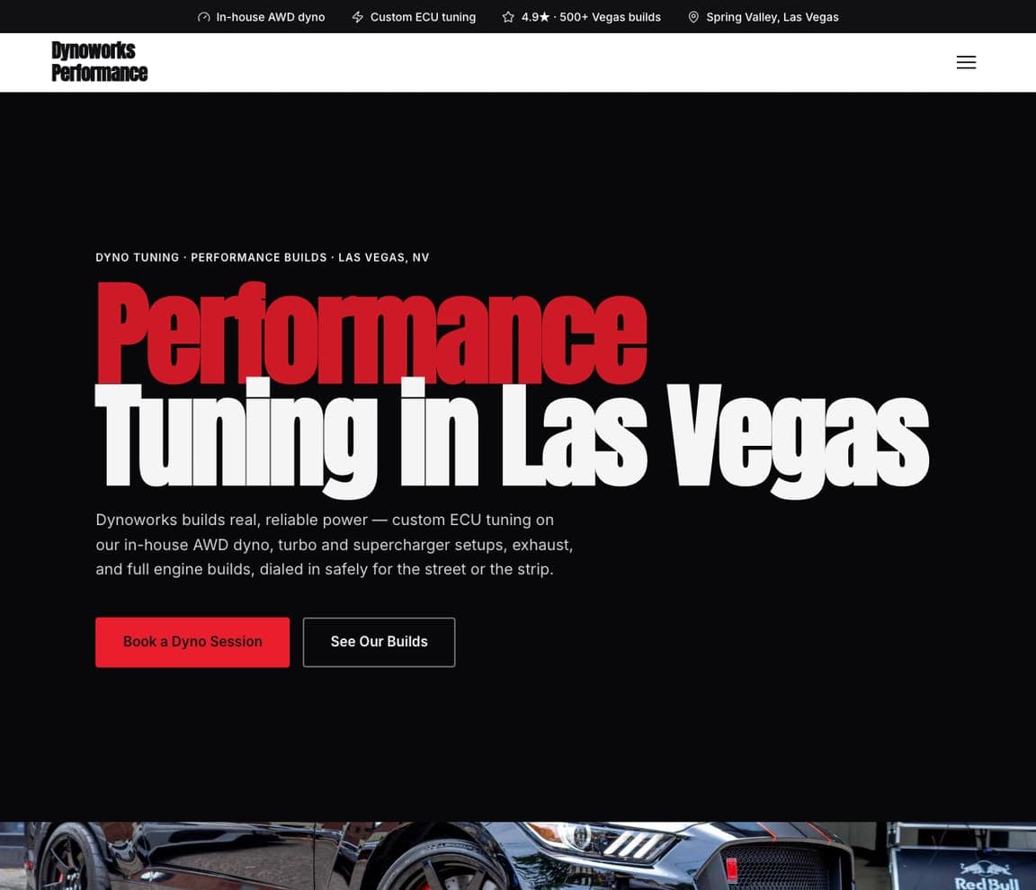
Dynoworks Performance: Red on black, dialed for the strip

Dynoworks Performance matches its design to its customer's adrenaline: 'Performance Tuning in Las Vegas' in huge type — 'Performance' blazing red on black — over a performance car, with a subhead that talks enthusiast ('custom ECU tuning on our in-house AWD dyno… dialed in safely for the street or the strip'). The type-hero and aggressive red-on-black palette perform the same trick Autodeutsche uses for German marques: the site looks like the culture it serves, so a tuner scrolling past feels immediately at home. 'Book a Dyno Session' is the enthusiast's exact next step. For a performance shop, restraint would be a mistake — the buyer wants power and personality, so a loud, dark, high-energy design signals you're one of them, not a corner garage that also does tunes.

See this template
Kingsley Classic Restoration — Classic Restoration website design you can build with Zarla
Build this with Zarla
  • Classic Restoration
  • Heritage

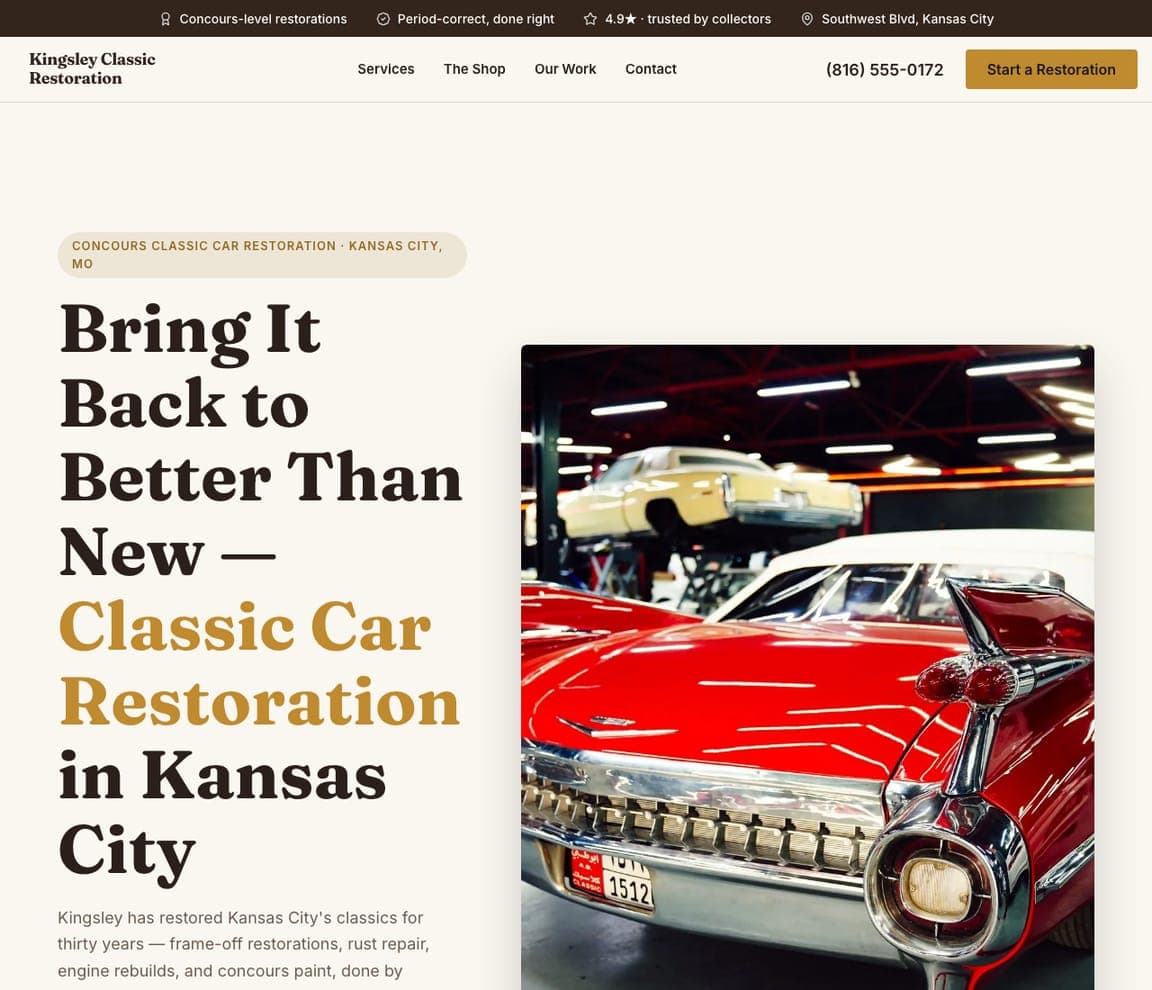
Kingsley Classic Restoration: Concours craft, in warm serif and gold

Kingsley Classic Restoration trades the category's workshop grit for heritage luxury: a giant warm serif — 'Bring It Back to Better Than New — Classic Car Restoration in Kansas City' — with 'Classic Car Restoration' in gold, beside a gleaming vintage chrome-and-fins classic. The split hero, cream-and-gold palette and 'concours-level, period-correct, trusted by collectors' language pitch to a completely different buyer than a brake job: an enthusiast spending five or six figures to restore a treasured car. The design has to look as considered as the frame-off work it sells, and this does — nothing about it reads 'quick lube.' For a restoration shop, matching the site's craft and warmth to the preciousness of the object is the pitch; collectors buy from people who obviously revere the cars too.

See this template
Apex Tire & Wheel — Tire & Wheel website design you can build with Zarla
Build this with Zarla
  • Tire & Wheel
  • Fast

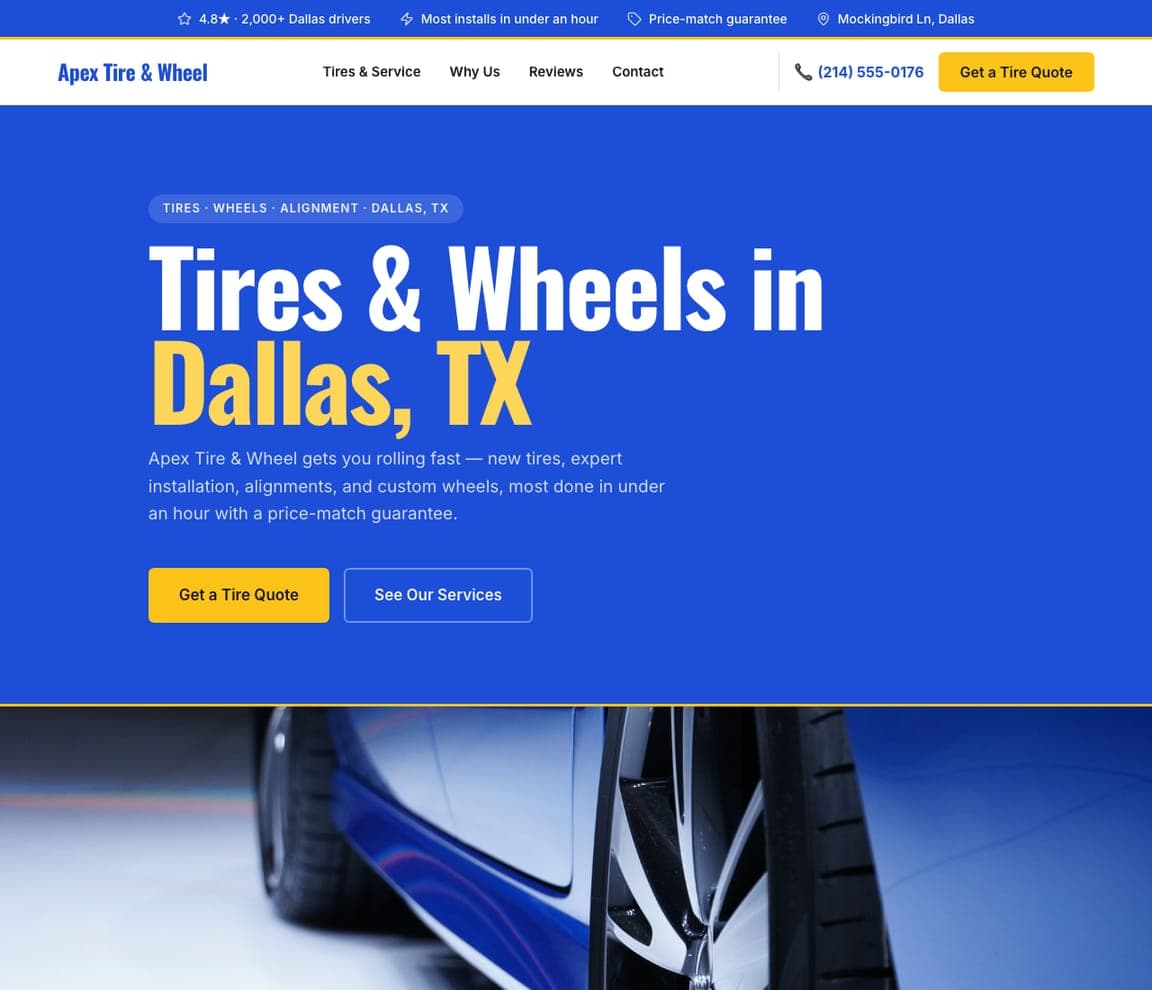
Apex Tire & Wheel: Under an hour, in bright blue

Apex Tire & Wheel wins on speed and clarity: a vivid blue color-field hero — 'Tires & Wheels in Dallas, TX' with a yellow accent — and a promise that closes a high-volume, price-sensitive sale, 'most done in under an hour with a price-match guarantee.' Where the specialist templates go dark and moody, Apex goes bright and fast, which is exactly right for tires — a commodity purchase where the buyer wants speed, a fair price, and to be back on the road, not atmosphere. The color-field variant makes the brand itself the backdrop, keeping it energetic and cheap-to-shoot (no hero photography required). For a high-turnover service like tires or oil changes, lead with the two things that actually decide the sale: how fast, and price-matched.

See this template

Frequently asked

Where can I find good auto repair website examples?

Right here — this page curates auto repair website examples two ways: standout real businesses (each linked, so you can explore the live site) and professionally designed Zarla templates you can clone and make your own. Every example comes with a note on why the design works — trust signals, layout, calls to action — so you can copy the move, not just the look.

What makes a good auto repair website?

A good auto repair website earns trust in the first few seconds, leads with strong visuals of the work, gives visitors one obvious action, and loads fast on a phone. Every design below leads with proof and a single clear call to action rather than a wall of text.

How much does a auto repair website cost?

A custom auto repair website from a designer typically runs into the thousands up front, and template builders charge roughly $16–$30 per month. An AI builder generates a complete, editable design for free and only charges (on the Premium plan) when you publish to your own domain — so you can build and preview before spending anything.

Do I need a designer to build a auto repair website?

No. Several designs on this page were generated by Zarla and are fully editable — you describe your business and get a complete, professionally designed site in about 30 seconds, then refine it by chatting. Building and previewing is free; publishing to your own domain needs the Premium plan.

What pages does a auto repair website need?

Most auto repair businesses need just a few: a home page that proves trust and points to one clear action, an about page that puts a face to the business, a services or work page that shows what you do, and a contact page with a form and a phone number. Local businesses also benefit from location or service-area pages that help them show up in nearby searches.

How do I get more customers from my auto repair website?

Lead with proof in the first few seconds (reviews, real photos, results), make one action obvious on every screen (call, book, or enquire), and keep it fast on mobile — most visitors arrive on a phone. The designs above each do this differently, but they all earn trust early and remove friction from the next step.

You've seen what works. Now make it yours.

Describe your business and Zarla designs a complete, professional website in about 30 seconds — built to convert, just like the ones above.

Free to build and preview · no credit card · publish to your own domain on Premium