Inspiration · Bookkeeping

The Best Bookkeeping Website Examples, Explained

Looking for bookkeeping website examples? These 15 are the strongest we found — real firms from solo local operators to venture-backed platforms, plus designs you can build with Zarla — and each comes with a breakdown of the specific move that wins clients. Steal the pattern, not just the palette: the best bookkeeping sites niche down, lead with proof, and make the next step obvious. Find a look you love and you can build a site in that exact style, free, in about 30 seconds.

Real sites + designs you can build with Zarla — free to build and preview, no credit card

What makes a great bookkeeping website

Bookkeeping is a trust purchase — you're handing someone your books — so the best bookkeeping websites do three things fast: they claim a niche (an industry, a software, a situation like catch-up work), they prove competence with specifics (client counts, funds raised, certifications — not adjectives), and they point to one clear action. Notice how many of the designs below lead with typography and brand personality rather than stock photography: in a category drowning in blue suits and calculator photos, a distinctive voice is the cheapest differentiator.

Avalon Accounting website — Online Bookkeeping Firm design example
Real site · Victoria, BC
  • Online Bookkeeping Firm
  • Warm
  • Cream + navy

Avalon Accounting: A promise that pairs warmth with competence

Avalon Accounting opens with five words that do all the positioning: 'We've got your books and your back.' The rhyme makes it warm, the claim makes it competent, and the design backs both — a chunky navy display serif on soft cream, one orange 'Let's Get Started' button, and a candid photo of the team actually working instead of a stock handshake. Scroll on and the proof is a linked case study ('I feel like I'm their only client — and they're my financial team') rather than an anonymous star wall. For a category that defaults to cold corporate blue, Avalon shows how far one warm sentence and real photography go toward making a numbers firm feel like an ally.

  • A rhyming promise headline does the positioning work of a whole page
  • Warm cream + navy serif reads friendly and competent at once
  • A linked case study beats an anonymous wall of stars

Steal this: Write the promise before the palette — 'books and your back' positions harder than any service list.

Pilot website — Startup Bookkeeping design example
Real site · San Francisco, CA
  • Startup Bookkeeping
  • Bold
  • Purple + yellow

Pilot: A question headline that names the real cost

Pilot doesn't sell bookkeeping — it asks 'If you're buried in bookkeeping, who's leading the company?' That question reframes the purchase from cost to leadership time, which is exactly what its founder audience values most. The deep-purple field, photo collage with floating chat chips ('your books are ready'), and an inline email field instead of a nav-away button all keep the momentum on one screen. A logo bar with OpenAI and Scale quietly says 'your peers are here.' Below, the pitch is '50/50 people and software' — dashboards plus former CFOs. It's the strongest example on this page of articulating the cost of the status quo instead of listing your own features.

  • A question headline makes the visitor feel the problem before the pitch
  • Inline email capture removes a click from the highest-intent moment
  • Peer logos (OpenAI, Scale) target the exact customer profile

Steal this: Name what the mess is costing them — time, leadership, growth — then offer the out.

Halo Tax + Accounting website — Tax + Accounting design example
Real site · Sydney, AU
  • Tax + Accounting
  • Vibrant
  • Navy + neon

Halo Tax + Accounting: A neon logo where the stock photo would go

Halo Tax + Accounting makes one radical swap: where every competitor puts a stock photo, it puts its own neon-script logo, glowing electric blue on midnight navy. The brand mark IS the hero visual — instantly memorable, zero photography budget. The headline ('More than you expect from your tax accountant') and a lime-green highlight line ('we're active supporters of our clients' financial life') carry the warmth, while a list of Eastern-Suburbs place names — Vaucluse, Rose Bay, Double Bay — works local search from the very first screen. Further down, a tabbed 'who we work with' selector routes individuals, sole traders, companies, trusts and SMSFs to tailored copy. Proof that personality plus local specificity can out-position firms ten times the size.

  • A distinctive logo can replace photography as the hero visual
  • Suburb names in the hero double as local-SEO and 'we're near you' trust
  • Lime-on-navy highlight lines direct the eye without a single image

Steal this: If your logo has personality, let it be the hero image.

KitchenSync website — Restaurant Bookkeeping design example
Real site
  • Restaurant Bookkeeping
  • Modern
  • Ink + cream

KitchenSync: Niche to one industry, then speak its language

KitchenSync commits to a single niche — restaurants — and the headline proves it in six words: 'Restaurant Back Office Work, Done Before Service.' 'Before service' is restaurant rhythm; no generalist would write it. The hero's product mockup shows a morning brief that reconciled six locations overnight and flagged a Sysco produce invoice up 12% — industry-fluent detail that reads as competence, not decoration. Below, the cost of the status quo is quantified per location, and an Anthropic/OpenAI/Google partner row signals modern tooling. The design itself is restrained ink-on-cream, because the specificity is doing the differentiation. This is the pattern for every niche bookkeeper: prove you know their operation, not just their ledger.

  • 'Done before service' — headline written in the customer's operational language
  • A believable product detail (Sysco invoice up 12%) beats generic dashboards
  • Restrained visual design lets the niche specificity differentiate
Decimal website — Online Bookkeeping design example
Real site
  • Online Bookkeeping
  • Editorial
  • Navy + coral

Decimal: One highlighted word carries the whole promise

Decimal sets its serif headline — 'Make bookkeeping and tax easy' — on deep navy and then boxes the word 'easy' in a white chip with coral type. That single typographic move is the design: the eye lands on the promise before reading the sentence. Faint orbit lines give the navy field depth without competing, and two floating status cards ('Bookkeeping — always current', 'Invoicing — get paid') preview the outcome as UI rather than claiming it as copy. Even the logo bar has personality (1-800-GOT-JUNK? next to fintech names). It's a masterclass in typographic emphasis: no photography, no illustration — one highlighted word and the confidence to let it work.

  • Boxing one word ('easy') aims the eye at the promise
  • Status-card UI previews the outcome instead of describing it
  • Serif display on navy reads editorial, not corporate
Hartwell & Pierce Bookkeeping — QuickBooks ProAdvisor website design you can build with Zarla
Build this with Zarla
  • QuickBooks ProAdvisor
  • Elegant
  • Burgundy + tan

Hartwell & Pierce Bookkeeping: The certification is the headline

Hartwell & Pierce Bookkeeping is Zarla's QuickBooks ProAdvisor template, and it leads with the thing buyers actually search for: the software. 'QuickBooks Bookkeeping in Charlotte, NC' — keyword and city, set as oversized display type on the type-hero layout, where the words themselves are the design. The burgundy-and-tan palette feels established rather than techy, deliberately unlike the SaaS blue that dominates this category, and the certification framing ('ProAdvisor') imports a trust standard the client already recognizes. When your buyer's first filter is 'does this bookkeeper know my software?', putting the certification in the headline removes the question before it's asked. Build it in about 30 seconds and make the city yours.

  • Buyers filter by software first — lead with the certification
  • Type-as-hero makes a text headline feel designed, not bare
  • Burgundy + tan reads established against a sea of SaaS blue

Steal this: Put the credential your client already trusts in the first five words.

See this template
Little Fish Accounting website — Boutique CPA Firm design example
Real site
  • Boutique CPA Firm
  • Calm

Little Fish Accounting: Calm as a market position

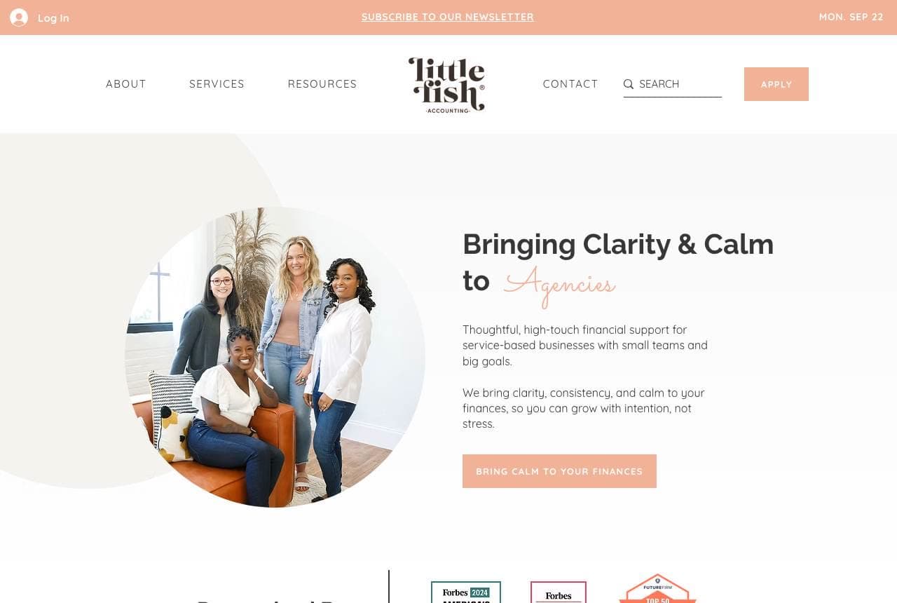
Little Fish Accounting stakes out an emotion — calm — and designs the whole page around it. 'Bringing Clarity & Calm to Agencies' pairs a niche (service agencies) with a feeling, the word 'Agencies' set in a soft script accent; the palette is blush and cream with charcoal type; the team appears in one relaxed circular photo instead of corporate headshots. Forbes 'Top 200 CPAs' badges sit quietly under a 'Recognized By' rule — proof without chest-beating — and the CTA says 'Bring calm to your finances,' extending the position all the way to the button label. In a category that sells on anxiety, choosing serenity is a genuinely contrarian move, and the niche keeps it credible.

Founder's CPA website — Startup CPA design example
Real site
  • Startup CPA
  • Professional

Founder's CPA: Stats only a specialist could claim

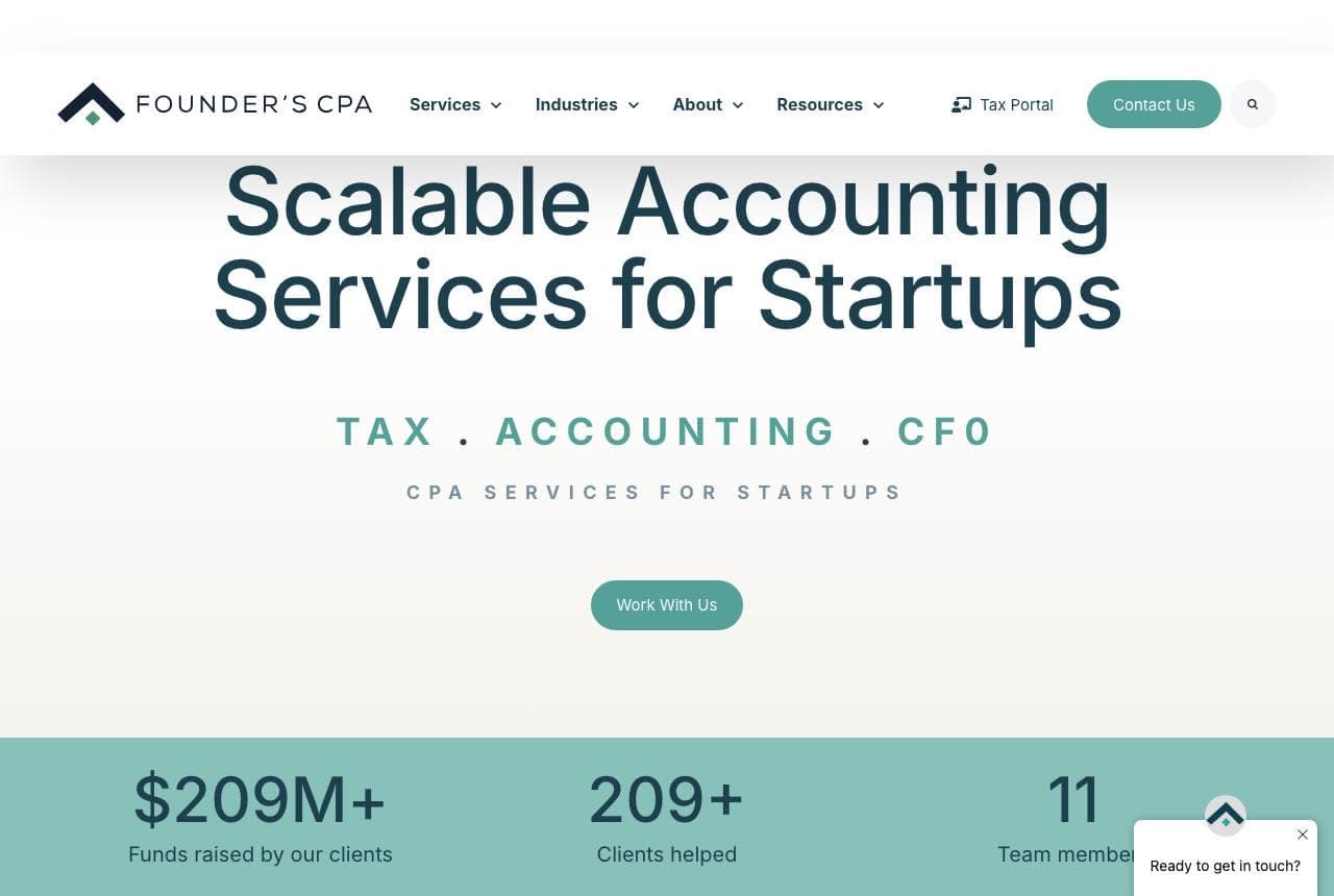
Founder's CPA proves its startup niche with numbers no generalist could print: a sage-green stats band declaring $209M+ raised by clients, 209+ clients helped, 11 team members — followed by the accelerator logos its customers came from (Y Combinator, Techstars, Shark Tank). The serif headline 'Scalable Accounting Services for Startups' plus a letterspaced TAX · ACCOUNTING · CFO overline keeps the frame calm and credible rather than hypey. That's the lesson: 'funds raised by our clients' is a metric that simultaneously proves the niche, the caliber of client, and the outcome. Every specialist bookkeeper has an equivalent stat — jobs costed, locations reconciled, returns filed — worth promoting to the hero.

American Dream CPA website — Tax Strategy CPA design example
Real site
  • Tax Strategy CPA
  • Heritage

American Dream CPA: A heritage identity in a category without one

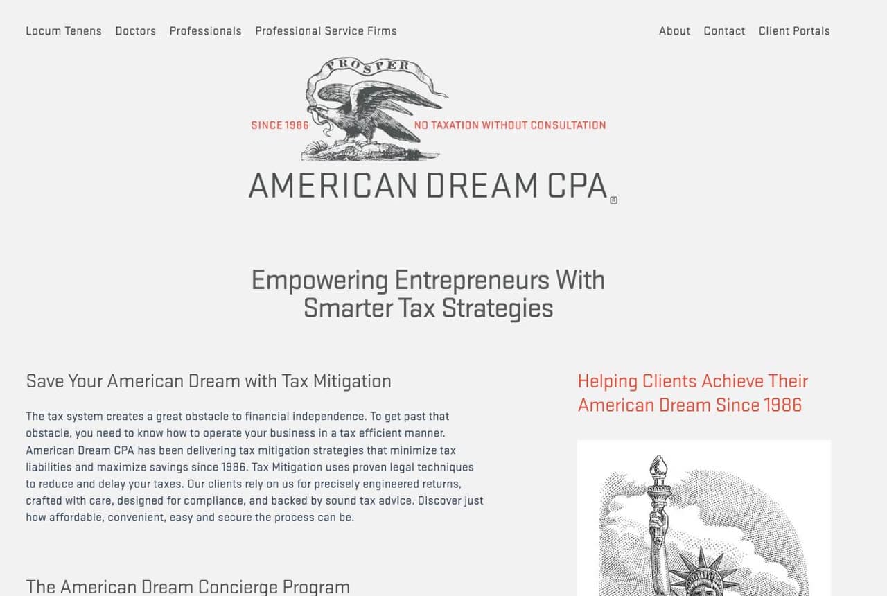
American Dream CPA dresses a tax firm like a letterpress certificate: an engraved prosperity eagle, a Statue of Liberty etching, 'SINCE 1986' and the tagline 'No taxation without consultation' — a joke that also states the service. Monochrome cream-and-black with red accents completes the currency-engraving feel. It shouldn't work, and that's why it does: every competitor is flat, blue, and ahistorical, so a heritage identity is instantly memorable and quietly implies durability — this firm has seen four decades of tax law. The lesson travels: pick one coherent visual metaphor (here, the engraved document) and commit every element to it, from the crest to the wordmark to the section dividers.

919 Bookkeeper website — Local Bookkeeper design example
Real site · Raleigh, NC
  • Local Bookkeeper
  • Bold

919 Bookkeeper: Area-code branding over a hometown skyline

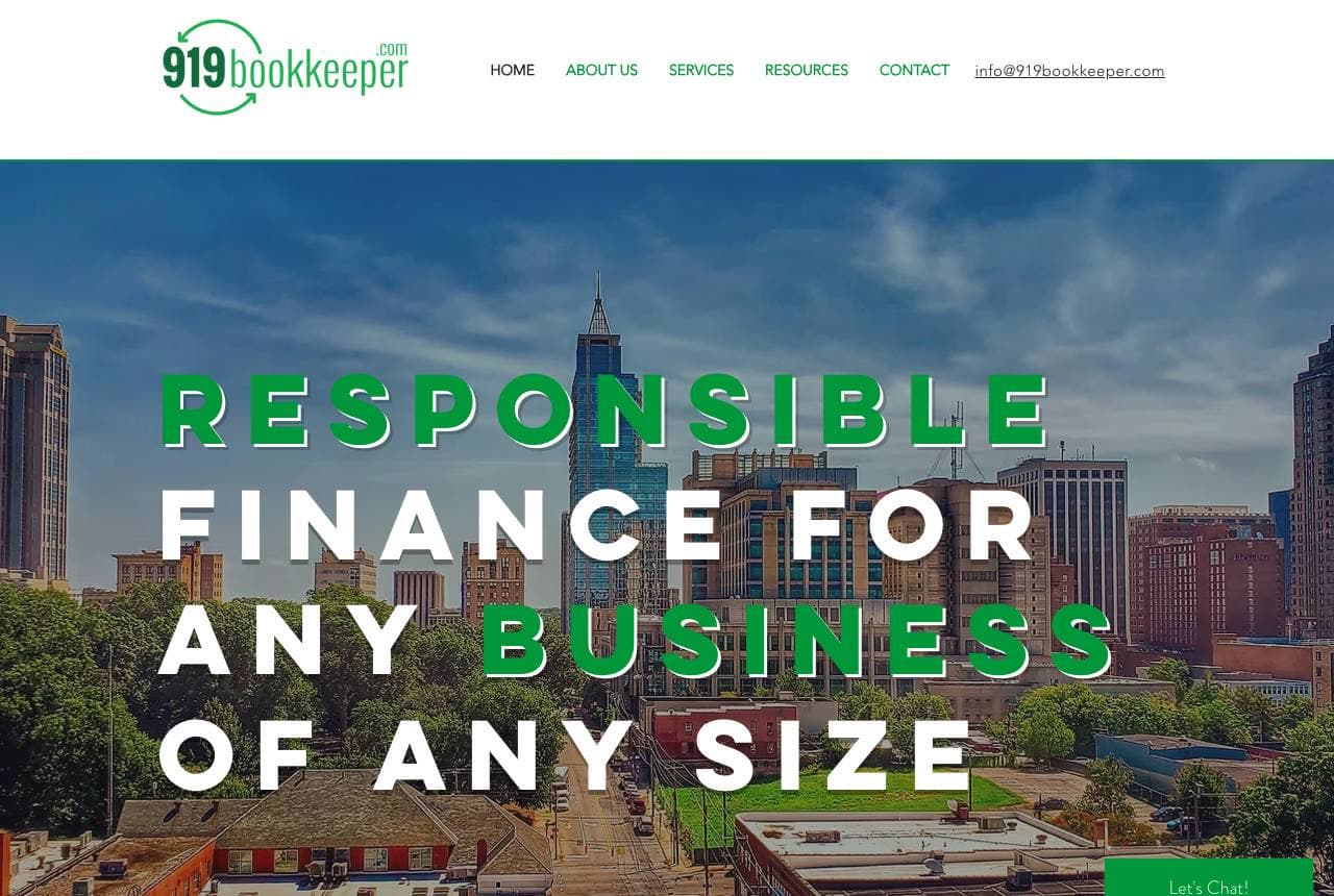
919 Bookkeeper builds its whole identity on Raleigh's area code — a local claim no national platform can copy — and backs it with a full-bleed aerial of the city itself under bold green-and-white capitals: 'Responsible finance for any business of any size.' The word 'BUSINESS' picked out in green ties the headline to the brand color, and the skyline does the 'we're from here' work that suburbs lists do elsewhere. It's a plain-spoken site beyond the hero, which is fine: for a local firm, the memorable name plus the hometown image is the differentiation. If your market is a metro, this is the cheapest strong identity available — claim the place.

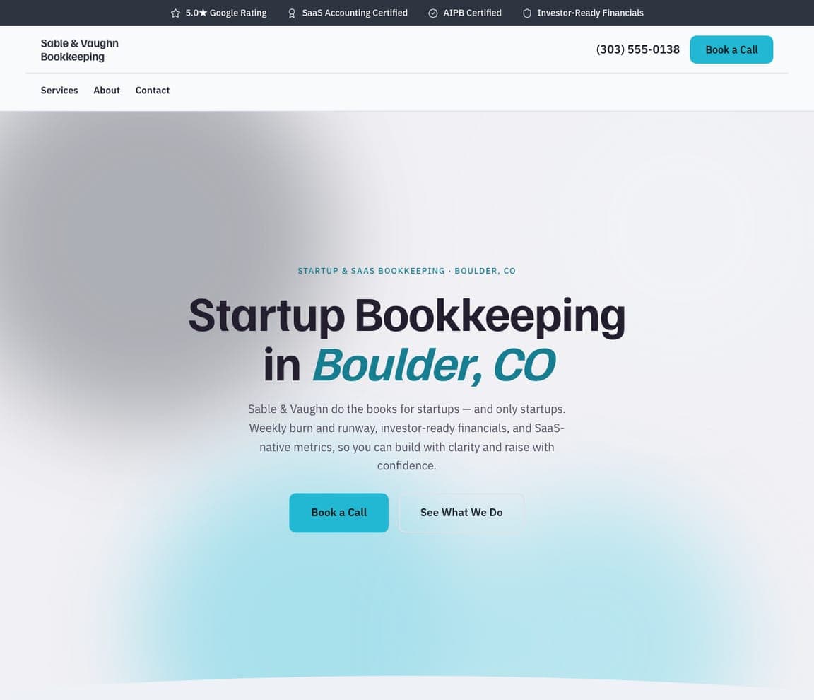
Sable & Vaughn Bookkeeping — Startup Bookkeeping website design you can build with Zarla
Build this with Zarla
  • Startup Bookkeeping
  • Modern

Sable & Vaughn Bookkeeping: An animated gradient instead of a photo shoot

Sable & Vaughn Bookkeeping is Zarla's startup-bookkeeping template on the aurora hero — a slowly shifting gradient mesh in slate and cyan with no photography at all. That's the right instinct for a software-native audience: founders read animated gradients as product-grade polish (it's the visual language of the tools they already use), and 'Startup Bookkeeping in Boulder, CO' keeps the search keyword and city doing the positioning. The palette stays cool and technical, and with no photos to source, the design never dates. For anyone selling financial services to tech companies, matching the customer's own aesthetic beats stock imagery of laptops and coffee cups every time. Build it in about 30 seconds.

See this template
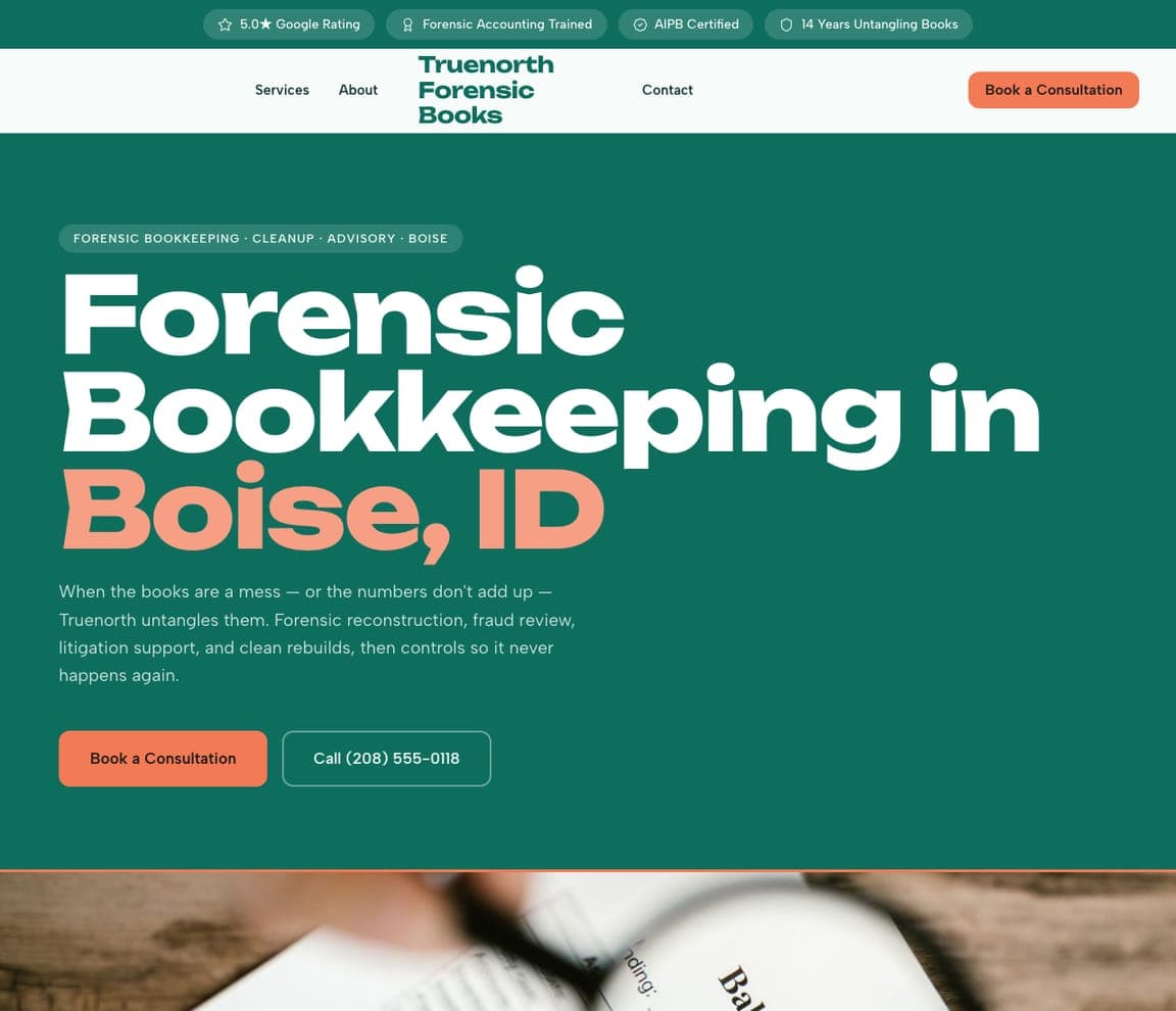
Truenorth Forensic Books — Forensic Bookkeeping website design you can build with Zarla
Build this with Zarla
  • Forensic Bookkeeping
  • Bold

Truenorth Forensic Books: A rare niche deserves a rare look

Truenorth Forensic Books is Zarla's forensic-and-cleanup template, and it doubles down on being unusual: the rarest specialty on this page (untangling books for disputes, audits, and messes) rendered on the color-field hero — an oversized headline on a vivid teal-green panel with coral accents, no photography. The visual logic is sound: a forensic bookkeeper sells rigor and nerve, and a confident, unusual design signals both. 'Forensic Bookkeeping in Boise, ID' keeps the searchable term front and center while the palette does the differentiation. If your specialty is genuinely uncommon, don't dress it in the category's default blue — the mismatch between rare service and common design wastes the story.

See this template
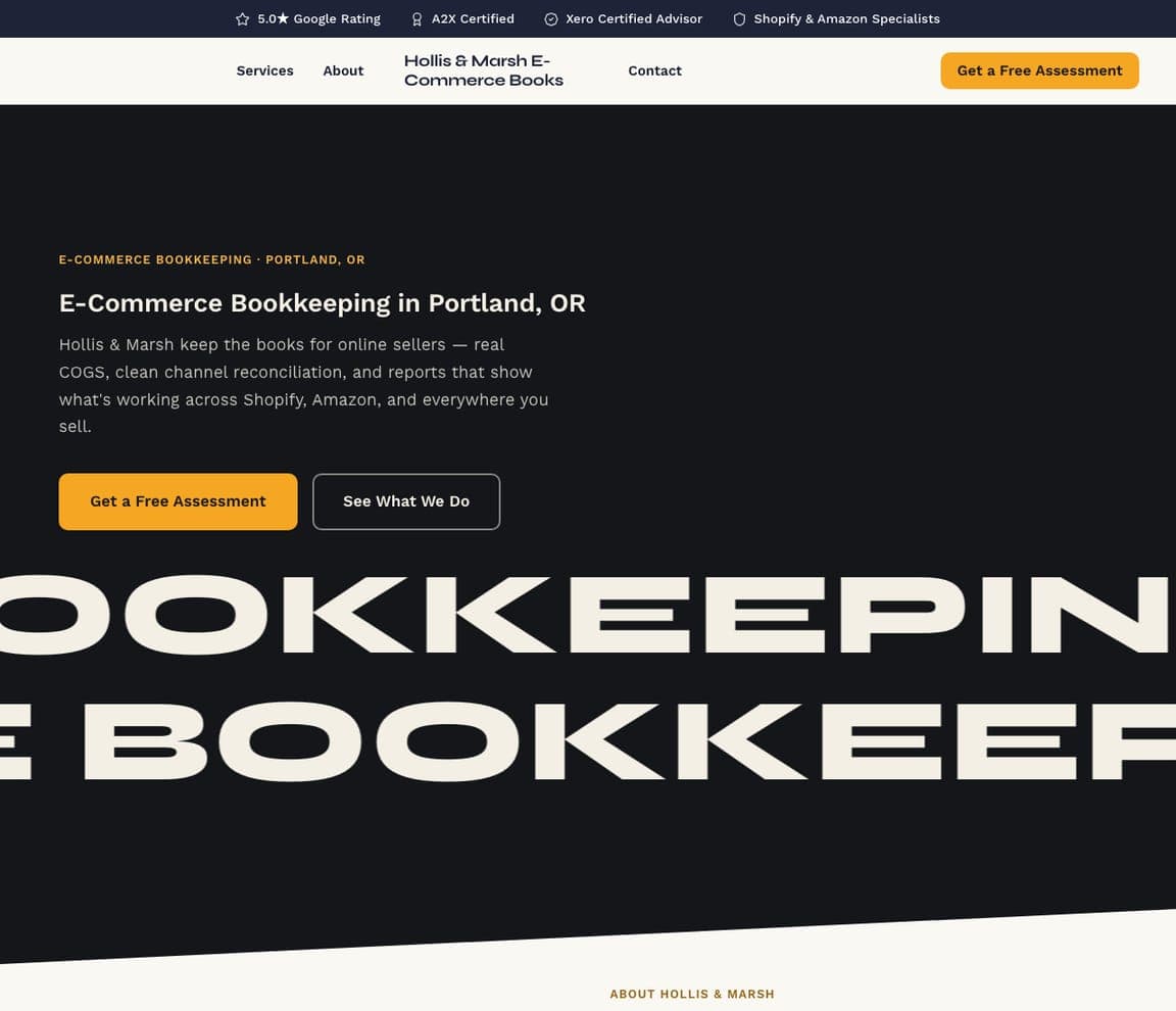
Hollis & Marsh E-Commerce Books — E-Commerce Bookkeeping website design you can build with Zarla
Build this with Zarla
  • E-Commerce Bookkeeping
  • Kinetic

Hollis & Marsh E-Commerce Books: Scrolling type for an always-on business

Hollis & Marsh E-Commerce Books is Zarla's e-commerce bookkeeping template on the marquee hero: a compact headline over two rows of giant type scrolling continuously across the screen, built from the services themselves — inventory, sales tax, channel reconciliation. Motion is the message: an e-commerce seller's business never stops moving, and neither does this hero. The midnight-navy-and-amber palette keeps the energy grounded, and 'E-Commerce Bookkeeping in Portland, OR' holds the keyword position. Kinetic type is a bolder choice than most bookkeepers would make — which is exactly why it works for sellers who spend their days inside Shopify dashboards and expect the web to feel alive. Build it in about 30 seconds.

See this template
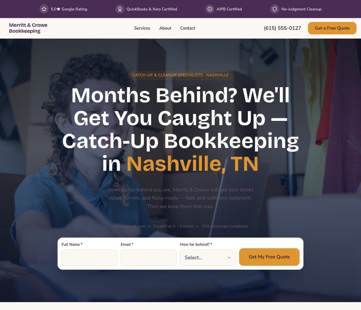
Merritt & Crowe Bookkeeping — Catch-Up Bookkeeping website design you can build with Zarla
Build this with Zarla
  • Catch-Up Bookkeeping
  • Reassuring

Merritt & Crowe Bookkeeping: Meet the shame, then remove the friction

Merritt & Crowe Bookkeeping is Zarla's catch-up and cleanup template, and it opens by naming the feeling every prospect arrives with: 'Months Behind? We'll Get You Caught Up.' That empathy-first headline matters in this niche — being behind on your books carries real shame, and a judgment-free opener lowers the guard. The form-quickquote hero then puts a 60-second quote bar directly in the hero, because someone who has avoided this task for months should not face a five-step contact flow. Plum and amber keep it warm rather than clinical. The pattern: for any embarrassing or overdue problem, acknowledge the situation in the headline and make the first step almost effortless.

See this template
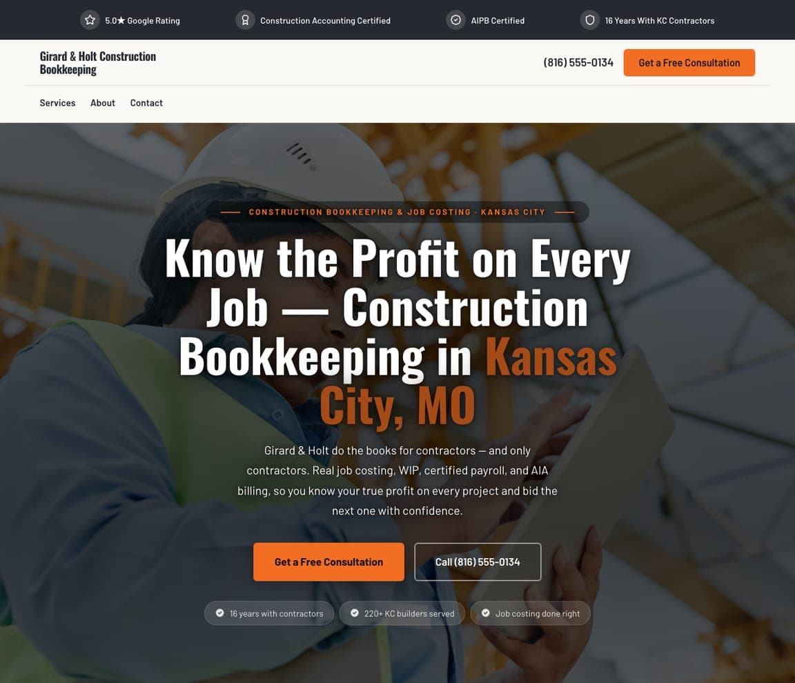
Girard & Holt Construction Bookkeeping — Construction Bookkeeping website design you can build with Zarla
Build this with Zarla
  • Construction Bookkeeping
  • Dark

Girard & Holt Construction Bookkeeping: Job-costing language on a jobsite palette

Girard & Holt Construction Bookkeeping is Zarla's construction-bookkeeping template, and it wins the trade audience by talking like them: 'Know the Profit on Every Job' leads with job costing — the number a contractor actually loses sleep over — not 'accurate monthly financials.' The dark-showcase hero sets that promise in bold type on near-black charcoal with safety-orange accents, a palette any contractor reads instantly as their own industry's. It's the same niching lesson as the restaurant and e-commerce examples above, tuned for trades: name the metric your customer manages their business by, and dress the page in their world's colors. Build it in about 30 seconds and swap in your own city.

See this template

Frequently asked

Where can I find good bookkeeping website examples?

Right here — this page curates bookkeeping website examples two ways: standout real firms (each linked, so you can explore the live site) and professionally designed Zarla templates you can clone and make your own. Every example includes a note on why the design works — the niche it claims, the proof it leads with, the call to action it commits to — so you can copy the move, not just the look.

What makes a good bookkeeping website?

Trust, specificity, and one clear next step. Bookkeeping is a hand-over-your-books purchase, so the best sites prove competence fast — client counts, certifications like QuickBooks ProAdvisor or Xero, niches served — and route every visitor toward a single action, usually booking a short call. Notice how the examples below lead with a specific claim ("catch-up bookkeeping", "restaurant back office", "startup CFO") rather than a generic "we handle your books."

What should a bookkeeping website include?

A specific headline that names who you serve, your services with a clear pricing posture (fixed monthly packages beat "contact us for a quote" in this category), credentials and software certifications, real proof — reviews, client logos, or concrete numbers — and a low-friction way to start, like a 15-minute intro call. Local firms should also name the areas they serve for search visibility.

How much does a bookkeeping website cost?

A custom site from a designer typically runs into the thousands up front, and template builders charge roughly $16–$30 per month. An AI builder generates a complete, editable bookkeeping site for free and only charges (on the Premium plan) when you publish to your own domain — so you can build and preview the whole thing before spending anything.

Do I need a website for my bookkeeping business?

Yes — even if every client comes by referral. Before a referred business owner emails you, they look you up, and a credible site with your niche, credentials, and a booking link converts that check into a call. It also compounds: a page that names your specialty ("e-commerce bookkeeping", "construction job costing") can rank for that exact search and bring clients no referral would.

How do bookkeepers get clients from their website?

Niche down and lower the friction. The sites on this page that win clients name a specific audience in the headline, prove it with numbers or certifications, and ask for something small — a 15-minute call, not a "request a proposal" form. If you serve an industry (restaurants, contractors, startups), give it its own page and speak its operational language: that's what turns a search into a booked call.

You've seen what works. Now make it yours.

Describe your business and Zarla designs a complete, professional website in about 30 seconds — built to convert, just like the ones above.

Free to build and preview · no credit card · publish to your own domain on Premium