Inspiration · Boutique Hotel

The Best Boutique Hotel Website Examples, Explained

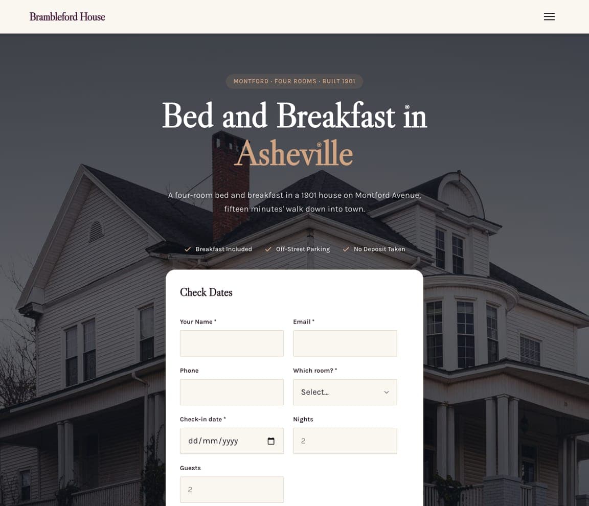
Looking for boutique hotel website examples? These 12 are the strongest we found — Piaule's booking widget written as a sentence over a cabin at dusk, The Standard's list of cities set down the side of a night photograph, Zero George's 'Charleston's charms, at your doorstep' over the cooks at work — plus luxury, spa and travel designs you can build with Zarla in the same register, each with a breakdown of the specific move that turns a getaway search into a reservation. A boutique hotel's website has one job most business sites don't: it has to feel like the stay before the stay. Find an approach you love and you can build a site in that spirit, free, in about 30 seconds.

Real sites + designs you can build with Zarla — free to build and preview, no credit card

What makes a great boutique hotel website

The best boutique hotel websites are photographs with a booking button: an aerial of the property (Post Ranch Inn on its cliff, Hotel Emma on the river), the building from the street (Palisociety), the landscape it sits in (Passalacqua's lake, Piaule's mountains), or the people who run it (Zero George's kitchen). Notice how the reservation path is built into the first screen — Piaule's 'I would like to stay for … days starting on …', The Newt's floating status pill with 'Book a Room' and the weather, The LINE's 'Check Availability' — and how little copy any of them need: an italic line, a list of cities, a season. Notice, too, the memberships and shops in the nav: a boutique hotel sells more than rooms. Every example below makes you want to arrive before it tells you the rate.

Piaule Catskill website — Landscape Hotel design example
Real site · Catskill, NY
  • Landscape Hotel
  • Quiet
  • Dusk + white

Piaule Catskill: 'I would like to stay for … days starting on …' — the booking widget as a sentence

Piaule Catskill makes the booking form the headline: a dark header with 'PIAULE CATSKILL' and a plain nav (Cabins, Oak House, Spa, Restaurant, Landscape, Experiences), then a photograph of a cabin's long cantilevered roof at dusk with the mountains blue behind it, and over the photo one sentence in white with fields inside it — 'I would like to stay for: [1] days starting on [SEP 12] →'. No welcome, no adjectives, no 'Book Now' button; the visitor completes the sentence and presses the arrow. The landscape does the persuading, and the sentence does the work. Piaule shows a landscape hotel how to book a room in one line: photograph the building in its setting at the right hour, and write the booking form the way a guest would say it.

  • The booking form written as a sentence with the fields inside it
  • A cabin at dusk with the mountains behind — the setting as the hero
  • No welcome copy, no button: the arrow at the end of the sentence

Steal this: Write your booking form as a sentence — 'I would like to stay for [n] nights starting on [date]' — and set it over the one photograph that is your place.

Visit Piaule Catskill

Opens a similar Zarla design you can make yours.

The Standard website — Lifestyle Hotel Group design example
Real site · New York, NY
  • Lifestyle Hotel Group
  • Nocturnal
  • Dark + red

The Standard: The list of cities set down the side of a night photograph

The Standard opens with where it is: the red upside-down 'The Standard' logo top-left, a tiny caps nav (Hotels ▾ | Book Now, Culture, Offers, Happenings, Meetings & Events, Upcoming Hotels, Residences, Shop, The StandardX), and then a night photograph of a concrete-and-glass building, its windows lit amber, a figure in pink in the brightest one — and down the left edge, in bold condensed white capitals, the hotels as a list: High Line, NYC / East Village, NYC / Bangkok / Miami Beach / Ibiza / Hua Hin / Maldives / London / Singapore / Melbourne X. No headline, no photo of a room; the list is the brand and the person in the window is the mood. The Standard shows a hotel group how to lead with its map: set the cities in type big enough to read as a poster, photograph one building at night, and keep the nav to the things a member would click.

  • The hotels listed as the hero — ten cities in condensed capitals
  • A night photograph of lit windows, a figure in pink in one of them
  • The famous upside-down logo, red, top-left

Steal this: If you have more than one property, list them as the headline in big condensed type — the list is the brag.

Visit The Standard

Opens a similar Zarla design you can make yours.

Post Ranch Inn website — Cliffside Resort design example
Real site · Big Sur, CA
  • Cliffside Resort
  • Awed
  • Green + Pacific

Post Ranch Inn: The inn from the air, on its cliff above the Pacific

Post Ranch Inn shows the one thing no other hotel has — its cliff: a slim header with a utility row above it (Offers & Packages, Shop, Gallery), then the logo and a small-caps nav (Stay, Dine, Experience, The Ranch, Sustainability), then an aerial video still of the property — timber buildings with umbrellas on their terraces tucked among pines, the coastal hills behind, the Pacific fading into haze. A pause button, a dark green band with the logo mark beneath, and no headline in the first screen; the H1 that follows begins 'High atop the cliffs of Big Sur'. The drone does what no sentence could. Post Ranch shows a destination hotel how to open: photograph the setting from above with the buildings small in it, keep the nav to five words, and let the description wait.

  • An aerial of the property in its landscape as the whole first screen
  • A five-word nav: Stay, Dine, Experience, The Ranch, Sustainability
  • No headline until the second screen — 'High atop the cliffs of Big Sur'

Steal this: If your setting is the reason people come, fly a drone over it at golden hour and let the buildings be small in the frame.

Visit Post Ranch Inn

Opens a similar Zarla design you can make yours.

Zero George website — Historic Inn design example
Real site · Charleston, SC
  • Historic Inn
  • Gracious
  • Black + white

Zero George: 'Charleston's charms, at your doorstep' over the cooks at work

Zero George welcomes you through its kitchen: a dark photograph of two cooks at a counter of plated dishes, and over it a boxed 'MENU' at the left, the 'ZERO GEORGE STREET' monogram centered, a boxed 'BOOK NOW' at the right, then an italic serif headline — 'Charleston's charms, at your doorstep' — and one sentence beneath: 'A sense of wander and wonder go hand in hand at Zero George, your sanctuary for exploring Charleston's endless delights.' A small 'START EXPLORING' with an arrow points down, and a pause button says the photograph moves. The city is in the headline, the hospitality is in the picture, and the booking is boxed where the eye lands. Zero George shows a historic inn how to feel alive rather than preserved: photograph the people working, write the city into the first line, and box the booking button.

  • The kitchen at work as the hero — hospitality photographed, not stated
  • The city in the headline: 'Charleston's charms, at your doorstep'
  • 'Menu' and 'Book Now' boxed either side of the monogram

Steal this: Photograph your staff doing the thing they're best at and write your city into the headline — people plus place is the whole promise.

Visit Zero George

Opens a similar Zarla design you can make yours.

Hotel Emma website — Landmark Hotel design example
Real site · San Antonio, TX
  • Landmark Hotel
  • Storied
  • Black + gold

Hotel Emma: The brewery and the river from the air, a gold crest in the header

Hotel Emma leads with its landmark: a black header with a gold crest ('HOTEL EMMA') hanging in the center, a small-caps nav either side (Overview, Accommodations, Culinary, Pearl Events | Venues, Gallery, Stories, Experiences, Press) and three pill buttons (Book Now, Careers, Shop), then an aerial video still of the Pearl — the old brick brewery buildings with 'American Eatery' painted on one, a footbridge over the San Antonio River, cypress trees, evening light — with slideshow arrows at the edges. No headline in the first screen; the H1 beneath simply says 'Welcome To Hotel Emma'. The crest says heritage, the aerial says the whole district is yours. Hotel Emma shows a landmark hotel how to open: hang the crest in the header, photograph the building in its neighborhood from above, and keep the copy to a welcome.

  • An aerial of the brewery, the river and the footbridge
  • A gold crest hung in the center of a black header
  • 'Welcome To Hotel Emma' as the only headline

Steal this: If your building has a history, put a crest in the header and photograph the block from above — the neighborhood is part of the room rate.

Visit Hotel Emma

Opens a similar Zarla design you can make yours.

Palisociety website — Hotel Collection design example
Real site · Los Angeles, CA
  • Hotel Collection
  • Cinematic
  • Brick + navy

Palisociety: 'World Famous Palisociety' over a woman walking into a brick hotel

Palisociety films its front door: a video still of a brick storefront with blue-and-white striped awnings, planters, and a woman in a cream coat walking in, with 'SELECT LOCATION' top-left and an outlined 'BOOK NOW' top-right, and across the middle the wordmark in white serif — 'World Famous' in script above 'PALISOCIETY', 'HOTELS by AVI BROSH' beneath. A blue crest with a floral border and a 'P.' sits over a striped band at the bottom. No headline beyond the name, no room, no rate; the moment of arrival is the pitch, and the crest and stripes say the brand has a wardrobe. Palisociety shows a hotel collection how to be cinematic: film someone arriving, set the wordmark like a marquee, and let one crest carry the identity across every property.

  • A guest arriving — the front door as the hero
  • 'World Famous' in script over the wordmark, like a marquee
  • A crest and striped band that travel across every hotel

Steal this: Film someone walking into your front door and set your name over it like a marquee — arrival is the moment guests remember.

Visit Palisociety

Opens a similar Zarla design you can make yours.

The LINE website — City Hotel Group design example
Real site · Los Angeles, CA
  • City Hotel Group
  • Editorial

The LINE: 'It All Happens Here' with three photographs of the neighborhood

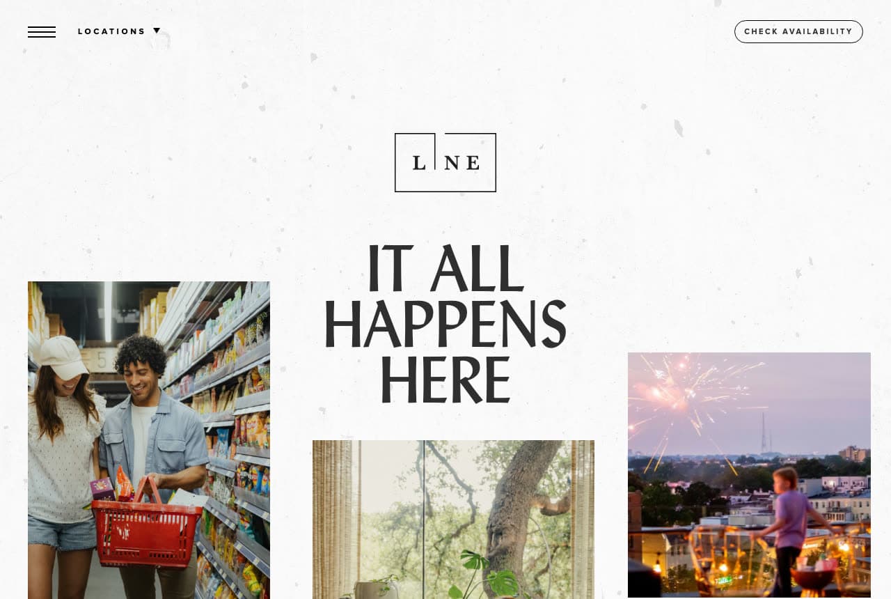
The LINE sells the city around the hotel: an off-white speckled ground, a hamburger with 'LOCATIONS ▾' at the left and an outlined 'CHECK AVAILABILITY' at the right, the boxed L|NE logo centered, and the headline in tall condensed capitals — 'IT ALL HAPPENS HERE' — with three photographs set around it like a magazine layout: a couple with a red basket in a grocery aisle, a window full of plants and a tree, a rooftop at dusk with fireworks over the skyline. No room, no lobby; the neighborhood is the offer, and the paper-textured ground makes it feel printed. The LINE shows an urban hotel group how to say 'location' without a map: three photographs of life nearby, a headline that claims the neighborhood, and 'Check Availability' as the only button.

Visit The LINE

Opens a similar Zarla design you can make yours.

The Newt in Somerset website — Estate Hotel design example
Real site · Somerset, UK
  • Estate Hotel
  • Editorial

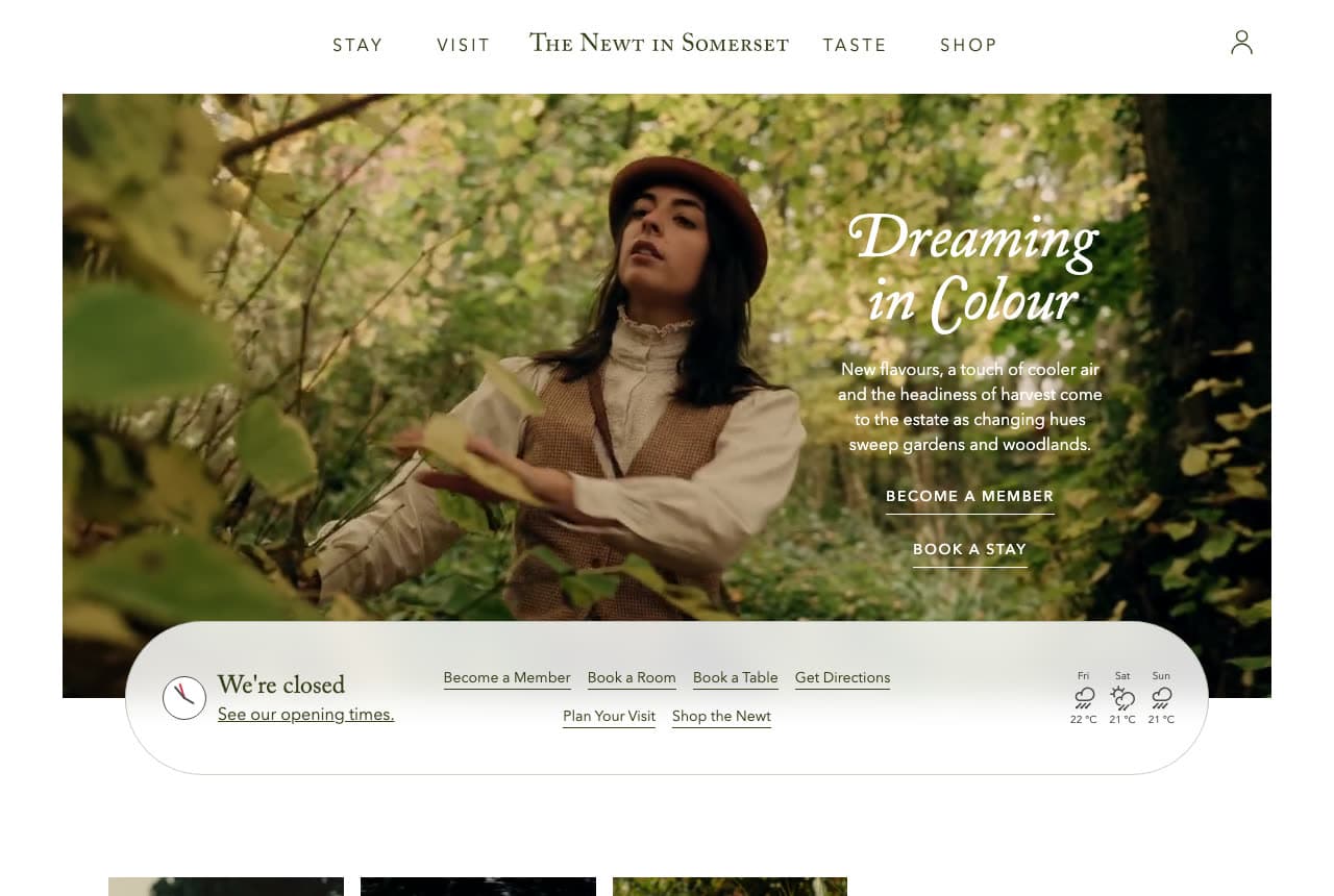
The Newt in Somerset: 'Dreaming in Colour' with a floating pill that says we're closed

The Newt in Somerset runs its home page like a magazine with a front desk attached: a white ground, a five-word nav across the top (Stay, Visit, The Newt in Somerset, Taste, Shop), a photograph of a woman in a hat and waistcoat among green leaves with an italic serif headline beside her — 'Dreaming in Colour' — a seasonal paragraph ('New flavours, a touch of cooler air and the headiness of harvest come to the estate') and two underlined links, 'BECOME A MEMBER' and 'BOOK A STAY'. Then the clever part: a floating white pill across the bottom of the photograph that reads 'We're closed · See our opening times', lists the actions (Become a Member, Book a Room, Book a Table, Get Directions, Plan Your Visit, Shop the Newt) and shows three days of weather. The Newt shows an estate hotel how to be both editorial and useful: a seasonal cover story, and a status bar with every practical link and the forecast.

Visit The Newt in Somerset

Opens a similar Zarla design you can make yours.

Passalacqua website — Lakeside Villa Hotel design example
Real site · Lake Como, Italy
  • Lakeside Villa Hotel
  • Serene

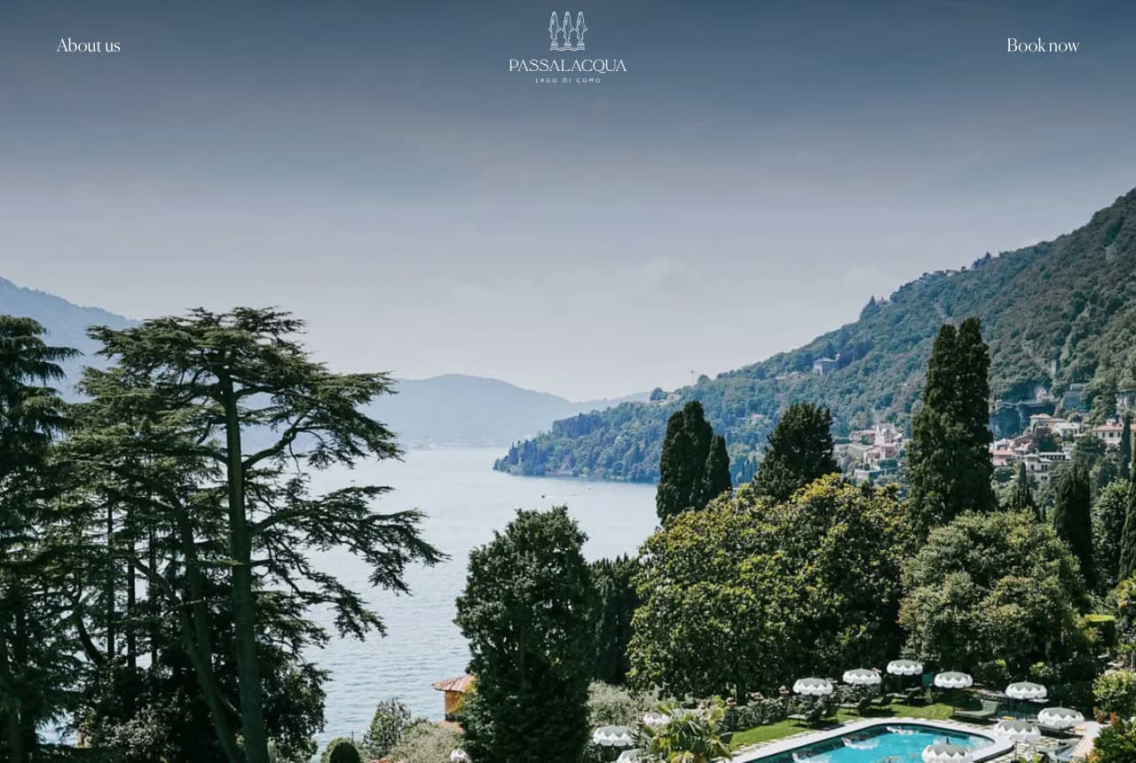
Passalacqua: The lake, the cypresses and the pool — a wordmark and two words

Passalacqua shows the view and nothing else: a thin header with 'About us' at the left, the wordmark in the center — three cypresses drawn above 'PASSALACQUA · LAGO DI COMO' — and 'Book now' at the right, then a photograph looking down over the gardens: cedars and cypresses, the lawn, the pool ringed with white umbrellas, the lake and the village on the far shore in morning haze. No headline in the first screen; the H1 further down is a line of Bellini ('Oh beloved places, I have found you'). Two links, one mark, one view. For a villa that has topped the world's-best lists, the restraint is the point. Passalacqua shows a destination hotel how to trust its photograph: a wordmark with a drawing in it, 'Book now' as plain text, and the view given the whole screen.

Visit Passalacqua

Opens a similar Zarla design you can make yours.

Merrow & Vane — Adaptable Template website design you can build with Zarla
Build this with Zarla
  • Adaptable Template
  • Refined

Merrow & Vane: 'Discreet. Exceptional. Results.' — the luxury register on a dark house

Merrow & Vane is a Zarla luxury real-estate template, and — since the catalog has no hotel template yet — the closest match to the dark, serif, photograph-first hotels here (The Standard, Zero George, Hotel Emma): a photograph of a modern concrete house in daylight under a dark overlay, a hamburger nav, the name in serif and a small gold eyebrow ('MERROW & VANE'), a three-word serif headline — 'Discreet. Exceptional. Results.' — a short paragraph, and a gold 'Private Enquiry' beside 'View Properties'. Clone it, rewrite the three words for your hotel ('Quiet. Considered. Yours.'), swap the buttons for 'Book a Stay' and 'See the Rooms', and the register carries over intact.

See this template
Stillwater Day Spa — Adaptable Template website design you can build with Zarla
Build this with Zarla
  • Adaptable Template
  • Calm

Stillwater Day Spa: 'Quiet the Noise. Restore the Calm.' — the spa register

Stillwater Day Spa is the Zarla day-spa template, and the closest catalog match to the calm, landscape-led hotels here (Piaule, The LINE): a dark photograph of a treatment room with blinds drawn, a serif headline in two sentences — 'Quiet the Noise. Restore the Calm.' — a paragraph about unhurried massage and restorative rituals beneath the red rocks, a 'Book a Treatment' beside 'Explore Treatments', and chips for the rating, licensed therapists and 'Open daily' — the neighborhood sits in the top strip. Clone it for a hotel with a spa, or for the hotel itself — 'Book a Treatment' becomes 'Book a Stay', and the chips become your rating and your setting.

See this template
Wayfare Travel Co. — Adaptable Template website design you can build with Zarla
Build this with Zarla
  • Adaptable Template
  • Escapist

Wayfare Travel Co.: 'Escape to Paradise' over the water — the destination register

Wayfare Travel Co. is the Zarla travel template, and the closest catalog match to the setting-first hotels here (Post Ranch Inn, Passalacqua, Palisociety): a full-bleed photograph of turquoise water and a white beach, a serif headline — 'Escape to Paradise' — a paragraph about overwater bungalows and an escape 'planned down to the last detail', an orange 'Plan a Beach Escape' beside 'Explore Destinations', and a header strip with the rating, the countries covered and the trips planned. Clone it for a resort or a destination inn — the beach becomes your view, 'Plan a Beach Escape' becomes 'Book a Stay', and the strip becomes your rating and your seasons.

See this template

Frequently asked

Where can I find good boutique hotel website examples?

Right here — this page curates boutique hotel website examples across the spectrum: a landscape hotel in the Catskills (Piaule), a global lifestyle brand (The Standard), a cliffside resort in Big Sur (Post Ranch Inn), a historic Charleston inn (Zero George), a landmark brewery hotel in San Antonio (Hotel Emma), a Los Angeles hotel collection (Palisociety), a three-city hotel group (The LINE), an English estate hotel (The Newt in Somerset) and a Lake Como villa (Passalacqua) — each linked so you can explore the live site — plus professionally designed Zarla luxury, day-spa and travel templates whose register fits a small hotel, which you can clone and make your own. Every example includes a note on why the design works — the photograph, the booking path, the copy — so you can copy the thinking, not just the look.

What makes a good boutique hotel website?

One photograph that is the stay, and a booking path in the same screen. The strong examples above open on the property from the air, the building from the street, the landscape, or the people — never a stock bed — and put 'Book Now' or 'Check Availability' in the header, often with the dates or the nights already in a field. The copy is a line — an italic welcome, a season, a list of cities — and the rest of the sale (rooms, restaurant, spa, events, membership, shop) is a nav item, not a paragraph. Photograph the thing guests photograph.

How much does a boutique hotel website cost?

A custom site from a hospitality agency typically runs from several thousand dollars up, hotel-booking-engine vendors charge a monthly fee for the site plus a commission or booking fee, and general template builders are roughly $16–$30 per month. An AI website builder generates a small-hotel site — rooms, rates, booking link, restaurant, spa, events, gallery, directions — from a short description in seconds, then lets you edit it in plain language. Spend the money you save on one day with a photographer at golden hour and, if you can, a drone.

Should a boutique hotel website show the room, the building or the view?

The thing that is only yours. Hotels on a spectacular site show the site — Post Ranch Inn's cliff, Passalacqua's lake, Piaule's mountains. Hotels in a landmark show the building — Hotel Emma's brewery, Palisociety's brick storefront. Hotels whose people are the story show them — Zero George's cooks. A room photograph belongs on the rooms page; on the home page it says 'hotel', not 'this hotel'.

What pages does a boutique hotel website need?

Most boutique hotels need seven: a home page with the photograph and the booking button, a rooms page with rates and a book link per room, a dining page (restaurant, bar, breakfast), an experiences or spa page, an events and private-hire page with a form (weddings and buyouts are the highest-margin sale), an offers page, and a contact page with directions. Add a gallery, a shop and a membership if you have them — The Newt, The Standard and Hotel Emma all put them in the nav.

How do boutique hotels get more direct bookings from their website?

Put the booking engine on the first screen, make the dates easy to set, and give people a reason to book direct — an offer, a membership, a perk. The converting pattern above: Piaule's sentence-form 'I would like to stay for … days', The LINE's 'Check Availability' outlined at the top right, The Newt's 'Book a Room' inside a floating pill that also shows the weather, Zero George's 'Book Now' boxed beside the monogram. Then let the photograph do the marketing — a property that looks like this gets booked without the OTA.

You've seen what works. Now make it yours.

Describe your business and Zarla designs a complete, professional website in about 30 seconds — built to convert, just like the ones above.

Free to build and preview · no credit card · publish to your own domain on Premium