Inspiration · Dentist

The Best Dentist Website Examples, Explained

These are some of the best dentist website designs we could find — a mix of standout real practices and designs you can build with Zarla — and instead of just showing them off, we explain why each one works. Dentistry is sold against anxiety, so watch how the best sites answer the fear before they list a single service: a calm hero photo, real reviews up front, and one obvious way to book. Then make any of the Zarla designs your own, free, in about a minute.

Real sites + designs you can build with Zarla — free to build and preview, no credit card

What makes a great dentist website

The best dental sites do three things fast. They lower anxiety on sight — a real, calm photo and a warm palette do more than any 'we're gentle' line ever could. They prove trust immediately with a star rating, a review count, and 'accepting new patients.' And they make booking the single obvious action, ideally right in the hero. Everything below is a variation on those three moves — pick the one that fits how your patients decide.

Grand Street Dental website — Cosmetic Dentist design example
Real site · Brooklyn, NY
  • Cosmetic Dentist
  • Editorial
  • Cream + primary shapes

Grand Street Dental: A dentist that looks like a design magazine

Grand Street Dental throws out every healthcare cliché and wins because of it. The hero is a cream canvas scattered with Bauhaus half-circles in pink, orange, and cobalt under a quiet serif reading 'Dentistry Redesigned' — it looks like a Kinfolk spread, not a clinic. That confidence is the strategy: a practice featured in Forbes and New York Magazine signals taste before it says a word about teeth, and in cosmetic dentistry taste reads as competence. The nav stays disciplined — Before & After and Book Online are the only jobs that matter. It's the boldest proof here that a dentist can borrow the visual language of a fashion brand and make routine care feel genuinely aspirational.

  • Editorial art direction signals taste = competence
  • Abstract shapes replace the stock smile photo
  • Nav trimmed to Before-and-After + Book

Steal this: Borrow a magazine's art direction — abstract shapes beat another stock smile.

Austin Dental Company website — Dentist design example
Real site · Austin, TX
  • Dentist
  • Boutique
  • Navy + cream

Austin Dental Company: Boutique branding that makes a clinic feel premium

Austin Dental Company makes a dentist feel like a boutique label rather than a clinic, and it's all in the branding. Genuinely stylish vintage-style typography, a Texas-outline logo, and an 'ATX — USA' mark give the practice the identity of a heritage apparel brand, while the dark-navy-and-cream palette reads more boutique hotel than healthcare. 'Quality Dentistry, Honestly Delivered' and a plain 'Accepting New Patients' keep the tone trustworthy and human. It's the strongest example here of design-as-differentiation: in a category where nearly every competitor defaults to clinical blue and stock smiles, a distinctive brand system does more to earn a click than any list of services could.

  • Heritage-brand typography sets it apart from clinical blue
  • A navy + cream palette feels boutique, not medical
  • 'Accepting new patients' keeps the pitch human
Dentalsaurus website — Pediatric Dentist design example
Real site · Austin, TX
  • Pediatric Dentist
  • Playful
  • Orange + cartoon

Dentalsaurus: A mascot kids actually recognize

Dentalsaurus commits fully to one audience and it pays off. A grinning cartoon-dinosaur mascot, a hot-orange palette, and a photo of a happy kid turn a pediatric practice into a brand a five-year-old actually recognizes. Everything is pitched at the real fear — that the visit will be a fight — and answers it with pure friendliness, while the 'Pediatric Dental Specialist' line and a Dental Topics menu reassure the parent. It's a clear lesson in niching down: by refusing to look like a generic 'family' practice, Dentalsaurus becomes the obvious choice for exactly the family it wants. A general dentist could never use this mascot — which is precisely why it works for this one.

  • A mascot builds instant recognition with kids
  • One loud color owns the pediatric niche
  • Speaks to the parent's fear and the kid's mood at once

Steal this: Pick one audience and design only for them — a mascot a general practice couldn't use.

Hedgecock Dental website — Family Dentist design example
Real site · Austin, TX
  • Family Dentist
  • Elegant
  • Plum + script

Hedgecock Dental: A booking form that is the hero

Hedgecock Dental does the unglamorous thing brilliantly: it puts the appointment form directly in the hero, side by side with 'Austin's Premier Dental Office' and a Google 4.8 from 350-plus reviews. There's no scrolling to convert — the single most valuable action on the page is the first thing you can do. A refined plum palette and a hand-script wordmark keep it feeling like a boutique practice rather than a lead-gen page, and 'Get Started On Your Perfect Smile' frames the form as an invitation, not a chore. It's the strongest example here of designing for the one action you want a visitor to take and then removing every step between them and it.

  • The booking form lives in the hero — zero friction
  • Star rating + review count earn trust up front
  • Boutique plum branding softens a lead-capture layout

Steal this: Put the booking form in the hero — don't make them scroll to convert.

North Austin Dentistry website — Dentist design example
Real site · Austin, TX
  • Dentist
  • Calm
  • Gold + taupe

North Austin Dentistry: Calm, gold, and quietly premium

North Austin Dentistry proves restraint sells. A muted gold-and-taupe palette, a soft-focus photo of a relaxed patient, and the plain-spoken 'Dentist in Austin, TX — Exceptional Personalized Care' create a mood closer to a spa than a surgery. Nothing shouts; the confidence lives in the whitespace and the single warm accent. A slim monogram wordmark and a clear phone number keep it functional, but the whole page is engineered to lower a nervous visitor's pulse before they read a word about a procedure. For a category built on anxiety, that calm is the pitch — it says 'you'll be comfortable here' through design alone, which no amount of 'gentle dentistry' copy can match.

  • A warm, muted palette lowers dental anxiety
  • Whitespace and soft focus read as premium calm
  • Restraint does the selling — no shouting
1311 Jackson Ave Dental website — Dentist design example
Real site · Long Island City, NY
  • Dentist
  • Warm
  • Wood + orange

1311 Jackson Ave Dental: The whole team, one neighborly hello

1311 Jackson Ave Dental leads with the people, not the procedures. A full-width photo of the actual team — scrubs, lab coats, easy smiles against a warm wood wall — sits under a plain 'Hello Long Island City,' and the effect is a local practice that feels like neighbors rather than a chain. Naming itself after its street address doubles down on that hyper-local identity. A single orange accent and a tidy nav (Services, Insurance, Patient Resources) keep it practical, but the real move is trust-through-faces: a nervous new patient sees exactly who will treat them before they book. For a neighborhood practice competing on relationship, showing the real team beats any stock photo.

  • A real team photo builds trust before booking
  • Street-name branding signals hyper-local
  • Warm wood + one accent keeps it neighborly
Smile Loft website — Dentist design example
Real site
  • Dentist
  • Calm

Smile Loft: Spa calm from a single full-bleed photo

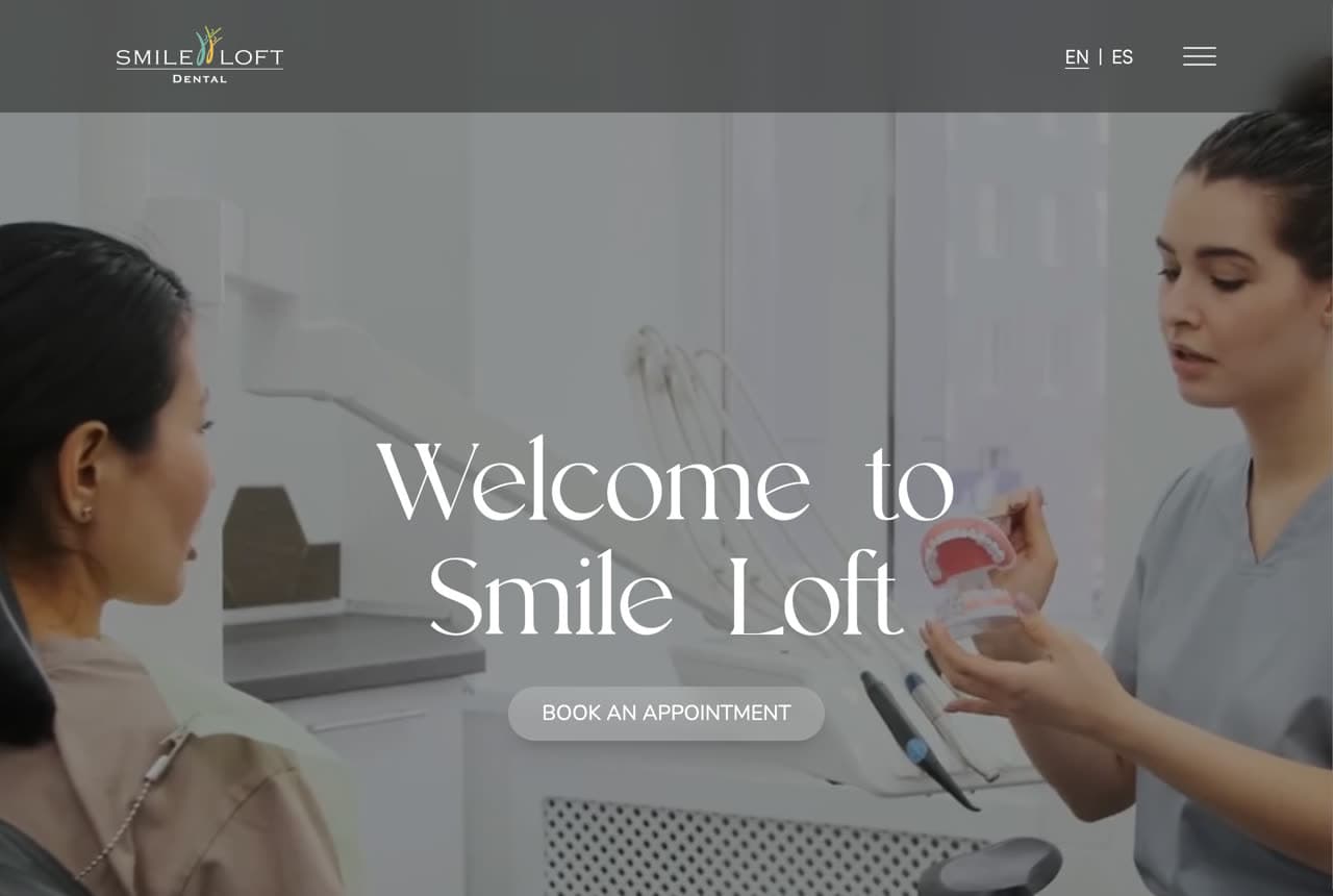
Smile Loft leans on one atmospheric image and lets it do the selling. A full-bleed photo of a hygienist working gently with a patient, dimmed under a soft overlay, carries an elegant serif 'Welcome to Smile Loft' and a single 'Book an Appointment' button. There's no clutter and no hard sell — just a mood of unhurried, spa-like care, which is exactly what a dental-averse visitor needs to feel. A quiet EN/ES toggle widens the door without adding noise. It's a tidy example of the photo-as-hero approach: instead of listing how gentle you are, show a calm, real moment of care and let the visitor picture themselves in it.

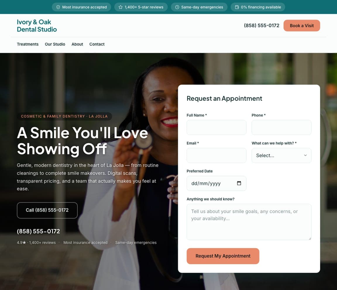
Ivory & Oak Dental Studio — Cosmetic Dentist website design you can build with Zarla
Build this with Zarla
  • Cosmetic Dentist
  • Warm

Ivory & Oak Dental Studio: Warm cosmetic practice with the form built in

Ivory & Oak Dental Studio pairs a genuinely warm hero photo with a 'Request an Appointment' form sitting right beside 'A Smile You'll Love Showing Off' — cosmetic dentistry sold on aspiration, booked without a scroll. A coral accent and a trust strip (1,400+ 5-star reviews, same-day emergencies, 0% financing) do the reassurance work up top, while 'digital scans, transparent pricing' answers the two things cosmetic patients quietly worry about. It's a template built around the single move that converts a dental site — capture the appointment in the hero — dressed in a warm, modern palette that reads more boutique than clinic. Describe your practice and it's yours in about a minute.

See this template
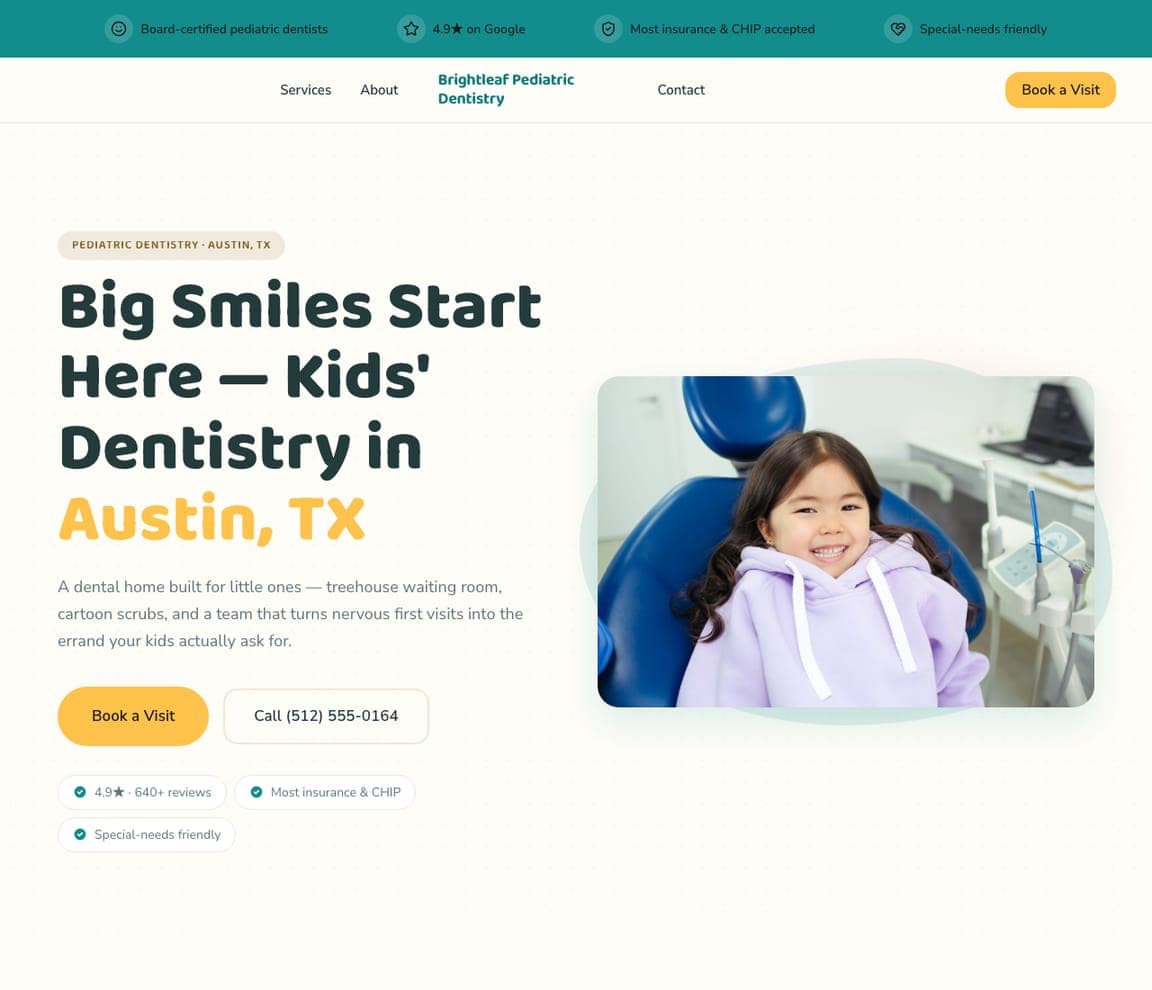
Brightleaf Pediatric Dentistry — Pediatric Dentist website design you can build with Zarla
Build this with Zarla
  • Pediatric Dentist
  • Cheerful

Brightleaf Pediatric Dentistry: Kid-first cheer that reassures the parent

Brightleaf Pediatric Dentistry aims everything at the family nervous about a first visit. 'Big Smiles Start Here — Kids' Dentistry in Austin, TX' sits beside a beaming child in the chair, with a sunny yellow 'Book a Visit' and the details a parent scans for — treehouse waiting room, cartoon scrubs, special-needs friendly, 4.9★. The palette is bright without being childish, so it reassures the adult while delighting the kid. It's a clean demonstration of the pediatric playbook: make the practice feel like a place children want to go, then back it with the specific reassurances (insurance, CHIP, gentleness) parents actually decide on. Swap in your name and services and publish it free.

See this template
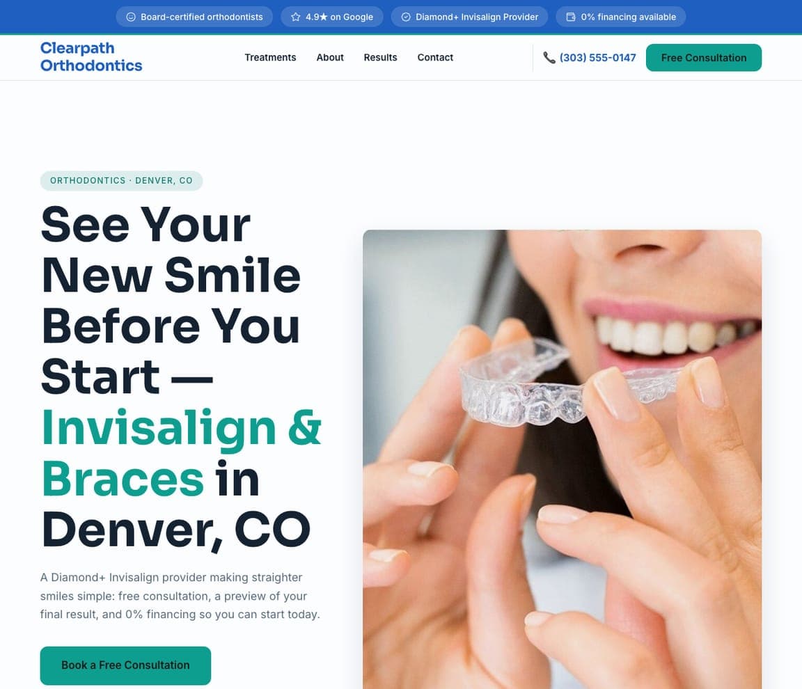
Clearpath Orthodontics — Orthodontist website design you can build with Zarla
Build this with Zarla
  • Orthodontist
  • Modern

Clearpath Orthodontics: See the result before you commit

Clearpath Orthodontics leads with the exact promise an ortho patient wants: 'See Your New Smile Before You Start — Invisalign & Braces in Denver, CO,' beside a clean photo of a clear aligner going in. A crisp teal palette and a green 'Book a Free Consultation' feel modern and clinical in the reassuring sense, and the 'Diamond+ Invisalign provider, free consultation, preview of your final result, 0% financing' line dispatches the three objections — trust, cost, and uncertainty — in one breath. It's a template tuned to a treatment sold on outcome and affordability, leading with the visual payoff rather than the process. Point it at your practice and it's live in under a minute.

See this template
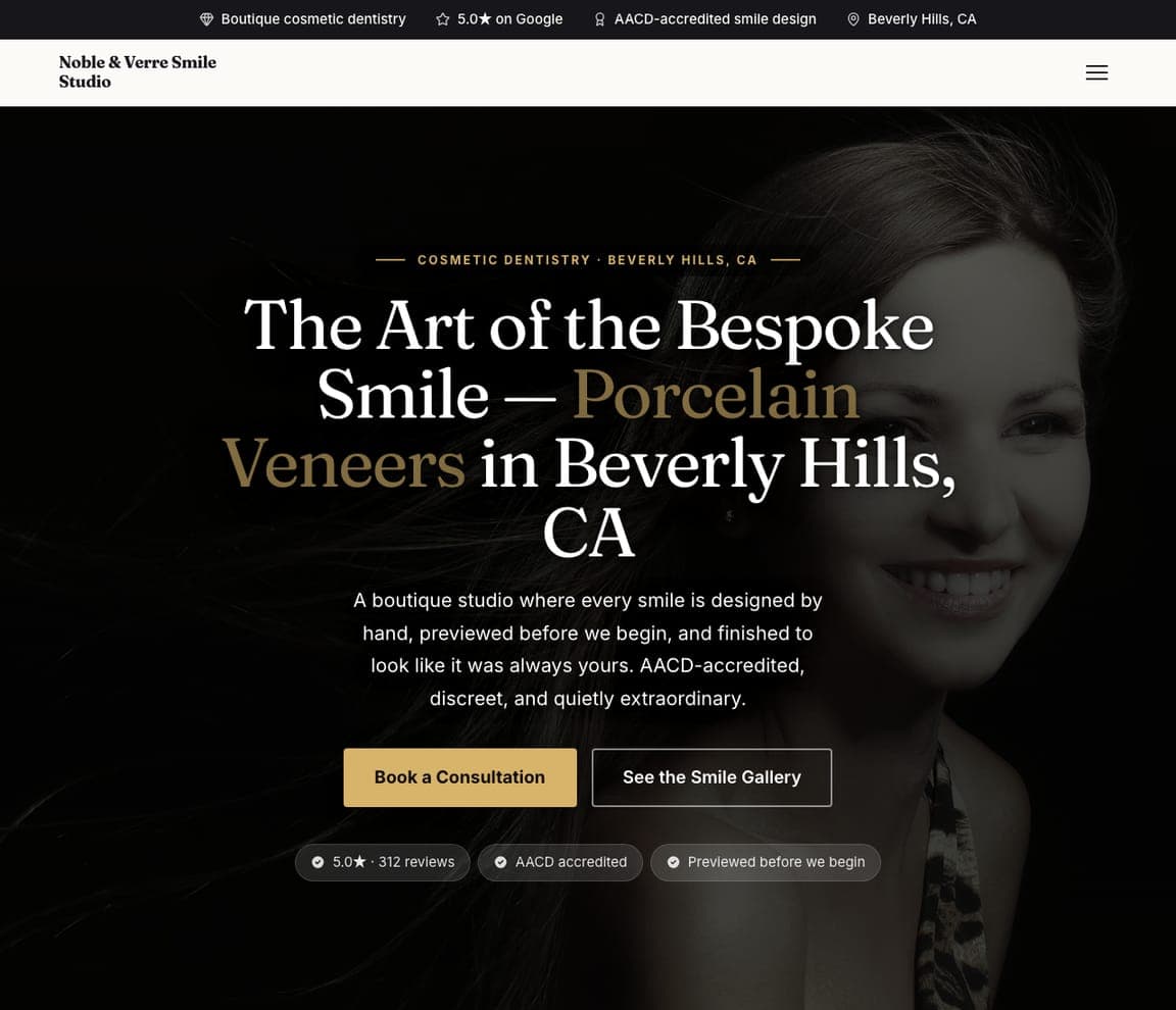
Noble & Verre Smile Studio — Cosmetic Dentist website design you can build with Zarla
Build this with Zarla
  • Cosmetic Dentist
  • Luxury

Noble & Verre Smile Studio: Dark, bespoke, and unmistakably luxury

Noble & Verre Smile Studio dials cosmetic dentistry all the way up to luxury. A near-black hero, an elegant serif, and a single gold accent on 'The Art of the Bespoke Smile — Porcelain Veneers in Beverly Hills' frame veneers as couture, not a procedure. 'A boutique studio where every smile is designed by hand, previewed before we begin, AACD-accredited, discreet, and quietly extraordinary' is pure high-end positioning — restraint, craft, exclusivity. The dark palette is the whole strategy: it signals price and taste to exactly the patient who will pay for a premium result, and quietly filters out the bargain shopper. It's the template to reach for when your practice competes on prestige rather than price.

See this template
Magnolia Family Dental — Family Dentist website design you can build with Zarla
Build this with Zarla
  • Family Dentist
  • Warm

Magnolia Family Dental: The reassuring family-practice standard

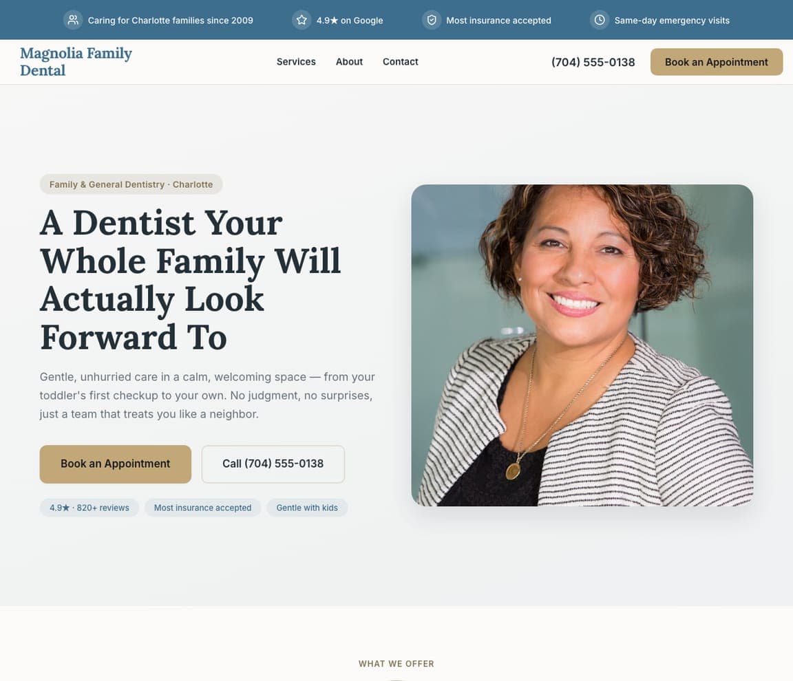
Magnolia Family Dental nails the warm, dependable register most family practices actually want. 'A Dentist Your Whole Family Will Actually Look Forward To' sits beside a friendly real portrait, with 'gentle, unhurried care in a calm space — from your toddler's first checkup to your own' speaking to the multi-generational household that books one practice for everyone. A soft, warm palette and a review-backed trust line (4.9★, most insurance accepted, gentle with kids) keep it credible without trying too hard. It's the cleanest template here for the bread-and-butter family dentist — approachable, trustworthy, and specific about serving every age under one roof. Describe your practice and Zarla builds it free in about a minute.

See this template

Frequently asked

What makes a good dentist website?

A good dentist website lowers anxiety in the first few seconds with a calm, real photo and a warm (not clinical-white) palette, proves trust immediately with a star rating and review count, makes booking the single obvious action — ideally a form or 'Book' button right in the hero — and loads fast on a phone. Notice how nearly every design below leads with reassurance and one clear call to action rather than a list of procedures.

What pages does a dental practice website need?

Most practices need five: a home page that lowers anxiety and points to booking, an about page that puts real faces and credentials to the practice, a services page covering treatments and — increasingly — pricing or financing, a new-patient or contact page with a form and phone number, and for cosmetic or specialty work, a before-and-after gallery that shows outcomes. A Google Business Profile connected to the site is what makes you show up for 'dentist near me.'

How do dentists get more patients from their website?

The practices that convert do three things: they answer the patient's core fear with a calm photo and real reviews before asking for anything, they make booking frictionless (a form in the hero, click-to-call on mobile), and they keep a steady stream of Google reviews — the single biggest factor in both ranking for 'dentist near me' and getting the nervous searcher to pick you over the practice down the street.

You've seen what works. Now make it yours.

Describe your business and Zarla designs a complete, professional website in about 30 seconds — built to convert, just like the ones above.

Free to build and preview · no credit card · publish to your own domain on Premium