Inspiration · Digital Marketing

The Best Digital Marketing Website Examples, Explained

Looking for digital marketing website examples? These 12 are the strongest we found — Kota's 'rebel against boring' on a pink gradient, That Lot's inflated 'creative' inside a plain sentence, Wpromote's 'CHALLENGERS WANTED.' — plus agency designs you can build with Zarla, each with a breakdown of the specific move that turns a marketing director's visit into a strategy call. A digital marketing agency's website is its own case study: if the site can't hold attention, the pitch is over. Find an approach you love and you can build a site in that spirit, free, in about 30 seconds.

Real sites + designs you can build with Zarla — free to build and preview, no credit card

What makes a great digital marketing website

The best digital marketing websites treat the first screen as proof of craft. The headline is an attitude or a category claim, never a service list — 'rebel against boring', 'spin doctors of cultural commentary', 'Challengers wanted.' — and it's set in type the agency would be proud to sell. Two schools show up: the brand-led agencies (Kota, That Lot, Madwell, Beans) lead with color, 3D and motion and put the services one scroll down; the performance-led ones (Olivine, Skale, Animalz, Wpromote) name the specialism and the buyer in the headline ('product marketing leaders in B2B SaaS', 'organic growth engines that win in AI search') and follow with proof (Olivine's client logo row, Wpromote's CFO line). Both keep the hero to one or two buttons. Every example below would still be recognizable with the logo removed — which is the whole test for an agency site.

Kota website — Branding Agency design example
Real site
  • Branding Agency
  • Bold
  • Pink + black

Kota: 'rebel against boring' on a pink gradient

Kota puts the manifesto in lowercase and lets the type run off the screen: a soft gradient shifts from white through blue and pink down the right side, and across it a three-line headline set in a heavy rounded grotesque — 'rebel / against / boring' — each line stepped further right, with a small 3D object peeking through a letter. A black square logo sits top-left with 'CELEBRATING 13 YEARS · 2013 - 2026' beside it, a black 'Hire us →' pill and a menu circle top-right, and a two-line description ('A global branding agency and creative web design studio based in…') tucked under the headline in small type. There is no image of work in the first screen; the type and the gradient are the work. Kota shows a branding agency how to make the hero a portfolio piece — one phrase, oversized, and a button that says exactly what to do.

  • A three-word manifesto in lowercase, stepped across the screen
  • A gradient instead of a photograph — color as the craft
  • 'Hire us →' as the only button, in the corner

Steal this: Set your positioning as three lowercase words in a display face at the largest size the screen allows — the type is the case study.

Visit Kota

Opens a similar Zarla design you can make yours.

That Lot website — Social Agency design example
Real site
  • Social Agency
  • Witty
  • Black + pink

That Lot: One inflated word inside a plain sentence

That Lot writes the most ordinary agency sentence possible and then breaks one word out of it: on a black field, 'That / creative / Social / Agency.' — with 'creative' rendered as a pink, inflated balloon word floating in the line, and a chrome cursor arrow drifting beside the last word. The nav is a wordmark in condensed italics with a tiny 'Part of The Weber Shandwick Collective' beside it, a 'Get in touch →' pill and a menu circle. Nothing else is on the screen. The joke is the pitch: a social agency that can make one word feel like content. That Lot shows a specialist agency how to say its category and still be memorable — keep the sentence plain, make the one word that matters into an object.

  • 'That creative Social Agency.' — the category as the headline
  • One word inflated in pink 3D: the craft demonstrated in the sentence
  • A single 'Get in touch →' pill, nothing else on the screen

Steal this: Say your category in a plain sentence and turn the one word that carries your difference into an object — a balloon, a sticker, a photograph.

Visit That Lot

Opens a similar Zarla design you can make yours.

Madwell website — Creative Agency design example
Real site
  • Creative Agency
  • Confident
  • Blue + navy

Madwell: Two spinning discs and a sentence about culture

Madwell reduces the agency to a color and a sentence: a saturated blue field, two large discs of darker blue segments (like spinning fans or pie charts) side by side, and across the seam between them one white line — 'We're spin doctors of cultural commentary.' A small script monogram sits top-left, three dots top-right, and that's the nav. No services, no logos, no button. The pun ('spin doctors' over spinning discs) is doing brand and design at once, and the confidence of a single color says the agency doesn't need to decorate. Madwell shows a creative agency how far one idea can go: choose a phrase, build one graphic that literalizes it, and refuse everything else.

  • One blue, two discs, one sentence — the whole first screen
  • 'Spin doctors' literalized as spinning graphics
  • A three-dot menu and a monogram: the nav disappears

Steal this: Build one graphic that literalizes your tagline and give it the whole screen — a visual pun does more than a paragraph.

Visit Madwell

Opens a similar Zarla design you can make yours.

Beans Agency website — Creative Agency design example
Real site
  • Creative Agency
  • Playful
  • Yellow + navy

Beans Agency: 3D bean characters on a yellow set

Beans Agency casts itself as characters: on a yellow field, a 3D scene of anthropomorphic beans — one in sunglasses, one in a space helmet, one climbing a signpost that faintly reads 'WE ARE BEANS' — around a laptop, all rendered in the same warm yellow so the set reads as one object. The nav is the logo, a navy 'SAY HELLO' button and nothing else; an Awwwards 'Site of the Day' ribbon hangs on the right edge. No headline in the conventional sense — the sign in the scene is the headline. The monochrome makes the busy scene calm, and the characters make an agency feel like a team you'd want in the room. Beans shows a creative agency how to be playful without being loud: commit to one color, build a world in it, and let the characters introduce you.

  • 3D characters instead of a team photograph
  • One yellow for everything — the scene reads as a single object
  • The headline lives inside the scene, on a signpost
Visit Beans Agency

Opens a similar Zarla design you can make yours.

Olivine website — Marketing Consultancy design example
Real site
  • Marketing Consultancy
  • Serious
  • Black + mint

Olivine: The buyer named in the headline, the logos right under it

Olivine writes the specialist's headline and proves it immediately: on black, 'We're product marketing leaders / in B2B SaaS' in a clean sans, a two-line explanation ('transforming products into powerful stories and go-to-market strategies that sell'), a mint 'CONTACT US' pill, and — still inside the first screen — a row of client logos: Applitools, Elation Health, ServiceNow, Diligent, LinkedIn, Looker. The nav mirrors the offer (Agency, Fractional, Playbooks) and repeats the mint button. The black is not moody; it's a slide. Olivine shows a consultancy how to convert directors who skim: name the discipline and the market in one line, put the button beneath it, and let the logos close the argument before the scroll.

  • 'Product marketing leaders in B2B SaaS' — discipline and market in one line
  • Client logos inside the first screen, not below the fold
  • Nav items that are the offer: Agency, Fractional, Playbooks
Visit Olivine

Opens a similar Zarla design you can make yours.

Animalz website — Content Agency design example
Real site
  • Content Agency
  • Literate
  • Cream + purple

Animalz: A serif promise with an otter and a platypus

Animalz makes a content agency feel like a publisher: a cream ground, a serif headline centered — 'Intelligent content for compounding growth' — a sub-line with two rotating words in orange script ('Resonate with audiences and algorithms through Distribution & Automat…' still typing in this frame), a purple 'Let's talk' pill with a speech-bubble icon, and two line-drawn animals — an otter on the left, a platypus on the right — peeking in from the edges. The nav is four words and the same purple button. The serif says editorial, the animals say personality, and 'algorithms' in the sub-line says the agency has moved with the market. Animalz shows a content shop how to look literate and current at once: a serif promise, a typed-out sub-line that names the new channels, mascots instead of stock.

  • A serif headline — the register of a publisher, not a vendor
  • A live-typing sub-line that names the current channels
  • Line-drawn mascots instead of stock photography
Visit Animalz

Opens a similar Zarla design you can make yours.

Skale website — SEO Agency design example
Real site
  • SEO Agency
  • Sharp

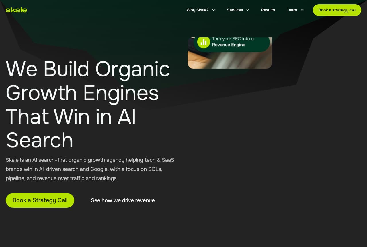
Skale: The outcome and the channel in one headline

Skale names the market's newest question in its headline: on a dark green field with a lighter angular shape behind it, 'We Build Organic / Growth Engines / That Win in AI / Search' in white, a paragraph that names the buyer and the metrics ('helping tech & SaaS brands win in AI-driven search and Google, with a focus on SQLs, pipeline, and revenue over traffic and rankings'), a lime 'Book a Strategy Call' beside a plain 'See how we drive revenue' link, and a small product-style card up in the corner ('Turn your SEO into a Revenue Engine'). The nav is the lime button again. It reads like a SaaS landing page because its buyers are SaaS marketers. Skale shows an SEO agency how to stay ahead of its category: put the new channel in the headline, the buyer's metrics in the paragraph, and one lime button.

Visit Skale

Opens a similar Zarla design you can make yours.

Crafted website — Digital Agency design example
Real site
  • Digital Agency
  • Cinematic

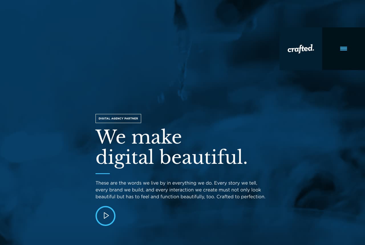
Crafted: 'We make digital beautiful.' over blue smoke

Crafted opens on atmosphere: a full-bleed photograph of blue smoke or ink drifting through dark water, the wordmark 'crafted.' in a black tab at the top-right beside a cyan menu icon, and low in the frame a small eyebrow — 'DIGITAL AGENCY PARTNER' — over a serif headline, 'We make / digital beautiful.' A thin cyan rule separates it from a paragraph about the words the agency lives by ('every story we tell, every brand we build… must not only look beautiful but has to feel and function beautifully, too'), and a cyan play button invites a reel. No client logos, no service list, no button but the play. It's a fashion-house hero for a digital agency. Crafted shows an agency selling craft how to prove it: a texture nobody else has, a serif, a sentence about standards, and a film.

Visit Crafted

Opens a similar Zarla design you can make yours.

Wpromote website — Performance Agency design example
Real site
  • Performance Agency
  • Bold

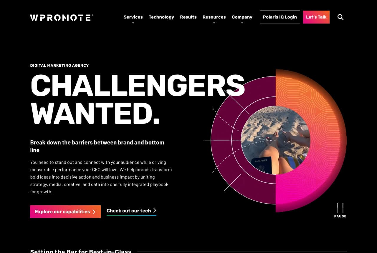
Wpromote: 'CHALLENGERS WANTED.' beside a gradient ring

Wpromote writes a recruiting poster for clients: on black, an eyebrow that states the category ('DIGITAL MARKETING AGENCY'), a two-word headline in heavy white capitals — 'CHALLENGERS WANTED.' — a bold sub-line that names the tension ('Break down the barriers between brand and bottom line'), a paragraph that speaks to the CFO ('measurable performance your CFO will love'), and two buttons, an orange-to-pink gradient 'Explore our capabilities' and an outlined 'Check out our tech'. To the right, a ring graphic in magenta and orange gradients with a photograph in its center and a pause control beneath it — a looping animation. The nav includes a client login ('Polaris IQ') and a pink 'Let's Talk'. Wpromote shows a large agency how to sound like a challenger anyway: a two-word headline, the CFO named in the copy, one gradient carried from the ring to the button.

Visit Wpromote

Opens a similar Zarla design you can make yours.

Larkin & Crowe — Adaptable Template website design you can build with Zarla
Build this with Zarla
  • Adaptable Template
  • Bold

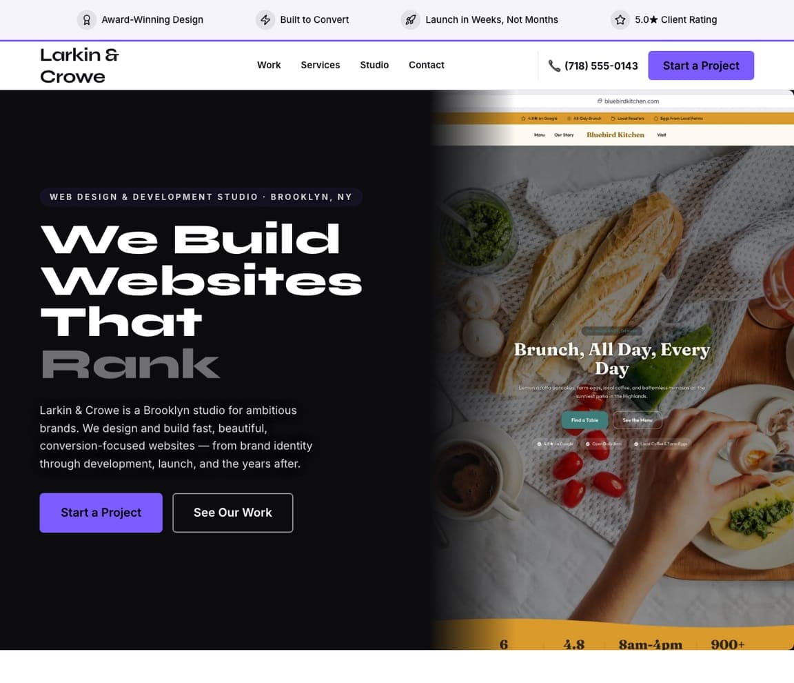
Larkin & Crowe: A kinetic statement in black and violet

Larkin & Crowe is a Zarla web-design studio template, and the closest catalog match to the brand-led agencies here (Kota, That Lot, Madwell): a black field, an eyebrow ('WEB DESIGN & DEVELOPMENT STUDIO · BROOKLYN, NY'), a headline set huge in a wide grotesque — 'We Build Websites That Rank' with the last word dropped to grey — a two-line studio description, a violet 'Start a Project' beside 'See Our Work', and a framed screenshot of a client site to the right. Clone it, swap 'websites' for 'brands' or 'campaigns', and the grey word becomes your promise.

See this template
Brennan & Locke — Adaptable Template website design you can build with Zarla
Build this with Zarla
  • Adaptable Template
  • Professional

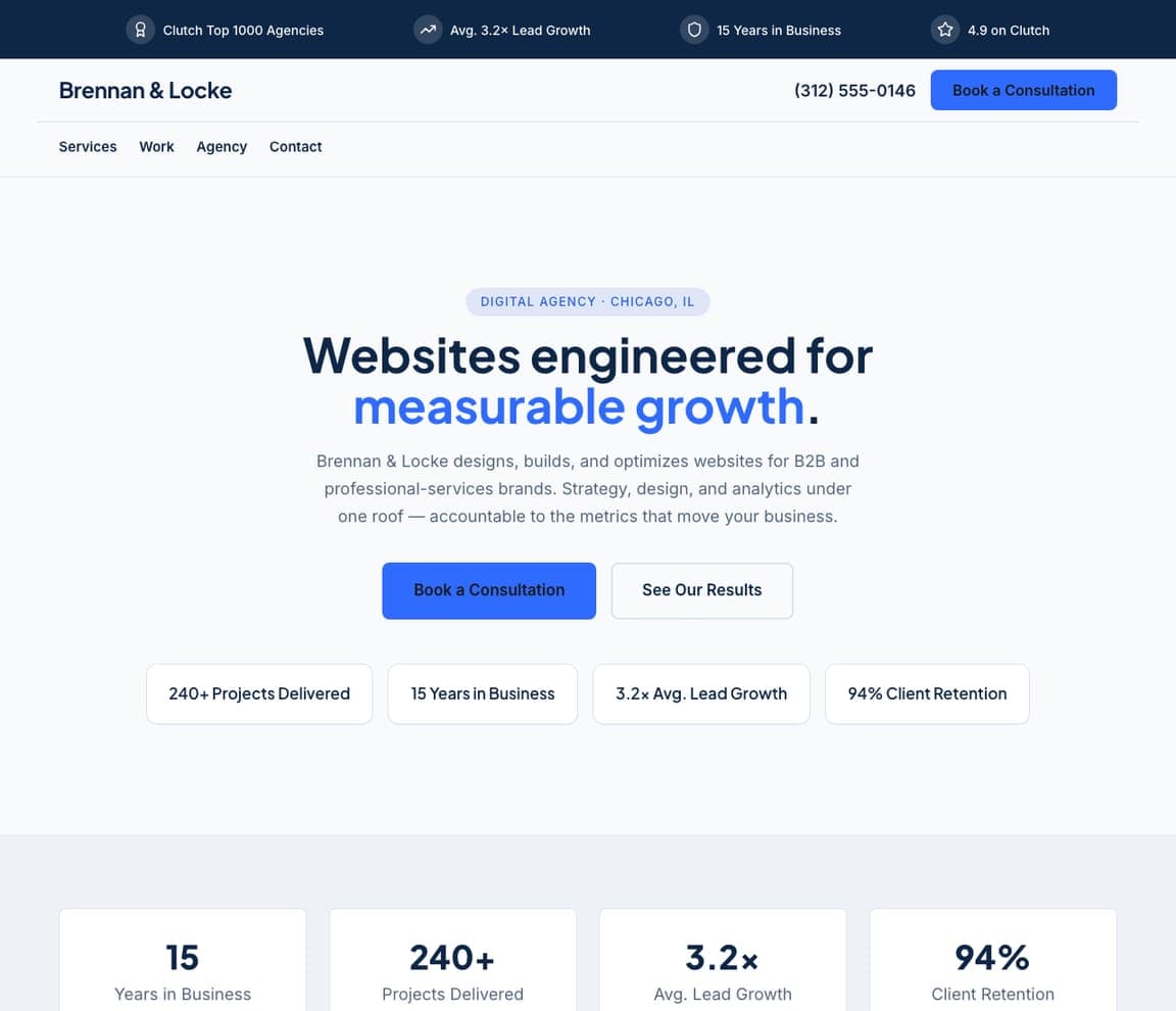
Brennan & Locke: Growth in blue, proof in chips

Brennan & Locke is the results-led agency template — the register Olivine, Skale and Wpromote share: a white ground, a headline with one blue phrase — 'Websites engineered for measurable growth.' — a description that names the buyer (B2B and professional-services brands), a blue 'Book a Consultation' beside 'See Our Results', and four proof chips: 240+ projects delivered, 15 years in business, 3.2× average lead growth, 94% client retention. A trust strip across the top repeats the Clutch and lead-growth numbers. Clone it for a performance agency, and the chips become your pipeline and retention figures.

See this template
Wren & Calder — Adaptable Template website design you can build with Zarla
Build this with Zarla
  • Adaptable Template
  • Minimal

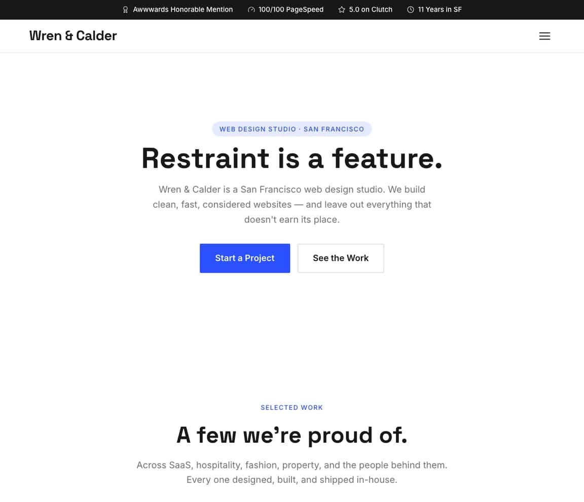
Wren & Calder: 'Restraint is a feature.' on white

Wren & Calder is the minimal studio template — Animalz's calm with a Swiss accent: a white ground, an eyebrow ('WEB DESIGN STUDIO · SAN FRANCISCO'), a centered headline in one line — 'Restraint is a feature.' — a two-line description ('clean, fast, considered websites — and leave out everything that doesn't earn its place'), and a blue 'Start a Project' beside 'See the Work'. The top strip carries the Awwwards mention, the PageSpeed score and the Clutch rating. For a content, SEO or strategy consultancy that wants to look considered rather than loud, clone it and let the headline state your thesis.

See this template

Frequently asked

Where can I find good digital marketing website examples?

Right here — this page curates digital marketing website examples across the spectrum: brand and creative agencies (Kota, Madwell, Beans Agency, Crafted), a social agency (That Lot), content and SEO specialists (Animalz, Skale), a product-marketing consultancy (Olivine) and a large performance agency (Wpromote) — each linked so you can explore the live site — plus professionally designed Zarla studio templates you can clone and restyle for a marketing agency. Every example includes a note on why the design works — the headline attitude, the proof, the one-button hero — so you can copy the thinking, not just the look.

What makes a good digital marketing agency website?

It proves the agency can do for itself what it sells to clients. That means a headline with a point of view rather than a list of services, type and color chosen like a brand project, one clear next step (a strategy call, 'hire us', 'let's talk'), proof that a buyer can scan — client logos, results, a specialism named plainly — and case studies with numbers one click away. The strong examples above are also fast and quiet about themselves: no 'full-service, data-driven, results-focused' paragraph anywhere in the first screen.

How much does a digital marketing agency website cost?

Agencies usually build their own, so the real cost is team time — often weeks of design and development — plus a builder or CMS at roughly $16–$30 per month, or considerably more for custom motion and 3D. An AI website builder generates an agency site — services, case studies, team, a booking call-to-action — from a short description in seconds, then lets you edit it in plain language, which is the fastest way for a small or new agency to get a credible site live while the team's hours go to client work.

Should a marketing agency website show services or results first?

Lead with a position, then prove it. The brand-led examples above open with an attitude (Kota, That Lot, Madwell) and let the work do the proving one scroll down; the performance-led ones open with the specialism and the buyer (Olivine's 'product marketing leaders in B2B SaaS') and follow immediately with a client logo row. Either way, the services list belongs on a page, not in the hero — a hero that reads 'SEO, PPC, social, content, email' looks like every competitor's.

What pages does a digital marketing agency website need?

Most agencies need six: a home page with the position and one button, a services page (or one per specialism if you rank for them), a case-studies or results page with numbers in the first line of each, an about page with the real team, a resources or insights section that proves expertise, and a contact page that books a call rather than collecting a form. Skale builds its whole positioning around 'AI search' because it's what buyers are asking about now — a page per current buyer question is the cheapest lead magnet you can build.

How do digital marketing agencies get more clients from their website?

Name the buyer and the specialism in the headline, put one call-to-action in the hero, and follow it with proof a director can scan in three seconds. The converting pattern above: Olivine's 'We're product marketing leaders in B2B SaaS' over a row of client logos, Skale's lime 'Book a Strategy Call' under a headline that names the outcome, Wpromote's 'Explore our capabilities' beside a promise a CFO would sign off on. Then publish case studies with the number in the title — that's what a referred visitor reads before they email.

You've seen what works. Now make it yours.

Describe your business and Zarla designs a complete, professional website in about 30 seconds — built to convert, just like the ones above.

Free to build and preview · no credit card · publish to your own domain on Premium