Inspiration · Doctor

The Best Doctor Website Examples, Explained

Looking for doctor website examples? These 8 are the best we could find — standout real doctor sites plus designs you can build with Zarla — and each comes with a breakdown of the specific design move that makes it work. Find a look you love and you can build a site in that exact style, free, in about 30 seconds.

Real sites + designs you can build with Zarla — free to build and preview, no credit card

What makes a great doctor website

The best doctor websites share a few moves: they earn trust fast, lead with strong visuals of the work, point to one clear action, and match the design to how their customers decide. Each example below calls out the specific choice worth stealing for your own doctor website.

Digestive Health UK website — Private Specialist design example
Real site · London, UK
  • Private Specialist
  • Trust-Stacked
  • Blue + white

Digestive Health UK: Reviews, founder, and press — all up front

Digestive Health UK stacks every trust signal a private medical practice can muster into its first screen: a verified '4.96 out of 5 based on 268 patient reviews' (Doctify) banner along the top, a warm photo of the named founder (Consultant Gastroenterologist Dr Sarmed Sami, with full credentials), symptom/condition/test navigation, video guides, and an 'As Seen On' press bar (Daily Mail, The Times, The Guardian). For private specialist medicine — a high-trust, often-anxious, out-of-pocket decision — front-loading verified reviews, the specific consultant's face and qualifications, and mainstream press validation directly builds the credibility a worried patient needs before booking. The condition-based navigation routes patients by their symptom. It's a masterclass in medical trust-building: verified reviews + a named, credentialed, human doctor + press + easy booking, all before the fold. For any specialist practice, that trust stack is the conversion engine.

  • Verified 268-review rating + press bar build instant credibility
  • Named founder with full credentials — a real, human doctor
  • Condition-based nav routes the anxious patient by symptom

Steal this: Stack verified reviews + the named doctor's credentials + press in the first screen. For anxious medical decisions, trust is the conversion.

One Medical website — Membership Primary Care design example
Real site · United States
  • Membership Primary Care
  • Modern
  • Green + white

One Medical: Primary care, reframed as painless

One Medical (now Amazon-owned) reframes the entire experience of seeing a doctor: 'Comprehensive Healthcare Just Got Less Painful,' with a membership offer (Prime members $99/year) and a clean, consumer-tech aesthetic more like a lifestyle app than a clinic. Below, three tiles (Care for Your Mental Health, The Annual Physical Reimagined, a Pharmacy That Really Delivers) show the breadth. The 'less painful' headline is clever positioning — it acknowledges that American healthcare is famously frustrating and promises relief from that frustration, not just medical treatment. The membership model, app-first design and 'get care today' immediacy target the busy modern patient who wants healthcare to be as easy as everything else in their life. For a modern primary-care brand, naming the category's real pain (healthcare is a hassle) and promising a frictionless, membership-based, app-driven alternative is a strong differentiator against the traditional clinic.

  • 'Less painful' names healthcare's real frustration and fixes it
  • Membership + app-first design targets the busy modern patient
  • Consumer-tech aesthetic reframes the doctor visit entirely
Parsley Health website — Functional Medicine design example
Real site · United States
  • Functional Medicine
  • Results-Led
  • Warm + editorial

Parsley Health: Root-cause medicine, results-first

Parsley Health positions functional medicine around a compelling promise: 'Medical Care That Delivers Results — partner with a functional medicine expert to uncover the root-cause of symptoms, to finally feel better and stay well,' with a deeper line that captures the whole philosophy: 'Finally, a doctor that asks why — not just what.' That framing brilliantly names the frustration of conventional medicine (treating symptoms, not causes) and positions Parsley as the alternative for patients who feel unheard. A trust row (Insurance Accepted, Board-Certified Clinicians, Advanced Lab Testing, Nationwide Telehealth, HSA/FSA Eligible) removes practical barriers, and warm, healthy-person photography keeps it aspirational. For a differentiated care model (functional, root-cause, integrative medicine), leading with the emotional payoff ('finally feel better,' 'a doctor that asks why') speaks directly to the chronically-frustrated patient who conventional medicine hasn't helped. Name what's broken about the status quo, then be the fix.

  • 'A doctor that asks why, not just what' names conventional care's flaw
  • 'Deliver results / finally feel better' speaks to the unheard patient
  • Trust row removes practical barriers (insurance, board-certified)

Steal this: Name what's broken about your category's status quo ('asks why, not just what'), then be the fix. It speaks to the frustrated customer.

Corktown Medical Centre website — Community Clinic design example
Real site · Toronto, ON
  • Community Clinic
  • Practical
  • Teal + white

Corktown Medical Centre: A community clinic, practically helpful

Corktown Medical Centre takes a warm, practical, community approach: a photo of the welcoming clinic space, 'Visits by Appointment Only,' prominent 'Online Non-Urgent Appointment Booking,' and — a genuinely useful, public-health-minded touch — 'Live Chat with Public Health Nurse' with direct links to Toronto Public Health and Health 811. For a community family clinic, being practically helpful (easy online booking, plus pointing patients to appropriate public-health resources for non-urgent needs) builds trust and manages patient flow sensibly — it's care-oriented, not just conversion-oriented. The clean, calm design and clear policies reassure. Rather than the aspirational branding of the membership startups, Corktown leads with accessibility and genuine helpfulness, which is exactly right for a neighbourhood practice serving a real community. Sometimes the most trustworthy positioning for a local clinic is simply being clearly, practically useful to patients — including directing them elsewhere when appropriate.

  • Online booking + public-health-nurse chat is genuinely helpful
  • Care-oriented (points to public resources), not just conversion
  • Calm, accessible design suits a real community practice
Dr André van Straten website — Solo Specialist design example
Real site · South Africa
  • Solo Specialist
  • Personal
  • White + neutral

Dr André van Straten: A solo specialist, personally introduced

Dr André van Straten's ENT-specialist site is built entirely around the individual doctor, and that's exactly right for a solo specialist: full credentials in the header (MBChB, FCORL, MMED), an educational 'Why See an ENT Specialist?' section that helps patients understand the specialty, and a warm, personal 'About Dr André van Straten' with a black-and-white photo of him with his child and a genuine biography ('passionate about his work… he believes a healthy and trusting relationship with his patient and their family is central to their care'). For a solo medical specialist, the patient is choosing a specific person to trust with a health concern, so leading with that doctor's credentials, philosophy and humanity (a real, warm photo, a personal story) builds the individual rapport the decision hinges on. The educational content also captures patients researching their symptoms. When the practice IS one doctor, make that doctor — credentials and humanity both — the entire site.

  • Full credentials + educational content establish specialist authority
  • Warm personal photo and bio build individual doctor rapport
  • For a solo specialist, the doctor IS the whole practice
Haematology & Oncology Northern Sydney website — Oncology Specialist design example
Real site · Sydney, AU
  • Oncology Specialist
  • Compassionate
  • Soft + purple

Haematology & Oncology Northern Sydney: Patient-centred care, gently designed

Haematology & Oncology Northern Sydney handles an emotionally heavy specialty with warmth and dignity: 'Putting YOU at the Centre of Your Care' in a soft circular graphic beside a tender black-and-white photo of hands being held, with service areas (Haematology, Oncology, Palliative Care) in gentle icons and the deeply human line 'the greatest gift you can give your family and the world is a healthy you.' For cancer and blood-disorder care — where patients and families are frightened and vulnerable — the compassionate, patient-first framing and the soft, human (not clinical or scary) design are exactly what's needed. The hand-holding imagery communicates care and support rather than sterile medicine. For any practice in an emotionally sensitive field, leading with empathy, patient-centredness and gentle, human design (soft colours, caring imagery, reassuring language) meets patients where they are. Match the emotional register of your design to the vulnerability of your patients.

  • 'Putting YOU at the centre' leads with patient-first empathy
  • Hand-holding imagery communicates care, not sterile medicine
  • Gentle design matches the vulnerability of cancer patients
PlushCare website — Telehealth design example
Real site · United States
  • Telehealth
  • Convenient

PlushCare: Top doctors, one tap, insurance answered

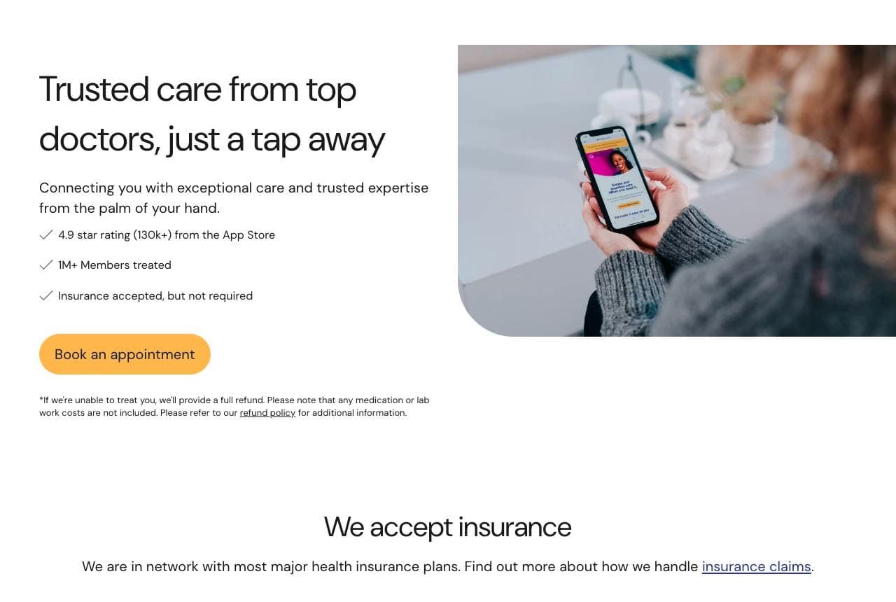
PlushCare positions virtual primary care around convenience and quality at once: 'Trusted Care from Top Doctors, Just a Tap Away,' with three checkmark reassurances — 4.9 App Store rating (130k+), 1M+ members treated, and 'Insurance accepted, but not required' — and a phone-in-hand image. The standout is the immediate answer to the two questions a telehealth patient has: is it good (top doctors, huge review count) and can I afford it (insurance accepted). Below, a prominent 'We Accept Insurance' section with real payer logos (UnitedHealthcare, Humana, Aetna) removes the cost barrier that stops many from trying telehealth. The clean, reassuring design balances the app-convenience pitch with the seriousness of real medical care. For a telehealth service, leading with 'top doctors' (quality, to counter the 'is virtual care real care?' doubt) plus prominent insurance acceptance (cost) directly answers the two barriers to trying virtual medicine.

Cornerstone Family Medicine — Family Medicine website design you can build with Zarla
Build this with Zarla
  • Family Medicine
  • Warm-Trustworthy

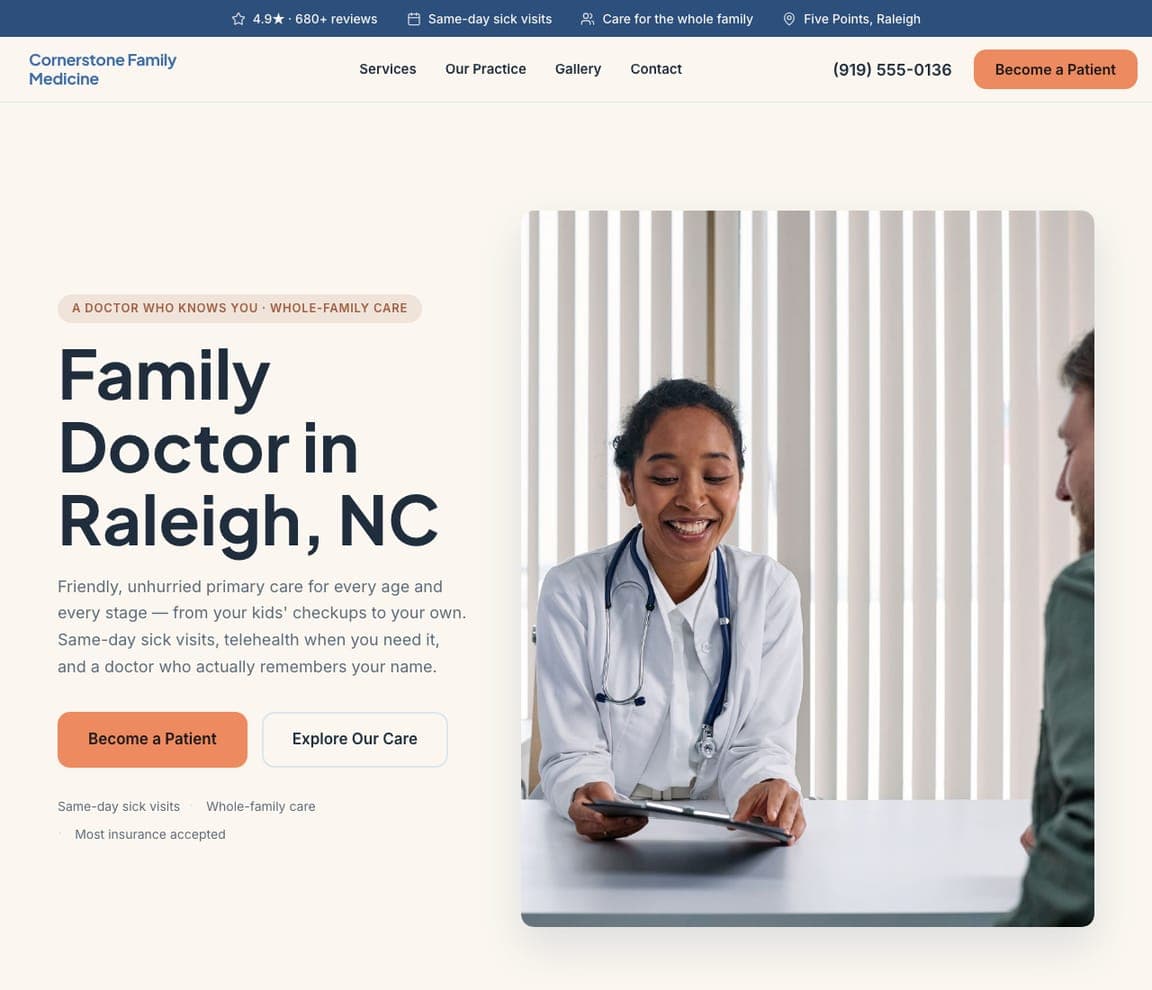
Cornerstone Family Medicine: A family doctor who knows you

Cornerstone Family Medicine is Zarla's doctor template, and its split-image-right hero lands the warmth a family practice needs: 'A Family Doctor Who Knows You,' in a blue-and-coral palette that reads trustworthy but warm (medical confidence without the cold). The 'knows you' framing sells the continuity and personal relationship a family-medicine patient values — the opposite of an impersonal walk-in — and the structure carries services (checkups, chronic care, family medicine), an about-the-doctor/practice section (the practitioner trust the reals all lead with), patient resources, and an appointment CTA. The friendly-professional palette photographs well beside real clinic and doctor imagery. Swap in your own practice details and photos and it's a credible, welcoming family-medicine site in about 30 seconds — no photographer or designer required. The reassuring register a patient needs when choosing who to trust with their family's health.

See this template

Frequently asked

Where can I find good doctor website examples?

Right here — this page curates doctor website examples two ways: standout real businesses (each linked, so you can explore the live site) and professionally designed Zarla templates you can clone and make your own. Every example comes with a note on why the design works — trust signals, layout, calls to action — so you can copy the move, not just the look.

What makes a good doctor website?

A good doctor website earns trust in the first few seconds, leads with strong visuals of the work, gives visitors one obvious action, and loads fast on a phone. Every design below leads with proof and a single clear call to action rather than a wall of text.

How much does a doctor website cost?

A custom doctor website from a designer typically runs into the thousands up front, and template builders charge roughly $16–$30 per month. An AI builder generates a complete, editable design for free and only charges (on the Premium plan) when you publish to your own domain — so you can build and preview before spending anything.

Do I need a designer to build a doctor website?

No. Several designs on this page were generated by Zarla and are fully editable — you describe your business and get a complete, professionally designed site in about 30 seconds, then refine it by chatting. Building and previewing is free; publishing to your own domain needs the Premium plan.

What pages does a doctor website need?

Most doctor businesses need just a few: a home page that proves trust and points to one clear action, an about page that puts a face to the business, a services or work page that shows what you do, and a contact page with a form and a phone number. Local businesses also benefit from location or service-area pages that help them show up in nearby searches.

How do I get more customers from my doctor website?

Lead with proof in the first few seconds (reviews, real photos, results), make one action obvious on every screen (call, book, or enquire), and keep it fast on mobile — most visitors arrive on a phone. The designs above each do this differently, but they all earn trust early and remove friction from the next step.

You've seen what works. Now make it yours.

Describe your business and Zarla designs a complete, professional website in about 30 seconds — built to convert, just like the ones above.

Free to build and preview · no credit card · publish to your own domain on Premium