Inspiration · Esthetician

The Best Esthetician Website Examples, Explained

Looking for esthetician website examples? These 14 are the strongest we found — Shannon Lee Esthetics' gloved hands applying a black mask under 'SELF LOVE ISN'T SELFISH', Bespoke Aesthetics & Wellness's clay-masked face beside 'Skincare, Crafted', Face Space's two faces cheek to cheek with 'This is your skin's safe space.' — plus skin-studio designs you can build with Zarla, each with a breakdown of the specific move that turns an 'esthetician near me' search into a booking. An esthetician's site is read by someone who has been let down by their skin, so the best ones here photograph a treatment in progress, write one kind sentence and make the only button 'Book'. Find an approach you love and you can build a site in that spirit, free, in about 30 seconds.

Real sites + designs you can build with Zarla — free to build and preview, no credit card

What makes a great esthetician website

The best esthetician websites photograph the treatment mid-way and write in the second person. The photographs: a black mask being spread by blue-gloved hands at Shannon Lee, a white clay mask at Bespoke Aesthetics, a sage mask brushed on at Jodi Mello, a face framed by two pairs of hands at Kerry Spindler. The sentences: 'SELF LOVE ISN'T SELFISH', 'YOUR SKIN, UNDERSTOOD.', 'This is your skin's safe space.', 'Skincare, Crafted'. Notice the button — 'BOOK', 'Book an appointment', 'BOOK A SERVICE', 'Call To Book' — and how rarely there is a second one. Notice the proof where it exists: Kerry Spindler's 'TOP 10 ESTHETICIANS in MASSACHUSETTS 2026' seal, Skin by Gabby's 'Voted 2025 Best of Inland Empire' marquee, Rose + Honey's '700+ Five-Star Reviews' and 'Named a Top 10 Skincare Clinic in San Diego by Yelp'. And notice The Organic Esthetician's 'CLEAN BEAUTY ELECTRIFIED' set in decorative serif over foam — a studio that sells a philosophy sets the words like a perfume ad. Every example below tells you whether the studio treats skin or sells a feeling about it.

Shannon Lee Esthetics website — Solo Esthetician Studio design example
Real site
  • Solo Esthetician Studio
  • Intimate
  • Photo + white

Shannon Lee Esthetics: Blue-gloved hands spreading a black mask under 'SELF LOVE ISN'T SELFISH'

Shannon Lee Esthetics is the cover because it shows the treatment and says one true thing. The white header sets Instagram and TikTok icons left, a small sunburst mark over 'SHANNON LEE ESTHETICS' centred, and a black cart pill right; a two-row nav beneath runs Book Now, About, Services, Shop, Testimonials, then Contact Us, Blog, FAQ, Policies. The hero is a close photograph of a face in profile, eyes closed, while two hands in blue nitrile gloves spread a glossy black mask across the cheek and jaw. Over it, in tall white serif capitals on two lines, 'SELF LOVE' / 'ISN'T SELFISH', and beneath, one small black pill: 'BOOK'. Nothing else — no paragraph, no second button, no price. The gloves say clinical, the black mask says a real treatment, the sentence gives permission. Clone it as the default one-esthetician layout.

  • A treatment mid-application as the photograph
  • A permission-giving sentence in serif capitals
  • One button: 'BOOK'

Steal this: Photograph the mask going on, not the glow after — the treatment in progress is the thing a nervous first-timer wants to see.

Visit Shannon Lee Esthetics

Opens a similar Zarla design you can make yours.

Bespoke Aesthetics & Wellness website — Skin Studio design example
Real site
  • Skin Studio
  • Serene
  • Black + white

Bespoke Aesthetics & Wellness: 'Skincare, Crafted' beside a face in a white clay mask with a large round earring

Bespoke Aesthetics & Wellness sets two words against one face. The header is dark: 'BESPOKE AESTHETICS & WELLNESS' in tracked serif capitals with an olive-green ampersand, a nav — Menu, About, Reviews, Press, Estheticians, Blog — and an outlined 'Book an appointment'. The hero is a close, dark photograph of a woman with her eyes closed, a white clay mask thick across her nose, cheeks and brow, a strand of hair loose and a large round patterned earring catching the light. Left, in light white serif, 'Skincare, Crafted', and beneath it the same outlined button, 'Book an appointment'. 'Estheticians' as a nav item says this is a studio with several, and 'Press' says it has been written about. The headline's comma does the work — skincare as something made, not bought. Clone the two-word serif line if your studio treats every face differently.

  • Two words and a comma — 'Skincare, Crafted'
  • The same outlined button in the header and the hero
  • 'Estheticians' and 'Press' in the nav

Steal this: Write the headline as two words with a comma — 'Skincare, Crafted' — and let the punctuation say bespoke.

Opens a similar Zarla design you can make yours.

Kerry Spindler website — Bespoke Facial Studio design example
Real site · Massachusetts
  • Bespoke Facial Studio
  • Gentle
  • White + sage green

Kerry Spindler: 'YOUR SKIN, UNDERSTOOD.' with a 'TOP 10 ESTHETICIANS in MASSACHUSETTS 2026' seal

Kerry Spindler frames the face and stamps the proof. The white header sets the script 'Kerry Spindler' signature logo centred with a green 'Schedule Your Treatment →' at the right, and a nav beneath — Home, About, Our Bespoke Treatments, Book Appointment, Shop, Gift Cards, Blog, Contact — with a search icon and '$0.00'. The hero's photograph enters under a wavy white edge: a woman's face, pale eyes open, framed by two pairs of hands — one pair cupping her jaw, another laid across her forehead. Centred beneath the eyes, in green small-caps serif, 'YOUR SKIN, UNDERSTOOD.' and in italic, 'Advanced expertise. Thoughtful care. Entirely personal.' Lower-right, a gold-and-navy seal: 'ELITE AESTHETICS GUIDE — TOP 10 ESTHETICIANS in MASSACHUSETTS — 2026'. The wavy edge softens the photo, the hands say hands-on, and the seal is the only proof on the screen. Clone the seal placement if you've won something.

  • A face framed by two pairs of hands
  • A wavy white edge on the photograph
  • An award seal in the hero corner

Steal this: Put your award in the hero as a seal — a round badge with the year reads as earned, where a line of text reads as claimed.

Visit Kerry Spindler

Opens a similar Zarla design you can make yours.

Face Space website — Inclusive Skin Studio design example
Real site
  • Inclusive Skin Studio
  • Tender
  • Photo + plum

Face Space: Two faces cheek to cheek under 'This is your skin's safe space.'

Face Space writes a paragraph to the visitor and means it. The header floats over the photo: a small caps nav — SERVICES, ABOUT, SHOP, FAQS, GIFT CARD — left, 'FACE SPACE' tracked in the centre, and a pale-blue pill, 'Book', right. The hero is a tight photograph of two faces pressed cheek to cheek — a red-haired, freckled woman and a dark-haired woman — filling the frame, one looking at the camera and one looking away. Centred over their cheeks, in white, three lines: 'We bring your skin story into focus. We treat your skin like a part of you worth knowing, not a problem to be fixed or hidden.' and, larger, 'This is your skin's safe space.' A plum pill beneath reads 'Start Your Journey'. The two faces are different skins, and the copy refuses the word 'problem'. Clone the paragraph-as-headline if your studio's promise is how it treats people, not what it does to them.

  • Two different skins in one close photograph
  • A headline that refuses the word 'problem'
  • 'Start Your Journey' instead of 'Book'

Steal this: Say what you won't call their skin — 'not a problem to be fixed or hidden' — and the anxious visitor knows you're safe before they book.

Visit Face Space

Opens a similar Zarla design you can make yours.

The Organic Esthetician website — Clean-Beauty Esthetician & Shop design example
Real site
  • Clean-Beauty Esthetician & Shop
  • Editorial
  • Photo + charcoal

The Organic Esthetician: 'CLEAN BEAUTY ELECTRIFIED' in decorative serif over a bar of soap in foam

The Organic Esthetician sets its three words like a fragrance ad. The header sits over a dark photograph: a small caps nav — ABOUT, SERVICE MENU, SHOP, BOOKINGS, PRO EDUCATION — left, an 'OE' monogram centred, and SEARCH, ACCOUNT, CART (0) right. The photograph is a close, warm-toned shot of a dark bar of soap sitting in thick white foam, bubbles catching the light. Centred on the page, in a tall decorative serif with looping ligatures, 'CLEAN' / 'BEAUTY' / 'ELECTRIFIED', then a tracked line — 'ELECTRIC FACIALS | SKINCARE EDUCATION | CLEAN BEAUTY' — and a grey 'SHOP NOW'. 'PRO EDUCATION' in the nav says the esthetician teaches other estheticians, and 'ELECTRIC FACIALS' names the signature treatment without explaining it. The button sells product, not appointments — the shop is a real business here. Clone the decorative-serif treatment if your studio is a brand as much as a room.

  • Three words in a decorative serif with ligatures
  • The signature treatment named in a tracked line
  • 'PRO EDUCATION' in the nav — the esthetician who teaches

Steal this: Name your signature treatment in a tracked line under the headline — 'ELECTRIC FACIALS' makes a visitor ask, and asking is the first step to booking.

Visit The Organic Esthetician

Opens a similar Zarla design you can make yours.

Skin by Gabby website — Results-Driven Facial Studio design example
Real site · Inland Empire, CA
  • Results-Driven Facial Studio
  • Confident
  • Cream + forest green

Skin by Gabby: 'INLAND EMPIRE SKIN COACH' in giant serif with a 'Voted 2025 Best of Inland Empire' marquee

Skin by Gabby calls itself a coach and runs its award as a ticker. The white header sets 'SKINBYGABBY' tracked left, a two-row small caps nav — HOME, TREATMENTS, ABOUT, SKIN COACHING PROGRAM, then APPOINTMENT, SHOP — social icons and a green 'BOOK APPOINTMENT'. A marquee scrolls beneath: 'Voted 2025 Best of Inland Empire · Voted 2025 Best of Inland Empire…'. The cream hero opens with 'INLAND EMPIRE' in green small caps and then 'SKIN COACH' in a giant green serif across the width. Three tiles follow: a black product tube on a tan ground, a photograph of a woman lying under an LED light panel, and a copy tile — the serif 'Result Driven Facials with a Spa like Experience', the line 'We believe you do not need to sacrifice relaxation for transformation, with Gabby you can experience it both.' and a green 'VIEW TRANSFORMATIONS'. 'SKIN COACHING PROGRAM' in the nav is the offer that makes 'coach' more than a word. Clone the marquee if you've won a local award and want it seen without a badge.

  • 'SKIN COACH' — the job retitled
  • A local award scrolled as a marquee
  • 'VIEW TRANSFORMATIONS' — the before-and-after named as the button
Visit Skin by Gabby

Opens a similar Zarla design you can make yours.

Jodi Mello Esthetician website — Solo Esthetician design example
Real site
  • Solo Esthetician
  • Quiet

Jodi Mello Esthetician: A sage-green mask brushed onto a cheek, a three-item nav and 'BOOK A SERVICE' — no headline

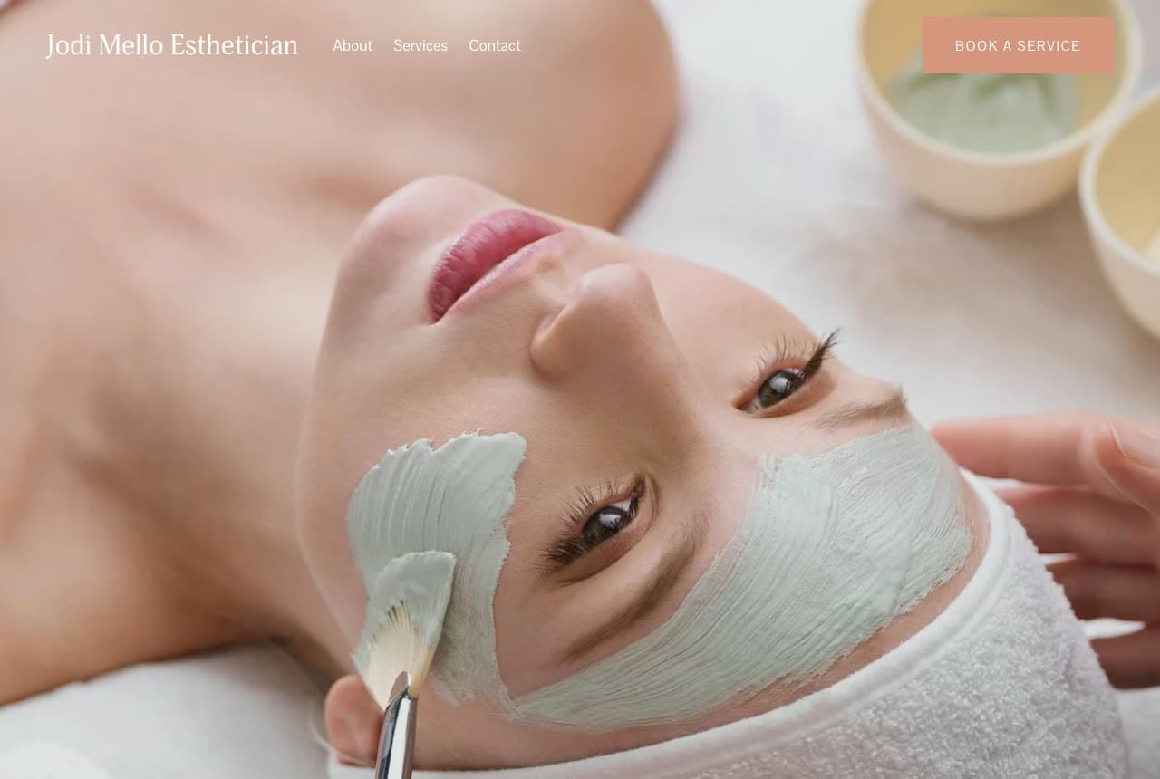
Jodi Mello Esthetician trusts the photograph to do everything. The header floats over it: 'Jodi Mello Esthetician' in light serif left, a three-item nav — About, Services, Contact — and a peach pill, 'BOOK A SERVICE', right. The hero is a close photograph of a woman lying back with a white towel wrapped around her hair, eyes open, while a brush spreads a sage-green mask across her cheek; small bowls of product sit blurred behind her. There is no headline, no paragraph and no second button — the whole first screen is the treatment, the name and the booking pill. The three-item nav is the minimum a service business can have, and the peach pill is the only colour that isn't in the photo. It is the most confident page in the gallery because it says nothing. Clone it if one great photograph is all you have — and one is enough.

Visit Jodi Mello Esthetician

Opens a similar Zarla design you can make yours.

Rose + Honey Skincare website — Corrective Skincare Clinic design example
Real site · San Diego, CA
  • Corrective Skincare Clinic
  • Evidence-Led

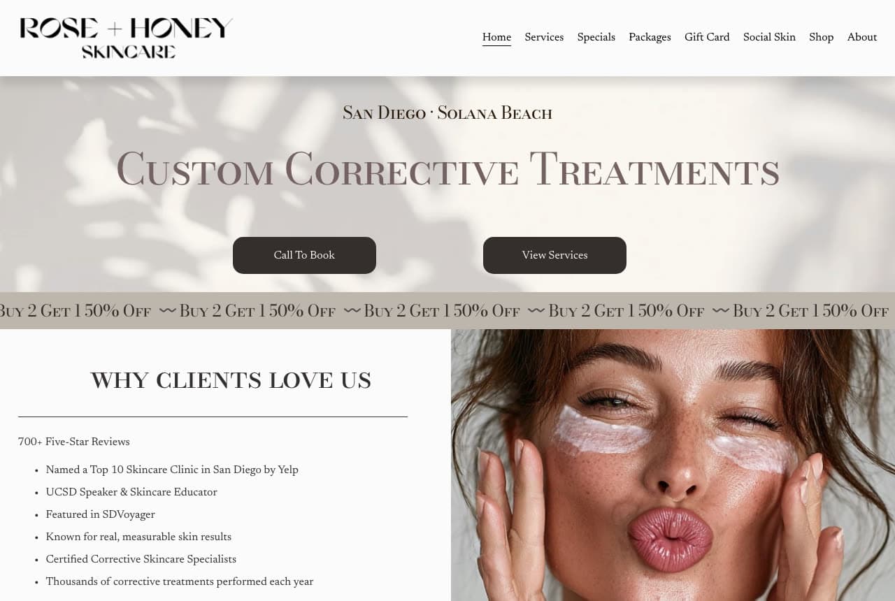
Rose + Honey Skincare: 'Custom Corrective Treatments' with 'San Diego · Solana Beach' above it and a seven-line proof list below

Rose + Honey Skincare names the town, the treatment and the receipts. The white header sets the 'ROSE + HONEY SKINCARE' logo left and a serif nav — Home, Services, Specials, Packages, Gift Card, Social Skin, Shop, About. The hero is a pale grey field with soft leaf shadows: a small serif line, 'San Diego · Solana Beach', then the serif capitals 'Custom Corrective Treatments', and two dark buttons, 'Call To Book' and 'View Services'. A marquee strip beneath repeats 'Buy 2 Get 1 50% Off'. Then a split: on the left, 'WHY CLIENTS LOVE US' over a rule and a bulleted list — '700+ Five-Star Reviews', 'Named a Top 10 Skincare Clinic in San Diego by Yelp', 'UCSD Speaker & Skincare Educator', 'Featured in SDVoyager', 'Known for real, measurable skin results', 'Certified Corrective Skincare Specialists', 'Thousands of corrective treatments performed each year'; on the right, a photograph of a woman with under-eye patches pouting at the camera. 'Corrective' is the word — this studio treats problems, and the list is how it proves it can. Clone the proof list if you have seven true things to say.

Visit Rose + Honey Skincare

Opens a similar Zarla design you can make yours.

The Good Esthetician website — Consultation-Led Skincare Spa design example
Real site · Reno, NV
  • Consultation-Led Skincare Spa
  • Earnest

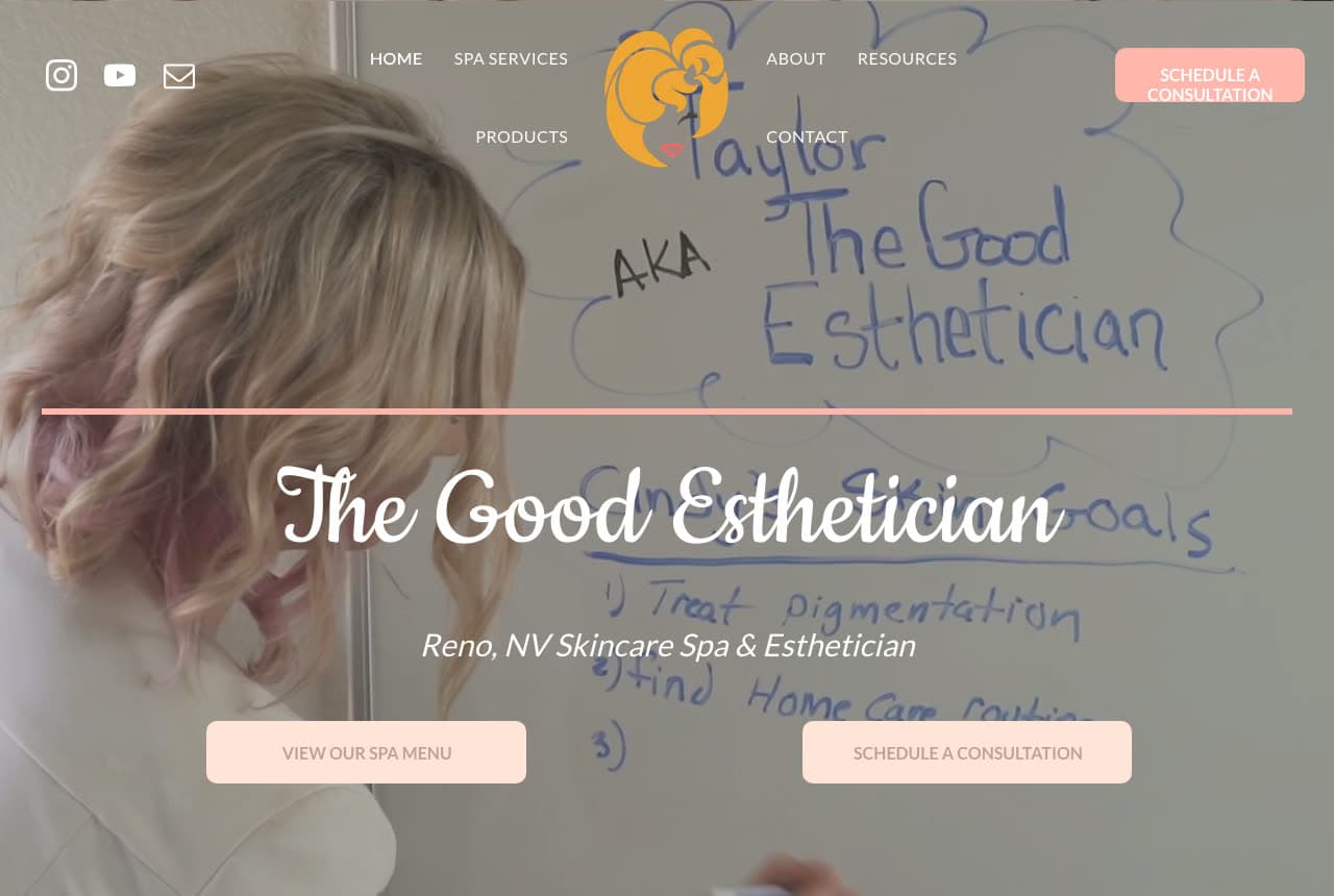
The Good Esthetician: A whiteboard treatment plan in her own handwriting behind 'The Good Esthetician'

The Good Esthetician photographs its owner teaching. The header floats over the photo: Instagram, YouTube and mail icons left, a two-row nav — HOME, SPA SERVICES, PRODUCTS, ABOUT, RESOURCES, CONTACT — a gold logo mark centred, and a peach 'SCHEDULE A CONSULTATION' right. The hero is a photograph of a blonde woman, seen from behind, writing on a whiteboard already covered in blue marker — 'Taylor AKA The Good Esthetician', a cloud around 'goals', '1) Treat pigmentation', '2) find Home Care routine', '3)'. A thin pink rule crosses the image; beneath it, in white script, 'The Good Esthetician', then in italic, 'Reno, NV Skincare Spa & Esthetician', and two peach buttons: 'VIEW OUR SPA MENU' and 'SCHEDULE A CONSULTATION'. The whiteboard is a real consultation — the client's goals numbered in her handwriting — and it says 'plan' where other sites say 'pamper'. Clone the teaching photograph if your value is the advice, not just the facial.

Visit The Good Esthetician

Opens a similar Zarla design you can make yours.

Linnea Lash & Brow Studio — Lash & Brow Studio Template website design you can build with Zarla
Build this with Zarla
  • Lash & Brow Studio Template
  • Soft

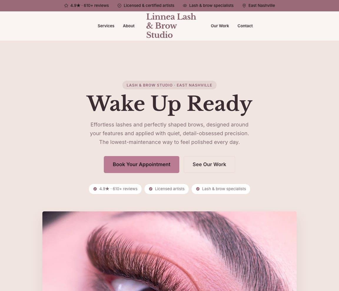
Linnea Lash & Brow Studio: 'Wake Up Ready' in serif on blush, with 'See Our Work' as the second button

Linnea Lash & Brow Studio is the Zarla lash-and-brow template, and its two-word headline is the best in the gallery. A mauve top strip carries '4.9★ · 610+ reviews', 'Licensed & certified artists', 'Lash & brow specialists' and 'East Nashville'. The blush header centres the serif wordmark between Services, About and Our Work, Contact. The hero is blush and centred: a pill, 'LASH & BROW STUDIO · EAST NASHVILLE', the serif 'Wake Up Ready', and a paragraph that sells the outcome — 'Effortless lashes and perfectly shaped brows, designed around your features and applied with quiet, detail-obsessed precision. The lowest-maintenance way to feel polished every day.' A mauve 'Book Your Appointment' sits beside an outline 'See Our Work', three tick pills repeat the proof, and a photograph begins at the fold. 'Our Work' in the nav and on the button is the esthetician's portfolio; 'Wake Up Ready' is the benefit in two words. Clone it for a lash, brow or waxing studio.

See this template
Glasshouse Skin Studio — Skin Studio Template website design you can build with Zarla
Build this with Zarla
  • Skin Studio Template
  • Honest

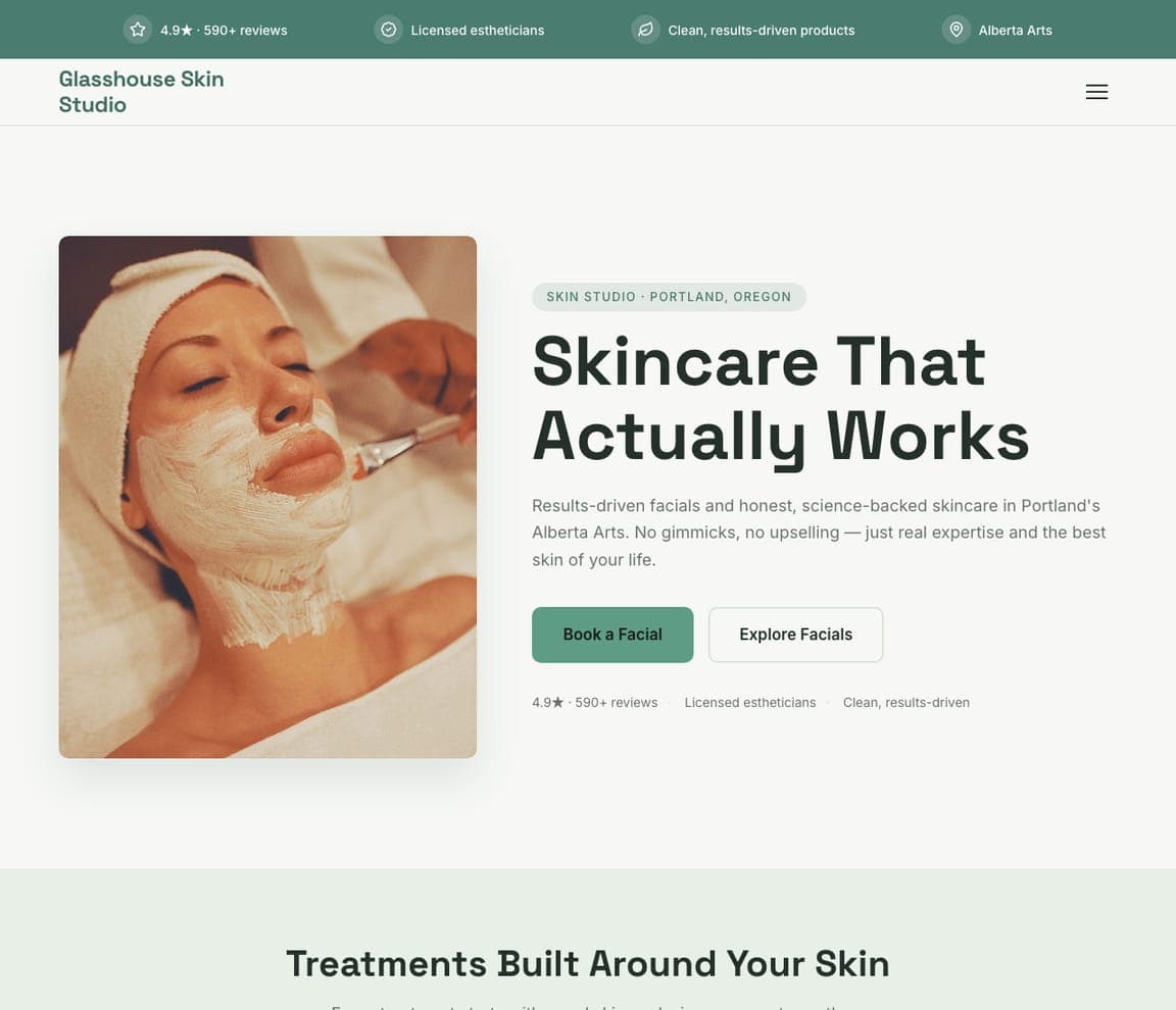
Glasshouse Skin Studio: 'Skincare That Actually Works' beside a facial mask being brushed on

Glasshouse Skin Studio is the Zarla skin-studio template — the esthetician's own design, and the cover of this pool. A green top strip carries '4.9★ · 590+ reviews', 'Licensed estheticians', 'Clean, results-driven products' and 'Alberta Arts'. The white header is the green wordmark and a hamburger. The hero is split: on the left a rounded photograph of a woman in a towel wrap having a mask brushed onto her face; on the right a green pill, 'SKIN STUDIO · PORTLAND, OREGON', the heavy 'Skincare That Actually Works', and a paragraph that draws its line — 'No gimmicks, no upselling — just real expertise and the best skin of your life.' A green 'Book a Facial' sits beside an outline 'Explore Facials', and a grey line repeats the strip: '4.9★ · 590+ reviews · Licensed estheticians · Clean, results-driven'. 'No upselling' is the sentence a facial client most wants to read. Clone it for a results-first studio; the treatment photograph does the rest.

See this template
Aquabloom Facial Bar — Facial Bar Template website design you can build with Zarla
Build this with Zarla
  • Facial Bar Template
  • Fresh

Aquabloom Facial Bar: 'HydraFacial in Portland, OR' in coral on dark, beside a smiling client in a white mask

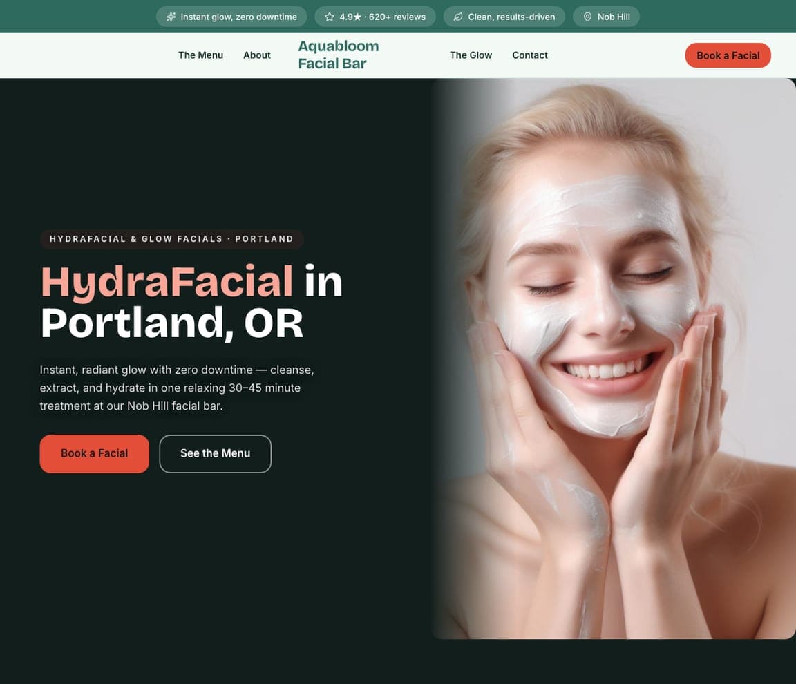
Aquabloom Facial Bar is the Zarla facial-bar template — one treatment, sold like a menu item. A teal top strip carries 'Instant glow, zero downtime', '4.9★ · 620+ reviews', 'Clean, results-driven' and 'Nob Hill'. The white header splits the nav around the centred teal wordmark — The Menu, About | The Glow, Contact — with a coral 'Book a Facial'. The hero is split: a dark left panel with a pill, 'HYDRAFACIAL & GLOW FACIALS · PORTLAND', the headline 'HydraFacial' in coral over 'in Portland, OR' in white, and a paragraph that sells the visit in a sentence — 'cleanse, extract, and hydrate in one relaxing 30–45 minute treatment at our Nob Hill facial bar.' A coral 'Book a Facial' sits beside an outline 'See the Menu'. On the right, a photograph of a smiling woman in a white face mask with her hands on her cheeks. 'The Menu' as a nav item is the move: treatments priced like dishes. Clone it for an esthetician with a signature treatment.

See this template
Renwick Skin Clinic — Clinical Skincare Template website design you can build with Zarla
Build this with Zarla
  • Clinical Skincare Template
  • Calm

Renwick Skin Clinic: 'Clearer Skin, Real Confidence' in serif and rust beside a smiling client

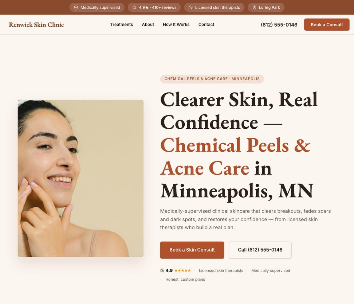
Renwick Skin Clinic is the Zarla clinical-skincare template, the medical end of the esthetician trade. A rust top strip carries 'Medically supervised', '4.9★ · 410+ reviews', 'Licensed skin therapists' and 'Loring Park'. The white header sets the rust serif wordmark against Treatments, About, How It Works, Contact, the phone and a rust 'Book a Consult'. The hero puts a photograph on the left — a smiling woman on a tan ground, touching her cheek — and the copy on the right: a pill, 'CHEMICAL PEELS & ACNE CARE · MINNEAPOLIS', the serif headline 'Clearer Skin, Real Confidence —' with 'Chemical Peels & Acne Care' in rust and 'in Minneapolis, MN', and a paragraph promising 'Medically-supervised clinical skincare that clears breakouts, fades scars and dark spots… from licensed skin therapists who build a real plan'. 'How It Works' in the nav and 'Book a Consult' as the button both say the first visit is a conversation. Clone it for an esthetician who treats acne — the serif keeps it calm.

See this template
Stillwater Day Spa — Day Spa Template website design you can build with Zarla
Build this with Zarla
  • Day Spa Template
  • Serene

Stillwater Day Spa: 'Quiet the Noise. Restore the Calm.' over a dark spa room with wooden blinds

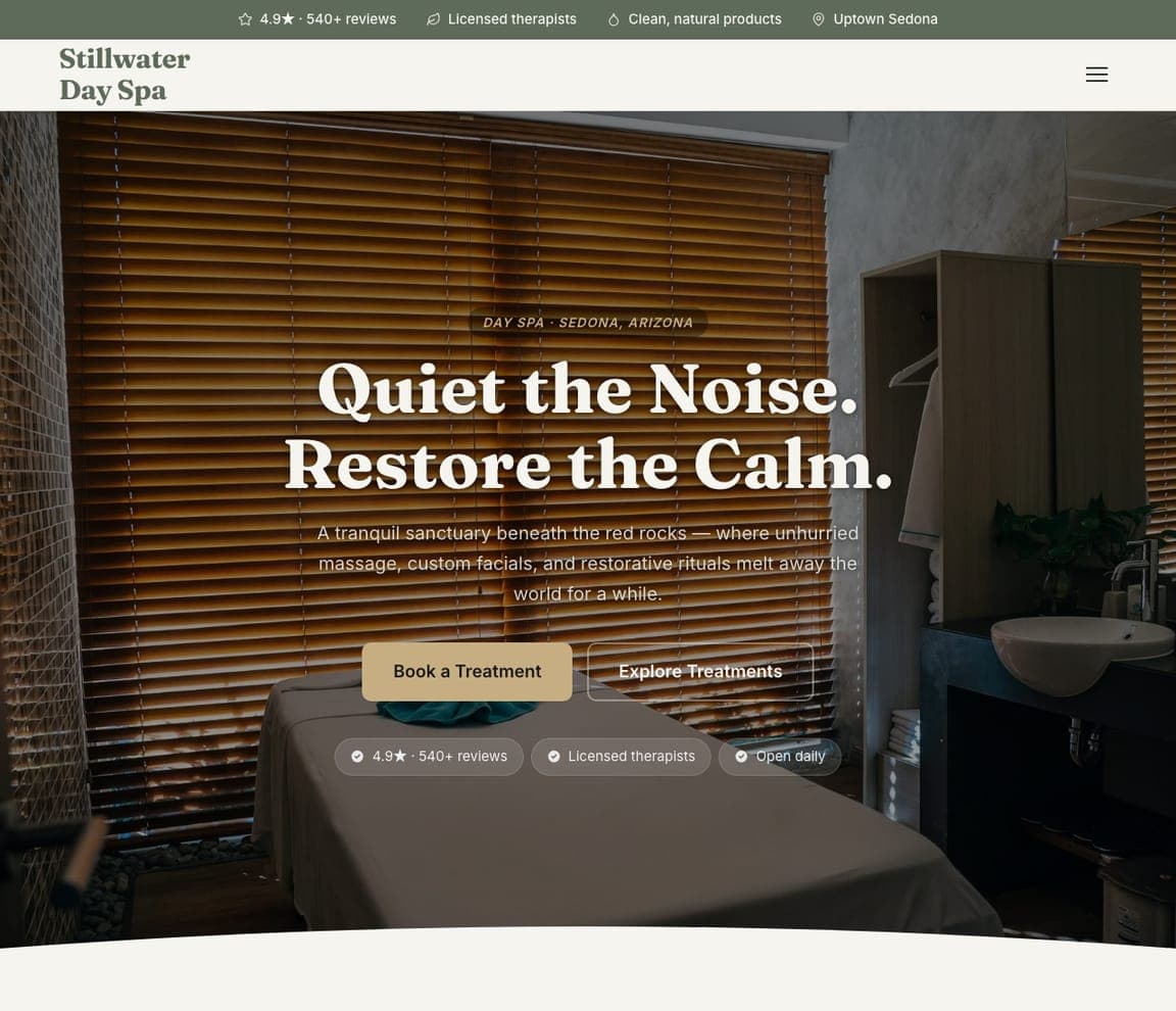
Stillwater Day Spa is the Zarla day-spa template, and the design an esthetician borrows when the room is the product. A sage top strip carries '4.9★ · 540+ reviews', 'Licensed therapists', 'Clean, natural products' and 'Uptown Sedona'. The header is the green serif wordmark and a hamburger. The hero is a full-bleed dark photograph of a spa room — wooden blinds, a basin, low light — with centred copy: an italic pill, 'DAY SPA · SEDONA, ARIZONA', the serif 'Quiet the Noise. Restore the Calm.', and a paragraph that reads like the room feels — 'A tranquil sanctuary beneath the red rocks — where unhurried massage, custom facials, and restorative rituals melt away the world for a while.' A tan 'Book a Treatment' sits beside an outline 'Explore Treatments', and tick pills sit at the fold. Two imperative sentences as the headline, and a photograph with nobody in it. Clone it for a facial studio whose room is worth the visit.

See this template

Frequently asked

What should an esthetician's website show first?

A treatment in progress and one sentence. Shannon Lee Esthetics shows blue-gloved hands spreading a black mask across a face under 'SELF LOVE ISN'T SELFISH'; Bespoke Aesthetics & Wellness shows a woman with a white clay mask, eyes closed, beside 'Skincare, Crafted'; Jodi Mello shows a sage-green mask being brushed on with no headline at all; Kerry Spindler frames a face with two pairs of hands and writes 'YOUR SKIN, UNDERSTOOD.' The photograph does the reassuring and the sentence does the rest.

How should an esthetician write the headline?

To the visitor, gently. Face Space: 'We bring your skin story into focus. We treat your skin like a part of you worth knowing, not a problem to be fixed or hidden. This is your skin's safe space.' Kerry Spindler: 'YOUR SKIN, UNDERSTOOD. Advanced expertise. Thoughtful care. Entirely personal.' Shannon Lee: 'SELF LOVE ISN'T SELFISH.' Skin by Gabby says 'you do not need to sacrifice relaxation for transformation'. None of them lists treatments in the headline.

How many buttons does an esthetician's homepage need?

One, and it books. Shannon Lee has a single black pill, 'BOOK'; Bespoke Aesthetics has an outlined 'Book an appointment' in the header and again under the headline; Jodi Mello has a peach 'BOOK A SERVICE' and nothing else; Face Space has a plum 'Start Your Journey'; Skin by Gabby has 'BOOK APPOINTMENT' in the header. Rose + Honey and The Good Esthetician offer two — 'Call To Book' beside 'View Services', 'VIEW OUR SPA MENU' beside 'SCHEDULE A CONSULTATION' — for the visitor who wants to read prices first.

What proof works on an esthetician's website?

An award, a count or a review list. Kerry Spindler places a gold-and-navy seal in the hero — 'ELITE AESTHETICS GUIDE · TOP 10 ESTHETICIANS in MASSACHUSETTS 2026'; Skin by Gabby runs 'Voted 2025 Best of Inland Empire' as a marquee above the headline; Rose + Honey lists '700+ Five-Star Reviews', 'Named a Top 10 Skincare Clinic in San Diego by Yelp', 'UCSD Speaker & Skincare Educator', 'Featured in SDVoyager' under 'WHY CLIENTS LOVE US'. The Good Esthetician's proof is the whiteboard behind her — a treatment plan in her own handwriting.

Should an esthetician's site say where it is?

Yes, in a line under the name. The Good Esthetician: 'Reno, NV Skincare Spa & Esthetician'. Rose + Honey: 'San Diego · Solana Beach' above the headline. Skin by Gabby: 'INLAND EMPIRE' above 'SKIN COACH'. Kerry Spindler's seal names Massachusetts. A skin studio is a place you drive to, so the city belongs in the first screen — the ones here that leave it out, like Face Space and Bespoke Aesthetics, put it in the booking flow instead.

Can I build an esthetician website like these with Zarla?

Yes. Every real site here has a 'Build a site like this' button that opens the closest Zarla template in the editor — Glasshouse Skin Studio for a rounded treatment photo beside a plain-spoken headline, in the Kerry Spindler and Jodi Mello spirit; Stillwater Day Spa for a full-bleed dark photograph with a serif line like Shannon Lee and The Organic Esthetician; Renwick Skin Clinic for a corrective-skincare page like Rose + Honey and Face Space; Aquabloom Facial Bar for a single-treatment studio like Skin by Gabby; Linnea Lash & Brow Studio for a blush, centred, tick-pill layout — and you swap in your own treatment photo, your city and your booking link. One photo of a mask going on, one kind sentence and a 'Book' button is the Shannon Lee pattern, and it takes about 30 seconds.

You've seen what works. Now make it yours.

Describe your business and Zarla designs a complete, professional website in about 30 seconds — built to convert, just like the ones above.

Free to build and preview · no credit card · publish to your own domain on Premium