Inspiration · Event Planner

The Best Event Planner Website Examples, Explained

Looking for event planner website examples? These 8 are the best we could find — standout real event planner sites plus designs you can build with Zarla — and each comes with a breakdown of the specific design move that makes it work. Find a look you love and you can build a site in that exact style, free, in about 30 seconds.

Real sites + designs you can build with Zarla — free to build and preview, no credit card

What makes a great event planner website

The best event planner websites share a few moves: they earn trust fast, lead with strong visuals of the work, point to one clear action, and match the design to how their customers decide. Each example below calls out the specific choice worth stealing for your own event planner website.

Coral & Co. website — Luxury / Brand Events design example
Real site · Melbourne, AU
  • Luxury / Brand Events
  • Editorial
  • Coral + cream

Coral & Co.: Making the case for the details

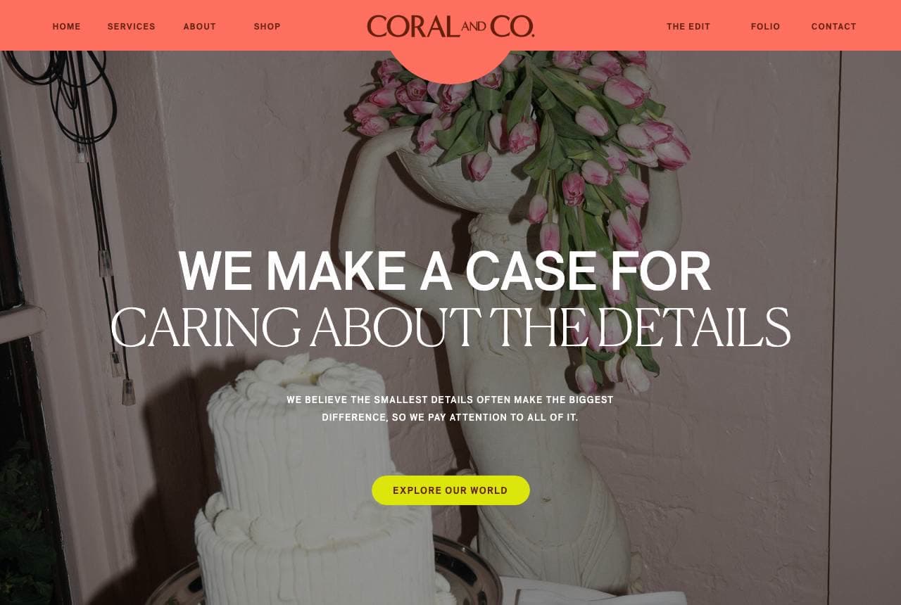
Coral & Co. leads with a thesis, not a portfolio: 'We Make a Case for Caring About the Details,' set over a moody tiered-cake photograph, followed by 'More Than Just a Beautiful Event' in a confident coral block. The whole page argues a point of view — that the smallest choices make the biggest difference — which is exactly what a discerning bride or brand-launch client is buying: judgment, not just decoration. The coral-and-cream palette gives it a distinct signature in a category drowning in blush-pink sameness, and 'Explore Our World' invites the browser into a curated aesthetic rather than a service list. Leading with a philosophy positions the planner as a taste authority; the portfolio then becomes proof of the thesis rather than the pitch itself.

  • Opens with a point of view — sells judgment, not décor
  • Signature coral cuts through a blush-pink category
  • 'Explore Our World' invites into an aesthetic, not a menu

Steal this: Lead with your philosophy of the work, not your service list. Clients hire the taste behind the details.

Cranberry Blue website — Luxury Weddings design example
Real site · United Kingdom
  • Luxury Weddings
  • Refined
  • Jewel tones

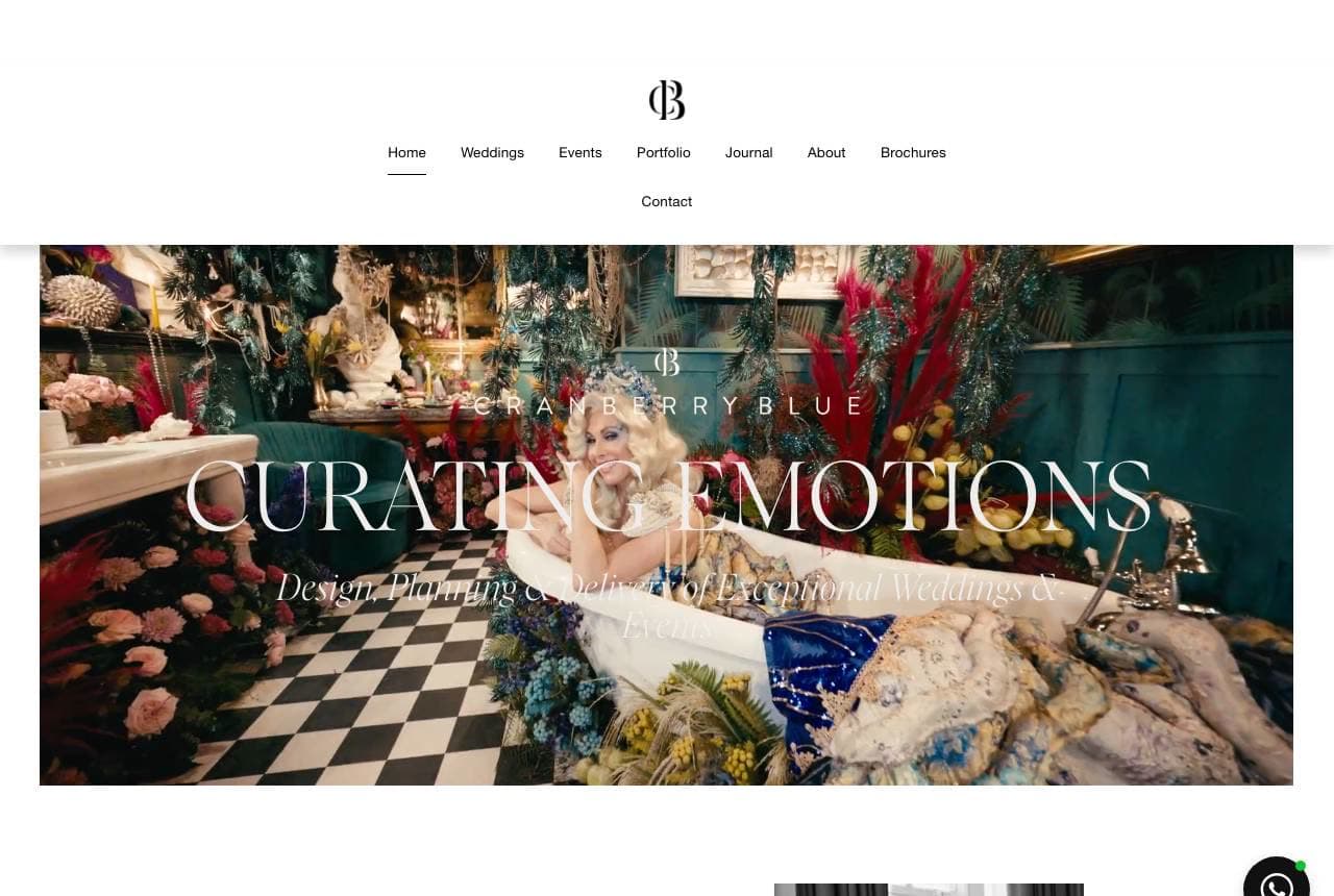
Cranberry Blue: 'Curating emotions' and a founder's face

Cranberry Blue reframes event planning as emotional design — 'Curating Emotions' over a lavish checkerboard-floor tablescape — and then does the single most powerful thing a solo luxury planner can do: it introduces the human. 'Hi, I'm Melanie. I don't just plan luxury weddings and bespoke events, I craft meaningful experiences that come straight from the heart,' beside her portrait and a 'Schedule time with me' button. Luxury weddings are a high-trust, high-touch purchase where clients are choosing a person to hand months of stress to, so putting the founder's face and voice up front collapses the trust gap faster than any gallery. The refined serif and jewel-toned photography keep it upscale. When the service IS you, sell you.

  • 'Curating Emotions' reframes planning as emotional design
  • Founder's face + first-person voice collapses the trust gap
  • 'Schedule time with me' — a person, not a contact form

Steal this: For a solo high-trust service, put your face and 'I' voice in the hero. Clients hire a person, not a logo.

ELM Events website — Corporate Events design example
Real site · Bozeman, MT
  • Corporate Events
  • Professional
  • Sage + tan

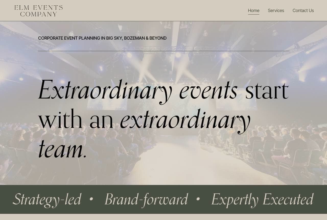
ELM Events: Corporate register, three-word promise

ELM Events targets the boardroom, not the ballroom: 'Extraordinary events start with an extraordinary team' in an italic serif over a wide conference-gala shot, with a three-part tagline — 'Strategy-led · Brand-forward · Expertly Executed' — that speaks fluent corporate. The body copy names the real buyer's anxiety precisely: 'managing a conference, summit, or large-scale gathering is a serious undertaking… you're expected to show up as a leader on the day itself,' then positions ELM as the fix — 'we protect your time, your budget, and your reputation.' That last word is the tell: corporate event buyers fear reputational risk more than cost. Sage-and-tan restraint keeps it executive. When you sell to companies, sell risk-removal in their vocabulary, not prettiness in yours.

  • 'Strategy-led · Brand-forward' speaks fluent corporate
  • Names the buyer's real fear: showing up as the leader
  • 'Protect your reputation' — the corporate buyer's true worry
Feel Good Events website — Event Styling design example
Real site · Melbourne, AU
  • Event Styling
  • High-Energy
  • Magenta + black

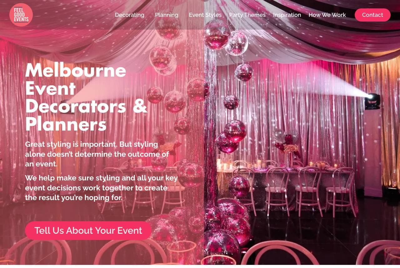
Feel Good Events: Styling as means, feeling as the end

Feel Good Events opens on a magenta-lit disco-ball-and-drapery scene — 'Melbourne Event Decorators & Planners' — and then argues a surprisingly sophisticated point for a styling company: 'great styling is important, but styling alone doesn't determine the outcome of an event.' The copy pivots from décor to psychology — 'what make an event truly memorable is what happens after the first wow' — and promises to design around how you want guests to FEEL from arrival to end. That reframe elevates a decorating business above the commodity 'balloons and backdrops' tier into experience design, justifying higher fees. The high-energy pink photography sells the party while the copy sells the thinking behind it. Even a visual trade wins by naming the outcome the visuals serve.

  • Pivots from styling to guest-feeling — décor as means, not end
  • Elevates a decorator above the 'balloons' commodity tier
  • High-energy magenta photography sells the party itself
Fun and Confetti website — Party Planning design example
Real site · Belmont, CA
  • Party Planning
  • Joyful
  • Pink + rainbow

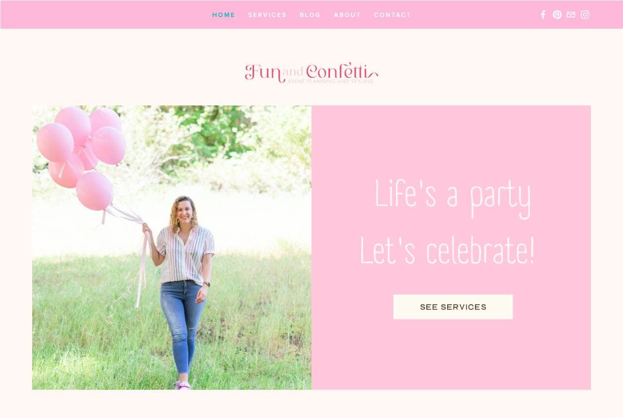
Fun and Confetti: Joy as the entire brand palette

Fun and Confetti commits fully to delight: a script wordmark, a woman with a fistful of pink balloons in a sunny field, 'Life's a party — Let's celebrate!' in a candy-pink block, and a rainbow-lettered 'SERVICES' heading over tiles for Planning Packages, Bar/Bat Mitzvahs and Balloon Packages. It's unabashedly cheerful, and that's the correct read for its niche — kids' parties and celebrations, where the buyer is a parent who wants joy, not sophistication. The founder's origin story ('I'm Myri, I've been planning parties since I was little') gives the pink personality a real person behind it. In a category where many planners over-polish toward luxury, owning pure fun is a clear, uncrowded position. Match your palette to the emotion your customers are actually buying.

  • Candy-pink joy matches what party parents actually want
  • Balloon + mitzvah packages name a specific celebration niche
  • Founder origin story humanizes the cheerful brand
Maximillion website — Corporate Experiences design example
Real site · Edinburgh, UK
  • Corporate Experiences
  • High-Energy
  • Black + lime

Maximillion: Neon energy and a 1989 pedigree

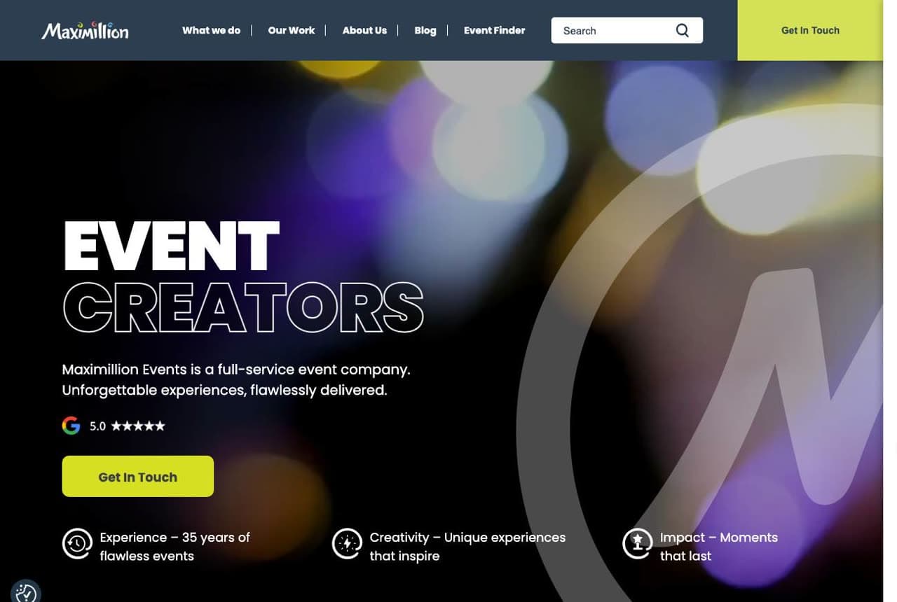
Maximillion pairs high-energy design with deep credentials: 'EVENT CREATORS' in bold white over a dark, bokeh-lit hero, a Google 5.0 badge, and a three-icon proof row — 35 years of flawless events, unique experiences, lasting impact. Scroll and the palette flips to electric lime for 'Innovation Since '89,' backed by hard numbers: 5,000+ events for a quarter-million guests since its first team-building session in a forest outside Edinburgh. The contrast is the strategy — the neon says 'we throw unforgettable parties,' the 1989 date and event count say 'and we've done it reliably for decades.' Corporate experience buyers want both excitement and safety; leading with energy and immediately grounding it in longevity delivers the pair. Dark hero, bright proof, decades of receipts.

  • Neon energy says 'unforgettable'; '5,000+ since '89' says 'reliable'
  • Electric-lime proof section grounds the party in decades
  • Google 5.0 + guest count answer the corporate risk question
ShimmerNYC website — Event Production design example
Real site · New York, NY
  • Event Production
  • Polished

ShimmerNYC: Three photos for three kinds of celebration

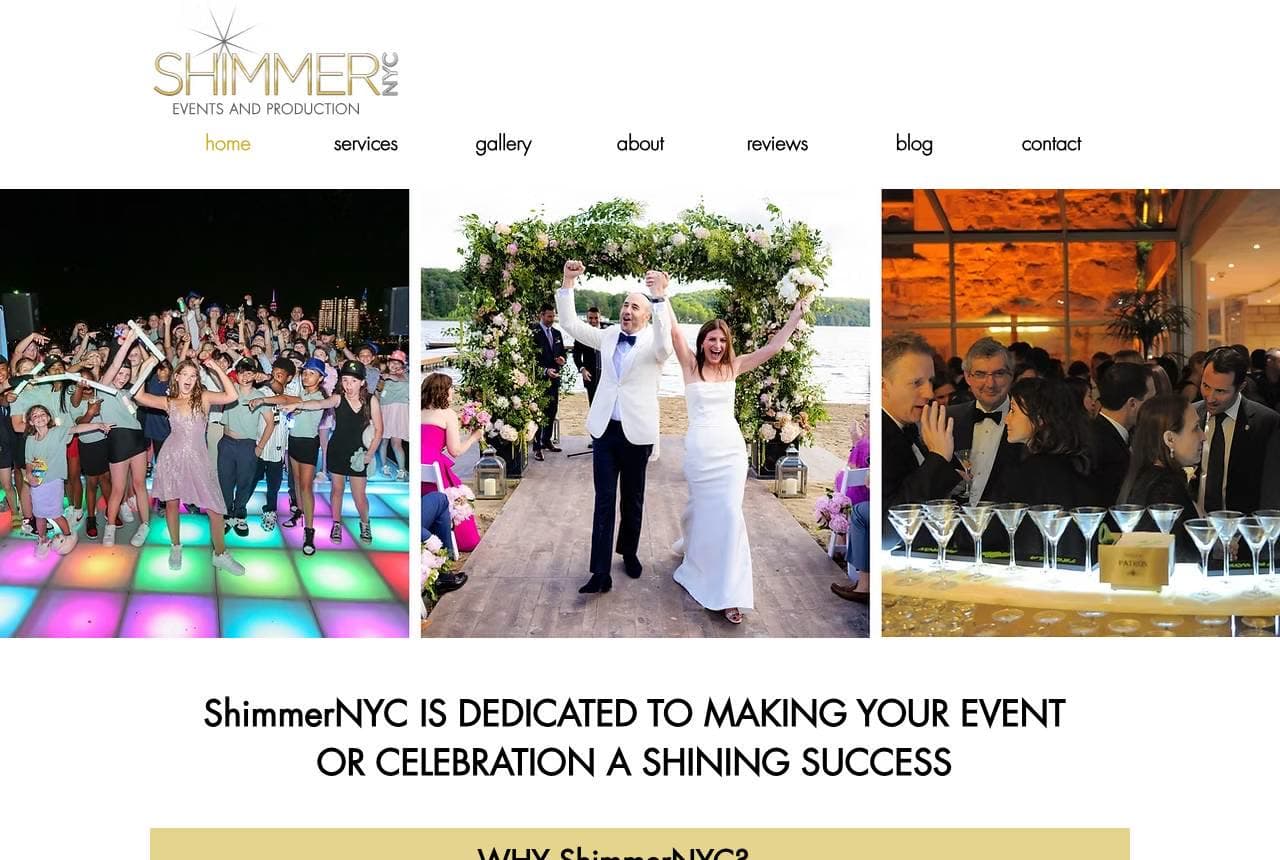
ShimmerNYC leads its full-service production pitch with a triptych that does the range-of-work job instantly: a colour-lit dance floor of celebrating friends, a couple cheering under a floral wedding arch, and an elegant champagne-tower gala — corporate, wedding and party in one glance. 'ShimmerNYC is dedicated to making your event or celebration a shining success,' with gold accents carrying the 'shimmer' theme. The copy then answers the paralyzed prospect directly: 'Not sure where to start? Don't have time to plan? Already have an idea in mind?' — meeting three readiness states at once. Since 2012 and NYC positioning add the local-authority note. Showing three distinct event types up front tells every visitor 'yes, we do the thing you specifically need' without a services page.

Marquee Events Co. — Full-Service Planner website design you can build with Zarla
Build this with Zarla
  • Full-Service Planner
  • Upscale

Marquee Events Co.: Three slides for three event types

Marquee Events Co. is Zarla's event-planner template, and its carousel hero rotates through the three markets a full-service planner serves — 'Galas That Command the Room,' 'Corporate Events With Polish,' 'Celebrations Worth Remembering' — the same range-in-the-hero move ShimmerNYC makes with its triptych. Forest green and antique gold set an upscale, trustworthy register that reads capable rather than flashy, right for a planner asking to be handed a big budget and a bigger reputation. The rotating slides let one hero address corporate, gala and private clients without a services page, and the structure carries a portfolio, an about section, and a consultation CTA beneath. Swap in your own event photos and you have a credible, upscale planner site in about 30 seconds.

See this template

Frequently asked

Where can I find good event planner website examples?

Right here — this page curates event planner website examples two ways: standout real businesses (each linked, so you can explore the live site) and professionally designed Zarla templates you can clone and make your own. Every example comes with a note on why the design works — trust signals, layout, calls to action — so you can copy the move, not just the look.

What makes a good event planner website?

A good event planner website earns trust in the first few seconds, leads with strong visuals of the work, gives visitors one obvious action, and loads fast on a phone. Every design below leads with proof and a single clear call to action rather than a wall of text.

How much does a event planner website cost?

A custom event planner website from a designer typically runs into the thousands up front, and template builders charge roughly $16–$30 per month. An AI builder generates a complete, editable design for free and only charges (on the Premium plan) when you publish to your own domain — so you can build and preview before spending anything.

Do I need a designer to build a event planner website?

No. Several designs on this page were generated by Zarla and are fully editable — you describe your business and get a complete, professionally designed site in about 30 seconds, then refine it by chatting. Building and previewing is free; publishing to your own domain needs the Premium plan.

What pages does a event planner website need?

Most event planner businesses need just a few: a home page that proves trust and points to one clear action, an about page that puts a face to the business, a services or work page that shows what you do, and a contact page with a form and a phone number. Local businesses also benefit from location or service-area pages that help them show up in nearby searches.

How do I get more customers from my event planner website?

Lead with proof in the first few seconds (reviews, real photos, results), make one action obvious on every screen (call, book, or enquire), and keep it fast on mobile — most visitors arrive on a phone. The designs above each do this differently, but they all earn trust early and remove friction from the next step.

You've seen what works. Now make it yours.

Describe your business and Zarla designs a complete, professional website in about 30 seconds — built to convert, just like the ones above.

Free to build and preview · no credit card · publish to your own domain on Premium