Inspiration · Flooring

The Best Flooring Website Examples, Explained

Looking for flooring website examples? These 12 are the strongest we found — SOTA Floors' 'YOUR FOREVER FLOOR STARTS HERE' in a white room full of light, Royal Home Flooring's 'The showroom comes to you.', Floors By Roberts' visualizer with a phone held over the sofa — plus three Zarla flooring designs, from a flooring contractor to a showroom studio and a carpet installer, each with a breakdown of the specific move that turns a 'flooring near me' search into a showroom visit or an in-home estimate. A flooring site is selling a surface people walk on without looking at it, so the best ones photograph the room instead of the plank and lead with the thing that makes them different. Find an approach you love and you can build a site in that spirit, free, in about 30 seconds.

Real sites + designs you can build with Zarla — free to build and preview, no credit card

What makes a great flooring website

The best flooring websites split into showrooms and contractors, and each knows which it is. The showrooms sell the visit and the choice — SOTA Floors' 'VISIT OUR SHOWROOM', Trinity Floor Company's 'ESTABLISHED 1934' badge and five product tiles, Floors By Roberts' 'Help me choose' chip and room visualizer, Best Flooring's owners inset in the hero. The contractors sell the job and the button — Unique Hardwood Flooring Chicago's five services as verbs and a big red 'GET A FREE QUOTE ›', Royal Home Flooring's shop-at-home model as a six-word headline, Midway Flooring's 'PROFESSIONAL, RESPONSIVE AND RELIABLE' for facilities buyers. Notice how many photograph a finished room rather than a floor (SOTA's white lounge, Stylish Interiors' kitchen, Petra Flooring & Blinds' hallway with the animal-print chair) and how the product range moves into the nav or a tile row so the hero can be one sentence. Every example below tells you whether to walk in or call before you scroll.

SOTA Floors website — Wood Floor Showroom design example
Real site
  • Wood Floor Showroom
  • Airy
  • White + wood

SOTA Floors: 'YOUR FOREVER FLOOR STARTS HERE' in a white room full of light

SOTA Floors — State of the Art Wood Floor Gallery — sells the floor by showing the room it makes possible: a bright white interior with a round mirror, a plant, cream sofas and a glass wall onto trees, the pale wood floor running under all of it. Over the photo, white capitals read 'YOUR FOREVER FLOOR STARTS HERE', then 'With more than 25 years of expert craftsmanship, we guide you from inspiration to installation.' and an outline 'VISIT OUR SHOWROOM'. The header is a showroom's header: the logo, COLLECTIONS, SERVICES, ABOUT SOTA, DOCUMENTS, LOCATIONS, CONTACT, and a 'Start searching…' box. 'Forever floor' is the reframe — a wood floor as a decision you make once — and 'from inspiration to installation' is the whole customer journey in five words. Clone it for a showroom whose product photographs best in daylight.

  • 'Forever floor' — the product reframed as a one-time decision
  • A search box in the header: the site is a catalogue
  • 'VISIT OUR SHOWROOM' as the call — not a quote

Steal this: Photograph your floor in the brightest room you've installed it in, and make the button 'Visit our showroom' if you have one — a showroom visit converts better than a form.

Visit SOTA Floors

Opens a similar Zarla design you can make yours.

Royal Home Flooring website — Shop-at-Home Flooring design example
Real site · Chicago, IL
  • Shop-at-Home Flooring
  • Bold
  • Dark + gold

Royal Home Flooring: 'The showroom comes to you.' in giant white on a dim living room

Royal Home Flooring has the best line in the gallery and gives it the whole screen: 'The showroom comes to you.' in huge white type over a dim living room with sheer curtains and a cello, and under it in yellow, 'Shop-at-home carpet, hardwood, vinyl, and laminate flooring installation across Chicago suburbs and Northwest Indiana.' The header is dark and sparse — a hamburger labelled MENU, a gold crown with 'ROYAL HOME FLOORING', 'Schedule Free Estimate' and the phone in gold, 312-625-7471. No form, no tiles, no badges: the sentence is the offer, the subline lists the four products and the two regions, and the phone is the button. It is the opposite of SOTA's showroom pitch and just as clear. Clone it if you bring samples to the house — that is the differentiator, so make it the headline.

  • The business model as the headline — six words
  • Products and regions in one yellow subline
  • Gold crown, dark ground, a phone number: the whole header

Steal this: If your model is different — mobile showroom, shop-at-home, next-day install — write it as a six-word sentence and make it the only headline.

Visit Royal Home Flooring

Opens a similar Zarla design you can make yours.

Floors By Roberts website — Flooring Retailer & Installer design example
Real site · Appleton, WI
  • Flooring Retailer & Installer
  • Helpful
  • White + teal

Floors By Roberts: 'Try Our Visualizer Today!' — a phone in a hand over the sofa

Floors By Roberts sells a tool before it sells a floor. The hero pairs 'Our Floors In Your Room! Try Our Visualizer Today!' and a teal 'Get Started Now' with a photograph of a hand holding a phone that shows a new floor rendered into a blue-sofa living room; the line under it names the business and the region, 'Floors By Roberts — Fox Valley's Flooring Showroom for Every Room'. Above, a teal band offers a search — 'Ask about our products and services' — with three chips: Free estimate, Inspiration, Help me choose. The header stacks the store facts (address, 'Today 9:00AM - 1:00PM', phone), a teal 'Get a Free Estimate', the logo, a cart and search, and a nav of Home, Products, Services, Finance, About Us, Contact Us. It is a retail site, and the visualizer is the reason to stay. Clone it if you have a visualizer — and if you don't, 'Help me choose' is still the chip to steal.

  • The visualizer, not the floor, as the hero offer
  • Three search chips that sort visitors: estimate, inspiration, help me choose
  • Store hours and address in the header — a shop you can walk into

Steal this: Give visitors a 'Help me choose' door in the first screen — most flooring buyers don't know the difference between LVP and laminate, and the site that helps them wins the estimate.

Visit Floors By Roberts

Opens a similar Zarla design you can make yours.

Stylish Interiors Flooring & Countertops website — Flooring & Countertop Store design example
Real site · Conroe, TX
  • Flooring & Countertop Store
  • Direct
  • Photo + red

Stylish Interiors Flooring & Countertops: 'Custom Flooring & Countertops' in heavy white, 'Since 1985' underneath

Stylish Interiors Flooring & Countertops is the loud, plain version of the flooring site and it works. A red script logo, a search box and 'Give us a call today! (936) 441-2026' sit over a nav of Home, Flooring, Countertops, In Stock, Our Brands, Gallery, Contact Us. The hero is a white kitchen photograph with the headline set in giant heavy white — 'Custom Flooring & Countertops' — and 'Proudly Serving Conroe, Texas Since 1985' beneath it, then two red buttons, 'VIEW FLOORING' and 'VIEW COUNTERTOPS'. Two products, two buttons, one founding year: nothing to decode. The 'In Stock' nav item is the quiet winner — a flooring buyer with a deadline goes straight there. Clone it for a two-product store where the headline can simply be the two products.

  • Two products, two buttons — the headline and the CTAs match
  • 'In Stock' as a nav item for the buyer in a hurry
  • The founding year as the subline, with the town

Opens a similar Zarla design you can make yours.

Petra Flooring & Blinds website — Flooring & Window Treatments design example
Real site · Houston, TX
  • Flooring & Window Treatments
  • Calm
  • Photo + tan

Petra Flooring & Blinds: 'The Best Flooring & Blinds in Houston' over a hallway with an animal-print chair

Petra Flooring & Blinds keeps the hero to one claim and one button and uses the header for everything else. A top bar carries social icons, the phone and an email; the white header sets the PETRA logo against a wide nav — HOME, RESIDENTIAL FLOORING, WINDOW TREATMENTS, COMMERCIAL FLOORING, FLOORING SERVICE, CABINETS & HARDWARE, BLOG — and a tan 'CONTACT'. The hero is a photograph of a hallway with an animal-print cushioned chair and a fern on a wood floor, with 'The Best Flooring & Blinds in Houston' in white and a tan 'OUR SERVICES'. The design decision is to let the nav carry the range (five product lines) so the hero can be calm. The tan accent, the cushion and the fern read as a Houston interior rather than a warehouse. Clone it if you sell more than floors and want the hero to stay simple.

  • The range lives in the nav, so the hero can be one sentence
  • A tan accent taken from the photo
  • 'OUR SERVICES' as the button — a browse, not a quote
Visit Petra Flooring & Blinds

Opens a similar Zarla design you can make yours.

Trinity Floor Company website — Established Flooring Dealer design example
Real site · Dallas, TX
  • Established Flooring Dealer
  • Traditional
  • White + coral

Trinity Floor Company: 'ESTABLISHED 1934' in a round badge, five product tiles under the kitchen

Trinity Floor Company wears its age in the logo: a round badge reading 'TRINITY FLOOR COMPANY · DALLAS, TEXAS · ESTABLISHED 1934', with the phone, the address and a nav of Products, Services, Reviews, Our Work, About Us, Contact and a 'What Are You Looking For?' search. The hero is a white kitchen with an island and bar stools, and the copy is old-fashioned on purpose — 'Commitment To Superior Workmanship And Customer Service' — with a coral 'Visit Our Showroom'. Under it, five tiles do the sorting: Hardwood, Tile, Natural Stone, Carpet, Luxury Vinyl. The tiles are the modern part; the sentence and the badge are the decades. Clone it for a long-established dealer — put the founding year in the logo so it is on every page, and let the product tiles do the navigation.

  • The founding year inside the logo badge
  • Five product tiles as the second screen
  • 'Visit Our Showroom' and a search box — a store, not a contractor
Visit Trinity Floor Company

Opens a similar Zarla design you can make yours.

Unique Hardwood Flooring Chicago website — Hardwood Refinishing Contractor design example
Real site · Chicago, IL
  • Hardwood Refinishing Contractor
  • Practical

Unique Hardwood Flooring Chicago: 'Family-owned… since 2004' and a big red 'GET A FREE QUOTE ›'

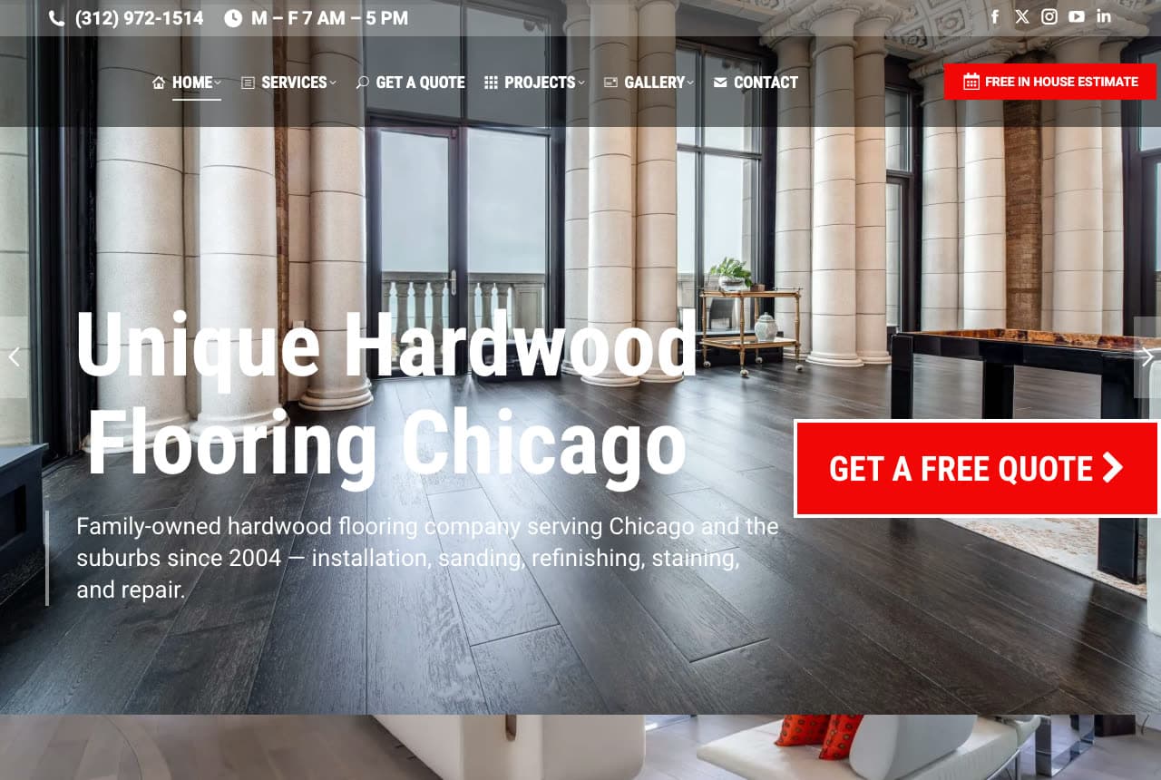
Unique Hardwood Flooring Chicago is the contractor's version of a flooring site: no showroom, five services and one big red button. A top bar carries the phone, 'M–F 7 AM–5 PM' and social icons; the dark header sets HOME, SERVICES, GET A QUOTE, PROJECTS, GALLERY, CONTACT and a red 'FREE IN HOUSE ESTIMATE'. The hero is a photograph of a columned room with dark hardwood, and the copy is one sentence that does all the work: 'Family-owned hardwood flooring company serving Chicago and the suburbs since 2004 — installation, sanding, refinishing, staining, and repair.' Under it, a large red 'GET A FREE QUOTE ›'. Family-owned, the region, the year and the five services in one line, then the button — for a refinishing trade, that is the whole first screen. Clone it and change the five verbs.

Opens a similar Zarla design you can make yours.

Midway Flooring website — Commercial Flooring Contractor design example
Real site
  • Commercial Flooring Contractor
  • Corporate

Midway Flooring: 'PROFESSIONAL, RESPONSIVE AND RELIABLE' over an orange panelled wall

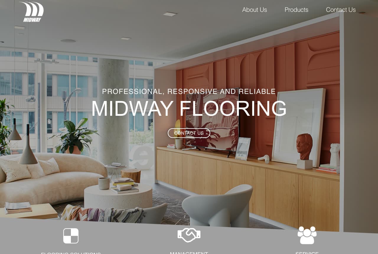
Midway Flooring is the commercial flooring site in this set and it looks like the offices it fits out. The header is a 'MIDWAY' mark and three words — About Us, Products, Contact Us — and the hero is a photograph of a lounge with an orange panelled wall, a sofa, a bust and a framed print, with 'PROFESSIONAL, RESPONSIVE AND RELIABLE' over 'MIDWAY FLOORING' in white and an outline 'CONTACT US'. A grey strip at the fold holds three line icons: FLOORING SOLUTIONS, MANAGEMENT, SERVICE. 'Management' is the tell — this is a firm that manages flooring across a portfolio, not a shop selling planks — and the three-adjective headline is exactly how a facilities buyer describes the supplier they want. Clone it for commercial work: fewer nav items, an interior photograph, adjectives instead of products.

Visit Midway Flooring

Opens a similar Zarla design you can make yours.

Best Flooring website — Family Flooring Dealer design example
Real site · Indianapolis, IN
  • Family Flooring Dealer
  • Warm

Best Flooring: A couple's photo inset in the hero and four product tiles beneath

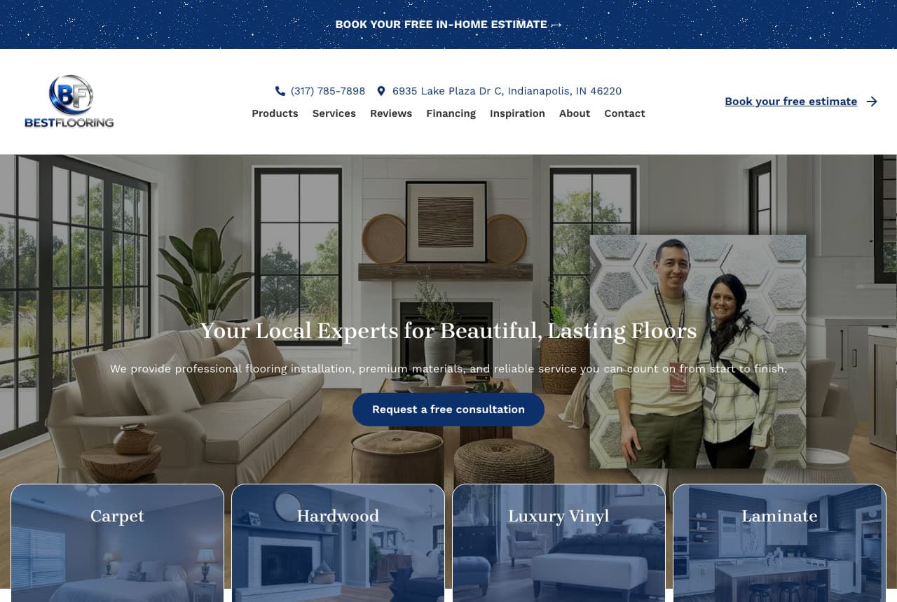
Best Flooring frames its owners. A navy bar reads 'BOOK YOUR FREE IN-HOME ESTIMATE →'; the header carries the BF logo, the phone and the address on Lake Plaza Drive, a nav of Products, Services, Reviews, Financing, Inspiration, About, Contact, and 'Book your free estimate →'. The hero is a living-room photograph with a smaller photo of a couple inset on the right, and the copy is serif and warm — 'Your Local Experts for Beautiful, Lasting Floors', 'We provide professional flooring installation, premium materials, and reliable service you can count on from start to finish.' — over a blue 'Request a free consultation'. Four tiles follow: Carpet, Hardwood, Luxury Vinyl, Laminate. The inset portrait is the move: a store with faces converts differently from a store with SKUs, and 'Financing' and 'Inspiration' in the nav round out a buyer's real questions. Clone it for a family dealer.

Visit Best Flooring

Opens a similar Zarla design you can make yours.

Brightwell Flooring Co. — Flooring Contractor website design you can build with Zarla
Build this with Zarla
  • Flooring Contractor
  • Elegant

Brightwell Flooring Co.: A sunlit empty room and 'one written price'

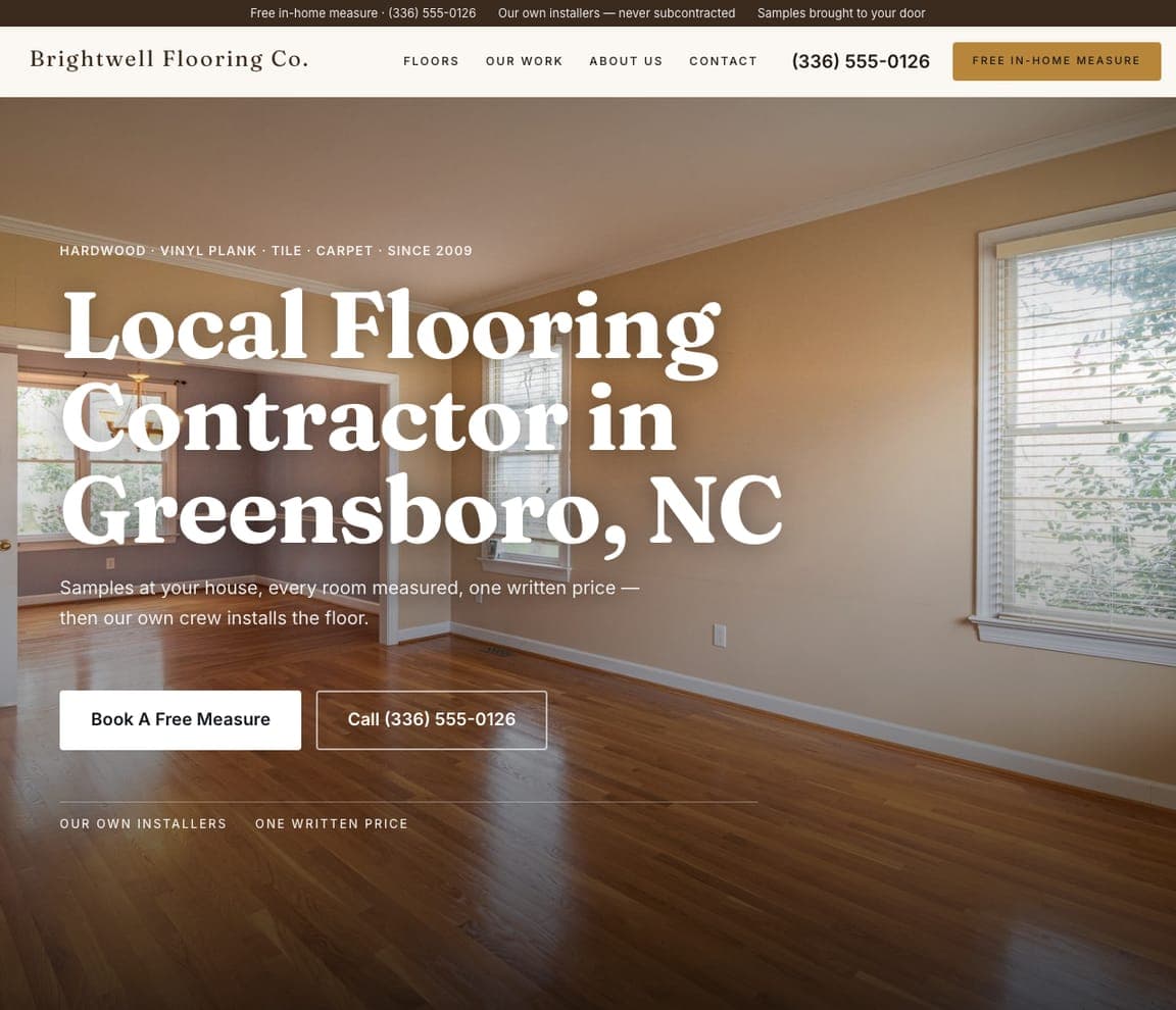
Brightwell Flooring Co. is the Zarla flooring-contractor design, and it takes the SOTA Floors lesson — show the room, not the plank — to the whole screen. The photograph is an empty room with a glossy wood floor running toward sunlit windows; over it, a small tracked line lists the range ('HARDWOOD · VINYL PLANK · TILE · CARPET · SINCE 2009') and a big serif headline reads 'Local Flooring Contractor in Greensboro, NC'. The paragraph is the whole process in one line — 'Samples at your house, every room measured, one written price — then our own crew installs the floor.' — and a white 'Book A Free Measure' sits beside 'Call (336) 555-0126'. The dark top strip repeats the promises: a free in-home measure, our own installers, never subcontracted. Clone it if you bring samples to the house, the way Royal Home Flooring does.

See this template
Norland Floor Studio — Flooring Studio website design you can build with Zarla
Build this with Zarla
  • Flooring Studio
  • Modern

Norland Floor Studio: A dark type panel beside a finished living room

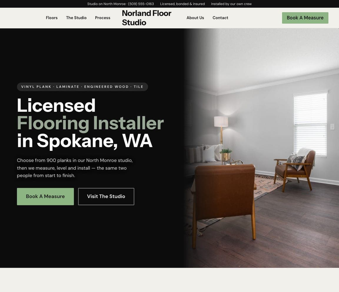
Norland Floor Studio is the Zarla showroom-and-install design, for a vinyl plank and laminate business that wants customers to come in and choose. The hero splits in two: on a black panel, a pill lists the products ('VINYL PLANK · LAMINATE · ENGINEERED WOOD · TILE') above a bold sans headline — 'Licensed' in white, 'Flooring Installer' in sage, 'in Spokane, WA' in white — and on the right, a finished living room with dark plank flooring, a leather armchair by the window, a sofa and a lamp. The paragraph ties the studio to the job: 'Choose from 900 planks in our North Monroe studio, then we measure, level and install — the same two people from start to finish.' A sage 'Book A Measure' sits beside 'Visit The Studio'. Clone it if you have a showroom, like SOTA Floors, Trinity and Floors By Roberts, and install what you sell.

See this template
Pembrook Carpet & Floors — Carpet Installation website design you can build with Zarla
Build this with Zarla
  • Carpet Installation
  • Friendly

Pembrook Carpet & Floors: 'Same-Week Carpet Installation' with a quote bar across the room

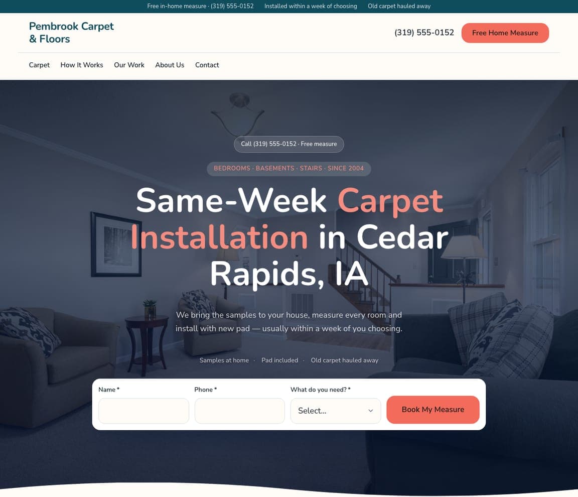
Pembrook Carpet & Floors is the Zarla carpet design, and it puts the booking in the first screen. Over a dim living room with a sofa, armchairs and a staircase, a pill sets the scope ('BEDROOMS · BASEMENTS · STAIRS · SINCE 2004') and the centered headline reads 'Same-Week Carpet Installation in Cedar Rapids, IA', with 'Carpet Installation' in coral. The paragraph makes the shop-at-home promise — 'We bring the samples to your house, measure every room and install with new pad — usually within a week of you choosing.' — and three small reassurances follow: samples at home, pad included, old carpet hauled away. Then a white quote bar asks for a name, a phone number and what you need, ending in a coral 'Book My Measure'. Clone it if speed is your edge and you want the form doing the work, like Best Flooring's estimate bar.

See this template

Frequently asked

What should a flooring company's website show first?

The room, not the plank, and the thing that makes you different. SOTA Floors opens on a bright white lounge with 'YOUR FOREVER FLOOR STARTS HERE'; Royal Home Flooring opens on 'The showroom comes to you.' because shop-at-home is its model; Floors By Roberts opens on its room visualizer. A close-up of grain tells a visitor nothing they can't see in a store.

Should a flooring website push a showroom visit or a free estimate?

Whichever your business actually runs on. The showrooms here make the visit the button — SOTA Floors' 'VISIT OUR SHOWROOM', Trinity Floor Company's 'Visit Our Showroom' — while the installers make the estimate the button: Unique Hardwood Flooring Chicago's red 'GET A FREE QUOTE ›', Best Flooring's 'BOOK YOUR FREE IN-HOME ESTIMATE →' bar, Royal Home Flooring's 'Schedule Free Estimate' in the header. Petra Flooring & Blinds splits the difference with 'OUR SERVICES'.

How do flooring sites handle a big product range without cluttering the hero?

They move it into the nav or a tile row. Petra Flooring & Blinds lists five product lines across the header and keeps the hero to one sentence; Trinity Floor Company and Best Flooring put Hardwood, Tile, Carpet and Luxury Vinyl in tiles directly under the hero; Stylish Interiors reduces it to two products and two buttons, 'VIEW FLOORING' and 'VIEW COUNTERTOPS'.

What copy works on a flooring website?

A model, a year or a service list — one of the three, in one sentence. Royal Home Flooring's 'The showroom comes to you.' is the model; Stylish Interiors' 'Proudly Serving Conroe, Texas Since 1985' and Trinity's 'ESTABLISHED 1934' badge are the year; Unique Hardwood Flooring Chicago packs 'installation, sanding, refinishing, staining, and repair' into a single line. Midway Flooring's 'PROFESSIONAL, RESPONSIVE AND RELIABLE' shows the commercial version — adjectives a facilities manager uses.

Do flooring stores need tools like a room visualizer?

Not to rank, but they help the undecided buyer stay. Floors By Roberts makes its visualizer the hero offer and adds a search band with 'Free estimate', 'Inspiration' and 'Help me choose' chips; SOTA Floors puts a 'Start searching…' box in the header; Trinity Floor Company asks 'What Are You Looking For?'. If you don't have a visualizer, a 'Help me choose' page is the cheap equivalent.

Can I build a flooring website like these with Zarla?

Yes. Every real site here has a 'Build a site like this' button that opens the closest Zarla template in the editor — Brightwell Flooring Co. for a contractor who brings the samples to the house, Norland Floor Studio for a showroom that installs what it sells, Pembrook Carpet & Floors for a carpet installer who wants the quote form in the first screen, Pellwood Floors for a hardwood refinisher — and you change the photos, the products and the button in the editor. A bright room photo, one sentence and a showroom or estimate button is the whole pattern, and it takes about 30 seconds.

You've seen what works. Now make it yours.

Describe your business and Zarla designs a complete, professional website in about 30 seconds — built to convert, just like the ones above.

Free to build and preview · no credit card · publish to your own domain on Premium