beciorpin.com
- Illustrator Portfolio
- Playful
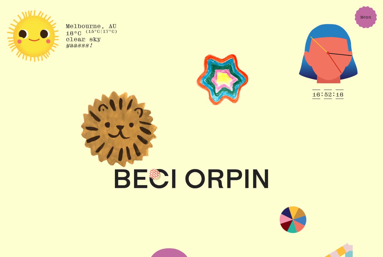
Beci Orpin: A yellow field of characters and the local weather
Beci Orpin's home page is a desk of her own illustrations: a pale yellow ground scattered with a smiling sun, a lion-faced cookie, a striped star, a stylized head, a pie chart and a purple 'Menu' badge, with 'BECI ORPIN' set in wide black capitals near the bottom. In the corner, typewriter text reports the day itself — 'Melbourne, AU / 16°C (15°C | 17°C) / clear sky / yaasss!' — and a clock ticks beside the head. Nothing is sold, nothing is explained; the page is the illustrator's world in a single screen, and the weather widget is the wink. Beci Orpin shows an illustrator how to make the site feel handmade and alive: the characters as the layout, the name as the only type, a live detail that says someone is home.
Opens a similar Zarla design you can make yours.
duzistudio.com
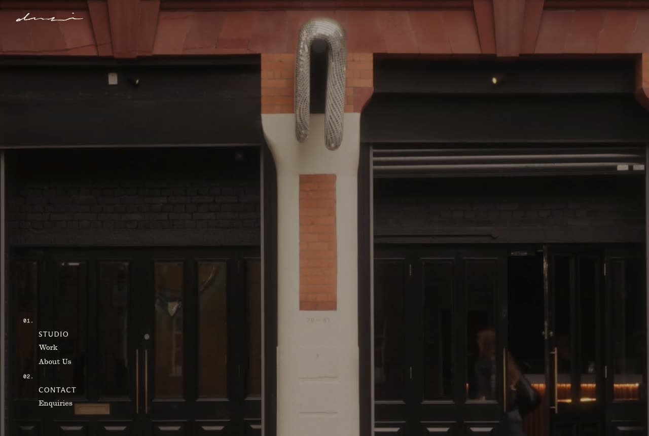
Duzi Studio: A dark storefront and a numbered nav
Duzi Studio opens on a photograph most studios would hide: the front of a building at night — black-framed doors, a brick facade, a metal hoop mounted on the pillar between them, warm light deep inside one doorway. A tiny script logo sits top-left, and the nav is a numbered list in the bottom-left corner in small serif caps: '01. STUDIO — Work, About Us; 02. CONTACT — Enquiries'. No headline, no copy. The darkness and the architecture do the positioning: this is a studio with a door you could walk through, not a freelancer with a template. Duzi Studio shows a small practice how to look like an institution — photograph the place, number the nav like an index, and say nothing.
Opens a similar Zarla design you can make yours.
marleighculver.com
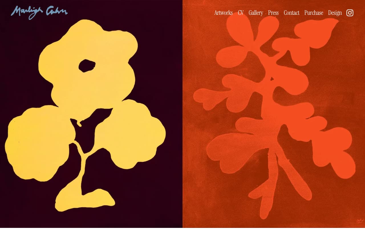
Marleigh Culver: Two artworks edge to edge under a signature
Marleigh Culver's home page is two paintings: a yellow flower silhouette on a near-black maroon field, and a red plant silhouette on a burnt-orange field, set edge to edge across the full width. Her signature, in a pale blue script, sits in the top-left corner over the first painting; a seven-item nav in small serif — Artworks, CV, Gallery, Press, Contact, Purchase, Design — runs across the top-right over the second. That is the whole first screen: the work at the size it deserves, the name as a signature, the nav as a caption. 'Design' as the last item says the practice spans both. Marleigh Culver shows an artist-designer how to let color do everything: two pieces, two grounds, a signature, and a nav quiet enough to disappear.
Opens a similar Zarla design you can make yours.
bodieotis.com
- Adaptable Template
- Playful
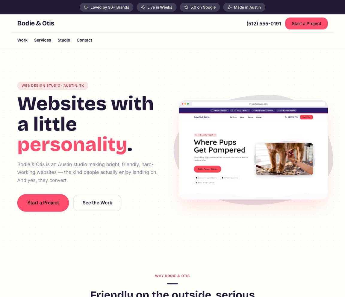
Bodie & Otis: 'A little personality' in pink, with a blob
Bodie & Otis is a Zarla web-design studio template, and the closest catalog match to the friendly, illustrated sites here (Hom Sweet Hom, Beci Orpin): a white ground, an eyebrow ('WEB DESIGN STUDIO · AUSTIN, TX'), a headline with one pink word — 'Websites with a little personality.' — a two-line studio description, a pink 'Start a Project' beside 'See the Work', and a pastel blob holding a screenshot of a client site. The top strip counts the brands and the Google rating. Clone it, change 'websites' to 'brands' or 'illustration', and the blob becomes your work.
ridleystone.com
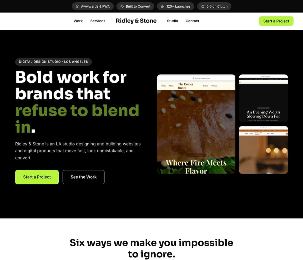
Ridley & Stone: Bold work that refuses to blend in, on black
Ridley & Stone is the dark studio template — the register van Schneider, Snask and Duzi Studio share: a black field, an eyebrow ('DIGITAL DESIGN STUDIO · LOS ANGELES'), a headline with the key phrase in lime — 'Bold work for brands that refuse to blend in.' — a two-line description, a lime 'Start a Project' beside 'See the Work', and three framed screenshots of client sites — one large, two stacked beside it. The top strip carries the awards and the Clutch rating. Clone it for a studio whose work photographs best against black, and the screenshots become your projects.
holtvane.com
- Adaptable Template
- Confident
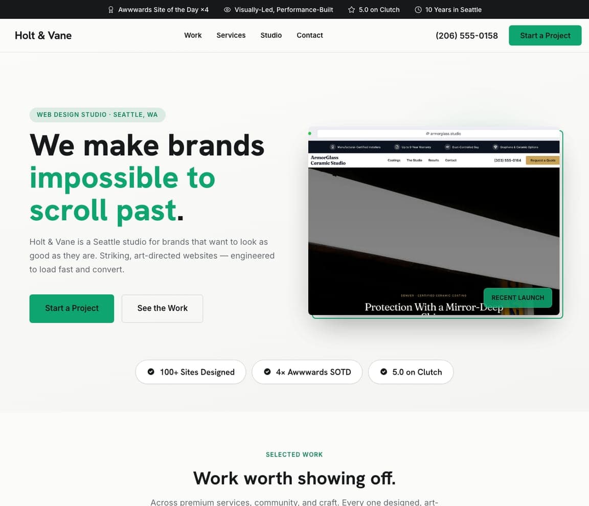
Holt & Vane: Impossible to scroll past — with the work beside it
Holt & Vane is the portfolio-led studio template: a white ground, an eyebrow ('WEB DESIGN STUDIO · SEATTLE, WA'), a headline with a teal phrase — 'We make brands impossible to scroll past.' — a two-line description, a green 'Start a Project' beside 'See the Work', a framed screenshot of a client site and three proof chips (100+ sites designed, 4× Awwwards Site of the Day, 5.0 on Clutch). It's Lotta Nieminen's and Anton & Irene's work-first instinct with a sentence and a button for clients who need them. Clone it, and the chips become your own counts.


