Inspiration · Gym

The Best Gym Website Examples, Explained

The best gym websites don't sell equipment — they sell an identity and a result. These are some of the best gym website designs we could find — a mix of standout real gyms, studios, and trainers (CrossFit, HIIT, personal training, martial arts, Pilates) and designs you can build with Zarla — and we break down the specific move that makes each one win members. Look for the patterns that repeat: an aspirational promise over sets and reps, real members and trainers instead of stock models, a class schedule or free-trial that's one tap away, and a clear reason to choose this gym — a niche, a community, or a mission. Then make any of the Zarla designs yours, free, in about 30 seconds.

Real sites + designs you can build with Zarla — free to build and preview, no credit card

What makes a great gym website

The best gym sites share a few moves: they lead with an aspirational promise or a specific niche rather than a feature list, they use real photos of actual members and trainers (not chiseled stock models) to signal belonging, they make the next step obvious — book a free class, get a day pass, request info — and they give one clear reason to choose this gym over the cheaper one down the road: community, expertise, a demographic focus, or a mission. Each example below calls out the specific choice worth stealing for your own gym website.

Barry's website — HIIT Studio design example
Real site
  • HIIT Studio
  • Bold
  • Red + black

Barry's: A boutique brand people wear like a badge

Barry's turned a workout into a global lifestyle brand, and the homepage sells the identity before the exercise. A dark, high-contrast hero declares 'Try the best workout in the world™' — supreme confidence, no hedging — with a 'Find a Studio' locator as the single action, because for a multi-city boutique the first job is 'is there one near me?' The signature red-and-black palette and clean Antenna type are instantly recognizable to anyone who's seen the brand, and 'Welcome to Barry's' in a warm script adds belonging. There's no feature list; the whole page trades on aspiration and membership. For any boutique fitness brand: when you've built a strong identity, lead with confidence and community — people join a tribe, not a gym.

  • Bold, unhedged confidence ('best workout in the world') sells the brand
  • A studio-locator is the right first action for a multi-city boutique
  • A recognizable palette + belonging language recruit a tribe

Steal this: When your brand identity is strong, lead with confidence and belonging — people join a tribe, not a gym.

Alchemy 365 website — Functional Fitness design example
Real site · Denver, CO
  • Functional Fitness
  • Modern
  • Grey + blue

Alchemy 365: Aspiration over sets and reps

Alchemy 365 sells transformation, not a treadmill. On a clean light-grey palette with bold Helvetica Neue, the hero pairs 'The Best Gym in Denver' with the aspirational command 'Pursue Your Legend,' and a looping background video of real people training in natural light does the emotional work. 'Strength Based Fitness' anchors the positioning without drowning the page in program details. It's a modern, almost editorial take on the gym site — restrained where competitors are loud, letting motion and a single confident line carry the mood. For a premium functional-fitness gym, that aspirational, cinematic framing attracts members buying an identity and a result, not a monthly rate. Alchemy shows that motion plus one bold promise beats a wall of class descriptions.

  • 'Pursue Your Legend' sells transformation, not equipment
  • A looping training video does the emotional work
  • Restraint reads as premium in a loud category
Pulse 24 Fitness — 24/7 Gym website design you can build with Zarla
Build this with Zarla
  • 24/7 Gym
  • Convenient
  • Dark + purple

Pulse 24 Fitness: Sell convenience to the time-poor

Pulse 24 Fitness is Zarla's 24/7-gym template, and it leads with the only thing that matters to its member: access on their schedule. The hero — 'Your Gym. Your Hours. — 24/7 Gym' — pairs the promise with a 'Get My Free Day Pass' form right there, and the trust strip front-loads exactly what a busy, no-frills member wants: secure keycard access any hour, full cardio and free-weights, group classes, and 'no long-term contracts.' There's no aspirational fluff — the whole pitch is convenience and freedom for someone who trains at 5am or 11pm around a job. For a 24/7 access gym, leading with hours and no-contract flexibility converts better than lifestyle imagery. Describe your gym and this conversion-first site builds in about 30 seconds.

  • 'Your hours' + keycard access sells the 24/7 model's core benefit
  • 'No long-term contracts' removes the biggest sign-up objection
  • A day-pass form in the hero converts the busy member fast
See this template
Integra Fitness Nashville website — Personal Training design example
Real site · Nashville, TN
  • Personal Training
  • Bold
  • Black + red

Integra Fitness Nashville: A private studio sells expertise, not equipment

Integra Fitness Nashville positions a private personal-training studio as the anti-big-box gym, and the confident black-and-red design backs it. The hero — 'The Best Personal Trainer in Nashville / Training for Life' — leads with a real trainer coaching a client, not rows of machines, because in one-on-one training the trainer IS the product. 'Structured personal training to help you get stronger, live better, and stay healthy long term' frames it as a lasting relationship, not a quick fix, and 'private clinic in Green Hills' signals exclusivity over the crowded commercial gym. Bold, credentialed, and relationship-forward, it's aimed at a serious client willing to pay for expertise. For personal training, sell the trainer and the outcome — the equipment is irrelevant.

  • A trainer-coaching-a-client hero sells expertise, not machines
  • 'Training for Life' frames it as a relationship, not a quick fix
  • 'Private clinic' positions exclusivity vs the big-box gym

Steal this: For personal training, sell the trainer and the outcome — the equipment is irrelevant.

Melbourne Fight Club website — Martial Arts design example
Real site · Melbourne, AU
  • Martial Arts
  • High-Energy
  • Black + yellow

Melbourne Fight Club: High-energy design that matches the sport

Melbourne Fight Club matches its design to its discipline — a bold black-and-yellow palette with aggressive type radiates the same intensity as the Muay Thai and martial arts it teaches. The hero leads with a concrete number ('75+ classes per week, morning, lunchtime, evening') that answers the intimidated beginner's real worry — 'will there be a class that fits my schedule and level?' — then reframes the sport as personal growth: 'kickstart your journey to strength, discipline, and confidence.' For a martial arts centre, that combination of high-energy branding and beginner-reassuring, growth-focused copy converts the nervous first-timer, not just the seasoned fighter. Melbourne Fight Club shows the design should feel like the workout — but the words should welcome the newcomer.

  • Black-and-yellow intensity matches the martial-arts discipline
  • '75+ classes' answers the beginner's schedule-and-level worry
  • Growth framing (discipline, confidence) welcomes the newcomer
Mt. Tabor CrossFit website — CrossFit design example
Real site · Portland, OR
  • CrossFit
  • Community
  • Black + cyan

Mt. Tabor CrossFit: Disarm CrossFit's intimidation with community

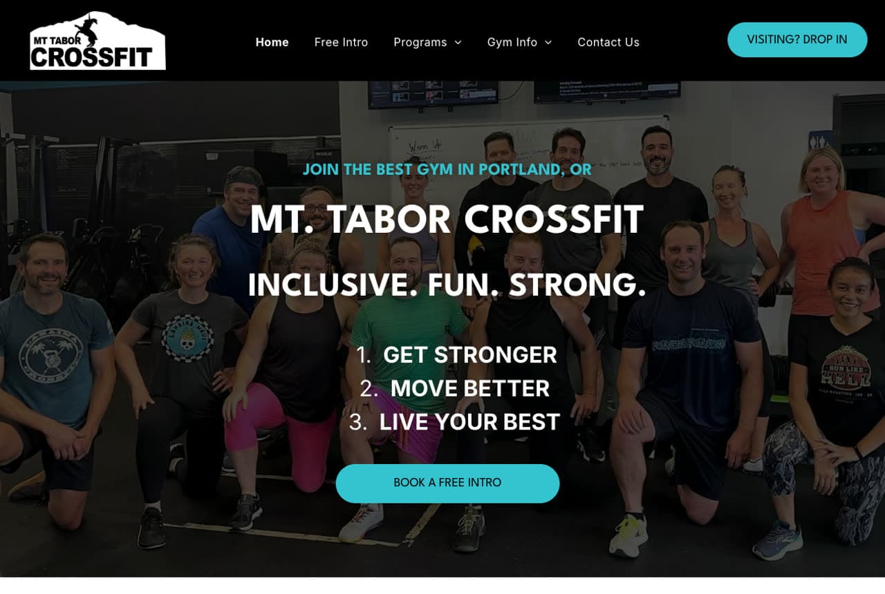
Mt. Tabor CrossFit tackles CrossFit's biggest barrier — the fear that it's only for elite athletes — head-on with three words in the hero: 'Inclusive. Fun. Strong.' A community group photo (real members, not chiseled models) on a friendly black-and-cyan palette signals belonging over intimidation, and three plain benefit cards (Get Stronger, Move Better, Live Your Best) translate CrossFit jargon into outcomes anyone understands. A single 'Book a Free Class' CTA lowers the commitment. For a CrossFit box, where the stereotype scares off exactly the beginners it needs, leading with inclusivity and community is the conversion strategy. Mt. Tabor proves that for an intimidating category, a warm, welcoming brand beats an intense one at bringing new members through the door.

  • 'Inclusive. Fun. Strong.' disarms the CrossFit-is-elite stereotype
  • A real-member group photo signals belonging over intimidation
  • Benefit cards translate jargon into outcomes anyone gets

Steal this: For an intimidating category, a welcoming brand beats an intense one at winning new members.

The Underground PDX website — CrossFit design example
Real site · Portland, OR
  • CrossFit
  • Mission-Led

The Underground PDX: A mission gives a gym a reason to exist

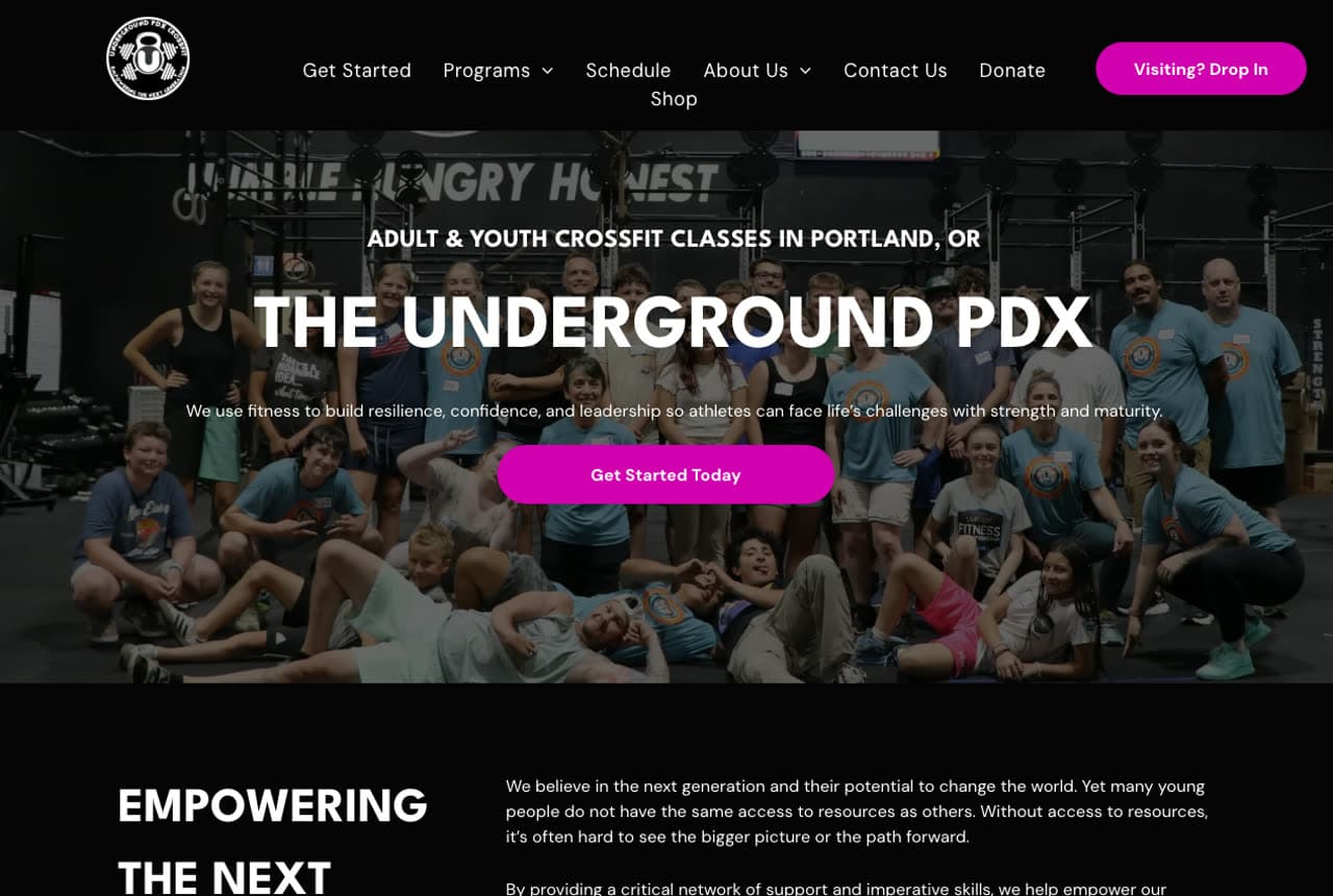
The Underground PDX is a CrossFit gym and a nonprofit, and it builds its whole identity around a cause: 'Empowering the Next' generation through fitness. A bold black-and-magenta palette gives it a distinctive, youthful energy that stands out from the standard black-and-white box, and 'Adult & Youth CrossFit Classes in Portland' makes the dual audience clear. By tying membership to a youth-empowerment mission, every workout becomes a contribution — a powerful differentiator for the member who wants their money to mean something beyond their own fitness. For a community gym, a genuine mission is stickier than any program feature. The Underground PDX shows that standing for something bigger turns members into believers, not just customers.

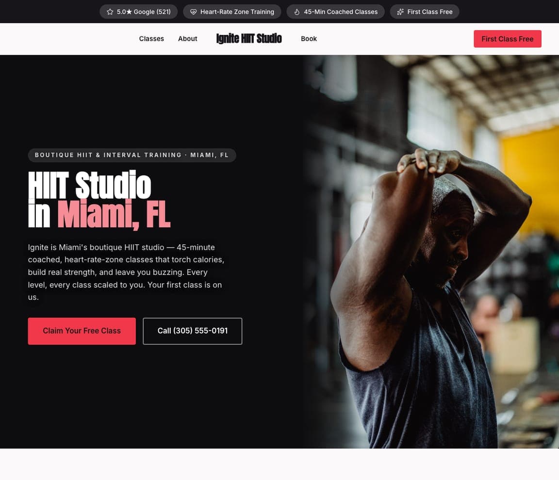
Ignite HIIT Studio — HIIT Studio website design you can build with Zarla
Build this with Zarla
  • HIIT Studio
  • High-Energy

Ignite HIIT Studio: Niche-specific from the first word

Ignite HIIT Studio is Zarla's HIIT template, and it commits fully to one format instead of trying to be everything. The hero names the niche and the place — 'HIIT Studio in Miami, FL' — over a high-effort action photo, and the copy speaks the exact language of the format: '45-coached, heart-rate-zone classes that torch calories, build real strength, and leave you buzzing.' 'Every level, every class scaled to you' reassures the beginner, and 'your first class is on us' removes the risk. For a boutique studio built around one modality, that specificity is the strength — a generalist 'we have everything' gym never signals expertise the way a focused HIIT brand does. Describe your studio and this focused, high-energy site builds in about 30 seconds.

See this template
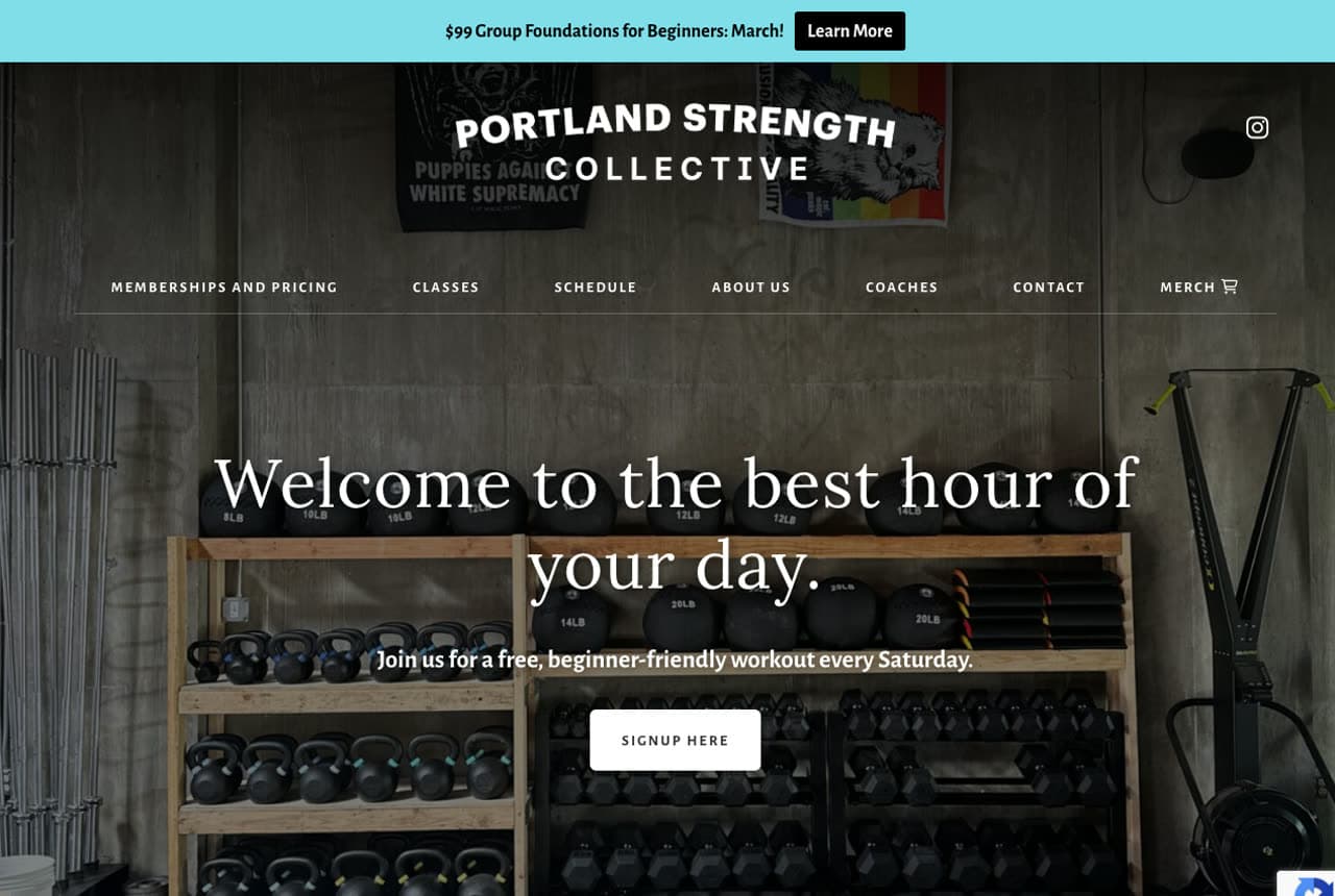
Portland Strength Collective website — Functional Fitness design example
Real site · Portland, OR
  • Functional Fitness
  • Elegant

Portland Strength Collective: Reframe a workout as the best hour of your day

Portland Strength Collective opens with a line that reframes the whole relationship: 'Welcome to the best hour of your day.' Instead of selling exertion, it sells a daily escape — a promise that resonates with a stressed adult who needs one hour that's theirs. An equipment-focused hero (kettlebells, a rack) on a dark, elegant palette with a refined serif signals a serious-but-inviting functional-fitness space, not a meathead gym. The 'collective' framing leans into community and belonging. For a functional-fitness gym competing with cheap big-box memberships, selling the feeling and the ritual — not the machines or the price — attracts members who stay. Portland Strength Collective shows that the most powerful gym pitch is often emotional, not physical.

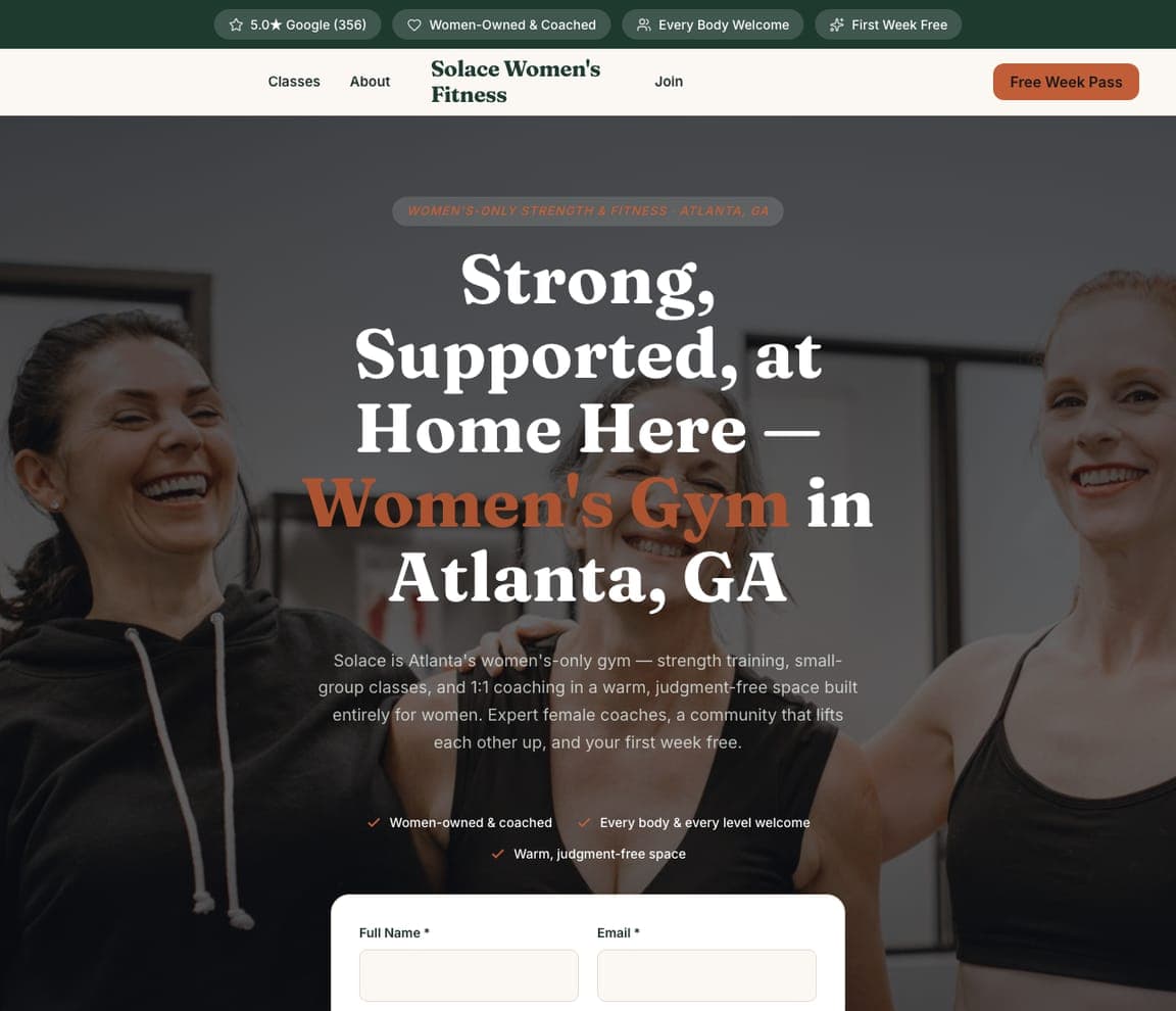
Solace Women's Fitness — Women's Gym website design you can build with Zarla
Build this with Zarla
  • Women's Gym
  • Warm

Solace Women's Fitness: Design a safe space, don't just say it

Solace Women's Fitness is Zarla's women's-gym template, and it wins by making its member feel safe before she reads a word. A warm grey-and-orange palette with two real, confident women in the hero — 'Strong, Supported, at Home Here — Women's Gym in Atlanta' — feels welcoming rather than performance-obsessed, and the trust strip names the promise plainly: 'women-owned & coached,' 'every body, every level welcome,' 'warm, judgment-free space.' For the huge segment of women who find conventional gyms intimidating or hyper-sexualized, a brand that leads with belonging and judgment-free coaching is the entire draw. Describe your gym and this warm, women-first site builds in about 30 seconds — the palette and copy live the safe-space promise instead of just claiming it.

See this template
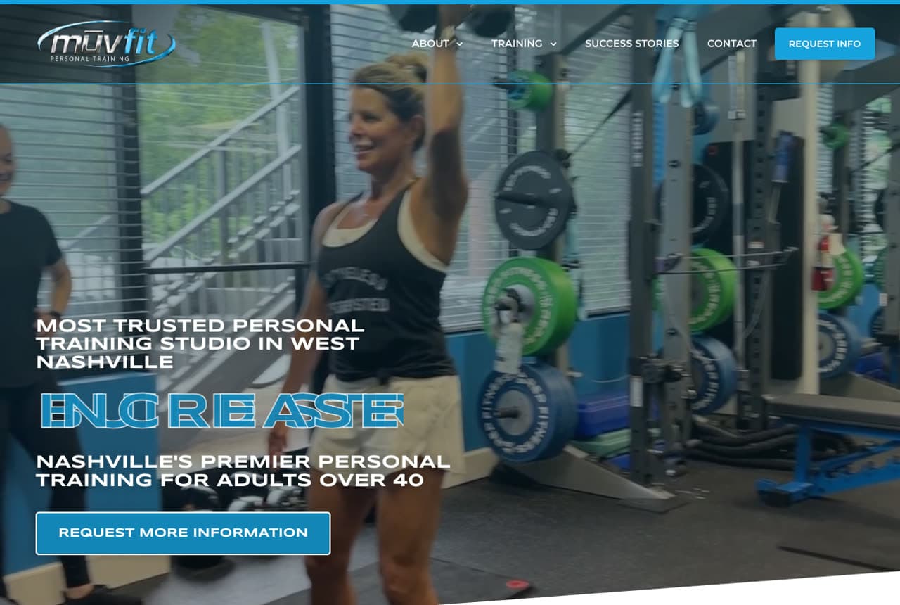
MUVFit website — Personal Training design example
Real site · Nashville, TN
  • Personal Training
  • Trusted

MUVFit: Pick a demographic and own it

MUVFit doesn't try to serve everyone — it targets one audience and speaks only to them: 'Most Trusted Personal Training Studio in West Nashville,' built for adults over 40. A calm cyan-and-dark palette (not the aggressive black-and-red of youth-focused gyms) and a hero of an older adult training signal 'this place is for you' to a demographic that feels out of place in a typical gym. Positioning as the 'most trusted' studio and a 'request more information' path (rather than a hard 'join now') matches how an older, more considered buyer decides. For personal training, choosing a specific demographic and designing entirely around them beats a generic 'all fitness levels welcome.' MUVFit shows that narrowing your audience widens your appeal to it.

Cadence Cycling Studio — Cycling Studio website design you can build with Zarla
Build this with Zarla
  • Cycling Studio
  • Energetic

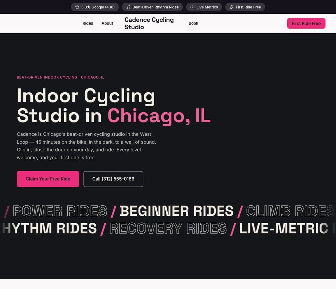
Cadence Cycling Studio: Sell the vibe of the class

Cadence Cycling Studio is Zarla's indoor-cycling template, and it sells the experience of the ride, not the bike. On a dark palette with an energetic pink accent, the hero — 'Indoor Cycling Studio in Chicago' — leans into the format's real draw: 'beat-driven,' 'clip in, close the door on your day, and ride.' A scrolling marquee of ride types (Power Rides / Beginner Rides / Climb Rides / Rhythm Rides / Recovery Rides) shows range while reinforcing the music-and-energy vibe, and 'every level welcome' plus 'first ride free' lower the barrier. For a spin studio, where members are buying a euphoric, club-like escape, selling the atmosphere and the beat is exactly right. Describe your studio and this high-energy site builds in about 30 seconds.

See this template
GOOD Pilates website — Pilates Studio design example
Real site · Adelaide, AU
  • Pilates Studio
  • Minimalist

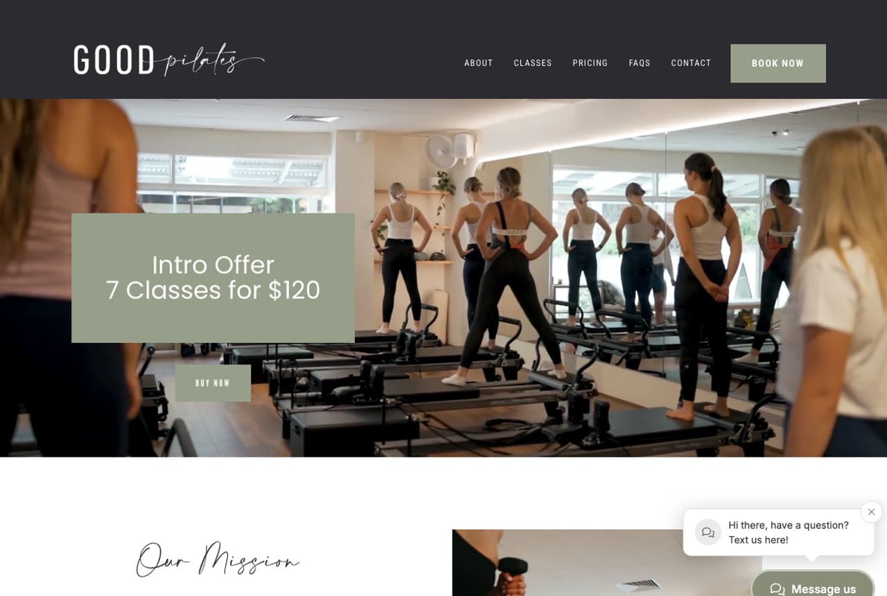
GOOD Pilates: Minimalism that signals boutique quality

GOOD Pilates strips a reformer-Pilates studio down to calm, confident minimalism — a sage-green, cream, and black palette, generous white space, and clean type that feels more like a wellness brand or a boutique hotel than a gym. Serene interior photos of the studio do the selling, and a single, transparent 'Intro Offer — 7 Classes for $120' gives the curious a low-commitment, clearly-priced way in. Nothing shouts; the restraint IS the signal, telling the visitor this is a considered, premium space, not a crowded chain. For boutique Pilates and wellness studios, quiet, tasteful design communicates quality and calm far better than high-energy gym clichés. GOOD Pilates proves that for a premium wellness audience, less really is more.

The Crux Climbing Gym — Climbing Gym website design you can build with Zarla
Build this with Zarla
  • Climbing Gym
  • Adventurous

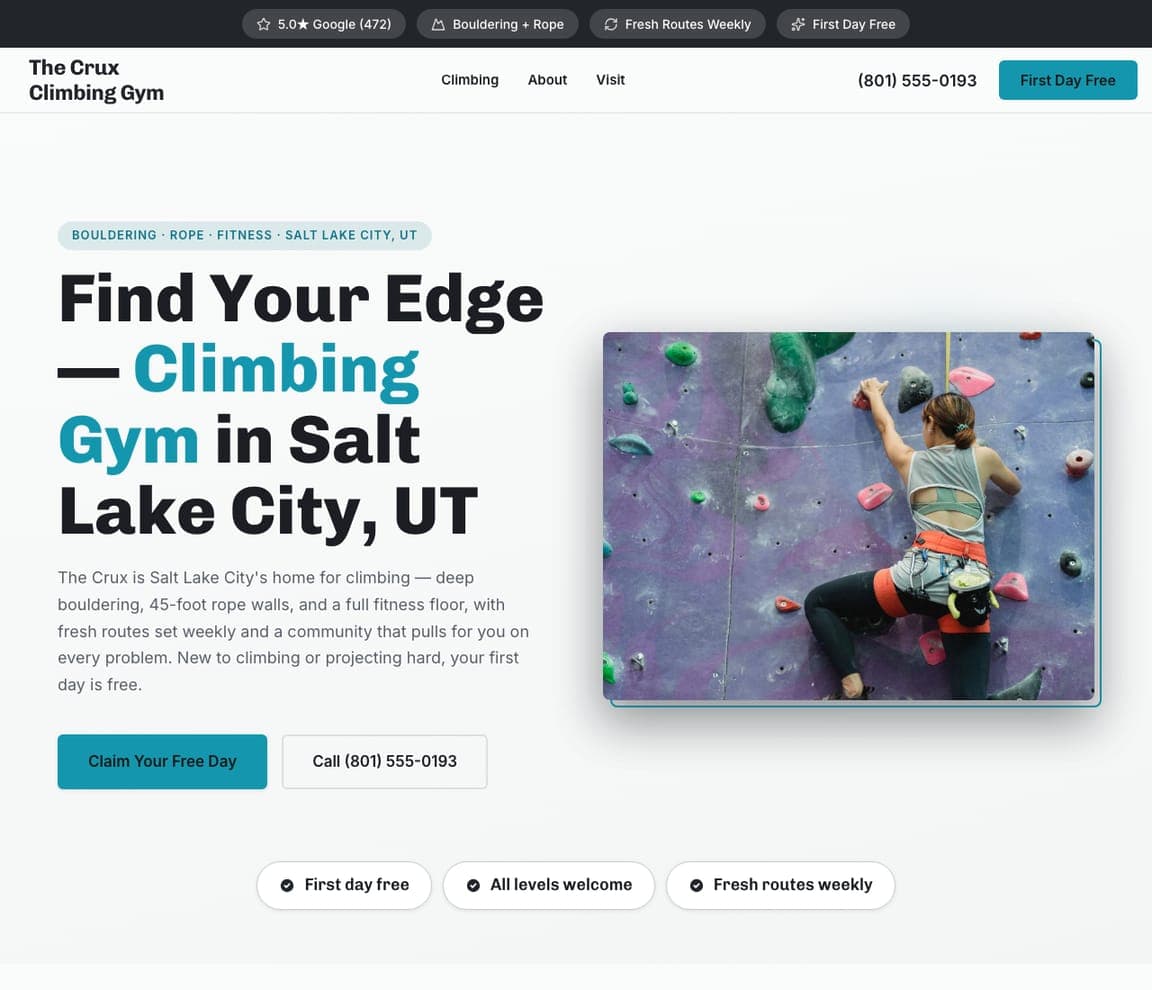
The Crux Climbing Gym: Turn a niche sport into an adventure

The Crux Climbing Gym is Zarla's climbing template, and it frames the sport as a challenge to rise to: 'Find Your Edge — Climbing Gym in Salt Lake City.' A bright, energetic layout with a teal accent and a real climber-on-the-wall photo captures the vertical thrill, and the copy speaks to both the curious beginner and the committed climber: 'deep bouldering, 45-foot rope walls, a full fitness floor,' with 'all levels welcome' and 'fresh routes weekly' reassuring newcomers there's always something new. 'First day free' removes the risk of trying an intimidating-looking sport. For a climbing gym, selling the adventure and the community while explicitly welcoming beginners is the winning combination. Describe your gym and this adventurous site builds in about 30 seconds.

See this template
Reset Recovery Lab — Recovery Studio website design you can build with Zarla
Build this with Zarla
  • Recovery Studio
  • Restorative

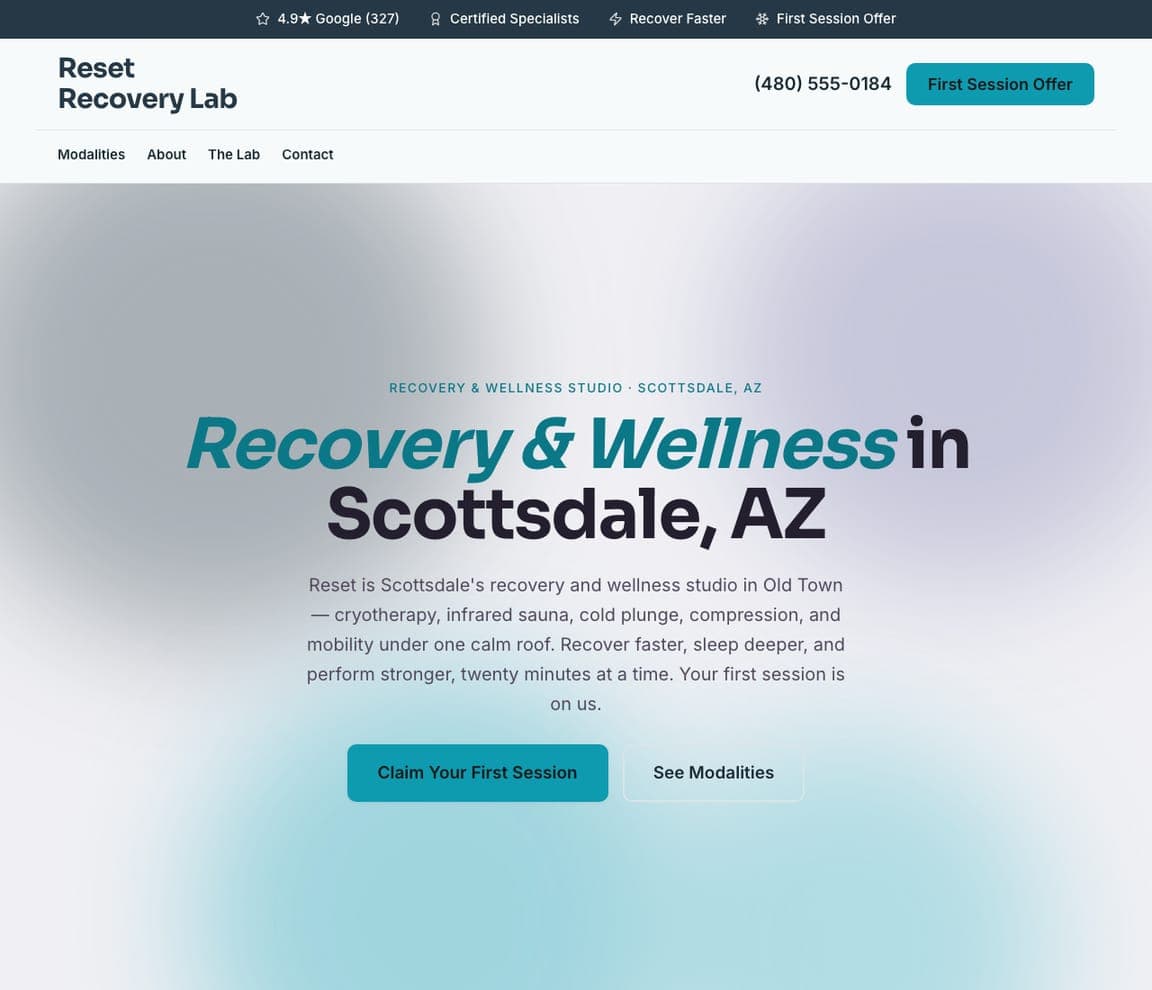
Reset Recovery Lab: A whole new fitness category, branded calm

Reset Recovery Lab is Zarla's recovery template, and it captures one of fitness's fastest-growing categories — recovery and wellness — with a design that feels as restorative as the service. On a light, spa-like palette with a soothing teal accent, the hero reads 'Recovery & Wellness in Scottsdale,' and the copy lists the modern menu a wellness-conscious buyer is searching for: cryotherapy, infrared sauna, cold plunge, compression, and mobility, 'twenty minutes at a time.' 'Your first session is on us' lowers the barrier to a still-novel category. It's positioned not as a gym but as a self-care destination, which is exactly how its affluent, health-optimizing member thinks about it. Describe your studio and this calm, premium wellness site builds in about 30 seconds.

See this template

Frequently asked

What should a gym website include?

At minimum: a strong hero that names who the gym is for, real photos of your actual members and trainers (not stock models), a clear class schedule or list of programs, genuine reviews or a rating, and one obvious next step — book a free class, grab a day pass, or request info. Notice how the designs below lead with an identity or a niche and a single clear action rather than a wall of program details.

What makes a good gym website design?

A good gym website sells an identity and a result, not a list of equipment. The best ones lead with an aspirational promise or a specific niche (HIIT, CrossFit, personal training, women's, recovery), use real members and trainers to signal belonging, and make booking a free class or trial effortless. Since more than half of gym-site visits happen on a phone, mobile-first design and a schedule that links straight to booking are the 2026 standard.

How much does a gym website cost?

A custom gym website from a fitness-marketing agency typically runs $2,000–$8,000 up front, and template builders like Wix or Squarespace charge roughly $16–$30 per month. An AI builder generates a complete, editable gym site for free and only charges (on the Premium plan) when you publish to your own domain — so you can build and preview the whole thing, schedule and free-trial flow included, before spending anything.

How do gyms get more members from their website?

Lead with a promise for a specific member type ('for adults over 40', 'judgment-free', 'the best hour of your day') rather than trying to appeal to everyone, use real photos of your members and trainers to signal belonging, and make the trial the obvious next step — a free class, a day pass, or 'first session on us' converts far better than 'contact us.' Then keep the class schedule one tap from booking, since most visitors are on a phone.

Should a gym website use dark or bright design?

Match the mood to your niche, not a rule. High-intensity brands (HIIT, CrossFit, martial arts) use dark, high-contrast palettes with energetic accents to convey intensity, while boutique Pilates, women's, and recovery studios win with warm, light, minimalist designs that feel calm and premium. The examples above span both — the point is that the palette should feel like the workout and speak to the member you want.

How do you make an intimidating gym feel welcoming?

Name the fear and design against it. The best gyms use real members (not models) in their photos, lead with inclusive language ('inclusive, fun, strong', 'every level welcome', 'judgment-free'), translate jargon into plain outcomes, and offer a free, low-risk first class so a nervous beginner can try without committing. Several examples above win specifically by making an intimidating format — CrossFit, martial arts, climbing — feel welcoming to the newcomer who's the hardest to convert.

You've seen what works. Now make it yours.

Describe your business and Zarla designs a complete, professional website in about 30 seconds — built to convert, just like the ones above.

Free to build and preview · no credit card · publish to your own domain on Premium