Inspiration · IT Services

The Best IT Services Website Examples, Explained

Looking for IT services website examples? These 12 are the strongest we found — Ntiva's 'built around your business' hero, Rocket IT's 'Make IT Amazing', Echelon's 'security and privacy are basic human rights' — plus B2B designs you can build with Zarla, each with a breakdown of the specific move that turns a CFO's cautious visit into a booked consultation. An IT provider's website sells two things at once: competence and calm. Find an approach you love and you can build a site in that spirit, free, in about 30 seconds.

Real sites + designs you can build with Zarla — free to build and preview, no credit card

What makes a great it services website

Every managed-IT website is answering the same unspoken question from a business owner or CFO: if I hand you our systems, will I stop worrying? The best ones answer it with a headline that names the outcome (growth, calm, one accountable partner), proof in numbers (years, certifications, clients, response times), and a single next step that sounds like a conversation, not a sales call — a strategy session, a discovery call. Notice how the strong examples split into two moods: dark, cyber-confident (Echelon, NexusTek, Logically, CompassMSP) and bright, approachable (Rocket IT, Corsica). Both work; what matters is picking one and committing.

Ntiva website — Managed IT design example
Real site
  • Managed IT
  • Confident
  • Navy + blue

Ntiva: The headline puts the client first, literally

Ntiva writes the promise in the order the buyer thinks: 'Managed IT Services Built Around Your Business', with the service half in a cool blue gradient and the business half in plain white — the emphasis lands on you, not on IT. The hero is dark and photographic (two colleagues over a laptop), but the persuasion is in the two buttons: a filled 'Our Clients Said It Best' that leads with proof, and an outlined 'Book an IT Strategy Session' that names the next step as strategy rather than sales. A quiet link beneath — 'Explore how Ntiva transforms IT into a growth engine' — reframes the whole category as growth. Ntiva shows the template for a national provider: outcome headline, proof first, a strategic-sounding ask.

  • 'Built Around Your Business' — the buyer is the subject of the sentence
  • The primary button leads with client proof, not a demo
  • 'Strategy session' makes the sales call sound like advice

Steal this: Put the client in the headline's subject position — 'built around your business' — and let the service be the modifier.

Visit Ntiva

Opens a similar Zarla design you can make yours.

Rocket IT website — Managed IT design example
Real site
  • Managed IT
  • Upbeat
  • Blue + orange

Rocket IT: Three words and a pile of dashboards

Rocket IT proves an IT site can be cheerful: a saturated blue field, a three-word headline — 'Make IT Amazing' — and a floating collage of dashboards, charts and a top-down photo of someone at a desk, as if the whole toolkit spilled onto the page. The copy underneath names the audience precisely ('CEOs, CFOs, and other key leaders of growing companies') and promises the human result: fewer headaches, happier teams. The single orange button reads 'Modernize My IT' — a first-person ask that puts the visitor in charge. A slim bar above the hero adds the longevity proof in a sentence: helping people thrive since 1995. Rocket IT is the bright, upbeat register done with discipline.

  • A three-word headline in a category addicted to jargon
  • The collage of real dashboards shows the work without a stock photo
  • First-person CTA — 'Modernize My IT' — hands control to the visitor
Visit Rocket IT

Opens a similar Zarla design you can make yours.

Echelon Risk + Cyber website — Cybersecurity design example
Real site
  • Cybersecurity
  • Bold
  • Charcoal + cobalt

Echelon Risk + Cyber: A cybersecurity firm with a conviction, not a catalog

Echelon Risk + Cyber opens with a belief instead of a service list: 'Security and privacy are basic human rights. We are built to protect them.' — the second sentence highlighted in cobalt boxes like a redaction reversed, two yellow slashes for punctuation, all over a dim photograph of hands at a keyboard. The paragraph beside it keeps the register ('we take this personally… We are all in'), and the yellow nav labels carry the palette into the chrome. Below, the offer gets concrete — managed security services, a vCISO-led team — in the same cobalt. It's design as stance: a security firm that sounds like it would actually fight for you. Echelon demonstrates that a value statement can outsell a feature grid.

  • The hero is a belief, not a service — and it's memorable
  • Cobalt highlight boxes turn one sentence into a visual signature
  • Yellow accents in the nav keep the palette consistent

Steal this: Write the one sentence your firm would go to war over, and make it the hero — services can wait one scroll.

Visit Echelon Risk + Cyber

Opens a similar Zarla design you can make yours.

Brennan & Locke — Adaptable Template website design you can build with Zarla
Build this with Zarla
  • Adaptable Template
  • Corporate
  • White + blue

Brennan & Locke: The B2B credibility engine, ready to restyle

Brennan & Locke is a Zarla template built for a digital agency, not an IT provider — but its bones are pure B2B services and that's why it's here: a trust strip up top (a Clutch ranking, average lead growth, years in business, a rating), a headline that promises a measurable outcome in blue, two buttons (book a consultation, see results), and a row of proof tiles — 15 years, 240+ projects, 3.2× growth, 94% retention — that any managed-service provider could refill with response times, endpoints managed and client tenure. Clone it, describe your IT practice to Zarla's AI, and the agency language becomes managed-IT language while the structure — trust, outcome, proof, ask — stays intact. Brennan & Locke is the closest starting point in the catalog for a provider that sells on numbers.

  • Trust strip + proof tiles: the exact skeleton MSP buyers scan for
  • Outcome headline in the accent color, services in the body
  • Clone → describe your IT practice → the AI restyles the copy

Steal this: Four proof tiles under the hero — years, clients, a growth number, a retention rate — do more than a paragraph of promises.

See this template
Electric website — IT Platform design example
Real site
  • IT Platform
  • Sleek
  • Black + magenta

Electric: IT services that look like a software product

Electric borrows the visual language of a SaaS launch page for an IT service: black field, a centered headline with one gradient word — 'Autonomous IT for Every Stage of the Employee Lifecycle' — a single magenta 'Get started' button, and a video card with an unmute control as the first content below. The framing is the strategic move: IT is described through HR moments — joins, leaves, changes roles — so an operations lead sees their own calendar in the copy rather than a list of technologies. Nothing here says 'managed services provider'; it says platform. For a provider whose edge is automation or AI, Electric shows how to position as a product company and price like one.

  • One gradient word ('Autonomous') carries the entire brand story
  • IT explained through the employee lifecycle, not through technology
  • A product-launch layout signals scale and modernity
Visit Electric

Opens a similar Zarla design you can make yours.

Corsica Technologies website — Managed IT design example
Real site · Fort Wayne, IN
  • Managed IT
  • Trustworthy
  • White + navy

Corsica Technologies: The city in the headline, the contract in the list

Corsica Technologies greets a visitor by city: a white ground, a bold headline that names the place before the service — 'Fort Wayne IT: Propelling Your Business Forward' — a photograph of the city's fountain plaza beside it, and a five-line checklist that reads like a contract: managed cybersecurity, managed IT services, data integration and EDI, unlimited and unmetered support, one predictable monthly price. A Clutch badge sits on the photo's corner, and a slim green bar above the nav points to the firm's research. It's a national provider behaving like a local one — the city in the headline, the town in the picture, the pricing promise in the list. Corsica shows how to make a large MSP feel like it lives down the street.

  • The city named before the service — local intent, national provider
  • A five-line checklist ending in 'one predictable monthly price'
  • A photo of the town's fountain plaza instead of a server rack
Visit Corsica Technologies

Opens a similar Zarla design you can make yours.

Axxys Technologies website — Managed Services design example
Real site · Dallas, TX
  • Managed Services
  • Direct

Axxys Technologies: Red accents and a converging promise

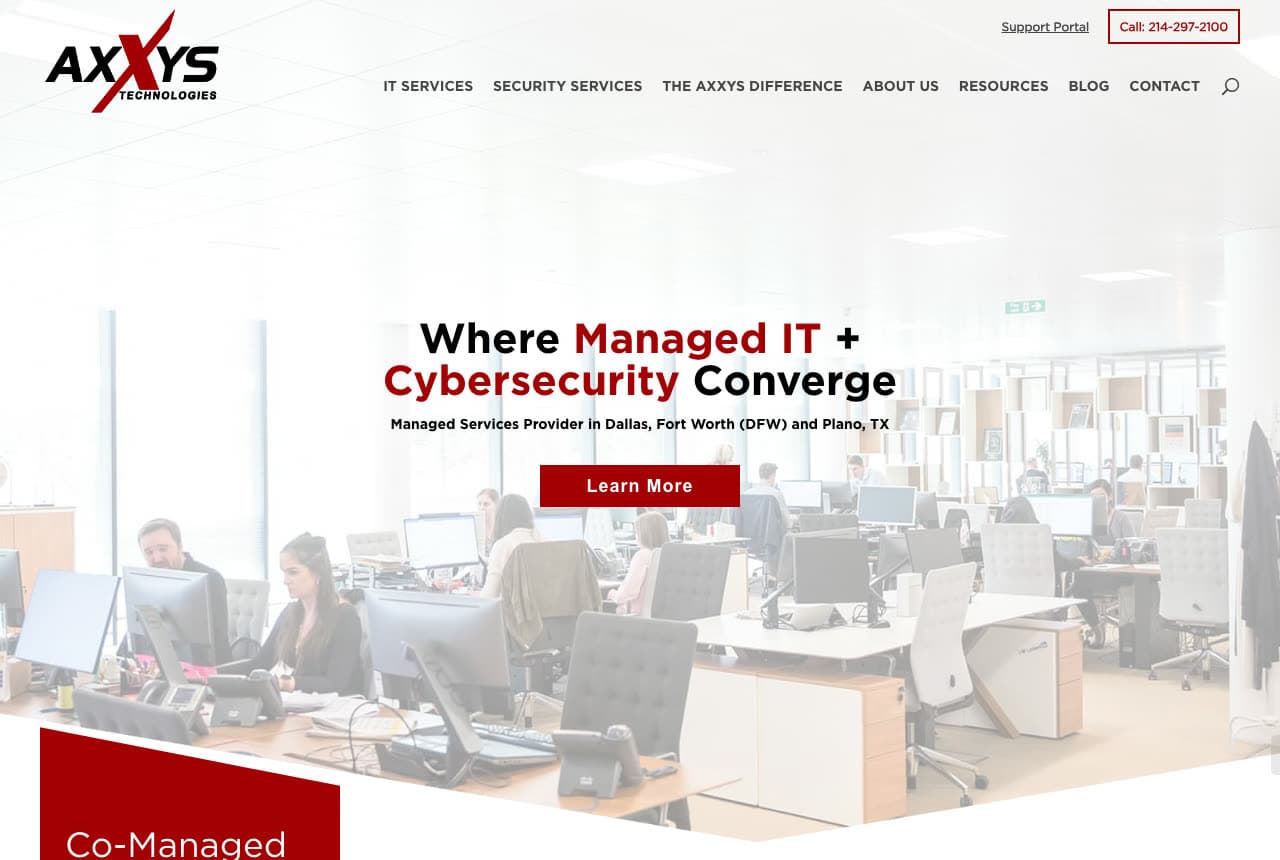
Axxys Technologies uses a two-color system nobody else in this set does — white and a hard red — and a headline built on a single verb: 'Where Managed IT + Cybersecurity Converge', with the two services picked out in red. The sub-line is pure local-search discipline (managed services provider in Dallas, Fort Worth and Plano, TX), the red 'Learn More' sits over a bright office photograph, and the red carries into the nav ('Call 214-297-2100' in an outlined pill) and the next section's 'Co-Managed' block. It's a regional provider's playbook: one memorable color, the city names in the first screen, a phone number you can't miss. Axxys shows how a local MSP looks confident without pretending to be national.

Visit Axxys Technologies

Opens a similar Zarla design you can make yours.

NexusTek website — Cloud Services design example
Real site
  • Cloud Services
  • Bold

NexusTek: Outlined italics for a cloud manifesto

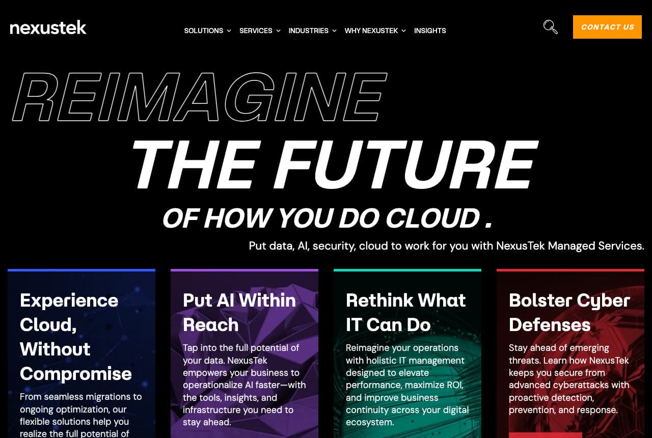
NexusTek treats its hero like a keynote slide: black field, a three-line headline in italic capitals — 'REIMAGINE' hollow-outlined, 'THE FUTURE' solid, 'OF HOW YOU DO CLOUD.' smaller — and a one-line brief ('Put data, AI, security, cloud to work for you') before four service tiles, each with a red top border and a verb-led title: Experience Cloud Without Compromise, Put AI Within Reach, Rethink What IT Can Do, Bolster Cyber Defenses. The typographic drama sells ambition; the tiles immediately make it concrete. An orange 'Contact Us' is the only color outside the red rules. NexusTek is the model for a provider that wants to look like a technology leader rather than a help desk — big type, disciplined grid, verbs everywhere.

Visit NexusTek

Opens a similar Zarla design you can make yours.

Logically website — IT + Cybersecurity design example
Real site
  • IT + Cybersecurity
  • Serious

Logically: One accountable partner, in one sentence

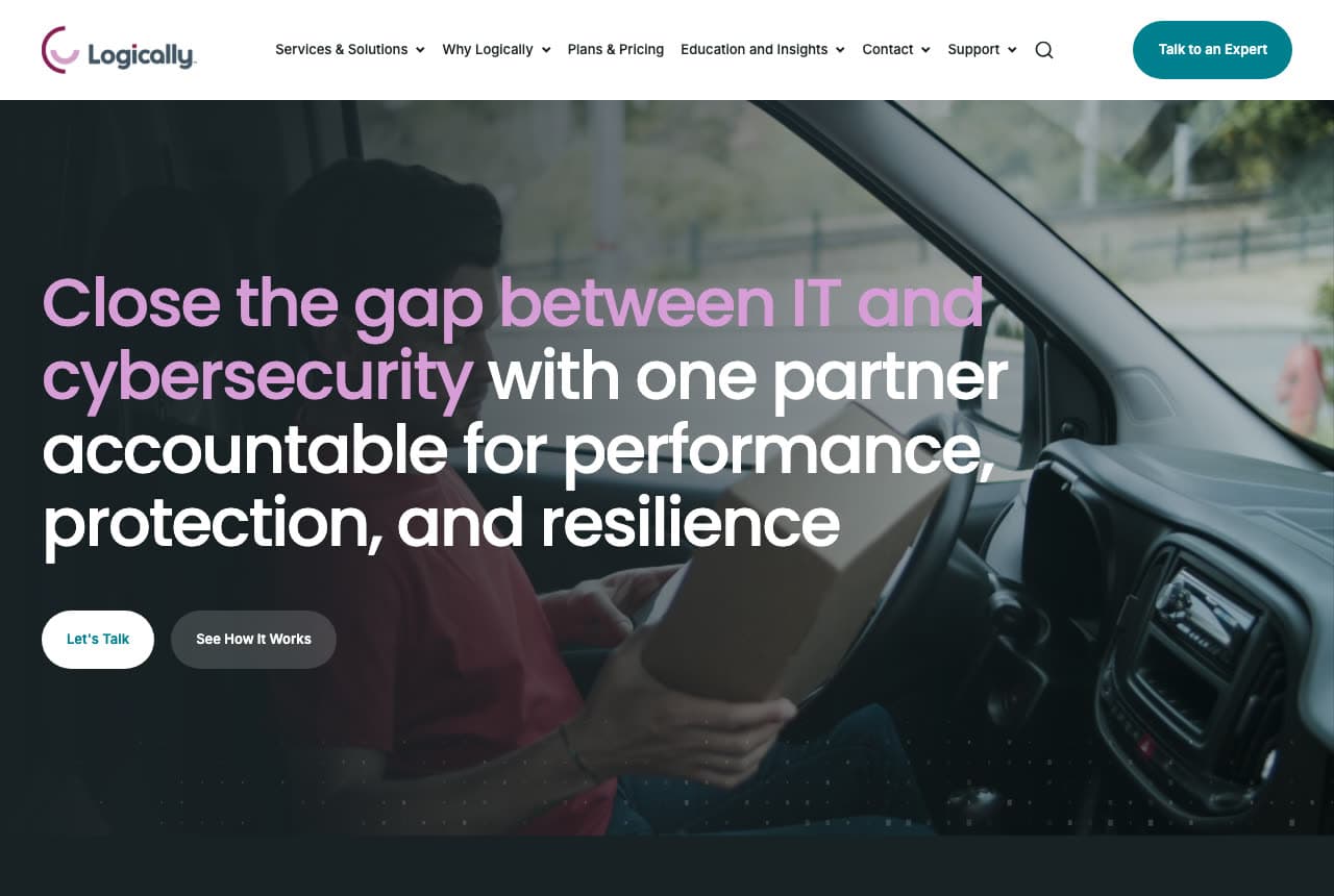
Logically compresses a complicated pitch into a single long headline and makes it readable with color: 'Close the gap between IT and cybersecurity' glows in a pink-to-purple gradient, then 'with one partner accountable for performance, protection, and resilience' finishes in white. The photograph behind it — a delivery driver in a red shirt at the wheel of a van, parcel in hand, unstaged — keeps the mood serious without stock theatrics, and the two pill buttons split the audience: 'Let's Talk' for the ready, 'See How It Works' for the curious. The word 'accountable' is the whole differentiator, and the gradient makes sure the eye lands on the problem before the promise. Logically shows how to sell a bundled offer without a bulleted list.

Visit Logically

Opens a similar Zarla design you can make yours.

CompassMSP website — Managed IT design example
Real site
  • Managed IT
  • Reassuring

CompassMSP: An emergency exit above the fold

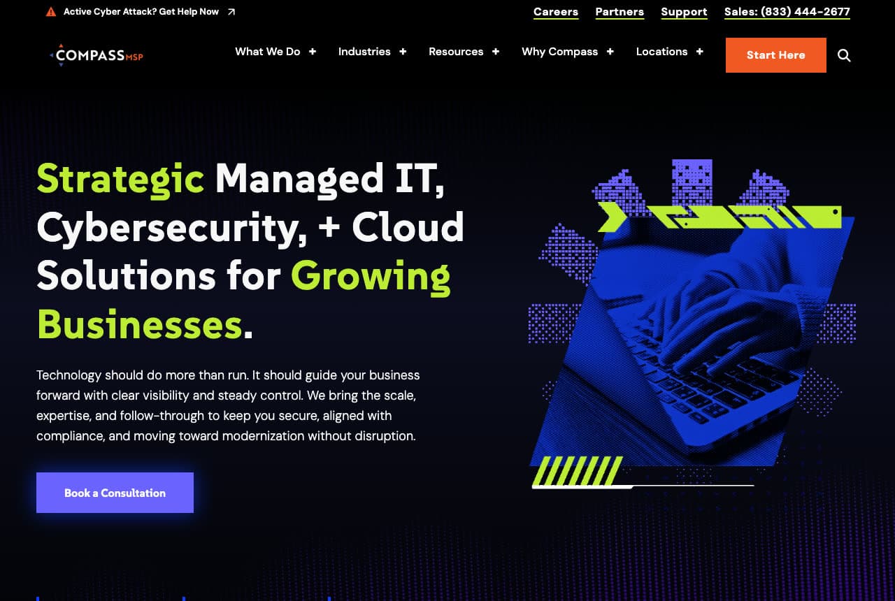
CompassMSP puts the panic button where a panicking visitor would look: a thin bar above the nav reads 'Active Cyber Attack? Get Help Now', with the sales number beside it. Below, the hero is dark and calm — 'Strategic Managed IT, Cybersecurity, + Cloud Solutions for Growing Businesses' in white with the strategic words in green — over a low-poly 3D graphic of a hand and a wireframe network in green and violet. The copy reframes IT as 'clear visibility and steady control', and a violet 'Book a Consultation' sits under a paragraph, not a form. Two audiences, two paths: the customer under attack gets a red-line exit in one second; the growing business gets a considered conversation. CompassMSP is the reference for handling urgency and strategy on one screen.

Visit CompassMSP

Opens a similar Zarla design you can make yours.

Throughline Consulting — Adaptable Template website design you can build with Zarla
Build this with Zarla
  • Adaptable Template
  • Executive

Throughline Consulting: The strategy-call form as the hero

Throughline Consulting is a Zarla template for a management consultancy — the closest catalog match to how an IT advisory practice sells: a dark photograph of a working session, a headline that promises measurable results, and a 'Book a Free Strategy Call' form card sitting right in the first screen (name, work email, company, 'what are you working on?'). The trust chips carry consultancy proof — trusted by 200+ companies, $40M+ value created, 95% client retention — that an IT provider swaps for endpoints managed and response times. Clone it, describe your practice, and the AI rewrites the consulting language into managed-IT language while the form-in-hero structure that converts B2B visitors stays. Throughline suits the provider who sells assessments and roadmaps before contracts.

See this template
Redbird Telecom Engineering — Adaptable Template website design you can build with Zarla
Build this with Zarla
  • Adaptable Template
  • Technical

Redbird Telecom Engineering: Infrastructure photography done beautifully

Redbird Telecom Engineering is a Zarla template for a network-engineering firm — the nearest relative to IT infrastructure in the catalog — and its hero shows how to photograph the unphotographable: a close-up of fiber-optic strands lit violet and blue beside a plain headline, 'The Network Under Everything', with the specialty and region in the second line. The copy talks in the trade's own units ('nineteen hundred miles of it'), and two teal buttons offer 'Scope a Network' and 'See the Projects' — scoping, not selling. For a managed-IT or network provider, the transfer is direct: swap the fiber for your data center or your NOC, keep the plain-spoken headline and the scope-first ask. Redbird proves infrastructure can be the most beautiful image on the page.

See this template

Frequently asked

Where can I find good IT services website examples?

Right here — this page curates IT services website examples across the spectrum: national managed-service providers like Ntiva and NexusTek, cybersecurity-led firms like Echelon Risk + Cyber and Logically, regional providers like Axxys and Rocket IT (each linked so you can explore the live site), plus professionally designed Zarla B2B templates you can clone and restyle for an IT practice. Every example includes a note on why the design works — the trust moves, the proof numbers, the booking path — so you can copy the thinking, not just the look.

What makes a good IT services website?

It makes a non-technical decision-maker feel safe. That means a headline about outcomes rather than acronyms, proof in plain numbers (years in business, certifications, clients served, response times), a visible way to reach a human, and one clear next step — a strategy call or free assessment. The examples above never lead with a server rack; they lead with the business result.

How much does an IT services website cost?

A custom site from an agency that specializes in MSPs typically runs into the thousands up front, and template builders charge roughly $16–$30 per month. An AI builder generates a complete, editable IT services site for free and only charges (on the Premium plan) when you publish to your own domain — so you can build and preview before spending anything.

Should an IT company website be dark or light?

Either — but commit. Dark designs (Echelon, NexusTek, Electric, CompassMSP) read as cyber-serious and product-like; bright designs (Rocket IT, Corsica) read as approachable and local. The mistake is mixing a dark hero with a corporate-blue body and stock handshake photos. Pick the mood that matches the client you want — a law firm and a startup respond to different registers.

What pages does an IT services website need?

Most providers need six: a home page that states the outcome and the proof, a services page (managed IT, cybersecurity, cloud, support), an industries page if you specialize, an about page with real faces and certifications, a resources or blog section that proves expertise, and a contact page with a form, a phone number and — for emergencies — a visible 'get help now' path like CompassMSP's.

How do IT companies get more clients from their website?

Lead with the outcome the owner wants (growth, security, fewer headaches), put the proof numbers in the first screen, and make the ask a conversation. The converting pattern above: Ntiva's 'Book an IT Strategy Session', Corsica's five-line checklist that ends in 'One Predictable Monthly Price', Rocket IT's 'Modernize My IT'. One clear action, backed by numbers, beats a wall of services.

You've seen what works. Now make it yours.

Describe your business and Zarla designs a complete, professional website in about 30 seconds — built to convert, just like the ones above.

Free to build and preview · no credit card · publish to your own domain on Premium