Inspiration · Life Coach

The Best Life Coach Website Examples, Explained

Looking for life coach website examples? These 9 are the best we could find — standout real life coach sites plus designs you can build with Zarla — and each comes with a breakdown of the specific design move that makes it work. Find a look you love and you can build a site in that exact style, free, in about 30 seconds.

Real sites + designs you can build with Zarla — free to build and preview, no credit card

What makes a great life coach website

The best life coach websites share a few moves: they earn trust fast, lead with strong visuals of the work, point to one clear action, and match the design to how their customers decide. Each example below calls out the specific choice worth stealing for your own life coach website.

Happen To Your Career website — Career Coaching design example
Real site
  • Career Coaching
  • Energetic
  • Navy + coral

Happen To Your Career: Brush-script joy breaking a corporate grid

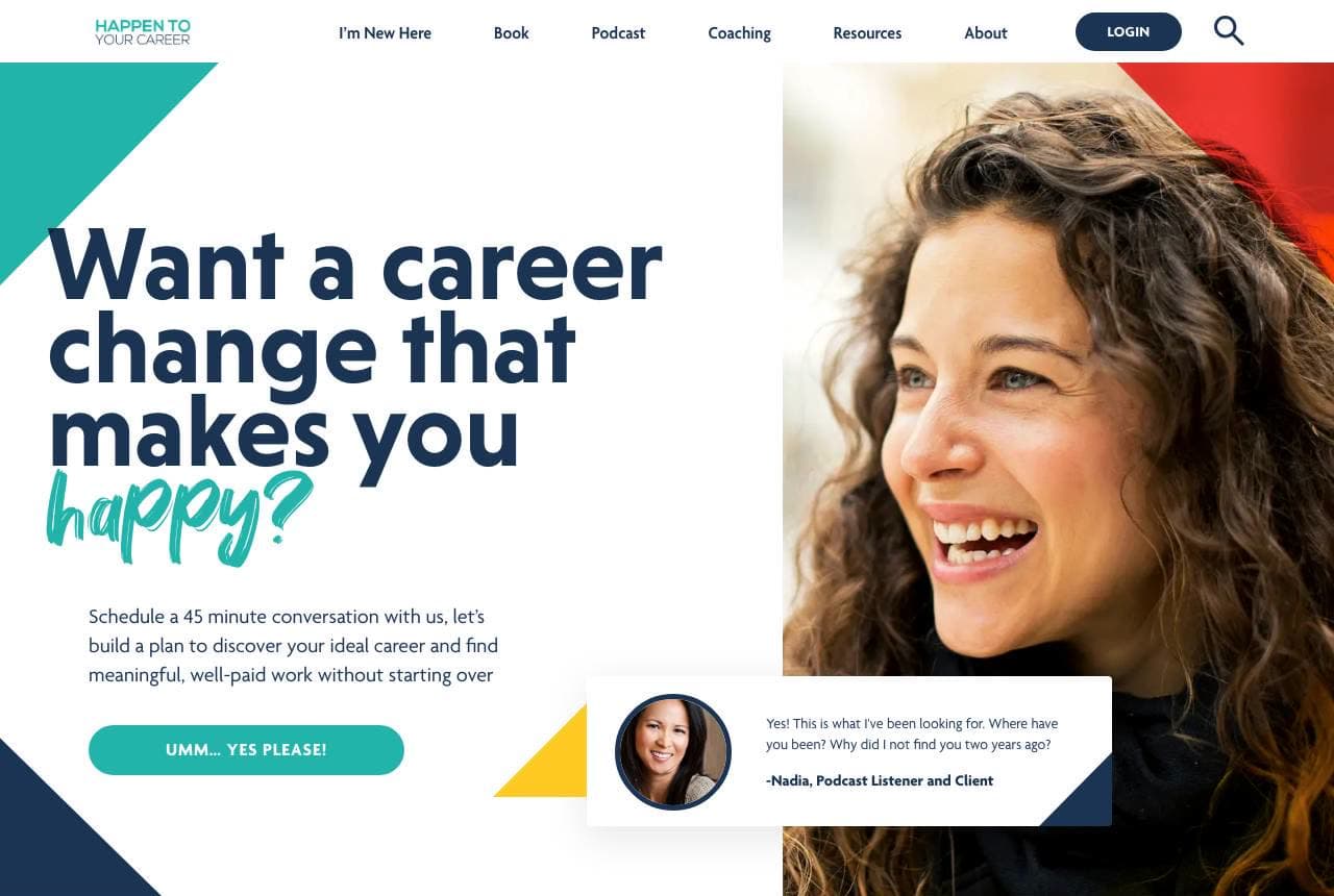
Happen To Your Career asks its whole pitch in one line — 'Want a career change that makes you happy?' — and sets the word 'happy?' in a loose brush script that breaks the corporate type around it, exactly the way the service promises to break a corporate rut. Geometric color shards (teal, gold, coral) energize the layout, a genuinely laughing portrait replaces the arms-crossed coach cliché, and a floating testimonial chip plus a press row (CNBC, Forbes, Fast Company) stack the proof. A second brush headline — 'Unwilling to settle? You're in the right place!' — keeps the voice consistent. The typography IS the transformation story: rigid to free, in one font change.

  • A script word inside structured type enacts the promise
  • A real laugh out-converts the folded-arms coach portrait
  • Color shards make a services page feel like momentum

Steal this: Let one typographic gesture act out your transformation promise.

Eliana Goldstein Coaching website — Career Coaching design example
Real site
  • Career Coaching
  • Editorial
  • Cream + black

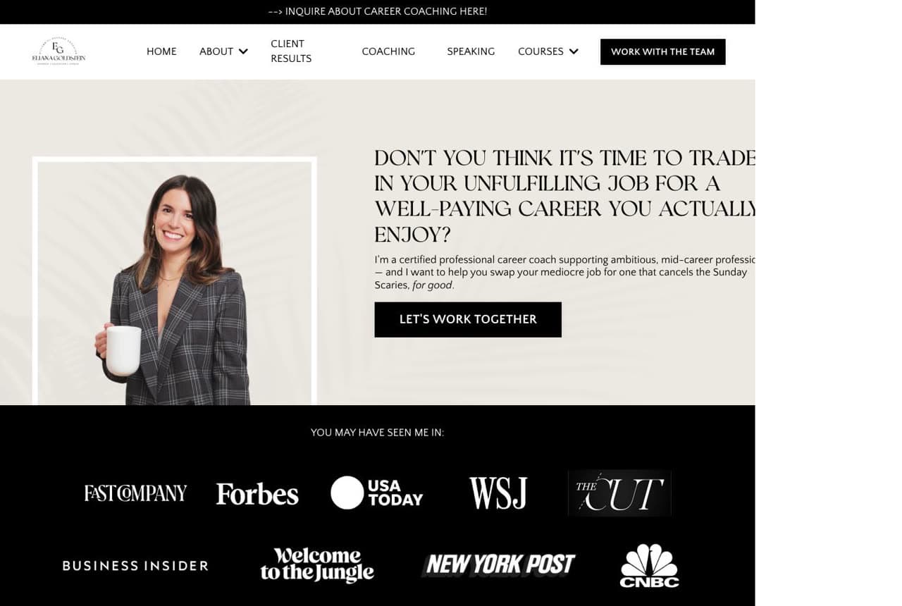
Eliana Goldstein Coaching: A confrontational question, then eight logos

Eliana Goldstein Coaching opens by needling the exact discomfort her clients live with: 'Don't you think it's time to trade in your unfulfilling job for a well-paying career you actually enjoy?' — set in slim serif capitals beside a warm coffee-in-hand studio portrait. Then comes the artillery: a full-width black press band with Fast Company, Forbes, USA Today, WSJ, The Cut, Business Insider, New York Post, and CNBC. That band answers the coaching industry's credibility problem in one glance — this is a professional the media already vets. The cream-and-black palette keeps it editorial. Provoke with the question, then close with borrowed authority; the order matters.

  • A second-person question makes the visitor the subject
  • An eight-logo press band settles credibility instantly
  • Cream + black reads magazine, not MLM
Madison Arnholt website — Alignment Coaching design example
Real site
  • Alignment Coaching
  • Serene
  • Beige + cream

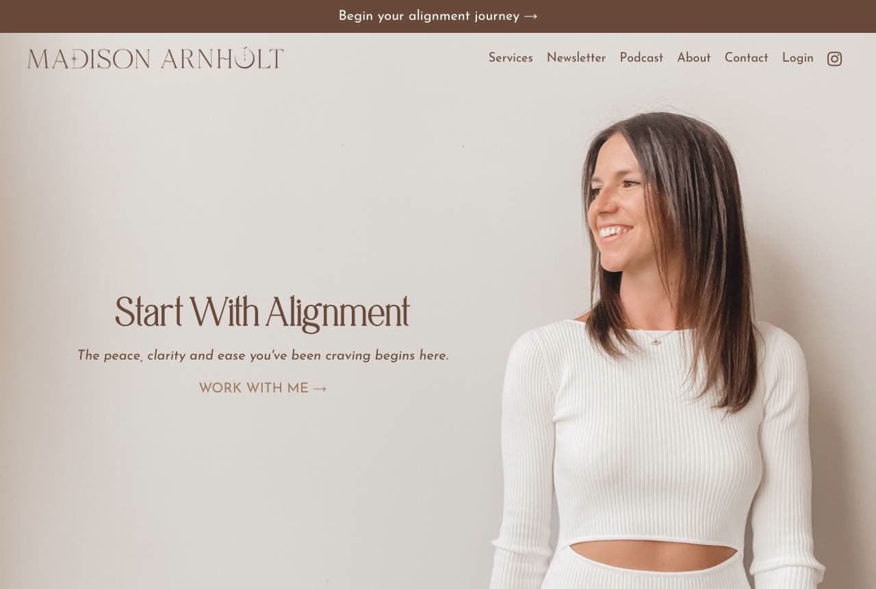
Madison Arnholt: Whitespace as the promise of calm

Madison Arnholt sells 'peace, clarity and ease' and the design delivers it before the copy does: an expanse of warm beige, a thin serif 'Start With Alignment,' one standing portrait in cream on cream, and a single 'work with me' link. The poetry continues below in short exhales — 'Less noise. Less pressure. More presence. Spaciousness. Lightness. Trust.' — copy that reads like the nervous-system state being sold. A quiet press row (LinkedIn, Meta, Reader's Digest, Medium) grounds the softness in credibility. For any practitioner whose product is calm — coaches, therapists, yoga teachers — the page's own pace is the proof. Density would contradict the offer.

  • Beige-on-cream minimalism enacts the calm being sold
  • Fragment copy ('Less noise. Less pressure.') breathes
  • One CTA respects the contemplative buying pace
Katarina Stoltz website — Coaching & Therapy design example
Real site · Berlin, DE
  • Coaching & Therapy
  • Confident
  • Cream + purple

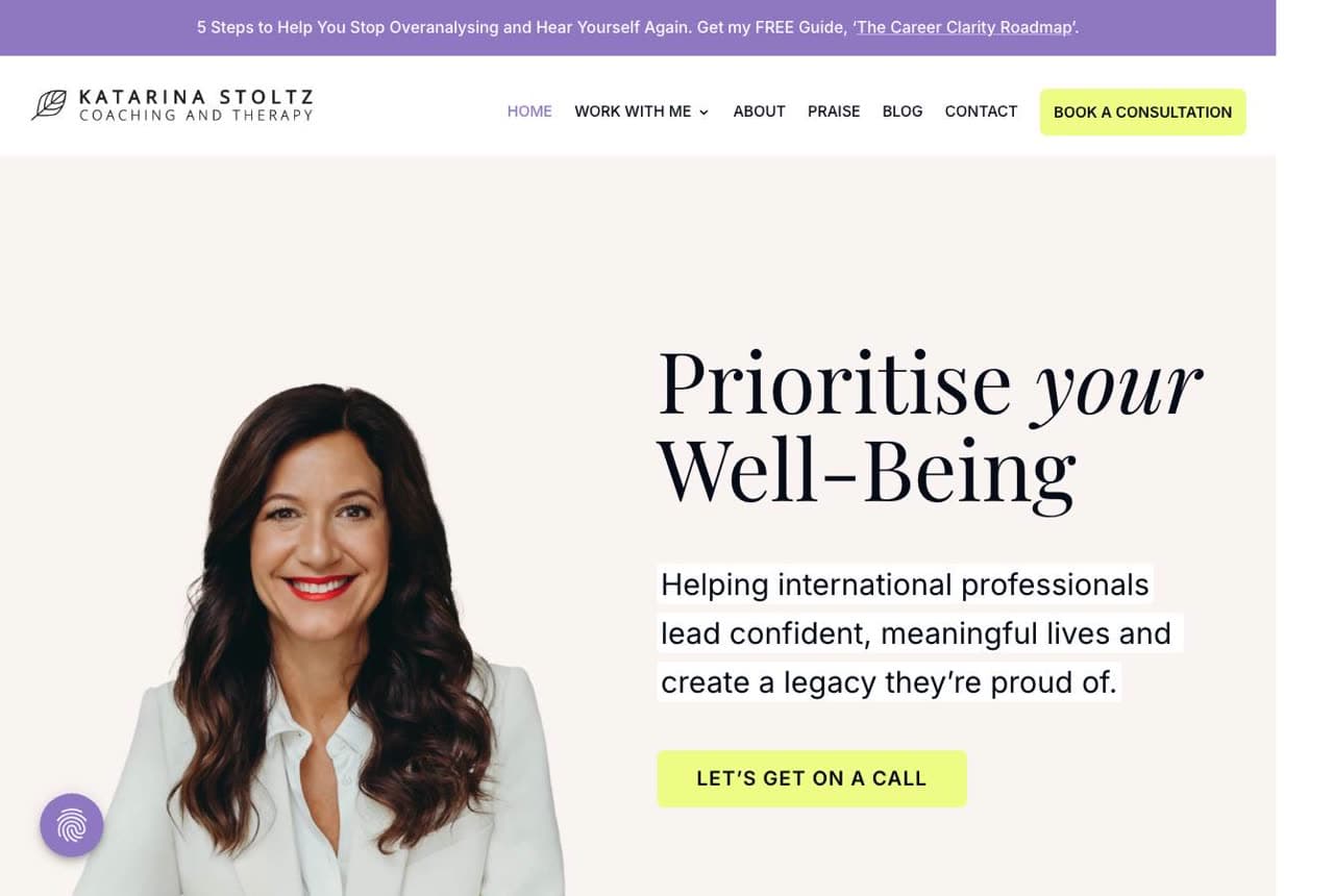
Katarina Stoltz: Highlighter marks on a dual credential

Katarina Stoltz leads with 'Prioritise your Well-Being' in serif italic beside a confident red-lip portrait, but her page's sharpest device is a literal purple highlighter: the audience line — 'for high achievers seeking balance, fulfillment, and freedom' — is marked like a passage in a well-read book. The positioning below does the differentiating: coaching AND psychotherapy, one practitioner, 'sometimes positive affirmations, green smoothies, and self-help books aren't enough.' That line respectfully dismisses the industry's fluff while claiming clinical depth. A free-guide banner tops the page for the not-yet-ready. Highlight your audience sentence — literally — and the right reader feels found.

  • A highlighter treatment makes the audience line unmissable
  • Coach + psychotherapist duality out-positions both fields
  • Copy that names the fluff earns the depth claim
Nathalie Sommer website — Intimacy Coaching design example
Real site
  • Intimacy Coaching
  • Bold
  • Ocean + white

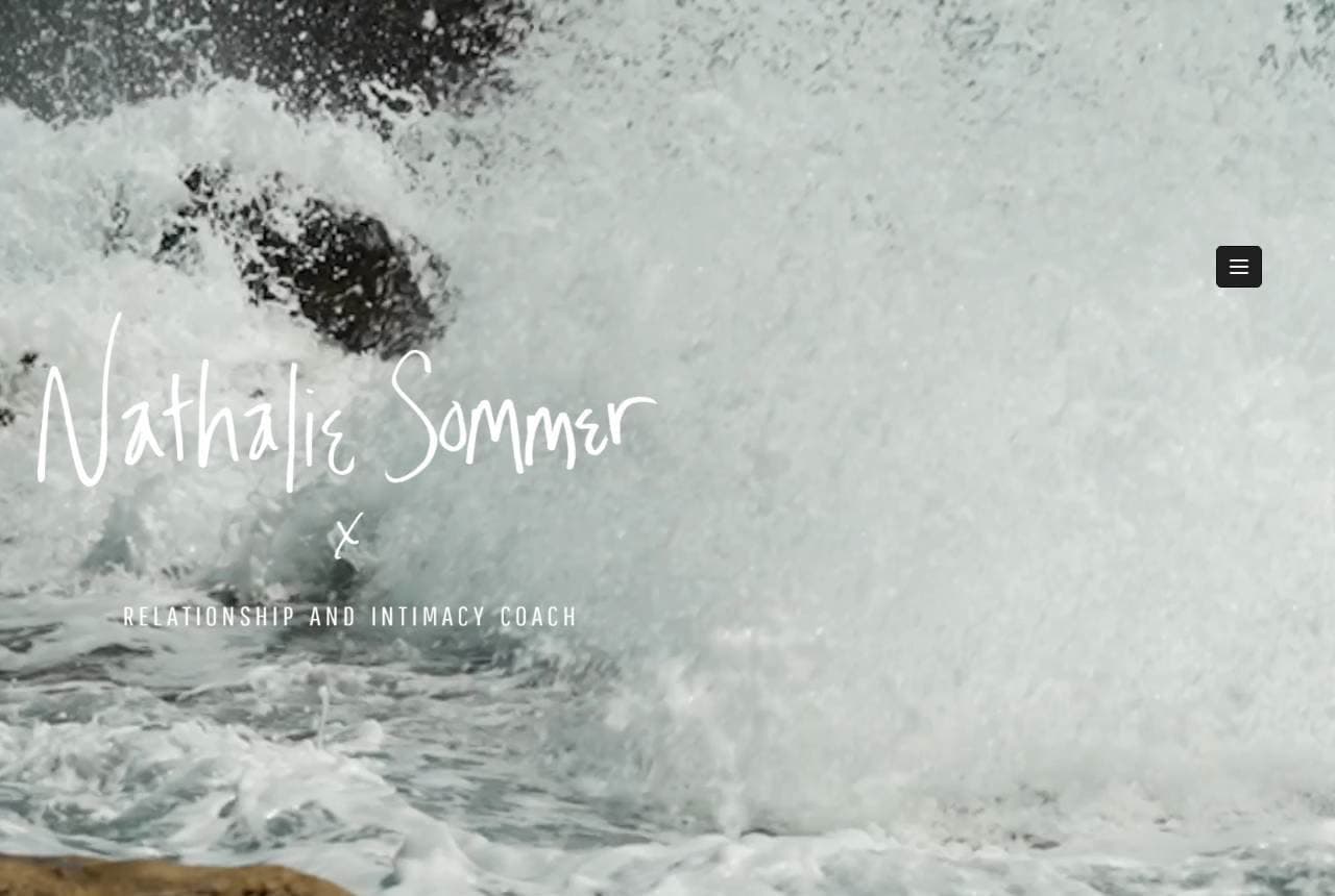
Nathalie Sommer: Ocean force for delicate subject matter

Nathalie Sommer coaches relationships and intimacy — territory most sites drown in rose gold — and instead opens on a churning black-and-white ocean wave with her name in handwritten script across it. The metaphor is exact: depth, force, things beneath the surface. The statement below commits to specificity most coaches avoid: 'For the woman or couple ready to awaken more depth, pleasure and connection in life, love and intimacy…' The triple tagline ('Transform yourself. Transform your life. Transform your love life.') builds in steps. Bold nature imagery plus unflinching copy signals a practitioner comfortable with the uncomfortable — which, for this niche, is the entire qualification.

  • A crashing wave outclasses every rose-gold cliché
  • Naming pleasure plainly signals professional comfort
  • Script-over-photo keeps the personal brand human
Daybreak Coaching — Life Coaching website design you can build with Zarla
Build this with Zarla
  • Life Coaching
  • Warm
  • Sienna + amber

Daybreak Coaching: The put-off self, addressed directly

Daybreak Coaching is Zarla's life-coach template, and its type-statement-split hero leads with a headline that stings gently: 'Become Who You've Been Putting Off.' No portrait needed at the top — the words carry the confrontation while the split layout balances them against warm imagery, in sienna and amber tones that feel like the early-morning metaphor of the brand name. The line works because it locates the problem inside the visitor's own delay, not their circumstances — which is precisely the coaching thesis. Structure below runs credentials, method, and a booking path. Clone it, keep the headline if you dare, and add your practice's specialty in about 30 seconds.

  • 'Putting off' locates the problem in delay, not defect
  • Type-led heroes suit practitioners without brand photography
  • Sienna + amber reads dawn — hope without saccharine
See this template
Tammy Gooler Loeb website — Executive Coaching design example
Real site · Boston, MA
  • Executive Coaching
  • Corporate

Tammy Gooler Loeb: Corporate logos for an executive audience

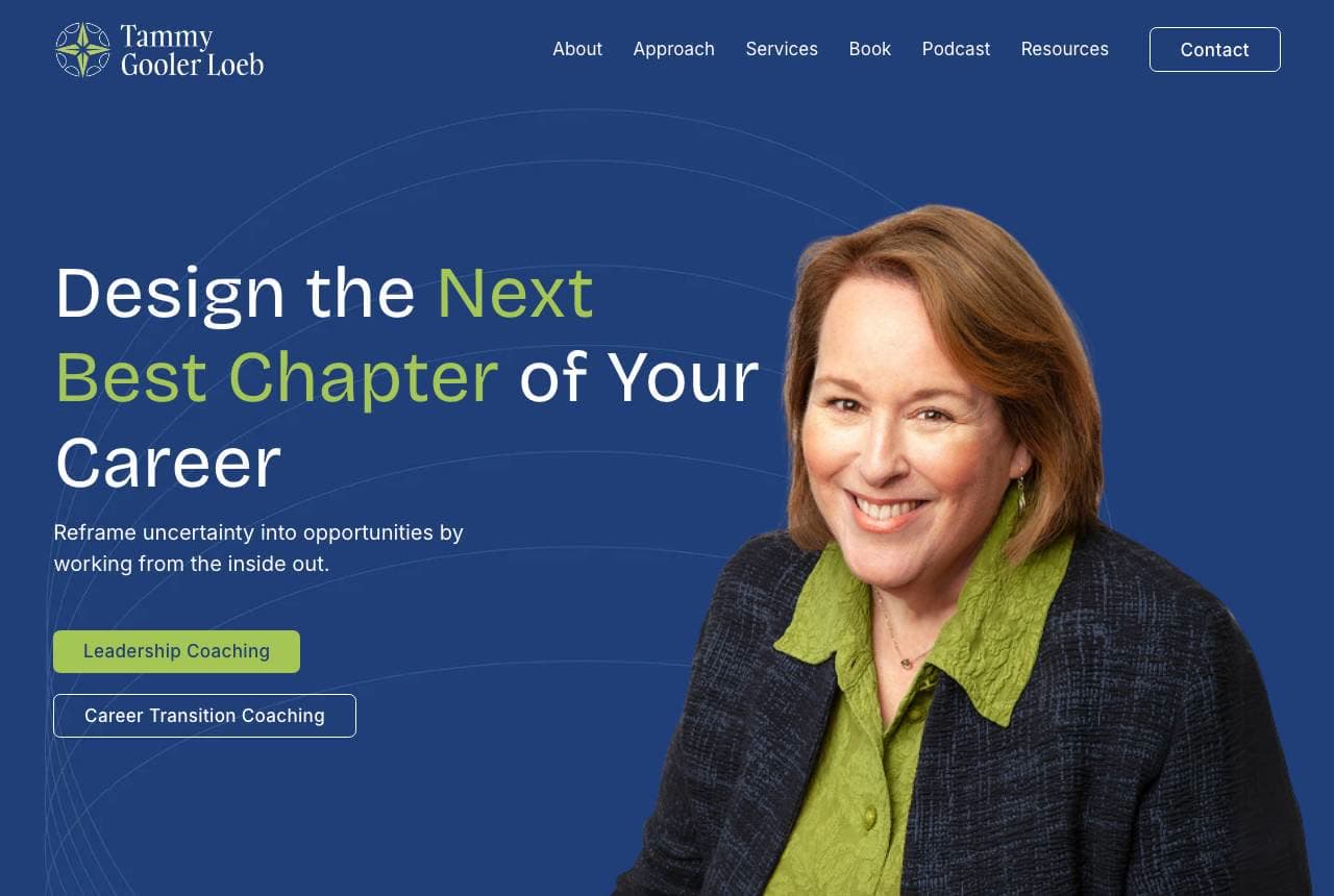
Tammy Gooler Loeb designs for the buyer who has a procurement process: a navy hero — 'Design the Next Best Chapter of Your Career' with the key phrase in green — a warm executive portrait, and the credential line that matters at this altitude: 'Trusted by leaders at' WBUR, Wells Fargo, Deloitte, L'Oréal, TJX. Two pill CTAs split leadership coaching from career-transition coaching, sorting the two distinct budgets her practice serves. The palette and structure read consultancy, not wellness — appropriate, since her buyers often expense the engagement. Executive coaches: your website competes with McKinsey alumni, not manifestation workshops. Dress accordingly and put employer logos where coaches put moon phases.

Rebecca Kirk website — Career Transition design example
Real site · UK
  • Career Transition
  • Calm

Rebecca Kirk: Serving the person and the employer at once

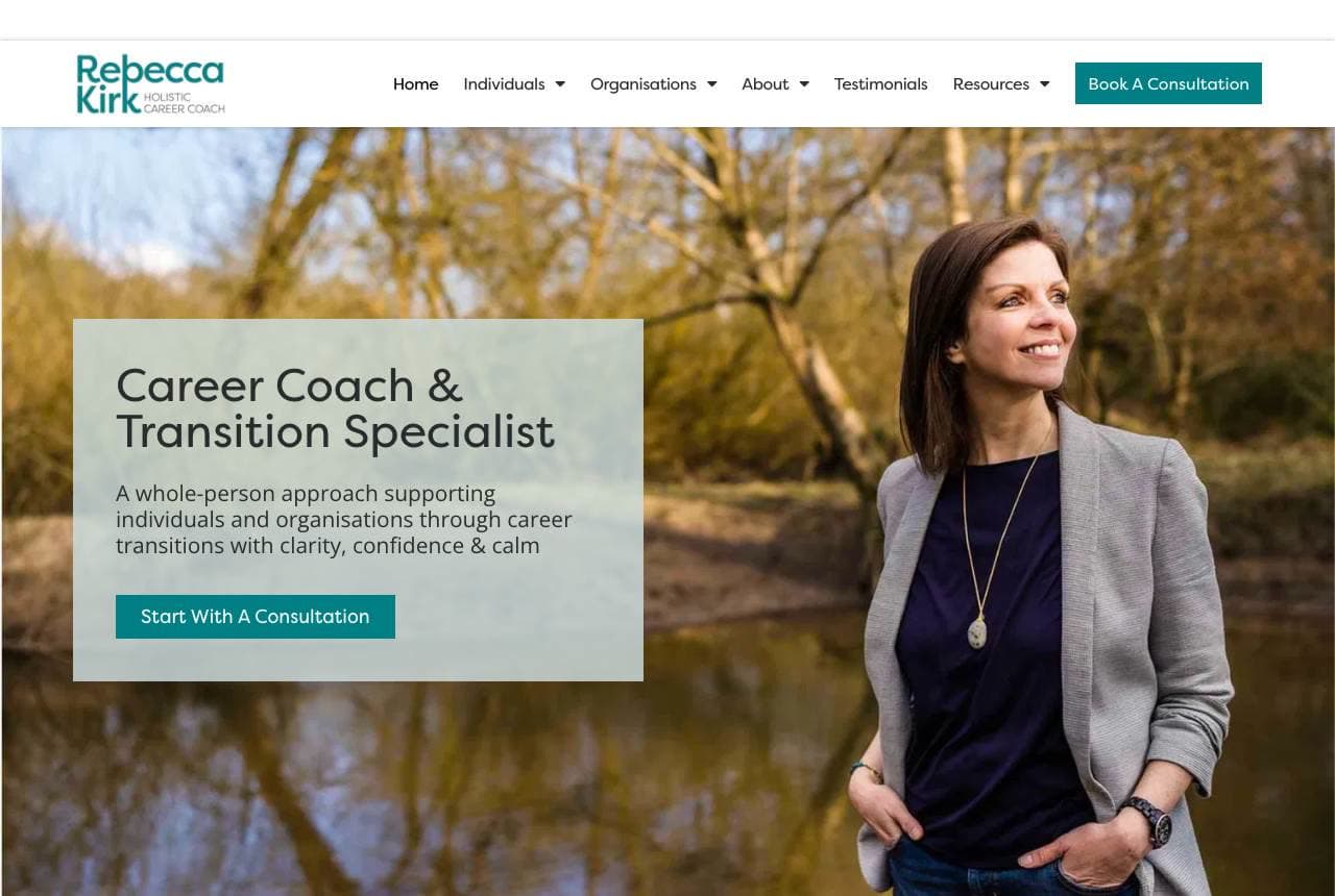
Rebecca Kirk photographs herself by a quiet river — 'Career Coach & Transition Specialist… with clarity, confidence & calm' in a soft sage card — and then does something structurally smart: the page immediately splits into 'For Individuals' and 'For Organisations,' acknowledging that career-transition work has two paying customers: the person in redundancy, and the employer funding outplacement. Each card gets its own path and CTA. The copy beneath ('At a Career Crossroads?… clarity rarely comes from urgency') keeps the pastoral tone while the structure does B2B work. Practitioners with dual markets: split the audiences on screen one, or both will read copy meant for the other.

Clarity Coaching website — Life Coaching design example
Real site · Canada
  • Life Coaching
  • Gentle

Clarity Coaching: A warning wrapped in a warm garden

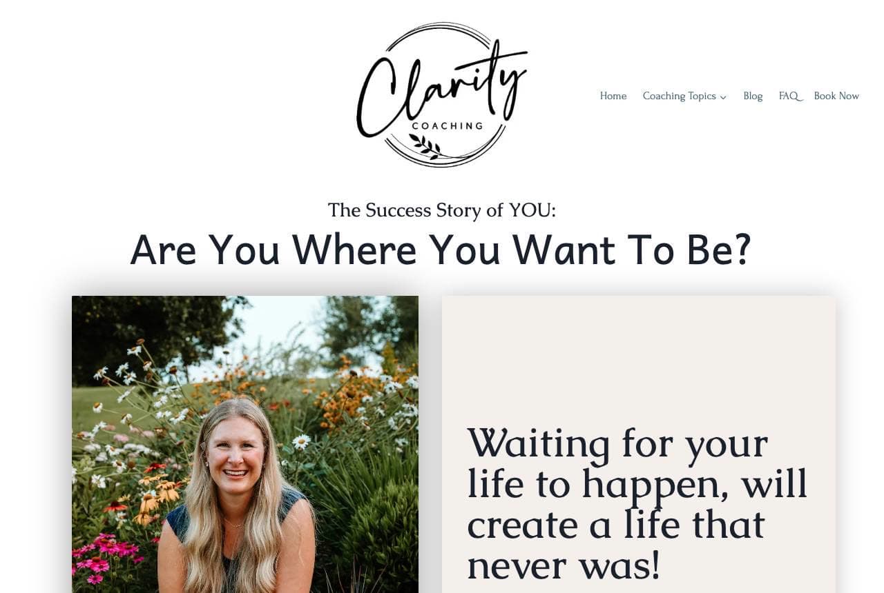
Clarity Coaching leads with the gentlest confrontation in the category: 'Waiting for your life to happen, will create a life that never was!' — italic serif in a blush card beside a relaxed garden portrait, under the framing headline 'The Success Story of YOU: Are You Where You Want To Be?' The stakes are named without aggression, which suits the wildflower-and-linen visual register. Below, an education block ('What is Life Coaching? And how is coaching different from counselling/therapy?') meets first-time buyers where they actually are — most prospects don't know what they're shopping for. Warn softly, then teach: a fitting sequence for a trust-heavy, unfamiliar service.

Frequently asked

Where can I find good life coach website examples?

Right here — this page curates life coach website examples two ways: standout real businesses (each linked, so you can explore the live site) and professionally designed Zarla templates you can clone and make your own. Every example comes with a note on why the design works — trust signals, layout, calls to action — so you can copy the move, not just the look.

What makes a good life coach website?

A good life coach website earns trust in the first few seconds, leads with strong visuals of the work, gives visitors one obvious action, and loads fast on a phone. Every design below leads with proof and a single clear call to action rather than a wall of text.

How much does a life coach website cost?

A custom life coach website from a designer typically runs into the thousands up front, and template builders charge roughly $16–$30 per month. An AI builder generates a complete, editable design for free and only charges (on the Premium plan) when you publish to your own domain — so you can build and preview before spending anything.

Do I need a designer to build a life coach website?

No. Several designs on this page were generated by Zarla and are fully editable — you describe your business and get a complete, professionally designed site in about 30 seconds, then refine it by chatting. Building and previewing is free; publishing to your own domain needs the Premium plan.

What pages does a life coach website need?

Most life coach businesses need just a few: a home page that proves trust and points to one clear action, an about page that puts a face to the business, a services or work page that shows what you do, and a contact page with a form and a phone number. Local businesses also benefit from location or service-area pages that help them show up in nearby searches.

How do I get more customers from my life coach website?

Lead with proof in the first few seconds (reviews, real photos, results), make one action obvious on every screen (call, book, or enquire), and keep it fast on mobile — most visitors arrive on a phone. The designs above each do this differently, but they all earn trust early and remove friction from the next step.

You've seen what works. Now make it yours.

Describe your business and Zarla designs a complete, professional website in about 30 seconds — built to convert, just like the ones above.

Free to build and preview · no credit card · publish to your own domain on Premium