Inspiration · Pest Control

The Best Pest Control Website Examples, Explained

These are some of the best pest control website designs we could find — a mix of standout real companies and designs you can build with Zarla — and instead of just showing them off, we explain why each one works. Pest control is a fear-and-trust purchase: watch how the strongest sites answer 'is this safe for my family?' and 'can I trust these people in my home?' before they list a single service — with a real photo, certifications, reviews, and one easy way to book. Then make any of the Zarla designs your own, free, in about a minute.

Real sites + designs you can build with Zarla — free to build and preview, no credit card

What makes a great pest control website

The best pest control sites do three things fast. They answer the safety question on sight — 'family- and pet-safe' and a real, warm image do more than any chemical spec. They prove trust immediately with reviews, certifications (GreenPro, licensing), and a local face. And they make getting a quote the one obvious action — a form or 'free inspection' button right in the hero. Everything below is a variation on those moves; pick the one that matches the customers you want, whether that's nervous families, a specific pest, or commercial facilities.

Pestie website — Pest Control design example
Real site
  • Pest Control
  • Modern
  • Green + white

Pestie: DIY pest control, sold like a premium product

Pestie is the freshest design in this category because it refuses to look like pest control at all. A clean green-and-white palette, friendly real photos of regular people spraying their own yards, and 'Do your own pest control like a pro. Save hundreds.' position it as a modern DTC subscription — think Warby Parker, not exterminator. A '4.7 average, 30,000+ reviews' line and 'a smarter way to get rid of bugs' do the trust and reframing work at once. The lesson is category disruption through design: by adopting the visual language of a consumer subscription brand rather than a trades service, Pestie makes a chore feel like a smart purchase and justifies a recurring plan. Even if you run a traditional local service, the clean, confident, product-brand aesthetic is worth stealing.

  • Consumer-subscription look, not exterminator
  • 'Save hundreds' reframes a chore as a smart buy
  • 30,000+ reviews front-load the trust

Steal this: Borrow a consumer-subscription brand's look — clean, confident and product-first beats another 'exterminator' site.

Natran Green Pest Control website — Eco Pest Control design example
Real site · Austin, TX
  • Eco Pest Control
  • Reassuring
  • Green + natural

Natran Green Pest Control: An eco promise, made with one image

Natran Green Pest Control makes its entire pitch with a single photograph. 'Your Health Is Our Priority / Certified Green Pest Control' sits beside a child laughing with a butterfly perched on their nose — an image that says 'safe for your family' more convincingly than any ingredient list could. GreenPro and QualityPro certification badges back the claim, and the copy names the real fear: 'our priority is to make sure you and your family aren't exposed to unnecessary toxins.' It's a masterclass in leading with the emotional benefit over the functional one: parents choosing a pest company aren't buying dead bugs, they're buying peace of mind about what their kids touch. The right hero image can carry that promise instantly, before a word is read.

  • One photo (child + butterfly) sells 'safe for your family'
  • Green certification badges back the eco claim
  • Leads with peace of mind, not dead bugs

Steal this: Let one hero photo carry the emotional promise — a safe-for-family image beats a paragraph about ingredients.

Orkin website — Pest Control design example
Real site
  • Pest Control
  • Bold
  • Red + white

Orkin: The category's most recognizable brand, flexed

Orkin leans on the one thing no local competitor has: national brand recognition. A confident photo of a uniformed 'Orkin Pro' at a customer's home, the signature red accent, and 'The Orkin Pros' headline trade on decades of TV advertising and instant name recognition. Residential/Commercial tabs and a 'Find Pest Control Near Me' block route the huge range of visitors efficiently. The takeaway for everyone else is instructive by contrast: Orkin can win on brand alone, so a local company has to win on the things Orkin can't fake — a real local face, genuine neighborhood reviews, and a founder's story. Orkin shows you what 'trusted authority' looks like; your job is to build the local, human version of it.

  • Brand recognition + the signature red do the heavy lifting
  • Residential/Commercial tabs route a huge visitor range
  • The lesson for locals: win on what a national brand can't fake
Aptive Environmental website — Pest Control design example
Real site
  • Pest Control
  • Professional
  • Green + clean

Aptive Environmental: Subscription pest control, positioned as smart

Aptive frames recurring pest service as intelligence rather than spraying. 'Welcome to Intelligent Pest Control' over a clean photo of a friendly tech, a green palette, and 'next-day treatments available' pitch a modern, tech-forward subscription — with a nav (Plans, Intelligence Center, Pest Library) that reinforces the 'smart system' story. It's a clear example of elevating a commodity service through positioning: the actual work is similar to every competitor's, but the language and structure make it feel like a considered, data-driven program you subscribe to, not a one-off you call in a panic. For any service business selling a recurring plan, the move is to package the ordinary work as a smarter system — and let the site's calm, organized design make that believable.

  • 'Intelligent Pest Control' elevates a commodity service
  • Plans + 'Intelligence Center' sell a system, not a spray
  • Calm, organized design makes the 'smart' claim land
Chem-free Organic Pest & Lawn website — Organic Pest Control design example
Real site · Austin, TX
  • Organic Pest Control
  • Premium
  • Dark + green

Chem-free Organic Pest & Lawn: Three services, one organic promise

Chem-free Organic Pest & Lawn makes a premium-organic positioning legible in a single glance. The hero splits into three clean columns — Organic Pest Control, Organic Rodent Control, Organic Lawn Service — over a dark, moody photo, with 'Austin's Authority on Low-Impact Environmental Management' and a 4.9-star, 861-review badge. Leading the word 'Organic' three times hammers the differentiator home, and the darker, more serious palette signals premium rather than budget. The lesson is disciplined positioning: rather than list twelve services, Chem-free presents exactly three, all under one clear promise, which makes the brand instantly understandable and ownable. When your edge is a specific approach (organic, low-impact), repeat it until it's unmistakable and let the palette signal the price tier.

  • Three clean service columns make the offer legible instantly
  • Repeating 'Organic' hammers the differentiator
  • Dark palette signals premium, not budget
EcoPro Services website — Wildlife Control design example
Real site · Austin, TX
  • Wildlife Control
  • Eco
  • Green + tan

EcoPro Services: Wildlife removal with an eco conscience

EcoPro Services stakes out a specific niche — critter and wildlife exclusion — and brands it warmly. 'Eco-Friendly Pest Control Done Right / Safe for your family and the environment' sits beside a photo of a raccoon on a fence, an image that instantly tells you this company handles the animals a general exterminator won't, and a '$100 off full home critter exclusion' offer converts the visitor with a real problem. The woman-owned, eco angle gives it a distinct, trustworthy identity in a category full of interchangeable trucks-and-chemicals brands. It's a good example of niche-plus-values differentiation: pick the specific job you want (wildlife exclusion), show it literally (the raccoon), and layer on the values (eco, local, woman-owned) that make a homeowner choose you over the faceless competition.

  • The raccoon photo signals wildlife/critter work at a glance
  • A specific '$100 off exclusion' offer converts the real problem
  • Eco + woman-owned values differentiate a commodity category

Steal this: Show the exact job you want literally — a wildlife photo pulls the critter customer a generic 'pest control' hero never would.

The Bug Master website — Pest Control design example
Real site · Austin, TX
  • Pest Control
  • Friendly

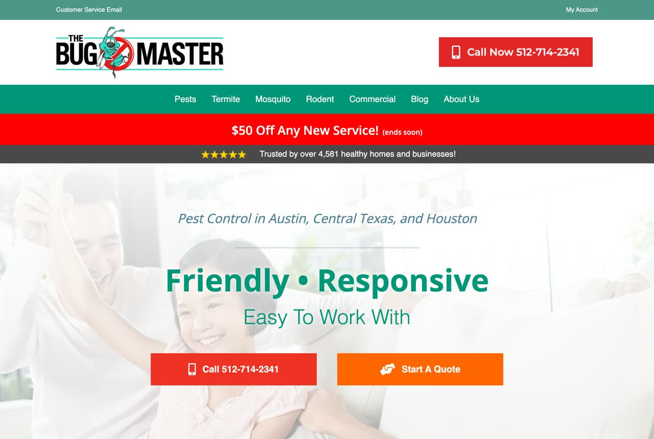
The Bug Master: Friendly beats scary in a scary category

The Bug Master wins by being warm in a category that usually trades on fear. 'Friendly • Responsive / Easy To Work With' — plus a cheerful teal, red, and orange palette and 'trusted by over 4,581 healthy homes and businesses' — positions the company as the pleasant, easy option rather than the alarming one. A '$50 off any new service' banner and click-to-call buttons keep it practical for the homeowner who just wants the problem gone. The lesson is tonal positioning: most pest sites lean on dread (infestations, danger, disgust), so choosing to be the friendly, low-stress choice is itself a differentiator. When everyone else is scary, being genuinely approachable — in copy and color — is a real competitive edge.

Ambervale Pest Solutions — Residential Pest website design you can build with Zarla
Build this with Zarla
  • Residential Pest
  • Approachable

Ambervale Pest Solutions: Book the inspection in the hero

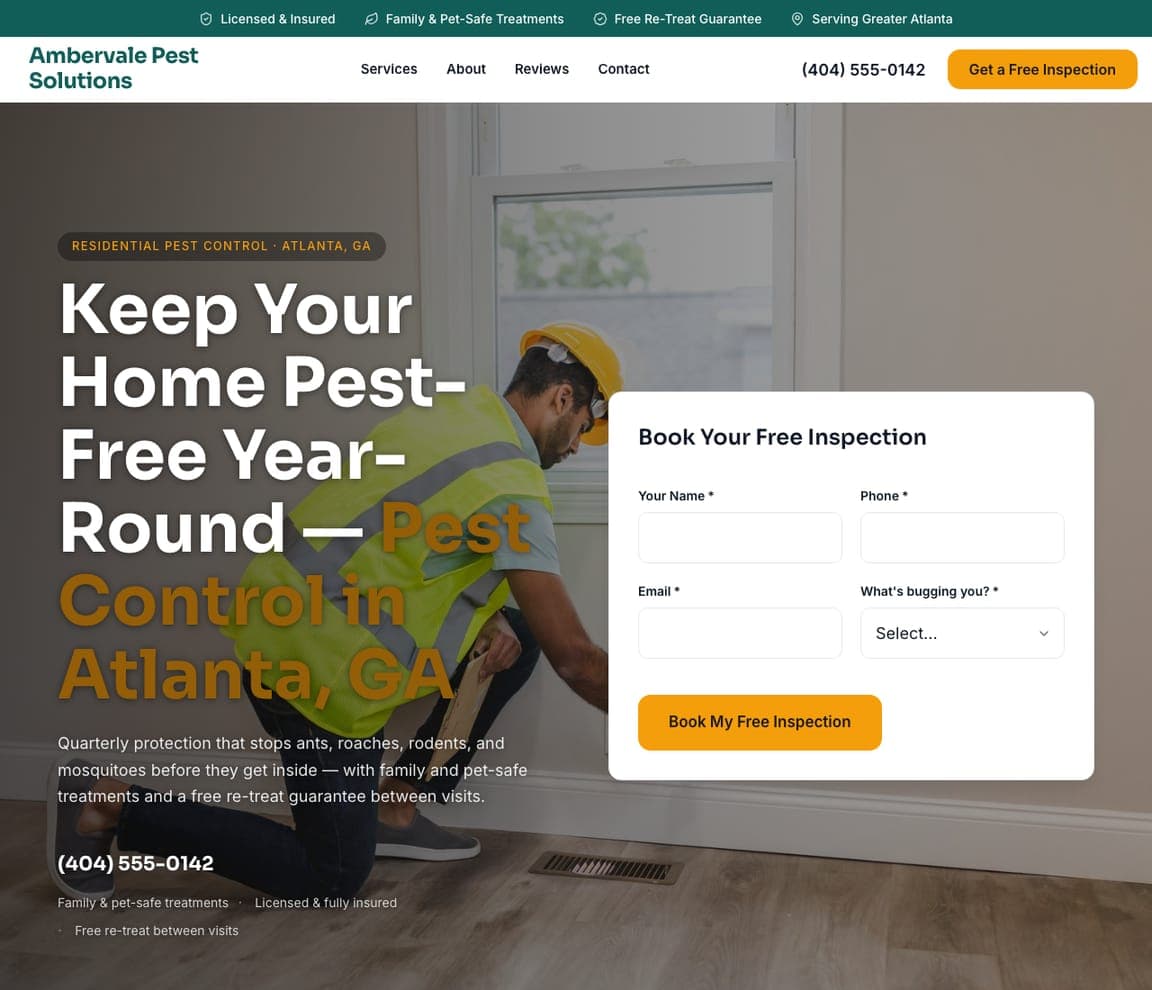
Ambervale Pest Solutions captures the lead before the visitor can leave. 'Keep Your Home Pest-Free Year-Round — Pest Control in Atlanta, GA' sits beside a 'Book Your Free Inspection' form, so the homeowner with a problem never has to hunt for a contact page, and a trust strip (licensed & insured, family & pet-safe, free re-treat guarantee) answers the 'is this safe and reliable?' question up top. Warm orange over a real tech-at-work photo keeps it approachable. It's the template built around the single highest-converting move in home services — put the quote form in the hero — dressed for the bread-and-butter quarterly-protection plan that most pest companies actually sell. Describe your service and it's yours in about a minute.

See this template
Ironclad Termite & Pest — Termite Control website design you can build with Zarla
Build this with Zarla
  • Termite Control
  • Authoritative

Ironclad Termite & Pest: Frame termite work as protecting an investment

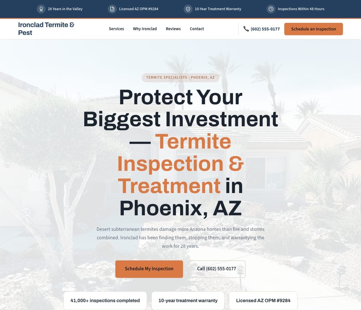
Ironclad Termite & Pest sells a high-ticket service by naming what's at stake. 'Protect Your Biggest Investment — Termite Inspection & Treatment in Phoenix, AZ' reframes an unglamorous inspection as defending a home's value, and the copy makes it visceral: 'desert subterranean termites damage more Arizona homes than fire and storms combined.' The reassurances are all about risk and permanence — 28 years in the valley, a 10-year treatment warranty, 41,000+ inspections, licensed AZ OPM — because a homeowner spending real money on termites is buying certainty. It's a template tuned to a considered, high-value decision: lead with the stakes, quantify the threat, and stack the warranties and track record. When the service is expensive and scary, the design's job is to make you feel safe spending the money.

See this template
Nightwatch Bed Bug Specialists — Bed Bug Control website design you can build with Zarla
Build this with Zarla
  • Bed Bug Control
  • Discreet

Nightwatch Bed Bug Specialists: Sell discretion for an embarrassing problem

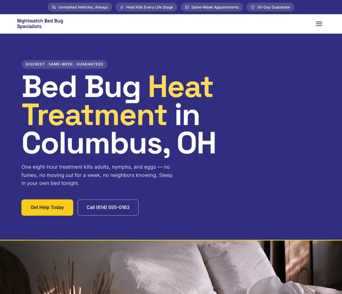
Nightwatch Bed Bug Specialists understands that its customer is anxious and embarrassed, and it designs for exactly that. 'Bed Bug Heat Treatment in Columbus, OH' over a deep-indigo hero with a yellow accent feels serious and discreet, and the copy answers the real worries head-on: 'one eight-hour treatment kills adults, nymphs, and eggs — no fumes, no moving out for a week, no neighbors knowing. Sleep in your own bed tonight.' The trust pills seal it — unmarked vehicles, same-week appointments, 30-day guarantee. It's a sharp lesson in designing for a customer's emotional state: a bed-bug sufferer isn't comparison-shopping features, they're mortified and want it gone quietly and fast. Speak to the shame and the urgency, and the discretion becomes the selling point. Point it at your business and publish it free.

See this template
Duskoff Mosquito & Tick — Mosquito Control website design you can build with Zarla
Build this with Zarla
  • Mosquito Control
  • Lifestyle

Duskoff Mosquito & Tick: Sell the outcome: your backyard back

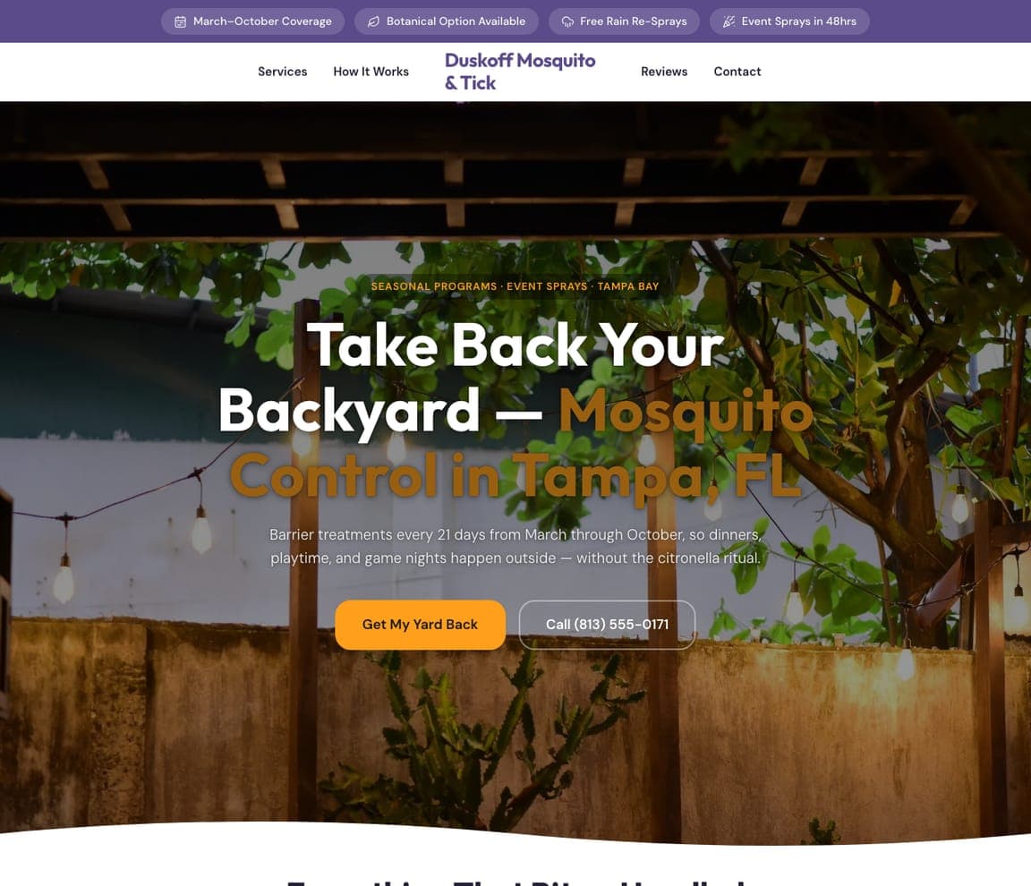
Duskoff Mosquito & Tick sells a summer, not a spray. 'Take Back Your Backyard — Mosquito Control in Tampa, FL' over a warm photo of a string-lit patio at dusk pitches the outcome the customer actually wants — evenings outside — rather than the treatment itself, and the copy makes it concrete: 'barrier treatments every 21 days from March through October, so dinners, playtime, and game nights happen outside — without the citronella ritual.' Seasonal-coverage and free-rain-re-spray reassurances handle the practical objections. It's a clean example of selling the benefit, not the service: nobody wants 'mosquito treatment,' they want their yard back for the season. Lead with the life the customer gets, use imagery that shows it, and the recurring plan sells itself. Swap in your details and publish it free.

See this template
Meridian Commercial Pest Group — Commercial Pest website design you can build with Zarla
Build this with Zarla
  • Commercial Pest
  • Corporate

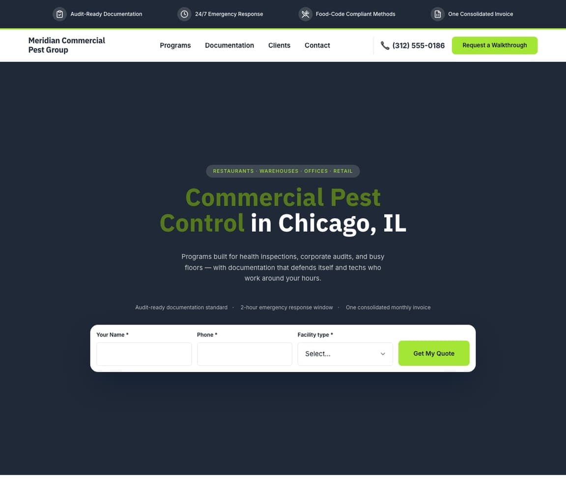
Meridian Commercial Pest Group: Speak the B2B buyer's language

Meridian Commercial Pest Group knows its buyer is a facilities manager, not a homeowner, and every choice reflects it. 'Commercial Pest Control in Chicago, IL' over a serious dark-navy hero with a green accent, plus copy built around what a business actually fears — 'programs built for health inspections, corporate audits, and busy floors, with documentation that defends itself.' The trust row speaks pure B2B: audit-ready documentation, 24/7 emergency response, food-code-compliant methods, one consolidated invoice. A 'facility type' quote form in the hero qualifies the lead. It's a template that correctly refuses to sound like a residential site: the commercial buyer is protecting a health score and a brand, so the design leads with compliance, documentation, and reliability rather than 'safe for your family.' When your customer is a business, sell to the business's fears.

See this template

Frequently asked

What makes a good pest control website?

A good pest control website answers the customer's real worries fast — 'is this safe for my family and pets?' and 'can I trust these people in my home?' — with a real photo, family/pet-safe messaging, certifications (GreenPro, state licensing), and reviews, then makes getting a quote the single obvious action with a form or 'free inspection' button in the hero. Notice how the designs below lead with safety and trust rather than a list of chemicals or bugs.

What pages does a pest control website need?

Most pest control companies need five: a home page that answers the safety-and-trust question and points to a free inspection, a services page broken out by pest (ants, termites, rodents, mosquitoes, bed bugs, wildlife), a plans or pricing page for recurring protection, an about page with real faces and certifications, and a contact page with a form and phone number. A Google Business Profile connected to the site is what gets you found for 'pest control near me' and 'exterminator near me.'

How do pest control companies get more customers from their website?

The companies that convert do three things: they defuse the safety fear up front (family- and pet-safe messaging, a real local face, green certifications), they make requesting a quote frictionless (a free-inspection form in the hero, click-to-call on mobile), and they keep a steady stream of Google reviews — the biggest factor in both ranking for 'exterminator near me' and getting a nervous homeowner to choose you. Speaking to a specific customer — a family, a bed-bug sufferer, a restaurant — rather than everyone is what makes all three land.

You've seen what works. Now make it yours.

Describe your business and Zarla designs a complete, professional website in about 30 seconds — built to convert, just like the ones above.

Free to build and preview · no credit card · publish to your own domain on Premium