Inspiration · Pharmacy

The Best Pharmacy Website Examples, Explained

Looking for pharmacy website examples? These 12 are the strongest we found — Grubb's Pharmacy's archival photograph of its 1867 storefront beside 'the oldest community pharmacy in the District', Bremo Pharmacy's illustrated Richmond street with a biplane towing 'SHOP LOCAL!', Capsule's 'Meds made easy' on navy with a zip-code check underneath — plus clinic designs you can build with Zarla, each with a breakdown of the specific move that turns a 'pharmacy near me' search into a transferred prescription. A pharmacy site is read by someone who needs a refill, a transfer or a vaccine today, so the best ones here put those three verbs in the first screen, say how long they've been open, and show a pharmacist's face. Find an approach you love and you can build a site in that spirit, free, in about 30 seconds.

Real sites + designs you can build with Zarla — free to build and preview, no credit card

What makes a great pharmacy website

The best pharmacy websites make the three tasks into buttons and the years into a headline. The tasks: Local Health's 'transfer your meds · refill your meds · find a location', Capsule's 'Check if we deliver to you' with a zip-code field, Scripx's 'Start An Online Visit', Grubb's 'Refills' in the nav, Koshland's 'REFILL RX' beside the logo. The years: Grubb's 'Since 1867', Bremo's 'SINCE 1976', Alto's 'Pharmacy reimagined' for the opposite claim. Notice the faces — Koshland's pharmacist at the counter captioned by name, Skippack's staff member in a tee reading 'HAS MY BACK' — and the drawings where a photo would be dull: Bremo's storefront street, Alto's pharmacists and phone screens, Capsule's arch and triangle. Notice the compounding pharmacies talking to two audiences at once, with 'PATIENTS' and 'DOCTORS' or 'Providers' and 'Patients' as paired nav items. Every example below tells you whether the pharmacy is a counter you walk up to or an app that comes to you.

Grubb's Pharmacy website — Historic Community Pharmacy design example
Real site · Washington, DC
  • Historic Community Pharmacy
  • Heritage
  • Black + white

Grubb's Pharmacy: An archival photo of the 1867 storefront beside 'the oldest community pharmacy in the District'

Grubb's Pharmacy is the cover because it has a date nobody can beat and shows the proof. The black header sets a boxed 'GRUBB'S PHARMACY' wordmark left and a nav — Our Team, Vaccines & Rapid Tests, Our Services, Refills, Contact Us — right; a grey band beneath reads '2026-2027 Flu Vaccines Now Available' and 'COVID-19 Vaccines Coming Soon'. The hero splits: on the left, a black-and-white archival photograph of the original shopfront with staff and children posed outside, stamped with a round 'GRUBB'S PHARMACY · Rx · SINCE 1867' seal; on the right, a black panel with a small Capitol-dome mark dated '1867', the serif 'GRUBB'S' / 'PHARMACY', and two paragraphs — 'Located a few streets away from the US Capitol Building, Grubb's Pharmacy is the oldest community pharmacy in the District. Since 1867, we have helped generations of families, residents, and lawmakers get the care they need to stay healthy and well.' and 'After more than 159 years of service, Grubb's Pharmacy continues to provide the best possible care…' 'Refills' and 'Vaccines & Rapid Tests' in the nav are the two reasons anyone visits. Clone the archive-photo hero if you have the archive.

  • A real archival photograph as half the hero
  • The founding year in a seal and in the copy
  • Vaccines and refills as nav items

Steal this: If you have an old photograph of the shop, make it half the hero — a seal that says 'since 1867' over a real 1867 storefront is unarguable.

Visit Grubb's Pharmacy

Opens a similar Zarla design you can make yours.

Bremo Pharmacy website — Independent Compounding Pharmacy design example
Real site · Richmond, VA
  • Independent Compounding Pharmacy
  • Charming
  • Sky blue + green

Bremo Pharmacy: An illustrated Richmond street with a biplane towing 'SHOP LOCAL!' over the pharmacy

Bremo Pharmacy draws its own block. The white header sets the blue 'Bremo PHARMACY' logo, a small 'Long Term Care Pharmacy' line, a caps nav — SERVICES, TRAINING & EDUCATION, BLOG, SHOP, CONTACT, ABOUT — and My Account, social icons and a search field. The hero is an illustration: a pale-blue sky with a soft yellow sun and clouds, a city skyline in silhouette, and a row of shopfronts along a street — a cafe, a red-brick building, the green 'BREMO PHARMACY' storefront, an antiques shop — with a lamppost, a bench, a tree and a biplane overhead towing a banner that reads 'SHOP LOCAL!'. Above the street, in navy serif, 'Bremo Pharmacy', and beneath it in tracked capitals, 'YOUR LOCALLY OWNED RICHMOND VA COMPOUNDING PHARMACY SINCE 1976'. Below, on white, 'Bremo's Pharmacy Services' introduces a row of coloured circles. 'TRAINING & EDUCATION' in the nav says the pharmacy teaches; 'Long Term Care' says it serves facilities; the drawing says neighbourhood. Clone the illustrated-street hero if a photo of your shopfront would look like every other one.

  • The pharmacy drawn into its own street
  • 'SHOP LOCAL!' towed by a biplane
  • City, specialism and year in one tracked line

Steal this: Draw your block — the cafe, your shop, the antiques store — and the visitor places you on a map before they read the address.

Visit Bremo Pharmacy

Opens a similar Zarla design you can make yours.

Capsule website — Same-Day Delivery Pharmacy design example
Real site
  • Same-Day Delivery Pharmacy
  • Bold
  • Navy + yellow + red

Capsule: 'Meds made easy' on navy with a yellow arch and a red triangle, and a zip-code check beneath

Capsule says the whole product in three words and asks one question. The navy header sets the 'CAPSULE' wordmark with a cross, a small caps nav — HOW IT WORKS, ABOUT US, FOR DOCTORS, QUESTIONS — 'SIGN IN' and an outlined 'GET STARTED'. The hero, on the same navy, opens with the heavy white 'Meds' / 'made easy', a line — 'Capsule is the pharmacy that delivers your prescriptions, the same day, for free—all from your phone.' — and a red 'GET STARTED'. On the right, three flat shapes: a yellow arch, a red triangle cut by the edge, a slate half-circle. Below, on white, 'Check if we deliver to you' beside a field reading 'Enter home or work zip code' and a teal arrow button. The shapes are pure brand; the zip-code line is the only thing a visitor needs to know. 'FOR DOCTORS' in the nav is the second customer. Clone the three-word headline and single question for any delivery pharmacy.

  • Three words — 'Meds made easy'
  • Flat shapes instead of a photograph
  • One question under the hero — the zip code

Steal this: Ask the one question that decides everything — 'Check if we deliver to you' with a zip-code field — directly under the hero.

Visit Capsule

Opens a similar Zarla design you can make yours.

Local Health website — Community Pharmacy design example
Real site
  • Community Pharmacy
  • Approachable
  • Blue + white

Local Health: 'your pharmacy, your way.' on blue with three buttons — transfer, refill, find a location

Local Health puts the three pharmacy tasks in a row and lowercases everything. The white header sets the 'local health' wordmark with a blue mark, a lowercase nav — home, locations, services, savings card, refill, transfer, careers, more... — and 'Log in' with a cart. The hero is a bright blue field patterned faintly with pills and capsules: the heavy white 'your pharmacy,' / 'your way.', a second line 'serving communities big & small.', and three outlined white buttons — 'transfer your meds', 'refill your meds', 'find a location'. Below, on white, 'We bring healthcare closer to where it matters most.' beside a photograph of orange pill bottles. The lowercase voice reads as a local shop rather than a chain, and the three buttons are the only three things a visitor came to do. 'savings card' in the nav is the fourth. Clone the three-task row as the default pharmacy hero.

  • Transfer, refill, find — the three tasks as three buttons
  • Lowercase everywhere, including the headline
  • A pill pattern instead of a photograph

Steal this: Make 'transfer your meds' the first button — a transfer is a new customer, and most pharmacy sites bury it under 'services'.

Visit Local Health

Opens a similar Zarla design you can make yours.

Koshland Pharm website — Custom Compounding Pharmacy design example
Real site
  • Custom Compounding Pharmacy
  • Personal
  • White + purple

Koshland Pharm: 'When It Comes To Your Health, We Don't Make Compromises.' beside the pharmacist at his counter, captioned by name

Koshland Pharm shows the man who makes the medicine. The white header sets the 'Koshland Pharm — Custom Compounding Pharmacy' logo with a leaf, 'REFILL RX', 'SHOP' and a search field, and a nav of PATIENTS, DOCTORS, ABOUT US, CONTACT; a lavender strip reads 'Personal Medicine. Uncompromising Standards.' The hero is a white card set over a pale ground: the purple serif 'When It Comes To' / 'Your Health, We Don't' / 'Make Compromises.', the line 'How we compound medicine makes a difference in your health outcomes.' and an outlined 'Watch Our Video — 1:50 min'. Overlapping the card's right edge, a photograph of a bald pharmacist in glasses, a vest and a tie, standing at the counter with a tablet, shelves of bottles behind him, captioned 'Peter Koshland, PharmD'. Below, a purple 'THREE DIFFERENCES THAT CREATE SUCCESS' and 'Compounding pharmacies are not all the same'. The caption is the detail — a named pharmacist is a promise a chain can't make. Clone the card-and-portrait layout for an owner-run pharmacy.

  • The pharmacist photographed at the counter and named
  • A video button with its length — '1:50 min'
  • PATIENTS and DOCTORS as the first two nav items

Steal this: Caption your pharmacist's photograph with their name and credential — 'Peter Koshland, PharmD' turns a stock-looking portrait into a promise.

Visit Koshland Pharm

Opens a similar Zarla design you can make yours.

Skippack Pharmacy website — Independent Pharmacy & Clinic design example
Real site · Schwenksville, PA
  • Independent Pharmacy & Clinic
  • Homely
  • White + blue

Skippack Pharmacy: Every phone line, the address and the hours in a block at the top, then a tee that says 'SKIPPACK PHARMACY HAS MY BACK'

Skippack Pharmacy puts the contact card first and a joke second. The top of the page is a centred block of small serif lines with icons: 'Pharmacy: 610-584-6979 | Clinic: 610-584-7937 | Text: 267-766-0076 | Fax: 267-436-0913', 'Email: clinic@skippackpharmacy.com', 'Location: 4118 W. Skippack Pike, Schwenksville, PA 19473 | Mail: PO Box 1371, Skippack, PA 19474', 'Hours: Mon-Fri: 9AM - 6PM | Sat: 10AM - 3PM', and four social icons. Below a dotted rule, the header sets the 'SKIPPACK PHARMACY' logo with a mortar and pestle left and a hamburger right. The hero is a photograph from behind of a staff member in a blue tee with both arms raised and her thumbs pointing back at her own shoulders, the shelves blurred around her, and the tee reads 'SKIPPACK PHARMACY — HAS MY BACK'. A separate clinic line and a text number say the pharmacy also runs a clinic and answers texts; the tee is the brand voice. Clone the contact-block-first layout if your customers are older and want the phone number before anything else.

  • Four phone lines, the address and the hours before the logo
  • A text number for the pharmacy
  • The slogan printed on the staff tee
Visit Skippack Pharmacy

Opens a similar Zarla design you can make yours.

Alto website — App-Based Pharmacy design example
Real site
  • App-Based Pharmacy
  • Gentle

Alto: 'Pharmacy reimagined' beside an illustration of a woman checking her phone and two pharmacists

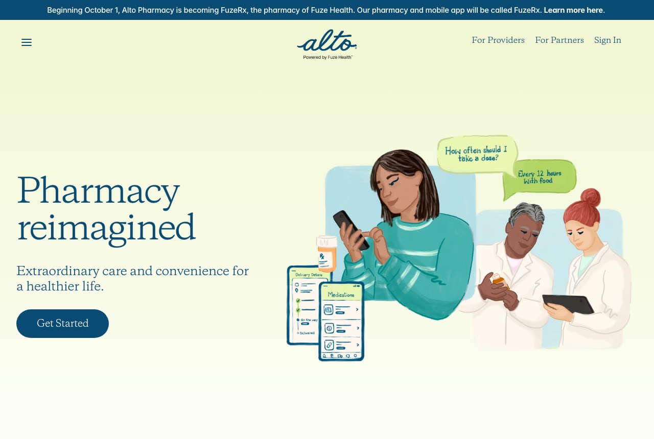
Alto draws the service it delivers. A pale strip reads 'Beginning October 1, Alto Pharmacy is becoming FuzeRx, the pharmacy of Fuze Health. Our pharmacy and mobile app will be called FuzeRx. Learn more here.'; the pale header sets a hamburger left, the 'alto — Powered by Fuze Health' logo centred, and For Providers, For Partners and Sign In right. The hero, on a pale yellow-green, opens with the navy serif 'Pharmacy' / 'reimagined', the line 'Extraordinary care and convenience for a healthier life.' and a navy 'Get Started'. On the right, an illustration: a woman in a teal sweater reading her phone, with speech bubbles — 'How often should I take a dose?' and 'Every 12 hours with food' — two pharmacists in white coats, one holding a tablet, a phone screen listing 'Medications' and 'Delivery Details', and a pill bottle. The drawing shows the conversation a delivery pharmacy has by text, and 'For Providers' and 'For Partners' name the other two customers. Clone the illustrated-conversation hero for a pharmacy that lives in an app.

Visit Alto

Opens a similar Zarla design you can make yours.

Scripx Pharmacy website — Compounding & Telehealth Pharmacy design example
Real site
  • Compounding & Telehealth Pharmacy
  • Clinical

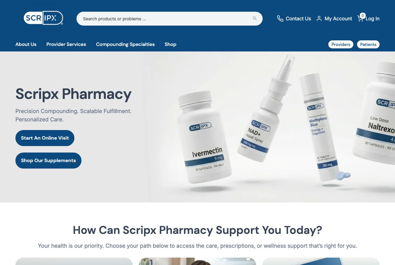
Scripx Pharmacy: 'Precision Compounding. Scalable Fulfillment. Personalized Care.' with labelled bottles floating beside it

Scripx Pharmacy writes three two-word promises and floats its bottles. The navy header sets the boxed 'SCRIPX' logo, a 'Search products or problems ...' field, Contact Us, My Account and Log In; a second row runs About Us, Provider Services, Compounding Specialties and Shop, with two pills at the right — 'Providers' and 'Patients'. The hero is pale grey: the bold navy 'Scripx Pharmacy', the line 'Precision Compounding. Scalable Fulfillment. Personalized Care.', and two navy buttons — 'Start An Online Visit' and 'Shop Our Supplements'. On the right, product shots float at angles: white bottles and a nasal spray, each labelled with the Scripx mark and a product name. Below, 'How Can Scripx Pharmacy Support You Today?' and 'Your health is our priority. Choose your path below to access the care, prescriptions, or wellness support that's right for you.' 'Start An Online Visit' says the pharmacy prescribes as well as compounds, and the Providers/Patients pills sort the visitor before they scroll. Clone the floating-bottles hero if your products are your own.

Visit Scripx Pharmacy

Opens a similar Zarla design you can make yours.

The Independent Pharmacy website — Regulated Online Pharmacy design example
Real site · United Kingdom
  • Regulated Online Pharmacy
  • Reassuring

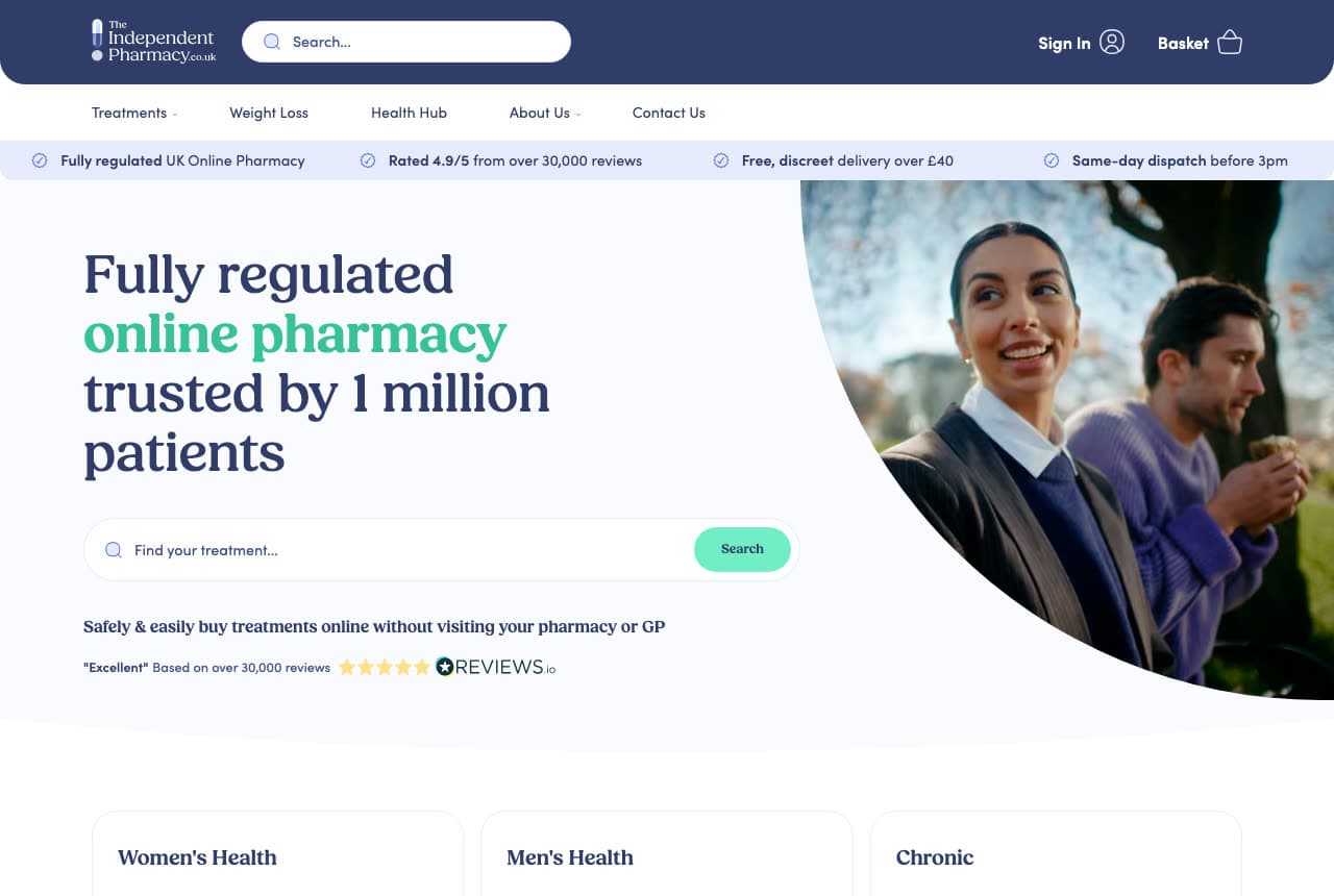
The Independent Pharmacy: 'Fully regulated online pharmacy trusted by 1 million patients' with four ticks and a treatment search

The Independent Pharmacy proves itself in a strip before the headline. The navy header sets the logo, a 'Search...' field, 'Sign In' and 'Basket'; a nav beneath runs Treatments, Weight Loss, Health Hub, About Us, Contact Us; and a pale strip carries four ticked claims — 'Fully regulated UK Online Pharmacy', 'Rated 4.9/5 from over 30,000 reviews', 'Free, discreet delivery over £40', 'Same-day dispatch before 3pm'. The hero, on white, sets the serif 'Fully regulated' / 'online pharmacy' / 'trusted by 1 million' / 'patients' with 'online pharmacy' in green, a rounded search field — 'Find your treatment...' with a mint 'Search' — the line 'Safely & easily buy treatments online without visiting your pharmacy or GP', and a review line: '"Excellent" Based on over 30,000 reviews' with five stars. On the right, a photograph cropped in a curve of a smiling woman and a man in a purple jumper outdoors. Three cards — Women's Health, Men's Health, Chronic — begin at the fold. The search field is the product, and 'without visiting your pharmacy or GP' is the promise. Clone the four-tick strip for any regulated online service.

Visit The Independent Pharmacy

Opens a similar Zarla design you can make yours.

Lumen Eye Care — Eye Care & Eyewear Template website design you can build with Zarla
Build this with Zarla
  • Eye Care & Eyewear Template
  • Clean

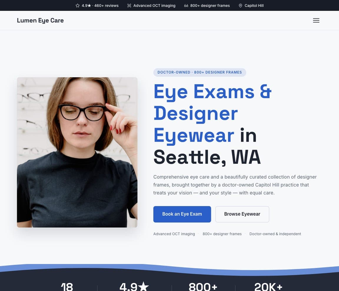
Lumen Eye Care: 'See Clearly. Look Incredible.' with 'Browse Eyewear' as the second button

Lumen Eye Care is the Zarla optometrist template, and it is the closest design in the catalog to an independent pharmacy: a clinic that is also a shop. A dark top strip carries '4.9★ · 460+ reviews', 'Advanced OCT imaging', '800+ designer frames' and 'Capitol Hill'; the white header is the wordmark and a hamburger. The pale-grey hero puts a rounded photograph on the left — a woman in a black tee adjusting black-framed glasses — and the copy on the right: a blue pill, 'EYE CARE & DESIGNER EYEWEAR · SEATTLE', the heavy two-sentence headline 'See Clearly. Look Incredible.', and a paragraph about 'a doctor-owned Capitol Hill practice that treats your vision — and your style — with equal care.' A blue 'Book an Eye Exam' sits beside an outline 'Browse Eyewear', and a small grey line repeats the proof: 'Advanced OCT imaging · 800+ designer frames · Doctor-owned & independent'. The two buttons are the pharmacy pattern exactly — one for the care, one for the shelves. Clone it and make the second button 'Shop the Front of Store'.

See this template
Cornerstone Family Medicine — Family Clinic Template website design you can build with Zarla
Build this with Zarla
  • Family Clinic Template
  • Reassuring

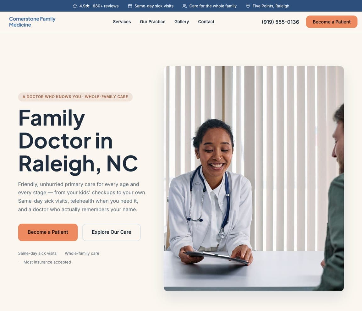
Cornerstone Family Medicine: 'A Family Doctor Who Knows You' beside a smiling doctor with a stethoscope

Cornerstone Family Medicine is the Zarla family-doctor template — the neighbourhood clinic a community pharmacy sits next to. A blue top strip carries '4.9★ · 680+ reviews', 'Same-day sick visits', 'Care for the whole family' and 'Five Points, Raleigh'. The white header sets the blue wordmark against Services, Our Practice, Gallery, Contact, the phone and an orange 'Become a Patient'. The hero opens with a peach pill, 'PRIMARY CARE FOR THE WHOLE FAMILY · RALEIGH', the heavy 'A Family Doctor Who Knows You', and a paragraph that ends with the line a pharmacist could borrow word for word — 'and a doctor who actually remembers your name.' An orange 'Become a Patient' and an outline 'Explore Our Care' sit at the fold, and on the right a rounded photograph shows a smiling doctor in a white coat with a stethoscope. 'Same-day sick visits' in the strip is the pharmacy's 'same-day refills'. Clone it for a pharmacy that wants to be known by its pharmacist.

See this template
Ivory & Oak Dental Studio — Modern Clinic Template website design you can build with Zarla
Build this with Zarla
  • Modern Clinic Template
  • Polished

Ivory & Oak Dental Studio: 'A Smile You'll Love Showing Off' beside a 'Request an Appointment' card

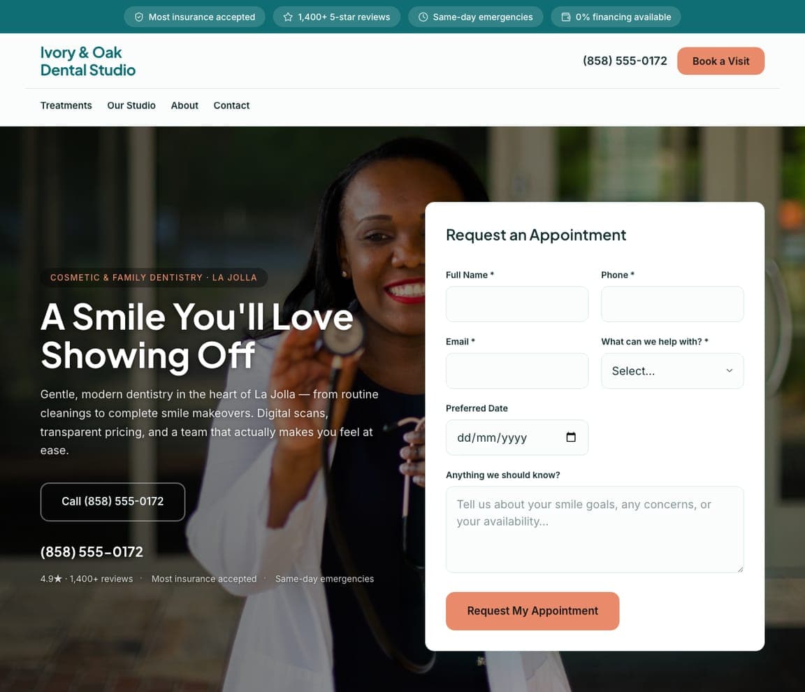
Ivory & Oak Dental Studio is the Zarla modern-dental template, and its form-in-the-hero is the layout a pharmacy needs for refills and transfers. A teal top strip carries 'Most insurance accepted', '1,400+ 5-star reviews', 'Same-day emergencies' and '0% financing available'. The white header stacks the teal wordmark, the phone and a coral 'Book a Visit' over a nav row of Treatments, Our Studio, About, Contact. The hero is a dark photograph of a smiling woman holding a stethoscope; on the left, a dark pill, 'COSMETIC & FAMILY DENTISTRY · LA JOLLA', the white heavy 'A Smile You'll Love Showing Off', a paragraph promising 'Digital scans, transparent pricing, and a team that actually makes you feel at ease', and an outline 'Call (858) 555-0172'. On the right, a white card, 'Request an Appointment', asks for Full Name, Phone, Email, 'What can we help with?', a Preferred Date and 'Anything we should know?'. Rename the card 'Transfer a Prescription' and it is a pharmacy homepage. Clone it if your customers arrive with a task.

See this template

Frequently asked

What should a pharmacy website show first?

The three tasks and the years. Local Health's hero is 'your pharmacy, your way. serving communities big & small.' with three outlined buttons — 'transfer your meds', 'refill your meds', 'find a location'; Capsule says 'Meds made easy' and asks for a zip code under the hero; Grubb's Pharmacy puts 'Since 1867' in its seal and 'the oldest community pharmacy in the District' in its first paragraph; Bremo writes 'YOUR LOCALLY OWNED RICHMOND VA COMPOUNDING PHARMACY SINCE 1976' under its name.

How should a pharmacy handle refills and transfers on the homepage?

As buttons in the first screen. Local Health names them exactly — 'transfer your meds', 'refill your meds'; Koshland Pharm puts 'REFILL RX' next to the logo; Grubb's has 'Refills' in the nav; Scripx offers 'Start An Online Visit' beside 'Shop Our Supplements'; The Independent Pharmacy replaces both with a 'Find your treatment...' search field. Skippack Pharmacy takes the plainest route — a contact block at the top with the pharmacy line, the clinic line, a text number, the address and the hours.

Should a pharmacy website show the pharmacist?

Yes — it is the trust signal. Koshland Pharm photographs its owner at the counter in a vest and tie, captioned 'Peter Koshland, PharmD', beside 'When It Comes To Your Health, We Don't Make Compromises.'; Skippack shows a staff member from behind, thumbs pointing at her own back, in a tee that reads 'SKIPPACK PHARMACY HAS MY BACK'; Grubb's shows its staff posed outside the 1867 storefront. The online pharmacies draw theirs — Alto's illustrated pharmacists in white coats — or show a customer instead, as The Independent Pharmacy does.

How do compounding pharmacies write for doctors and patients at once?

By splitting the nav. Koshland Pharm's nav is PATIENTS, DOCTORS, ABOUT US, CONTACT; Scripx puts two pills — 'Providers' and 'Patients' — at the right of its nav and offers 'Provider Services' and 'Compounding Specialties'; Alto's header carries 'For Providers' and 'For Partners'; Capsule's nav includes 'FOR DOCTORS'. Bremo's top line says 'Long Term Care Pharmacy' for the institutional buyer while the hero speaks to neighbours.

Can a pharmacy website be illustrated instead of photographed?

Three here are, and they are the most memorable. Bremo Pharmacy draws its block — a cafe, the green 'BREMO PHARMACY' storefront, an antiques shop, a lamppost — with a biplane towing a 'SHOP LOCAL!' banner overhead; Alto draws a woman checking her phone, two pharmacists and a medication screen under 'Pharmacy reimagined'; Capsule uses a yellow arch, a red triangle and a slate half-circle as pure shapes beside 'Meds made easy'. An illustration lets a pharmacy look friendly without a stock photo of pills.

Can I build a pharmacy website like these with Zarla?

Yes. Every real site here has a 'Build a site like this' button that opens the closest Zarla template in the editor — Cornerstone Family Medicine for a friendly community-practice page with a rounded portrait, in the Grubb's, Bremo and Local Health spirit; Lumen Eye Care for a photo-beside-copy layout with a proof line like Koshland and Alto; Ivory & Oak Dental Studio for a dark hero with a request card in the Capsule and Scripx vein — and you swap in your pharmacist, your years and your refill and transfer links. Three task buttons, the founding year and a face at the counter is the Local Health pattern, and it takes about 30 seconds.

You've seen what works. Now make it yours.

Describe your business and Zarla designs a complete, professional website in about 30 seconds — built to convert, just like the ones above.

Free to build and preview · no credit card · publish to your own domain on Premium