ambervickery.com
- Brand & Family Photography
- Warm
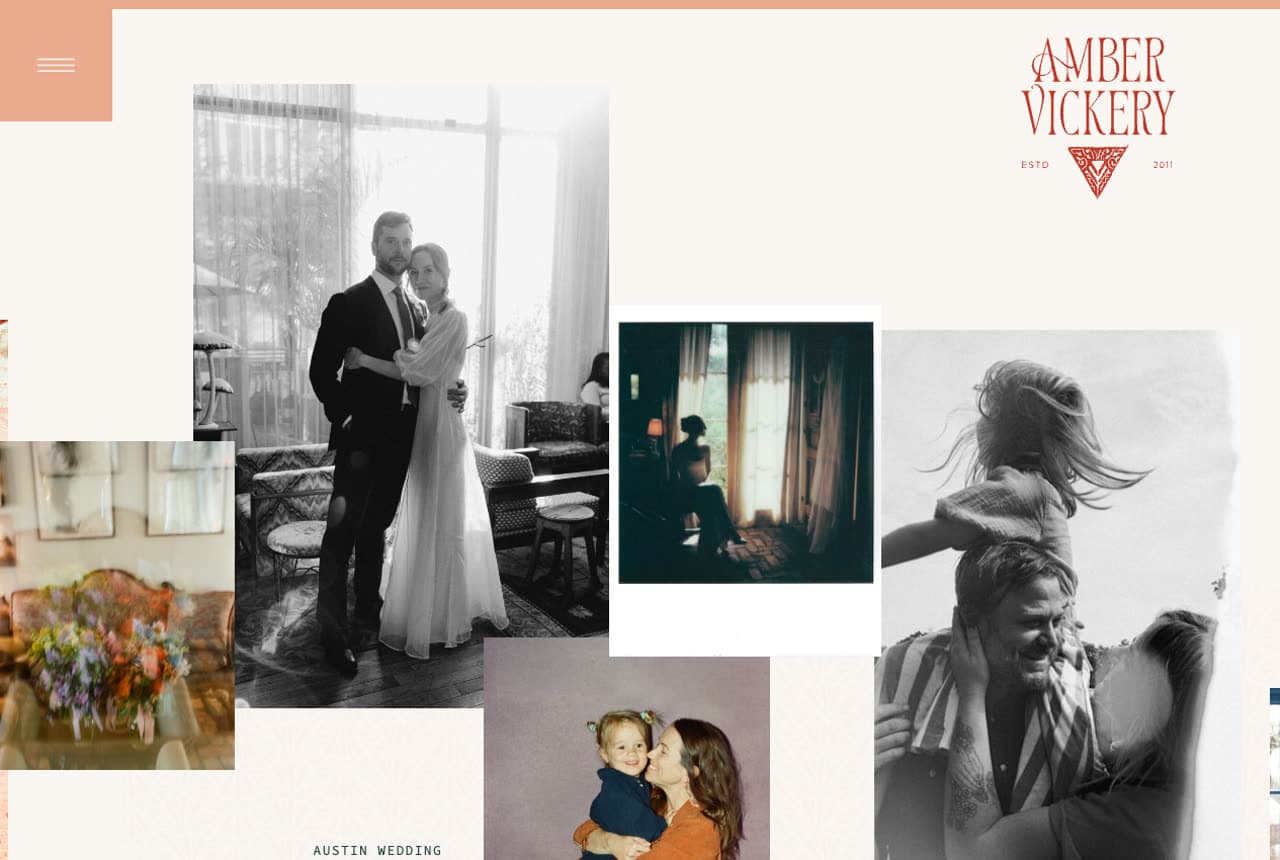
Amber Vickery Photography: Color and collage that signal 'not your average photographer'
Amber Vickery throws out the minimalist-photographer playbook and it works. A scattered photo collage hero mixes black-and-white with color, set against an unusual palette of cream, coral-terracotta, and dark teal that instantly reads 'artful and a little bohemian.' The positioning line — 'capturing vibrantly soulful images for events, brands, and families' — and an 'I do this for:' section with three plain service cards make the range obvious without diluting the personality. Personal touches (mama to River, dog mom to Scout) turn the about page into a reason to like her. When every competitor looks the same, a distinctive palette and a real personality are the differentiator — this site leans all the way in.
Opens a similar Zarla design you can make yours.
wildivy.com.au
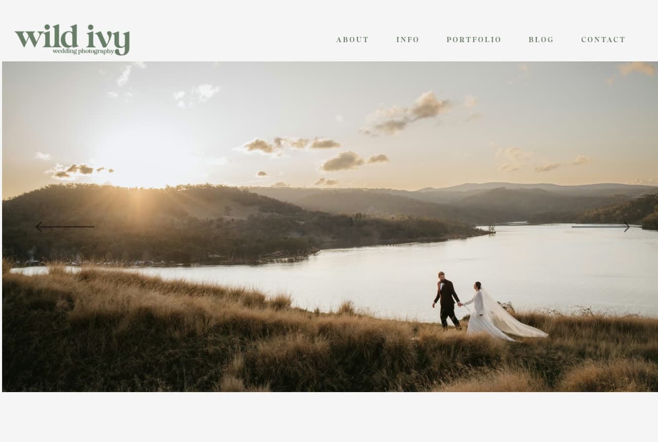
Wild Ivy Photography: Niche-down copy that names its ideal client
Wild Ivy knows exactly who it's for: 'natural, fun-filled wedding photography for laid-back lovers.' That one line does more targeting than a whole services page — relaxed couples self-select in, stiff formal ones self-select out. A full-screen golden-hour landscape carousel sets the warm, outdoorsy tone, a sage-green palette reinforces the organic feel, and a casual 'Hi, I'm Tim' intro keeps it human. The long-form manifesto about a candid, unposed approach reassures the exact couples who'd hate being directed all day. The lesson: naming your ideal client in the hero is more powerful than claiming to serve everyone — it makes the right person feel seen instantly.
Opens a similar Zarla design you can make yours.
kirstencox.com
- Event Photography
- Professional
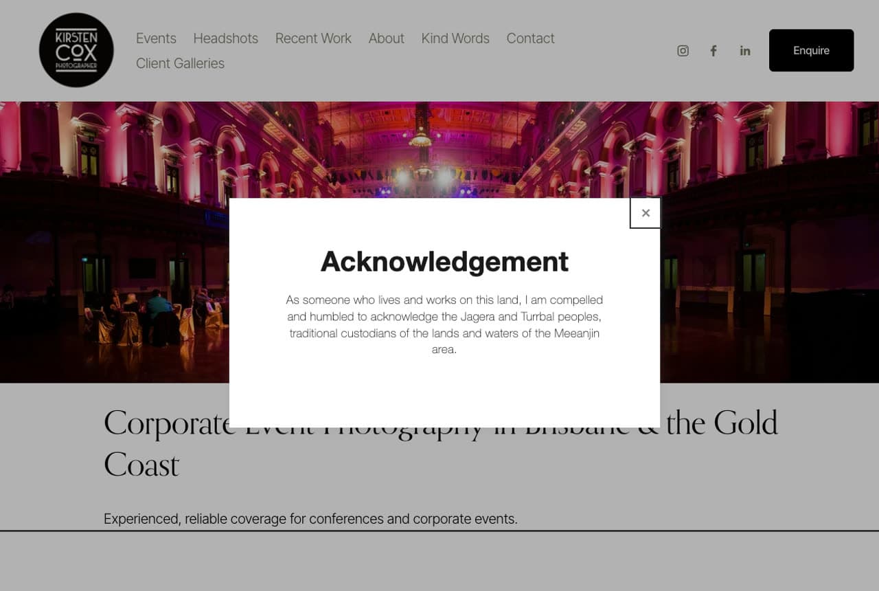
Kirsten Cox: B2B clarity for a different kind of photo client
Kirsten Cox shows what a photographer's site looks like when the client is a corporate event planner, not a couple. The design goes clean black-and-white minimal, the hero is a single full-width ballroom shot, and the copy is short and logistical — 'Trusted Corporate Event Photography' with a 'Check Date Availability' CTA that speaks to a planner's first question. There's no romance, because the buyer doesn't want romance; they want reliability and a confirmed date. A thoughtful Acknowledgement of Country on load signals professionalism for the Australian market. It's a clean lesson in matching tone to buyer: the same craft, sold completely differently because the decision-maker is different.
Opens a similar Zarla design you can make yours.
ktmerry.com
- Wedding Photography
- Luxury
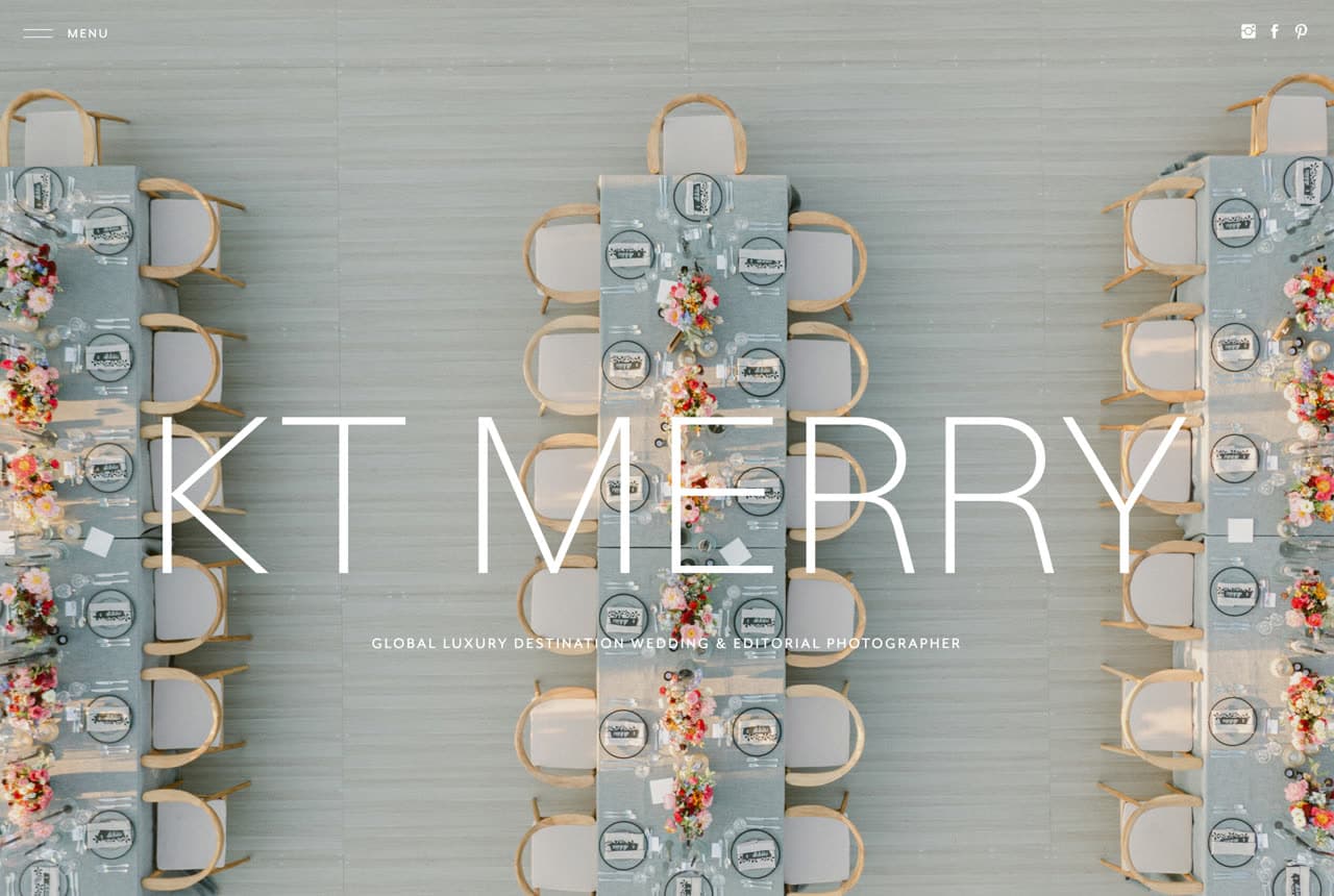
KT Merry: Luxury, stated in one bold wordmark
KT Merry positions herself at the very top of the wedding market, and the design makes the case instantly. An enormous, elegant 'KT MERRY' wordmark laid over a gorgeous overhead shot of a flower-laden reception table, with the single line 'Global Luxury Destination Wedding & Editorial Photographer.' There's no clutter, no menu of packages — just one stunning image and a confident name, which is exactly how a luxury brand behaves. The restraint signals that if you have to ask, you're not the client, and the editorial quality of that first frame does more selling than any testimonial could. The lesson for high-end photographers is that confidence is shown through restraint: lead with a single, magazine-grade image and let the work — and a bold, quiet identity — establish the price tier before a word of copy.
Opens a similar Zarla design you can make yours.
lindenlambnewbornstudio.com
- Newborn Photography
- Gentle
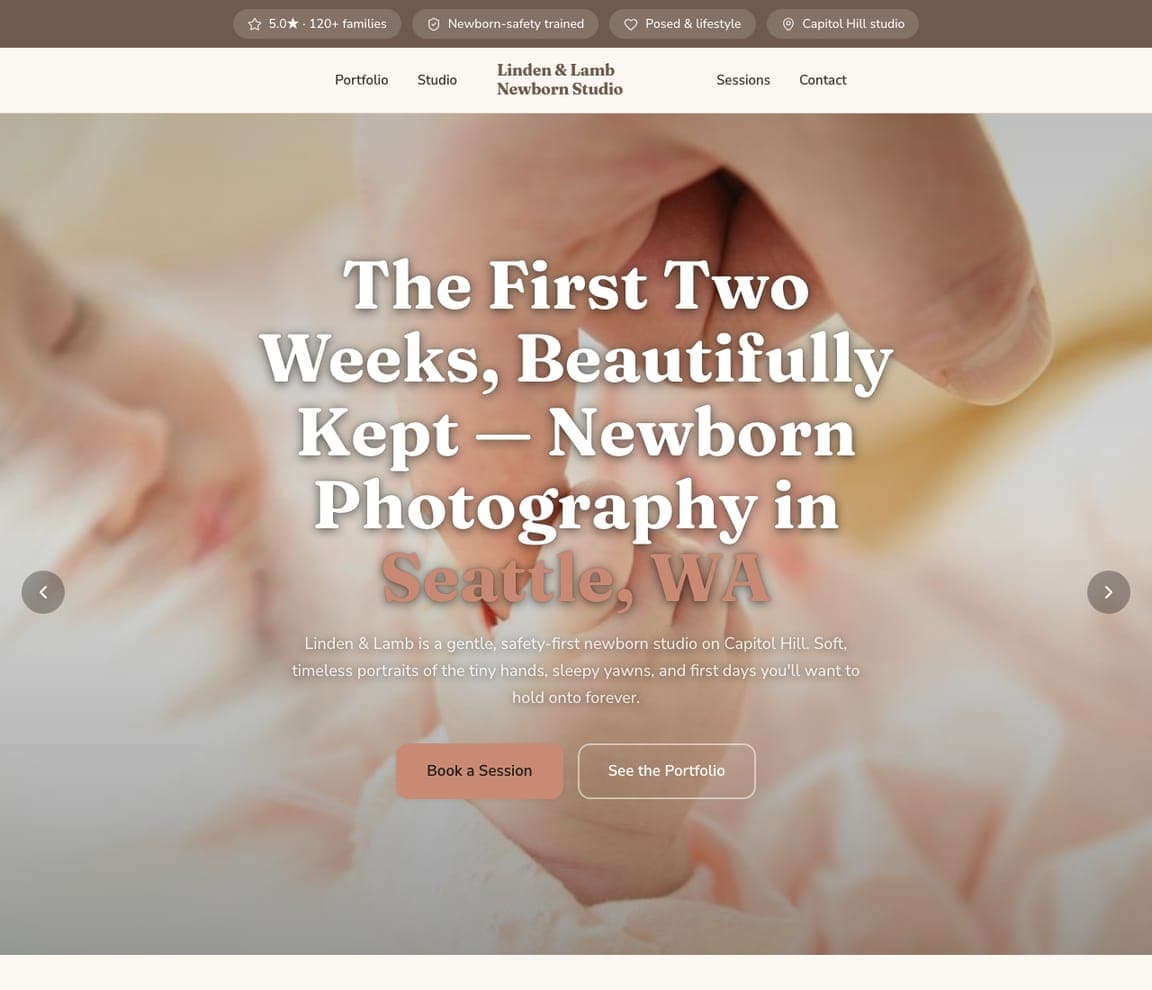
Linden & Lamb Newborn Studio: Design for a fragile, high-trust moment
Linden & Lamb Newborn Studio designs for the most emotional, safety-conscious client in photography: new parents. 'The First Two Weeks, Beautifully Kept — Newborn Photography in Seattle, WA' over a soft, warm photo of a sleeping newborn, with copy that reassures on the two things that matter — tenderness and safety: 'a gentle, safety-first newborn studio, soft timeless portraits of the tiny hands, sleepy yawns, and first days you'll want to hold onto forever.' The trust strip (120+ families, newborn-safety trained) directly answers the parent's anxiety. The lesson is designing for a fragile, high-trust moment: newborn clients are exhausted and protective, so the template leads with gentleness, safety credentials, and keepsake emotion rather than technique. Describe your studio and it's yours in about a minute.
fastbreakstudio.com
- Sports Photography
- Dynamic
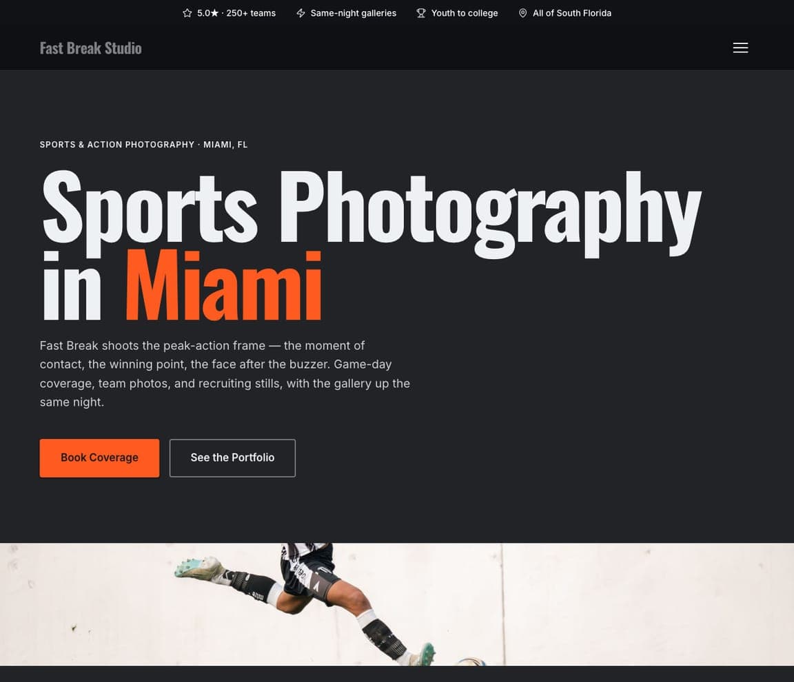
Fast Break Studio: Match the design's energy to the subject
Fast Break Studio matches its design to the energy of what it shoots. 'Sports Photography in Miami' in bold, urgent type with an orange accent over a dark, high-motion action frame — the whole hero feels fast. The copy is all about the decisive moment and speed of delivery: 'the moment of contact, the winning point, the face after the buzzer — game-day coverage, team photos, and recruiting stills, with the gallery up the same night.' Same-night galleries and 'youth to college' signal a business tuned to sports' real deadlines (recruiting, social sharing). The lesson is matching the design's energy to the subject: a sports photographer selling on dynamism should look dynamic — bold type, dark palette, an action hero — and lead with the two things athletes and parents want: the epic frame and a fast turnaround. Point it at your studio and publish it free.
marigoldvinephotography.com
- Wedding Photography
- Luxury
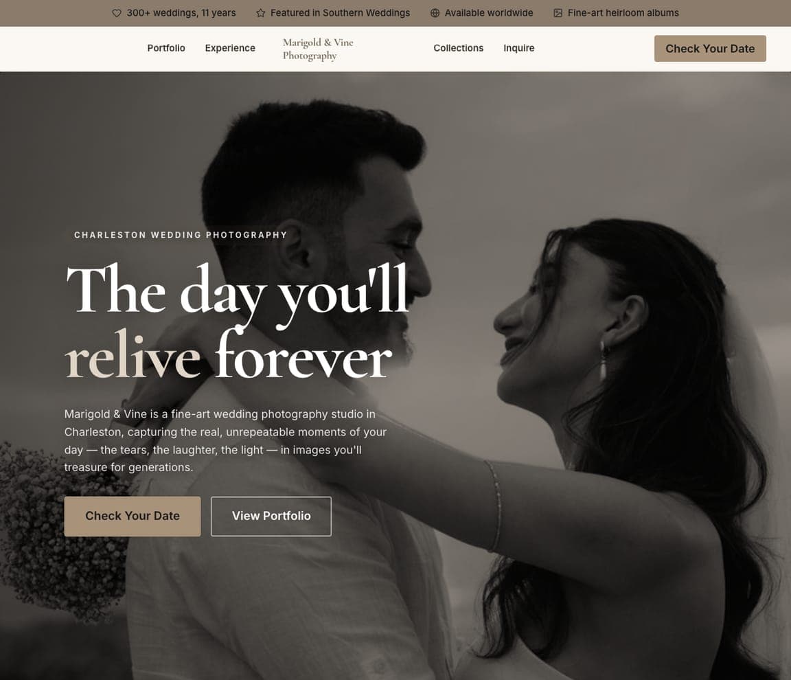
Marigold & Vine Photography: A collage hero that feels like the first album spread
Marigold & Vine arranges its hero as an image collage — several frames layered like the opening spread of a wedding album — over a soft taupe-and-ivory palette. It tells the emotional story (your day, remembered forever) before a single word, and a full slideshow further down lets couples picture their own gallery. The muted, warm neutrals feel timeless rather than trendy. For weddings, feeling beats information, and this design leads with feeling — the warmer, more romantic counterpart to the editorial restraint at the top of this page, and exactly what makes a couple enquire.
fetchframestudio.com
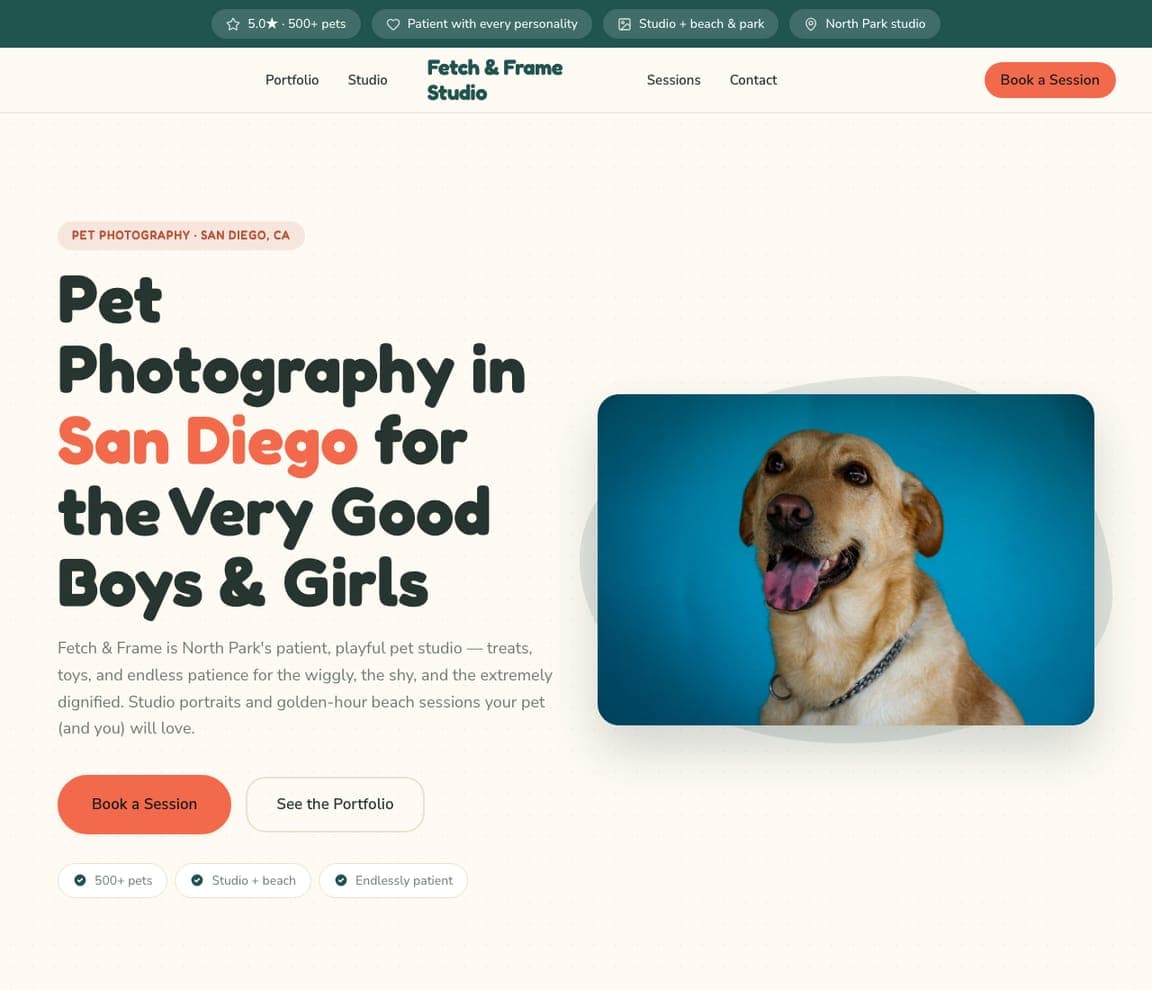
Fetch & Frame Studio: Tone as the differentiator for an emotional niche
Fetch & Frame Studio leans all the way into the joy of its niche, and that warmth is the whole pitch. 'Pet Photography in San Diego for the Very Good Boys & Girls' beside a delighted dog on a bright teal ground, with copy full of personality — 'treats, toys, and endless patience for the wiggly, the shy, and the extremely dignified.' It's playful without being unprofessional, and the reassurances a pet owner actually worries about (patient with every personality, studio + beach sessions) sit right up top. The lesson is that tone can be the differentiator: pet photography is an emotional, fun purchase, so a warm, playful, personality-rich site signals 'your anxious rescue will be in good hands and we'll actually enjoy this' far better than a stiff, generic portfolio would. Swap in your details and publish it free.
wildlightstudio.com
- Landscape Photography
- Scenic
Wildlight Studio: Monetize a passion niche, plainly
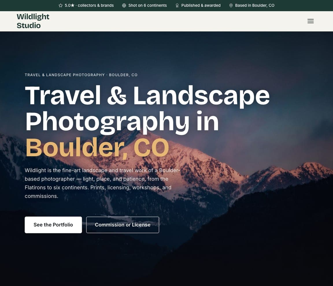
Wildlight Studio positions landscape work as fine art and commerce at once. 'Travel & Landscape Photography in Boulder, CO' over a moody, dramatic mountain photo, with copy that establishes both craft and range: 'light, place, and patience, from the Flatirons to six continents. Prints, licensing, workshops, and commissions.' That last line is the smart part — it names four distinct revenue streams, signaling a real business, not just a portfolio. The dark, atmospheric palette lets the scenery dominate. The lesson is monetizing a passion-driven niche: a landscape photographer's site should lead with breathtaking work (the emotional hook) but immediately clarify how you actually sell it — prints, licensing, commissions — so a collector, an art director, and a workshop student all instantly see their path. Point it at your studio and publish it free.
saltsilvereditions.com
- Fine Art Photography
- Gallery
Salt & Silver Editions: When you sell art, look like a gallery
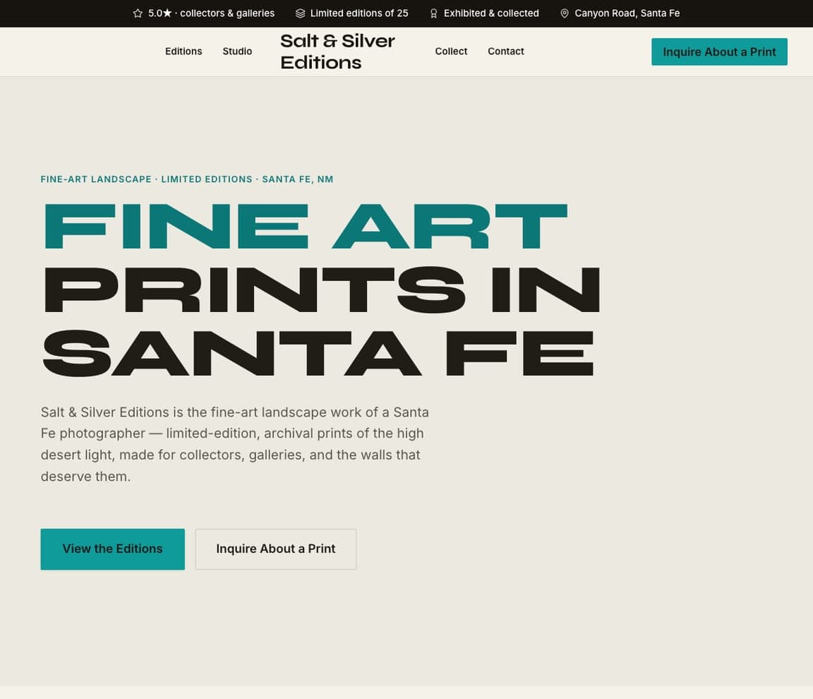
Salt & Silver Editions treats photography as fine art for collectors, and every choice signals the gallery, not the studio. 'FINE ART PRINTS IN SANTA FE' in huge, confident typography with a teal accent on a clean cream ground reads like an exhibition poster, and the copy speaks to collectors: 'limited-edition, archival prints of the high desert light, made for collectors, galleries, and the walls that deserve them.' 'Limited editions of 25' and 'exhibited & collected' establish scarcity and provenance — the currency of the art market. The lesson is positioning for a completely different buyer: a fine-art print collector isn't booking a session, they're acquiring an artwork, so the template leads with scarcity, archival quality, and gallery language rather than services and packages. When you sell art, look like a gallery. Swap in your details and publish it free.
maisonnoirstudio.com
- Fashion Photography
- Editorial
Maison Noir Studio: High-fashion positioning, in black and gold
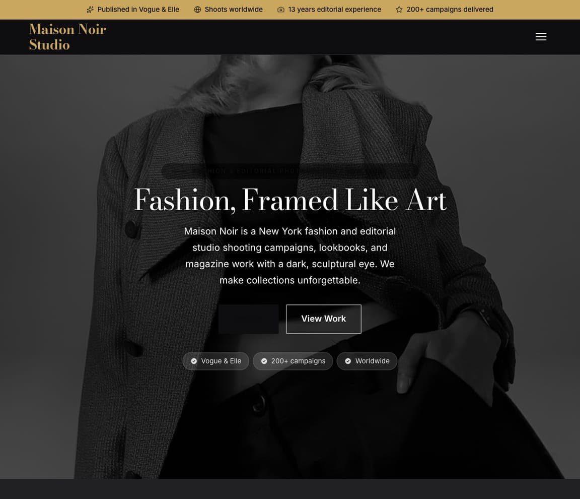
Maison Noir Studio pitches fashion and editorial work at the top of the market, and the design commits fully. 'Fashion, Framed Like Art' in cream serif over a near-black ground, with a dark, sculptural photo and copy built for art directors and brands: 'a New York fashion and editorial studio shooting campaigns, lookbooks, and magazine work with a dark, sculptural eye.' The proof is pure fashion-world currency — Published in Vogue & Elle, 200+ campaigns, shoots worldwide. The dark palette isn't just aesthetic; it signals the high-fashion tier and filters for premium commercial clients, not budget portraits. It's the template for a fashion or editorial photographer who sells to brands and magazines — lead with the marquee credits, go dark and sculptural, and let the restraint read as prestige. Point it at your studio and publish it free.
skywardstudio.com
- Aerial Photography
- Commercial
Skyward Studio: Lead with the license for a regulated service
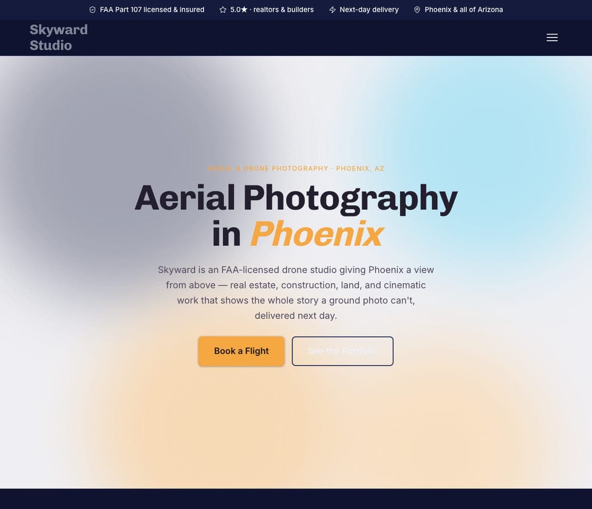
Skyward Studio sells a capability, not a style, and leads with the credential that unlocks it. 'Aerial Photography in Phoenix' over a soft sky-gradient, with the FAA-license reassurance front and center — 'an FAA-licensed drone studio giving Phoenix a view from above.' The copy names the concrete commercial uses (real estate, construction, land, cinematic) and the two things those buyers need: legal compliance and speed ('FAA Part 107 licensed & insured, next-day delivery'). The lesson is leading with the license for a regulated service: aerial and drone work is legally gated, so a commercial buyer's first question is 'are you licensed and insured?' — and the template answers it before anything else, then names the specific industries it serves. When your service requires credentials, make them the headline. Point it at your studio and publish it free.


