Inspiration · Physical Therapy

The Best Physical Therapy Website Examples, Explained

Looking for physical therapy website examples? These 8 are the best we could find — standout real physical therapy sites plus designs you can build with Zarla — and each comes with a breakdown of the specific design move that makes it work. Find a look you love and you can build a site in that exact style, free, in about 30 seconds.

Real sites + designs you can build with Zarla — free to build and preview, no credit card

What makes a great physical therapy website

The best physical therapy websites share a few moves: they earn trust fast, lead with strong visuals of the work, point to one clear action, and match the design to how their customers decide. Each example below calls out the specific choice worth stealing for your own physical therapy website.

RISE Physical Therapy website — Sports PT design example
Real site · San Diego, CA
  • Sports PT
  • Energetic
  • Red + lime

RISE Physical Therapy: Sports-brand energy for physical therapy

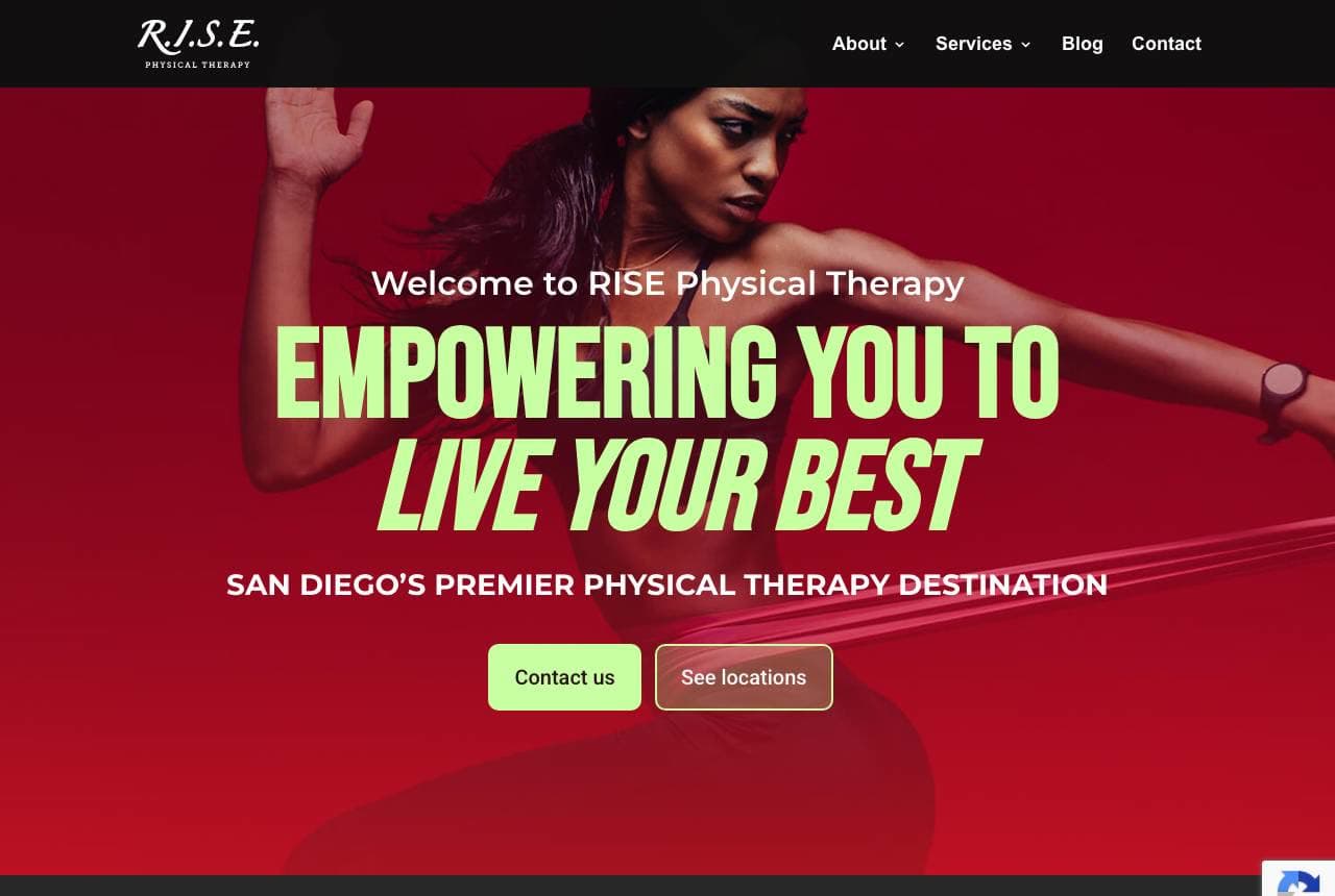
RISE Physical Therapy borrows the visual energy of a sportswear brand: 'Empowering You to Live Your Best' in bold, athletic type over a dynamic photo of a runner on a deep-red background, with 'San Diego's Premier Physical Therapy Destination.' Where most PT clinics look clinical and cautious, RISE looks motivating and performance-focused, which appeals to the active-injury patient (runners, athletes, weekend warriors) who wants to get back to doing what they love, not just 'manage pain.' The copy reinforces a 1-on-1 model ('all of our sessions are spent 1-on-1 with a provider… an unrivaled level of care'). The bold, energetic design signals a modern, results-driven practice rather than a sleepy medical office. For a physio clinic serving active patients, matching the design's energy to the patient's goal (return to performance) — and promising real one-on-one time — is a strong, differentiating position.

  • Sportswear-brand energy appeals to the active-injury patient
  • 'Empowering you to live your best' sells return-to-performance
  • Promises 1-on-1 sessions — real care time, not a sleepy office

Steal this: Match your design energy to the patient's actual goal (return to sport), not the medical category. Motivation beats clinical caution.

In Touch NYC website — 1-on-1 PT design example
Real site · New York, NY
  • 1-on-1 PT
  • Reassuring
  • Green + white

In Touch NYC: One-on-one care and the insurance answer

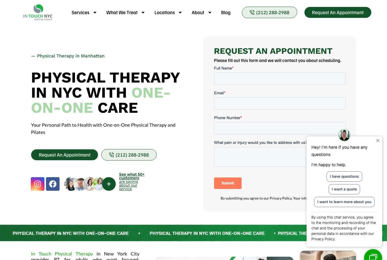
In Touch NYC Physical Therapy leads with its differentiator and removes the biggest friction at once: 'Physical Therapy in NYC with One-on-One Care' beside a Request an Appointment form open right in the hero, and — crucially — an 'Insurance Accepted' section listing the major providers (Blue Cross, Aetna, Cigna, UnitedHealthcare). For medical services, 'do you take my insurance?' is often the very first question, and answering it up front (with recognizable logos) removes a major barrier before the patient even calls. The in-hero appointment form shortens the path to booking, and the 1-on-1 positioning differentiates from mill-style clinics that hand patients to aides. A video and social proof round it out. For any healthcare practice, surfacing accepted insurance prominently — not buried on an FAQ — directly answers the patient's real first question and removes friction from the booking.

  • 'Insurance Accepted' + provider logos answer the real first question
  • Appointment form in the hero shortens the path to booking
  • 1-on-1 care differentiates from aide-driven mill clinics

Steal this: Surface accepted insurance (with logos) in the hero, not an FAQ. 'Do you take my insurance?' is the patient's first question — answer it.

Physiosolutions website — Established Clinic design example
Real site · London, UK
  • Established Clinic
  • Condition-Led
  • Teal + white

Physiosolutions: Route patients by their pain

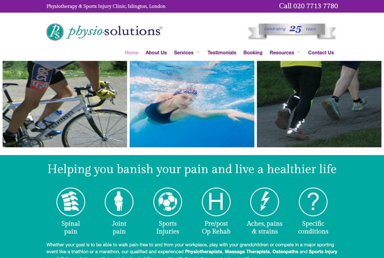
Physiosolutions (an established Islington clinic, '25 years') organizes its homepage around the patient's actual problem: 'Helping You Banish Your Pain and Live a Healthier Life,' followed by a row of condition icons — Spinal Pain, Joint Pain, Sports Injuries, Pre/Post-Op Rehab, Aches & Strains, Specific Conditions. Letting a patient click straight to their specific issue is smart medical UX; someone with a bad back doesn't care about the full service list, they want to know 'can you fix THIS?' Two clear paths ('Talk to a Physiotherapist' free 15-min call / 'Book Online') meet different readiness levels, and a row of named, credentialed therapists with photos builds trust. The 25-year mark anchors credibility. For a physio or medical clinic, condition-based navigation (route by the patient's symptom) plus visible practitioner credentials is exactly how you convert the pain-driven searcher.

  • Condition icons route patients to their exact problem
  • Free 15-min call + book-online meet different readiness levels
  • Named, credentialed therapists with photos build trust

Steal this: Navigate by the patient's symptom (spinal / joint / sports), not your service list. The pain-driven searcher wants 'can you fix THIS?'

Benchmark Physiotherapy website — Results-Driven Physio design example
Real site · Sydney, AU
  • Results-Driven Physio
  • Empathetic
  • Charcoal + teal

Benchmark Physiotherapy: Results-driven, and empathetic to failure

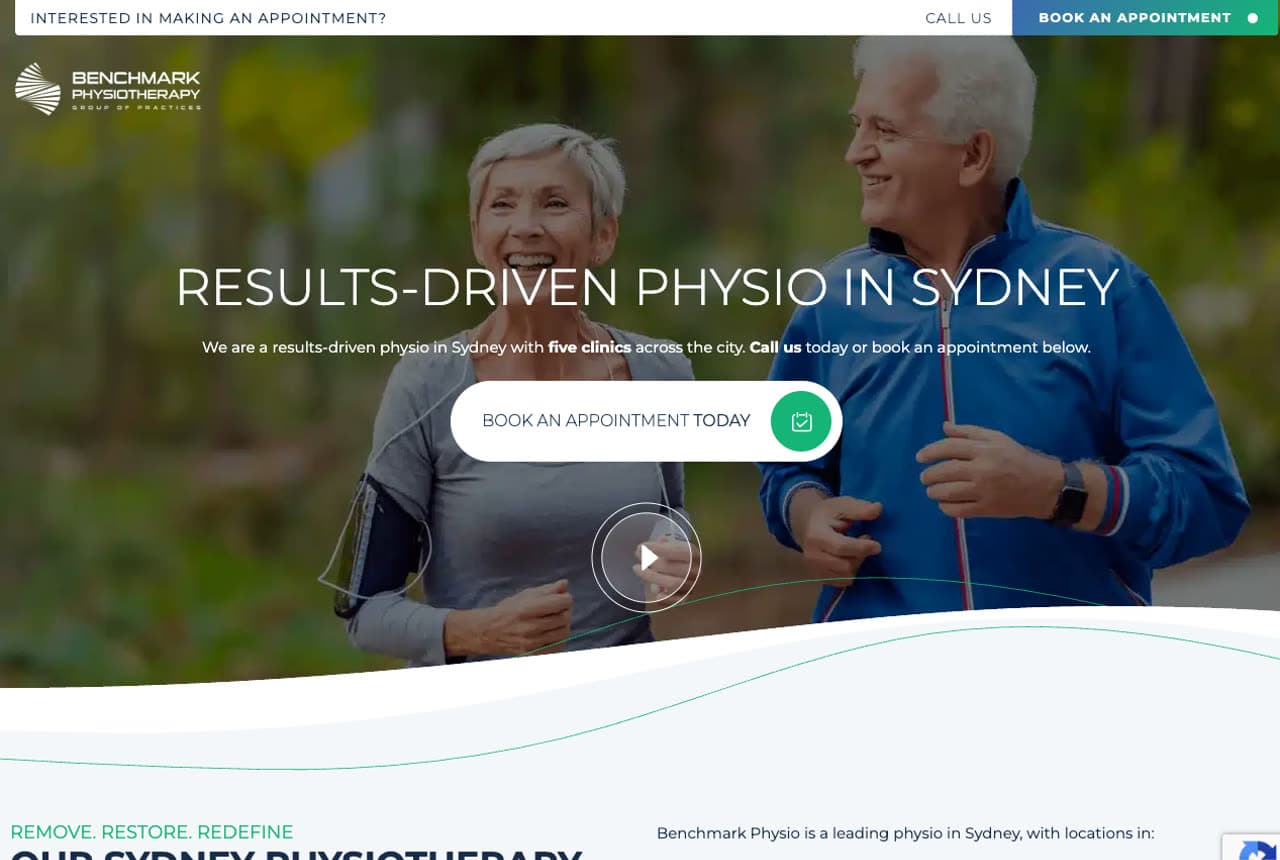
Benchmark Physiotherapy leads with outcomes and speaks to the frustrated patient: 'Results-Driven Physio in Sydney' with 'five clinics across the city' and a book-now CTA, then copy that names the real emotional state — 'if you're frustrated because you've tried other treatments without success, or you're searching for a solution beyond the standard prescription of rest and painkillers, we can help.' That empathy for the patient who's been failed by other treatments is powerful; chronic-pain sufferers often arrive discouraged, and acknowledging that (rather than just listing services) builds instant rapport. 'Remove, Restore, Redefine' frames a clear methodology, the five-clinic footprint signals scale and convenience, and warm photography of real patients keeps it human. For a physio clinic, pairing a results-focused promise with genuine empathy for the patient's frustration — 'we help when other treatments haven't' — converts the discouraged, high-intent patient.

  • Names the frustrated-by-other-treatments patient's real state
  • 'Results-driven' + a named method (Remove/Restore/Redefine)
  • Five-clinic footprint signals scale and convenience
Stadium Sports Physiotherapy website — Sports Physio design example
Real site · Sydney, AU
  • Sports Physio
  • Specialist
  • White + green

Stadium Sports Physiotherapy: Treat the cause, and no referral needed

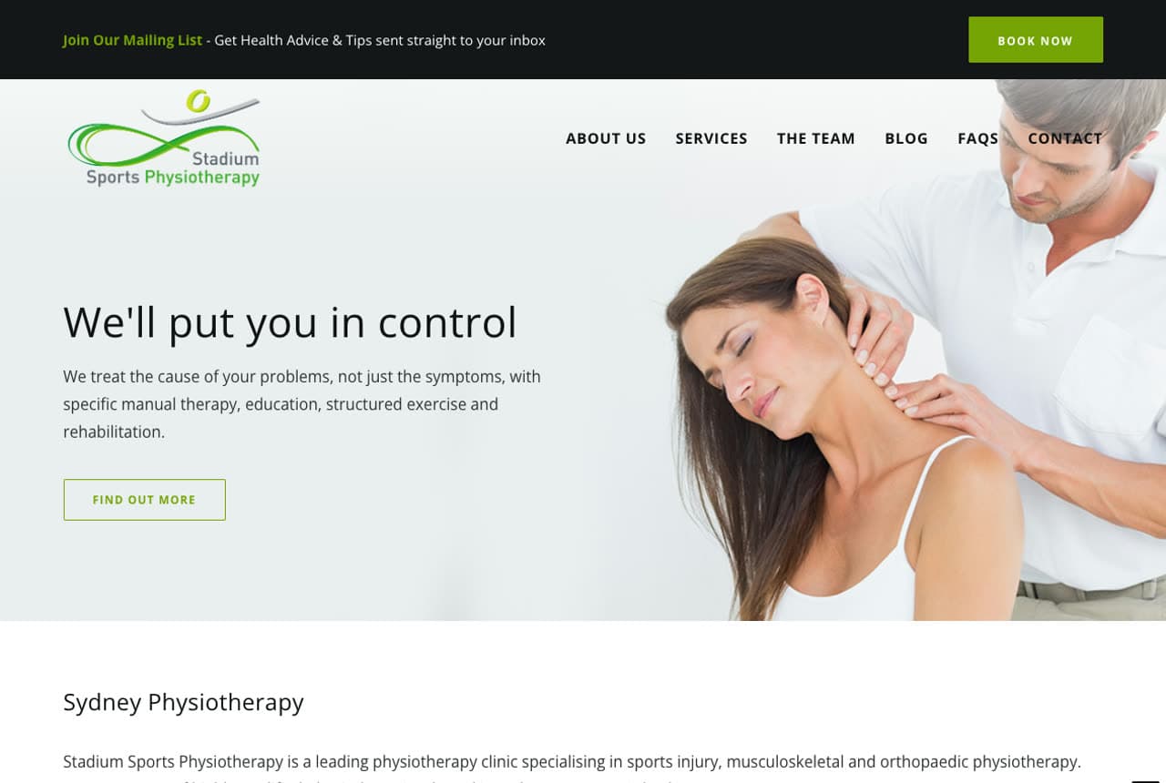
Stadium Sports Physiotherapy leads with a philosophy and a friction-remover: 'We'll Put You in Control — we treat the cause of your problems, not just the symptoms, with specific manual therapy, education, structured exercise and rehabilitation.' Three columns then reinforce it: Since 2008 (credibility), Holistic Approach (the cause-not-symptoms method), and — the standout — 'No Referral Necessary' ('you don't need a referral for an appointment… get the treatment you need without interruption to work, sport or family'). That last point removes a real barrier: many patients wrongly assume they need a doctor's referral for physio, so stating plainly that they don't lowers the hurdle to booking. The clinical-but-warm design and specialist sports-medicine positioning (based at a sports medicine centre) target the athlete and active patient. Lead with your treatment philosophy, and proactively remove the barriers (like a referral) patients assume exist.

  • 'No referral necessary' removes a barrier patients assume exists
  • 'Treat the cause, not symptoms' states a clear philosophy
  • Sports-medicine-centre basing targets the athlete patient
Chicago Physical Therapists website — Boutique PT design example
Real site · Chicago, IL
  • Boutique PT
  • Calm
  • Warm + minimal

Chicago Physical Therapists: Boutique calm and a signature offering

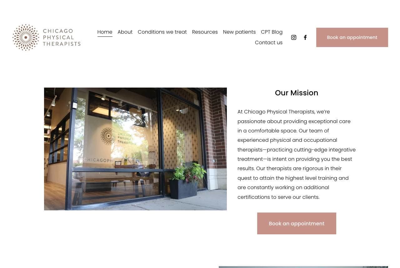
Chicago Physical Therapists takes a calm, boutique approach: a clean, minimal design, a photo of its welcoming clinic space, and an 'Our Mission' focused on 'exceptional care in a comfortable space… cutting-edge integrative treatment.' The standout is a specific, ownable service — 'Run Clinics' with 'Video Gait Analysis, an individualized assessment, and exercises tailored to fit your needs' — a signature offering that both differentiates the practice and captures the runner niche (a specific, motivated patient group). Naming and featuring a distinctive service (gait analysis for runners) rather than a generic service list gives the clinic something to be known for and a hook for a targeted audience. The understated, spa-like calm of the design suits patients who want a considered, unhurried care experience over a busy medical mill. For a physio practice, a named signature program plus a calm, boutique aesthetic attracts the discerning patient.

  • 'Run Clinics' with gait analysis — a signature, ownable service
  • Boutique, spa-like calm attracts the discerning patient
  • A named program captures a specific niche (runners)
Adaptive Chiropractic website — Chiropractic design example
Real site · Melbourne, AU
  • Chiropractic
  • Trustworthy

Adaptive Chiropractic: The team, up front, for a hands-on trade

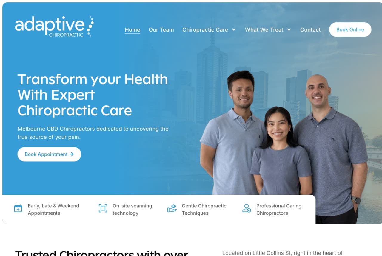
Adaptive Chiropractic (Melbourne CBD) leads with the thing that matters most for hands-on care — the practitioners themselves: 'Transform Your Health with Expert Chiropractic Care' beside a warm photo of the actual chiropractor team, with '25 years of combined experience' and 'Meet the Experts Behind Your Care' below. For a physical, hands-on treatment where a stranger manipulates your spine, seeing the real, approachable, credentialed people who'll treat you is deeply reassuring — trust in the individual practitioner is the whole decision. A benefit row (Early/Late/Weekend Appointments, On-Site Scanning, Gentle Techniques, Professional Caring Chiropractors) answers practical concerns, and 'Book Online' keeps conversion easy. The bright, warm blue design keeps it inviting rather than clinical. For any hands-on health practice, putting the real team front and centre — with faces, names and experience — is what converts the patient who's deciding whether to trust you with their body.

Wynhurst Physical Therapy — Physical Therapy website design you can build with Zarla
Build this with Zarla
  • Physical Therapy
  • Clinical-Warm

Wynhurst Physical Therapy: Recover faster, in your own city

Wynhurst Physical Therapy is Zarla's physical therapy template, and its proof-strip hero lands the promise this category runs on: 'Recover Faster: Physical Therapy in Portland, OR' — the outcome every patient wants, with the service and the city right where Google and the visitor both look — plus trust markers on first paint, in a navy-and-teal palette that reads clinical-but-warm (medical trust without the cold). It borrows the right instincts from this gallery — sell the recovery outcome, front-load credibility, keep booking easy — pre-built. The structure carries services (sports rehab, manual therapy, conditions treated), an about/team section (the practitioner trust the reals all lead with), and a book-appointment CTA. The clean, professional palette photographs well beside real clinic imagery. Swap in your own team and services and it's a credible, trustworthy PT site in about 30 seconds — no photographer or designer required. The register a patient in pain needs to trust you with their recovery.

See this template

Frequently asked

Where can I find good physical therapy website examples?

Right here — this page curates physical therapy website examples two ways: standout real businesses (each linked, so you can explore the live site) and professionally designed Zarla templates you can clone and make your own. Every example comes with a note on why the design works — trust signals, layout, calls to action — so you can copy the move, not just the look.

What makes a good physical therapy website?

A good physical therapy website earns trust in the first few seconds, leads with strong visuals of the work, gives visitors one obvious action, and loads fast on a phone. Every design below leads with proof and a single clear call to action rather than a wall of text.

How much does a physical therapy website cost?

A custom physical therapy website from a designer typically runs into the thousands up front, and template builders charge roughly $16–$30 per month. An AI builder generates a complete, editable design for free and only charges (on the Premium plan) when you publish to your own domain — so you can build and preview before spending anything.

Do I need a designer to build a physical therapy website?

No. Several designs on this page were generated by Zarla and are fully editable — you describe your business and get a complete, professionally designed site in about 30 seconds, then refine it by chatting. Building and previewing is free; publishing to your own domain needs the Premium plan.

What pages does a physical therapy website need?

Most physical therapy businesses need just a few: a home page that proves trust and points to one clear action, an about page that puts a face to the business, a services or work page that shows what you do, and a contact page with a form and a phone number. Local businesses also benefit from location or service-area pages that help them show up in nearby searches.

How do I get more customers from my physical therapy website?

Lead with proof in the first few seconds (reviews, real photos, results), make one action obvious on every screen (call, book, or enquire), and keep it fast on mobile — most visitors arrive on a phone. The designs above each do this differently, but they all earn trust early and remove friction from the next step.

You've seen what works. Now make it yours.

Describe your business and Zarla designs a complete, professional website in about 30 seconds — built to convert, just like the ones above.

Free to build and preview · no credit card · publish to your own domain on Premium