trustinsoda.com
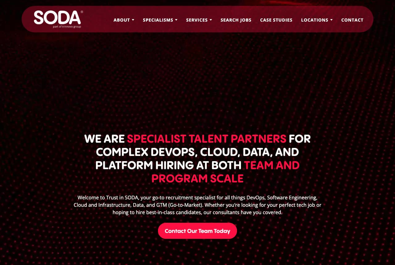
Trust in SODA: Red-accented capitals on a dotted black field
Trust in SODA looks like the technology it recruits for: a black field with a red dot-matrix gradient rising from the bottom, a rounded red nav bar, and a headline in white capitals with the key phrases in red — 'WE ARE SPECIALIST TALENT PARTNERS FOR COMPLEX DEVOPS, CLOUD, DATA, AND PLATFORM HIRING AT BOTH TEAM AND PROGRAM SCALE'. The paragraph names the disciplines again (DevOps, software engineering, cloud and infrastructure, data, go-to-market) and speaks to both sides ('your perfect tech job… best-in-class candidates'), and one red pill, 'Contact Our Team Today', closes the screen. The nav puts 'SEARCH JOBS' and 'CASE STUDIES' side by side. Trust in SODA shows a tech recruiter how to signal fluency through the design itself — dark, dense, precise — so the disciplines in the headline feel native rather than borrowed.
Opens a similar Zarla design you can make yours.
zebrapeople.com
- Digital Recruiter
- Friendly
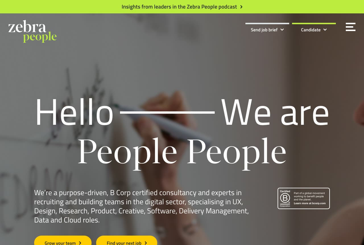
Zebra People: 'Hello — We are People People' over a whiteboard
Zebra People greets before it sells: over a soft photograph of a hand writing on a whiteboard, the headline reads 'Hello ——— We are / People People' — a light sans for the first line, a serif for the second — and the paragraph beneath says exactly what kind of people ('a purpose-driven, B Corp certified consultancy… recruiting and building teams in the digital sector, specialising in UX, Design, Research, Product, Creative, Software, Delivery Management, Data and Cloud roles'). A Certified B Corporation badge sits beside the copy, two yellow buttons split the audience ('Grow your team ›', 'Find your next job ›'), and a lime bar above the nav points to the firm's podcast. Below that bar, the lime-green 'people' in the wordmark and the two yellow buttons are the only color on the page. Zebra People shows a digital recruiter how to feel like a team rather than an agency: a greeting, a certification, two doors.
Opens a similar Zarla design you can make yours.
tiger-recruitment.com
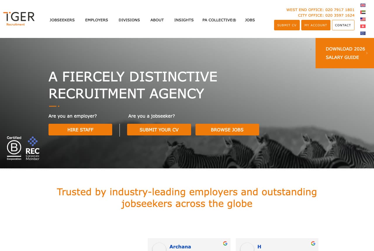
Tiger Recruitment: Three orange buttons and a zebra
Tiger Recruitment answers its two questions out loud: over a black-and-white photograph of a zebra, the headline states the brand ('A FIERCELY DISTINCTIVE RECRUITMENT AGENCY'), then two small labels ask 'Are you an employer?' and 'Are you a jobseeker?', and three orange buttons answer for both — 'HIRE STAFF', 'SUBMIT YOUR CV', 'BROWSE JOBS'. A B Corp mark and a REC membership badge sit at the left edge, an orange tab offers the 2026 salary guide, and the nav carries two office phone numbers. Beneath the hero a line of orange type — 'Trusted by industry-leading employers and outstanding jobseekers across the globe' — introduces Google review cards. Tiger shows a generalist agency how to be memorable without a niche: one animal, one color, and every next step spelled out as a button.
Opens a similar Zarla design you can make yours.
carrowmoorhealthcarestaffing.com
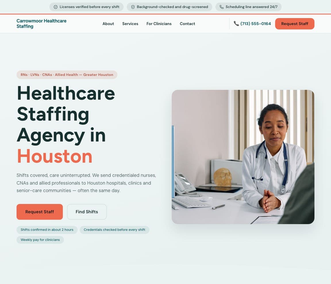
Carrowmoor Healthcare Staffing: Credentials stated before the headline
Carrowmoor Healthcare Staffing answers a nurse manager's first question — is this person cleared to work? — before the headline does. A strip above the nav reads 'Licenses verified before every shift', 'Background-checked and drug-screened' and 'Scheduling line answered 24/7'; a coral pill names the licenses ('RNs · LVNs · CNAs · Allied Health — Greater Houston'); and the chips under the buttons split the promise between the two visitors — 'Shifts confirmed in about 2 hours' for the facility, 'Weekly pay for clinicians' for the nurse. The buttons follow suit, coral 'Request Staff' and outlined 'Find Shifts', beside a photograph of a clinician at a desk. In regulated staffing the compliance proof is the pitch: clone it and put your licenses and response time where a slogan would go.
penhallowsearchpartners.com
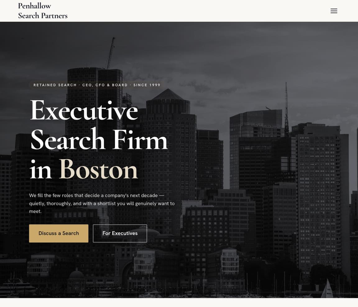
Penhallow Search Partners: A dimmed skyline, a serif, one champagne word
Penhallow Search Partners lets one serif headline carry a retained-search firm's gravity: 'Executive Search Firm in Boston' set large in white over a darkened, near-monochrome photograph of the city's skyline, with only 'Boston' in champagne. The overline works like Hunt Club's eyebrow — 'RETAINED SEARCH · CEO, CFO & BOARD · SINCE 1999' names the model, the seats and the tenure — and the sub-line sells discretion over volume: 'We fill the few roles that decide a company's next decade — quietly, thoroughly…'. Two buttons split the audience without a job board: champagne 'Discuss a Search' for boards, outlined 'For Executives' for candidates. The header is just the name and a menu icon. For a firm that sells judgment, one sentence and one accent are the credential.
brindleworkforce.com
- Warehouse Staffing
- Industrial
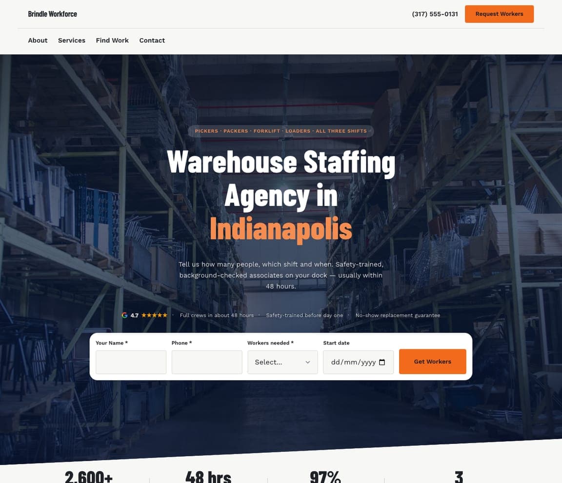
Brindle Workforce: A crew-request bar across the hero
Brindle Workforce puts the order form where most agencies put their buttons. Under 'Warehouse Staffing Agency in Indianapolis' — white condensed type over a dark, blue-tinted photograph of racking, the city in safety orange — the sub-line is the brief itself ('Tell us how many people, which shift and when'), and a white bar across the photo asks for that: name, phone, workers needed, start date, and an orange 'Get Workers'. It's Aquent's search bar turned around, for the employer. The row above the bar answers the fear before the ask: a 4.7 Google rating, 'Full crews in about 48 hours', 'No-show replacement guarantee'. 'Find Work' stays in the nav for associates. When clients buy headcount by the shift, make the first screen the order.


