Inspiration · Software

The Best Software Company Website Examples, Explained

Looking for software company website examples? These 14 are the strongest we found — Wispr Flow's serif 'Don't type, just speak.' with a ribbon of dictated text looping around it, Ghost's 'Turn your audience into a business.' above a dark members dashboard, Gumroad's 'Go from 0 to $1' with pink coins scattered across the page — plus studio designs you can build with Zarla, each with a breakdown of the specific move that turns a curious visitor into a sign-up. A software site is read by someone deciding whether to try the thing, so the best ones here say what it does in one line, show the product in the first screen and make the button 'Get started' or 'Start selling', never 'Learn more'. Find an approach you love and you can build a site in that spirit, free, in about 30 seconds.

Real sites + designs you can build with Zarla — free to build and preview, no credit card

What makes a great software website

The best software websites write one sentence a friend could repeat and then show the screen. The sentences: 'Don't type, just speak.' (Wispr Flow), 'Turn your audience into a business.' (Ghost), 'Go from 0 to $1' (Gumroad), 'Time is money. Save both.' (Ramp), 'Make anything 3D' (Spline), 'Create slides that win.' (Pitch). The screens: Ghost's dashboard with '13,041 total members', Ramp's reporting view with a phone showing a bill, Tranch's mock '$100,000 invoice' with three payment types, Homerun's tilted stack of candidate cards. Notice the buttons — 'Get Started — free', 'Start selling', 'Get started for free', 'Try free for 15 days' — and the proof set small under the headline: Ramp's 'US CORPORATE PAYMENTS PROCESSED BY RAMP: 0.877235%', Homerun's '4.7 on Capterra', Pitch's '4M+ teams'. And notice the two that decorate instead of screenshot — Gumroad's pink coins and Juno's letters stuffed with a skateboard and a suitcase — because a playful brand can afford to. Every example below tells you whether the product is a tool or a platform.

Wispr Flow website — Voice Dictation App design example
Real site
  • Voice Dictation App
  • Witty
  • Pale yellow + lilac

Wispr Flow: Serif 'Don't type, just speak.' with a ribbon of messy dictated text looping around it

Wispr Flow is the cover because it shows the before and after without a screenshot. On a pale-yellow page, the header is a floating pill — a 'Flow' logo, a toggle reading 'Dictation | Notetaker', Business, Pricing, Lab, and a lilac 'Get started on macOS' with an Apple icon. Centred beneath: a small caps eyebrow, 'WISPR FLOW DICTATION'; the serif headline 'Don't type,' with 'just speak.' in italics; 'The voice-to-text AI that turns speech into clear, polished writing in every app.'; the same lilac button; and 'Available on Mac, Windows, iPhone, and Android' in small type. Around all of it a ribbon of rambling text loops — '…although it's probably going to slip. There's been a lot of back and forth and honestly the whole thing…' — and a black ribbon crosses the lower right: '…ng has been a bit chaotic. It feels like nobody really knows what's going on…', with a struck-through 'Umm' and a waveform pill at the centre. The ribbons are the raw dictation; the headline is the polished output. Clone the demonstrate-don't-describe idea if your product transforms something.

  • The messy input drawn around the clean output
  • A serif headline with an italic second line
  • The platform in the button — 'Get started on macOS'

Steal this: Show the before around the after — if your product cleans something up, put the mess on the page and let the headline be the clean version.

Visit Wispr Flow

Opens a similar Zarla design you can make yours.

Ghost website — Publishing & Memberships Platform design example
Real site
  • Publishing & Memberships Platform
  • Confident
  • White + black

Ghost: 'Turn your audience into a business.' above a dark dashboard with '13,041 total members'

Ghost writes the outcome and shows the numbers. The white header sets the 'ghost' wordmark with its circle mark left, a nav of Product, Explore, Resources and Pricing, and 'Sign in' beside a black 'Get Started — free'. The hero is centred on white: a yellow pill, 'Just launched: Ghost 6.0 →', then the huge, heavy 'Turn your audience' / 'into a business.' Nothing else — no subline, no second button — before the product appears: a dark dashboard screenshot rising from the fold, its sidebar reading Dashboard, View site, Posts, Drafts, Scheduled, and its top row showing 'Total members 13,041 +4%', 'Paid members 3,207 +1%', 'Free members 9,834 +8%'. The headline is a promise and the dashboard is what the promise looks like when it is kept; the '— free' on the button removes the last objection. Clone the headline-then-dashboard stack for any product whose screen tells the story.

  • A six-word outcome and nothing else above the product
  • The dashboard's numbers as the proof
  • '— free' inside the button label

Steal this: Put the price in the button — 'Get Started — free' answers the question the visitor was about to ask before they click.

Visit Ghost

Opens a similar Zarla design you can make yours.

Gumroad website — Creator Commerce Platform design example
Real site
  • Creator Commerce Platform
  • Playful
  • White + pink

Gumroad: 'Go from 0 to $1' with pink 'G' coins scattered around the page

Gumroad sets the smallest possible goal and decorates it. The white header sets the heavy 'Gumroad' wordmark, a GitHub pill reading '9.6K ★', a nav of Discover, Blog, Pricing, Features, About — About in a black pill — and Gumclaw, then 'Log in' and a black 'Start selling'. The hero is centred: 'Go from 0 to $1' in huge light type, the line 'Anyone can earn their first dollar online. Just start with what you know, see what sticks, and get paid. It's that easy.', a black 'Start selling' beside a 'Search marketplace ...' field, and, in small grey, 'Contribute or fork on GitHub'. Around it all, oversized pink coins stamped with a black 'G' tumble at angles — top-left, top-right, both edges — and three bordered cards begin at the fold: 'Sell anything', a product card 'How to Play Ukelele', 'Make your…'. '$1' is a smaller promise than 'a business' and a more believable one, and the GitHub line says the company is open source. Clone the tiny-goal headline if your users are beginners.

  • The smallest goal — '$1' — as the headline
  • Pink coins as decoration instead of a screenshot
  • GitHub stars in the header and a fork line under the button

Steal this: Promise the first dollar, not the first million — 'Go from 0 to $1' is a goal a beginner believes they can hit tonight.

Visit Gumroad

Opens a similar Zarla design you can make yours.

Ramp website — Finance Automation Platform design example
Real site
  • Finance Automation Platform
  • Efficient
  • White + lime

Ramp: 'Time is money. Save both.' with a live share of US corporate payments printed above it

Ramp puts a running statistic where most sites put a slogan. The pale-grey header sets the 'ramp' wordmark, a nav of Products, Partners, Solutions, Resources, Customers and Pricing, 'Sign in', a lime 'See a demo' and a black 'Get started'. The white hero opens with a tiny caps line — 'US CORPORATE PAYMENTS PROCESSED BY RAMP: 0.877235%' — then the heavy 'Time is money. Save both.' and 'Cards, expenses, bill payments, and banking* – in the blink of AI.' Beneath, an email field reading 'What's your work email?' sits beside a lime 'Get started for free'. The product rises from the fold: a reporting screen — 'Reporting', tabs for Spending, Compliance, Process, a 'Save up to $3,500' pill, 'Total spending' with a chart — and a phone showing 'Bills — $396,000.00 at Quickbooks' with a green 'Approve'. The percentage is small and oddly precise, which is why it reads as true. Clone the email-field-plus-button hero if your sign-up starts with a work address.

  • A precise running statistic as the eyebrow
  • An email field as the call to action
  • The product shown on desktop and phone together

Steal this: Print one oddly precise number above the headline — '0.877235%' reads as measured, and measured reads as true.

Visit Ramp

Opens a similar Zarla design you can make yours.

Spline website — 3D Design Tool design example
Real site
  • 3D Design Tool
  • Immersive
  • Black + gradient

Spline: 'Make anything 3D' with the prompt box in the hero and glossy shapes floating around it

Spline makes the homepage the product. On black, the header sets a gradient-circle mark, a nav of Products, Resources, Community, Customers, Enterprise and Pricing, a grey 'Log In' and a white 'Get Started'. Centred: the white 'Make anything 3D', the line 'Create 3D with AI or build with direct control', and a dark prompt box reading 'Describe what you want to create...' with a plus and a send arrow. Around the copy, glossy 3D shapes float at angles — a pink rounded slab, a deep-blue one, a yellow blob, a green one, a translucent teardrop — and a small white cartoon rabbit with pink ears stands lower-centre on a perspective grid that recedes into the dark. The shapes are what the tool makes; the prompt box is how you make them; the rabbit is the joke that proves it can do characters. Clone the prompt-in-the-hero pattern if your product starts with a text box.

  • The product's own input box as the hero's call to action
  • The output — 3D shapes — floating around the headline
  • A cartoon rabbit for range

Steal this: If your product starts with a text prompt, put the prompt box in the hero — a visitor who types is already a user.

Visit Spline

Opens a similar Zarla design you can make yours.

Juno website — Employee Benefits Platform design example
Real site
  • Employee Benefits Platform
  • Warm
  • Cream + black

Juno: The letters J U N O stuffed with a skateboard, a flower, a suitcase and a dumbbell under 'Healthier, Happier, Motivated'

Juno illustrates its name instead of its interface. On cream, the header sets the lowercase 'juno' wordmark left and a nav — Platform, Solutions, Resources, Pricing, Sign In — right. The hero is a large illustration: the four black letters J, U, N, O tumbled across the page and crammed with colourful objects — a skateboard under a yellow shape, an orange flower, a green bottle, a tan suitcase, a pink sleep mask, a dumbbell and a blue wave — sitting on a single black ground line. Beneath it, in heavy rounded type, 'Healthier, Happier, Motivated', and the line 'Employees come in all shapes and sizes, and we exist to make sure every team member has access to meaningful benefits and rewards.' No button, no screenshot in the first screen. The objects are the benefits — travel, fitness, sleep, wellbeing — drawn rather than listed, and the sentence says the product is for everyone in the company. Clone the illustrated-name hero if your product is a bundle of things.

  • The brand name as an illustration of what it contains
  • Three adjectives as the headline
  • No button in the first screen

Steal this: Draw your product's contents into your logo — a skateboard, a suitcase and a sleep mask inside the letters say 'flexible benefits' faster than a feature list.

Visit Juno

Opens a similar Zarla design you can make yours.

Tranch website — Invoice Payments Platform design example
Real site
  • Invoice Payments Platform
  • Matter-of-Fact

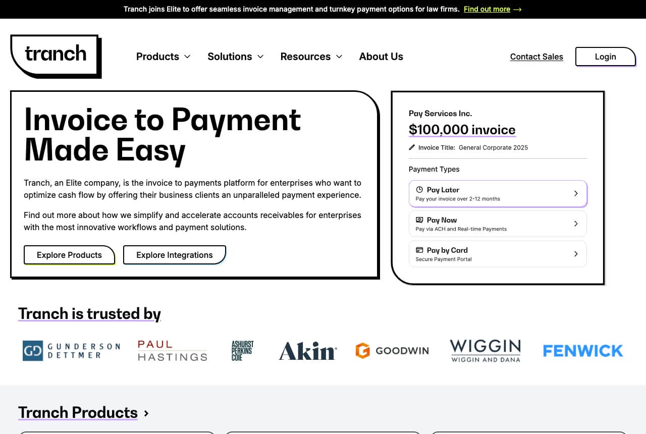
Tranch: 'Invoice to Payment Made Easy' beside a mock $100,000 invoice with three ways to pay

Tranch shows the exact screen its customer's customer sees. A black strip reads 'Tranch joins Elite to offer seamless invoice management and turnkey payment options for law firms. Find out more →'; the white header sets a boxed 'tranch' wordmark, a nav of Products, Solutions, Resources and About Us, 'Contact Sales' and an outlined 'Login'. The hero is two bordered, rounded cards: on the left, 'Invoice to Payment' / 'Made Easy', two short paragraphs — 'Tranch, an Elite company, is the invoice to payments platform for enterprises who want to optimize cash flow…' and 'Find out more about how we simplify and accelerate accounts receivables…' — and two outlined buttons, 'Explore Products' and 'Explore Integrations'; on the right, a mock invoice — 'Pay Services Inc.', '$100,000 invoice', 'Invoice Title: General Corporate 2025' — with three 'Payment Types': 'Pay Later — Pay your invoice over 2-12 months', 'Pay Now — Pay via ACH and Real-time Payments', 'Pay by Card — Secure Payment Portal'. Below, 'Tranch is trusted by' and a row of law-firm logos, then 'Tranch Products ›'. The invoice explains the business in one glance. Clone the two-card hero for any B2B product with a customer-facing screen.

Visit Tranch

Opens a similar Zarla design you can make yours.

Pitch website — Presentation Software design example
Real site
  • Presentation Software
  • Vivid

Pitch: 'Create slides that win.' in giant white over a purple field of faded slide thumbnails

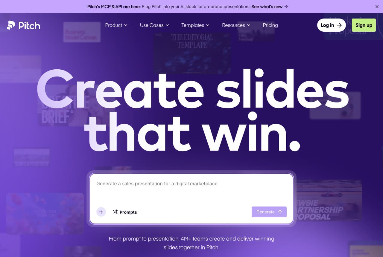
Pitch sets a four-word headline at the largest size on the page. A lilac strip reads 'Pitch's MCP & API are here: Plug Pitch into your AI stack for on-brand presentations — See what's new →'; the purple header sets the 'Pitch' wordmark, a nav of Product, Use Cases, Templates, Resources and Pricing, a black 'Log in →' and a lime 'Sign up'. The hero is a deep-purple field with faded slide thumbnails ghosted across it — 'THE EDITORIAL TEMPLATE', 'BRIEF', 'PARTNERSHIP PROPOSAL' — and, centred in huge white, 'Create slides' / 'that win.' Beneath, a translucent prompt box reads 'Generate a sales presentation for a digital marketplace' with '+ Prompts' and a 'Generate ↑' button, and a line: 'From prompt to presentation, 4M+ teams create and deliver winning slides together in Pitch.' The ghosted slides are the output and the prompt box is the input, and the headline is bigger than both. Clone the giant-headline-over-product approach when the product is visual.

Visit Pitch

Opens a similar Zarla design you can make yours.

Homerun website — Hiring & HR Software design example
Real site
  • Hiring & HR Software
  • Cheerful

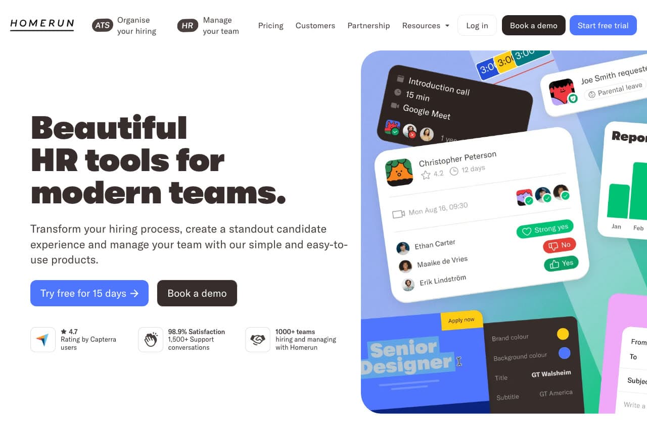
Homerun: 'Beautiful HR tools for modern teams.' beside a tilted stack of candidate cards

Homerun shows the interface as a collage. The white header sets the tracked 'HOMERUN' wordmark, two labelled pills — 'ATS Organise your hiring', 'HR Manage your team' — a nav of Pricing, Customers, Partnership and Resources, 'Log in', a black 'Book a demo' and a blue 'Start free trial'. The hero splits: left, the heavy 'Beautiful' / 'HR tools for' / 'modern teams.', a line — 'Transform your hiring process, create a standout candidate experience and manage your team with our simple and easy-to-use products.' — a blue 'Try free for 15 days →' beside a black 'Book a demo', and three small proof tiles: '★ 4.7 Rating by Capterra users', '98.9% Satisfaction 1,500+ Support conversations', '1000+ teams hiring and managing with Homerun'. Right, a rounded gradient panel holding tilted UI cards — an 'Introduction call · 15 min · Google Meet' scheduler, a candidate card for 'Christopher Peterson ★ 4.2 · 12 days' with 'Strong yes', 'No' and 'Yes' tags, a blue 'Senior Designer · Apply now' job ad, a 'Reports' chart. The two pills in the header split the product into its two jobs. Clone the tilted-card collage if your UI has many small, good-looking pieces.

Visit Homerun

Opens a similar Zarla design you can make yours.

Ridley & Stone — Dark Studio Template website design you can build with Zarla
Build this with Zarla
  • Dark Studio Template
  • Bold

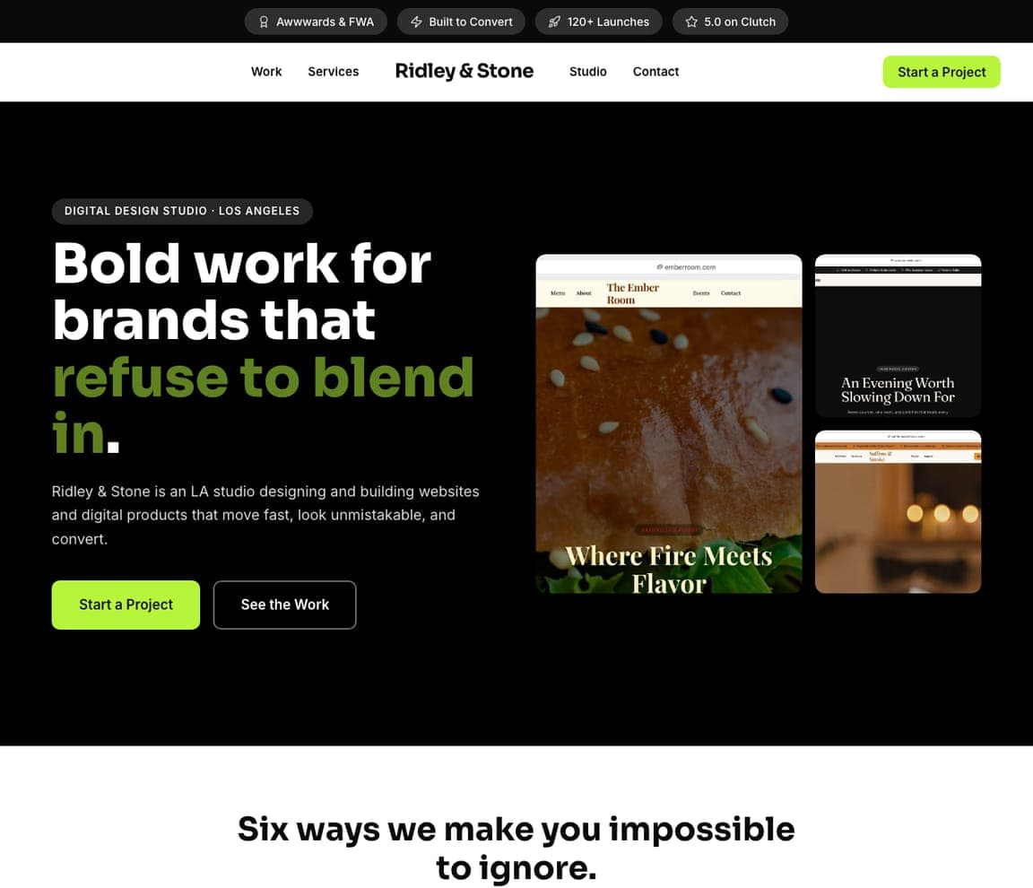
Ridley & Stone: 'Bold work for brands that refuse to blend in.' beside three product screenshots on black

Ridley & Stone is the Zarla dark-studio template, and its first screen is the software-company pattern: a claim on the left, the product on the right. A dark top strip carries 'Awwwards & FWA', 'Built to Convert', '120+ Launches' and '5.0 on Clutch'. The header splits the nav around a centred bold wordmark — Work, Services | Studio, Contact — with a lime 'Start a Project'. On black, the hero opens with a pill, 'DIGITAL DESIGN STUDIO · LOS ANGELES', then the heavy white headline 'Bold work for brands that' with 'refuse to blend in.' in olive green, a paragraph about 'websites and digital products that move fast, look unmistakable, and convert', and a lime 'Start a Project' beside an outline 'See the Work'. On the right, a collage of three website screenshots — a restaurant called The Ember Room, a dark editorial page, a warm café — stands in for the product. Replace the screenshots with your app and the layout is a SaaS landing page. Clone it for a software company with a dark brand.

See this template
Wren & Calder — Minimal Studio Template website design you can build with Zarla
Build this with Zarla
  • Minimal Studio Template
  • Restrained

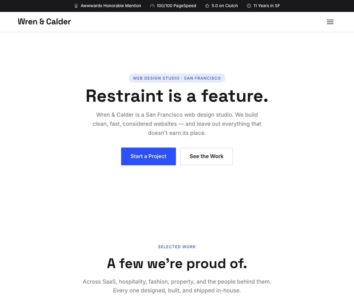
Wren & Calder: 'Restraint is a feature.' — one line, two buttons, a lot of white

Wren & Calder is the Zarla minimal-studio template and the purest one-idea landing page in the catalog. A dark top strip carries 'Awwwards Honorable Mention', '100/100 PageSpeed', '5.0 on Clutch' and '11 Years in SF'; the white header is the wordmark and a hamburger. The hero is centred in generous white space: a blue pill, 'WEB DESIGN STUDIO · SAN FRANCISCO', the four-word headline 'Restraint is a feature.', a paragraph that practises what it preaches — 'We build clean, fast, considered websites — and leave out everything that doesn't earn its place.' — and a blue 'Start a Project' beside an outline 'See the Work'. There is no image at all. For a software company, this is the pre-launch or single-product page: one sentence about the product, one button to try it. Clone it if your product can be explained in a line and you'd rather show the app after the click.

See this template
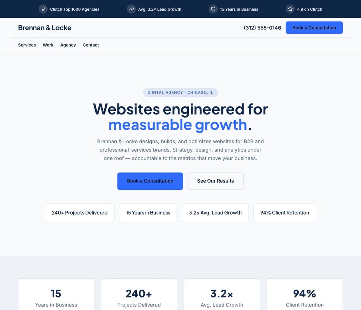
Brennan & Locke — Corporate Agency Template website design you can build with Zarla
Build this with Zarla
  • Corporate Agency Template
  • Credible

Brennan & Locke: 'Websites engineered for measurable growth.' over four stat tiles

Brennan & Locke is the Zarla corporate-studio template, and its stat tiles are the B2B software pattern. A navy top strip carries 'Clutch Top 1000 Agencies', 'Avg. 3.2× Lead Growth', '15 Years in Business' and '4.9 on Clutch'. The header stacks the wordmark, the phone and a blue 'Book a Consultation' over a nav row of Services, Work, Agency, Contact. The hero is centred on pale grey: a pill, 'DIGITAL AGENCY · CHICAGO, IL', the headline 'Websites engineered for' with 'measurable growth.' in blue, a paragraph about being 'accountable to the metrics that move your business', and a blue 'Book a Consultation' beside an outline 'See Our Results'. Beneath, four white tiles carry the numbers — '240+ Projects Delivered', '15 Years in Business', '3.2× Avg. Lead Growth', '94% Client Retention'. Retention and multiples are exactly the numbers a SaaS company shows. Clone it for B2B software that sells on outcomes: put your customer count, uptime and retention in the tiles.

See this template
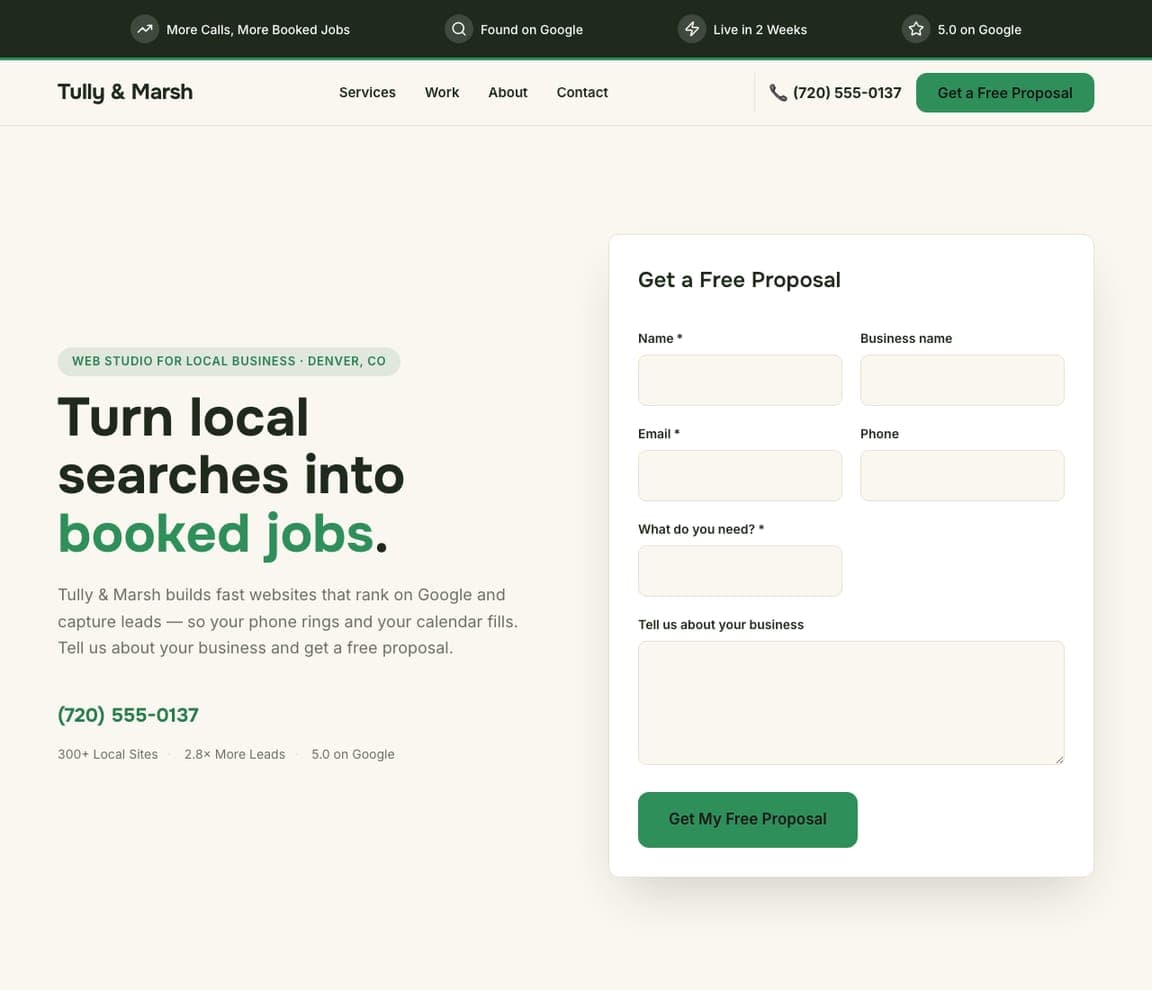
Tully & Marsh — Lead-Gen Studio Template website design you can build with Zarla
Build this with Zarla
  • Lead-Gen Studio Template
  • Practical

Tully & Marsh: 'Turn local searches into booked jobs.' beside a 'Get a Free Proposal' card

Tully & Marsh is the Zarla lead-generation studio template — a claim on the left and a proposal form on the right, the layout a software company uses for a demo request. A dark-green top strip carries 'More Calls, More Booked Jobs', 'Found on Google', 'Live in 2 Weeks' and '5.0 on Google'. The cream header sets the wordmark against Services, Work, About, Contact, the phone and a green 'Get a Free Proposal'. On the cream hero, a pill reads 'WEB STUDIO FOR LOCAL BUSINESS · DENVER, CO', the heavy headline 'Turn local searches into' ends with 'booked jobs.' in green, and the paragraph says 'so your phone rings and your calendar fills. Tell us about your business and get a free proposal.' A green phone number sits under it. On the right, a white card, 'Get a Free Proposal', asks for Name, Business name, Email, Phone, 'What do you need?' and 'Tell us about your business'. Rename the card 'Book a Demo' and you have a SaaS homepage. Clone it if your sale starts with a form.

See this template
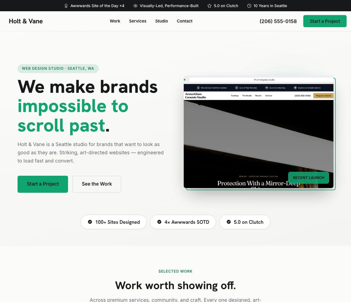
Holt & Vane — Visual Studio Template website design you can build with Zarla
Build this with Zarla
  • Visual Studio Template
  • Striking

Holt & Vane: 'We make brands impossible to scroll past.' beside a browser-framed screenshot tagged 'RECENT LAUNCH'

Holt & Vane is the Zarla visual-studio template, and its browser-framed screenshot is how software companies show a product without a photograph. A black top strip carries 'Awwwards Site of the Day ×4', 'Visually-Led, Performance-Built', '5.0 on Clutch' and '10 Years in Seattle'. The white header sets the wordmark against Work, Services, Studio, Contact, the phone and a green 'Start a Project'. The hero opens with a pill, 'WEB DESIGN STUDIO · SEATTLE, WA', the heavy headline 'We make brands' with 'impossible to scroll past.' in green, a paragraph about 'Striking, art-directed websites — engineered to load fast and convert', and a green 'Start a Project' beside an outline 'See the Work'. On the right, a website (ArmorGlass Ceramic Studio) sits inside a drawn browser window with a green 'RECENT LAUNCH' tag on its corner; three pills below read '100+ Sites Designed', '4× Awwwards SOTD', '5.0 on Clutch'. Put your dashboard in the browser frame and the tag becomes 'NEW IN v2'. Clone it for a product with a screen worth showing.

See this template

Frequently asked

What should a software company's homepage say first?

What the product does, in a sentence you could say out loud. Wispr Flow: 'Don't type, just speak.' Ghost: 'Turn your audience into a business.' Spline: 'Make anything 3D'. Pitch: 'Create slides that win.' Ramp: 'Time is money. Save both.' Homerun: 'Beautiful HR tools for modern teams.' Each is under seven words, and each is followed by one clarifying line — Wispr's 'The voice-to-text AI that turns speech into clear, polished writing in every app.' — not a paragraph.

Should a software website show the product on the homepage?

Yes, in the first screen. Ghost shows its members dashboard with real-looking numbers — 13,041 total, 3,207 paid, 9,834 free; Ramp shows a reporting screen and a phone with a $396,000 bill; Tranch shows a mock $100,000 invoice with 'Pay Later', 'Pay Now' and 'Pay by Card'; Homerun tilts a stack of candidate cards, a 'Senior Designer' job ad and a report chart. Spline and Pitch go further and put the prompt box itself in the hero — 'Describe what you want to create...', 'Generate a sales presentation for a digital marketplace'.

What should the button on a software homepage say?

The first action, with the price. Ghost: 'Get Started — free'. Ramp: 'Get started for free' beside an email field. Homerun: 'Try free for 15 days →' with 'Book a demo' as the second. Gumroad: 'Start selling'. Wispr Flow: 'Get started on macOS' with an Apple icon, then 'Available on Mac, Windows, iPhone, and Android' in small type. Pitch offers 'Sign up' in lime; Spline offers 'Get Started'. None of them says 'Learn more'.

How much proof belongs in the hero of a software site?

One line, set small. Ramp prints 'US CORPORATE PAYMENTS PROCESSED BY RAMP: 0.877235%' above the headline; Homerun puts three tiles under its buttons — '4.7 Rating by Capterra users', '98.9% Satisfaction · 1,500+ Support conversations', '1000+ teams hiring and managing with Homerun'; Pitch writes 'From prompt to presentation, 4M+ teams create and deliver winning slides together in Pitch.' under its prompt box; Gumroad shows its GitHub stars, '9.6K', in the header; Tranch lists the law firms that trust it under the hero.

Can a software website be playful instead of a product screenshot?

Yes, if the brand can carry it. Gumroad scatters pink 'G' coins around 'Go from 0 to $1' and writes 'Contribute or fork on GitHub' under the button; Juno builds its name from letters stuffed with a skateboard, a flower, a suitcase and a dumbbell and headlines 'Healthier, Happier, Motivated'; Spline floats glossy 3D blobs and a small white rabbit over a black grid; Wispr Flow loops a ribbon of messy dictated text — 'nobody really knows what's going on' — around its clean serif headline to show the before and after.

Can I build a software company website like these with Zarla?

Yes. Every real site here has a 'Build a site like this' button that opens the closest Zarla template in the editor — Wren & Calder for a white, centred, one-sentence page in the Wispr Flow and Ghost spirit; Ridley & Stone for a black, lime-accented hero with screenshots like Spline and Pitch; Holt & Vane for a headline beside a browser-framed product shot like Homerun; Brennan & Locke for a stat-tile layout in the Tranch and Ramp vein; Tully & Marsh for a headline beside a sign-up form — and you swap in your own product screenshot and your sentence. One sentence, one screenshot and a 'Get started — free' button is the Ghost pattern, and it takes about 30 seconds.

You've seen what works. Now make it yours.

Describe your business and Zarla designs a complete, professional website in about 30 seconds — built to convert, just like the ones above.

Free to build and preview · no credit card · publish to your own domain on Premium