Inspiration · Videographer

The Best Videography Website Examples, Explained

Looking for videography website examples? These 12 are the best we could find — standout real videography sites plus designs you can build with Zarla — and each comes with a breakdown of the specific design move that makes it work. Find a look you love and you can build a site in that exact style, free, in about 30 seconds.

Real sites + designs you can build with Zarla — free to build and preview, no credit card

What makes a great videography website

The best videography websites share a few moves: they earn trust fast, lead with strong visuals of the work, point to one clear action, and match the design to how their customers decide. Each example below calls out the specific choice worth stealing for your own videography website.

Here Now Films website — Commercial Production design example
Real site · London, UK
  • Commercial Production
  • Confident
  • Warm + navy

Here Now Films: A promise, then seven brand logos

Here Now Films leads with the best headline in the category — 'The film you'll be known for.' — and then immediately makes it believable: a dense credentials line (500+ productions, est. 2016, Clutch #1 London, Drum Awards, 52 five-star reviews) and a trusted-by row stacking Tate, BBC, Airbnb, JP Morgan, Red Bull, Domino's and Pepsico. The hero image is a warm, human production still rather than a showreel montage, which keeps the page grounded while the logos do the flexing. Below, 'Video that builds brands — films that move, made in London' translates craft into client outcome. Production companies routinely bury their proof on an about page; this one spends it in the first screen, where the procurement manager actually looks.

  • 'The film you'll be known for' sells the client's outcome
  • Credentials line + seven-logo row in the first screen
  • Human production still grounds the brand-name flex

Steal this: Compress your proof into one line under the headline — productions count, award, review score. Don't make buyers hunt.

Harvest Film Company website — Film Studio design example
Real site · Minneapolis, MN
  • Film Studio
  • Cinematic
  • Black + white

Harvest Film Company: Dark restraint, spotlighted work

Harvest Film Company presents like a private screening room: a centered serif wordmark, a single moody warehouse still — shafts of light through industrial windows — and one bolded sentence, 'A results-driven, creative-focused, video production company.' Then straight to Project Spotlight, where each film gets a title card treatment: 'Born to Bitcoin // National Broadcast Commercial — Client: VanEck.' Naming real clients and formats in the caption does quiet commercial work; it tells prospects what budget tier and deliverable class this team operates in without a rate card. The near-black canvas makes every still feel graded and cinematic. For filmmakers, restraint is the credential — a site this quiet says the work doesn't need help.

  • Screening-room dark canvas makes stills read as graded film
  • Client + format in every caption signals budget tier
  • One bolded sentence instead of an agency manifesto

Steal this: Caption work like a title card — 'Project // Format — Client.' It communicates your tier without a rate card.

Monster & Bear website — Creative Studio design example
Real site · Melbourne, AU
  • Creative Studio
  • Playful
  • Mustard + navy

Monster & Bear: Lowercase wit over a full-bleed still

Monster & Bear opens on a full-bleed film still — a deadpan actor in a Santa hat — with 'creative + production. the perfect pair.' set lowercase across it, and a mustard-yellow brand bar on top. Everything about the composition is a personality test the right clients pass: the lowercase type says unstuffy, the comic still says we make things people actually enjoy watching, and the name itself promises a double act. Production companies sell taste and temperament as much as gear, and this hero communicates both in two seconds. Note the discipline underneath the play — one frame, one line, one accent color. The joke lands because the design around it is dead straight.

  • A comic film still filters for clients who get it
  • Lowercase headline reads unstuffy, not unserious
  • One mustard accent keeps the play disciplined

Steal this: Lead with the frame that shows your sensibility. Clients hire the taste they can see, not the gear list.

Bottle Rocket Media website — Video Agency design example
Real site · Chicago, IL
  • Video Agency
  • Commercial
  • Teal + red

Bottle Rocket Media: Videos that rank, not just play

Bottle Rocket Media makes an unusual promise for a production company: 'We make videos that rank and get watched.' That one line repositions the craft as a marketing channel — the client isn't buying a film, they're buying search visibility and watch time — and 'Chicago's #1 Video Production Agency' anchors it locally. The hero product shot (a close-crop of a hair tool in use) demonstrates the commercial work itself, and below, four service tiles use playful illustrated badges — including an astronaut dog for AI Search — to make a services list feel like a brand. Most videographer sites sell beautiful; Bottle Rocket sells findable and watched, which is the language of the person approving the budget.

  • 'Rank and get watched' sells outcomes, not footage
  • City + #1 claim anchors the SEO positioning locally
  • Illustrated service badges turn a list into a brand
The Lift website — Production House design example
Real site · Mexico City, MX
  • Production House
  • Cinematic
  • Black + white

The Lift: The reel starts before the pitch

The Lift's homepage is a film already playing: a black-and-white still — a young man lit by candles — with a play button, the artist credit '& Young Thug' and 'Director: RUBBERBAND.' overlaid like end titles. No headline, no value proposition, no services menu in sight; the work IS the interface, and the director credit is the trust signal, because in this tier of production the buyer is hiring names. It's the boldest version of portfolio-first design: assume the visitor came to watch, and let navigation reveal itself second. A local videographer shouldn't copy this wholesale — but the principle scales down: your best 10 seconds should be playing before your pitch starts talking.

  • The homepage is a playing reel, not a page about one
  • Director and artist credits do the trust work
  • Navigation second, work first — total portfolio confidence
NAF+ website — Music Video design example
Real site · Global
  • Music Video
  • Dark UI
  • Black + yellow

NAF+: Celebrity thumbnails as credentials

NAF+ calls itself 'the global film production powerhouse,' and instead of arguing the claim it shows the receipts: a black grid of music-video posters where the first tile is Imagine Dragons' 'Thunder' — the band name in yellow doing more credentialing than any award logo could. The site is structured like a streaming service: dark UI, poster tiles, artist names as titles, services (Originals, Brandfilms, Worldwide Services) reading like content categories in the nav. When your clients are household names, the design job is to get out of the way and let recognition fire. The takeaway survives at any scale: lead with the most recognizable name or brand you've ever shot, and make it look like a poster, not a list item.

  • Streaming-service UI turns a portfolio into a catalog
  • One household-name tile outranks a page of award badges
  • Nav categories read like content genres, not services
Wren & Willow Films — Wedding Films website design you can build with Zarla
Build this with Zarla
  • Wedding Films
  • Romantic

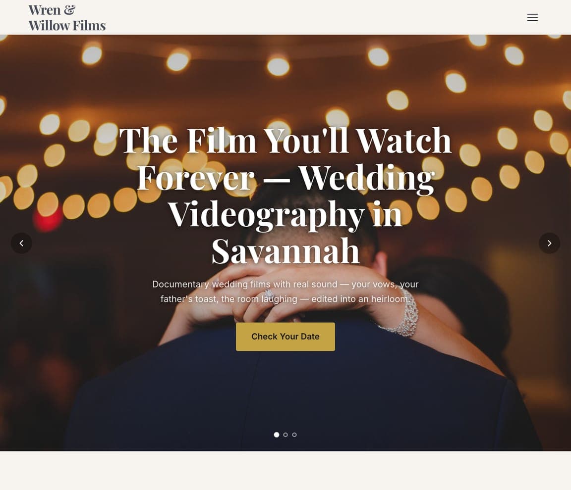
Wren & Willow Films: Three slides, one wedding promise

Wren & Willow Films is Zarla's wedding-videography template, and its carousel hero rotates through the three sentences every engaged couple wants to hear: 'The Film You'll Watch Forever,' 'Filmed Under the Oaks, Kept Forever,' 'Full-Day Coverage, Delivered as a Film.' Each slide pairs the promise with warm imagery — an embrace under string lights — and the slate-and-antique-gold palette keeps it romantic without drifting into scrapbook territory. Wedding video is bought on emotion and specified on logistics, and the slides carry both: forever-language up top, coverage terms in the same breath. The 'Savannah & the Lowcountry' overline shows how to own a region by name. Clone it and it's live in about 30 seconds.

See this template
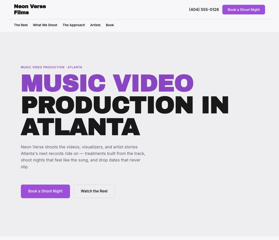
Neon Verse Films — Music Video website design you can build with Zarla
Build this with Zarla
  • Music Video
  • Neon

Neon Verse Films: Hollow type with a neon glow

Neon Verse Films is Zarla's music-video template, and it dresses for the job: 'Music Video Production in Atlanta' set in oversized outline type — the accent word rendered hollow with a violet neon edge on near-black — so the page itself feels like a frame from a video shoot. No stock photo of a camera operator, no corporate blue; the typography is the production value. That matters in this niche because artists judge a videographer's taste from the first pixel, and Atlanta in the headline plants the flag in a real music market. The dark canvas also makes embedded reels look color-graded by default. If your clients are musicians, your site should read like a title sequence. This one does, in about 30 seconds.

See this template
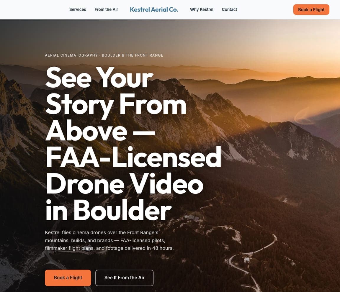
Kestrel Aerial Co. — Drone Video website design you can build with Zarla
Build this with Zarla
  • Drone Video
  • Aerial

Kestrel Aerial Co.: Licensed altitude as the pitch

Kestrel Aerial Co. is Zarla's drone-videography template, opening on a fullbleed aerial with 'See Your Story From Above — FAA-Licensed Drone Video in Boulder.' The license in the headline is the sharp move: drone work is one of the few creative trades with a regulatory moat, and putting FAA certification next to the poetry answers the commercial client's compliance question before it's asked. Sky blue and signal orange keep the palette literally aerial, and the left-weighted composition holds the type legible over landscape footage. Real-estate developers, construction firms and tourism boards all need licensed pilots, not just pretty footage — this template speaks to their procurement checklist while still selling the view. Live in about 30 seconds.

See this template
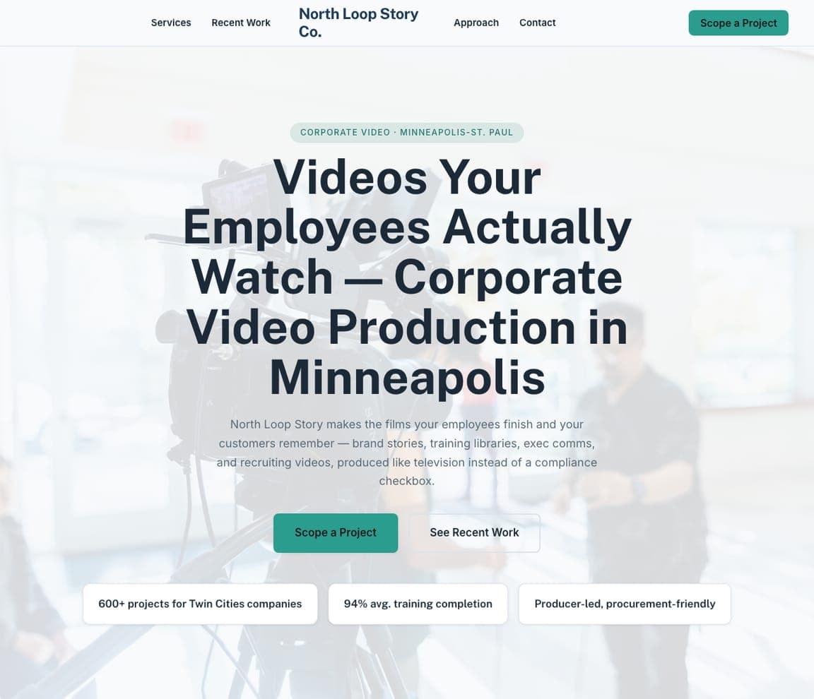
North Loop Story Co. — Corporate Video website design you can build with Zarla
Build this with Zarla
  • Corporate Video
  • Professional

North Loop Story Co.: Corporate video without the yawn

North Loop Story Co. is Zarla's corporate-video template, and its credentials-centered hero makes the promise every internal-comms buyer secretly wants: 'Videos Your Employees Actually Watch.' That headline works because it names the industry's dirty secret — most corporate video is ignored — and positions the studio as the fix. The deep navy and teal palette reads boardroom-appropriate, the centered credentials layout mirrors how these buyers evaluate agencies (proof first, sizzle second), and Minneapolis in the title targets the search a marketing director actually types. Training films, culture pieces, executive comms: unglamorous, recurring, well-budgeted work. A site that speaks fluent HR wins it. Clone it and it's live in about 30 seconds.

See this template
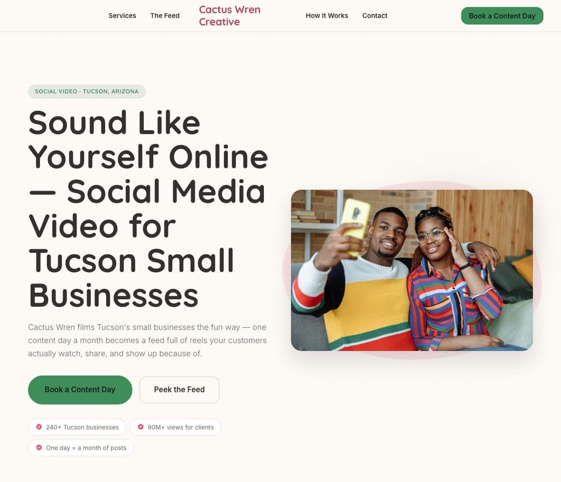
Cactus Wren Creative — Social Video website design you can build with Zarla
Build this with Zarla
  • Social Video
  • Playful

Cactus Wren Creative: Playful pop for scroll-native video

Cactus Wren Creative is Zarla's social-media-video template, and it practices what it sells: 'Sound Like Yourself Online' in a playful-pop hero with coral and cactus-green energy that feels native to the feeds the work will live in. The pitch targets small businesses drowning in the content treadmill — the promise isn't cinematography, it's voice: showing up online sounding like the actual humans behind the counter. That's the right frame for this niche, where clients buy consistency and personality over polish. Tucson in the headline localizes an otherwise borderless service, which matters because small businesses still hire nearby. If your product is Reels and TikToks, a solemn cinematic site is the wrong costume. Live in about 30 seconds.

See this template
Bitterroot Documentary Co. — Documentary website design you can build with Zarla
Build this with Zarla
  • Documentary
  • Serious

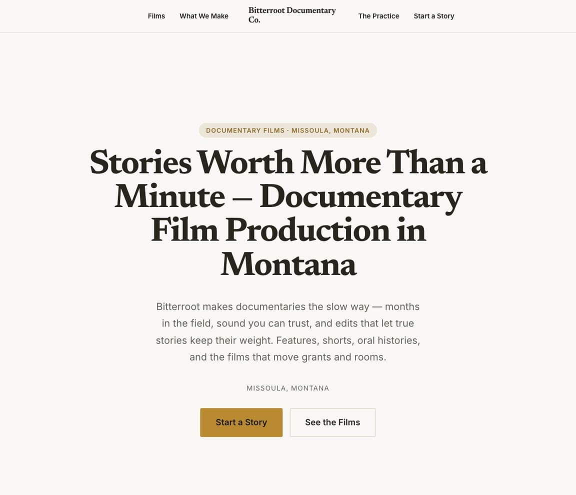
Bitterroot Documentary Co.: Editorial gravity for long stories

Bitterroot Documentary Co. is Zarla's documentary template, and its editorial hero carries the right weight: 'Stories Worth More Than a Minute — Documentary Film Production in Montana,' set against charcoal with an old-gold accent that feels like a film-festival program. The headline draws the line that defines the niche — this is the counter-offer to the 30-second attention economy — and the editorial layout (magazine margins, restrained type) signals the patience the work demands. Documentary clients are foundations, brands with heritage stories, families commissioning legacies; they're buying seriousness, and the design performs it. Montana grounds the practice in a place, which for documentary is half the aesthetic. Clone it and it's live in about 30 seconds.

See this template

Frequently asked

Where can I find good videography website examples?

Right here — this page curates videography website examples two ways: standout real businesses (each linked, so you can explore the live site) and professionally designed Zarla templates you can clone and make your own. Every example comes with a note on why the design works — trust signals, layout, calls to action — so you can copy the move, not just the look.

What makes a good videography website?

A good videography website earns trust in the first few seconds, leads with strong visuals of the work, gives visitors one obvious action, and loads fast on a phone. Every design below leads with proof and a single clear call to action rather than a wall of text.

How much does a videography website cost?

A custom videography website from a designer typically runs into the thousands up front, and template builders charge roughly $16–$30 per month. An AI builder generates a complete, editable design for free and only charges (on the Premium plan) when you publish to your own domain — so you can build and preview before spending anything.

Do I need a designer to build a videography website?

No. Several designs on this page were generated by Zarla and are fully editable — you describe your business and get a complete, professionally designed site in about 30 seconds, then refine it by chatting. Building and previewing is free; publishing to your own domain needs the Premium plan.

What pages does a videography website need?

Most videography businesses need just a few: a home page that proves trust and points to one clear action, an about page that puts a face to the business, a services or work page that shows what you do, and a contact page with a form and a phone number. Local businesses also benefit from location or service-area pages that help them show up in nearby searches.

How do I get more customers from my videography website?

Lead with proof in the first few seconds (reviews, real photos, results), make one action obvious on every screen (call, book, or enquire), and keep it fast on mobile — most visitors arrive on a phone. The designs above each do this differently, but they all earn trust early and remove friction from the next step.

You've seen what works. Now make it yours.

Describe your business and Zarla designs a complete, professional website in about 30 seconds — built to convert, just like the ones above.

Free to build and preview · no credit card · publish to your own domain on Premium