soniasmithcreative.com
- Wedding Industry VA
- Warm Editorial
Sonia Smith Creative: The niche and the software in the same headline
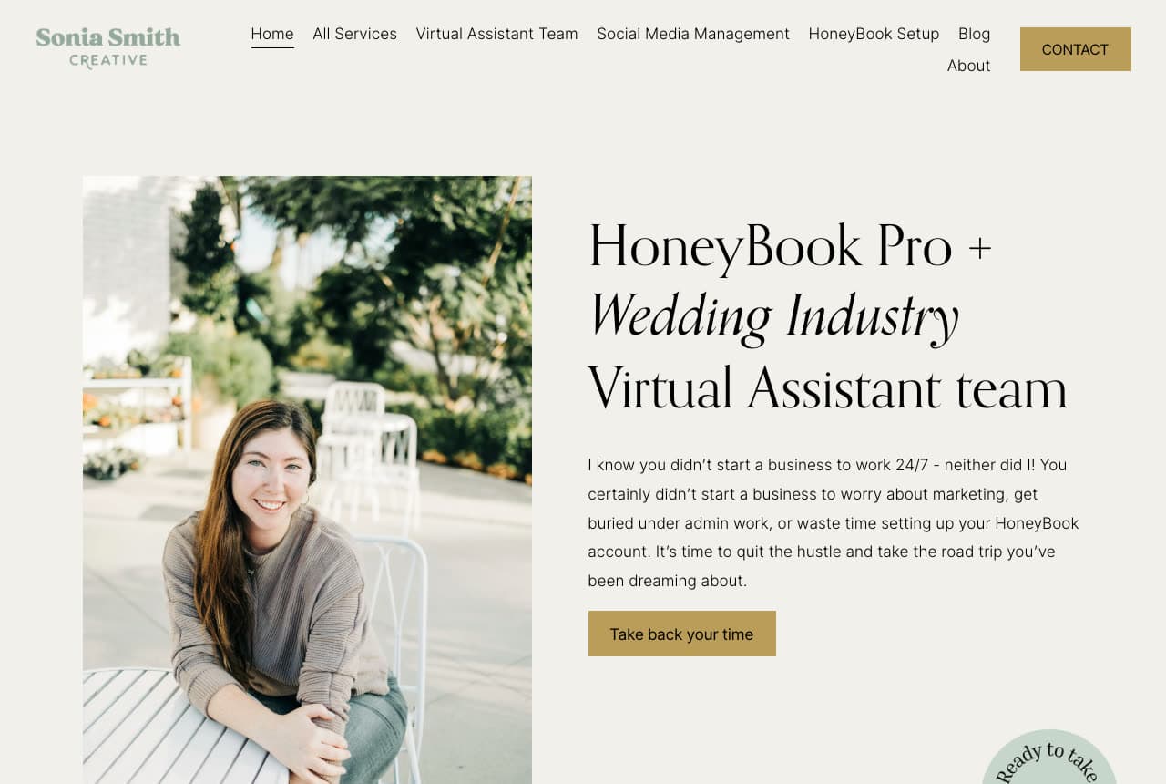
Sonia Smith Creative narrows twice in one line. The black display serif reads 'HoneyBook Pro + Wedding Industry Virtual Assistant team' — an industry and a specific piece of software a wedding planner already pays for — which means the page ranks and converts for a search no generalist VA site can touch. The setting is bone and sage: a sage serif wordmark, a portrait of Sonia on a white metal chair in front of greenery, and an antique-gold button reading 'Take back your time'. The paragraph is written as one person talking to another: 'I know you didn't start a business to work 24/7 - neither did I!' The nav does the same job as the headline, listing Virtual Assistant Team, Social Media Management and HoneyBook Setup as separate destinations. Sonia shows that the narrowest promise is the most valuable one.
Opens a similar Zarla design you can make yours.
prialto.com
- Managed VA Service
- Corporate
Prialto: Headshots inset into a geometric mosaic
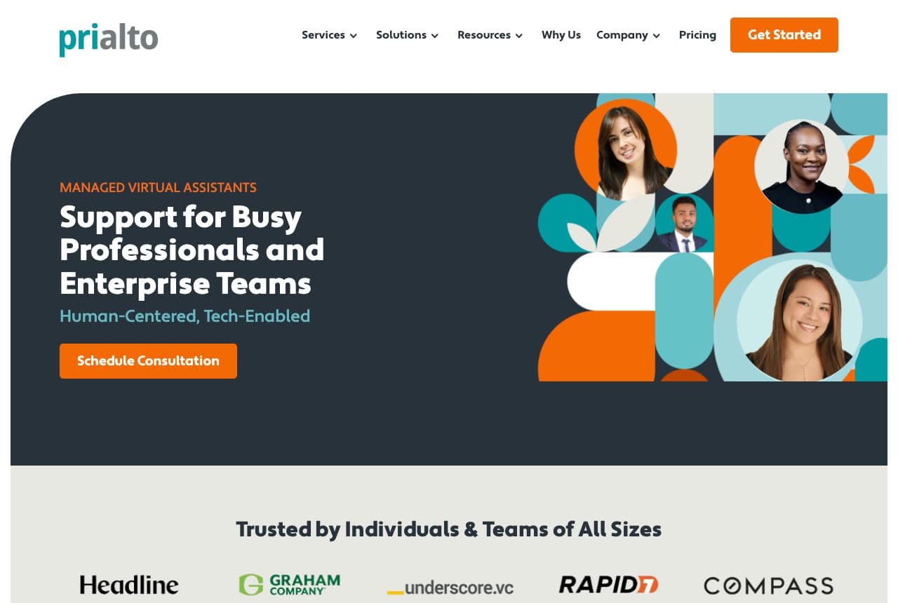
Prialto has to sell to a solo professional and an enterprise buyer on the same screen, and the design splits the difference cleanly. A dark charcoal panel with rounded corners carries an orange eyebrow — 'MANAGED VIRTUAL ASSISTANTS' — a white sans headline, 'Support for Busy Professionals and Enterprise Teams', and a teal qualifier, 'Human-Centered, Tech-Enabled', which is how a company reassures a buyer who suspects the assistant might be software. The right half is the memorable part: an orange, teal and cream mosaic of circles, pills and leaf shapes with four headshots inset into it, so the faces read as designed rather than dropped in. Beneath, 'Trusted by Individuals & Teams of All Sizes' runs Headline, Graham Company, underscore.vc, RAPID7 and COMPASS. Prialto shows how to make headshots read as design rather than as decoration.
Opens a similar Zarla design you can make yours.
wingassistant.com
Wing Assistant: 'Previously at Uber' as a chip under each face
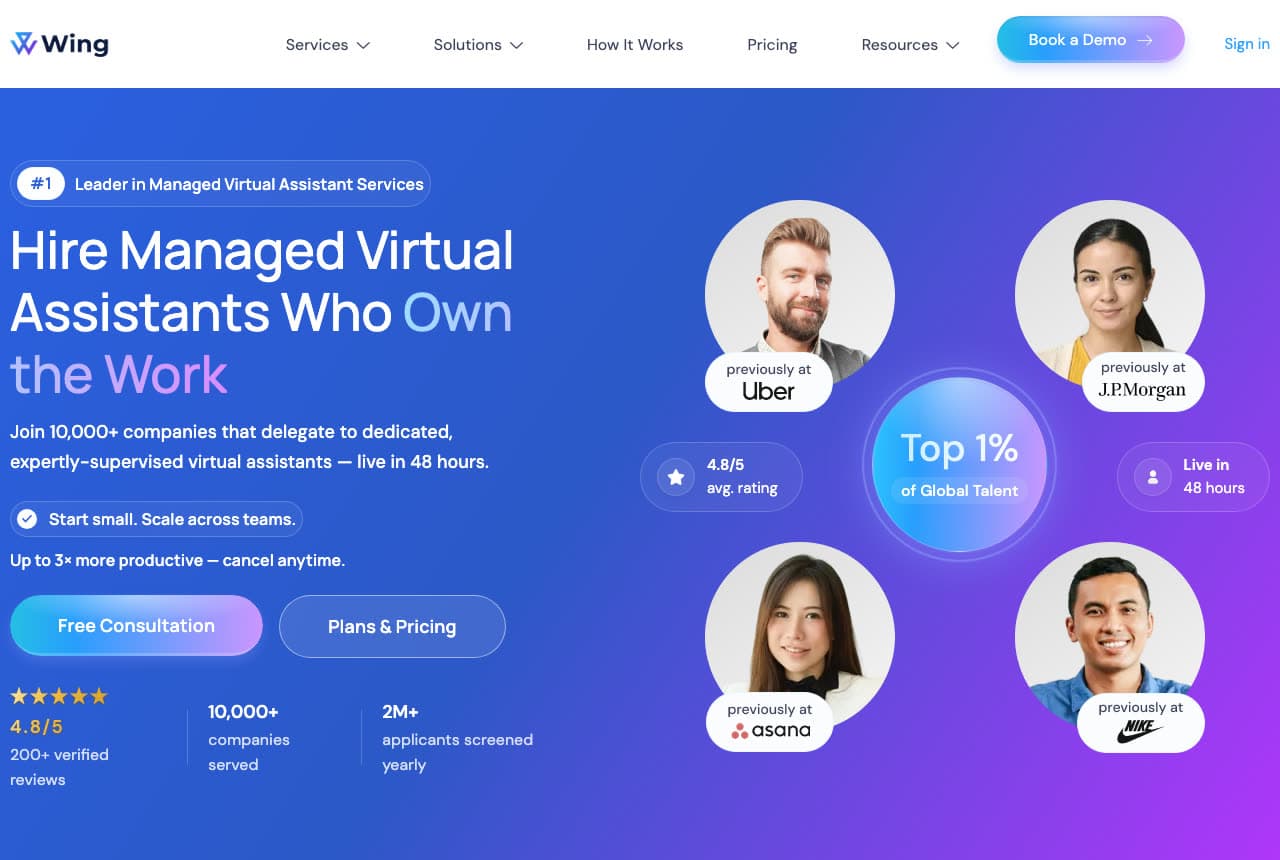
Wing Assistant answers the offshore-VA objection with credentials attached to faces. On a blue-to-purple gradient, four circular portraits each carry a white chip beneath — 'previously at Uber', 'previously at J.P.Morgan', 'previously at asana', 'previously at NIKE' — arranged around a glowing circle reading 'Top 1% of Global Talent', with 'Live in 48 hours' and a 4.8/5 rating floating beside them. The headline, 'Hire Managed Virtual Assistants Who Own the Work', runs 'Own the Work' out of white into pale blue and lilac, and the word that matters is 'Managed': the sub-line promises 'expertly-supervised' assistants, which is the real fear being addressed. A stats row closes it — 10,000+ companies served, 2M+ applicants screened yearly. Wing shows that a credential is more persuasive pinned to a person than listed in a paragraph.
Opens a similar Zarla design you can make yours.
timeetc.com
- Task-Based VA Service
- Corporate
Time etc: A running total of hours saved since 2007
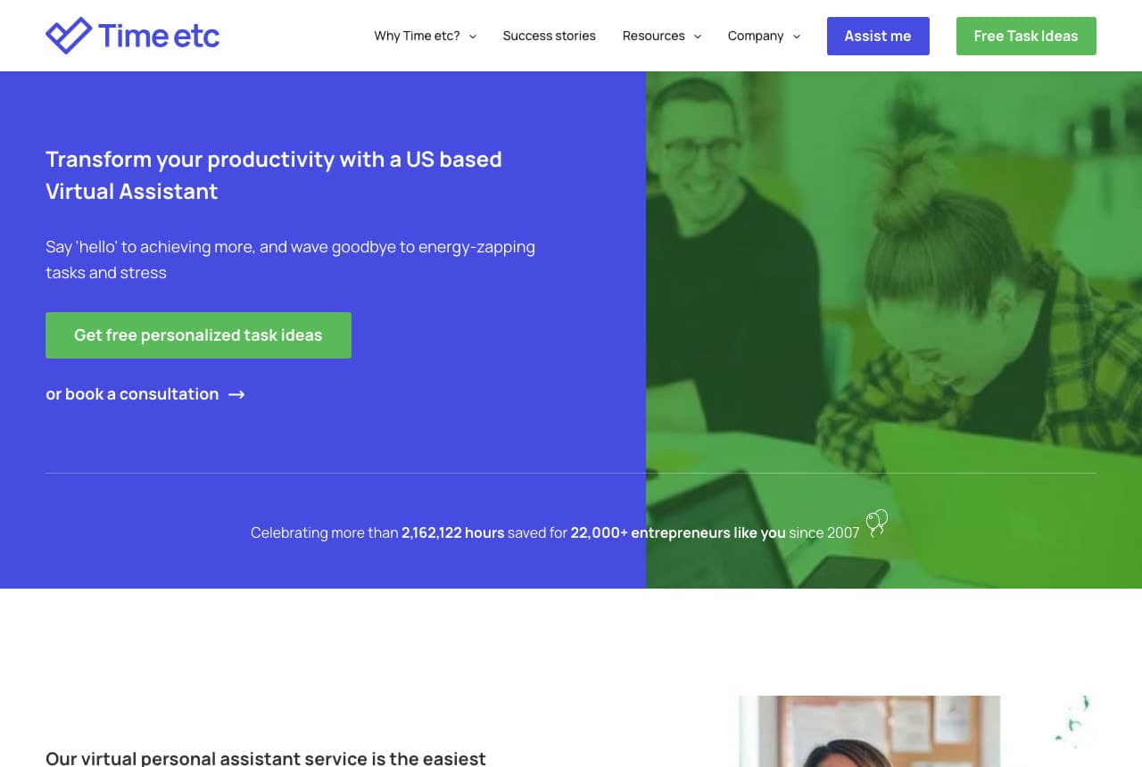
Time etc puts a nineteen-year track record into one line and lets it carry the page. At the foot of a royal-blue panel and a green-duotoned photograph of two people at laptops, a hairline rule runs the full width and a single sentence straddles the split: 'Celebrating more than 2,162,122 hours saved for 22,000+ entrepreneurs like you since 2007.' The precision is the point — a rounded '2 million' would read as marketing, while 2,162,122 reads as a number someone counts. The rest is deliberately plain: 'Transform your productivity with a US based Virtual Assistant', a green button offering 'free personalized task ideas' rather than a sales call, and a quieter text link to book a consultation. One honest note: the headline is set small for the space it occupies, so the counter ends up being the loudest thing in the fold. Time etc shows what a specific number buys you.
Opens a similar Zarla design you can make yours.
theorganisedva.com.au
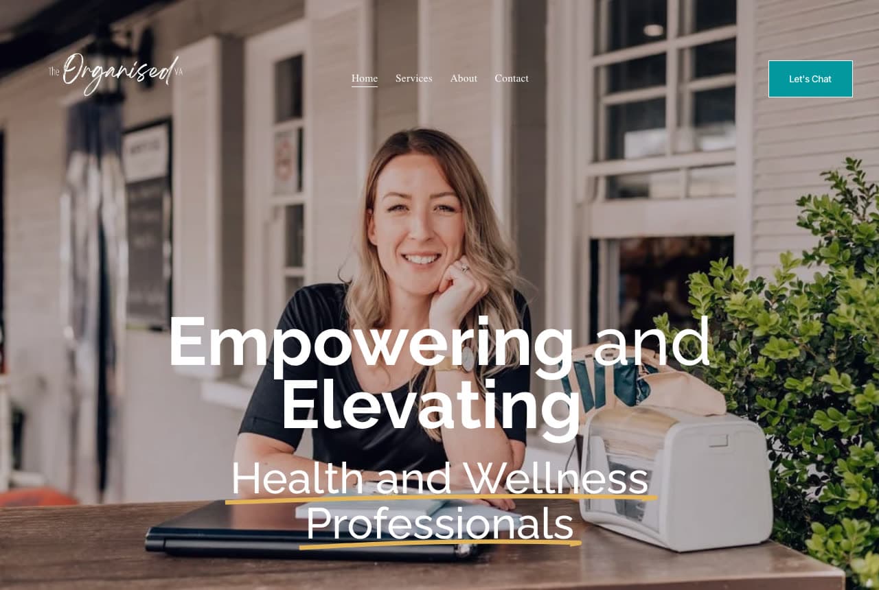
The Organised VA: One niche named in the only line on the page
The Organised VA gives its whole first screen to a photograph and a single sentence, and the sentence does all the qualifying. Over a full-bleed shot of its owner at an outdoor timber table — closed laptop, file box, verandah behind her — white type reads 'Empowering and Elevating' in alternating bold and light weights above a lighter 'Health and Wellness Professionals', with yellow hand-drawn underlines beneath the niche. There is no services list, no stats bar and no logo wall in the fold; just a script wordmark, a four-item nav and a teal 'Let's Chat' button. It works because a naturopath or a physio recognises themselves instantly and everyone else self-selects out, which is exactly what a solo practitioner with limited capacity wants. The Organised VA is the cheapest version of the strongest idea in this gallery: say who you are for, in the largest type on the page.
Opens a similar Zarla design you can make yours.
larkvaneinboxcalendar.com
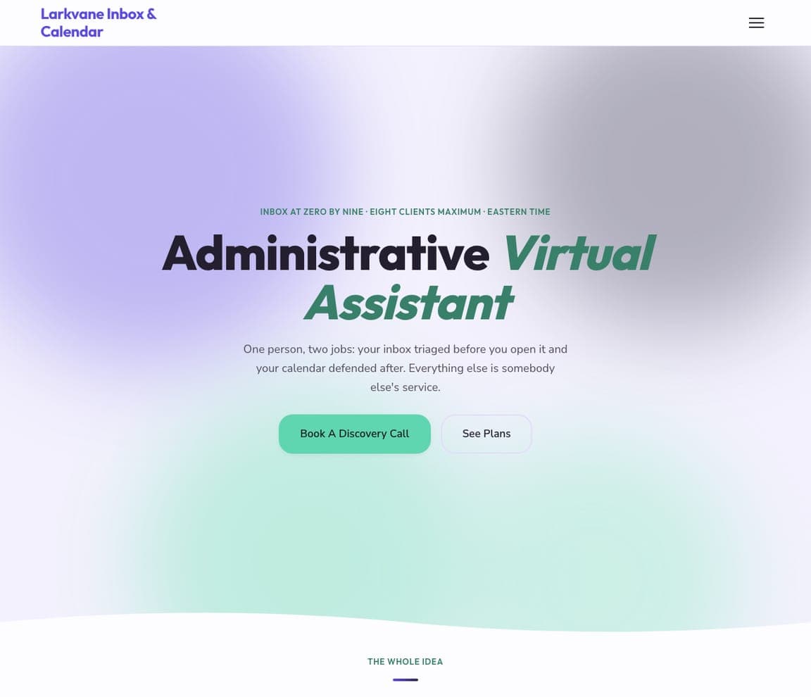
Larkvane Inbox & Calendar: One person, two jobs, eight clients maximum
Larkvane Inbox & Calendar sells a deliberately narrow practice: two jobs done properly, and an explicit refusal of everything else. A soft aurora gradient runs violet at the top into mint at the bottom with no photography at all, and the eyebrow sets the terms of the practice before the pitch: 'INBOX AT ZERO BY NINE · EIGHT CLIENTS MAXIMUM · EASTERN TIME'. The oversized headline pairs a near-black 'Administrative' with a green italic 'Virtual Assistant', and the sub-line is a model of scope-setting: 'One person, two jobs: your inbox triaged before you open it and your calendar defended after. Everything else is somebody else's service.' A mint button offers the discovery call, with plans one click away. Larkvane shows that a capacity limit is a selling point — scarcity and quality reading as the same signal to a buyer.
cadencewellpodcastsupport.com
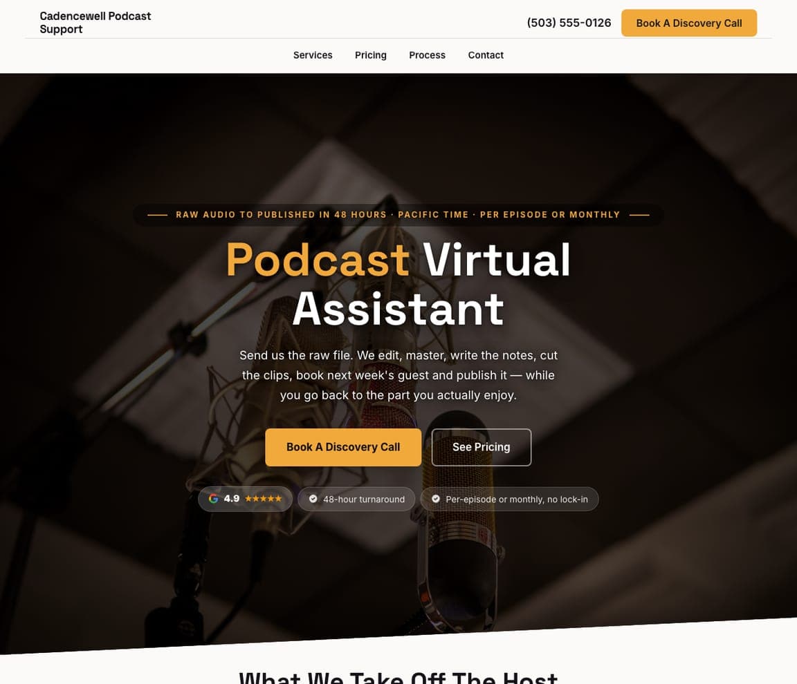
Cadencewell Podcast Support: Raw audio to published in 48 hours, in amber
Cadencewell Podcast Support trades on a deadline rather than a task list. The hero is a dimmed, warm-lit photograph of a studio condenser microphone in a shock mount, and the eyebrow between two amber rules states the promise as a turnaround: 'RAW AUDIO TO PUBLISHED IN 48 HOURS · PACIFIC TIME · PER EPISODE OR MONTHLY'. The headline splits an amber 'Podcast' from a white 'Virtual Assistant', and the paragraph lists the whole job in one breath — 'We edit, master, write the notes, cut the clips, book next week's guest and publish it' — before landing the emotional close: 'while you go back to the part you actually enjoy.' Three chips underneath carry a 4.9 Google rating, a 48-hour turnaround and 'Per-episode or monthly, no lock-in'. Cadencewell shows a specialist how to price a promise instead of an hour.
harrowvanerealtysupport.com
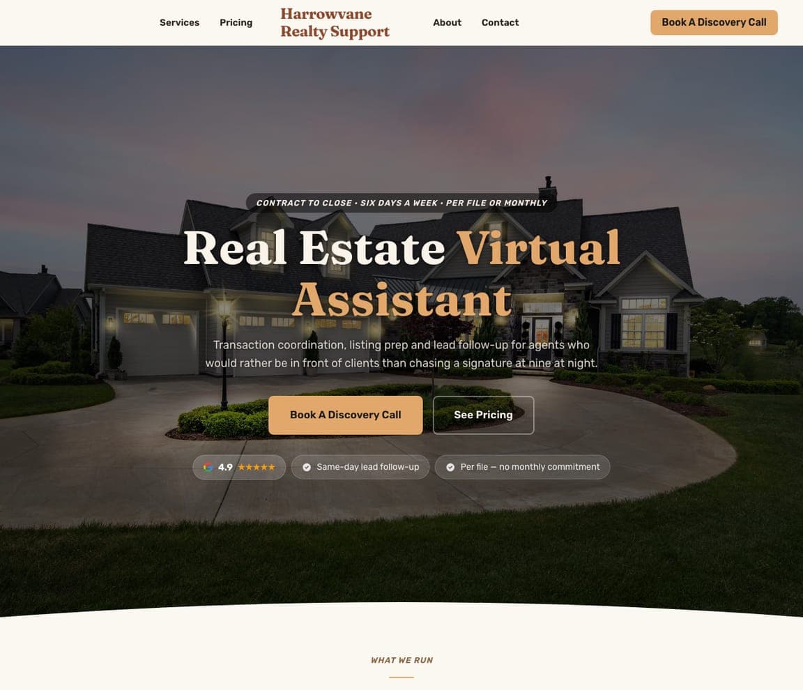
Harrowvane Realty Support: A dusk-lit listing behind a centred serif
Harrowvane Realty Support borrows the imagery of the industry it serves. A large suburban home sits at dusk with its windows warmly lit, a curving driveway leading in — a real estate agent's own hero shot, used to sell support to the agent. A centred serif wordmark sits between nav items split either side of it, and the headline pairs a cream 'Real Estate' with a sand 'Virtual Assistant'. The sub-line names the exact resentment the service removes: 'for agents who would rather be in front of clients than chasing a signature at nine at night.' The eyebrow pill sets the commercial terms — 'CONTRACT TO CLOSE · SIX DAYS A WEEK · PER FILE OR MONTHLY' — and chips underneath add same-day lead follow-up and 'Per file — no monthly commitment'. Harrowvane shows that dusk imagery keeps light type readable where midday never would.
quilbeckreception.com
- Virtual Receptionist
- Bright
Quilbeck Reception: The trial-week form sits inside the fold
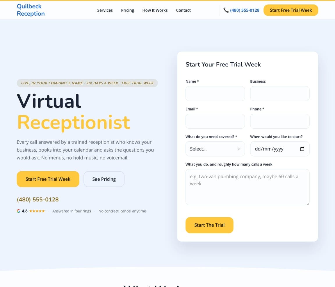
Quilbeck Reception puts the form where the panic is: its buyer loses money every time a call rings out, so the trial form sits in the first screen rather than at the bottom. On a pale sky-blue field, a navy 'Virtual' sits over a yellow 'Receptionist', and the sub-line disposes of three objections in one sentence: 'No menus, no hold music, no voicemail.' The right half is a white card headed 'Start Your Free Trial Week' — name, business, email, phone, what needs covering, a start date, and a free-text field whose placeholder teaches the reader how to answer it ('e.g. two-van plumbing company, maybe 60 calls a week.'). A trust row carries a 4.8 Google rating, 'Answered in four rings' and 'No contract, cancel anytime'. Quilbeck shows that a good placeholder is instruction, not decoration.
ledgervanebookkeeping.com
- Bookkeeping VA
- Professional
Ledgervane Bookkeeping: Weekly, not quarterly — a rhythm as the pitch
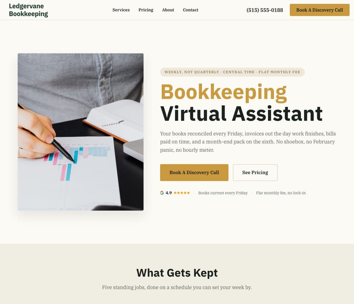
Ledgervane Bookkeeping sells a schedule rather than a service. The eyebrow pill states the difference from a traditional accountant in three fragments: 'WEEKLY, NOT QUARTERLY · CENTRAL TIME · FLAT MONTHLY FEE'. An ochre 'Bookkeeping' sits above a near-black 'Virtual Assistant' on a cream ground with a forest-green wordmark, beside a photograph of a hand and pen over a printed bar chart. The paragraph turns the schedule into something a business owner can picture — 'Your books reconciled every Friday, invoices out the day work finishes, bills paid on time, and a month-end pack on the sixth' — then names the fears it removes: 'No shoebox, no February panic, no hourly meter.' The section below is headed 'What Gets Kept'. Ledgervane shows that a rhythm someone can set their week by is easier to buy than an outcome.


