Inspiration · Wedding Planner

The Best Wedding Planner Website Examples, Explained

Looking for wedding planner website examples? These 14 are the best we could find — standout real wedding planner sites plus designs you can build with Zarla — and each comes with a breakdown of the specific design move that makes it work. Find a look you love and you can build a site in that exact style, free, in about 30 seconds.

Real sites + designs you can build with Zarla — free to build and preview, no credit card

What makes a great wedding planner website

The best wedding planner websites share a few moves: they earn trust fast, lead with strong visuals of the work, point to one clear action, and match the design to how their customers decide. Each example below calls out the specific choice worth stealing for your own wedding planner website.

Marcy Blum Events website — Celebrity Planner design example
Real site · New York, NY
  • Celebrity Planner
  • Editorial
  • Blush + black

Marcy Blum Events: The name, at billboard scale, as the brand

Marcy Blum Events makes the boldest statement in this gallery by stripping almost everything away: 'MARCY BLUM EVENTS' set in enormous, high-fashion display type on a soft blush canvas, 'EST. 1986,' and just an email and phone number. No hero photo of a wedding, no portfolio grid above the fold — for a celebrity wedding planner of this stature, the name IS the brand, and the confidence to present it at billboard scale with a 40-year establishment date signals you already know who she is (and if you don't, you're not the client). The oversized typography reads editorial and exclusive, like a fashion house. It's the ultimate expression of restraint-as-luxury: when your reputation precedes you, the website's job is to look as expensive and self-assured as your clientele expects. Sometimes the most powerful hero is your own name, set enormous.

  • The name at billboard scale — reputation as the whole brand
  • 'Est. 1986' + fashion-house type signals exclusive pedigree
  • Restraint-as-luxury: no portfolio needed above the fold

Steal this: When your reputation precedes you, set your own name enormous and cut almost everything else. Confidence reads as luxury.

Modern Rebel website — Non-Traditional design example
Real site · New York, NY
  • Non-Traditional
  • Rebellious
  • Pink + warm

Modern Rebel: The anti-wedding wedding planner

Modern Rebel builds an entire brand on rejecting wedding conventions: 'The Original Modern Rebel of the Wedding Industry,' a friendly founder intro ('Hey, I'm Amy… I help couples plan total Love Parties — weddings that break the rules'), and the killer positioning line 'The Anti-Wedding Wedding Planner' (a nickname from The Cut). For the couple who finds traditional, stuffy weddings suffocating — and there are many — this contrarian identity is a magnet, and calling weddings 'Love Parties' reframes the whole product around fun over formality. The warm pink palette and casual, first-person voice make it feel like a friend, not a vendor. Positioning against your own industry's conventions ('anti-wedding') is a powerful way to own a specific, underserved segment — the couples who want a celebration that feels like them, not like every other wedding. Define yourself against the category.

  • 'Anti-wedding wedding planner' magnetizes convention-averse couples
  • 'Love Parties' reframes weddings around fun over formality
  • Casual first-person voice feels like a friend, not a vendor

Steal this: Position against your own industry's conventions ('anti-wedding'). Owning the couples who reject the norm is a magnet, not a limitation.

Grit & Grace Events website — Bespoke Planning design example
Real site · Southern California
  • Bespoke Planning
  • Aspirational
  • Warm + serif

Grit & Grace Events: An aspirational promise, press-backed

Grit & Grace Events leads with a promise aimed straight at the dreaming couple: 'You Deserve a Wedding That Turns Out Even Better Than You Imagined,' over a warm string-lit reception, with 'Bespoke Wedding Planning' and 'Plan Your Wedding' as the CTA. Directly beneath sits a press bar — New York Times, Brides, WeddingWire, Shutterfly — that converts aspiration into credibility. That 'even better than you imagined' framing sells the emotional outcome (exceeded expectations) rather than a service list, and the immediate press validation reassures a couple about to hand over the most important day of their lives. The elegant serif and warm photography keep it romantic. For a wedding planner, pairing an aspirational, outcome-focused headline with recognizable press or venue credibility is the ideal one-two: make them dream, then prove you can deliver the dream.

  • 'Better than you imagined' sells the emotional outcome
  • Press bar (NYT, Brides) converts aspiration to credibility
  • Warm string-lit reception photo keeps it romantic
Pocketful of Dreams website — Design-Led Luxury design example
Real site · Cotswolds, UK
  • Design-Led Luxury
  • Editorial
  • Cream + sage

Pocketful of Dreams: Design-led luxury, stated as a philosophy

Pocketful of Dreams positions at the design-conscious luxury end with a philosophy, not a pitch: a stunning glasshouse-venue photograph, 'For Those Who Believe in Authentic Celebrations, Considered Gatherings, and Design That Feels as Good as It Looks,' and 'an experience-first approach… rooted in story, style, and intentional design.' The vocabulary ('considered,' 'intentional,' 'elegantly understated') and the architectural, editorial art direction filter precisely for the couple who cares about design and authenticity over big-and-flashy. This is wedding planning as art direction, and the site performs the taste it's selling — the restraint, the beautiful venue, the thoughtful copy all demonstrate the sensibility a client is buying. When your differentiator is design taste, the website itself must be the proof; Pocketful's is, and its language names the exact values of its ideal client.

  • 'Design that feels as good as it looks' filters for taste
  • The site itself demonstrates the sensibility it sells
  • 'Considered / intentional' language names the ideal client's values
Soul Bound website — Modern Romantic design example
Real site · New Zealand
  • Modern Romantic
  • Cinematic
  • Charcoal + warm

Soul Bound: Modern romance, warmly addressed

Soul Bound opens with quiet, modern romance: a beautifully-shot photograph of a couple walking away in the golden light, 'Soul Bound' in an elegant serif, and a warm, personal welcome — 'Hello, Love Birds. Congratulations on your engagement… we cannot wait to be a part of it.' The dark, cinematic photography and the direct, affectionate address to the newly-engaged couple make it feel intimate and current rather than fussy or traditional. The copy names the real feeling ('we know how overwhelming the coming months can be') and positions the planner as the calm, honest partner through it. For a modern wedding planner, speaking directly and warmly to the couple as people (not 'clients'), paired with contemporary, emotive photography, creates the personal connection that wins the booking. Address the couple like friends and show the feeling, not just the flowers.

  • 'Hello, Love Birds' addresses the couple warmly and directly
  • Dark cinematic photography reads modern, not fussy
  • Names the overwhelm, positions the planner as the calm partner
Mandy Scott Events website — Upscale Elegant design example
Real site · San Francisco, CA
  • Upscale Elegant
  • Atmospheric
  • Black + white

Mandy Scott Events: Grandeur, in atmospheric black and white

Mandy Scott Events leads with pure atmosphere: a dreamy, double-exposed black-and-white image of a couple dancing in a grand, ornate venue, with a spare nav (Weddings • Events • Décor / Portfolio / Services). The moody, cinematic, almost fine-art treatment signals a planner who works at the high, elegant end — grand San Francisco venues, sophisticated design — and the restraint (one beautiful image, minimal text) lets the mood do the selling. 'Voted Best Wedding Planner in San Francisco' anchors the local authority. Where a mid-market planner shows a grid of happy couples, Mandy Scott shows one artful, atmospheric frame, positioning the brand as tasteful and exclusive. For an upscale planner, a single, gorgeously art-directed image that captures the FEELING of an elegant wedding can be more persuasive than a portfolio — it sells the emotion and the taste in one frame.

  • One artful B&W frame sells the feeling of an elegant wedding
  • Cinematic restraint positions the planner as tasteful, exclusive
  • 'Best in San Francisco' anchors local authority
Lavender Blue website — Alternative Weddings design example
Real site · Edinburgh, UK
  • Alternative Weddings
  • Colourful

Lavender Blue: Quirky, colourful, proudly alternative

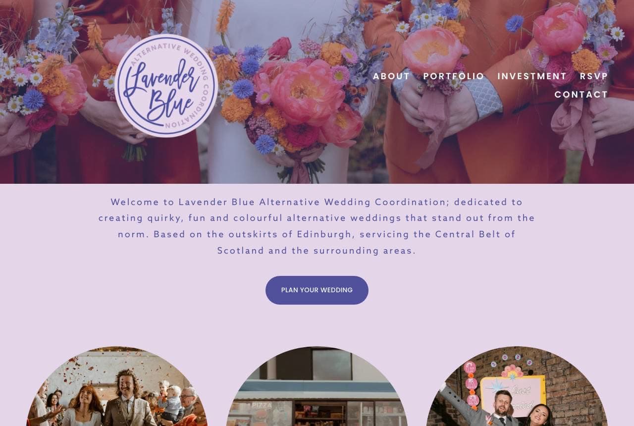
Lavender Blue Alternative Wedding Coordination owns the un-traditional lane with joy: a bright, floral, lavender-hued design, copy that's explicit about the niche ('dedicated to creating quirky, fun and colourful alternative weddings that stand out from the norm'), and — the standout — real client couples shown in circular photos with their first names (Jess + Rob, Kirsten + Sam, Lauren + Daniel), several visibly non-traditional. Naming the specialty ('alternative') and showing genuinely diverse, real, joyful couples rather than glossy stock brides makes the inclusive, anything-goes positioning credible and welcoming. For couples who feel unseen by the traditional white-wedding industry, seeing people like themselves celebrated on the homepage is a powerful signal. When you serve an underserved, non-mainstream audience, put real members of that community front and centre — the representation is the pitch.

Wren & Ivy Events — Wedding Planner website design you can build with Zarla
Build this with Zarla
  • Wedding Planner
  • Elegant

Wren & Ivy Events: Beautifully planned, effortlessly yours

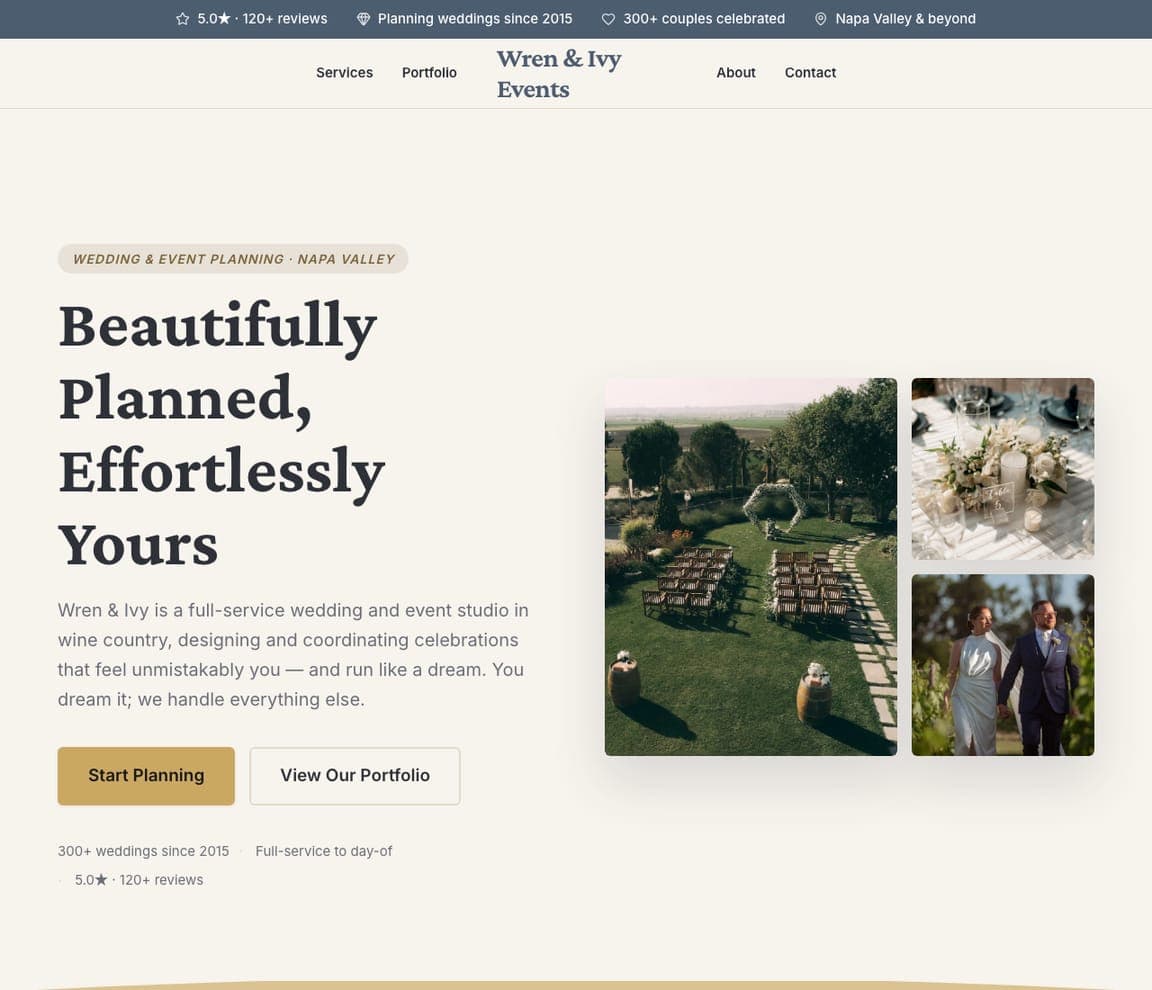
Wren & Ivy Events is Zarla's wedding-planner template, and its image-collage hero lands the promise couples respond to: 'Beautifully Planned, Effortlessly Yours' — the dream of a gorgeous wedding without the stress — in a slate-blue-and-antique-gold palette that reads elegant and calming. The collage format showcases multiple weddings and moods at once, exactly what a planner wants to display, and the structure carries services (full planning, partial, day-of), a portfolio, an about-the-planner section, and a consultation CTA — the complete planner funnel. It borrows the right instincts from this gallery: sell the effortless outcome, look tasteful, and make the enquiry easy. Swap in photos of your own weddings and it's an elegant, on-brand planner site in about 30 seconds — no photographer or designer required. The emotional register a couple needs before handing over their big day.

See this template
Voyage & Vow — Destination Weddings website design you can build with Zarla
Build this with Zarla
  • Destination Weddings
  • Wanderlust

Voyage & Vow: 'Just arrive and celebrate' — the destination promise

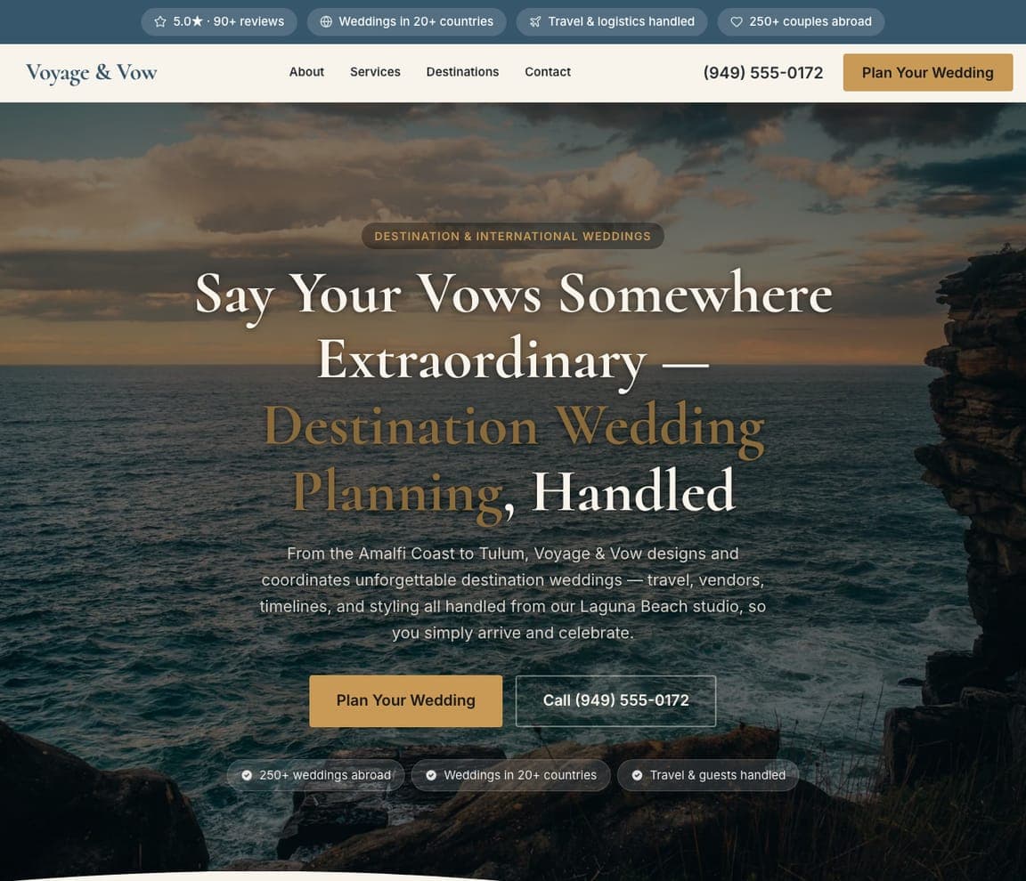
Voyage & Vow sells the fantasy AND removes the fear: 'Say Your Vows Somewhere Extraordinary — Destination Wedding Planning, Handled,' over a dusk Amalfi-style coastline, with the line that closes a nervous couple — 'travel, vendors, timelines, and styling all handled… so you simply arrive and celebrate.' A destination wedding's dream (a wild, beautiful somewhere) is inseparable from its dread (planning a wedding a continent away), so naming that everything's handled is the whole pitch. The gold-on-dusk palette and '20+ countries' proof sell the wanderlust and the competence at once. For a destination or travel-based planner, pair the aspirational location with an explicit 'we handle the logistics' promise — the couple is buying permission to relax about the hardest wedding to plan.

See this template
Meadowlark Elopements — Elopements website design you can build with Zarla
Build this with Zarla
  • Elopements
  • Intimate

Meadowlark Elopements: Just the two of you — none of the fuss

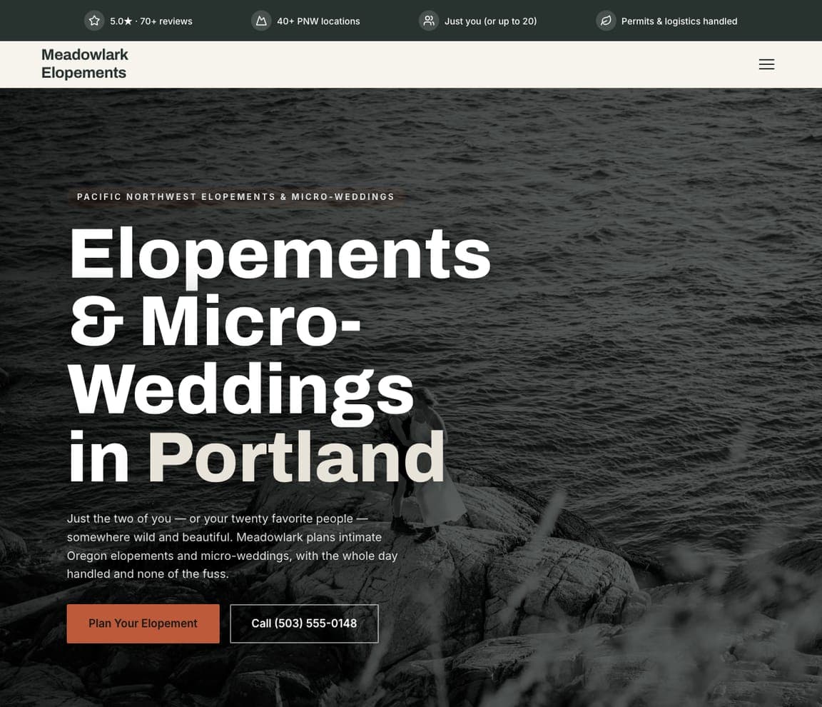
Meadowlark Elopements owns the counter-trend to the big-production wedding: 'Elopements & Micro-Weddings in Portland' in huge type over a wild, moody Pacific-Northwest coast, with a subhead that draws the exact line — 'Just the two of you — or your twenty favorite people — somewhere wild and beautiful… with the whole day handled and none of the fuss.' For couples who find the 200-guest ballroom suffocating (the same instinct Modern Rebel taps), naming 'elopement' and 'micro-wedding' and promising 'none of the fuss' is a magnet. The dark type-hero and untamed landscape perform the intimate, adventurous mood. For an elopement specialist, lead with the size and the freedom — the whole appeal is that this is NOT a traditional wedding, so say so and show somewhere breathtaking.

See this template
Zari Weddings — South Asian Weddings website design you can build with Zarla
Build this with Zarla
  • South Asian Weddings
  • Ceremonial

Zari Weddings: Every ritual, from mehndi to vidaai

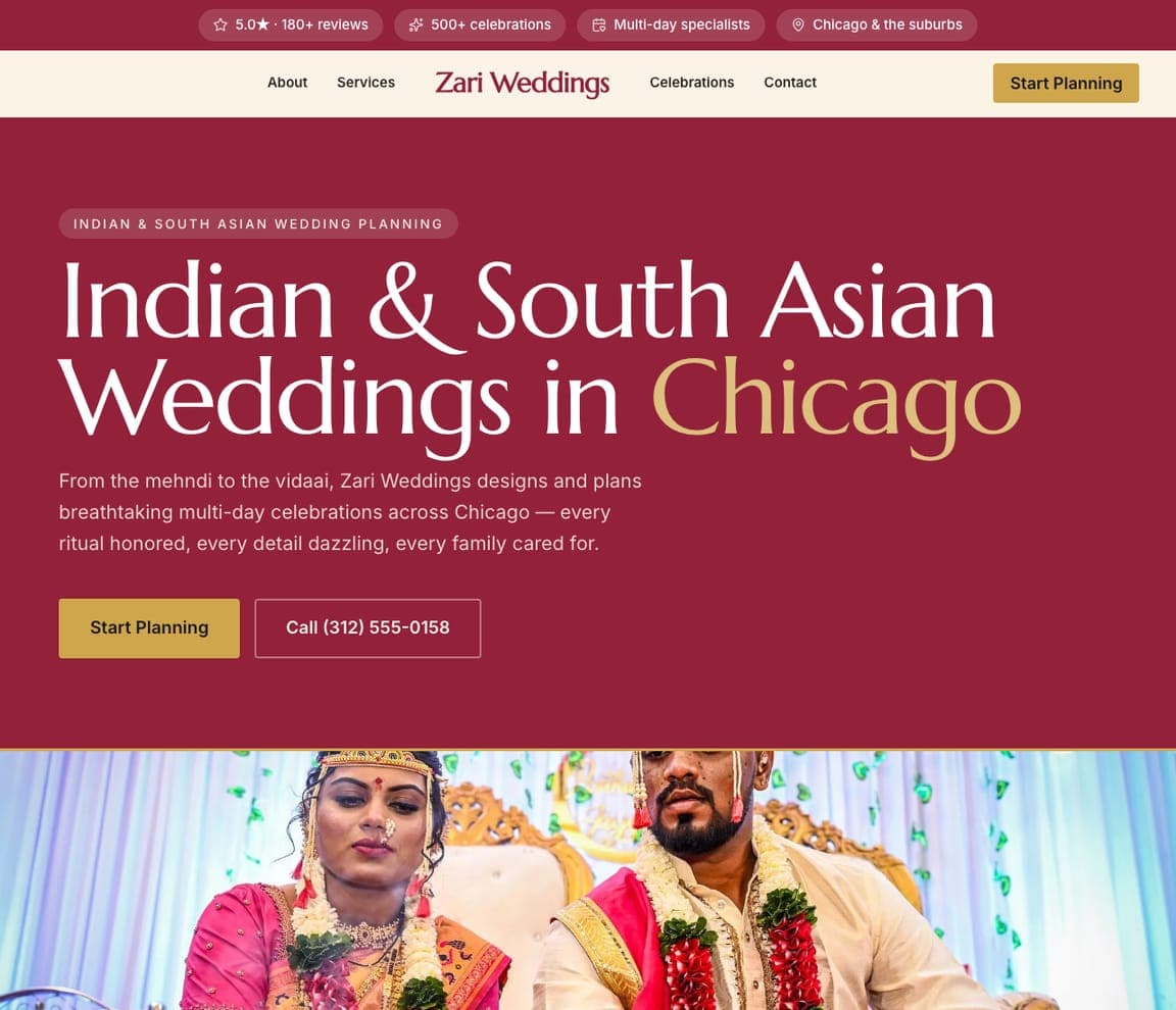
Zari Weddings shows the power of deep cultural fluency: 'Indian & South Asian Weddings in Chicago' in a rich maroon-and-gold palette drawn straight from the celebrations it plans, with copy that proves insider knowledge — 'From the mehndi to the vidaai… every ritual honored, every detail dazzling, every family cared for' — beside a radiant photo of a couple in traditional dress. For a South Asian family planning a multi-day wedding, a planner who names the specific rituals — and 'every family cared for,' acknowledging the extended-family dynamic — signals they won't have to explain their own traditions. It's the representation-is-the-pitch move Lavender Blue makes, tuned to culture: use the community's own palette and vocabulary, not generic white-wedding language, and the booking follows.

See this template
Oak & Olive Weddings — Vineyard Weddings website design you can build with Zarla
Build this with Zarla
  • Vineyard Weddings
  • Wine-Country

Oak & Olive Weddings: Long tables among the vines

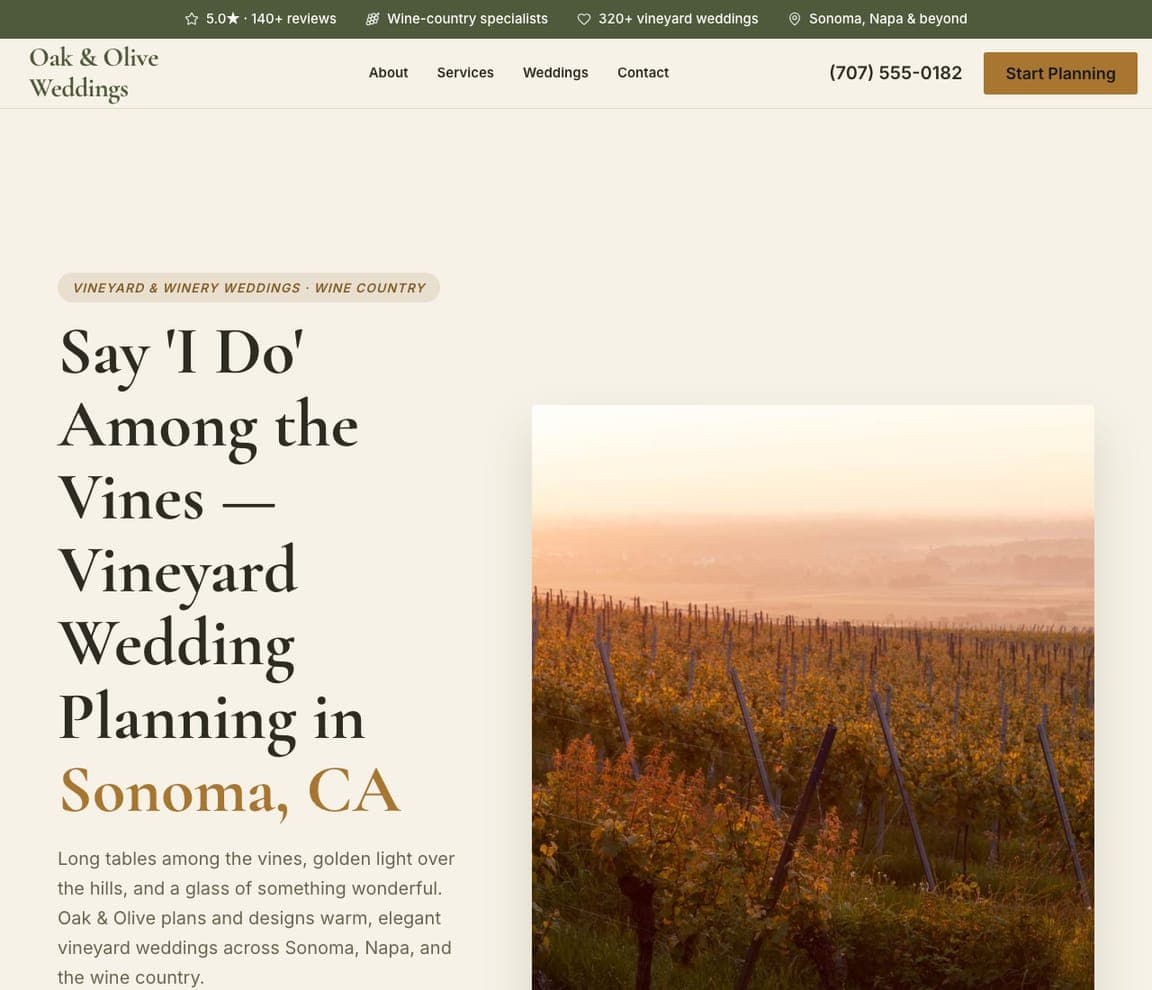
Oak & Olive Weddings sells a whole atmosphere in one line: 'Say I Do Among the Vines — Vineyard Wedding Planning in Sonoma, CA,' with a golden-hour vineyard beside it and a subhead that paints the day — 'long tables among the vines, golden light over the hills, and a glass of something wonderful.' Rather than list planning services, it evokes the specific sensory fantasy of a wine-country wedding, which is exactly what a couple choosing a vineyard venue is buying. The warm cream-and-terracotta serif palette matches the setting. For a venue-specific planner (vineyard, estate, garden), lead with the sensory world of that place — the light, the long tables, the wine — because the couple has already fallen for the setting; your job is to show you understand its particular magic.

See this template
Salt & Sea Weddings — Beach Weddings website design you can build with Zarla
Build this with Zarla
  • Beach Weddings
  • Coastal

Salt & Sea Weddings: Barefoot on the sand, at golden hour

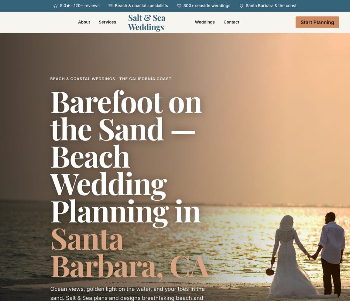
Salt & Sea Weddings captures the beach-wedding dream in three words: 'Barefoot on the Sand — Beach Wedding Planning in Santa Barbara, CA,' over a sun-drenched photo of a couple walking the shoreline at golden hour, with 'ocean views, golden light on the water, and your toes in the sand.' The full-bleed sunset image does most of the selling — a coastal wedding is chosen for exactly this feeling, so showing it at its most beautiful (that golden-hour light) is more persuasive than any service list. The coral-and-cream serif keeps it romantic. For a beach or coastal planner, the single best hero is a real ceremony in that perfect end-of-day light — the emotion in one frame is the pitch, the same feeling-first move Soul Bound makes.

See this template
Timber & Twine — Barn & Farm Weddings website design you can build with Zarla
Build this with Zarla
  • Barn & Farm Weddings
  • Rustic

Timber & Twine: String lights in the rafters

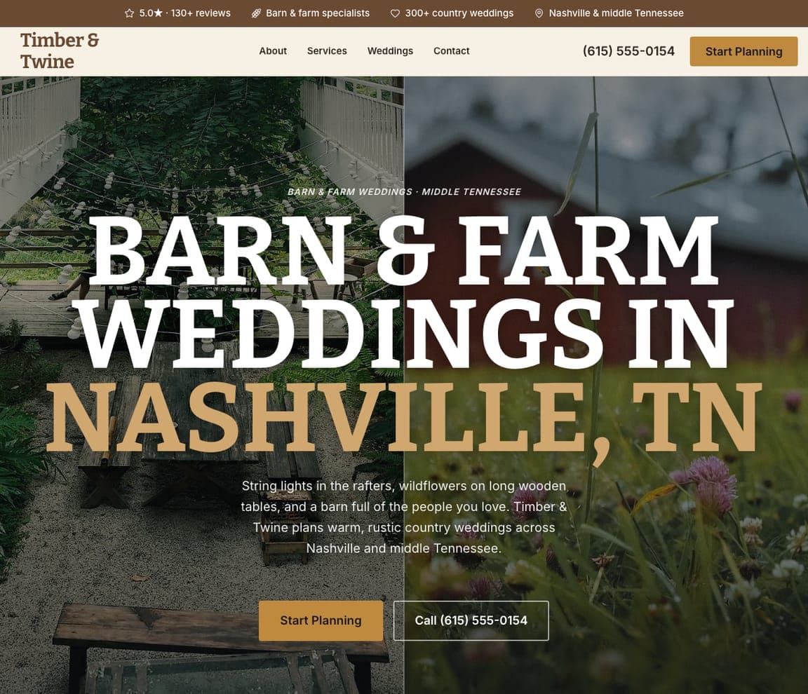
Timber & Twine nails rustic-country romance: 'Barn & Farm Weddings in Nashville, TN' in bold uppercase over a warm barn setting, with a subhead that assembles the whole vision — 'string lights in the rafters, wildflowers on long wooden tables, and a barn full of the people you love.' Like the vineyard and beach templates, it wins by evoking the specific, cozy sensory world of a barn wedding rather than listing coordination services, which is precisely the warmth a couple choosing a farm venue wants. The gold-on-dark palette and rustic uppercase carry the country mood. For a barn or farm-wedding planner, describe the room the couple is dreaming of — the lights, the long tables, the gathered people — that unpretentious warmth is the whole reason they skipped the ballroom.

See this template

Frequently asked

Where can I find good wedding planner website examples?

Right here — this page curates wedding planner website examples two ways: standout real businesses (each linked, so you can explore the live site) and professionally designed Zarla templates you can clone and make your own. Every example comes with a note on why the design works — trust signals, layout, calls to action — so you can copy the move, not just the look.

What makes a good wedding planner website?

A good wedding planner website earns trust in the first few seconds, leads with strong visuals of the work, gives visitors one obvious action, and loads fast on a phone. Every design below leads with proof and a single clear call to action rather than a wall of text.

How much does a wedding planner website cost?

A custom wedding planner website from a designer typically runs into the thousands up front, and template builders charge roughly $16–$30 per month. An AI builder generates a complete, editable design for free and only charges (on the Premium plan) when you publish to your own domain — so you can build and preview before spending anything.

Do I need a designer to build a wedding planner website?

No. Several designs on this page were generated by Zarla and are fully editable — you describe your business and get a complete, professionally designed site in about 30 seconds, then refine it by chatting. Building and previewing is free; publishing to your own domain needs the Premium plan.

What pages does a wedding planner website need?

Most wedding planner businesses need just a few: a home page that proves trust and points to one clear action, an about page that puts a face to the business, a services or work page that shows what you do, and a contact page with a form and a phone number. Local businesses also benefit from location or service-area pages that help them show up in nearby searches.

How do I get more customers from my wedding planner website?

Lead with proof in the first few seconds (reviews, real photos, results), make one action obvious on every screen (call, book, or enquire), and keep it fast on mobile — most visitors arrive on a phone. The designs above each do this differently, but they all earn trust early and remove friction from the next step.

You've seen what works. Now make it yours.

Describe your business and Zarla designs a complete, professional website in about 30 seconds — built to convert, just like the ones above.

Free to build and preview · no credit card · publish to your own domain on Premium