Inspiration · Winery

The Best Winery Website Examples, Explained

Looking for winery website examples? These 9 are the best we could find — standout real winery sites plus designs you can build with Zarla — and each comes with a breakdown of the specific design move that makes it work. Find a look you love and you can build a site in that exact style, free, in about 30 seconds.

Real sites + designs you can build with Zarla — free to build and preview, no credit card

What makes a great winery website

The best winery websites share a few moves: they earn trust fast, lead with strong visuals of the work, point to one clear action, and match the design to how their customers decide. Each example below calls out the specific choice worth stealing for your own winery website.

Ridge Vineyards website — Iconic Estate design example
Real site · California
  • Iconic Estate
  • Minimal
  • Misty landscape

Ridge Vineyards: Let the landscape be the whole hero

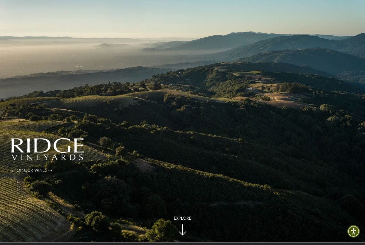
Ridge Vineyards trusts its place to do the selling: a full-screen, misty photograph of the Santa Cruz mountain ridgeline, 'Ridge Vineyards' in restrained type, and a single quiet 'Shop Our Wines' — no discount banner, no bottle grid, just terroir. For a winery of Ridge's stature (the 'Judgment of Paris' legacy referenced below), the restraint IS the flex, signalling that the wine, like the view, needs no hard sell. The near-monochrome landscape and generous space read premium and confident, and the elegant minimalism appeals to the serious collector rather than the casual buyer. Wine is one of the few products where the place it comes from is a genuine quality signal, so leading with a breathtaking, unadorned photograph of that place — and almost nothing else — is a powerful move for any estate with a view worth showing. Let the land speak first.

  • Full-screen terroir photo — the place is the quality signal
  • Restraint (no banners, one CTA) reads premium and confident
  • Appeals to the collector, not the discount buyer

Steal this: If your place is the product, lead with one breathtaking photo of it and almost nothing else. Terroir sells itself.

Château du Taillan website — Heritage Château design example
Real site · Bordeaux, FR
  • Heritage Château
  • Storied
  • Cream + green

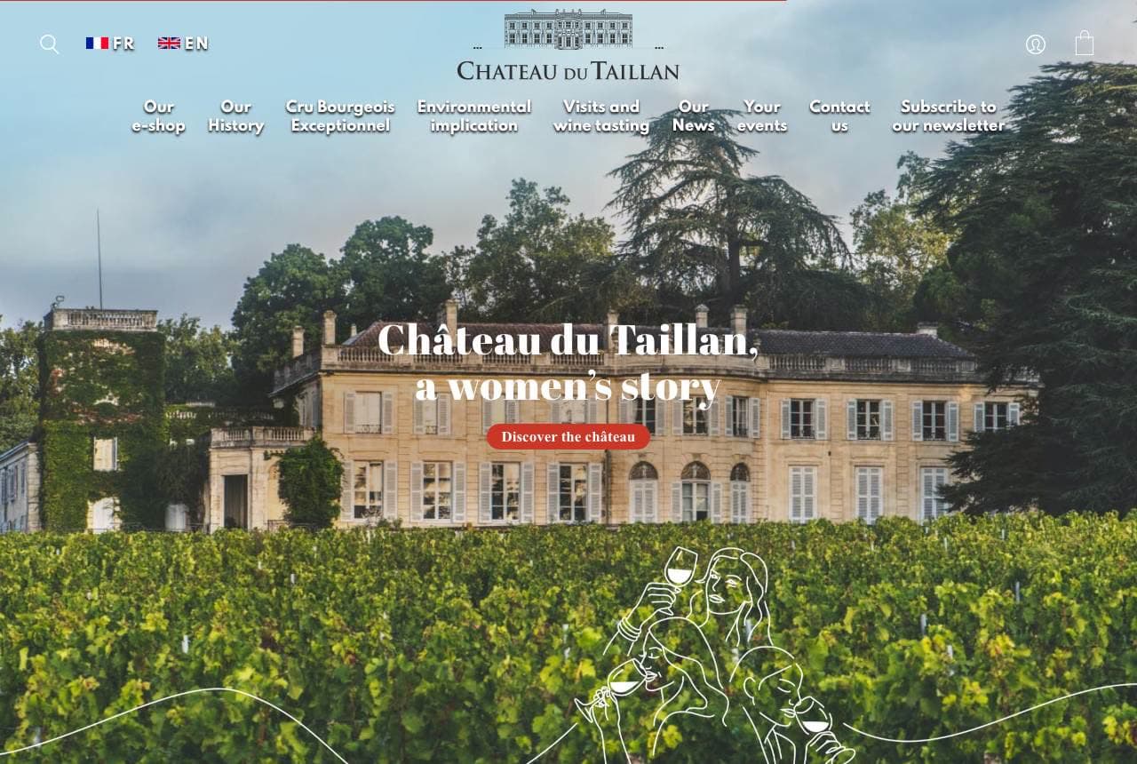
Château du Taillan: A Bordeaux estate told as a women's story

Château du Taillan takes a 130-year Bordeaux estate and gives it a strikingly human, contemporary angle: 'Château du Taillan, a women's story,' over a classic photograph of the château and vineyards, with a delicate line-illustration of women sharing wine woven across the scene. The copy explains that five sisters now run the family estate ('a modern history related by women… with this feminine aura, Château du Taillan managed to renew itself'). In a category dominated by centuries-old, male-lineage châteaux that all blur together, foregrounding the five sisters gives this estate a distinct, memorable identity and a genuine story worth telling. The elegant illustration softens the grandeur into something personal and current. When your category is full of interchangeable heritage, find the true human story inside your history and lead with it — the people are what a competitor can't replicate.

  • 'A women's story' gives a heritage château a distinct identity
  • The five-sisters narrative is a story a rival can't replicate
  • Line-illustration softens grandeur into something personal

Steal this: Find the true human story inside your history and lead with it. In a category of interchangeable heritage, the people are the difference.

Joiy website — Canned Wine design example
Real site · New Zealand
  • Canned Wine
  • Playful
  • White + pastel

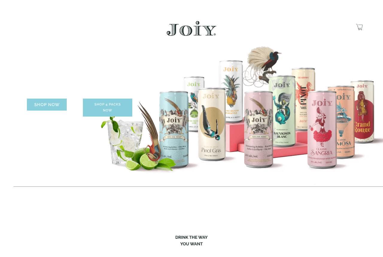
Joiy: Wine, reinvented for the can

Joiy rejects the entire wine-website playbook because it's selling a different product: canned wine spritzers, not cellared bottles. The homepage is bright, product-forward and unpretentious — a colourful lineup of cans (Sauvignon Blanc, Pinot Gris, Sangria, Mimosa) with whimsical bird illustrations, 'Shop Now / Shop 4-Packs,' and benefit icons (Drink the Way You Want, Recyclable, Convenient On the Go, Low-Calorie). It looks more like a craft-seltzer brand than a vineyard, and that's exactly right — the customer is a younger, casual drinker who finds traditional wine culture stuffy. By matching the design to the format (fun, portable, guilt-light) rather than the category convention (dark, reverent, terroir-obsessed), Joiy owns a segment the châteaux can't reach. When your product breaks the category mould, your website should too — design for the customer the format actually attracts.

  • Bright, product-forward design fits a canned-wine format
  • Benefit icons (portable, low-cal) speak to a casual drinker
  • Breaks every wine-site convention on purpose
Camel Valley website — English Sparkling design example
Real site · Cornwall, UK
  • English Sparkling
  • Practical
  • Green + white

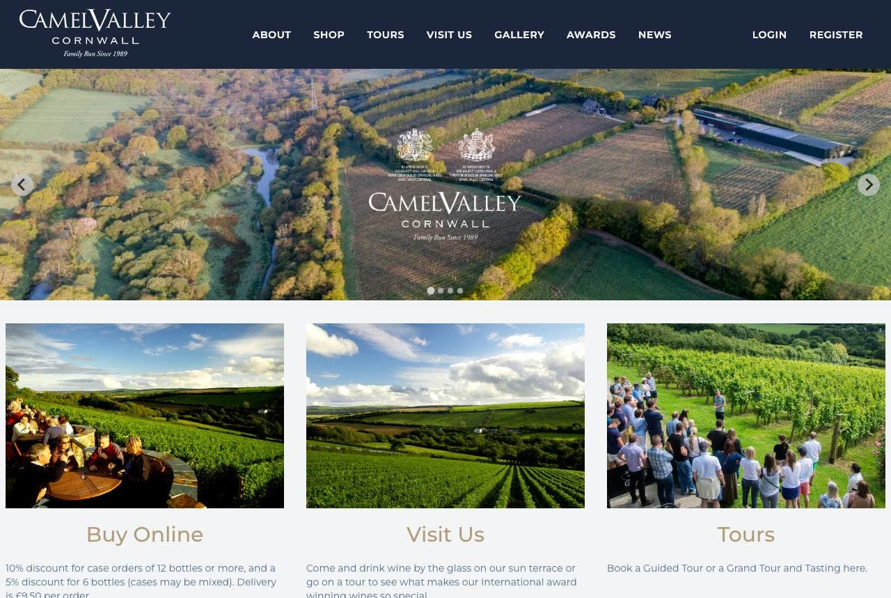
Camel Valley: Three doors for three visitor intents

Camel Valley, an English sparkling-wine estate in Cornwall, organizes its homepage around what visitors actually want to do: a sweeping aerial of the vineyard, then three clear tiles — 'Buy Online' (with case-discount details), 'Visit Us' (sun-terrace tastings), and 'Tours' (guided tour and tasting bookings). Splitting the three revenue streams — retail, cellar-door visits, and tours — into equal, obvious doors means every type of customer finds their path in one glance, whether they're a local buying a case or a tourist planning a day out. The 'Family Run Since 1989' mark and award mentions add credibility. For a winery that makes money three different ways, this intent-based navigation is smarter than a single 'shop' funnel — it acknowledges that a visit and a purchase are different journeys and gives each its own front door.

  • Three tiles split retail, visits and tours into clear doors
  • Intent-based nav serves every customer type at a glance
  • Aerial vineyard + 'family run since 1989' add credibility
Jordan Winery website — Estate + Hospitality design example
Real site · Sonoma, CA
  • Estate + Hospitality
  • Lifestyle
  • Charcoal + oak

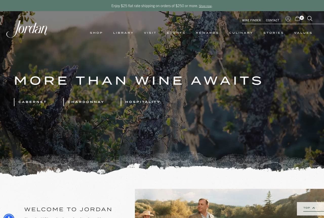
Jordan Winery: Selling the experience, not just the bottle

Jordan Winery leads with hospitality, not product: 'More Than Wine Awaits' over an atmospheric oak-canopy scene, with three pillars — Cabernet, Chardonnay, Hospitality — giving the visit equal billing with the wine. The copy reinforces it ('we believe wine should not overpower the food… Jordan is more than a bottle of wine'), and warm lifestyle photography of people gathered lakeside sells the estate as a destination and an experience. For a Sonoma winery, the tasting-room visit and events are a huge revenue and loyalty driver, so positioning the estate as a place to spend a day — not just a label to buy — captures the higher-value experiential customer. The 'more than wine' framing turns a winery into a lifestyle brand. When your business includes hospitality, give the experience equal weight with the product in the hero, and shoot the people enjoying it.

  • 'More Than Wine' gives the visit equal billing with the bottle
  • Lifestyle photography sells the estate as a destination
  • Captures the higher-value experiential, event-going customer
Silver Oak website — Premium DTC design example
Real site · Napa Valley, CA
  • Premium DTC
  • Polished
  • Gold + green

Silver Oak: Premium DTC with a scarcity hook

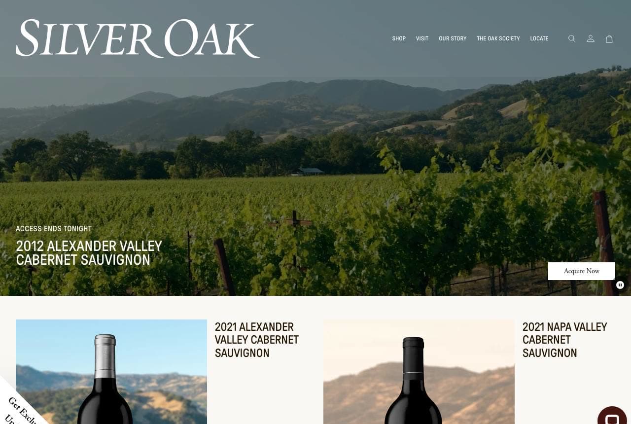
Silver Oak runs a polished direct-to-consumer wine operation: an elegant serif wordmark over a golden-hour vineyard, a featured allocation ('2012 Alexander Valley Cabernet — access ends tonight'), and a clean product row pairing each cabernet with 'shop' and 'visit' links for its two valleys. The 'access ends tonight' scarcity and the allocation framing are the standout — fine wine is often sold in limited releases, and treating a vintage as a time-limited, exclusive drop drives urgency and rewards club members, exactly the DTC mechanics a premium winery needs. The refined photography and dual shop/visit paths keep it both transactional and aspirational. For any winery with a wine club or limited releases, borrowing e-commerce scarcity tactics (allocations, 'ends tonight,' member early access) turns the bottle into an event worth acting on now.

  • 'Access ends tonight' allocation drives DTC urgency
  • Each cabernet pairs a shop and a visit path
  • Refined photography keeps it aspirational and transactional

Steal this: Sell vintages as limited allocations with 'access ends' urgency. Scarcity mechanics turn a bottle into an event worth buying now.

Bonny Doon Vineyard website — Artisan Iconoclast design example
Real site · Santa Cruz, CA
  • Artisan Iconoclast
  • Literary

Bonny Doon Vineyard: An etched, literary, one-of-a-kind brand

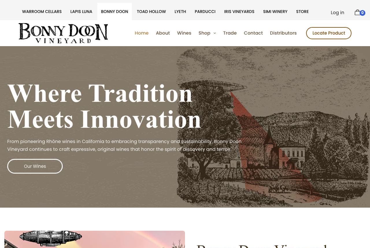
Bonny Doon Vineyard looks like no other winery here, and that's the entire point: 'Where Tradition Meets Innovation' over a vintage-style etched illustration of the estate in warm sepia tones, with a wry, literary voice ('the in-retrospect foolish attempt to replicate Burgundy in California'). Founder Randall Grahm built the brand on wit and iconoclasm — pioneering Rhône varieties, radical transparency, quirky labels — and the hand-etched art direction and self-deprecating copy make the personality unmistakable on first glance. In a category that defaults to reverent photography and terroir-speak, a distinctive illustration style plus a genuinely funny, human voice is a moat: people remember and repeat a brand with character. When your founder's personality IS the differentiator, commit to it in the art direction and the copy — Bonny Doon proves a winery can win on wit.

Frog's Leap website — Sustainable Estate design example
Real site · Napa Valley, CA
  • Sustainable Estate
  • Principled

Frog's Leap: Mission-led, organic, joyfully shared

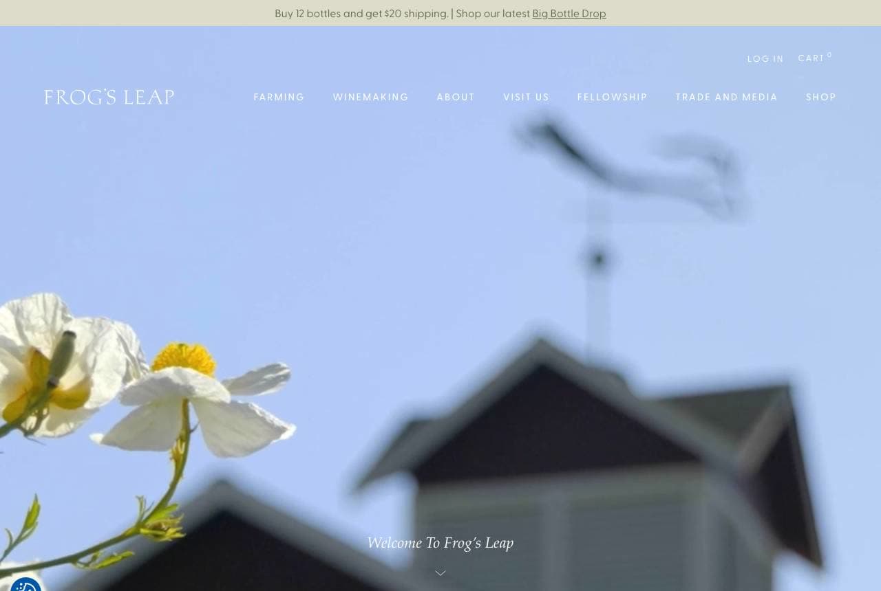
Frog's Leap leads with values, not vintages: 'Our mission is to make wines of terroir, responsibly farmed, sustainably produced and joyfully shared,' in an elegant serif over a soft photo of the estate barn framed by wild poppies. The nav (Farming, Winemaking, Fellowship) puts sustainability and community front and centre, and the whole tone is warm, principled and unpretentious rather than grand or scarcity-driven. For a growing segment of wine buyers, how the wine is farmed (organic, dry-farmed, sustainable) is a genuine purchase driver, and leading with that mission attracts the values-aligned customer and differentiates from estates that lead with prestige. The gentle photography and 'joyfully shared' warmth keep it inviting. When your practices are a real differentiator, put the mission in the hero — the customer who cares will choose you for exactly that reason.

Greywood Estate — Winery website design you can build with Zarla
Build this with Zarla
  • Winery
  • Warm

Greywood Estate: Wine with a sense of place

Greywood Estate is Zarla's winery template, and its carousel hero lands the register this whole gallery rewards: 'Wine With a Sense of Place' — the terroir promise that sits at the heart of wine marketing (the same instinct behind Ridge's landscape and Frog's Leap's 'wines of terroir'). The deep-bordeaux and antique-gold palette reads warm, established and premium, and the carousel format lets one hero showcase multiple estate scenes — vineyard, cellar, tasting room. The structure carries a wine lineup, an about-the-estate story, and a visit/tasting CTA, exactly what a winery needs to drive both bottle sales and cellar-door visits (the two revenue streams Camel Valley splits so clearly). Swap in photos of your own vineyard and it's a warm, credible winery site in about 30 seconds — no photographer or designer required.

See this template

Frequently asked

Where can I find good winery website examples?

Right here — this page curates winery website examples two ways: standout real businesses (each linked, so you can explore the live site) and professionally designed Zarla templates you can clone and make your own. Every example comes with a note on why the design works — trust signals, layout, calls to action — so you can copy the move, not just the look.

What makes a good winery website?

A good winery website earns trust in the first few seconds, leads with strong visuals of the work, gives visitors one obvious action, and loads fast on a phone. Every design below leads with proof and a single clear call to action rather than a wall of text.

How much does a winery website cost?

A custom winery website from a designer typically runs into the thousands up front, and template builders charge roughly $16–$30 per month. An AI builder generates a complete, editable design for free and only charges (on the Premium plan) when you publish to your own domain — so you can build and preview before spending anything.

Do I need a designer to build a winery website?

No. Several designs on this page were generated by Zarla and are fully editable — you describe your business and get a complete, professionally designed site in about 30 seconds, then refine it by chatting. Building and previewing is free; publishing to your own domain needs the Premium plan.

What pages does a winery website need?

Most winery businesses need just a few: a home page that proves trust and points to one clear action, an about page that puts a face to the business, a services or work page that shows what you do, and a contact page with a form and a phone number. Local businesses also benefit from location or service-area pages that help them show up in nearby searches.

How do I get more customers from my winery website?

Lead with proof in the first few seconds (reviews, real photos, results), make one action obvious on every screen (call, book, or enquire), and keep it fast on mobile — most visitors arrive on a phone. The designs above each do this differently, but they all earn trust early and remove friction from the next step.

You've seen what works. Now make it yours.

Describe your business and Zarla designs a complete, professional website in about 30 seconds — built to convert, just like the ones above.

Free to build and preview · no credit card · publish to your own domain on Premium