Inspiration · Yoga Studio

The Best Yoga Website Examples, Explained

Looking for yoga website examples? These 9 are the best we could find — standout real yoga sites plus designs you can build with Zarla — and each comes with a breakdown of the specific design move that makes it work. Find a look you love and you can build a site in that exact style, free, in about 30 seconds.

Real sites + designs you can build with Zarla — free to build and preview, no credit card

What makes a great yoga website

The best yoga websites share a few moves: they earn trust fast, lead with strong visuals of the work, point to one clear action, and match the design to how their customers decide. Each example below calls out the specific choice worth stealing for your own yoga website.

Unplugged Yoga website — Boutique Yoga design example
Real site · Brisbane, AU
  • Boutique Yoga
  • Wordcraft
  • Cream + teal

Unplugged Yoga: The best-written yoga site in the set

Unplugged Yoga proves copywriting can be a studio's whole competitive edge. The hero — 'The hour that readies you for the other twenty-three' in mixed serif/script — reframes a yoga class as preparation for the rest of your day, and every section carries a crafted heading ('Don't just stretch. Reset.', 'A sanctuary, not a showroom.', 'No Mirrors, No Ego.'). Classes are branded and outcome-tagged (The Reset — best for sleep/stress/mobility; The Flow — best for strength/energy/focus) so beginners choose by result, not by cryptic Sanskrit style names. A warm cream-and-teal palette and a 3-step onboarding lower the intimidation newcomers feel. In a category of interchangeable serene-photo studios, Unplugged wins on words: name your classes by outcome, write every heading with intent, and the studio feels like the thoughtful one worth trying.

  • Outcome-tagged class names ('best for sleep') beat Sanskrit styles
  • Every heading is crafted — copy as the competitive edge
  • 'No Mirrors, No Ego' disarms newcomer intimidation

Steal this: Name classes by outcome ('The Reset — best for sleep'), not by style. Result-based selection converts the intimidated beginner.

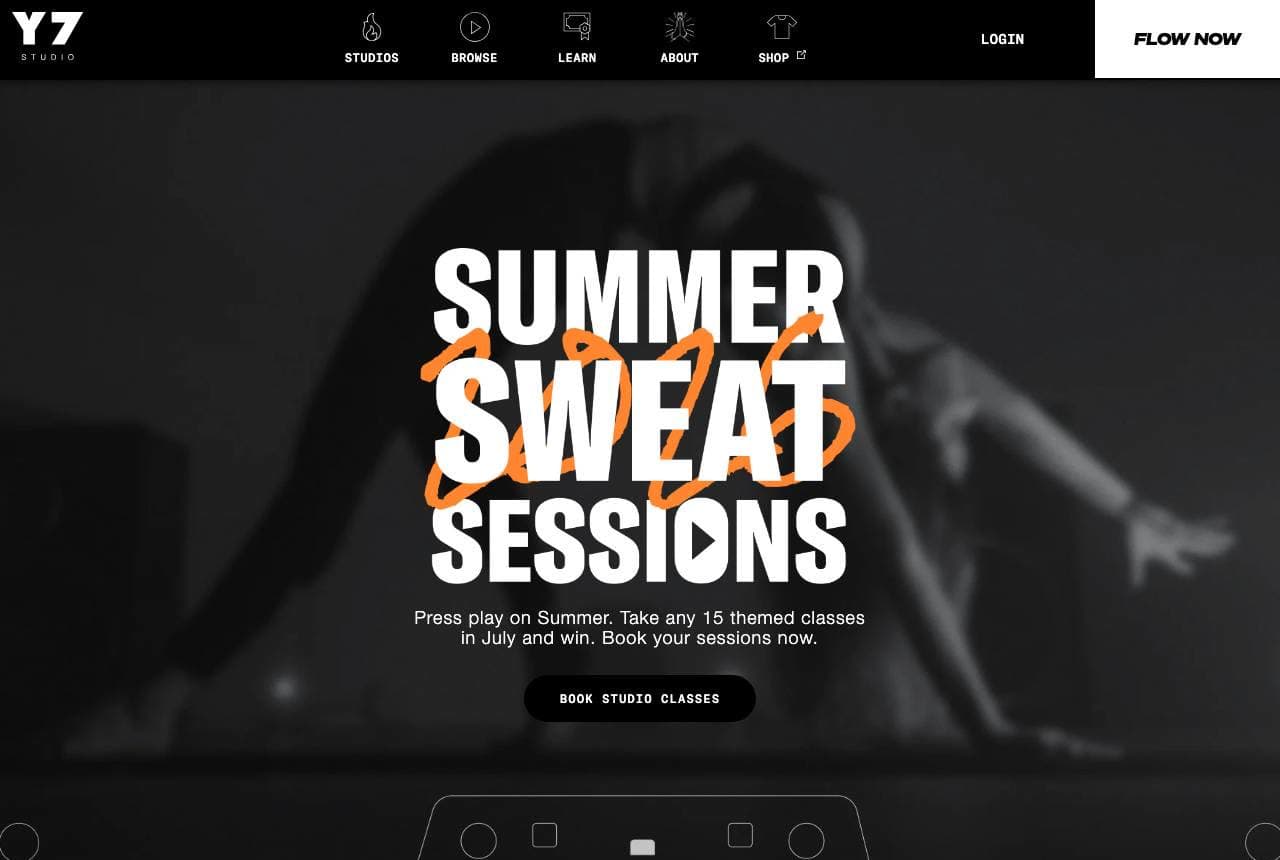
Y7 Studio website — Hot Yoga design example
Real site · New York, NY
  • Hot Yoga
  • Edgy
  • Black + orange

Y7 Studio: Yoga rebranded loud, dark and cool

Y7 Studio throws out the serene-lavender yoga cliché entirely: a dark, high-energy hero, 'SUMMER SWEAT SESSIONS' in bold graffiti-adjacent type, and a gamified challenge ('take any 15 themed classes in July and win'). This is hip-hop-soundtracked, candlelit hot yoga aimed squarely at a young urban crowd who'd never set foot in a traditional ashram, and the design signals that in one glance — black palette, energetic type, streetwear attitude. The 'Sweat Sessions' challenge is a retention mechanic borrowed from fitness apps, turning class attendance into a game with a reward. By looking like a cool downtown fitness brand rather than a spiritual retreat, Y7 owns a demographic the gentle studios can't reach. Match your design to the customer you actually want, even if it breaks every convention of your category.

  • Dark, streetwear-loud design breaks every yoga cliché
  • Gamified class challenge is a fitness-app retention mechanic
  • Looks like a cool fitness brand, not a spiritual retreat
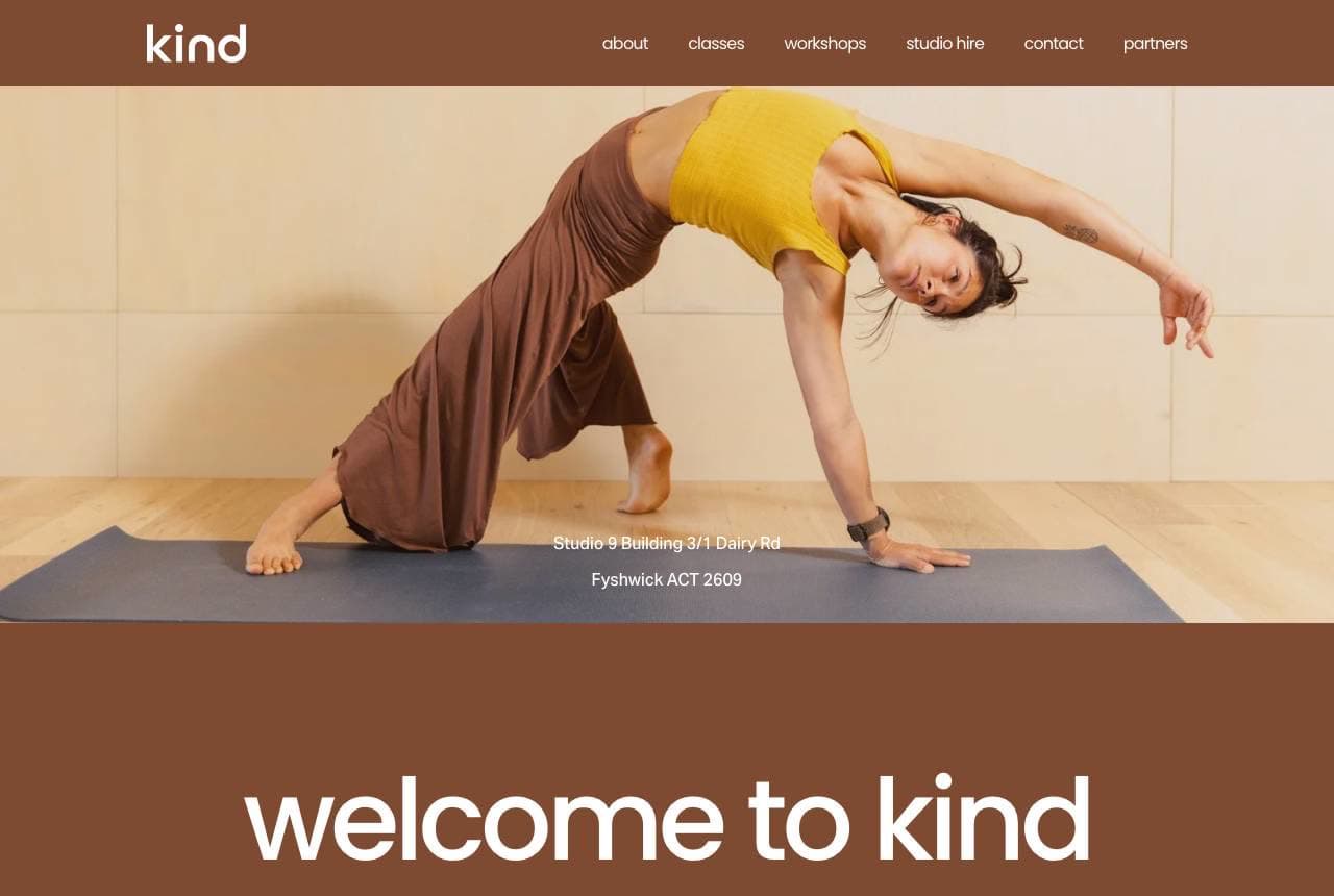
Kind website — Community Studio design example
Real site · Canberra, AU
  • Community Studio
  • Warm-Minimal
  • Brown + cream

Kind: One warm word, one calm room

Kind commits to a single-word brand and lets calm do the rest: 'welcome to kind' in soft lowercase over a warm chocolate-brown canvas, a single graceful yoga pose, and a 'meet the team' row of real instructor portraits directly beneath. The restraint is the whole personality — the muted earth palette, the lowercase humility, and the immediate focus on the actual people who'll teach you signal a small, human, non-intimidating studio. Leading with the team (not a promotion or a class grid) tells a nervous newcomer 'these are the real, approachable people you'll practise with,' which is exactly what converts the yoga-curious. A one-word name like 'kind' is a gift — it states the value in the brand itself. When your edge is warmth and human connection, show the humans first and keep everything else quiet.

  • A one-word name ('kind') states the value in the brand
  • 'Meet the team' first reassures the nervous newcomer
  • Muted brown restraint reads small, human, unintimidating
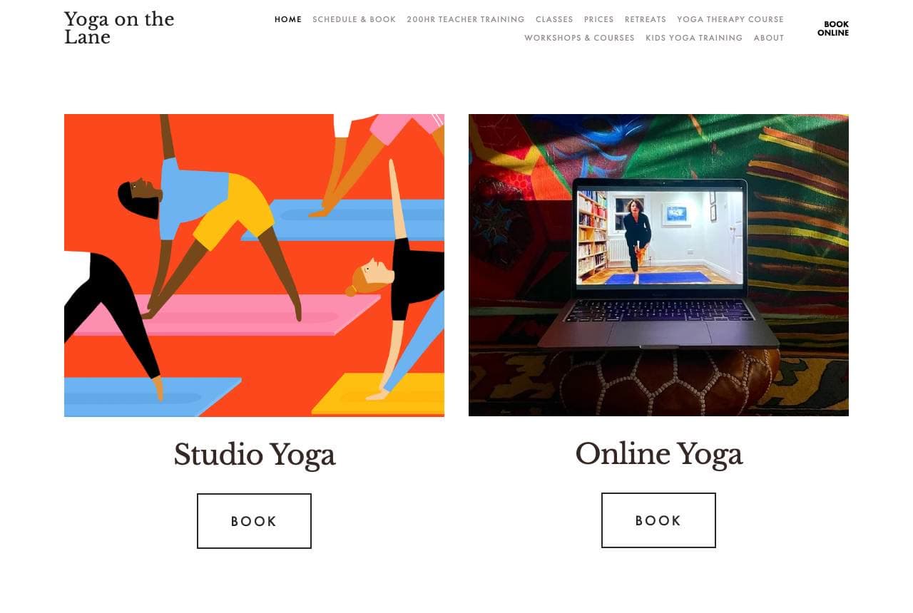
Yoga on the Lane website — Hybrid Studio design example
Real site · London, UK
  • Hybrid Studio
  • Illustrated
  • Multicolor + white

Yoga on the Lane: Two doors: studio yoga and online

Yoga on the Lane solves the post-2020 studio question cleanly: two big, equal doors — 'Studio Yoga' and 'Online Yoga' — each with its own vivid, joyful illustration and Book button, letting the visitor self-select their format before anything else. That hybrid framing acknowledges the modern reality that a yoga business now serves both in-person locals and a remote audience, and treating online as a first-class offering (not a pandemic afterthought) widens the revenue base. The bold, colourful illustration style is a refreshing break from the photographic-serenity default and gives this East London studio a distinct, contemporary identity. When your service comes in two genuinely different modes, present them as equal choices up front rather than burying the online option — and consider illustration when every competitor is using the same calm stock photo.

  • Two equal doors (studio / online) fit the hybrid reality
  • Online treated as first-class, not a pandemic afterthought
  • Bold illustration breaks the serene-photo yoga default
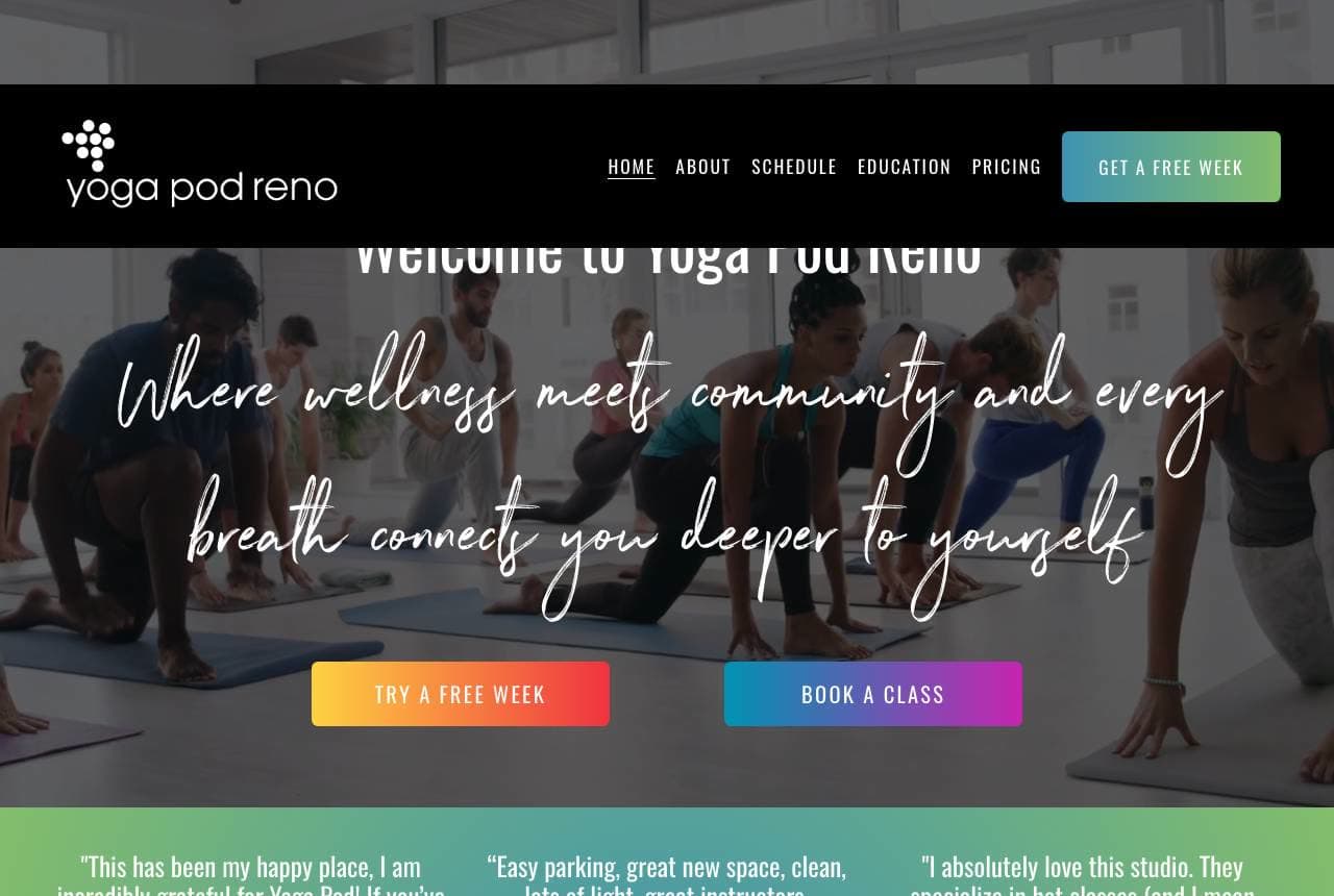
Yoga Pod Reno website — Community Yoga design example
Real site · Reno, NV
  • Community Yoga
  • Welcoming
  • Gradient + warm

Yoga Pod Reno: Community framing and a free week

Yoga Pod Reno leads with belonging and a low-risk entry: 'Where wellness meets community and every breath connects you deeper to yourself,' over a soft gradient, with 'Try a Free Week' beside 'Book a Class' and a row of real, specific testimonials ('This has been my happy place'). The free-week trial is the conversion engine — yoga is a habit purchase, and a week of unlimited classes lets a hesitant newcomer build the habit before committing to a membership. Framing the studio as 'your home for yoga in South Reno' plus genuine, detailed reviews (naming instructors, describing the vibe) builds the local, communal trust that keeps members. The gradient-and-warmth palette reads welcoming rather than austere. Offer a genuine free trial and prove community with specific member voices — that pairing turns first-timers into regulars.

  • 'Try a Free Week' lets newcomers build the habit before paying
  • Specific, named testimonials prove real community
  • 'Your home for yoga' framing builds local belonging

Steal this: Offer a genuine free week, not a single class. Yoga is a habit — let people build it before you ask for the membership.

Bella Prāṇa Collective website — Inclusive Collective design example
Real site · Tampa, FL
  • Inclusive Collective
  • Welcoming
  • Warm + purple

Bella Prāṇa Collective: Radical inclusivity as the brand

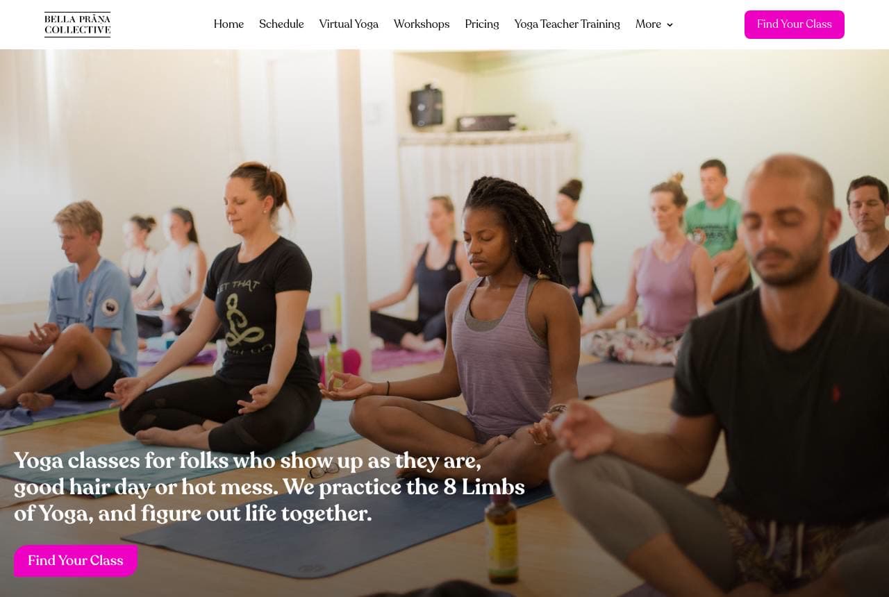
Bella Prāṇa Collective makes accessibility its entire identity: 'Yoga classes for folks who show up as they are, good hair day or hot mess. We practice the 8 Limbs of Yoga, and figure out life together,' over a genuinely diverse class photo. The word 'Collective' and the 'compassion, accessibility, and equity' mission reframe a yoga studio as a welcoming community rather than an aspirational body-image space — directly countering the intimidation and exclusivity many feel about yoga culture. The self-deprecating, warm copy ('good hair day or hot mess') is disarming in exactly the right way, and featuring real, varied bodies in the imagery makes the inclusivity claim credible rather than performative. When the barrier to your service is 'I don't belong here,' lead with unconditional welcome and prove it with who you actually put in the photos.

  • 'Show up as you are, hot mess' disarms yoga-culture intimidation
  • 'Collective' + equity mission reframes studio as community
  • Genuinely diverse imagery makes the inclusivity credible
Inna Bliss website — Embodiment Yoga design example
Real site · Brisbane, AU
  • Embodiment Yoga
  • Spiritual

Inna Bliss: Embodiment language and light-filled rooms

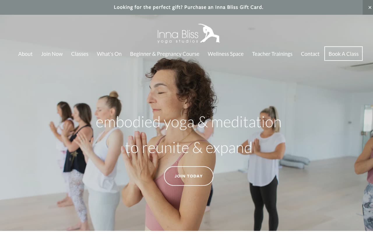
Inna Bliss positions above the fitness-yoga fray with a spiritual, feminine register: 'embodied yoga & meditation to reunite & expand,' over a warm photo of a laughing class, with 'welcome to our two light filled Brisbane studios' and 'breath inspired and heart driven movement' below. The vocabulary ('embodied,' 'reunite & expand,' 'heart driven') signals a practice about inner experience and transformation rather than a workout, attracting the client seeking depth and meditation alongside movement. The soft, airy photography and gentle palette reinforce that the studios themselves are part of the calm the brand is selling. A 'Book A Class' CTA and a gift-card prompt keep conversion practical beneath the poetry. When your differentiator is depth and feeling, let the language do the positioning — but keep a clear booking path so the poetry still converts.

GOOD Pilates website — Reformer Pilates design example
Real site · Adelaide Hills, AU
  • Reformer Pilates
  • Inclusive

GOOD Pilates: A trial offer and an inclusive reformer room

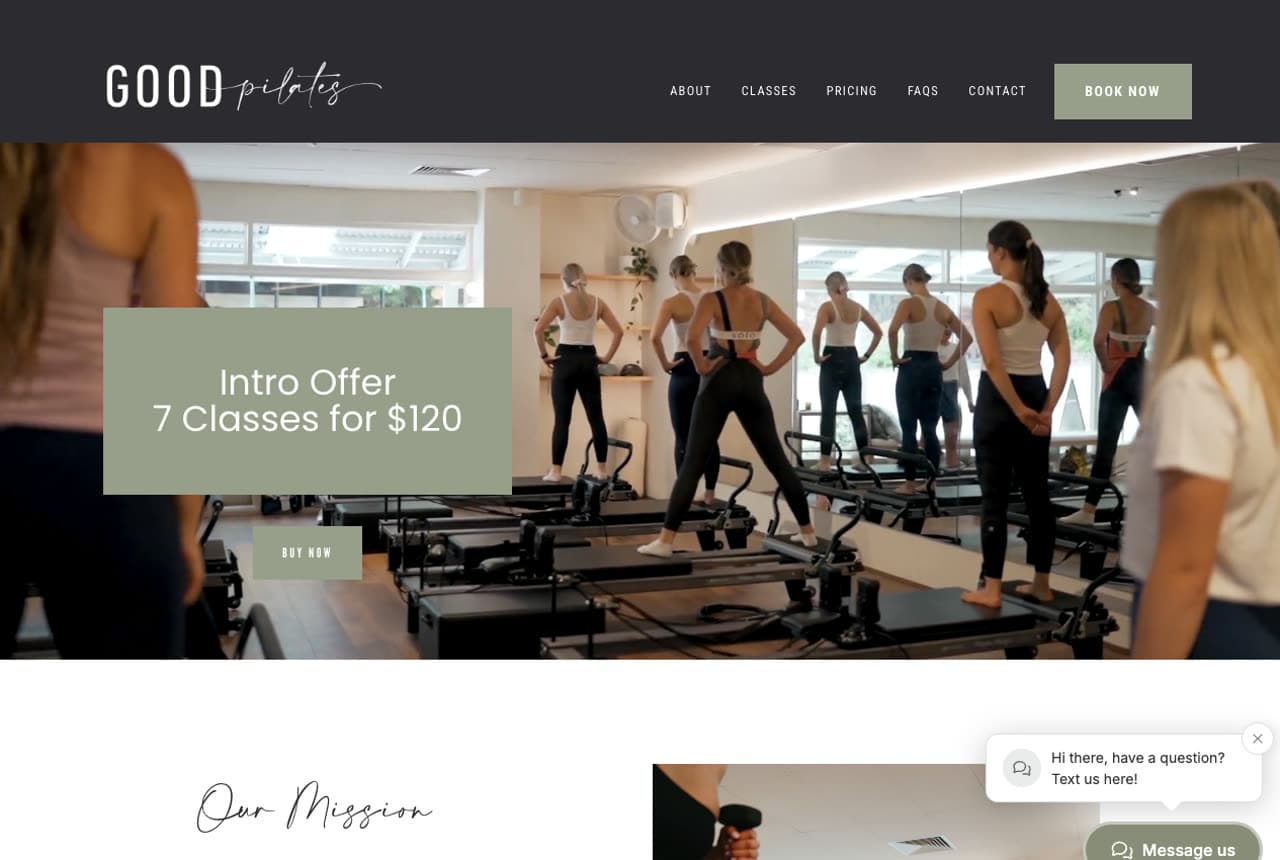
GOOD Pilates (the reformer cousin of the yoga studios here) leads with the single most effective conversion device for a class-based business: 'Intro Offer — 7 Classes for $120,' stated plainly over a bright photo of a full reformer studio. A multi-class intro pack is smarter than a single trial for pilates specifically — reformer results and comfort come with repetition, so a 7-class pack gives a newcomer enough time to feel progress before deciding on a membership. The welcoming, inclusive positioning (classes for beginners, prenatal, postnatal, men, and over-50s) widens the audience well beyond the young-and-bendy stereotype, and a warm mission ('welcoming and inclusive environment') matches. Bright, real studio photography keeps it approachable. For any repeat-visit fitness service, an intro multi-pack plus explicitly inclusive class options is a proven way to convert and widen at once.

Willow & Vale Yoga — Yoga Studio website design you can build with Zarla
Build this with Zarla
  • Yoga Studio
  • Serene

Willow & Vale Yoga: Find your flow, full-bleed

Willow & Vale Yoga is Zarla's yoga template, and its fullwidth-overlay hero lands the calm this category runs on: 'Find Your Flow' over a serene full-bleed image, in a violet-and-amber palette that reads warm and welcoming. It borrows the right instincts from this gallery — sell the feeling and the community, keep a clear booking path — pre-built. The structure carries a class schedule, an about-the-studio section, an instructor/team area (the 'meet the team' reassurance that Kind leads with), and a booking CTA, exactly what a yoga or pilates studio needs to convert the curious into a first class. The gentle palette photographs beautifully against real studio imagery. Swap in photos of your own space and teachers and you have a tranquil, on-brand studio site in about 30 seconds — no photographer or designer required.

See this template

Frequently asked

Where can I find good yoga website examples?

Right here — this page curates yoga website examples two ways: standout real businesses (each linked, so you can explore the live site) and professionally designed Zarla templates you can clone and make your own. Every example comes with a note on why the design works — trust signals, layout, calls to action — so you can copy the move, not just the look.

What makes a good yoga website?

A good yoga website earns trust in the first few seconds, leads with strong visuals of the work, gives visitors one obvious action, and loads fast on a phone. Every design below leads with proof and a single clear call to action rather than a wall of text.

How much does a yoga website cost?

A custom yoga website from a designer typically runs into the thousands up front, and template builders charge roughly $16–$30 per month. An AI builder generates a complete, editable design for free and only charges (on the Premium plan) when you publish to your own domain — so you can build and preview before spending anything.

Do I need a designer to build a yoga website?

No. Several designs on this page were generated by Zarla and are fully editable — you describe your business and get a complete, professionally designed site in about 30 seconds, then refine it by chatting. Building and previewing is free; publishing to your own domain needs the Premium plan.

What pages does a yoga website need?

Most yoga businesses need just a few: a home page that proves trust and points to one clear action, an about page that puts a face to the business, a services or work page that shows what you do, and a contact page with a form and a phone number. Local businesses also benefit from location or service-area pages that help them show up in nearby searches.

How do I get more customers from my yoga website?

Lead with proof in the first few seconds (reviews, real photos, results), make one action obvious on every screen (call, book, or enquire), and keep it fast on mobile — most visitors arrive on a phone. The designs above each do this differently, but they all earn trust early and remove friction from the next step.

You've seen what works. Now make it yours.

Describe your business and Zarla designs a complete, professional website in about 30 seconds — built to convert, just like the ones above.

Free to build and preview · no credit card · publish to your own domain on Premium