Inspiration · Chiropractor

The Best Chiropractor Website Examples, Explained

These are some of the best chiropractor website designs we could find — a mix of standout real practices and designs you can build with Zarla — and instead of just showing them off, we explain why each one works. Chiropractic is sold against skepticism and a little fear, so watch how the strongest sites answer the doubt before they list a single service: a real team photo, hard proof (reviews, years, guarantees), and one easy way to book. Then make any of the Zarla designs your own, free, in about a minute.

Real sites + designs you can build with Zarla — free to build and preview, no credit card

What makes a great chiropractor website

The best chiropractic sites do three things fast. They build trust on sight — a real photo of the actual chiropractor and a visible star rating do more than any 'trusted care' line. They answer the specific patient: family, athlete, expectant mum, disc-pain sufferer, accident victim — each wants different proof. And they make booking the one obvious action, ideally a form or 'Book' button right in the hero. Everything below is a variation on those moves — pick the one that matches the patients you want to reach.

TexStar Chiropractic website — Chiropractor design example
Real site · Austin, TX
  • Chiropractor
  • Warm
  • Orange + blue

TexStar Chiropractic: Warmth and reviews doing the heavy lifting

TexStar Chiropractic proves you don't need a clever concept to convert — you need warmth and proof. A confident orange hero, a real photo of the two chiropractors standing together (not a stock model), and 'Improve your quality of life with personalized chiropractic care' set a friendly, human tone, while a 648-review Google badge sits right under the headline doing the trust work. That combination — a genuine team photo plus visible social proof above the fold — is what makes a nervous first-timer pick up the phone. The orange palette is a smart break from the sea of clinical blue every competitor defaults to, so TexStar reads as approachable rather than sterile. It's the clean, high-converting community-practice formula: real faces, real reviews, one warm invitation to book.

  • A real team photo beats a stock model for trust
  • 648-review Google badge above the fold does the proof work
  • Warm orange breaks from the clinical-blue default

Steal this: Put a real photo of your team and your Google rating above the fold — warmth plus proof converts.

The Melbourne Chiropractor website — Chiropractor design example
Real site · Melbourne, AU
  • Chiropractor
  • Trustworthy
  • Green + clean

The Melbourne Chiropractor: Transparent pricing as the hook

The Melbourne Chiropractor leads with the thing most clinics hide — price. A 'Starting from $89' badge sits right in the hero beside a clean clinic-interior shot, and the service list (Chiro, Osteo, Infants & Kids, Massage, Pregnancy Care) tells you in one line that this is a full allied-health practice, not a single-modality shop. A tidy spine-monogram logo and a '500+ 5-star Google reviews, 20+ years' banner add polish and proof. The strategy is disarming transparency: by naming a price up front, the practice removes the biggest friction in booking a first visit — 'what's this going to cost me?' — and signals confidence. For a multi-location or multi-service clinic, it's the template for turning breadth and honesty into the pitch.

  • 'Starting from $89' removes the biggest booking friction
  • One service line signals a full allied-health practice
  • Spine-monogram logo + review banner add polish and proof

Steal this: Name a starting price in the hero — transparency removes the top objection before the visitor even scrolls.

Melbourne City Chiropractic website — Chiropractor design example
Real site · Melbourne, AU
  • Chiropractor
  • Persuasive
  • Cyan + white

Melbourne City Chiropractic: Answers the skeptic before they leave

Melbourne City Chiropractic is built for the doubter, and that's its genius. Rather than lead with adjustments, the hero opens with 'Finding the root cause of your issue for long-term improvements' beside a plain-spoken video explainer of its ABC (Advanced BioStructural Correction) method, backed by four hard stats — 16+ years, 150+ 5-star reviews, 85 years combined experience, 5,000+ patients. Further down, an actual 'Common Objections to Chiropractic Care' section names the skepticism out loud and answers it. That's a rare, confident move: most health sites pretend doubt doesn't exist, while this one treats the visitor as a smart, wary adult and earns the click by addressing the fear head-on. For any service sold against skepticism, proactively handling objections on the page is the conversion lever almost nobody uses.

  • A named method + a video explainer build credibility
  • Four hard stats front-load the proof
  • A 'Common Objections' section answers skepticism head-on

Steal this: Add a 'common objections' section — naming the doubt out loud and answering it converts the skeptic.

100% Chiropractic website — Chiropractor design example
Real site · Denver, CO
  • Chiropractor
  • Calm
  • Lavender + white

100% Chiropractic: Softer palette, bigger promise

100% Chiropractic reframes the category from 'crack your back' to whole-body care, and the design carries it. A soft lavender-to-white gradient — a real departure from clinical blue — sits under 'Central Park's Chiropractor for Every Stage of Life,' with a subhead that widens the offer: 'more than adjustments — chiropractic, massage, lab testing, and integrative care, built to treat the root, not just the symptom.' The gentle palette and 'every stage of life' framing pitch the clinic as a calm, ongoing wellness partner for the whole family rather than a quick pain fix. It's a smart positioning lesson: by looking and sounding like integrative healthcare instead of a walk-in adjustment shop, the practice invites a longer, higher-value relationship — and the soft, un-clinical design is what makes that promise believable.

  • Soft lavender palette signals wellness, not 'crack your back'
  • 'Every stage of life' invites a long-term relationship
  • Widening to massage + labs raises the perceived value
Action Spine & Joint website — Chiropractor design example
Real site · Nashville, TN
  • Chiropractor
  • Established
  • Teal + neutral

Action Spine & Joint: Two decades of proof, shown not told

Action Spine & Joint sells experience, and it shows it rather than claims it. The hero pairs 'Comprehensive Chiropractic Care in Nashville' with a collage of real photos — a lead chiropractor's portrait alongside genuine treatment shots — plus a bold '25+ years' marker and a named 'Peace of Mind Guarantee.' The muted teal palette reads settled and credible, the opposite of a flashy new clinic. The takeaway is that longevity is a competitive asset most practices underuse: a two-decade track record, shown through real faces and a concrete guarantee, reassures the patient who's been burned by a churn of pop-up wellness shops. For any established local business, foregrounding years-in-business and real staff photos turns 'we've been here a while' into a genuine reason to choose you.

  • Real treatment photos beat stock 'spine' graphics
  • '25+ years' + a named guarantee reassure the burned patient
  • Muted teal reads established, not flashy
HealthFirst Spine & Wellness website — Chiropractor design example
Real site · South Austin, TX
  • Chiropractor
  • Approachable
  • Green + natural

HealthFirst Spine & Wellness: Three doors into one easy first step

HealthFirst Spine & Wellness keeps the first decision effortless. 'Best Chiropractor in South Austin, TX' sits over a warm, real team photo shot outdoors, and directly below the hero are three plain cards — Meet the Chiropractor, Book Your Appointment, What Is Chiropractic — that route the three kinds of visitor exactly where they want to go: the researcher, the ready-to-book, and the total newcomer. That immediate three-way fork is a quietly smart piece of UX; instead of one generic CTA, it meets people at their actual stage of intent. A calm, natural palette and a specific local claim ('South Austin') keep it grounded and searchable. It's a clean reminder that reducing the first click to an obvious, intent-matched choice is worth more than any amount of hero copy.

  • Three intent-matched cards beat one generic CTA
  • A real outdoor team photo keeps it warm and human
  • A specific 'South Austin' claim aids local search
Adaptive Chiropractic website — Chiropractor design example
Real site · Melbourne, AU
  • Chiropractor
  • Modern

Adaptive Chiropractic: Convenience as the selling point

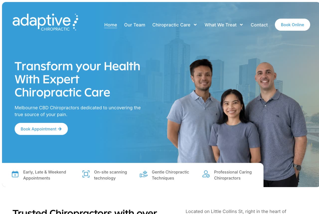
Adaptive Chiropractic knows the modern patient books on availability, so it leads with it. A team photo against the Melbourne skyline pairs with 'Transform Your Health With Expert Chiropractic Care,' and the four badges directly under the hero are all about friction: early/late/weekend appointments, on-site scanning technology, gentle techniques, professional caring staff. It's a light-blue, clean-clinical look that reassures without trying to be clever. The lesson is that for a busy-professional clientele, convenience IS the differentiator — putting 'we're open when you're free' and 'we have the tech' above the fold answers the two questions that actually decide where a time-poor patient books. When your edge is access and equipment rather than a niche, say so immediately.

Wellspring Family Chiropractic — Family Chiropractor website design you can build with Zarla
Build this with Zarla
  • Family Chiropractor
  • Warm

Wellspring Family Chiropractic: Book in the hero, reassure the whole family

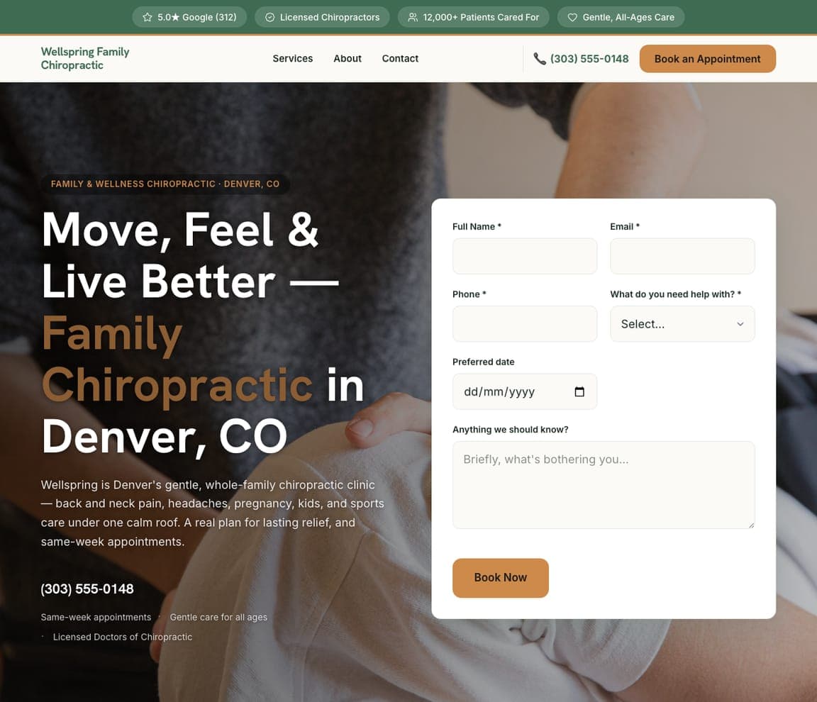
Wellspring Family Chiropractic captures the appointment in the hero and reassures the whole household while it's at it. 'Move, Feel & Live Better — Family Chiropractic in Denver, CO' sits beside a booking form, so the ready-to-go patient never has to scroll, while a trust strip (5.0 stars from 312 reviews, licensed chiropractors, 12,000+ patients cared for, gentle all-ages care) answers the 'is this safe for my kids and my back?' question up top. A warm palette over a real adjustment photo keeps it approachable rather than clinical. It's the template built around the single move that converts a chiropractic site — put the form in the hero — dressed for the bread-and-butter family practice that treats everyone from toddlers to grandparents. Describe your clinic and it's yours in about a minute.

See this template
Torque Sport & Spine — Sports Chiropractor website design you can build with Zarla
Build this with Zarla
  • Sports Chiropractor
  • Athletic

Torque Sport & Spine: Niche down and look the part

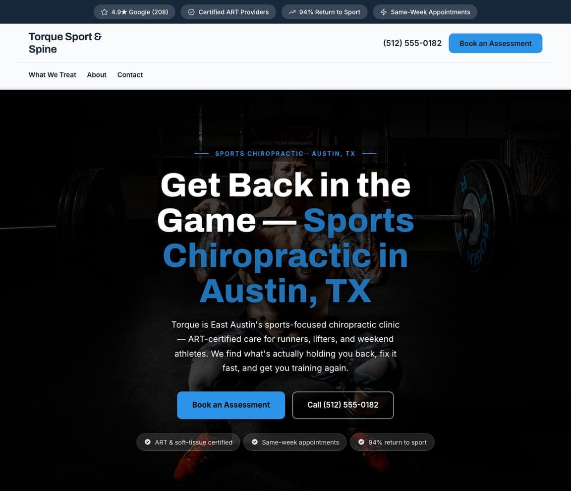
Torque Sport & Spine niches down hard and looks the part. 'Get Back in the Game — Sports Chiropractic in Austin, TX' sits on a dark, near-black hero over a gym-and-barbell photo, with a blue accent and the specifics an athlete scans for: ART-certified care for runners, lifters, and weekend athletes, a 94%-return-to-sport stat, same-week appointments. The dark, athletic palette instantly signals 'this is for serious training,' filtering for exactly the performance-minded patient it wants and away from the general back-pain crowd. It's a clean demonstration of the niche playbook — pick one type of patient, speak their language (ART, return-to-sport), and let the visual system do the sorting. Point it at your practice and it's live in under a minute.

See this template
Nest Prenatal & Pediatric Chiropractic — Prenatal Chiropractor website design you can build with Zarla
Build this with Zarla
  • Prenatal Chiropractor
  • Gentle

Nest Prenatal & Pediatric Chiropractic: Lead with the certifications a parent Googles

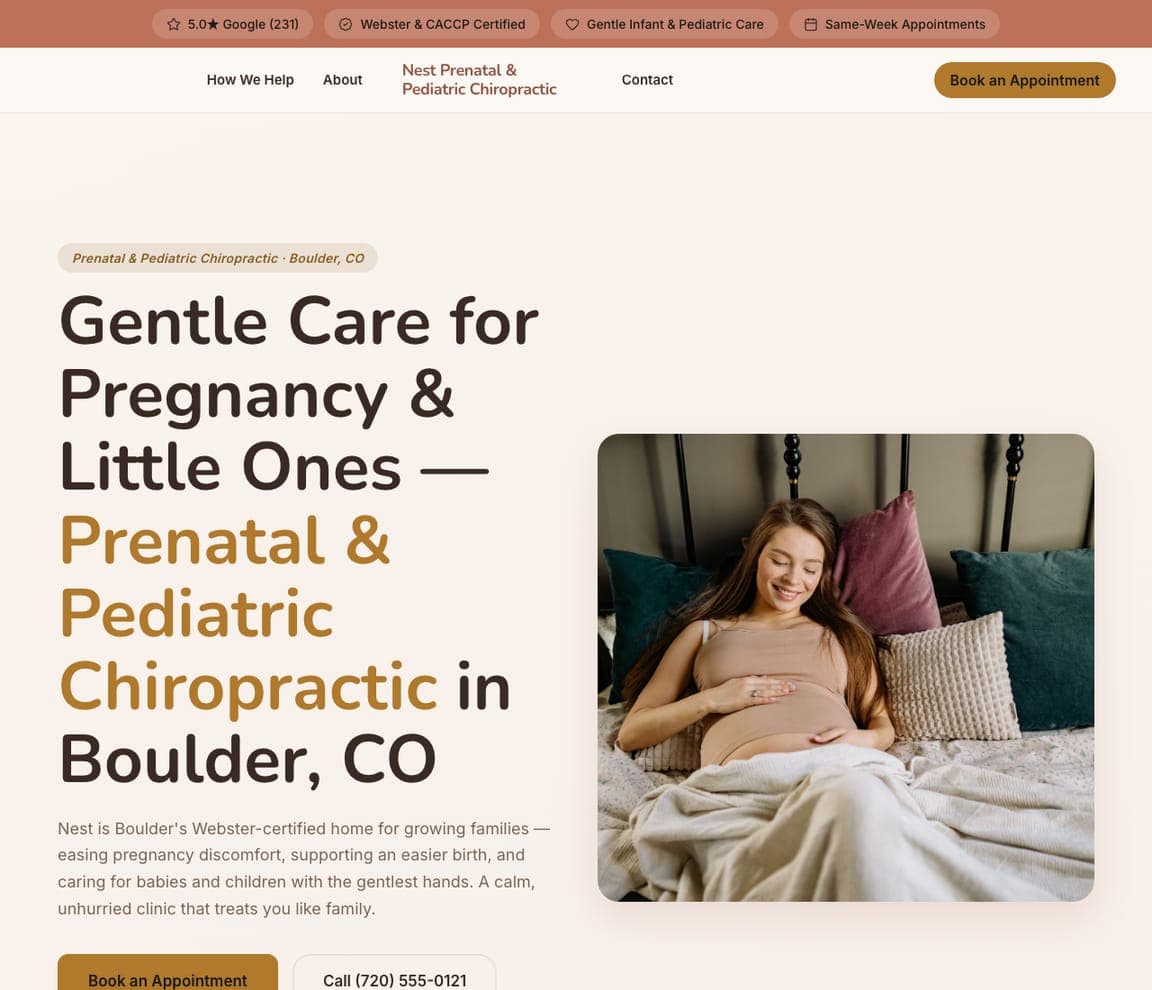
Nest Prenatal & Pediatric Chiropractic aims everything at one anxious, high-trust decision: care during pregnancy and for a new baby. 'Gentle Care for Pregnancy & Little Ones — Prenatal & Pediatric Chiropractic in Boulder, CO' pairs a soft cream-and-gold palette with a calm photo of an expectant mother, and the credentials that matter to this parent — Webster-certified, CACCP, gentle infant care — sit right up top. Every choice signals safety and softness, because that's the entire buying criterion in this niche. It's the template to reach for when your practice serves a specific, cautious audience: lead with the exact certifications they'll Google, choose imagery that feels calm and safe, and let the warmth do the reassuring. Swap in your details and publish it free.

See this template
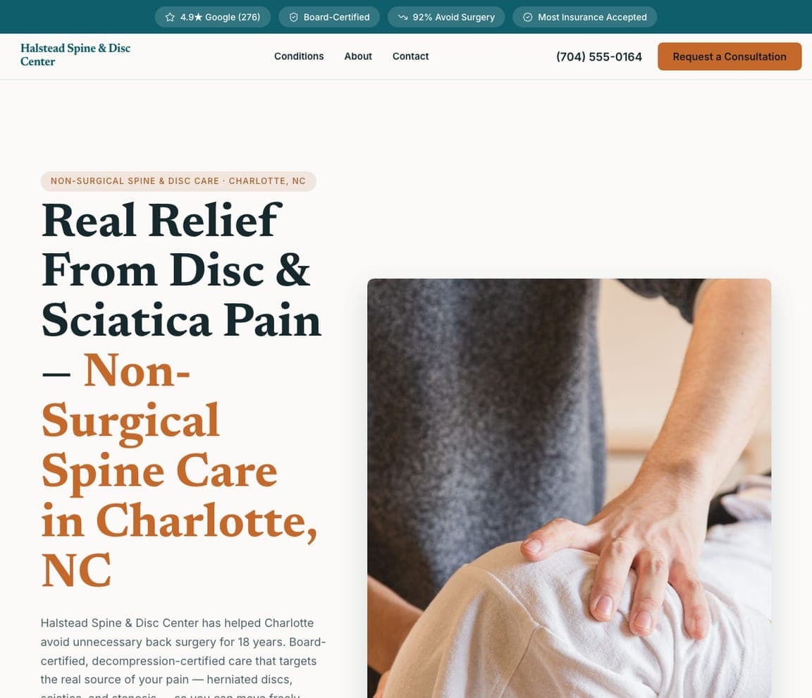
Halstead Spine & Disc Center — Spine & Disc website design you can build with Zarla
Build this with Zarla
  • Spine & Disc
  • Clinical

Halstead Spine & Disc Center: Sell the outcome: avoiding surgery

Halstead Spine & Disc Center sells the outcome a disc patient actually wants: avoiding surgery. 'Real Relief From Disc & Sciatica Pain — Non-Surgical Spine Care in Charlotte, NC' leads with the benefit, and a rust-toned, serious palette signals medical credibility rather than wellness-spa softness. The reassurances are pointed — board-certified, decompression-certified, an 18-year track record, a '92% avoid surgery' stat, most insurance accepted — because this patient is scared, in pain, and comparing you to an operation. It's a template tuned to a high-stakes, medical-leaning decision: lead with the outcome (no surgery), stack the clinical credentials, and answer the insurance question early. For a practice competing on serious conditions rather than general wellness, that clinical confidence is the whole pitch. Point it at your clinic and it's yours in a minute.

See this template
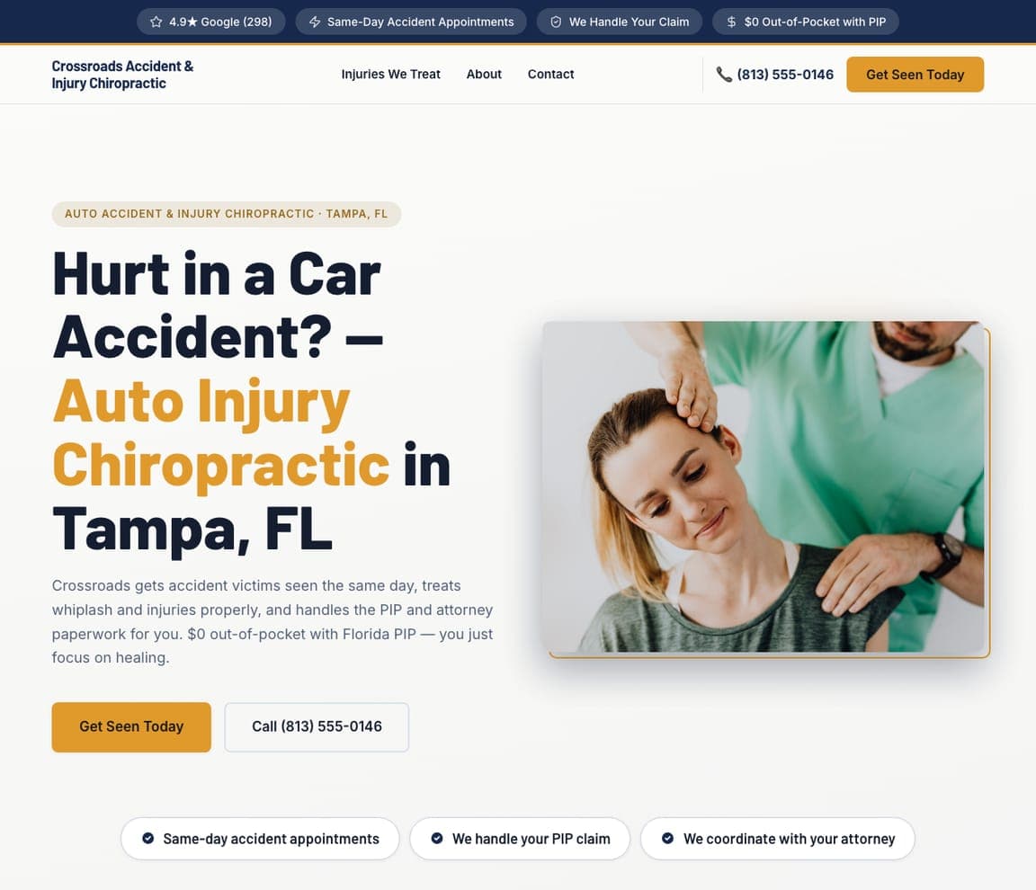
Crossroads Accident & Injury Chiropractic — Auto-Injury Chiropractor website design you can build with Zarla
Build this with Zarla
  • Auto-Injury Chiropractor
  • Urgent

Crossroads Accident & Injury Chiropractic: Match the message to an urgent trigger

Crossroads Accident & Injury Chiropractic speaks to a patient in a very specific, urgent moment: just hurt in a car accident. 'Hurt in a Car Accident? — Auto Injury Chiropractic in Tampa, FL' names the situation directly, and the reassurances answer that patient's real anxieties — seen the same day, whiplash treated properly, 'we handle your PIP claim and the attorney paperwork,' $0 out-of-pocket with Florida PIP. A gold accent over a real neck-adjustment photo keeps it credible. It's the sharpest example here of matching the message to a high-intent, high-anxiety trigger: this person isn't comparison-shopping chiropractors, they're panicking about medical bills and insurance, so the page leads with 'same day' and '$0 cost' instead of philosophy. When you serve an urgent niche, address the fear, not the treatment. Describe your practice and publish it free.

See this template

Frequently asked

What makes a good chiropractor website?

A good chiropractor website builds trust in the first few seconds with a real photo of the actual chiropractor (not a stock model) and a visible star rating, speaks to a specific patient — family, athlete, expectant mother, disc-pain sufferer, accident victim — rather than 'everyone', and makes booking the single obvious action, ideally a form or 'Book' button right in the hero. Notice how the strongest designs below lead with proof and one clear next step instead of a list of techniques.

What pages does a chiropractic practice website need?

Most practices need five: a home page that builds trust and points to booking, an about page with real photos and credentials of the chiropractor(s), a services or conditions page covering what you treat (and increasingly, pricing or insurance), a new-patient or contact page with a form and phone number, and — for practices that live on it — a reviews or results section. A Google Business Profile connected to the site is what gets you found for 'chiropractor near me.'

How do chiropractors get more patients from their website?

The practices that convert do three things: they answer the patient's doubt and fear up front (a real team photo, reviews, a clear method, sometimes even a 'common objections' section), they make booking frictionless — a form in the hero, click-to-call on mobile, transparent pricing — and they keep a steady stream of Google reviews, the single biggest factor in both ranking for 'chiropractor near me' and getting a wary searcher to choose you. Speaking to one specific type of patient, rather than everyone, is what makes all three land.

You've seen what works. Now make it yours.

Describe your business and Zarla designs a complete, professional website in about 30 seconds — built to convert, just like the ones above.

Free to build and preview · no credit card · publish to your own domain on Premium