Inspiration · Church

The Best Church Website Examples, Explained

Looking for church website examples? These 8 are the best we could find — standout real church sites plus designs you can build with Zarla — and each comes with a breakdown of the specific design move that makes it work. Find a look you love and you can build a site in that exact style, free, in about 30 seconds.

Real sites + designs you can build with Zarla — free to build and preview, no credit card

What makes a great church website

The best church websites share a few moves: they earn trust fast, lead with strong visuals of the work, point to one clear action, and match the design to how their customers decide. Each example below calls out the specific choice worth stealing for your own church website.

Life.Church website — Megachurch design example
Real site · United States
  • Megachurch
  • Series-Marketing
  • Black + bold

Life.Church: A sermon series, marketed like a movie

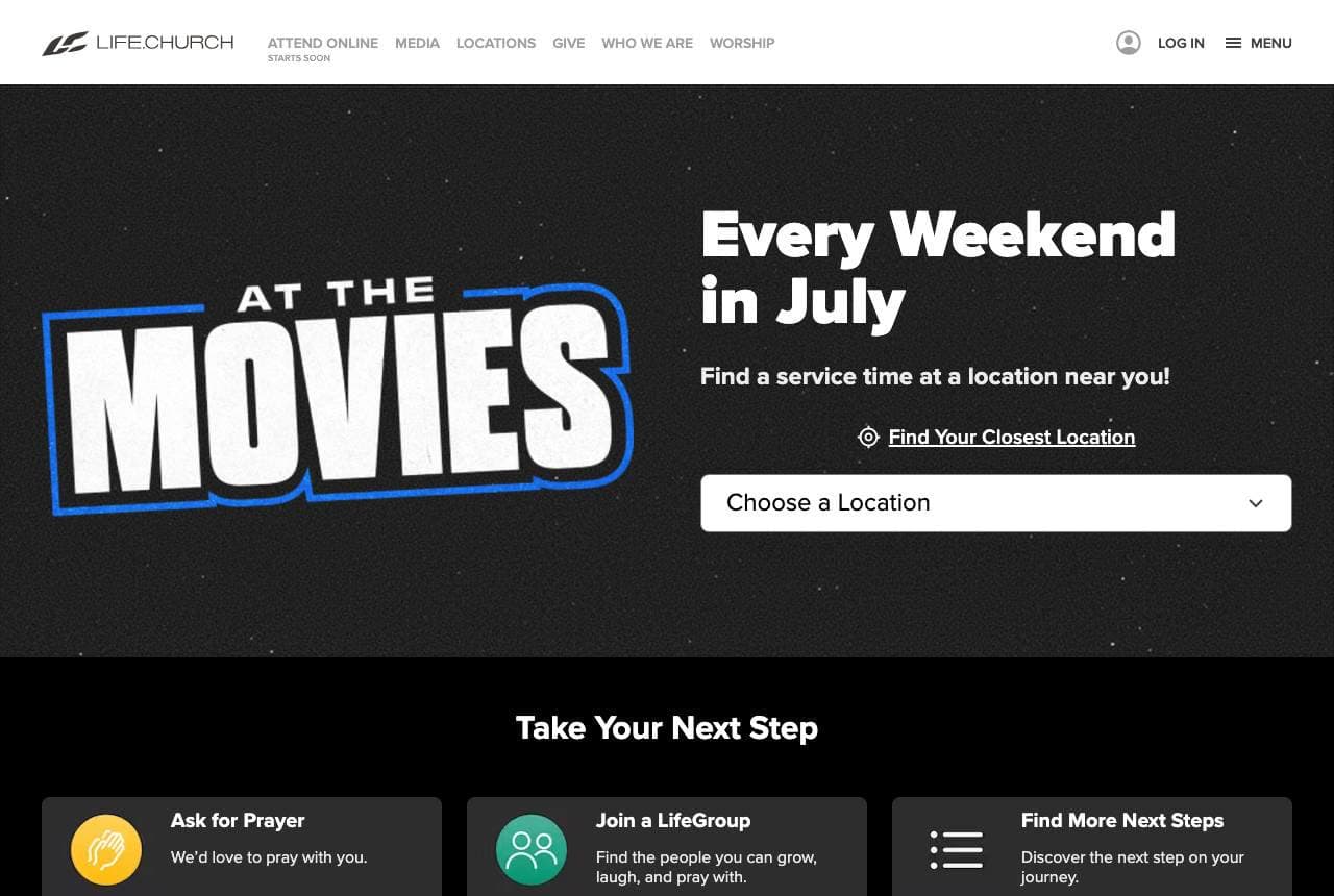
Life.Church (one of the largest churches in the US) markets its content like a media company: 'At the Movies — Every Weekend in July,' a bold, cinematic sermon-series campaign with blockbuster-style branding, a 'Find Your Closest Location' selector, and 'Take Your Next Step' cards (Ask for Prayer, Join a LifeGroup, Find More Next Steps). The 'At the Movies' series treats a sermon theme as a promotable, seasonal event with its own identity — the same way Netflix promotes a show — which makes attending feel current, relevant and worth showing up for. The location finder and next-step cards make it easy for a newcomer to act. For a modern church, packaging sermon content into branded, marketable series (rather than a generic 'join us Sunday') creates anticipation and gives visitors a specific, appealing reason to come this week. Treat your content like campaigns — give people something specific and current to show up for.

  • 'At the Movies' packages a sermon series like a blockbuster
  • Location finder + 'next step' cards make acting easy
  • Branded, seasonal series create a reason to come THIS week

Steal this: Package your content into branded, seasonal campaigns (not 'join us Sunday'). A specific, current series gives people a reason to show up now.

Hillsong Church website — Global Church design example
Real site · Global
  • Global Church
  • Minimal
  • Dark + white

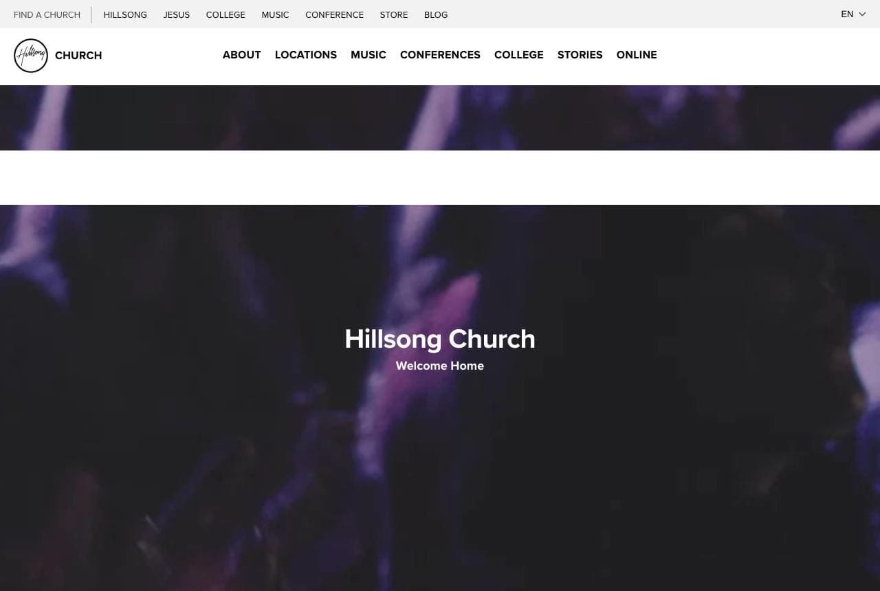
Hillsong Church: Global scale, minimal and welcoming

Hillsong Church, a global brand with a famous worship-music arm, leads with quiet confidence: 'Hillsong Church — Welcome Home' over a dark, atmospheric worship image, with the simple mission statement 'a church that believes in Jesus, a church that loves God and people,' and a global region selector (Asia Pacific, Europe, North America, Latin America, Africa & Middle East, Online). The restrained, almost fashion-brand minimalism is unusual for a church and signals a modern, design-conscious, international organization. 'Welcome Home' is warm and inclusive despite the global scale, and the region selector handles the reality of a multi-continent church. For a large or multi-site church, balancing a warm, personal welcome ('Welcome Home') with the practical navigation of a global footprint (region selector) — all in a clean, contemporary design — signals both intimacy and scale. Big can still feel like home if the design and words stay warm.

  • 'Welcome Home' stays warm despite global scale
  • Fashion-brand minimalism signals a modern, design-conscious church
  • Region selector handles the multi-continent footprint
Mariners Church website — Multi-Site Church design example
Real site · Irvine, CA
  • Multi-Site Church
  • Mission-Led
  • Charcoal + coral

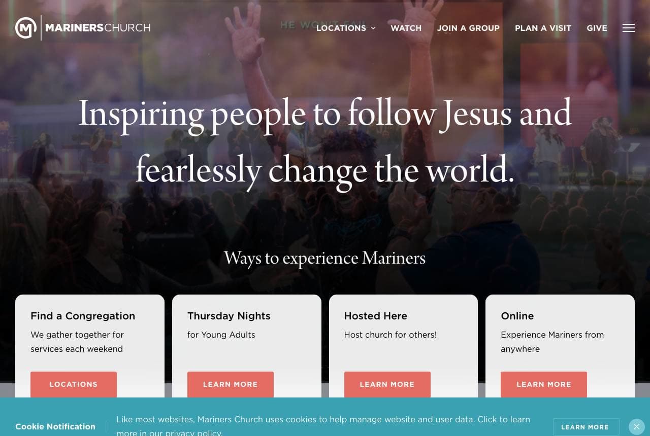
Mariners Church: A mission statement, and four ways in

Mariners Church leads with a bold, aspirational mission: 'Inspiring People to Follow Jesus and Fearlessly Change the World,' over a full-worship-service image, followed by 'Ways to Experience Mariners' — four cards (Find a Congregation, Thursday Nights for Young Adults, Hosted Here, Online). The strong mission statement gives the church a clear, motivating identity beyond 'come to services,' and the multiple entry points acknowledge that different people connect differently (a young adult, a weekend attender, an online viewer). A branded sermon series ('NUMBERS') provides current content. For a large multi-site church, articulating an inspiring mission (a reason bigger than attendance) plus offering several clear ways to get involved meets both the seeker looking for purpose and the newcomer figuring out how to plug in. Lead with a mission worth joining, then make the ways in obvious.

  • A bold mission ('fearlessly change the world') gives identity
  • Four 'ways to experience' cards meet different connection styles
  • Branded sermon series provides current, specific content
Emmanuel Faith website — Community Church design example
Real site · Escondido, CA
  • Community Church
  • Visitor-First
  • Navy + warm

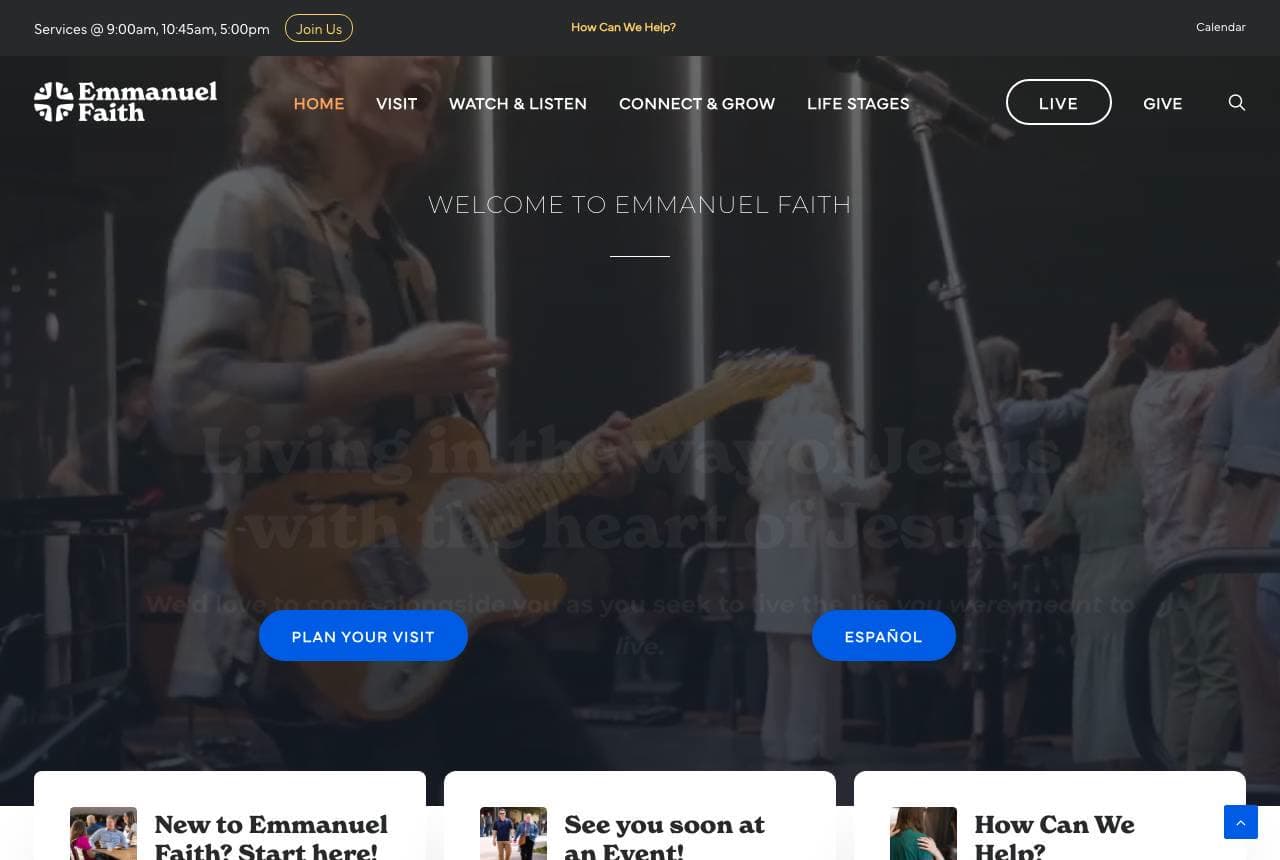
Emmanuel Faith: Everything a first-time visitor needs

Emmanuel Faith Community Church is optimized around the nervous first-time visitor: 'Welcome to Emmanuel Faith' over a worship-band image, with 'Plan Your Visit' and 'Español' as prominent CTAs, and three welcoming cards — 'New to Emmanuel Faith? Start here!', 'See you soon at an Event!', 'How Can We Help?' A latest-sermon feature keeps content fresh. Visiting a church for the first time is intimidating (where do I park? what do I wear? what happens?), so a prominent 'Plan Your Visit' path plus a 'New here? Start here' card directly reduces that anxiety — the church is anticipating and answering the newcomer's fears. Offering Spanish and 'How Can We Help?' signals genuine inclusivity and service. For any church wanting to grow, treating the first-time visitor as the primary audience — and giving them an obvious, reassuring 'start here' path — is the single highest-leverage thing the homepage can do. Answer the newcomer's fear before they feel it.

  • 'Plan Your Visit' + 'New here? Start here' reduce newcomer anxiety
  • Spanish + 'How Can We Help?' signal genuine inclusivity
  • Treats the first-time visitor as the primary audience

Steal this: Build the homepage for the nervous first-time visitor: a prominent 'plan your visit' + 'new here? start here' answers their fear before they feel it.

Liverpool Cathedral website — Historic Cathedral design example
Real site · Liverpool, UK
  • Historic Cathedral
  • Dual-Audience
  • Orange + stained glass

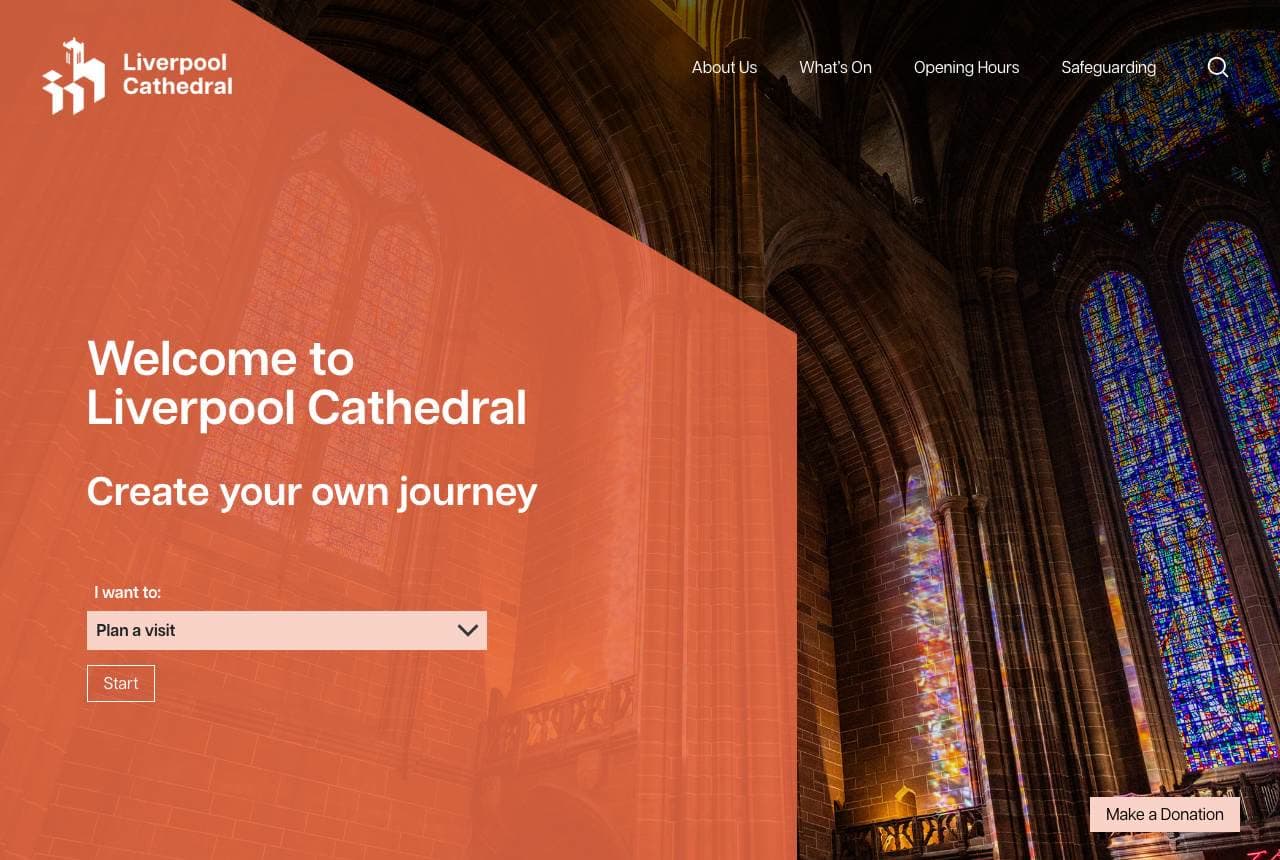
Liverpool Cathedral: Serving worshippers and visitors at once

Liverpool Cathedral balances two very different audiences — worshippers and tourists — with a smart 'I want to…' selector: 'Welcome to Liverpool Cathedral — Create Your Own Journey,' over a stunning stained-glass interior, with an orange geometric overlay and a dropdown to route visitors by intent (Plan a visit, etc.), plus 'Make a Donation' and an Upcoming Services calendar. A historic cathedral is simultaneously an active place of worship AND a major tourist attraction and events venue, so the intent-based navigation lets a Sunday worshipper, a sightseeing tourist, and an events enquirer each find their own path from one homepage. The dramatic architectural photography sells the awe of the space (its biggest draw), while the modern orange overlay keeps a centuries-old institution feeling current. For any organization serving genuinely distinct audiences from one site, an 'I want to…' selector is the cleanest way to route each to the right journey. Let visitors self-select their intent.

  • 'I want to…' selector routes worshippers vs tourists vs events
  • Dramatic stained-glass photography sells the space's awe
  • Modern orange overlay keeps a historic institution current
Australia For Christ website — Multicultural Church design example
Real site · Sydney, AU
  • Multicultural Church
  • Welcoming
  • Warm + worship

Australia For Christ: Warm welcome, and services in three languages

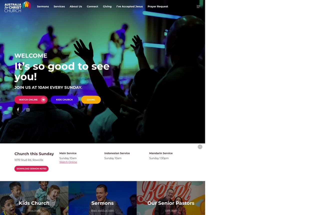
Australia For Christ Church leads with warmth and genuine multiculturalism: 'Welcome — It's So Good to See You! Join us at 10am every Sunday' over a joyful worship photo, and — the standout — service times in three languages (Main Service, Indonesian Service, Mandarin Service). Explicitly offering services in multiple languages, right on the homepage, is a powerful, concrete signal of inclusivity that a diverse, immigrant-rich community responds to — it tells people 'there's a place here for you, in your language.' The friendly 'so good to see you' copy, Kids Church, and 'Whatever your age or life story, you're welcome here' reinforce genuine welcome. For a church serving a multicultural community, surfacing multi-language services and explicit belonging language isn't just nice — it's the exact information a prospective member from that community is looking for. Show, specifically, that everyone belongs.

  • Services in three languages — concrete, credible inclusivity
  • 'So good to see you' + 'you're welcome here' warm the welcome
  • Kids Church + all-ages language signal a place for whole families
Joy Fountain Church website — Community Church design example
Real site · Winnipeg, MB
  • Community Church
  • Relational

Joy Fountain Church: Church is family, plainly and warmly

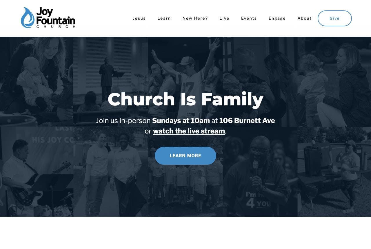
Joy Fountain Church leads with a simple, warm idea: 'Church Is Family,' over a collage of real congregation photos, with clear practical details right there — 'Join us in-person Sundays at 10am at 106 Burnett Ave, or watch the live stream.' The 'Church Is Family' framing sells belonging and community (what many people are really seeking from a church) over doctrine or spectacle, and putting the exact time and address in the hero removes friction for a newcomer deciding to attend. A bright 'Signup, Subscribe & Engage' section covers ongoing connection (Moms Group, Youth events, church-wide messages). For a mid-sized community church, leading with a warm, relational promise ('family') plus the plain practical logistics (when, where, or watch online) is exactly the balance a prospective visitor needs — the emotional reason to come and the practical details to actually do it. Sell belonging; then tell them when and where.

Wildwood Community Church — Community Church website design you can build with Zarla
Build this with Zarla
  • Community Church
  • Welcoming

Wildwood Community Church: You're welcome here

Wildwood Community Church is Zarla's church template, and its fullwidth-overlay hero lands the single most important message a church can send: 'You're Welcome Here,' over a warm full-bleed image, in a forest-green and warm-gold palette that reads inviting, grounded and community-minded. It borrows the right instinct from every church in this gallery — lead with genuine welcome and make it easy for a newcomer to take the next step — pre-built. The structure carries service times and location (the practical details Joy Fountain front-loads), an about/what-to-expect section (answering the nervous visitor's questions), sermons or ministries, and a plan-your-visit CTA. The warm, natural palette photographs well beside real congregation imagery. Swap in your own service times and photos and it's a warm, welcoming church site in about 30 seconds — no photographer or designer required. The reassuring register a first-time visitor needs to feel they belong.

See this template

Frequently asked

Where can I find good church website examples?

Right here — this page curates church website examples two ways: standout real businesses (each linked, so you can explore the live site) and professionally designed Zarla templates you can clone and make your own. Every example comes with a note on why the design works — trust signals, layout, calls to action — so you can copy the move, not just the look.

What makes a good church website?

A good church website earns trust in the first few seconds, leads with strong visuals of the work, gives visitors one obvious action, and loads fast on a phone. Every design below leads with proof and a single clear call to action rather than a wall of text.

How much does a church website cost?

A custom church website from a designer typically runs into the thousands up front, and template builders charge roughly $16–$30 per month. An AI builder generates a complete, editable design for free and only charges (on the Premium plan) when you publish to your own domain — so you can build and preview before spending anything.

Do I need a designer to build a church website?

No. Several designs on this page were generated by Zarla and are fully editable — you describe your business and get a complete, professionally designed site in about 30 seconds, then refine it by chatting. Building and previewing is free; publishing to your own domain needs the Premium plan.

What pages does a church website need?

Most church businesses need just a few: a home page that proves trust and points to one clear action, an about page that puts a face to the business, a services or work page that shows what you do, and a contact page with a form and a phone number. Local businesses also benefit from location or service-area pages that help them show up in nearby searches.

How do I get more customers from my church website?

Lead with proof in the first few seconds (reviews, real photos, results), make one action obvious on every screen (call, book, or enquire), and keep it fast on mobile — most visitors arrive on a phone. The designs above each do this differently, but they all earn trust early and remove friction from the next step.

You've seen what works. Now make it yours.

Describe your business and Zarla designs a complete, professional website in about 30 seconds — built to convert, just like the ones above.

Free to build and preview · no credit card · publish to your own domain on Premium