Inspiration · Insurance

The Best Insurance Website Examples, Explained

Looking for insurance website examples? These 12 are the strongest we found — Sword Insurance's 'made simple from your local expert' on orange, Gary Marshall's 'why call an agency that will only look at one company?', Alpine Castle Lake's four coverage tiles under a mountain — plus agency designs you can build with Zarla, each with a breakdown of the specific move that turns a quote-shopper into a call. An insurance agency's website has to do the thing the big carriers can't: feel like a person who will pick up the phone. Find an approach you love and you can build a site in that spirit, free, in about 30 seconds.

Real sites + designs you can build with Zarla — free to build and preview, no credit card

What makes a great insurance website

The best insurance agency websites sell the agent, not the policy. The carriers already own 'save 15%'; an independent agency wins with the argument Gary Marshall puts in its headline — we compare the leading companies for you — and with faces: Warren's two founders on a sofa, Good Circle's staff behind a family, Heffernan's brokers at a tablet. Coverage is shown as a menu you can tap (Sword's nine circle icons, Alpine's four tiles) rather than a paragraph, the quote is one click and often a form in the hero (Heaton Bennett), and the proof is either a year (Morris & Garritano's 'since 1885') or a counted rating (Alpine's 4.9 across 418 reviews). Notice the palettes: orange, green, gold, cream — anything but carrier blue. Every example below gives the visitor a reason to call this agency instead of typing into a national site.

Sword Insurance website — Independent Agency design example
Real site
  • Independent Agency
  • Friendly
  • Orange + white

Sword Insurance: Nine coverage icons beside one plain promise

Sword Insurance turns the whole product into a grid of icons: on a solid orange field, a rounded white headline says 'Insurance made simple from your local expert', an outlined 'GET A QUOTE' sits under a thin rule with the phone number beneath it, and to the right nine circles — house, motorcycle, ring, car, family, flood, buildings, boat, umbrella — alternate white and grey to say 'we cover all of this' without a paragraph. A grey band under the hero speaks to the second visitor: 'Already a customer? Check out our Customer Portal for service related items.' The nav lists 'Our Carriers' and the portal; nothing else competes. Sword shows a small independent agency how to be instantly legible: one warm color, one promise about simplicity, and the coverage as pictures.

  • Coverage as nine icons — the product explained without copy
  • 'From your local expert' — the independent-agency argument in six words
  • A band for existing customers under the hero

Steal this: Lay out what you cover as a grid of simple icons beside the quote button — a visitor sees their situation in one glance.

Visit Sword Insurance

Opens a similar Zarla design you can make yours.

Good Circle Insurance Agency website — Personal-Lines Agency design example
Real site
  • Personal-Lines Agency
  • Warm
  • Green + white

Good Circle Insurance Agency: A family, the staff, and a badge that says who you help

Good Circle Insurance Agency puts its promise on a badge: a photograph of a three-generation family on a sofa fills the left of the hero, the agency's own staff at their desks fill the right, and over the seam sits a green rosette-and-ribbon badge that reads 'WE HELP People with INSURANCE' — the word 'People' in a friendly script. Above the nav, a green promo bar offers a referral contest ('enter to win $100 Gas Card!'), and under the hero the first heading says the same thing in words: 'Your Friendly Neighborhood Insurance Experts!' The nav is three items. It's a small-town design that knows exactly what it's selling — not policies, help — and shows both the helped and the helpers in one frame. Good Circle shows a neighborhood agency how to feel like one: real customers, real staff, and the promise stamped on a badge.

  • 'We help people with insurance' — the promise as a badge over the photo
  • Customers on the left, staff on the right, in one hero
  • A referral offer in the top bar — the small-agency growth engine

Steal this: Photograph your actual staff beside your actual customers and put the promise on a badge across the seam — people trust agencies that look like their town.

Opens a similar Zarla design you can make yours.

Gary Marshall Insurance Agency website — Independent Agency design example
Real site
  • Independent Agency
  • Direct
  • Charcoal + blue

Gary Marshall Insurance Agency: The independent-agency argument as a question

Gary Marshall Insurance Agency writes the case for independence as a headline you can't argue with: over a dark-tinted photograph of a smiling woman in the driver's seat, keys in hand, a light sans asks 'Why call an agency that will only look at one company?' and the sub-line answers it — 'We compare your current policy with the areas leading companies and find you the best coverage & the best price!' — with a single blue 'LEARN MORE'. The white nav is five plain items ending in 'GET A FREE QUOTE'; the monogram logo is navy. Nothing about the page is clever, and that's the strength: the question does the positioning against every captive agent and every carrier app. Gary Marshall shows an independent agency how to lead with its only real advantage, stated as a question the visitor already suspects the answer to.

  • A rhetorical question as the headline — the whole independent-agency pitch
  • 'We compare… and find you the best coverage & the best price' — the answer in one line
  • A car photo for an agency whose first quote is usually auto

Steal this: Turn your biggest advantage into a question the visitor already suspects the answer to — 'why call an agency that will only look at one company?'

Opens a similar Zarla design you can make yours.

Warren Insurance Group website — Boutique Agency design example
Real site
  • Boutique Agency
  • Editorial
  • Cream + tan

Warren Insurance Group: Two founders on a sofa, a script promise beside them

Warren Insurance Group looks like a boutique because it is one: on a cream ground, a layered collage — a photograph of the two founders seated on a white sofa, a peach panel behind, a swatch of texture — and over the right side a tan card with the headline in handwritten script, 'Protecting your future', a sentence that says the specialty plainly ('designing unique long-term insurance solutions for your individual and business needs'), and a brown 'LET'S CHAT'. The logo is a script 'warren' with 'EST 2015' above it; the nav is four words and two social icons. There is no coverage grid, no quote form, no carrier logo — the founders and the script are the pitch. Warren shows a young agency how to position against the incumbents by looking nothing like them: editorial, personal, and unhurried.

  • The founders photographed as the hero — a boutique, not a brokerage
  • A script headline in a tan card: warmth as the brand
  • 'Let's chat' instead of 'get a quote'
Visit Warren Insurance Group

Opens a similar Zarla design you can make yours.

Alpine Castle Lake Insurance website — Independent Agency design example
Real site · Idaho Falls, ID
  • Independent Agency
  • Straightforward
  • Forest + blue

Alpine Castle Lake Insurance: Four coverage tiles under a mountain headline

Alpine Castle Lake Insurance packs the whole funnel into one screen and keeps it legible: a photograph of evergreens and mountains, a serif headline in white — 'More Insurance Options & Better Rates' — a bold line that states the model and the town ('Coverage from an Independent Idaho Falls Insurance Agency'), the phone number in gold italics ('Call Now: 208-552-2100'), and a white card overlapping the bottom of the hero with four outlined tiles — Vehicle, Property, Business, Life — plus a link for health insurance. The blue nav ends in 'INSTANT QUOTE', and a thin top bar counts the proof: '4.9 Star Rating (418 reviews)'. Alpine shows a regional agency how to route and reassure at once: name the town, count the reviews, and let the four tiles send each visitor to the right page.

  • 'More options & better rates' — the independent pitch as a benefit
  • Four coverage tiles in a card overlapping the hero
  • The review count in the top bar, the phone in gold under the headline

Opens a similar Zarla design you can make yours.

Morris & Garritano website — Heritage Brokerage design example
Real site
  • Heritage Brokerage
  • Assured
  • White + red

Morris & Garritano: 'You've earned it.' with 140 years behind it

Morris & Garritano leads with age and a face: a photograph of two smiling women lit by window flare fills the left, with a serif line low in the frame — 'You've earned it.' — and the right panel does the history in two sentences: 'For over 140 years, we've committed our service to providing peace of mind.' and 'Since 1885, we have built a tradition of earning your trust twice: at the time of purchase and at the time of need.' A circular video thumbnail of a broker with a play button sits beneath, a red 'GET A QUOTE' tab hangs off the right edge, and the header carries 'MAKE A PAYMENT' and 'Careers' beside a client center. 'Earning your trust twice' is the best line in this gallery. Morris & Garritano shows a heritage brokerage how to make its age feel like a promise rather than a plaque.

  • 'Since 1885… earning your trust twice' — the heritage as a promise
  • A video portrait of a broker as the proof
  • A red 'Get a Quote' tab hanging off the edge of the screen
Visit Morris & Garritano

Opens a similar Zarla design you can make yours.

Heaton Bennett Insurance website — Family Agency design example
Real site · Austin, TX
  • Family Agency
  • Trustworthy

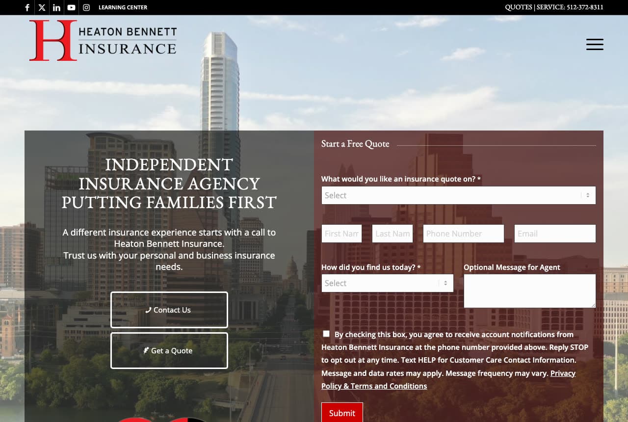
Heaton Bennett Insurance: Families first, and the quote form already open

Heaton Bennett Insurance splits the screen between the story and the ask: on the left, over a red-tinted photograph of downtown Austin's towers, a serif headline in capitals — 'INDEPENDENT INSURANCE AGENCY PUTTING FAMILIES FIRST' — a two-line invitation ('A different insurance experience starts with a call…'), and two outlined buttons, 'Contact Us' and 'Get a Quote'; on the right, a 'Start a Free Quote' form that asks what to quote (a dropdown), name, phone, email, how you found them and a message, with the consent text and a red 'Submit'. The black top bar carries the socials, a learning center and 'QUOTES | SERVICE: 512-372-8311'. Everything a visitor might do is on the first screen. Heaton Bennett shows a family agency how to convert the ready and reassure the unsure at once: form on the right, story on the left, phone at the top.

Visit Heaton Bennett Insurance

Opens a similar Zarla design you can make yours.

Secord Agency website — Insurance Agency design example
Real site · Seattle, WA
  • Insurance Agency
  • Straightforward

Secord Agency: A welcome in serif over a Seattle street

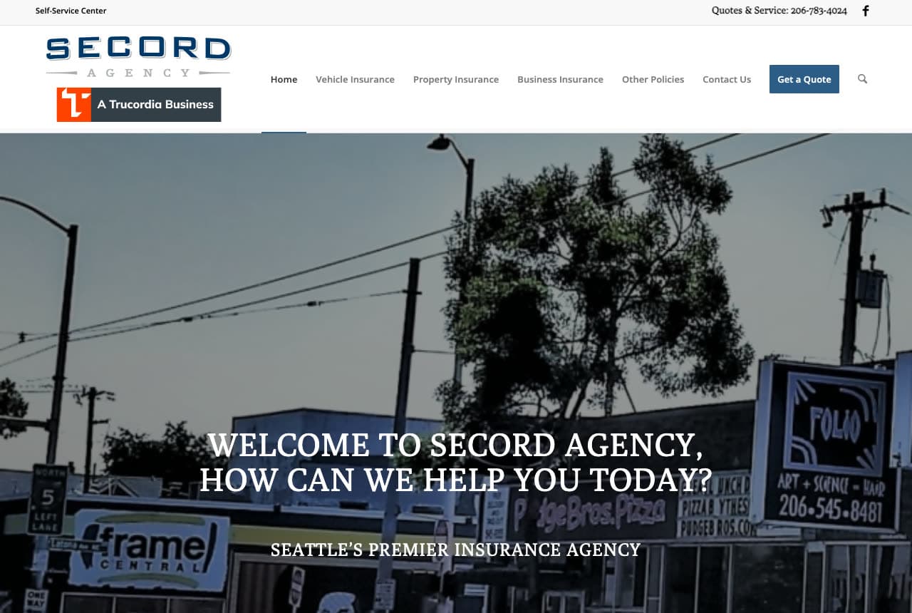
Secord Agency greets before it sells: over a grey-tinted photograph of a Seattle street — shop signs, overhead wires, a frame shop's storefront — a serif headline in capitals asks 'WELCOME TO SECORD AGENCY, HOW CAN WE HELP YOU TODAY?', with the positioning beneath it in smaller capitals, 'SEATTLE'S PREMIER INSURANCE AGENCY'. The white header stacks the logo over 'A Trucordia Business', a nav organized by coverage (Vehicle, Property, Business, Other Policies) and a blue 'Get a Quote'; the thin top bar offers a self-service center and 'Quotes & Service: 206-783-4024'. The street is the point: this is a neighborhood agency photographed in its neighborhood. Secord shows a city agency how to sound like the person at the counter — say welcome, ask how you can help, name the city, and organize the nav the way customers think about coverage.

Visit Secord Agency

Opens a similar Zarla design you can make yours.

Heffernan Insurance Brokers website — Insurance Brokerage design example
Real site
  • Insurance Brokerage
  • Modern

Heffernan Insurance Brokers: Expertise meets technology, in gold, on white

Heffernan Insurance Brokers looks like a modern firm rather than an agency: a white ground traced with faint gold contour lines, a photograph of two colleagues smiling at a tablet, and a bold navy headline — 'Decades of expertise meets modern technology.' — over a single gold pill, 'Discover Our Approach →'. The logo carries the tagline in handwriting ('Because You're Different'), and the nav is a hamburger; nothing else is on the screen. No coverage grid, no quote form, no phone number in the hero — this is a brokerage that sells consultation, and the page reads accordingly. Heffernan shows a larger broker how to feel current without feeling cold: warm photography, one gold accent, and a headline that pairs the two things clients want from an old firm — experience and tools.

Visit Heffernan Insurance Brokers

Opens a similar Zarla design you can make yours.

Hearthside Insurance Group — Independent Agency website design you can build with Zarla
Build this with Zarla
  • Independent Agency
  • Reassuring

Hearthside Insurance Group: A family photo and a red quote button

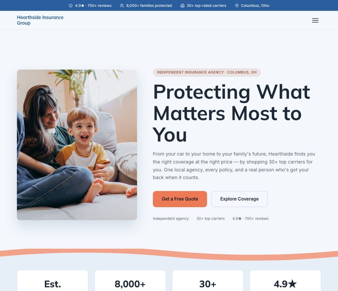
Hearthside Insurance Group is the Zarla insurance template: a white ground, an eyebrow that names the model and the city ('Independent Insurance Agency · Columbus, OH'), a headline about the client — 'Protecting What Matters Most to You' — a paragraph that makes the independent-agency argument in plain words ('shopping 30+ top carriers for you. One local agency, every policy, and a real person who's got your back'), a red 'Get a Free Quote' beside 'Explore Coverage', and a photograph of a mother and child at home. Three chips beneath count the carriers and the rating. It's Gary Marshall's argument with Good Circle's warmth. Clone it, name your town, and the chips become your carriers and your reviews.

See this template
Wexford Wealth Partners — Adaptable Template website design you can build with Zarla
Build this with Zarla
  • Adaptable Template
  • Calm

Wexford Wealth Partners: Fee-only calm for the life-and-annuity side

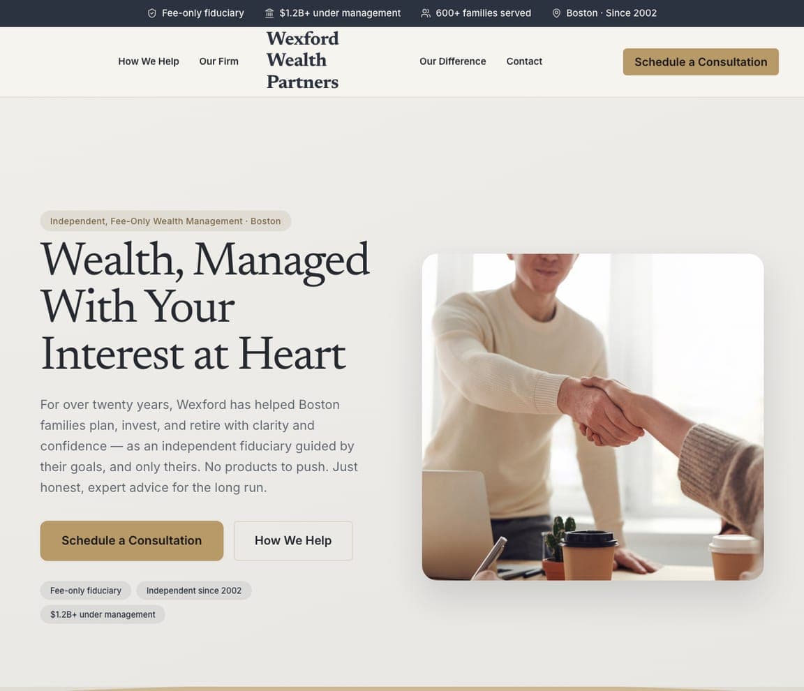
Wexford Wealth Partners is the Zarla wealth-management template, and the closest catalog match to the boutique register Warren and Heffernan use: a cream ground, an eyebrow ('Independent, Fee-Only Wealth Management · Boston'), a serif headline — 'Wealth, Managed With Your Interest at Heart' — a paragraph about twenty years of honest advice, a gold 'Schedule a Consultation' beside 'How We Help', and a photograph of a handshake across a desk. For an agency whose business leans to life, annuities and benefits, clone it and let the serif carry the consultative tone.

See this template
Mainstay Small Business CPAs — Adaptable Template website design you can build with Zarla
Build this with Zarla
  • Adaptable Template
  • Professional

Mainstay Small Business CPAs: Written to the business owner, with proof in the strip

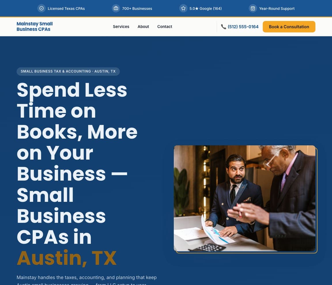
Mainstay Small Business CPAs is an accounting template, not an insurance one — but its hero is the closest catalog match to a commercial-lines agency talking to owners: a navy ground, an eyebrow ('Small Business Tax & Accounting · Austin, TX'), a large white headline — 'Spend Less Time on Books, More on Your Business — Small Business…' — a photograph of an advisor with a client, and a trust strip counting the licensed professionals, the businesses served and the rating. Swap 'books' for 'coverage gaps' and it is Heaton Bennett's business-insurance page. Clone it, and the strip becomes your carriers and your years.

See this template

Frequently asked

Where can I find good insurance website examples?

Right here — this page curates insurance website examples across the spectrum: independent agencies (Sword Insurance, Gary Marshall Insurance Agency, Alpine Castle Lake Insurance, Heaton Bennett Insurance, Secord Agency), a neighborhood agency (Good Circle), a boutique founded in 2015 (Warren Insurance Group), a brokerage founded in 1885 (Morris & Garritano) and a modern national broker (Heffernan) — each linked so you can explore the live site — plus professionally designed Zarla insurance and financial-services templates you can clone and make your own. Every example includes a note on why the design works — the argument, the coverage menu, the quote path — so you can copy the thinking, not just the look.

What makes a good insurance agency website?

It answers 'why you and not the carrier's app?' in the first screen. The strong examples above lead with the independent-agency argument (we shop the leading companies), show the people who answer the phone, lay coverage out as a tappable menu (auto, home, business, life), and make the quote one click — a form in the hero, an 'instant quote' button, or a phone number set as a button. Proof is a founding year or a counted rating, not a wall of carrier logos. And the palette is warm: the sites that convert here look like a local business, not a claims portal.

How much does an insurance agency website cost?

Insurance-specific platforms charge a monthly fee for a templated agency site (often with a quote-form integration), agencies that serve the industry build custom sites for several thousand dollars, and general template builders are roughly $16–$30 per month plus your time. An AI website builder generates an agency site — coverage types, the independent-agency story, carriers, a quote form and the phone number in the header — from a short description in seconds, then lets you edit it in plain language. Spend the savings on a real photograph of the team; it's the one thing the carriers can't copy.

Should an insurance website lead with a quote form or the agency story?

Both, split across the screen. Heaton Bennett shows the pattern: the headline and the story on the left ('Independent insurance agency putting families first'), a 'Start a Free Quote' form on the right with the coverage type as a dropdown. If a full form is too much for your first screen, do what Alpine does — one 'Instant Quote' button in the nav, the phone number in gold under the headline, and four coverage tiles so the visitor self-selects before they call.

What pages does an insurance agency website need?

Most agencies need six: a home page with the argument, the people and the quote path, a page per coverage line (auto, home, business, life — each is its own search), a carriers page that lists whom you represent, an about page with the team's faces and licenses, a claims or customer-service page (Sword's 'already a customer?' band is the model), and a contact page with a quote form and the number. Agencies with several offices add a locations page; Gary Marshall puts 'Locations' in the main nav for that reason.

How do insurance agencies get more clients from their website?

Put the independent-agency argument in the headline, the coverage menu in the first screen, and the quote one click away. The converting pattern above: Gary Marshall's 'Why call an agency that will only look at one company?', Sword's nine coverage icons beside 'Get a Quote', Alpine's '4.9 star rating (418 reviews)' in the top bar. Then build a page per coverage line and per town you serve — 'business insurance Idaho Falls' should land on a page written for it — and answer the phone the way the site promises.

You've seen what works. Now make it yours.

Describe your business and Zarla designs a complete, professional website in about 30 seconds — built to convert, just like the ones above.

Free to build and preview · no credit card · publish to your own domain on Premium