Inspiration · Luxury Real Estate

The Best Luxury Real Estate Website Examples, Explained

Looking for luxury real estate website examples? These 14 are the strongest we found — Jade Mills' glass-house-at-dusk hero, Carolwood's off-market listings with the numbers to back it, Louise Phillips Forbes' rooftop and six billion in sales — plus estate-agent designs you can build with Zarla, each with a breakdown of the specific move that makes a high-net-worth buyer or seller pick up the phone. A luxury agent's website has one job the property portals can't do: prove the agent is the asset. Find an approach you love and you can build a site in that spirit, free, in about 30 seconds.

Real sites + designs you can build with Zarla — free to build and preview, no credit card

What makes a great luxury real estate website

The best luxury real estate websites are photographed like the homes they sell and written like a private bank. Nearly every strong example here opens on a full-bleed image — a glass house at dusk, a rooftop at sunset, a barn interior — followed by a number that establishes the league (billions sold, a ranking, off-market inventory) and an invitation rather than a form. Notice what's absent: no 'search 40,000 listings', no bright buttons, no urgency. The register is discretion; the proof is scale; the ask is a conversation. Every example below sells the agent first and the inventory second.

Jade Mills Estates website — Individual Agent design example
Real site · Beverly Hills, CA
  • Individual Agent
  • Stately
  • Navy + white

Jade Mills Estates: A glass house at dusk, a name in thin serif

Jade Mills Estates opens the way a luxury brochure does: a photograph of a modern glass house at dusk, lit from within, and over it the agent's name in a thin, widely tracked serif — with a tiny eyebrow above it that does the bragging ('The 9 Billion Dollar Woman'), a line beneath establishing the affiliation (Coldwell Banker Global Luxury Ambassador) and a single dark 'Search All Homes'. Nothing else. The photograph does the positioning: if this is the kind of property the agent sells, the visitor already knows the league. The typeface (a delicate display serif) matches the restraint; there are no stats or badges competing in the first screen. Jade Mills shows that at the top of the market, one photograph and a name can outsell a page of accolades.

  • The dusk photograph states the league; the eyebrow states the number
  • A thin display serif for the name — nothing louder is needed
  • One button, 'Search All Homes', framed as an invitation

Steal this: Lead with one photograph of the best property you've sold — it tells a buyer which league you play in faster than any statistic.

Visit Jade Mills Estates

Opens a similar Zarla design you can make yours.

Carolwood Estates website — Boutique Brokerage design example
Real site · Beverly Hills, CA
  • Boutique Brokerage
  • Discreet
  • Cream + gold

Carolwood Estates: An interior first, the off-market billions beneath

Carolwood Estates opens on an interior rather than a facade: a cream living room in afternoon light — linen sofas, a stone fireplace, tall windows onto greenery — with only the wordmark and a quiet 'Contact Us' in the nav. Then, one scroll down, it sells the one thing portals can't offer — access — and proves it with numbers: 'Access Our Off-Market Listings', a line inviting private contact, and three figures in tracked capitals ($1.3B off-market inventory, $5B sold in 2025, $2.2B on-market inventory). The palette is cream, gold and shadow; the typeface is a plain sans that lets the numbers be the drama. It reads like the lobby of a private bank rather than a brokerage. Carolwood shows the brokerage-scale version of the luxury formula: one interior photograph, one privilege, three numbers big enough to end the conversation.

  • 'Off-market' is the offer — exclusivity as the headline
  • Three tracked-caps figures (inventory, sold, on-market) do the persuasion
  • A living-room photo signals interiors, not curb appeal

Steal this: Put your three biggest numbers in small tracked capitals right after the hero — quiet type, loud figures.

Visit Carolwood Estates

Opens a similar Zarla design you can make yours.

Louise Phillips Forbes Team website — Brokerage Team design example
Real site · New York, NY
  • Brokerage Team
  • Editorial
  • Amber + white

Louise Phillips Forbes Team: A rooftop at sunset and one enormous number

Louise Phillips Forbes Team frames Manhattan the way a buyer imagines living in it: a rooftop terrace at sunset — planters, lounge furniture, the skyline going amber — with a monogram over the photograph and a single claim in capitals beneath it, 'OVER 6 BILLION IN SALES', followed by a 'Recent Sales' link. Only after that does a 'Smart Search' panel appear, with city, beds, baths and price fields in a clean grid. The sequencing is the lesson: brand, proof, then utility. The type is a geometric sans, the palette is the photograph's own, and the nav is five items. Louise Phillips Forbes shows a top New York team how to include property search without letting it turn the site into a portal.

  • The terrace photo sells the lifestyle before any listing
  • One number in capitals — 'over 6 billion' — as the entire proof
  • Search comes second, in a quiet panel, after the brand

Steal this: Sequence the hero as brand → one number → search — the order tells visitors the agent matters more than the inventory.

Visit Louise Phillips Forbes Team

Opens a similar Zarla design you can make yours.

Merrow & Vane — Luxury Agent website design you can build with Zarla
Build this with Zarla
  • Luxury Agent
  • Discreet
  • Charcoal + gold

Merrow & Vane: Three words and four figures for the discreet seller

Merrow & Vane is the Zarla luxury real estate template: a modern house photographed at dusk, and over it three words in thin serif — 'Discreet. Exceptional. Results.' — with a line that names the market and the specialty ('off-market transactions for discerning buyers and sellers'), a gold 'Private Enquiry' button beside 'View Properties', and a stats band beneath in the same restrained type: $2.8B sold, years, homes, a satisfaction figure. The whole design is the vocabulary of Carolwood and Jade Mills — discretion, access, scale — with the enquiry funnel already built. Clone it, replace the numbers and the city, and the site reads like a private practice rather than a brokerage franchise. Merrow & Vane suits the agent whose best listings never hit the portals.

  • 'Discreet. Exceptional. Results.' — the whole register in three words
  • 'Private Enquiry' instead of 'Contact Us' — the ask matches the client
  • A stats band in restrained type: scale without shouting

Steal this: Rename your contact button 'Private Enquiry' — the two words reposition the whole site.

See this template
Breitenbach Advisory Team website — Luxury Team design example
Real site · Hamptons, NY
  • Luxury Team
  • Ambitious
  • Timber + white

Breitenbach Advisory Team: A barn interior, positioned as a force

Breitenbach Advisory Team chooses a photograph most agents wouldn't: the inside of a timber-framed barn house, doors open to the lawn, evening light on the rafters — and over it a serif headline, 'Legacy Evolved', with a paragraph that refuses the category's vocabulary ('not a traditional real estate team but a vertically integrated real estate force… driving $3B+ in elite sales'). The image sells the Hamptons interior a buyer is purchasing; the copy sells the team as an institution. It's a brokerage speaking like a media company, and the confidence lands because the number is real. Breitenbach shows that a luxury team can trade the exterior aerial for a lived-in interior and win the emotional argument.

  • A lived-in interior, not an empty exterior
  • 'Real estate force' — institutional language with a $3B figure to back it
  • Serif headline over a timber interior: editorial, not corporate
Visit Breitenbach Advisory Team

Opens a similar Zarla design you can make yours.

Saslove & Warwick website — Resort Real Estate design example
Real site · Aspen, CO
  • Resort Real Estate
  • Cinematic
  • Night + amber

Saslove & Warwick: A glowing house at night and a ranking in capitals

Saslove & Warwick shows a modern Aspen house at night — glass walls glowing, the trees around it strung with lights — and over it four words in condensed capitals, '#1 TEAM IN ASPEN', with a two-line tag beneath: 'Boutique Touch. International Reach.' The headline is the only fact that matters in a resort market where everyone claims to be the best: a ranking, stated flatly, and the photograph is the Aspen a buyer is really buying — the house you'd return to after the mountain. The palette is the night's own (black, warm window light, a few strings of bulbs) and the type is bold enough to read over the scene. Saslove & Warwick shows how a resort-market team positions itself: show the house at its most cinematic, claim the number, let the town do the rest.

  • A night photograph makes the house the destination
  • A ranking in condensed capitals as the entire headline
  • The scene's own palette — no brand colors imposed
Visit Saslove & Warwick

Opens a similar Zarla design you can make yours.

Ginger Martin + Co website — Lifestyle Brokerage design example
Real site · Napa Valley, CA
  • Lifestyle Brokerage
  • Cinematic

Ginger Martin + Co: A hazy view over wine country

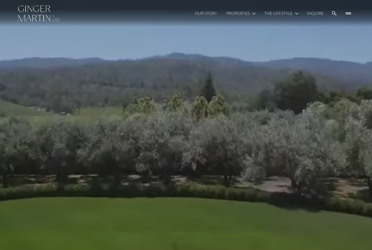
Ginger Martin + Co lets the region do the selling: a high, hazy view over a lawn, orchard trees and wooded hills, vine rows just visible at the edge — and the nav floating over it. The entire positioning lives just below the frame — a Sotheby's International Realty eyebrow over 'SELLING NAPA VALLEY + SONOMA VALLEY' in tracked capitals — with no headline number and no button in the first screen; the landscape itself is the promise. It's the wine-country lifestyle rendered as a view from above. Ginger Martin shows a regional specialist how to make geography the brand: name the two valleys, photograph the land they're buying, and keep everything else out of the way.

Visit Ginger Martin + Co

Opens a similar Zarla design you can make yours.

Ben Belack Group website — Advisory Team design example
Real site · Beverly Hills, CA
  • Advisory Team
  • Composed

Ben Belack Group: Advisory in serif, pain-free in italic

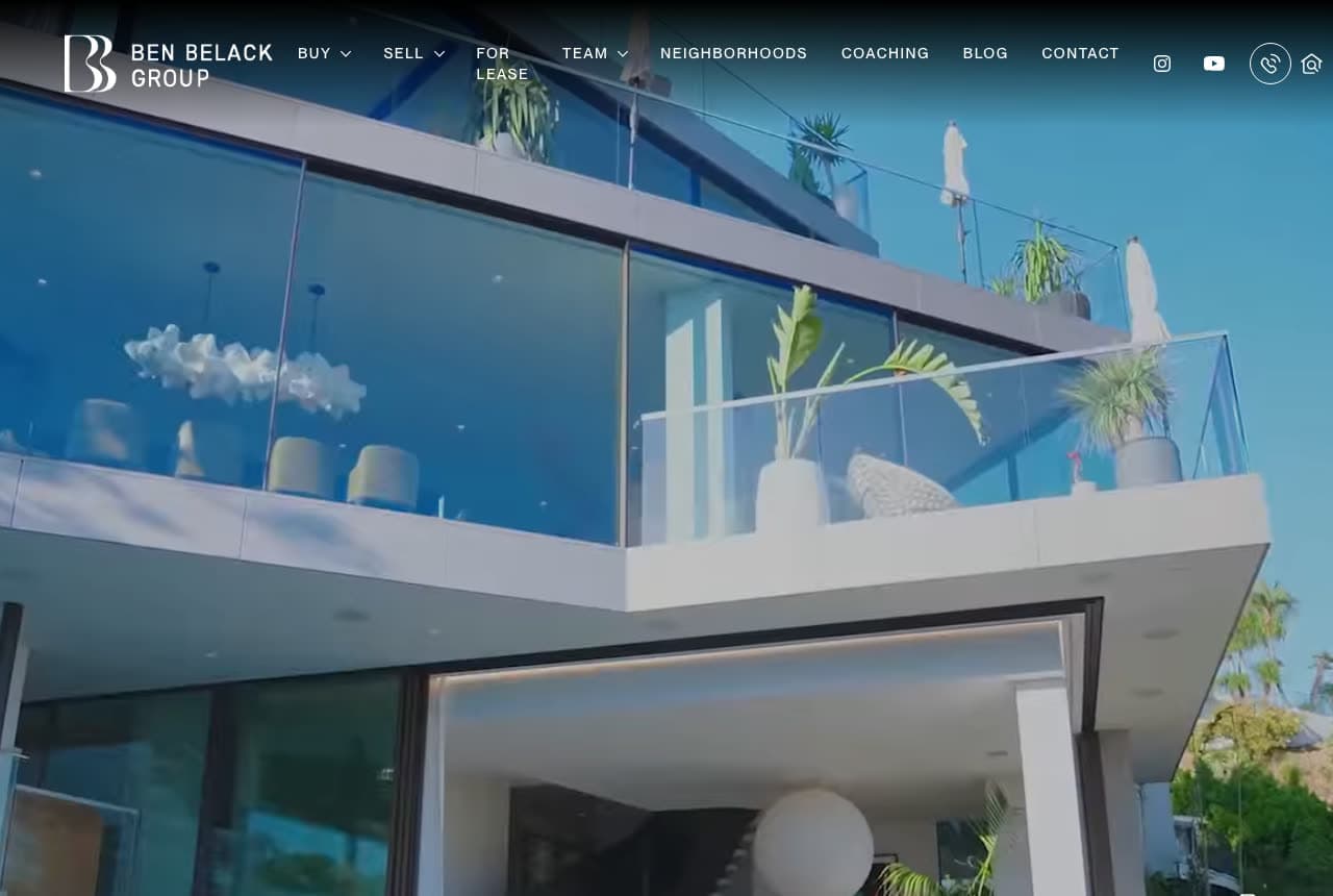
Ben Belack Group positions a real estate team as counsel: the first screen is a glass house in daylight — a glass balustrade, palms, the hills behind — with the nav laid over it carrying the split that runs through the whole site (Buy, Sell, For Lease, plus Neighborhoods and Coaching). The pitch arrives just below the fold, still over the photograph: 'Real Estate Advisory' in serif and, under it, the promise in italic — 'Hands-On. Pain Free.' — with two buttons — an outlined 'Sell My Home' and a filled white 'Find a Home'. The word 'advisory' does the repositioning; the italic line does the reassurance; the daylight photograph does the luxury. It's a team that sells process to clients who've been burned by a transaction before. Ben Belack shows how one noun — advisory — can lift a group above the 'agent' label without a single claim of being the best.

Visit Ben Belack Group

Opens a similar Zarla design you can make yours.

Angela Andronache website — Personal Brand design example
Real site
  • Personal Brand
  • Confident

Angela Andronache: The agent steps into the living room

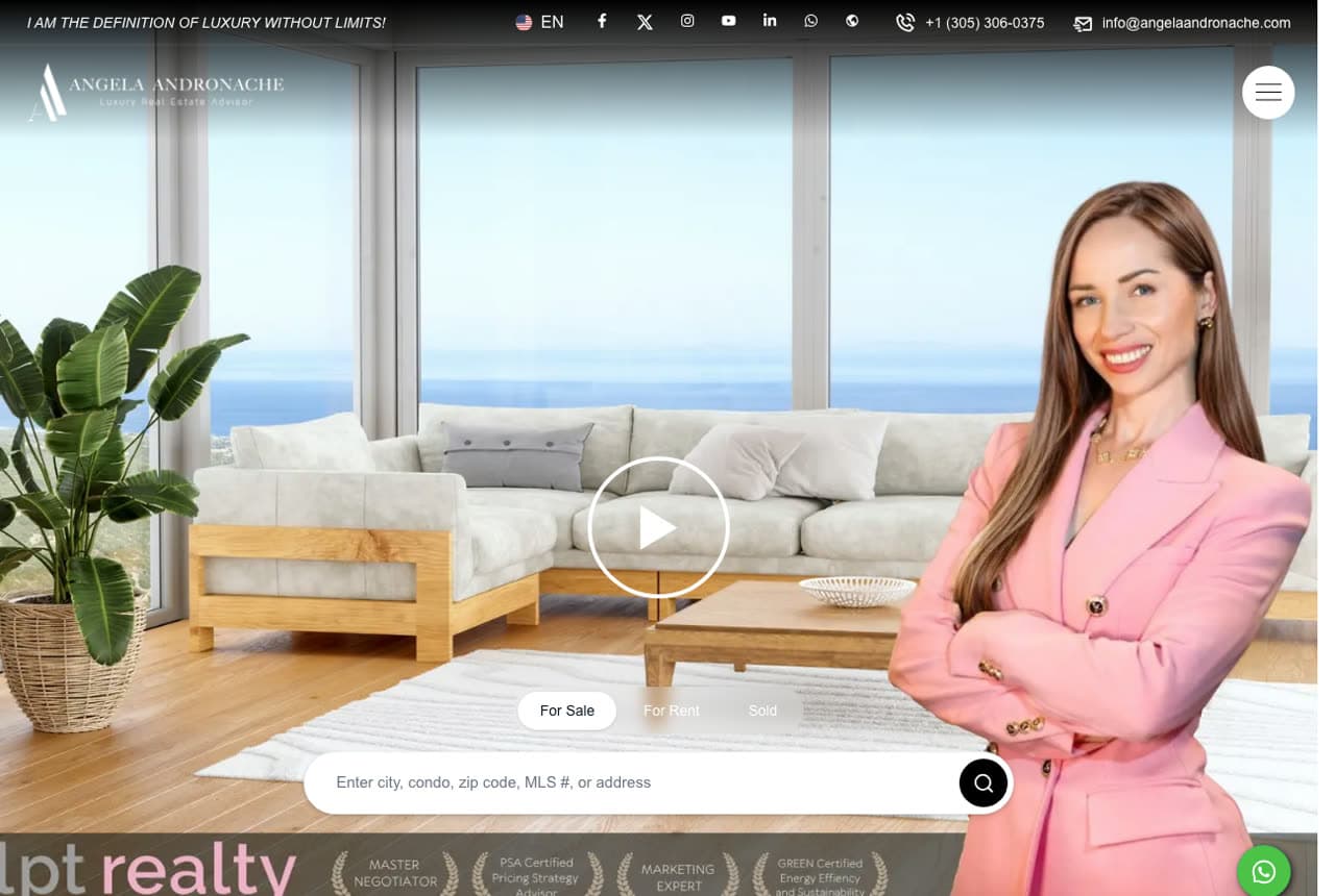
Angela Andronache puts herself in the frame: a bright living room with an ocean view, and standing in it, cut out at full height in a pink blazer with arms crossed — the agent as the host of the property. A play button in the center opens a video; beneath sits a search bar with 'For Sale' and 'For Rent' tabs, and a line across the top of the page announces the brand voice ('I am the definition of luxury without limits!'). It's personal branding at maximum confidence, and it works because the agent is the product a client is choosing. Angela Andronache shows the personality-led end of luxury real estate: the person, the view, a video, and only then the search.

Visit Angela Andronache

Opens a similar Zarla design you can make yours.

Inked Real Estate website — Boutique Brokerage design example
Real site
  • Boutique Brokerage
  • Warm

Inked Real Estate: A green velvet sofa says welcome

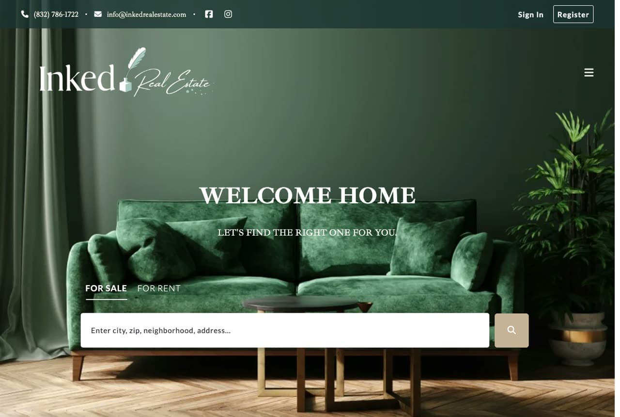
Inked Real Estate makes the homepage feel like an interior: a deep green velvet sofa against green walls and a monstera, with two lines of white serif over it — 'WELCOME HOME' and 'Let's find the right one for you' — a For Sale / For Rent toggle and a single search field asking for a city, zip, neighborhood or address. The logo is a script-and-serif lockup with a feather, and the palette is one color in every tone. It's less a brokerage site than a mood board for the home a client wants, which is exactly the emotional cue buyers respond to. Inked shows how a boutique brokerage can compete with portals on feeling: one styled room, two warm lines, and a search that feels like an invitation.

Visit Inked Real Estate

Opens a similar Zarla design you can make yours.

Marren & Vale Estates — Luxury Agent website design you can build with Zarla
Build this with Zarla
  • Luxury Agent
  • Stately

Marren & Vale Estates: The Malibu standard, with the numbers built in

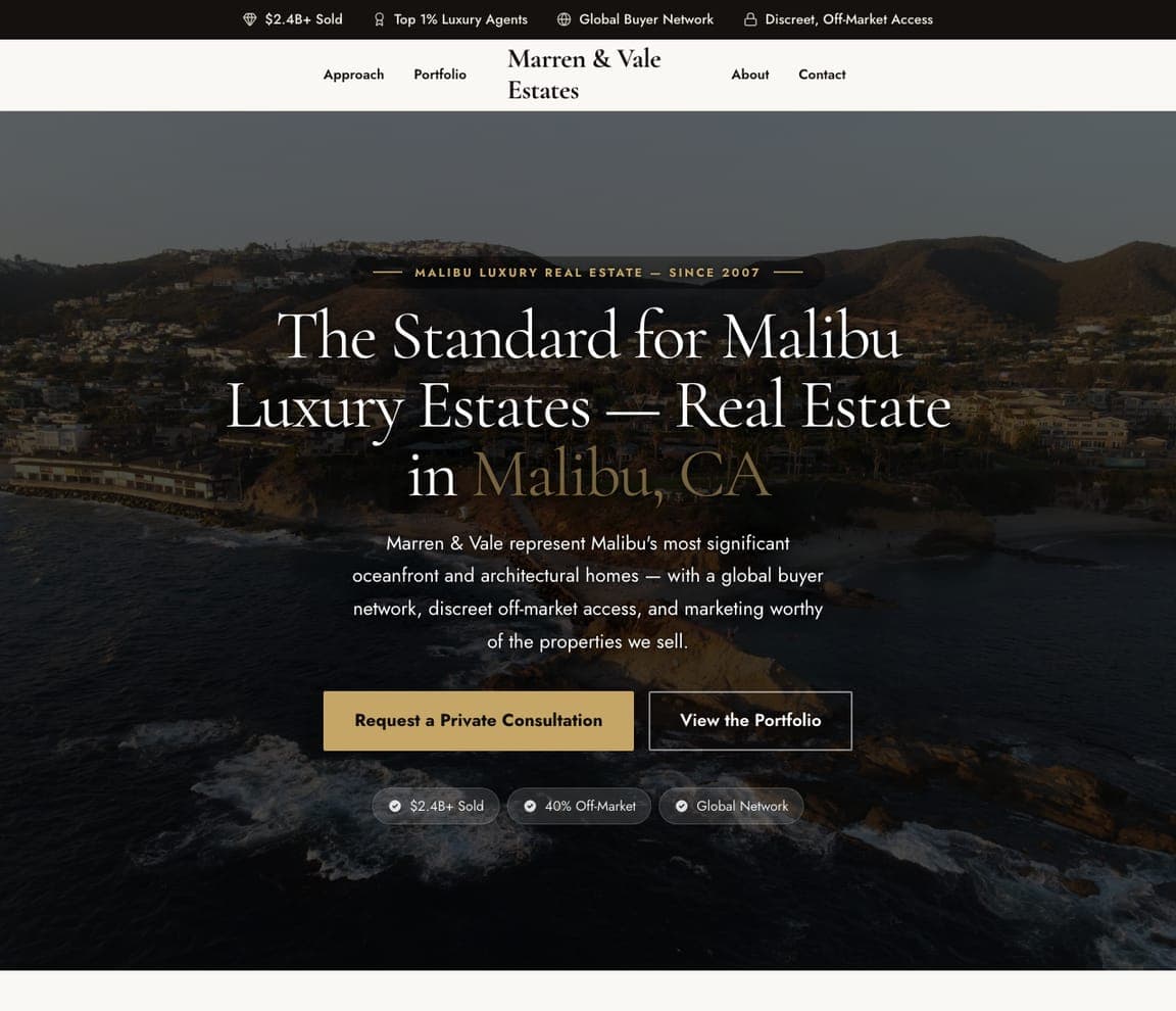
Marren & Vale Estates is the Zarla luxury estate agent template: a dark photograph of an oceanfront house, a serif headline that claims the market — 'The Standard for Malibu Luxury Estates — Real Estate in Malibu, CA' with the city in gold — and a paragraph about oceanfront and architectural homes with a global network and discreet off-market access. A gold 'Request a Private Consultation' sits beside 'View the Portfolio', and three chips carry the proof ($2.4B+ sold, 40% off-market, global network). It's the buildable version of Jade Mills' and Breitenbach's aerial-and-serif register with Carolwood's numbers. Clone it, change the coast and the figures, and a luxury specialist has a site that reads like the market leader.

See this template
Corwin & Ash Real Estate — Condo Specialist website design you can build with Zarla
Build this with Zarla
  • Condo Specialist
  • Urban

Corwin & Ash Real Estate: Towers in the frame, elevation in the headline

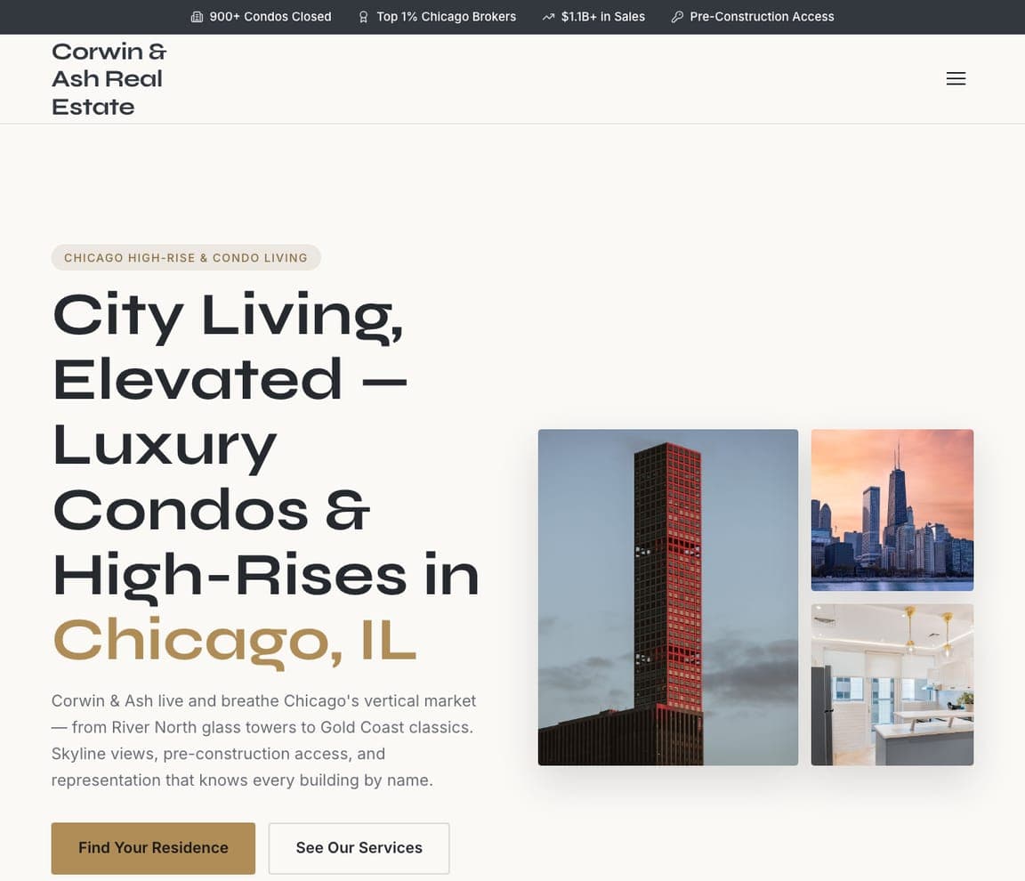
Corwin & Ash Real Estate is a Zarla template for the vertical market: a white ground, a serif headline stacked tall — 'City Living, Elevated — Luxury Condos & High-Rises in Chicago, IL' with the city in gold — and three photographs of towers and a glass-walled interior beside it. The paragraph names the neighborhoods (River North, Gold Coast) and the specialties (skyline views, pre-construction access), and the buttons are 'Find Your Residence' and 'See Our Services'. Chips above the nav carry the condo count and the pre-construction access. It's the buildable version of Louise Phillips Forbes' rooftop register for an agent whose product is the skyline. Clone it for any high-rise or condo specialist.

See this template
Tidewell & Cortez Real Estate — Coastal Specialist website design you can build with Zarla
Build this with Zarla
  • Coastal Specialist
  • Breezy

Tidewell & Cortez Real Estate: Big serif over the water's edge

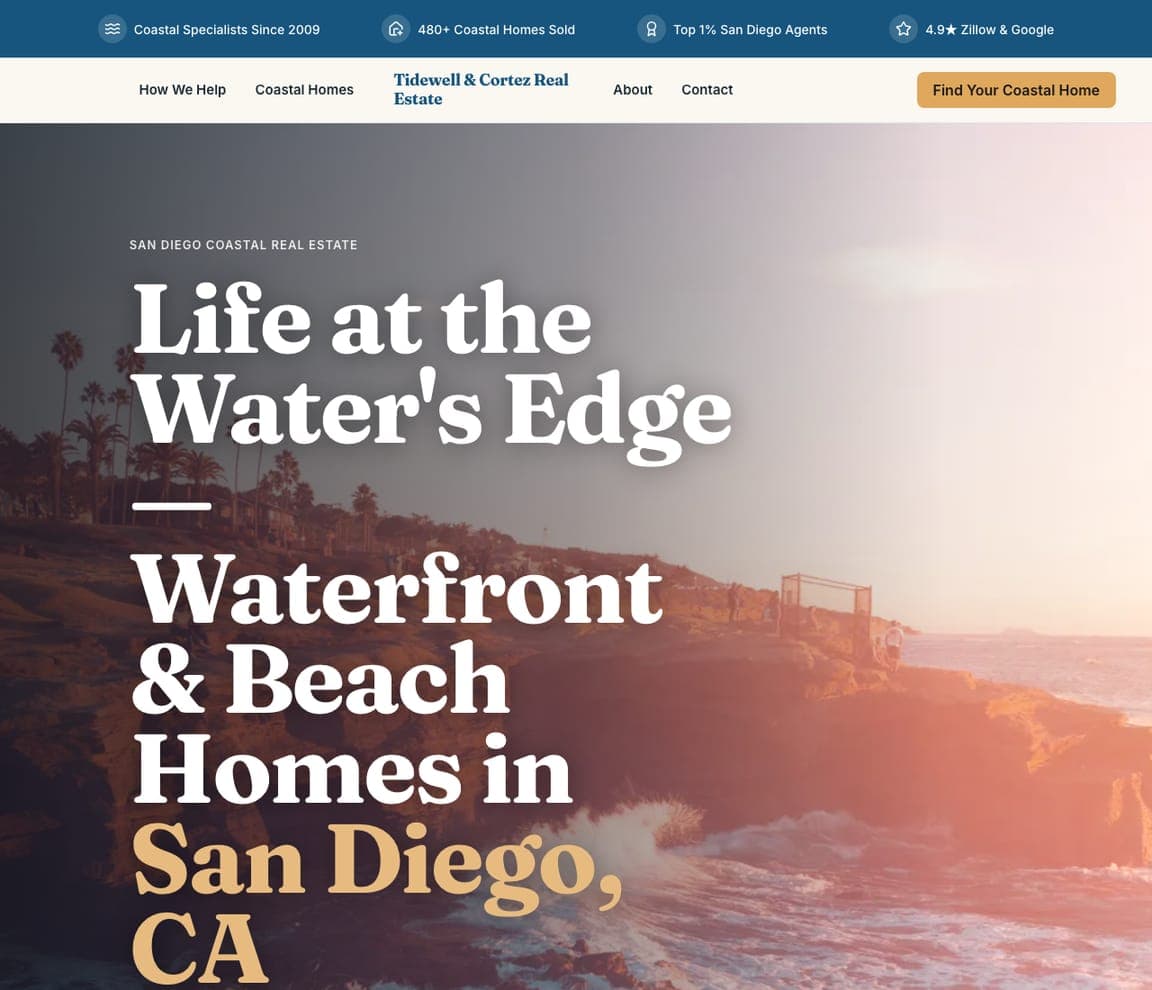
Tidewell & Cortez Real Estate is the Zarla template for coastal specialists: a full-bleed photograph of a beach house above the surf, and over it a serif headline at poster scale — 'Life at the Water's Edge — Waterfront & Beach Homes in San Diego, CA', with the city in a warm orange. An orange 'Find Your Coastal Home' button and an outlined second action sit beneath; chips above the nav carry the coastal sales count and the agent rankings. The oversized type and the horizon photograph are the same move Saslove & Warwick makes with skiers — photograph the lifestyle, claim the specialty. Clone it for any waterfront, lakefront or resort-market practice.

See this template
Hearthstone Realty Group — Advisory Agent website design you can build with Zarla
Build this with Zarla
  • Advisory Agent
  • Assured

Hearthstone Realty Group: Sell for more, in a serif that means it

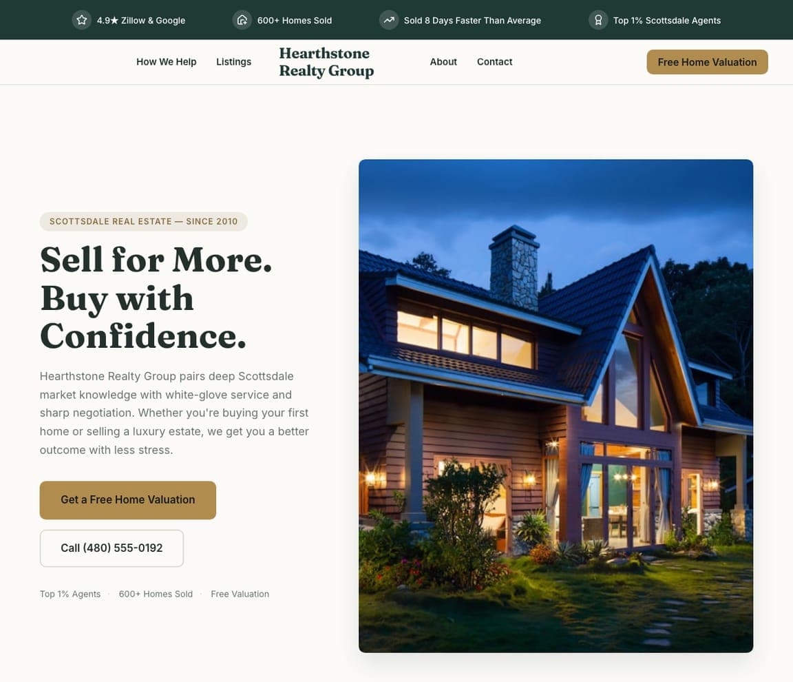
Hearthstone Realty Group is a Zarla template for the advisory register that Ben Belack uses: a photograph of a modern house at dusk, and beside it a serif headline that makes two promises in two short sentences — 'Sell for More. Buy with Confidence.' — followed by a paragraph about market knowledge, white-glove service and sharp negotiation. A gold 'Get a Free Home Valuation' leads, with a phone number beside it, and the chips above the nav carry the agent ranking, homes sold and the free valuation. Clone it for an agent or team whose pitch is judgment rather than glamour: the design is calm, the numbers are present, and the first step (a valuation) is free.

See this template

Frequently asked

Where can I find good luxury real estate website examples?

Right here — this page curates luxury real estate website examples across the spectrum: celebrated individual agents like Jade Mills and Louise Phillips Forbes, boutique brokerages like Carolwood Estates and Saslove & Warwick, and regional specialists like Ginger Martin in wine country and Breitenbach in the Hamptons (each linked so you can explore the live site), plus professionally designed Zarla luxury agent templates you can clone and make your own. Every example includes a note on why the design works — the imagery, the proof numbers, the private-consultation path — so you can copy the thinking, not just the look.

What makes a good luxury real estate website?

It makes the agent the reason to call. That means editorial-quality photography of real sold homes, a headline number that establishes the league (sales volume, ranking, years), evidence of access — off-market listings, a network, a track record — and an invitation to a private conversation rather than a lead form. The examples above never look like a listings portal; they look like the agent's own brand.

How much does a luxury real estate website cost?

Agencies that specialize in luxury agent sites typically charge many thousands up front, and template builders run roughly $16–$30 per month. An AI builder generates a complete, editable agent site for free and only charges (on the Premium plan) when you publish to your own domain — so you can build, load your sold portfolio and preview before spending anything.

Should a luxury agent's website include property search?

Only if it's discreet. Portals win on search; an agent's site wins on the agent. Louise Phillips Forbes and Inked Real Estate include search, but below the fold or in a quiet bar under a brand statement. The stronger pattern above — Carolwood, Jade Mills, Marren & Vale — leads with access ('off-market listings', 'search all homes') framed as a privilege, and puts a private consultation ahead of a form.

What pages does a luxury real estate website need?

Most luxury agents need six: a home page that establishes the league with one number and one image, a sold or portfolio page with editorial photography, a listings page (often with off-market access by request), an about page with the agent's story and affiliations, a neighborhoods or market page, and a contact page framed as a private enquiry. Teams add a page per agent; brokerages add press and market reports.

How do luxury agents get more clients from their website?

Prove the league, show the access, invite the conversation. The converting pattern in the examples above: a full-bleed image of a real sold home, a headline number ('over 6 billion in sales', '$5B sold in 2025'), a line about off-market or network access, and a single quiet button — private enquiry, request a consultation, find your home — rather than a bright form. Luxury clients call the agent whose site looks like the homes they want.

You've seen what works. Now make it yours.

Describe your business and Zarla designs a complete, professional website in about 30 seconds — built to convert, just like the ones above.

Free to build and preview · no credit card · publish to your own domain on Premium