Inspiration · Perfume

The Best Perfume Website Examples, Explained

Looking for perfume website examples? These 12 are the strongest we found — indie fragrance houses, cult DTC brands, and heritage maisons, plus designs you can restyle with Zarla — and each comes with a breakdown of the move that sells an invisible product through a screen. Perfume is the hardest thing to sell online: nobody can smell your work, so the design has to do the smelling for them. Find an approach you love and you can build a site in that spirit, free, in about 30 seconds.

Real sites + designs you can build with Zarla — free to build and preview, no credit card

What makes a great perfume website

Every perfume site fights the same problem: the product is invisible and the screen has no nose. The best ones translate scent into sight — staging bottles with their raw ingredients, building a color world per fragrance, or writing a story the visitor can almost smell — and then lower the risk of buying blind with samples, discovery sets, and quizzes. Notice how much personality wins here: in a category where every product is a glass rectangle, the brand voice around the bottle is the entire differentiation.

Abbott NYC website — Indie Fragrance House design example
Real site · New York, NY
  • Indie Fragrance House
  • Vibrant
  • Yellow + coral

Abbott NYC: Staging the scent's ingredients in the frame

Abbott NYC makes an invisible product visible by art-directing the notes themselves: on a saturated yellow field, a hand reaches for the Papaya Isla bottle between a cut papaya, an orchid, and a palm frond — you can practically smell the composition. A press bar (GQ, WWD, Oprah Magazine) follows, then plain-spoken clean-formula columns ('no phthalates, no sulfates') that read as label honesty rather than marketing. The travel-inspired range gives every fragrance its own destination story and color world. It's the clearest demonstration of the perfume category's first rule: don't photograph the bottle, photograph what's inside it.

  • The notes appear as physical ingredients around the bottle
  • A saturated color field gives each scent its own world
  • Press logos + plain clean-formula claims stack trust fast

Steal this: Photograph the ingredients of your scent, not just the bottle.

D.S. & Durga website — Niche Perfume House design example
Real site · New York, NY
  • Niche Perfume House
  • Playful
  • Pink + cream

D.S. & Durga: Campaign thinking instead of product pages

D.S. & Durga treats every launch like an ad campaign: the hero pits two rose fragrances against each other as 'Battle of the Roses,' the bottles wedged into pink boxing gloves — a concept a visitor remembers for weeks. Scroll on and the pop-art energy continues: 'I Don't Know What' rendered as a glass-of-water still life, a 'Cult Classics' grid treating scents like album covers. The Brooklyn house calls itself 'perfume as world-building,' and the site proves it — each fragrance gets a fully-realized visual fiction, not a row of specs. The lesson for any small fragrance brand: one witty campaign image outsells ten catalog shots.

  • Each launch is a campaign concept, not a product listing
  • Boxing-glove wit makes a luxury product feel alive
  • Consistent pop-art art direction builds a collectible feel

Steal this: Give your next launch a campaign concept you could describe in five words.

Ffern website — Seasonal Perfumery design example
Real site · Somerset, UK
  • Seasonal Perfumery
  • Editorial
  • Peach + cream

Ffern: Scarcity as the entire design system

Ffern doesn't sell perfume so much as membership in a ledger: the hero's left rail reads like an almanac — current season, a countdown to the next release, waiting list: open — while the panel on the right explains 'a new model for perfumery' and, in red, 'Currently full.' Four seasonal blends a year, made in the English countryside, delivered at the solstice and equinox; you join a list to be allowed to buy. The peach still life (bottle, cut orange, garden rose) supplies the sensory warmth while the structure supplies desire. It's the boldest positioning play on this page: the checkout friction IS the brand, and the design commits to it completely.

  • A countdown + waiting list turns buying into belonging
  • 'Currently full' in red is the strongest trust signal on the page
  • Ledger-style layout makes the seasonal model instantly legible

Steal this: If your capacity is genuinely limited, design around the limit — scarcity told honestly converts.

Byredo website — Luxury Fragrance House design example
Real site · Stockholm, SE
  • Luxury Fragrance House
  • Minimal
  • Green + white

Byredo: Typography as scenery behind the bottle

Byredo composes its hero like a gallery installation: a macro product shot — the Alto Astral bottle against green coconut skin — with the brand's name set in giant lime stencil type running behind the product, half-hidden by it. The type isn't a label, it's the landscape. Everything else stays ruthlessly reduced: the white pharmacy-style bottle label, a near-invisible nav, no discounts, no banners. That restraint is the point — the Stockholm house signals luxury by refusing to persuade. For a small brand the transferable move is cheaper than it looks: one oversized word behind one great product photo creates depth, scale, and identity with zero extra assets.

  • Giant type behind the product reads as scenery, not signage
  • A macro ingredient backdrop makes the bottle monumental
  • Ruthless reduction — no banners, no persuasion — signals luxury
Snif website — DTC Fragrance design example
Real site
  • DTC Fragrance
  • Irreverent
  • Cream + green

Snif: Internet-native irreverence in a serious category

Snif talks about fine fragrance the way group chats do: the hero is reality-TV star Rob Rausch in a cowboy hat holding a vial — 'rob rausch has your milk delivery.' — for a scent literally named after milk, while a marquee loops 'smell expensive, spend less' and a body-care tile just says 'rub it in.' Underneath the jokes sits a sharp commercial machine: try-first sampling, plain prices, Ulta retail callouts. The design's bet is that a generation priced out of Le Labo wants the quality without the hush, and every pixel commits to that voice. Proof that in a category built on reverence, comedy is a moat.

  • A meme-fluent campaign hero stops the scroll cold
  • Marquee copy ('smell expensive, spend less') states the position
  • The jokes sit on a serious try-first sampling funnel
Stillwater Day Spa — Adaptable Template website design you can build with Zarla
Build this with Zarla
  • Adaptable Template
  • Serene
  • Sage + champagne

Stillwater Day Spa: A sensorial-calm starting point to restyle

Stillwater Day Spa is a Zarla template — for a spa, not a perfume house — but it's here because its design language is the closest match in our catalog to how fragrance sells: a full-bleed sensory photograph, sage-and-champagne palette, and a headline that promises a feeling ('Quiet the Noise. Restore the Calm.') rather than a service. That's exactly the register a boutique perfumery needs. Clone it, tell Zarla's AI you're a fragrance brand, and it rewrites the structure and copy for scent — your notes where the treatments were, your discovery set where the bookings sat — in about 30 seconds. The aesthetic does the transferring; the AI does the translating.

  • Feeling-led headline register matches how fragrance sells
  • Sage + champagne palette reads sensorial, not clinical
  • Clone → describe your brand → the AI restyles it for perfume
See this template
Diptyque website — Heritage Maison design example
Real site · Paris, FR
  • Heritage Maison
  • Elegant

Diptyque: Craft surfaces that photograph like heirlooms

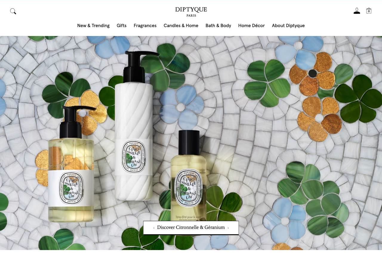
Diptyque stages its summer line on a hand-set mosaic of tile flowers — a surface that took someone days to make — and lets that craftsmanship transfer to the products lying on it. 'A tactile moment to reconnect with nature' reads less like e-commerce copy than a gallery card, and the best-sellers row below keeps the same museum calm: generous whitespace, oval labels, no urgency mechanics. Sixty years of Parisian heritage is communicated entirely through texture and restraint rather than claimed in words. The transferable idea scales down beautifully: shoot your products on one extraordinary handmade surface — tile, linen, pressed flowers — and the craft rubs off on everything in frame.

Maya Njie website — Artisan Perfumery design example
Real site · London, UK
  • Artisan Perfumery
  • Warm

Maya Njie: Memory as the brand's raw material

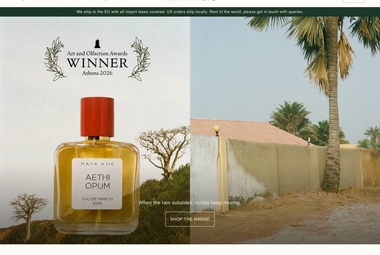
Maya Njie opens with an award laurel — Art and Olfaction Awards winner — then splits the hero between a bottle and a sun-bleached Gambian courtyard with a palm tree, captioned 'when the rain subsides, cycles keep moving.' The copy below states the practice plainly: perfumes of recollection, drawn from family photo albums and the founder's dual Swedish–Gambian heritage. Every scent is a memory made wearable, and the photography style — warm, grainy, personal — matches the archive it draws from. For any founder-led fragrance brand this is the template: your specific history is the one ingredient competitors cannot source, so put it in the hero, not the about page.

Imaginary Authors website — Concept Perfumery design example
Real site · Portland, OR
  • Concept Perfumery
  • Bold

Imaginary Authors: A literary conceit carried through every pixel

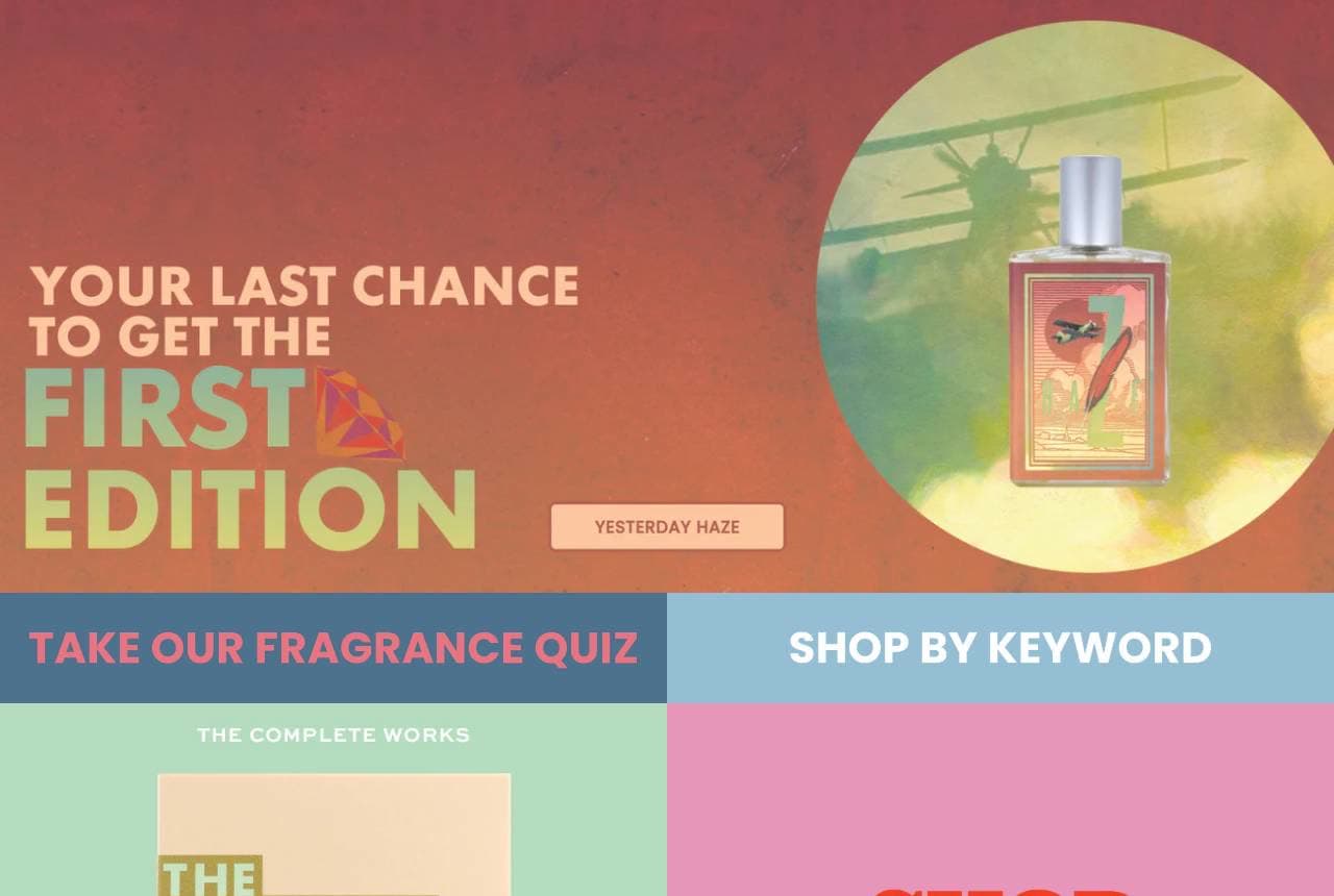
Imaginary Authors runs on one big idea: every fragrance is a novel by an author who doesn't exist, and the site commits like a small press. Launches are 'first editions,' the catalog is 'The Complete Works,' sample packs become type-set posters in pink and red, and the whole page reads like a paperback table at a book fair — flat colors, punchy display type, almost no product photography at all. The conceit does every job at once: naming, packaging, storytelling, and differentiation. It's the strongest proof on this page that a small brand doesn't need better bottle photos than the majors — it needs a fiction the majors can't copy.

Skylar website — DTC Fragrance design example
Real site
  • DTC Fragrance
  • Playful

Skylar: One dessert metaphor sells a whole launch

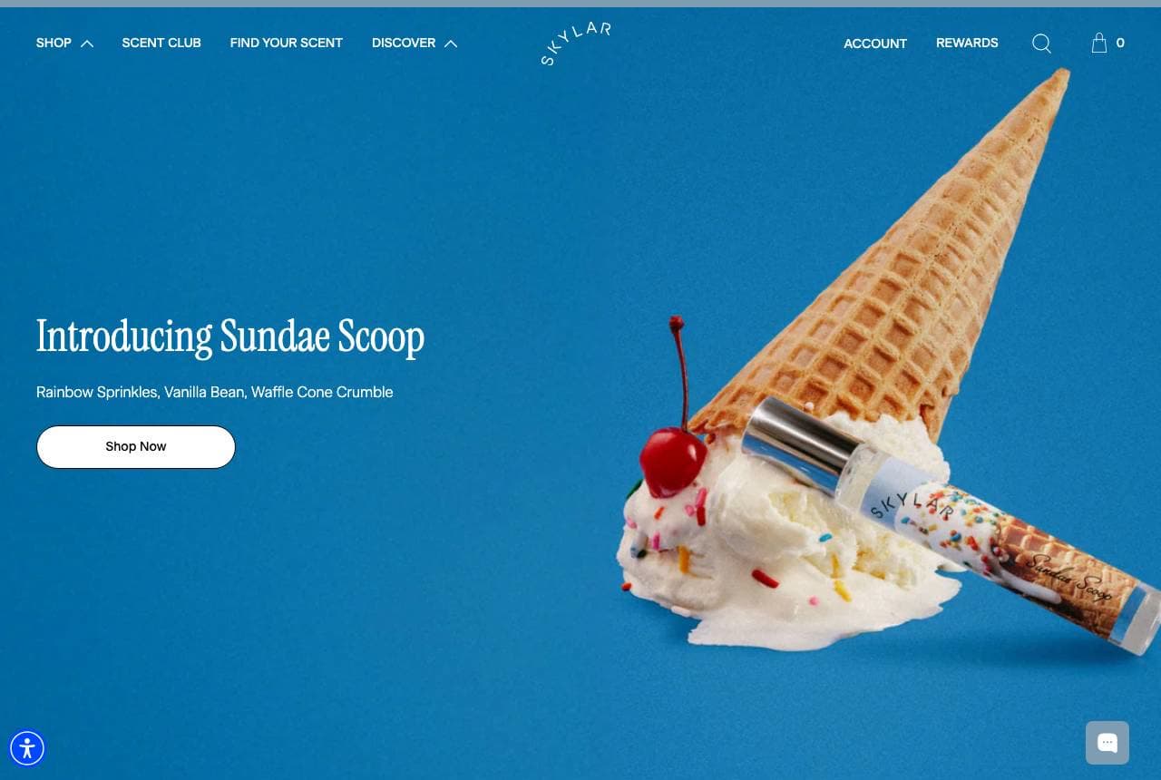
Skylar introduces its Sundae Scoop line by dropping the rollerball into an actual scoop of ice cream — sprinkles, waffle cone, cherry — on an electric blue field. No notes pyramid, no adjectives: the photograph IS the scent description, and 'Rainbow Sprinkles, Vanilla Bean, Waffle Cone Crumble' just confirms what the eye already smelled. Below, the serif statement 'Bringing a fresh perspective to fragrance' and a tidy best-sellers row return to clean DTC convention, which makes the playful hero land harder. The move is repeatable for any gourmand or lifestyle scent: build the flavor world as a physical prop and let one photograph carry the launch.

Vyrao website — Wellness Fragrance design example
Real site
  • Wellness Fragrance
  • Vivid

Vyrao: Wellness positioning through saturated color

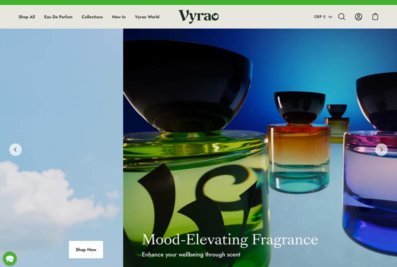
Vyrao sells fragrance as energy work — 'Mood-Elevating Fragrance… combining neuroscience and master perfumery' — and the design makes the claim visible: rainbow-gradient bottles glowing against open sky, a giant botanical monogram wrapping the glass, and an 'ENERGY IS EVERYTHING' marquee looping beneath. Where most luxury perfume goes hushed and monochrome, Vyrao floods the screen with chroma, so the wellbeing promise arrives before a word is read. The brand's Ayurveda-adjacent story could easily tip into vagueness; the confident, art-directed color system is what keeps it feeling premium instead. If your fragrance sells a feeling, pick the color of that feeling and own it everywhere.

Maison Lune Salon — Adaptable Template website design you can build with Zarla
Build this with Zarla
  • Adaptable Template
  • Elegant

Maison Lune Salon: Maison-style elegance ready for a rebrand

Maison Lune Salon is a Zarla template built for a hair salon — but its bones are pure French perfumery: the 'Maison' naming convention fragrance houses share, a warm bronze-and-gold palette, an elegant split hero pairing serif type with atmospheric photography. If you're launching a perfume brand and want the maison register without the maison budget, this is the closest starting point in our catalog. Clone it, describe your fragrance house to Zarla's AI, and it swaps the services for your scents, the stylists for your story, and the booking flow for a discovery-set funnel — in about 30 seconds. Keep the palette; it already smells like amber.

See this template

Frequently asked

Where can I find good perfume website examples?

Right here — this page curates perfume website examples across the whole spectrum: indie houses like Maya Njie and Imaginary Authors, cult DTC brands like Snif and Skylar, and heritage maisons like Diptyque and Byredo, each linked so you can explore the live site. Every example includes a note on why the design works — how it makes scent visible, how it lowers the risk of buying unsniffed — so you can copy the move, not just the look.

What makes a good perfume website?

It solves the category's core problem: visitors can't smell anything. Good perfume websites translate each scent into something the eye can process — ingredient still-lifes, a color world per fragrance, campaign storytelling — and then remove the risk of buying blind with samples and discovery sets. The examples above each pick a different translation strategy, from Abbott's ingredient staging to Byredo's typographic scenery.

How do perfume brands sell scent online?

By selling the idea of the scent, then sampling the scent itself. The strongest sites on this page describe fragrances through place, memory, or story (a Gambian courtyard, an imaginary novel, a summer getaway), show the notes as real ingredients, and make a low-risk first step — a discovery set, a sample pack, a quiz — the primary call to action rather than a full-bottle purchase.

What should a perfume website include?

A distinct visual identity per fragrance (not just bottle-on-white), the notes and ingredients presented visually, a sample or discovery-set offer as the low-risk entry point, the brand's story — founder, process, place — and any press or awards for credibility. If you sell in person too (markets, boutiques, a studio), include where to find you: fragrance is still a try-before-you-buy category.

How much does a perfume website cost?

A custom e-commerce site from a designer typically runs into the thousands, and template builders charge roughly $16–$30 per month plus transaction fees. An AI builder generates a complete, editable site for free and only charges (on the Premium plan) when you publish to your own domain — so a small fragrance house can build and preview everything before spending anything.

Do I need professional product photography for a perfume website?

You need deliberate staging more than an expensive shoot. The examples above prove the range: Abbott stages bottles with the fruit and flowers of the notes, Skylar drops a rollerball into an ice-cream scoop, and Byredo simply sets giant type behind a macro shot. One strong visual idea per scent — even executed simply — beats a folder of generic bottle-on-white renders.

You've seen what works. Now make it yours.

Describe your business and Zarla designs a complete, professional website in about 30 seconds — built to convert, just like the ones above.

Free to build and preview · no credit card · publish to your own domain on Premium