Inspiration · Real Estate Agent

The Best Real Estate Website Examples, Explained

Looking for real estate website examples? These 12 are the best we could find — standout real real estate sites plus designs you can build with Zarla — and each comes with a breakdown of the specific design move that makes it work. Find a look you love and you can build a site in that exact style, free, in about 30 seconds.

Real sites + designs you can build with Zarla — free to build and preview, no credit card

What makes a great real estate website

The best real estate websites share a few moves: they earn trust fast, lead with strong visuals of the work, point to one clear action, and match the design to how their customers decide. Each example below calls out the specific choice worth stealing for your own real estate website.

Fox Marin website — Urban Brokerage design example
Real site · Toronto, ON
  • Urban Brokerage
  • Editorial
  • Black + white

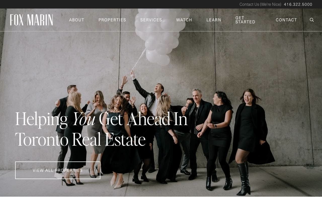
Fox Marin: Fashion-editorial polish for a brokerage

Fox Marin shoots its team like a magazine masthead — black-and-white group portrait, everyone styled, nobody holding a 'sold' sign — under 'Helping You Get Ahead In Toronto Real Estate' with the 'You' set in italic serif. That single typographic flourish carries the brand: the serif italics reappear in 'Winning Results. Every Time.' below, tying the page together like an editorial spread. Then the structure gets practical: three doors labelled by intent — Thinking of Selling? Buying A Home? Looking To Invest? — each with its own interior photo. Real estate is a fashion business pretending to be a finance business; Fox Marin dresses accordingly and lets intent-based navigation do the selling.

  • B&W team portrait styled like a masthead, not a bus bench
  • One italic-serif flourish repeated becomes the brand voice
  • Sell / buy / invest doors route visitors by intent
Rouse + Co website — Boutique Agency design example
Real site · Hudson Valley, NY
  • Boutique Agency
  • Literary
  • Charcoal + cream

Rouse + Co: Copy written for a buyer's imagination

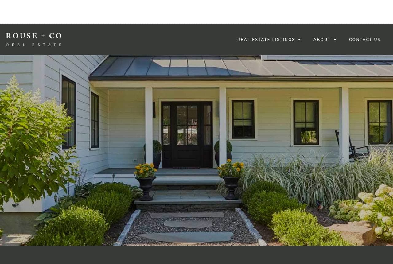
Rouse + Co sells the Hudson Valley the way the Hudson Valley sells itself: a farmhouse porch in dappled light, a slim serif wordmark, and then copy that most brokerages would never dare — 'Whether a modernist or preservationist, a devotee of charm or elegance…' It's writing aimed at a reader's self-image, naming the buyer archetypes (storied estates, restored farmhouses, architect-designed retreats) rather than listing bedroom counts. The dark panel gives the words a gallery wall to hang on, and 'homes with history, presence, and an undeniable sense of place' closes the pitch. Boutique agents compete on taste; this page proves taste in every sentence, which is the only evidence that counts.

  • Names buyer archetypes instead of listing bedroom counts
  • Dark panel turns prose into a gallery wall
  • Farmhouse-porch photo sells the region's actual fantasy

Steal this: Write to your buyer's self-image ('modernist or preservationist') — taste on the page is proof of taste in the deal.

Living Room Realty website — Lifestyle Brokerage design example
Real site · Portland, OR
  • Lifestyle Brokerage
  • Human
  • Red + warm white

Living Room Realty: Photograph the life, not the listing

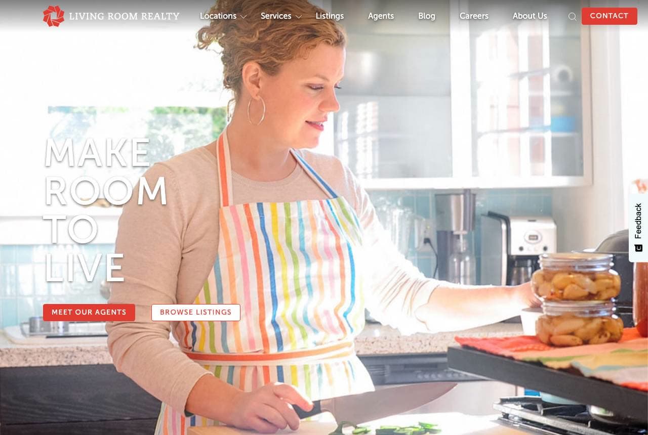
Living Room Realty's hero contains zero houses: a woman in a striped apron bakes in her kitchen under the spaced-out words 'MAKE ROOM TO LIVE.' That inversion is the whole strategy, and the manifesto below says it out loud — 'your home is more than a shelter… you want to plant a garden, be a neighbor, take a deep breath, sing in the shower.' The red accent on warm photography keeps it human, and 'Real Estate Done Differently' earns its claim by actually being different on the page. Every competitor leads with granite countertops; Living Room leads with the Saturday morning the countertops are for. Buyers purchase futures, not floor plans — the brave version of that insight looks like this.

  • A kitchen moment, not a facade — the hero sells the Saturday
  • Manifesto copy commits: gardens, neighbors, singing in the shower
  • 'Done Differently' proven by the design, not just claimed

Steal this: Lead with the life the house enables. One lived-in moment outsells another exterior-at-dusk shot.

Tall Poppy website — Flat-Fee Agency design example
Real site · New Zealand
  • Flat-Fee Agency
  • Approachable
  • Blue + teal

Tall Poppy: The fee math, published on the homepage

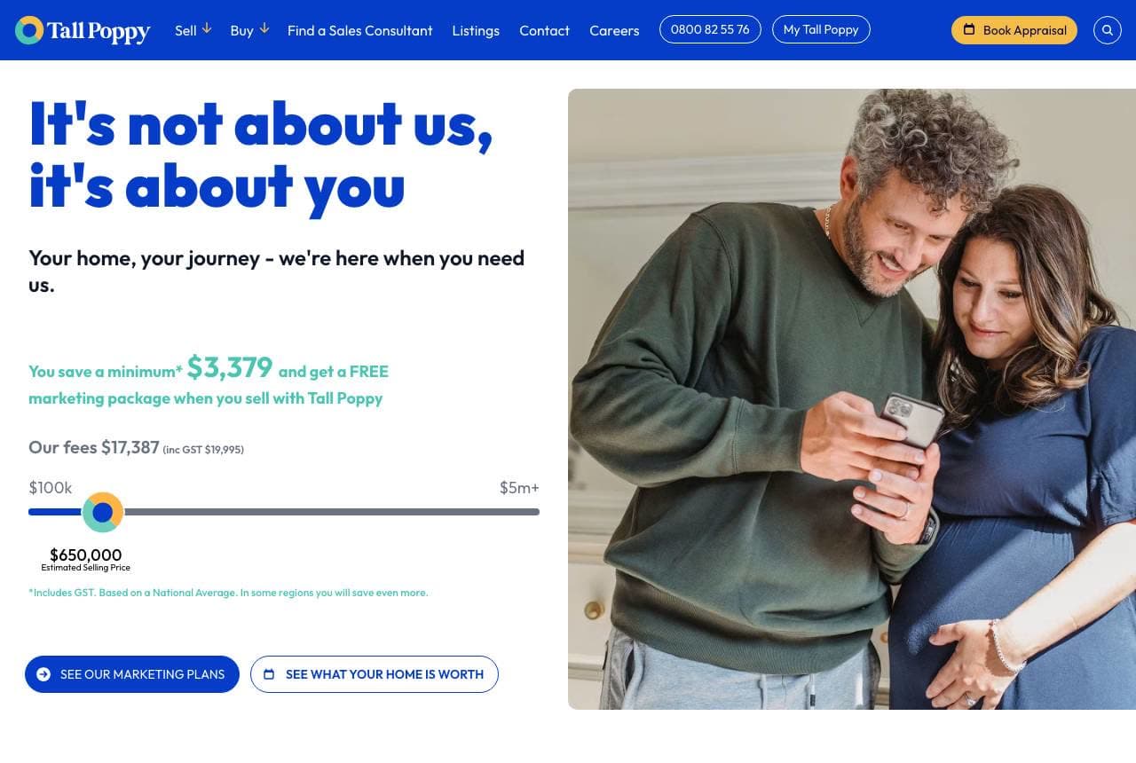
Tall Poppy weaponizes transparency: 'It's not about us, it's about you' in big friendly blue, then — right on the homepage — an interactive savings widget showing the actual numbers: our fee $17,387 vs theirs, 'you save a minimum $3,379,' free marketing package included. No other agent shows their commission before the first meeting, which is exactly why the flat-fee challenger must. Below, sold-property cards from 'the last few days' pair each address with the agent's face and the vendor's review — proof the discount doesn't mean discount service. The rounded type and couple-on-the-sofa photo keep it approachable. When your model is the product, the homepage's job is arithmetic.

  • Commission calculator on the homepage — radical in this trade
  • Sold-this-week cards pair savings claims with fresh proof
  • Friendly rounded type softens a hard-numbers pitch

Steal this: If price is your edge, publish the math. A savings calculator converts better than 'competitive fees.'

Move Residential website — Valuation Funnel design example
Real site · Liverpool, UK
  • Valuation Funnel
  • Direct
  • Navy + lime

Move Residential: One lime button, one lead magnet

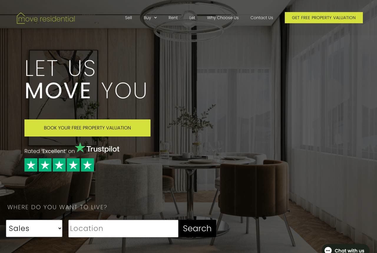
Move Residential runs the valuation-funnel playbook with unusual discipline: 'LET US MOVE YOU' in mixed-weight type, and a single lime-yellow button — 'Book Your Free Property Valuation' — glowing against the muted interior photo. Every seller wants to know their number, so the free valuation is the perfect lead magnet, and making it the page's only bright element makes the next step unmissable. Trustpilot stars sit directly beneath, an 'As Seen On' bar stacks Zoopla, BBC and the local Echo, and the dark band reframes the service — 'Not Just Moving Home, Moving Forward…' Local press logos, one loud CTA, one free offer: the unglamorous formula that fills a listing pipeline.

  • Free valuation = the lead magnet every seller already wants
  • Lime CTA is the page's single bright element by design
  • Local press logos beat generic awards for a city agency

Steal this: Make the free valuation your only bright button. Sellers click their number before they click 'about us.'

Herbert & Lansdowne website — Estate Agency design example
Real site · Dublin, IE
  • Estate Agency
  • Establishment
  • Green + amber

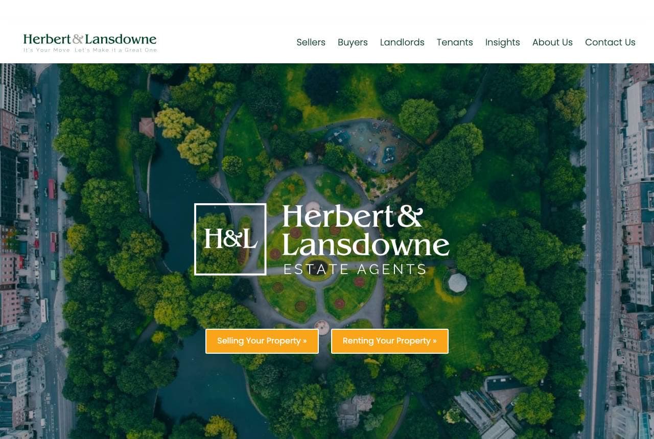
Herbert & Lansdowne: A drone shot that sells the postcode

Herbert & Lansdowne opens from above — a drone photograph of a leafy Dublin square, georgian terraces framing the green — with the serif H&L mark centered like a wax seal and two amber buttons splitting the audience: Selling Your Property, Renting Your Property. The aerial does something a facade photo can't: it sells the neighbourhood, which in Dublin is the actual product. Below, the palette flips to deep estate green for a suited team photo and copy that covers every role — landlord, vendor, buyer, renter. The two-button hero is quietly smart segmentation; sellers and landlords have different anxieties, and letting each self-select on arrival means the next page can speak to one worry instead of four.

  • Aerial photo sells the postcode, not one facade
  • Two CTAs segment sellers and landlords at the door
  • Estate green + serif seal reads establishment-grade
Marren & Vale Estates — Luxury Listings website design you can build with Zarla
Build this with Zarla
  • Luxury Listings
  • Opulent

Marren & Vale Estates: Gold-on-black for the top of the market

Marren & Vale Estates is Zarla's luxury real-estate template, and its dark-showcase hero speaks the segment's dialect fluently: 'The Standard for Malibu Luxury Estates' in gold over near-black, with the muted gold accent carrying through every button and rule line. Luxury listings are won in the seller's living room, and this is the site you're not embarrassed to have open on their iPad — restrained, evening-toned, zero clutter. The structure holds the register: featured properties, a private-consultation ask instead of a 'free quote,' credentials over exclamation points. Swap Malibu for your market, keep the discipline. Clone it and the whole thing is live in about 30 seconds.

See this template
Finch & Rowe Real Estate — First-Time Buyers website design you can build with Zarla
Build this with Zarla
  • First-Time Buyers
  • Encouraging

Finch & Rowe Real Estate: Hand-holding as the headline promise

Finch & Rowe Real Estate is Zarla's first-time-buyer template, and it leads with the anxiety every renter-turned-buyer carries: 'Your First Home, Made Simple.' The split-image-left hero pairs warm photography with a teal-and-coral palette that reads encouraging rather than corporate — closer to a friendly guide than a suit — and the page structure walks the nervous buyer through the process step by step, which is precisely the service this niche actually sells. First-timer specialists live on being the safe pair of hands; a site that explains, reassures and never jargons is the proof. Clone it, localize the steps to your market's quirks, and it's live in about 30 seconds.

See this template
Tidewell & Cortez Real Estate — Waterfront Homes website design you can build with Zarla
Build this with Zarla
  • Waterfront Homes
  • Coastal

Tidewell & Cortez Real Estate: The shoreline is the brand

Tidewell & Cortez Real Estate is Zarla's waterfront specialist template: a fullbleed-left hero puts the water itself on screen under 'Life at the Water's Edge,' with deep harbor blue and sand-gold accents doing the rest of the talking. Niche coastal practices win by owning a geography — a bay, a string of beach towns — and this design makes the geography the identity: every color choice echoes the product. The left-weighted composition keeps the headline legible over the seascape, and the structure showcases featured waterfront listings where generic sites would bury them. If your patch is the shoreline, your website should taste like salt. Clone it and it's live in about 30 seconds.

See this template
Kestrel Land & Ranch — Ranch & Land website design you can build with Zarla
Build this with Zarla
  • Ranch & Land
  • Rugged

Kestrel Land & Ranch: Acreage sold in earth tones

Kestrel Land & Ranch is Zarla's ranch-and-land template, opening on a fullwidth Montana vista — 'Own a Piece of Montana' — in saddle brown and sage green that smell like the product. Land is a different purchase than a house: buyers are buying horizon, water rights and elbow room, so the design leads with landscape photography and keeps the type sturdy and unfussy, like a ranch gate sign. The palette alone filters the audience; nobody shopping for a downtown condo lingers here, and that's the point of a specialist site. For brokers working acreage, hunting parcels or ranchland, this is the register that wins the listing. Clone it and it's live in about 30 seconds.

See this template
Rushmore & Vale Home Offers — Cash Offers website design you can build with Zarla
Build this with Zarla
  • Cash Offers
  • High-Urgency

Rushmore & Vale Home Offers: A form where the hero should be

Rushmore & Vale Home Offers is Zarla's cash-offer template, and it commits to the funnel: the form-centered hero puts 'Sell Your Home Fast — Cash Offers in Las Vegas' directly above a lead-capture card, because this niche's visitor isn't browsing — they're in a hurry, often under pressure, and the only question is 'what's my offer?' The charcoal base with a decisive red accent creates urgency without desperation, and the page answers the three objections in order: how fast, how much, what's the catch. Investor-buyers and we-buy-houses operators live and die on cost-per-lead; a homepage that IS the form is the whole business model, honestly stated. Live in about 30 seconds.

See this template
Northsend Realty — Tech-Forward Agent website design you can build with Zarla
Build this with Zarla
  • Tech-Forward Agent
  • Modern

Northsend Realty: An aurora instead of a headshot

Northsend Realty is Zarla's tech-forward agent template, and it refuses the industry's two default heroes — the headshot and the house — in favor of an animated aurora gradient in indigo and cyan under 'Smarter Real Estate in Seattle.' The software-startup aesthetic is the positioning: this is the agent who runs pricing models, markets listings with data, and answers on Slack-speed, and the site says so before a word is read. For younger sellers choosing between a legacy brokerage and someone who feels current, the design is the differentiator. It also photographs beautifully in a listing presentation next to a competitor's 2012 site. Clone it and it's live in about 30 seconds.

See this template

Frequently asked

Where can I find good real estate website examples?

Right here — this page curates real estate website examples two ways: standout real businesses (each linked, so you can explore the live site) and professionally designed Zarla templates you can clone and make your own. Every example comes with a note on why the design works — trust signals, layout, calls to action — so you can copy the move, not just the look.

What makes a good real estate website?

A good real estate website earns trust in the first few seconds, leads with strong visuals of the work, gives visitors one obvious action, and loads fast on a phone. Every design below leads with proof and a single clear call to action rather than a wall of text.

How much does a real estate website cost?

A custom real estate website from a designer typically runs into the thousands up front, and template builders charge roughly $16–$30 per month. An AI builder generates a complete, editable design for free and only charges (on the Premium plan) when you publish to your own domain — so you can build and preview before spending anything.

Do I need a designer to build a real estate website?

No. Several designs on this page were generated by Zarla and are fully editable — you describe your business and get a complete, professionally designed site in about 30 seconds, then refine it by chatting. Building and previewing is free; publishing to your own domain needs the Premium plan.

What pages does a real estate website need?

Most real estate businesses need just a few: a home page that proves trust and points to one clear action, an about page that puts a face to the business, a services or work page that shows what you do, and a contact page with a form and a phone number. Local businesses also benefit from location or service-area pages that help them show up in nearby searches.

How do I get more customers from my real estate website?

Lead with proof in the first few seconds (reviews, real photos, results), make one action obvious on every screen (call, book, or enquire), and keep it fast on mobile — most visitors arrive on a phone. The designs above each do this differently, but they all earn trust early and remove friction from the next step.

You've seen what works. Now make it yours.

Describe your business and Zarla designs a complete, professional website in about 30 seconds — built to convert, just like the ones above.

Free to build and preview · no credit card · publish to your own domain on Premium