Inspiration · Handyman

The Best Handyman Website Examples, Explained

Looking for handyman website examples? These 15 are the best we could find — standout real handyman sites plus designs you can build with Zarla — and each comes with a breakdown of the specific design move that makes it work. Find a look you love and you can build a site in that exact style, free, in about 30 seconds.

Real sites + designs you can build with Zarla — free to build and preview, no credit card

What makes a great handyman website

The best handyman websites share a few moves: they earn trust fast, lead with strong visuals of the work, point to one clear action, and match the design to how their customers decide. Each example below calls out the specific choice worth stealing for your own handyman website.

Zach of All Trades website — Solo Craftsman design example
Real site · Montana
  • Solo Craftsman
  • Editorial
  • Warm neutrals

Zach of All Trades: Craftsmanship framing for odd jobs

Zach of All Trades makes the strongest case on this page that a handyman site can feel like a craftsman's portfolio. The serif headline — 'Craftsmanship your home deserves.' — sits over a close-up of precise tile work, reframing odd jobs as skilled trade rather than errand-running. Then the honesty move: 'Two trades, done thoroughly.' Instead of the usual 40-item service list, Zach names exactly what he does and lets a stats row (700+ homes, 8+ years, 100% satisfaction) prove depth over breadth. That scope discipline is the real lesson: customers trust a specialist's boundary more than a generalist's promise, and the restrained, editorial layout makes one person look like a premium studio.

  • Serif type + close-up craft photo reframes the category
  • 'Two trades, done thoroughly' — scope honesty as brand
  • Stats row proves depth where a service list would dilute

Steal this: Name what you don't do. A tight scope statement ('two trades, done thoroughly') earns more trust than a 40-item list.

The Welsh Handyman website — Veteran-Owned design example
Real site · South Wales, UK
  • Veteran-Owned
  • Illustrated
  • Cream + charcoal

The Welsh Handyman: A veteran story told wall to wall

The Welsh Handyman wraps its entire hero in an illustrated wallpaper of hand tools — hammers, saws, planes in a repeating pattern — and it instantly separates the site from every photo-of-a-van competitor. But the design is carrying a story, not just a style: the headline leads with 'Ex-forces' plumbers, electricians and carpenters, and a 'Supporting veterans' panel deeper down makes hiring them feel like backing something. That's positioning a template can't fake — who your people are becomes the reason to choose you. The illustration keeps the mood warm and workshop-like where stock photography would feel corporate, proving that a distinctive graphic system plus a true story beats another smiling-tradesman hero.

  • Illustrated tool wallpaper — instantly unlike every van-photo rival
  • 'Ex-forces' staffing is the headline, not a footnote
  • Warm workshop mood where stock photos would read corporate
Gillespie Handyman website — Established Firm design example
Real site · Ottawa, ON
  • Established Firm
  • Premium
  • Black + gold

Gillespie Handyman: An estimate promise with a deadline

Gillespie Handyman turns the quote form — usually the most passive element on a trades site — into its sharpest conversion tool. Beside the form sits a 'Fast Estimate Promise': send us photos of the job and you'll have a response within one business day, guaranteed. That single sentence answers the fence-sitter's real question (will anyone actually get back to me?) better than any badge. Around it, the design earns the promise: serif headlines with gold accents on near-black, '20 Years' and '11,000+ Happy Clients' stated plainly, and checkmark reassurances like 'we show up when scheduled.' It reads like a company that has systematized reliability — which, for a handyman, is the entire product.

  • 'Response within 1 business day, guaranteed' — the promise converts
  • Photo-based quoting lowers the ask to a phone-camera task
  • Gold-on-black serif carries 20-year weight without stuffiness

Steal this: Put a response-time guarantee next to your quote form. 'Within 1 business day, guaranteed' beats any trust badge.

Jiffy website — On-Demand Platform design example
Real site · Toronto, ON
  • On-Demand Platform
  • App-Like
  • Blue + white

Jiffy: Booking a handyman like ordering a ride

Jiffy is the platform take on the category — 'Home maintenance booked when you need it' over a single search box where a customer is mid-typing 'furnace is making a weird noise.' That one interaction pattern collapses the entire services page: instead of reading a directory to self-diagnose, you describe the problem in your own words and the site routes you. The proof bar underneath scales with the model — 500,000+ jobs completed, 96% satisfaction, 4.8 stars — numbers no solo operator can post but every solo operator can learn from: Jiffy makes the first step typing, not reading. Even a one-person outfit can borrow that by making 'describe your job' the hero action instead of 'browse my services.'

  • Search-box hero: describe the problem, skip the directory
  • 500,000+ jobs / 4.8★ — proof scaled to the platform claim
  • First step is typing, not reading — friction near zero
Odd Job website — Awarded Firm design example
Real site · Toronto, ON
  • Awarded Firm
  • Confident
  • Green + white

Odd Job: 'Most awarded' backed by visible reviews

Odd Job leads with a superlative — 'Canada's Most Awarded Handyman Services Company' — and then does the thing most superlative-claimers skip: it shows the receipts on the same screen. Tabbed Google, Facebook and Yelp review cards sit right below the green-wrapped van photo, complete with owner responses visible under customer reviews. Those replies are the quiet masterstroke; a business that answers its reviews in public reads as accountable before you've exchanged a word. The branded van matters too — vehicle wraps are the trade's oldest credibility signal, and photographing yours is free. Claim big, then let third-party platforms and your own responsiveness do the verifying.

  • Superlative claim + same-screen review proof
  • Visible owner responses read as accountability
  • The wrapped van is a credibility photo you already own

Steal this: Answer your Google reviews — then embed them. Visible owner responses are trust the competition can't copy-paste.

Fantastic Handyman website — City Handyman design example
Real site · London, UK
  • City Handyman
  • Corporate
  • Red + navy

Fantastic Handyman: A service directory that sells breadth

Fantastic Handyman is the big-operator playbook executed cleanly: a hero with the branded van and uniformed tradesman parked outside a London terrace, then a tiled directory of every job category — furniture assembly, TV mounting, electrical, plumbing, painting — each with its own icon and link. Where Zach of All Trades sells depth, Fantastic sells coverage: whatever's broken, there's a tile for it, and the grid's uniformity signals process and dispatch capacity rather than one busy person. The lesson for anyone with a multi-skill team is that breadth needs structure — a categorized, scannable grid reads as organized capability, while the same list in a paragraph would read as a jack-of-all-trades hedge.

  • Tiled category grid turns breadth into browsable structure
  • Van + uniform photo signals dispatch-scale operations
  • Uniform icons make 'we do everything' feel organized, not vague
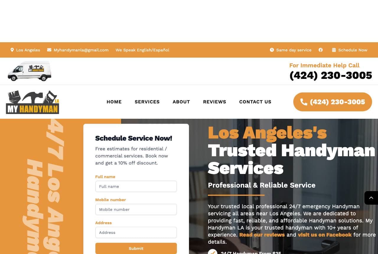
My Handyman LA website — Emergency Service design example
Real site · Los Angeles, CA
  • Emergency Service
  • High-Urgency

My Handyman LA: 24/7 urgency with the form in the hero

My Handyman LA is conversion-first design with the subtlety dial at zero — and it works. A high-vis orange palette signals urgency, '24/7' and a from-$35 price anchor remove two objections before scrolling, and the scheduling form sits inside the hero itself so the distance between arriving and booking is one viewport. Below, a row of Google, Yelp and Facebook logos each showing 5.0 stars stacks three platforms' worth of proof into one glance. Nothing here is decorative; every element either creates urgency, removes friction, or verifies trust. For high-intent traffic — someone with water on the floor at 11pm — this beats an elegant brochure site every time.

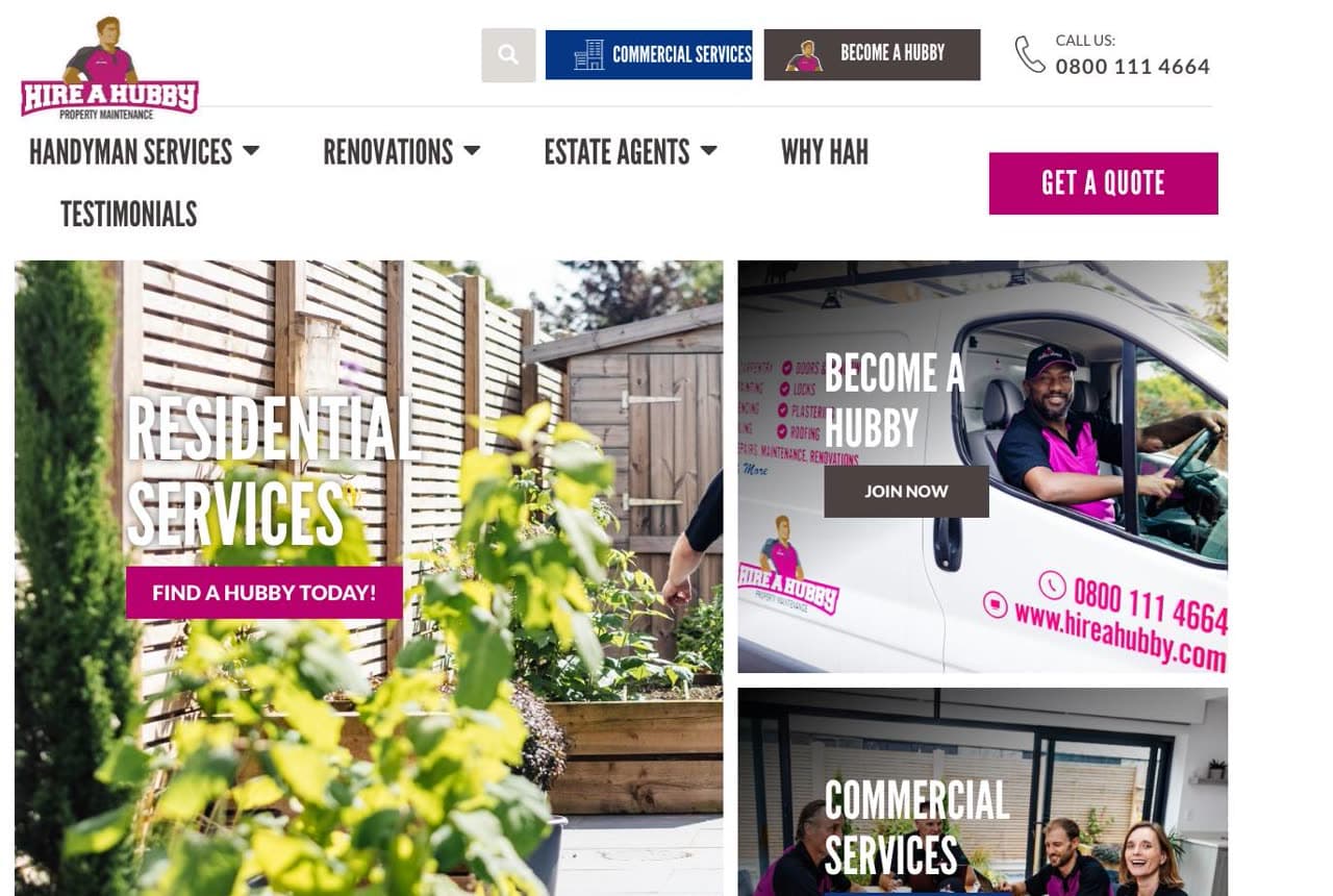
Hire A Hubby website — National Franchise design example
Real site · Australia
  • National Franchise
  • Playful

Hire A Hubby: Franchise pink you can't mistake

Hire A Hubby owns a color the way few trades brands dare: hot pink, on the vans, the shirts, the photo-tile overlays, everywhere. In a category that defaults to safety-orange and navy, the pink is a memory device — you see one van and recognize the next one instantly. The site is structured franchise-first: 'Find Your Local Hubby' is the primary action, with residential and commercial photo tiles routing the two audiences. Pair that with the name itself — a joke you understand in one second and repeat at a barbecue — and you get the whole lesson: distinctiveness compounds. A memorable name plus an ownable color does more advertising than a bigger media budget.

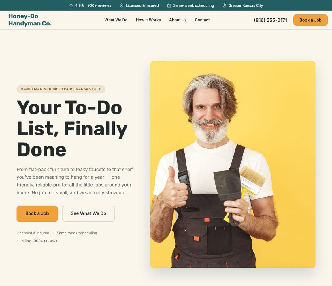
Honey-Do Handyman Co. — Local Handyman website design you can build with Zarla
Build this with Zarla
  • Local Handyman
  • Friendly

Honey-Do Handyman Co.: Warmth that clears the chore list

Honey-Do Handyman Co. is Zarla's handyman template, and it aims at the emotional center of the category: the backlog. 'Your To-Do List, Finally Done' speaks straight to the homeowner staring at six months of unhung shelves and dripping taps — relief as the product, not drill bits. The split-image-right hero pairs that promise with real-work photography, in a deep teal and warm amber palette that lands friendly-but-capable, warmer than the industrial navy most trades default to. Even the business name works the vernacular — every homeowner knows what a honey-do list is. Clone it, swap in your own photos and service area, and you have this positioning live in about 30 seconds.

See this template
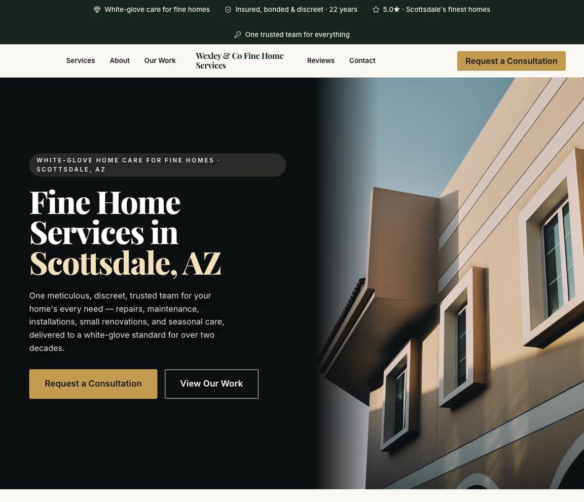
Wexley & Co Fine Home Services — Fine Home Services website design you can build with Zarla
Build this with Zarla
  • Fine Home Services
  • White-Glove

Wexley & Co Fine Home Services: White-glove handyman for fine homes

Wexley & Co Fine Home Services shows there's a luxury tier to the handyman trade: 'Fine Home Services in Scottsdale, AZ,' in an elegant gold serif over a warm architectural home, promising 'one meticulous, discreet, trusted team… delivered to a white-glove standard for over two decades.' Where most handymen compete on speed and price, Wexley competes on discretion and finish — 'insured, bonded & discreet' speaks to affluent homeowners who want a vetted, unobtrusive professional in their home, not the cheapest quote. The dark-and-gold serif design looks like a concierge service, not a work van. For a handyman targeting high-end homes, positioning as white-glove — and designing to match — pre-qualifies for premium rates and the kind of repeat, trusted-access relationship that's far more valuable than one-off calls.

See this template
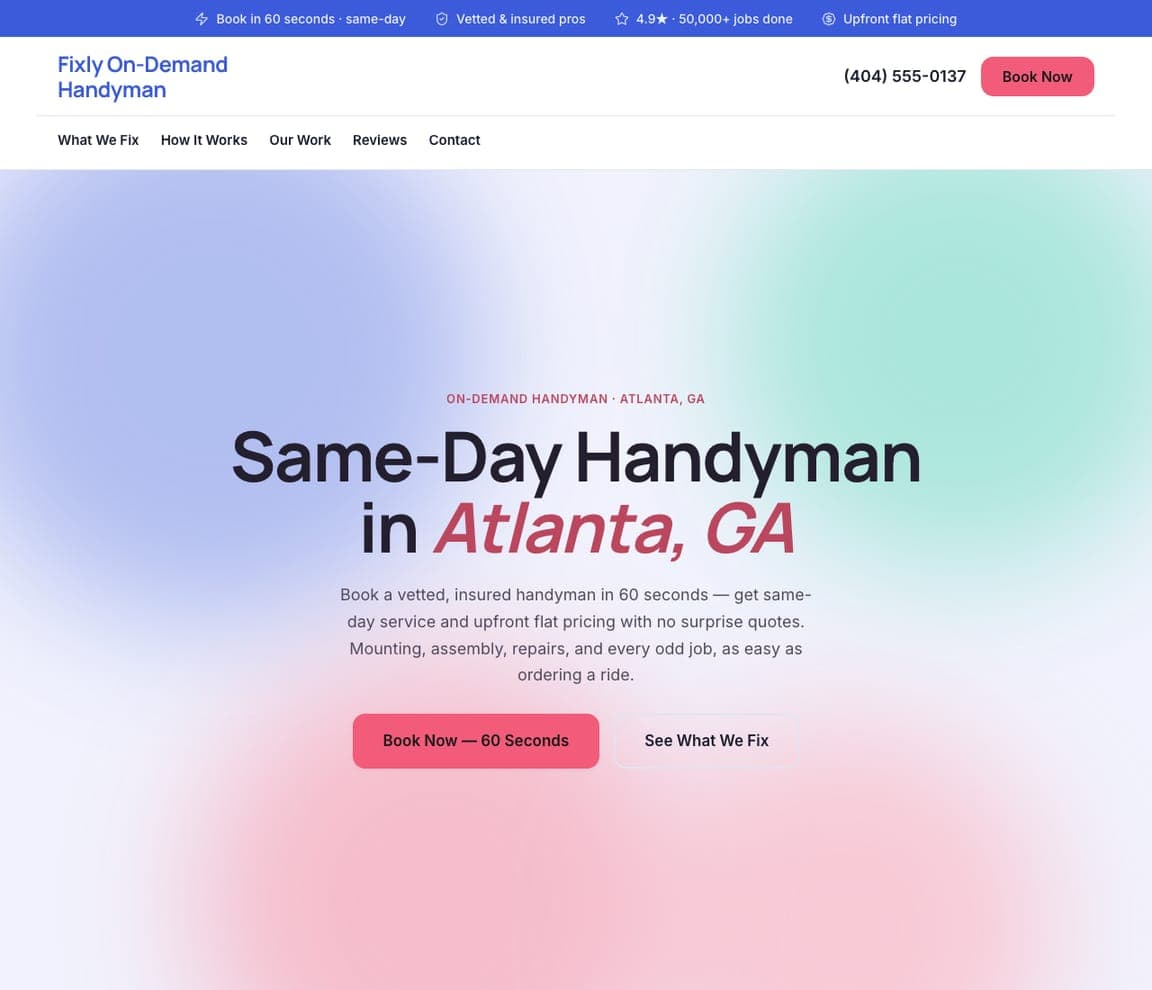
Fixly On-Demand Handyman — On-Demand Handyman website design you can build with Zarla
Build this with Zarla
  • On-Demand Handyman
  • Modern-Tech

Fixly On-Demand Handyman: Booked in 60 seconds, flat price

Fixly On-Demand Handyman brings the app-era booking model to the trade — the same on-demand approach Jiffy proves among the reals above — as a pre-built template: 'Same-Day Handyman in Atlanta, GA' on a soft pink-and-mint gradient, promising to 'book a vetted, insured handyman in 60 seconds… as easy as ordering a ride,' with 'upfront flat pricing, no surprise quotes.' The friendly aurora gradient and instant-booking framing position Fixly against the whole hassle of the traditional handyman experience — the callback that never comes, the vague quote. It's the tech-platform playbook applied to home repair. For a modern, on-demand handyman service, sell the frictionless experience (60 seconds, flat price, same-day) and design something bright and app-like — the differentiator isn't the fixing, it's how effortless you make getting it fixed.

See this template
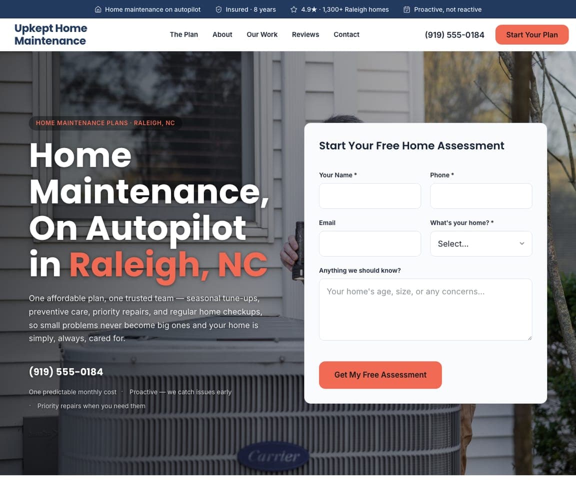
Upkept Home Maintenance — Maintenance Plans website design you can build with Zarla
Build this with Zarla
  • Maintenance Plans
  • Systematic

Upkept Home Maintenance: Home upkeep on a subscription

Upkept Home Maintenance sells the recurring-revenue model most handymen never think to offer: 'Home Maintenance, On Autopilot in Raleigh, NC,' with a lead-capture form in the hero and the pitch 'one affordable plan, one trusted team — seasonal tune-ups, preventive care, priority repairs… proactive, not reactive.' Reframing handyman work from one-off emergency calls into a subscription — a membership that catches problems before they become expensive — is smart for both sides: the homeowner gets peace of mind, and the business gets predictable monthly revenue and a locked-in relationship. The form-split hero captures the lead immediately with a free assessment. For any home-service business, a maintenance-plan offering turns sporadic, price-shopped jobs into loyal recurring customers — and leading with 'on autopilot' sells the exact relief a busy homeowner wants.

See this template
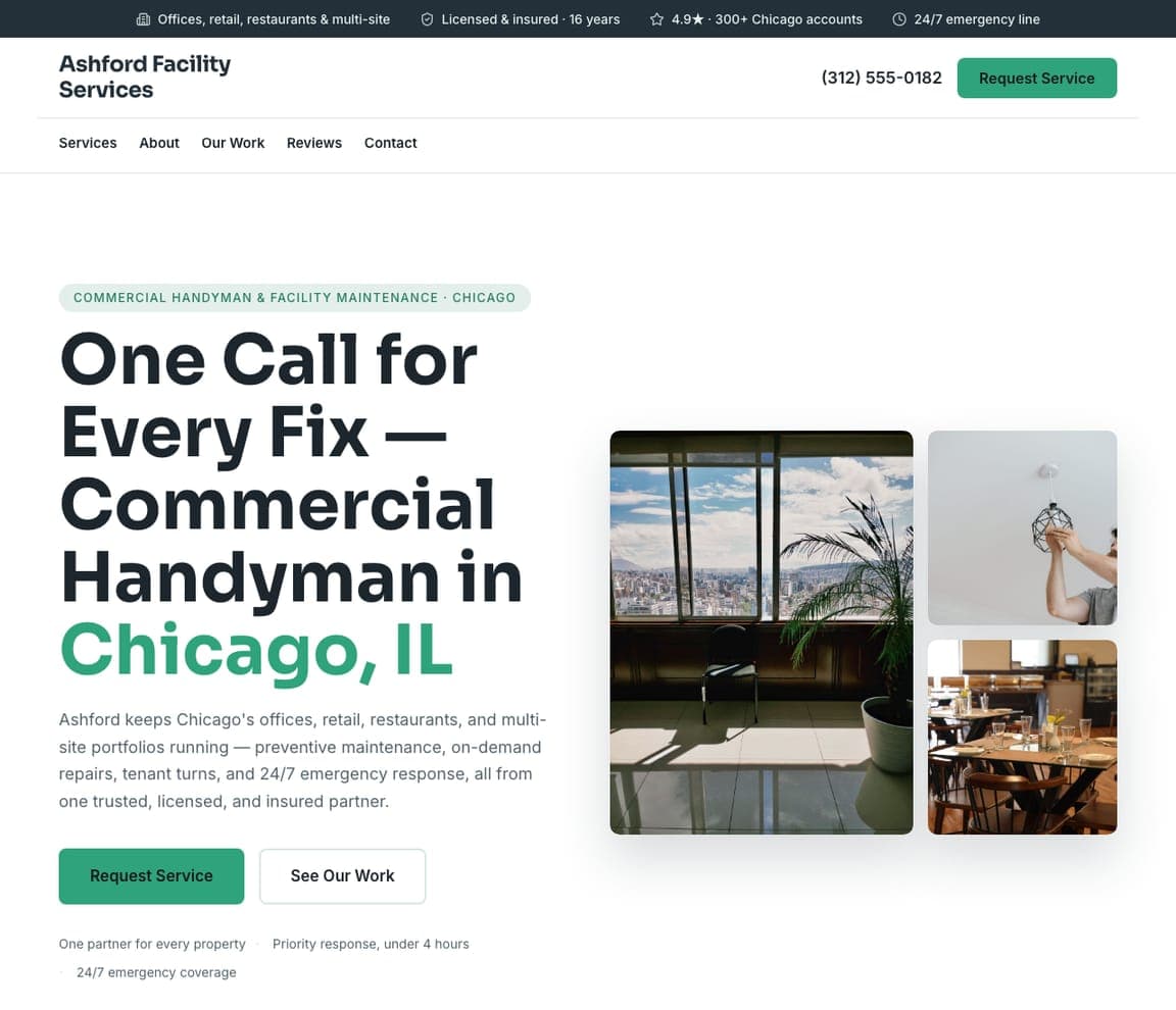
Ashford Facility Services — Commercial Handyman website design you can build with Zarla
Build this with Zarla
  • Commercial Handyman
  • B2B

Ashford Facility Services: One call for every property

Ashford Facility Services points the handyman trade at businesses, not homeowners: 'One Call for Every Fix — Commercial Handyman in Chicago, IL,' promising to keep 'offices, retail, restaurants, and multi-site portfolios running — preventive maintenance, tenant turns, and 24/7 emergency response, all from one trusted partner.' The B2B buyer (a property manager or facilities lead) has completely different needs from a homeowner — they want one accountable vendor across many sites, fast response, and proper licensing — so the corporate green design, the 'under 4 hours' response promise, and 'multi-site portfolios' language speak directly to that. For a handyman who wants larger, recurring contracts, positioning for commercial and facility work — one reliable partner for every property — is a higher-value lane than competing for residential odd jobs one at a time.

See this template
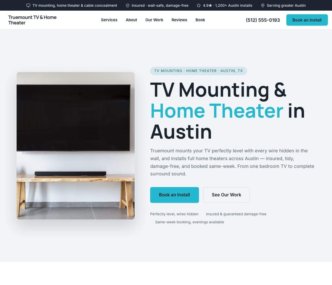
Truemount TV & Home Theater — TV Mounting website design you can build with Zarla
Build this with Zarla
  • TV Mounting
  • Focused

Truemount TV & Home Theater: Level, wires hidden, damage-free

Truemount TV & Home Theater narrows to one high-demand job and sells the details that matter: 'TV Mounting & Home Theater in Austin,' with a clean shot of a perfectly-mounted TV and the reassurances a nervous customer wants — 'mounted perfectly level with every wire hidden in the wall… insured, tidy, damage-free.' TV mounting is a job people are anxious to DIY (a dropped TV, holes in the wrong stud, dangling cables), so naming 'level, wires hidden, damage-free' answers every fear directly, and 'booked same-week' beats the general handyman's vague scheduling. For a handyman, spinning a single popular task into its own focused page — with the specific quality promises that task's customers worry about — captures the high-intent searcher who typed exactly 'TV mounting near me,' not 'handyman.'

See this template
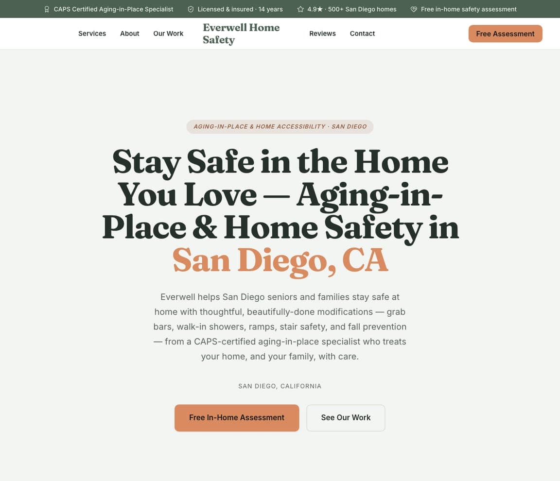
Everwell Home Safety — Aging-in-Place website design you can build with Zarla
Build this with Zarla
  • Aging-in-Place
  • Caring

Everwell Home Safety: Stay safe in the home you love

Everwell Home Safety serves a growing, underserved need with genuine warmth: 'Stay Safe in the Home You Love — Aging-in-Place & Home Safety in San Diego, CA,' offering 'grab bars, walk-in showers, ramps, stair safety, and fall prevention — from a CAPS-certified aging-in-place specialist who treats your home, and your family, with care.' This isn't a generic handyman job — it's an emotional, trust-heavy purchase often made by an adult child worried about a parent, so the caring copy, the CAPS certification, and the warm cream-and-orange serif design signal competence AND compassion, exactly what that buyer needs. For a handyman with the right certification, specializing in accessibility and aging-in-place taps a demographic wave and a values-driven client; lead with the reassurance ('stay safe in the home you love') and prove the credential.

See this template

Frequently asked

Where can I find good handyman website examples?

Right here — this page curates handyman website examples two ways: standout real businesses (each linked, so you can explore the live site) and professionally designed Zarla templates you can clone and make your own. Every example comes with a note on why the design works — trust signals, layout, calls to action — so you can copy the move, not just the look.

What makes a good handyman website?

A good handyman website earns trust in the first few seconds, leads with strong visuals of the work, gives visitors one obvious action, and loads fast on a phone. Every design below leads with proof and a single clear call to action rather than a wall of text.

How much does a handyman website cost?

A custom handyman website from a designer typically runs into the thousands up front, and template builders charge roughly $16–$30 per month. An AI builder generates a complete, editable design for free and only charges (on the Premium plan) when you publish to your own domain — so you can build and preview before spending anything.

Do I need a designer to build a handyman website?

No. Several designs on this page were generated by Zarla and are fully editable — you describe your business and get a complete, professionally designed site in about 30 seconds, then refine it by chatting. Building and previewing is free; publishing to your own domain needs the Premium plan.

What pages does a handyman website need?

Most handyman businesses need just a few: a home page that proves trust and points to one clear action, an about page that puts a face to the business, a services or work page that shows what you do, and a contact page with a form and a phone number. Local businesses also benefit from location or service-area pages that help them show up in nearby searches.

How do I get more customers from my handyman website?

Lead with proof in the first few seconds (reviews, real photos, results), make one action obvious on every screen (call, book, or enquire), and keep it fast on mobile — most visitors arrive on a phone. The designs above each do this differently, but they all earn trust early and remove friction from the next step.

You've seen what works. Now make it yours.

Describe your business and Zarla designs a complete, professional website in about 30 seconds — built to convert, just like the ones above.

Free to build and preview · no credit card · publish to your own domain on Premium