Inspiration · Notary

The Best Notary Website Examples, Explained

Looking for notary website examples? These 12 are the best we could find — standout real notary sites plus designs you can build with Zarla — and each comes with a breakdown of the specific design move that makes it work. Find a look you love and you can build a site in that exact style, free, in about 30 seconds.

Real sites + designs you can build with Zarla — free to build and preview, no credit card

What makes a great notary website

The best notary websites share a few moves: they earn trust fast, lead with strong visuals of the work, point to one clear action, and match the design to how their customers decide. Each example below calls out the specific choice worth stealing for your own notary website.

Tegan Tang Notary Services website — Notary Public design example
Real site · British Columbia, CA
  • Notary Public
  • Personal
  • Navy + red

Tegan Tang Notary Services: The notary herself, seaside and smiling

Tegan Tang Notary Services opens with the person, not the seal: a warm seaside portrait fills half the hero while the welcome copy explains what a BC notary actually is — 'official witnesses to important legal documents, life events, and business transactions… accepted as genuine proof in most courts of law.' That educational paragraph does real work; most visitors don't know a notary's scope. The red-accented service row (wills and estate planning, real estate conveyances, notarizations) each carries a plain-language description and a 'Learn more.' For a profession that trades entirely on personal trust, leading with a genuine face and teaching before selling is exactly the right order.

  • A real portrait converts better than any seal graphic
  • Educating 'what notaries do' serves confused first-timers
  • Plain-language service cards de-jargon legal work

Steal this: Teach what your profession actually does — confused visitors don't book.

Notarity website — Online Notarization design example
Real site · Vienna, AT
  • Online Notarization
  • Modern
  • Violet + white

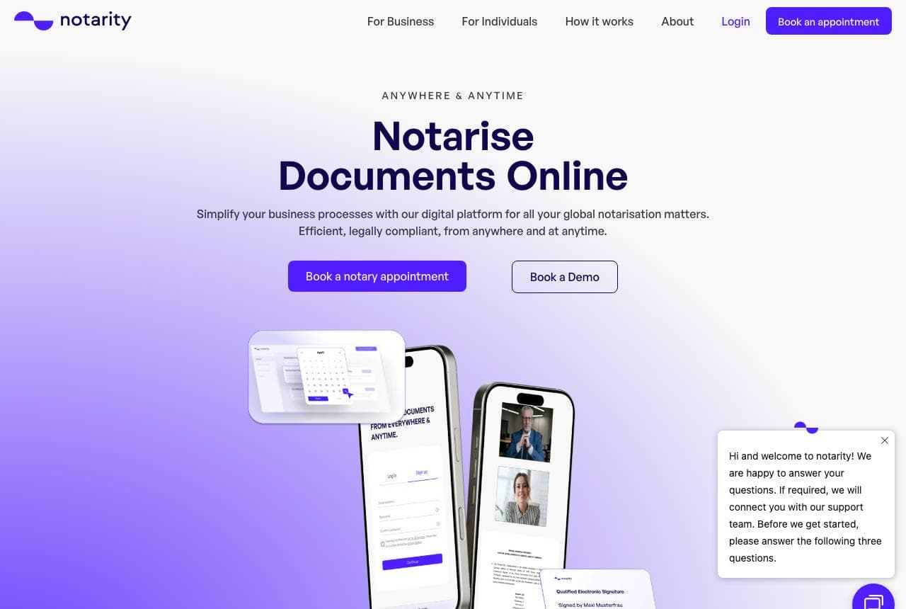
Notarity: Phone mockups making paperwork feel light

Notarity turns Europe's most paper-bound profession into an app aesthetic: 'Notarise Documents Online — anywhere & anytime' floats above a cluster of phone mockups showing video-call notarization in progress, all on a soft violet gradient. The proof line — over 1,000 companies rely on the service, with logos — grounds the lightness, and a four-icon strip (worldwide applicable, fully digital, legally compliant, time and cost-efficient) answers the compliance anxiety that haunts digital-legal products. The design's job is making 'legally valid' and 'effortless' feel compatible, and the gradient-plus-device language borrowed from consumer fintech does exactly that. Regulated services can look friendly without looking casual.

  • Device mockups prove the digital promise visually
  • Compliance icons calm the 'is this legal?' reflex
  • Fintech gradients make legal work feel effortless
OneNotary website — Online Notary Platform design example
Real site
  • Online Notary Platform
  • Trustworthy
  • Blue + white

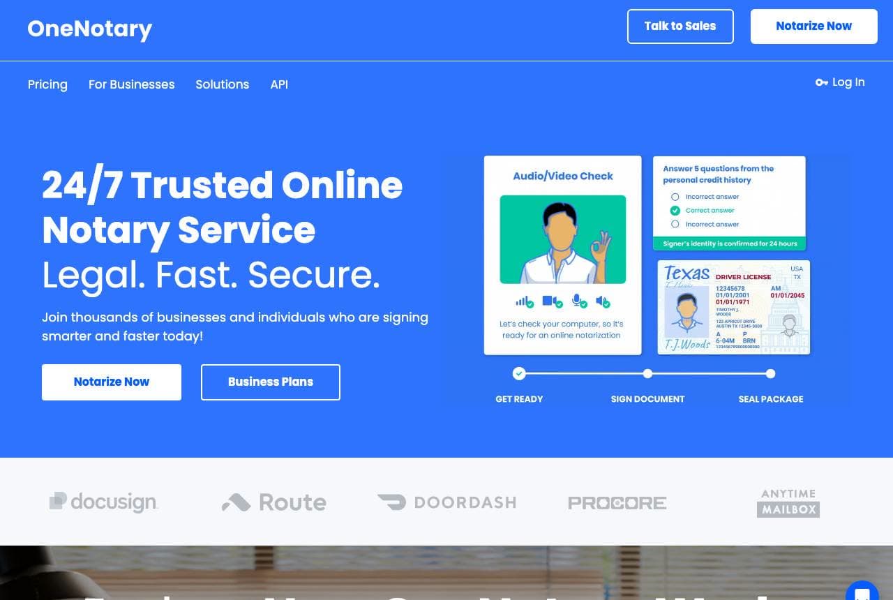
OneNotary: Three words carrying a legal product

OneNotary compresses its whole promise into a headline rhythm: '24/7 Trusted Online Notary Service. Legal. Fast. Secure.' — three single-word sentences that answer the three doubts in order. Beside it, a step-flow graphic walks the identity-verification process (audio/video check, credential questions, Texas license mock-up), demystifying the part first-timers fear. The logo bar underneath is quietly devastating for competitors: DocuSign, DoorDash, Procore. A 'Notarize Now' primary and 'Business Plans' secondary split consumers from teams. Regulated-tech design at its cleanest: name the fears, sequence the process, borrow enterprise logos, and keep the palette government-form blue so it all feels official.

  • 'Legal. Fast. Secure.' answers three doubts in three words
  • A step-flow graphic demystifies identity verification
  • DocuSign and DoorDash logos end the credibility question
Judith Winward website — Notary Public design example
Real site · Colchester, UK
  • Notary Public
  • Elegant
  • Green + white

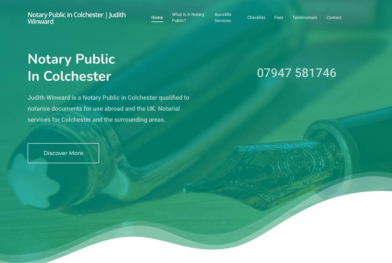
Judith Winward: Green ink and out-of-hours honesty

Judith Winward's site is a solo notary public rendered with unusual grace: a green ink-wash wave flows across the hero — a literal nod to the fountain-pen trade — with her phone number set plainly beside 'Notary Public in Colchester.' The copy underneath is the page's quiet strength: first-person, specific, and generous — 19 years' experience, willing to meet during evenings and occasional weekends, home visits for those who can't travel, named surrounding towns for search. No stock gavels, no fake urgency. For sole practitioners in trust professions, this is the model: one elegant visual idea, then honest logistics written like a letter.

  • An ink-wash motif nods to the trade without clichés
  • Out-of-hours honesty is a differentiator in legal services
  • Named surrounding towns quietly do the local SEO
Notable Notary website — Mobile Notary design example
Real site · Toronto, ON
  • Mobile Notary
  • Approachable
  • Purple + white

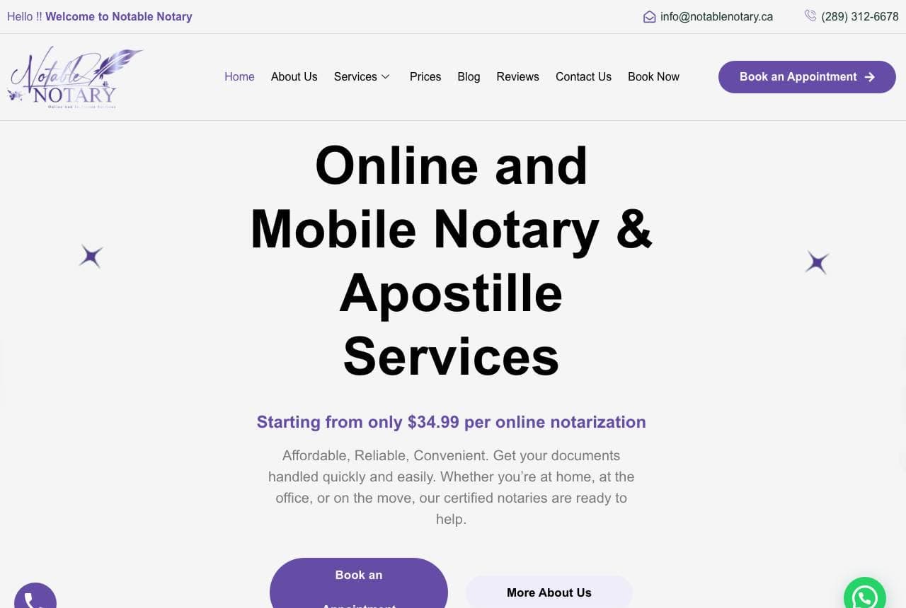
Notable Notary: A price on the table before the pitch

Notable Notary does the thing legal services almost never do: it prints the price in the hero — 'starting from only $34.99 per online notarization,' directly under 'Online and Mobile Notary & Apostille Services.' That one number removes the biggest friction in booking legal help: fee anxiety. Friendly flat illustration (a notary at a giant document) keeps the tone approachable, purple CTAs pair booking with a WhatsApp button for the chat-native, and the service area is spelled out (Ajax, Pickering, Whitby, Oshawa, greater Toronto). An '8 years experience' chip floats as a credential. Transparent pricing plus multiple contact channels: conversion fundamentals, applied to a profession that usually hides both.

  • A visible price defuses the fee-anxiety that stalls bookings
  • WhatsApp contact meets chat-native clients where they are
  • Named suburbs make the service area concrete
Beacon 24/7 Notary — 24/7 Mobile Notary website design you can build with Zarla
Build this with Zarla
  • 24/7 Mobile Notary
  • Urgent
  • Midnight + cyan

Beacon 24/7 Notary: Any-hour promise with proof up front

Beacon 24/7 Notary is Zarla's around-the-clock notary template on the proof-strip hero: 'Notarized at Your Door, Any Hour — 24/7 Mobile Notary' with a strip of trust chips (rating, response time, credentials) directly beneath the headline, midnight navy with a cyan accent that glows like a sign still lit at 3 a.m. Emergency notarization — hospitals, jails, last-minute closings — is bought entirely on availability and trust, in that order, and this layout leads with both. The proof strip answers 'are they legit?' while the headline answers 'will they come now?' Clone it, put your county in the headline, and the night-shift market is addressed in about 30 seconds.

  • Availability + credibility, in that order, wins urgent work
  • The proof strip answers 'legit?' before the scroll
  • Midnight + cyan reads open-all-night
See this template
PDX Signing website — Mobile Notary design example
Real site · Portland, OR
  • Mobile Notary
  • Direct

PDX Signing: Search phrases quoted right in the copy

PDX Signing writes its homepage in its customers' search language — literally: the copy quotes the phrases '24 hour mobile notary near me' and 'mobile notary services near me' in explaining who the service is for. The black hero pairs 'Mobile Notary Near Me On-Demand, Anytime.' with an Enquire Now form whose dropdown ('What are you looking for?') pre-sorts loan signings from I-9 verifications from translations. Transparent pricing gets stated plainly — $25 to $125 — alongside 'since 2017' and 'thousands of satisfied clients.' It's an unabashedly SEO-built page that still respects the visitor: instant form, honest prices, clear scope. Sometimes ranking language and human language can be the same words.

Ironclad Signing Co. — Loan Signing Agent website design you can build with Zarla
Build this with Zarla
  • Loan Signing Agent
  • Professional

Ironclad Signing Co.: Funding-day stakes, named and owned

Ironclad Signing Co. is Zarla's loan-signing template, and it speaks to the only metric that matters in this niche: 'Closings That Fund On Time — Certified Loan Signing Agent.' The dark-showcase hero sets it in confident type on near-black with an amber accent — escrow-office gravity rather than notary-shop cheer. Loan signings are B2B work sold to title companies and lenders who care about error-free packages and on-time funding, so the headline sells their KPI, not the notary's commission. Certification rides in the headline where that buyer looks for it. Clone it, add your NNA credentials and turnaround stats, and the title-company pitch is built.

See this template
Clarity Online Notary — Online Notary website design you can build with Zarla
Build this with Zarla
  • Online Notary
  • Editorial

Clarity Online Notary: The couch, legally speaking

Clarity Online Notary is Zarla's remote-notarization template, and its editorial hero makes the modern pitch in one line: 'Notarized From Your Couch — Legally Valid Online Notary.' The layout treats that claim with newspaper seriousness — structured type, generous margins, a deep navy-and-cobalt palette — so the convenience never reads as corner-cutting. That's the tension every RON (remote online notarization) business must resolve: sound easy AND official. The editorial register does both, and the 'legally valid' phrase sits right in the headline to preempt the number-one objection. Clone it, add your state authorizations, and the couch-to-closing pipeline is open in about 30 seconds.

See this template
Haven Mobile Notary — Hospice Notary website design you can build with Zarla
Build this with Zarla
  • Hospice Notary
  • Gentle

Haven Mobile Notary: Slow, kind design for hard rooms

Haven Mobile Notary is Zarla's seniors-and-hospice notary template, and every choice honors the rooms this work happens in: 'Unhurried, Patient Care — Mobile Notary for Seniors & Hospice' on the portrait-calm hero, sage green and soft gold, nothing flashing, nothing urgent. This niche — powers of attorney at bedsides, wills in care facilities — is the opposite of the 24/7 adrenaline notary: families choose the practitioner who won't rush a difficult afternoon. The design's slowness IS the service promise. The word 'unhurried' in a headline is rare and precious; it tells an exhausted family exactly what walking in the door will feel like. Clone with care.

See this template
Verano Notary — Bilingual Notary website design you can build with Zarla
Build this with Zarla
  • Bilingual Notary
  • Welcoming

Verano Notary: Comprehension as the core service

Verano Notary is Zarla's bilingual-notary template, and it locates the real product precisely: 'Understand Every Word You Sign — Bilingual Notary Services.' For immigrant communities, the notary risk isn't a missing stamp, it's signing what you couldn't read — so comprehension, not certification, leads the page. The split-image-left hero pairs that promise with warm photography, in teal and coral tones that read welcoming rather than institutional (an important distinction, given 'notario' scams have burned these communities before). Trust here is built in the customer's first language, visually and verbally. Clone it, state your languages in the headline, and serve the market the monolingual shops can't.

See this template
Ashcroft Estate Notary — Estate Notary website design you can build with Zarla
Build this with Zarla
  • Estate Notary
  • Formal

Ashcroft Estate Notary: Two images, one seam, estate gravity

Ashcroft Estate Notary is Zarla's estate-and-trust template on the split-duo hero: two side-by-side photographs with 'Estate & Trust Notary in Charleston' spanning the seam in oversized type — a composition with the formality of a law-office letterhead and the confidence of a modern brand. Deep plum and antique gold carry the gravity estate work deserves; this is the notarization attached to wills, trusts, and transfers, bought by families and estate attorneys who want ceremony done correctly. The split-duo structure lets one image say 'documents' and the other say 'people,' which is the estate notary's actual double duty. Build it in about 30 seconds.

See this template

Frequently asked

Where can I find good notary website examples?

Right here — this page curates notary website examples two ways: standout real businesses (each linked, so you can explore the live site) and professionally designed Zarla templates you can clone and make your own. Every example comes with a note on why the design works — trust signals, layout, calls to action — so you can copy the move, not just the look.

What makes a good notary website?

A good notary website earns trust in the first few seconds, leads with strong visuals of the work, gives visitors one obvious action, and loads fast on a phone. Every design below leads with proof and a single clear call to action rather than a wall of text.

How much does a notary website cost?

A custom notary website from a designer typically runs into the thousands up front, and template builders charge roughly $16–$30 per month. An AI builder generates a complete, editable design for free and only charges (on the Premium plan) when you publish to your own domain — so you can build and preview before spending anything.

Do I need a designer to build a notary website?

No. Several designs on this page were generated by Zarla and are fully editable — you describe your business and get a complete, professionally designed site in about 30 seconds, then refine it by chatting. Building and previewing is free; publishing to your own domain needs the Premium plan.

What pages does a notary website need?

Most notary businesses need just a few: a home page that proves trust and points to one clear action, an about page that puts a face to the business, a services or work page that shows what you do, and a contact page with a form and a phone number. Local businesses also benefit from location or service-area pages that help them show up in nearby searches.

How do I get more customers from my notary website?

Lead with proof in the first few seconds (reviews, real photos, results), make one action obvious on every screen (call, book, or enquire), and keep it fast on mobile — most visitors arrive on a phone. The designs above each do this differently, but they all earn trust early and remove friction from the next step.

You've seen what works. Now make it yours.

Describe your business and Zarla designs a complete, professional website in about 30 seconds — built to convert, just like the ones above.

Free to build and preview · no credit card · publish to your own domain on Premium