Inspiration · Tax

The Best Tax Service Website Examples, Explained

Looking for tax service website examples? These 14 are the strongest we found — Elmira Tax's giant slab-serif 'Elmira tax' on a green field under 'Taxes should not be taxing.', Lutz and Carr's jazz trumpeter beside 'Beyond the Numbers', Lewis.cpa's 'Chicago-Based CPA Firm' next to two women at a table of laptops and tulips — plus five Zarla tax preparer designs, from a family-run preparer to a walk-in office and an online practice, each with a breakdown of the specific move that turns a 'tax accountant near me' search into a booked call. A tax firm's site is read by someone anxious about a deadline or a letter, so the best ones here say who they are for in the first line, sound like a person, and make the button a call or a consultation. Find an approach you love and you can build a site in that spirit, free, in about 30 seconds.

Real sites + designs you can build with Zarla — free to build and preview, no credit card

What makes a great tax website

The best tax service websites say who the client is before they say what the firm does. Who: Dark Horse's 'Top Tax & Accounting CPAs for Small Businesses', Shay CPA's 'TECH COMPANY ACCOUNTANTS', Taxes for Expats' 'Expat tax services from trusted tax experts', David French's 'serial entrepreneurs and business leaders', Boxelder's 'Grow Your Small Business'. The tone: Elmira Tax's 'Taxes should not be taxing.', Molen & Associates' 'Proactive Strategy. True Partnership. Confident Growth.', Lutz and Carr's 'Beyond the Numbers'. Notice the buttons — 'Talk to Your CPA', 'Talk to a CPA', 'Book Your Free Discovery Call', 'Get free consultation today', 'FREE CONSULTATION' — a conversation, never a form marked 'Submit'. Notice the proof: Taxes for Expats' '50,000+ expats served over 25 years' and '2,751 reviews on Trustpilot', Lewis.cpa's street address and 'Online appointments available' in the top strip. And notice the two firms that refuse the stock handshake — Lutz and Carr's jazz players, Boxelder's St. Bernard. Every example below tells you whether the firm files returns or plans decades.

Elmira Tax website — Individual & Business Tax Firm design example
Real site
  • Individual & Business Tax Firm
  • Calm
  • Green + black

Elmira Tax: 'Taxes should not be taxing.' above the firm's own name in giant black slab serif on green

Elmira Tax is the cover because it does a tax firm's homepage without a single photograph. The whole first screen is a flat green field: the header sets the serif 'Elmira Tax' left, a small nav — About, Tax Services, Articles, Portal — and an outlined 'Contact Us' right. Centred beneath, in black serif, 'Taxes should not be taxing.', then a two-line sentence: 'We're here to provide clear, responsive, and customized tax solutions for individuals and businesses.' And then the name again — 'Elmira tax' — in a black slab serif so large it runs the full width of the screen and touches the fold. Below, on white, a thin arc, a small caps 'HI THERE. WE'RE ELMIRA TAX' and the serif 'Don't worry about your taxes, we provide Full- Service Tax Services. Trusted…'. The pun is gentle, the green is calming, and the giant name says the firm is not shy. Clone it if you'd rather be remembered than look like every other CPA.

  • No photograph — a green field and typography
  • A gentle pun as the headline
  • The firm's name set at poster size

Steal this: Set your own name at poster size on a single colour — a visitor who can't remember three CPA names will remember the one that filled the screen.

Visit Elmira Tax

Opens a similar Zarla design you can make yours.

Lutz and Carr website — CPA Firm for Audit & Tax design example
Real site
  • CPA Firm for Audit & Tax
  • Expressive
  • Blue + yellow

Lutz and Carr: A jazz trumpeter and saxophonist in blue stage light beside 'Beyond the Numbers'

Lutz and Carr photographs musicians and lets the headline explain. The white header sets a blocky, stencil-style 'LUTZ AND CARR — CERTIFIED PUBLIC ACCOUNTANTS, LLP' logo left and a hamburger right. The hero is a photograph in deep blue stage light: a trumpeter in a hat on the left, a saxophonist on the right, both mid-phrase. Over the left half, a small caps 'ACCOUNTING SERVICES' with a white rule, the serif 'Providing sound tax and audit advice whenever you need it.' and two outlined buttons with yellow arrows — 'AUDIT →' and 'TAX →'. Over the right half, in huge white sans on three lines, 'Beyond' / 'the' / 'Numbers'. A solid yellow band follows at the fold: 'OUR HISTORY — 1950'S · FIRM FOUNDED BY ROBERT…' on the left and 'ABOUT US — Who We Are' on the right. The two buttons split the firm into its two practices, and the yellow band puts the founding decade one scroll away. Clone the unexpected photograph if your firm has a personality to show.

  • Musicians, not accountants, in the hero photograph
  • Two buttons for two practices — AUDIT and TAX
  • A yellow history band with the founding decade

Steal this: Photograph something your clients love instead of your office — a jazz stage under 'Beyond the Numbers' says who you are better than a desk does.

Visit Lutz and Carr

Opens a similar Zarla design you can make yours.

Susan S. Lewis, LTD. website — Full-Service CPA Firm design example
Real site · Naperville, IL
  • Full-Service CPA Firm
  • Approachable
  • White + navy

Susan S. Lewis, LTD.: 'Chicago-Based CPA Firm' beside a half-circle photo of two women at a table of laptops and tulips

Susan S. Lewis, LTD. — the firm behind Lewis.cpa — puts its address in the top strip and its people in a half-circle. A grey strip reads '1064 104th Street Naperville, Illinois 60564 | Online appointments available' with 'Client Portal ↑' at the right; the white header sets the 'Susan S. Lewis, LTD. Certified Public Accountants' logo, a small caps nav — TAXES, TAX CALCULATORS, ACCOUNTING, INDUSTRIES, ABOUT US — the phone '(630) 548 9600' and an outlined 'Contact Us'. The hero's photograph is cropped into a half-circle on the left: two women at a wooden table with laptops, a mug, papers and a vase of tulips, shot from above. On the right, in navy serif, 'Chicago-Based' / 'CPA Firm', then a paragraph — 'From bookkeeping and reporting to taxes and accounting, your finances are in good hands with Lewis.cpa. Our full-service certified public accounting firm takes care of everything, so you won't have to.' — and an outlined 'Talk to Your CPA'. 'TAX CALCULATORS' in the nav is a reason to come back before you're a client. Clone the half-circle crop to make an ordinary office photo feel designed.

  • The street address and 'Online appointments available' in the top strip
  • A half-circle crop on an ordinary office photograph
  • 'Talk to Your CPA' — the button as a person

Steal this: Crop your team photo into a half-circle — it turns a stock-looking office shot into a design element without a designer.

Visit Susan S. Lewis, LTD.

Opens a similar Zarla design you can make yours.

Dark Horse CPAs website — Small-Business CPA Firm design example
Real site
  • Small-Business CPA Firm
  • Assured
  • Photo + orange

Dark Horse CPAs: 'Top Tax & Accounting CPAs for Small Businesses' with three coloured pills for three client types

Dark Horse names its client in the headline and sorts the rest into pills. The white header sets the horse-head 'DARK HORSE CERTIFIED PUBLIC ACCOUNTANTS' logo, a nav of Solutions, Industries, Pricing, About and Learn, a 'Client Login' and an orange 'Talk to a CPA'. The hero is a dimmed photograph of a woman and a man, each on the phone, in an office; centred over it, the white serif 'Top Tax & Accounting CPAs for Small Businesses', the line 'Get insightful accounting and a winning strategy to minimize your taxes from your dedicated Dark Horse CPA. Whenever, wherever.', and three pill buttons in three colours — orange 'Business Solutions', teal 'Personal Solutions', slate 'Wealth Advisory'. 'Pricing' in the nav is rare for a CPA firm and says the firm is comfortable being compared. 'Whenever, wherever' says remote without the word. Clone the three-pill split if you serve businesses, individuals and wealth clients from one door.

  • The client type in the headline — small businesses
  • Three coloured pills for three client types
  • 'Pricing' in the nav — a CPA firm willing to be compared

Steal this: Put 'Pricing' in your nav — almost no accountant does, and the visitor who finds it stops shopping.

Visit Dark Horse CPAs

Opens a similar Zarla design you can make yours.

David French & Associates website — Tax Strategy & Wealth CPA design example
Real site · Austin, TX
  • Tax Strategy & Wealth CPA
  • Ambitious
  • Photo + white

David French & Associates: 'We help you create generational wealth through tax strategy.' over glass towers shot from below

David French & Associates writes a tax firm's sentence like a wealth firm's. The dark header sets the 'df DAVID FRENCH & ASSOCIATES' logo, a small caps nav — SERVICES, ABOUT, BLOG, TAX CALCULATOR — 'LOGIN' and a white 'CONTACT US'. The hero is a photograph of glass office towers shot from the pavement, looking up into a dark sky; centred over it in white serif, 'We help you create generational wealth' / 'through tax strategy.', then a paragraph — 'We are a leading Austin CPA firm in tax, accounting, and wealth management consulting. We provide serial entrepreneurs and business leaders the invaluable insight they need to navigate the complex tax code.' — an outlined 'CONTACT US →' and, underlined beneath, 'MEET OUR TEAM'. A row of client logos begins at the fold. 'Serial entrepreneurs' is the client named precisely; 'generational' is the timescale. Clone the towers-and-serif treatment for a firm that plans rather than files.

  • 'Generational wealth' — the outcome, not the service
  • 'Serial entrepreneurs' — the client named precisely
  • A team link under the button, not a second button

Steal this: Name the timescale — 'generational' tells a founder you're planning their decade, not their April.

Visit David French & Associates

Opens a similar Zarla design you can make yours.

Molen & Associates website — Business Tax & Accounting Firm design example
Real site · Houston, TX
  • Business Tax & Accounting Firm
  • Decisive
  • Grey + green

Molen & Associates: 'Proactive Strategy. True Partnership. Confident Growth.' with 'Book Your Free Discovery Call'

Molen & Associates writes its promise as three two-word sentences. The white header sets the green leaf-mark 'MOLEN & ASSOCIATES' logo, a small caps nav — HOME, TAX & ACCOUNTING SERVICES, ABOUT, RESOURCES, NEW CLIENTS, CONTACT — and a green 'BOOK A MEETING'. The hero is a dimmed grey photograph with the copy set left: a caps eyebrow, 'SERVING THE GREATER HOUSTON AREA & BEYOND', then the large white 'Proactive' / 'Strategy. True' / 'Partnership.' / 'Confident' / 'Growth.', a paragraph — 'Molen & Associates goes beyond the numbers. We provide the forward-thinking financial guidance you need to navigate your next stage of business with total confidence.' — and two buttons: a green 'Book Your Free Discovery Call' and a white 'View Our Services'. 'NEW CLIENTS' as a nav item is the onboarding page named for the person looking for it, and 'Discovery Call' makes the first meeting sound like a conversation rather than a sales pitch. Clone the three-sentence headline if you want to sound decisive without a boast.

  • Three two-word sentences as the headline
  • 'NEW CLIENTS' in the nav
  • 'Discovery Call' — the first meeting renamed

Steal this: Call the first meeting a 'discovery call' — it tells a nervous business owner the first conversation is about them, not about signing.

Visit Molen & Associates

Opens a similar Zarla design you can make yours.

Taxes for Expats website — Expat Tax Service design example
Real site
  • Expat Tax Service
  • Reassuring

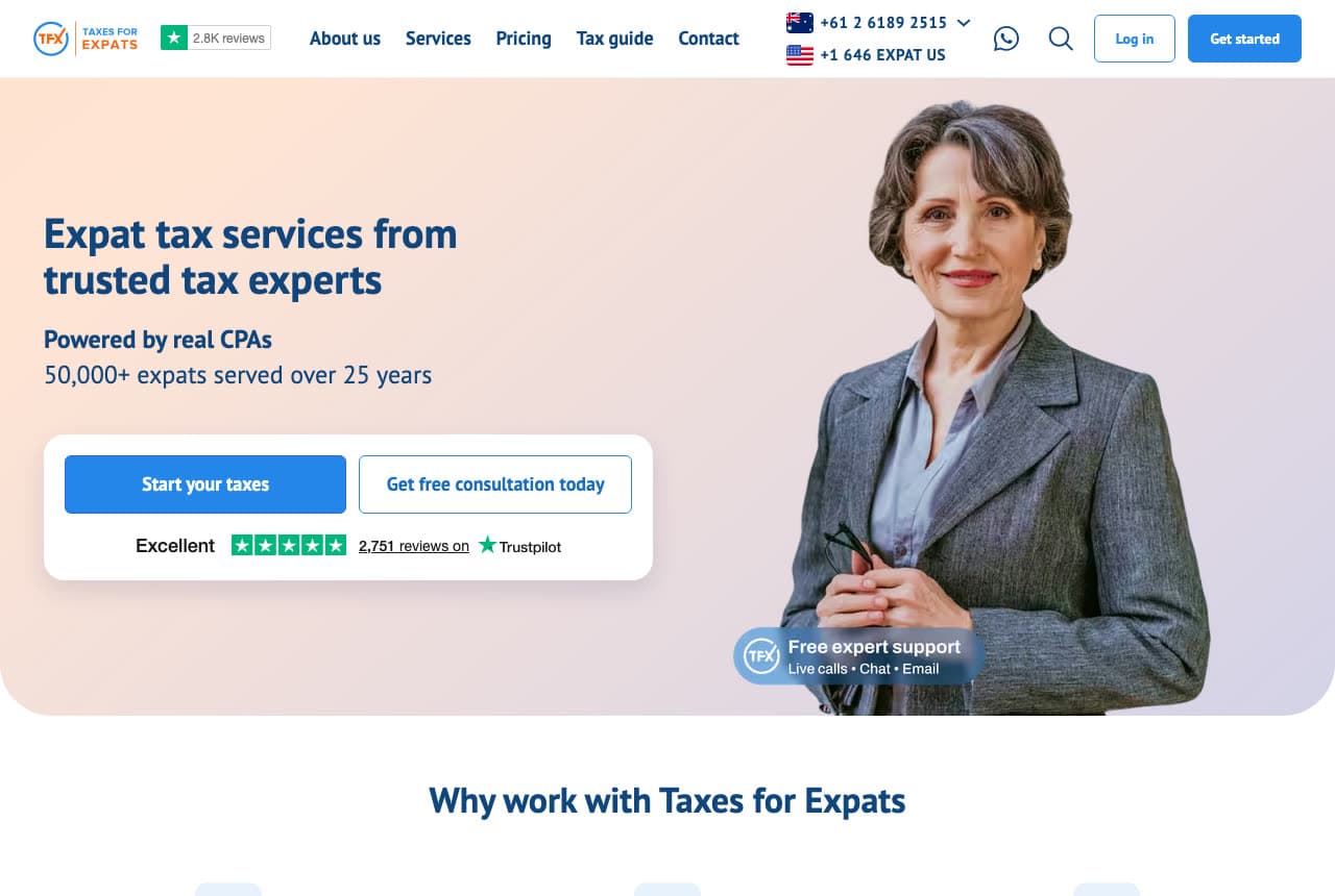
Taxes for Expats: '50,000+ expats served over 25 years' with two country phone lines and a Trustpilot card

Taxes for Expats proves scale with three numbers and two flags. The white header sets the 'TFX TAXES FOR EXPATS' logo beside a green '★ 2.8K reviews' pill, a nav of About us, Services, Pricing, Tax guide and Contact, then two flagged phone lines — '+61 2 6189 2515' with an Australian flag and '+1 646 EXPAT US' with a US flag — a WhatsApp icon, search, 'Log in' and a blue 'Get started'. The hero is a soft pink-to-blue gradient: left, the navy 'Expat tax services from' / 'trusted tax experts', a bold 'Powered by real CPAs' and '50,000+ expats served over 25 years'; a white card holds a blue 'Start your taxes', an outlined 'Get free consultation today' and 'Excellent ★★★★★ 2,751 reviews on Trustpilot'. Right, a photograph of a grey-haired woman in a grey suit holding her glasses, and a pill: 'TFX Free expert support — Live calls • Chat • Email'. Below, 'Why work with Taxes for Expats'. The two phone lines are the whole business in the header. Clone the flagged-phones idea if your clients are in more than one country.

Visit Taxes for Expats

Opens a similar Zarla design you can make yours.

Shay CPA website — Startup & Tech CPA Firm design example
Real site
  • Startup & Tech CPA Firm
  • Focused

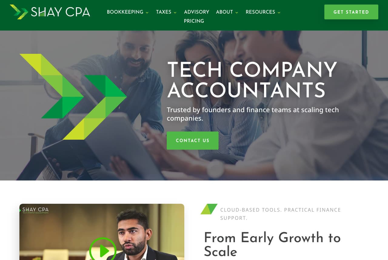
Shay CPA: 'TECH COMPANY ACCOUNTANTS' in white capitals with a green chevron slicing the photo

Shay CPA picks one industry and says so in three words. The green header sets the chevron-mark 'SHAY CPA' logo, a caps nav — BOOKKEEPING, TAXES, ADVISORY, ABOUT, RESOURCES, PRICING — and a green 'GET STARTED'. The hero is a dimmed photograph of a team gathered around a tablet, with a large green chevron graphic cutting in from the left; over it, the white capitals 'TECH COMPANY' / 'ACCOUNTANTS', the line 'Trusted by founders and finance teams at scaling tech companies.' and a green 'CONTACT US'. Below the fold, a video thumbnail labelled 'SHAY CPA' with a play button sits beside a caps eyebrow — 'CLOUD-BASED TOOLS. PRACTICAL FINANCE SUPPORT.' — and the serif 'From Early Growth to Scale'. PRICING in the nav and 'scaling' in the subline both speak the client's language. A firm that says 'tech company accountants' loses every restaurant and wins every startup. Clone the one-industry headline if you can afford to be that specific.

Visit Shay CPA

Opens a similar Zarla design you can make yours.

Boxelder Consulting website — Small-Business Accounting & Consulting design example
Real site
  • Small-Business Accounting & Consulting
  • Personable

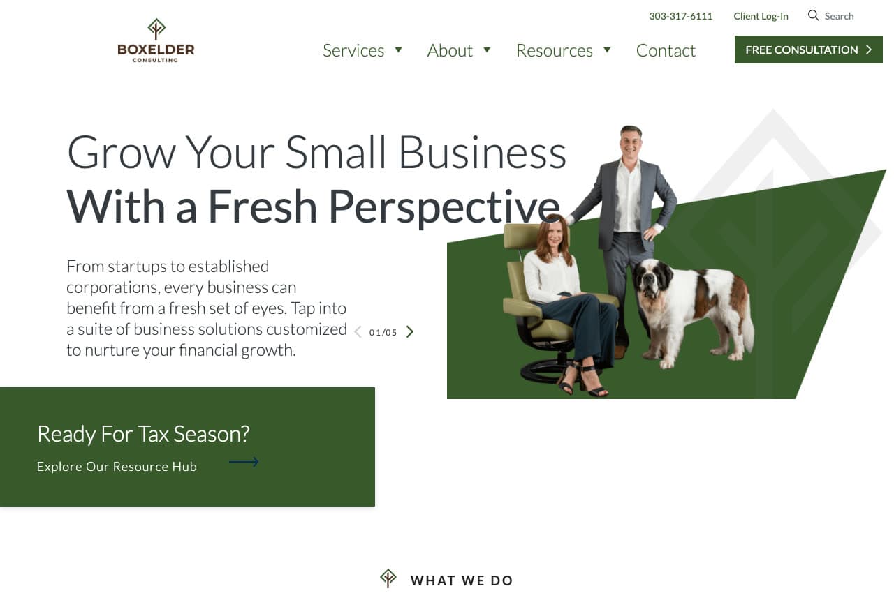
Boxelder Consulting: 'Grow Your Small Business With a Fresh Perspective' with the partners and a St. Bernard cut out beside it

Boxelder Consulting puts a dog in the hero and it works. The white header sets the tree-mark 'BOXELDER CONSULTING' logo, a nav — Services, About, Resources, Contact — with the phone '303-317-6111', 'Client Log-In' and a search field above, and a green 'FREE CONSULTATION ›'. The hero opens with 'Grow Your Small Business' in light type over a bold 'With a Fresh Perspective', a paragraph — 'From startups to established corporations, every business can benefit from a fresh set of eyes. Tap into a suite of business solutions customized to nurture your financial growth.' — and a slide counter, '01/05'. On the right, a cut-out photograph: a man in a grey suit standing, a woman seated in a chair, and a St. Bernard between them, all placed on a green angular shape with the tree mark faintly behind. A green card lower-left reads 'Ready For Tax Season? Explore Our Resource Hub →', and 'WHAT WE DO' begins at the fold. The dog says 'small firm, real people' more efficiently than any About page. Clone the cut-out-on-a-shape idea if your team photo is flat.

Visit Boxelder Consulting

Opens a similar Zarla design you can make yours.

Oakhallow Tax Service — Tax Preparer website design you can build with Zarla
Build this with Zarla
  • Tax Preparer
  • Trustworthy

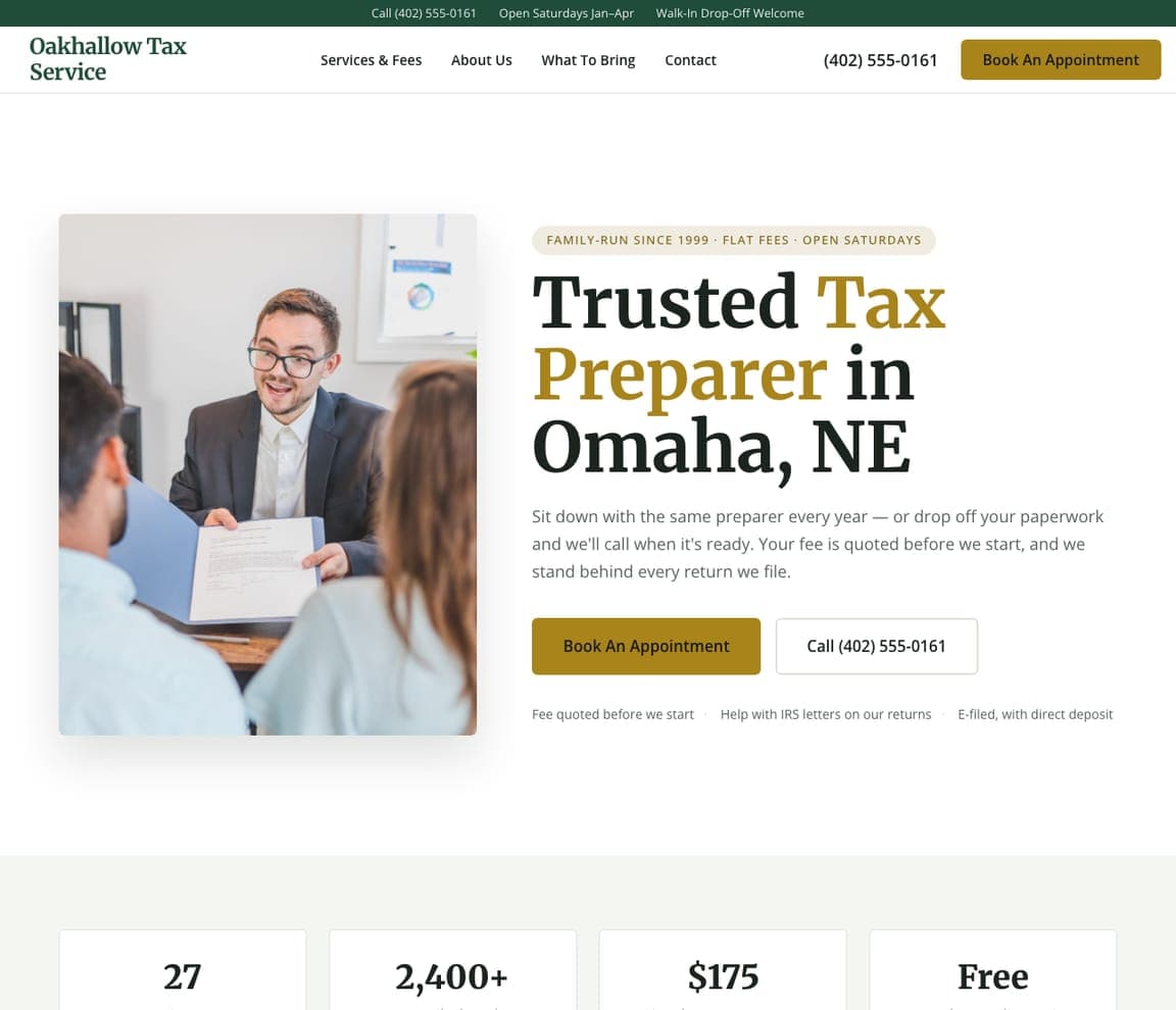
Oakhallow Tax Service: 'Trusted Tax Preparer' beside a preparer handing back a return

Oakhallow Tax Service is the Zarla neighborhood tax-preparer design, and it sells what a family preparer has that an app doesn't: the same person every year. A framed photograph on the left shows a preparer in glasses handing a document across the desk to a couple; on the right, a pill reads 'FAMILY-RUN SINCE 1999 · FLAT FEES · OPEN SATURDAYS' and the serif headline says 'Trusted Tax Preparer in Omaha, NE', with 'Tax Preparer' in gold. The paragraph: 'Sit down with the same preparer every year — or drop off your paperwork and we'll call when it's ready. Your fee is quoted before we start, and we stand behind every return we file.' A gold 'Book An Appointment' leads, and the forest-green top strip adds Saturday hours from January to April and walk-in drop-off. Clone it if your clients come back every spring.

See this template
Penhale Tax Resolution — Enrolled Agent website design you can build with Zarla
Build this with Zarla
  • Enrolled Agent
  • Serious

Penhale Tax Resolution: 'Enrolled Agent & IRS Tax Help' over a softened stack of paperwork

Penhale Tax Resolution is the Zarla enrolled-agent design, for the visitor holding a letter from the IRS. The hero is a pale, softened photograph of stacked paperwork and a pair of glasses, with everything centered over it: a pill listing the problems ('BACK TAXES · AUDITS · PAYMENT PLANS · LEVIES'), the serif headline 'Enrolled Agent & IRS Tax Help in El Paso, TX' with 'IRS Tax Help' in brick red, and a paragraph that asks the visitor's own questions first — 'Owe the IRS, behind on filing, or holding a letter you don't want to open?' — before explaining that its enrolled agents are licensed to represent them. A brick-red 'Book A Free Consultation' leads, and three white cards underneath read 'Licensed by the IRS', 'Free, confidential consultation' and 'Flat fees in writing'. Clone it if you represent clients before the IRS and fear is the first feeling they arrive with.

See this template
Coveley Tax Co. — Small Business Tax website design you can build with Zarla
Build this with Zarla
  • Small Business Tax
  • Bold

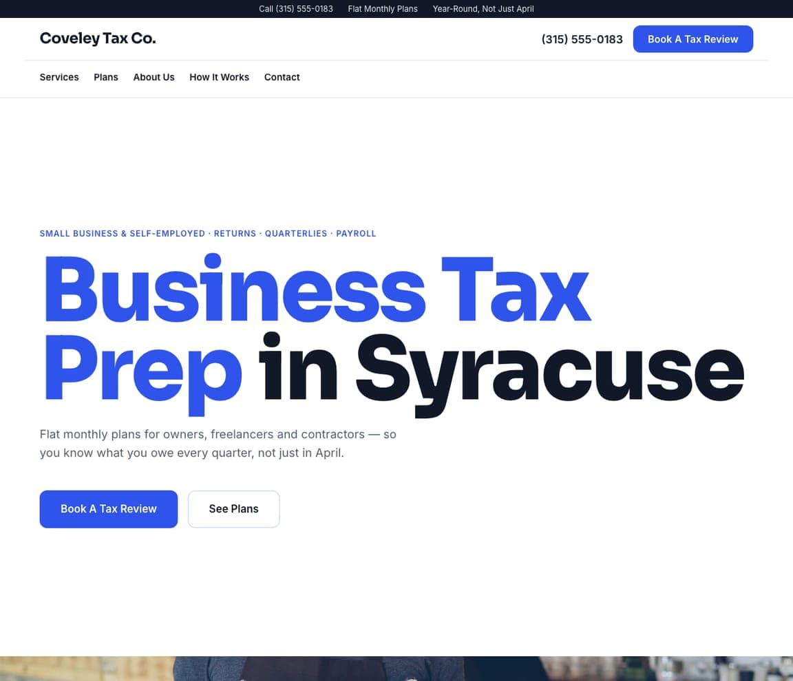
Coveley Tax Co.: 'Business Tax Prep in Syracuse' as giant cobalt and black type

Coveley Tax Co. is the Zarla small-business tax design, and it lets the type do the work, the way Elmira Tax does with its own name. The hero is plain white with no photograph at the top: a cobalt line names the clients and the services ('SMALL BUSINESS & SELF-EMPLOYED · RETURNS · QUARTERLIES · PAYROLL'), and the headline runs across the page in heavy sans — 'Business Tax Prep' in cobalt, 'in Syracuse' in black. The paragraph sells the year, not the season: 'Flat monthly plans for owners, freelancers and contractors — so you know what you owe every quarter, not just in April.' A cobalt 'Book A Tax Review' sits beside 'See Plans', and the top strip repeats 'Flat Monthly Plans' and 'Year-Round, Not Just April'. Clone it if your clients are businesses, like Dark Horse's and Shay CPA's, and pay you every month.

See this template
Pellbrook Tax Office — Walk-In Tax Office website design you can build with Zarla
Build this with Zarla
  • Walk-In Tax Office
  • Friendly

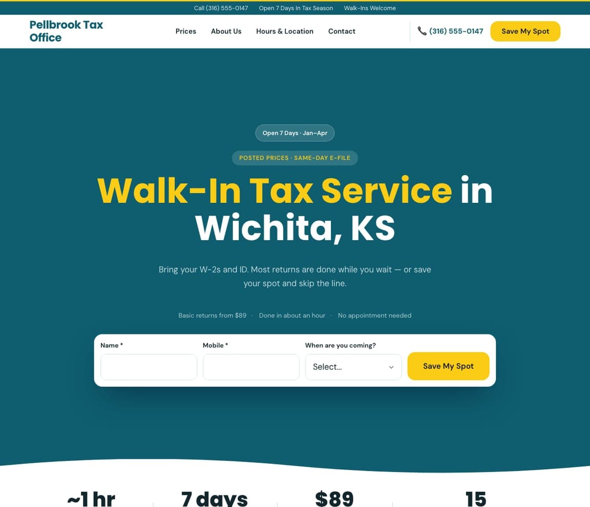
Pellbrook Tax Office: 'Walk-In Tax Service' with a save-my-spot form

Pellbrook Tax Office is the Zarla walk-in design, for a storefront preparer whose busiest days fall between January and April. On a deep teal field, two pills give the hours and the promise ('Open 7 Days · Jan–Apr', 'POSTED PRICES · SAME-DAY E-FILE'), and the centered headline reads 'Walk-In Tax Service in Wichita, KS', with 'Walk-In Tax Service' in yellow. The paragraph tells you what to bring: 'Bring your W-2s and ID. Most returns are done while you wait — or save your spot and skip the line.' A small line posts the price and the time ('Basic returns from $89 · Done in about an hour · No appointment needed'), and then the form asks for a name, a mobile number and 'When are you coming?', ending in a yellow 'Save My Spot'. Clone it if customers walk in off the street and the line is your problem.

See this template
Vantree Tax — Online Tax Preparation website design you can build with Zarla
Build this with Zarla
  • Online Tax Preparation
  • Modern

Vantree Tax: 'Online Tax Preparation' over two rows of scrolling type

Vantree Tax is the Zarla online tax preparation design, for a preparer whose clients never visit an office. The hero is a charcoal field: a small orange line gives the whole process ('UPLOAD · VIDEO CALL · E-SIGN · E-FILE'), the headline reads 'Online Tax Preparation in Fresno, CA' with 'Online Tax Preparation' in soft orange, and the paragraph answers the worry that online means software — 'Snap your documents, meet your tax pro on video and sign from your phone. A real person prepares your return — you never have to drive to an office.' An orange 'Start My Return' sits beside 'See Pricing', and two rows of giant type scroll beneath, some words solid and some outlined — 'VIDEO TAX APPOINTMENTS', 'ONLINE TAX RETURNS' and a 'SELF-EMPLOYED &…' that runs off the edge. Clone it for a remote practice that wants clients to know a person does the work.

See this template

Frequently asked

What should a tax firm's website say first?

Who it serves. Dark Horse writes 'Top Tax & Accounting CPAs for Small Businesses'; Shay CPA writes 'TECH COMPANY ACCOUNTANTS — Trusted by founders and finance teams at scaling tech companies'; Taxes for Expats writes 'Expat tax services from trusted tax experts'; David French says 'serial entrepreneurs and business leaders' in its first paragraph; Boxelder headlines 'Grow Your Small Business'. Lewis.cpa says where instead — 'Chicago-Based CPA Firm'. A visitor decides in one line whether the firm is for people like them.

How should a tax accountant's website sound?

Like a person who is calm about taxes. Elmira Tax: 'Taxes should not be taxing.' then 'Don't worry about your taxes'. Molen & Associates: 'Proactive Strategy. True Partnership. Confident Growth.' Lewis.cpa: 'your finances are in good hands… so you won't have to.' Lutz and Carr: 'Providing sound tax and audit advice whenever you need it.' Dark Horse adds a location joke — 'Whenever, wherever.' None of them opens with 'We are a full-service firm offering…'.

What should the button on a tax website say?

A conversation, not a submission. Lewis.cpa: 'Talk to Your CPA'. Dark Horse: 'Talk to a CPA'. Molen: 'Book Your Free Discovery Call' beside 'View Our Services'. Taxes for Expats: 'Start your taxes' beside 'Get free consultation today'. Boxelder: 'FREE CONSULTATION'. David French: 'CONTACT US →' with 'MEET OUR TEAM' underlined beneath. Lutz and Carr splits the button by service — 'AUDIT →' and 'TAX →'.

What proof works on a tax firm's homepage?

Counts and a place. Taxes for Expats prints '50,000+ expats served over 25 years', 'Powered by real CPAs' and a Trustpilot line — 'Excellent · 2,751 reviews'. Lewis.cpa puts its street address in Naperville and 'Online appointments available' in the top strip, with the phone number in the header. Lutz and Carr shows a yellow 'OUR HISTORY — 1950'S · FIRM FOUNDED BY ROBERT…' band under the hero. Molen names its territory — 'SERVING THE GREATER HOUSTON AREA & BEYOND'. David French lists client logos at the fold.

Does a tax website need a photograph of accountants?

No — the two most memorable here avoid it. Lutz and Carr photographs a jazz trumpeter and a saxophonist in blue stage light and writes 'Beyond the Numbers'. Elmira Tax uses no photograph at all in the first screen: a green field and its own name set in giant black slab serif. Boxelder cuts out its two partners with a St. Bernard beside them. Molen dims a grey photo behind white type; David French shoots glass towers from below; Lewis.cpa crops two women at a table into a half-circle.

Can I build a tax service website like these with Zarla?

Yes. Every real site here has a 'Build a site like this' button that opens the closest Zarla template in the editor — Oakhallow Tax Service for a preparer clients see every year, in the Lewis.cpa and Boxelder spirit; Coveley Tax Co. for a big-type page aimed at business owners, like Elmira Tax, Dark Horse, Molen and Shay CPA; Penhale Tax Resolution for an enrolled agent who handles IRS letters; Pellbrook Tax Office for a walk-in storefront; Vantree Tax for an online practice; Atlas Expat Tax for an expat practice like Taxes for Expats; Ridgeline Wealth & Tax for a serif, no-photo planning page in the David French and Lutz and Carr vein — and you swap in your client, your city and your number. One line naming the client, a calm sentence and a 'Talk to a CPA' button is the Dark Horse pattern, and it takes about 30 seconds.

You've seen what works. Now make it yours.

Describe your business and Zarla designs a complete, professional website in about 30 seconds — built to convert, just like the ones above.

Free to build and preview · no credit card · publish to your own domain on Premium