coolangattapsychology.com.au
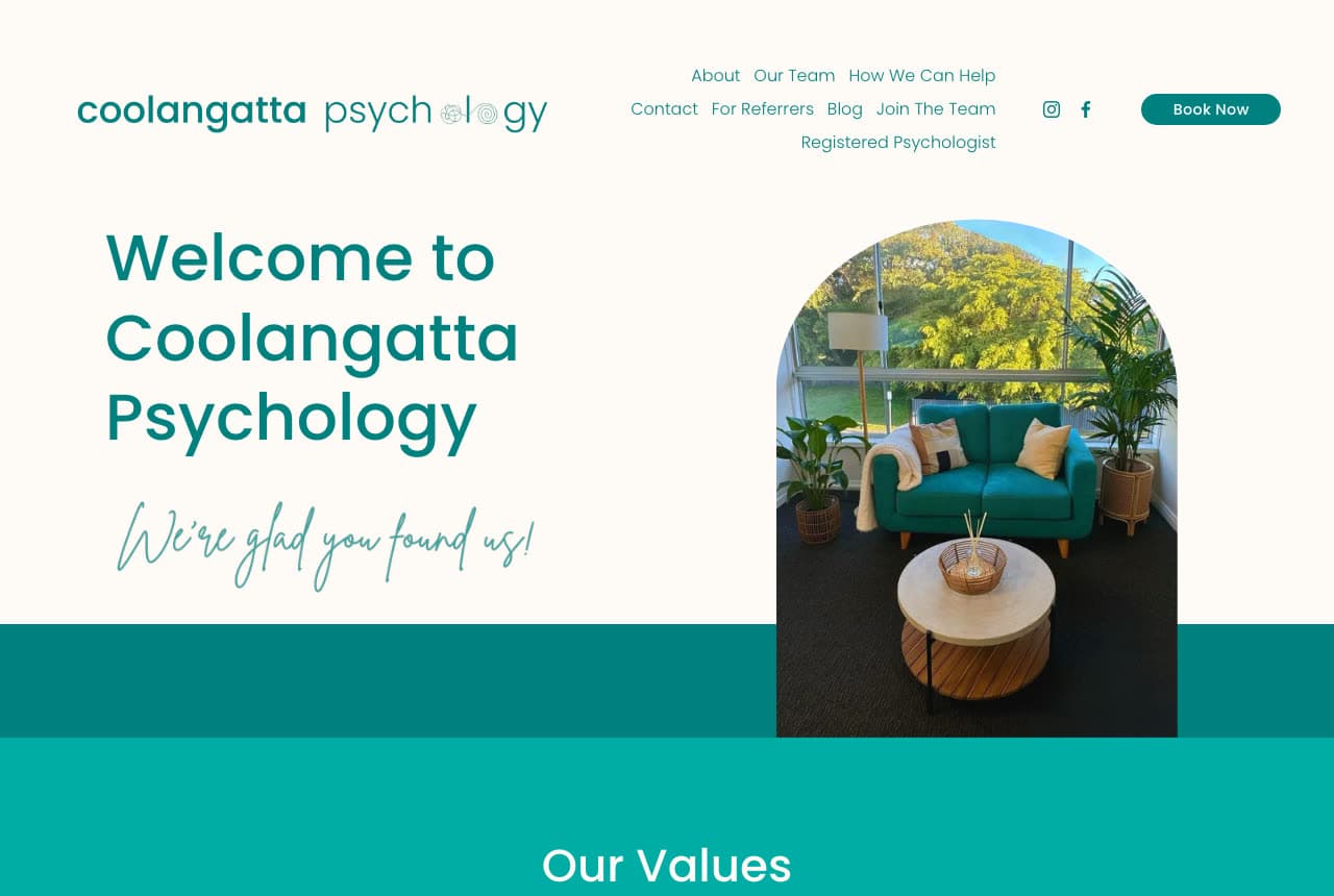
Coolangatta Psychology: A welcome, a script line and a teal sofa
Coolangatta Psychology greets before it explains: a teal sans headline — 'Welcome to Coolangatta Psychology' — with a handwritten script line under it, 'We're glad you found us!', beside an arch-framed photograph of the practice's teal sofa and a round timber table, on a cream ground. The nav speaks to three audiences at once (About, Our Team, How We Can Help, For Referrers), a teal 'Book Now' sits in the corner, and a full-width teal band follows with 'Our Values'. No clinical vocabulary in the first screen; the script line and the sofa do the reassuring. It's the right register for a practice that sees families: a nervous parent and a nervous eight-year-old need the same page to feel safe. Coolangatta shows that a welcome, a handwritten line and one honest room photo can soften an evidence-based practice without cheapening it.
Opens a similar Zarla design you can make yours.
kristinheinrichpsychology.com.au
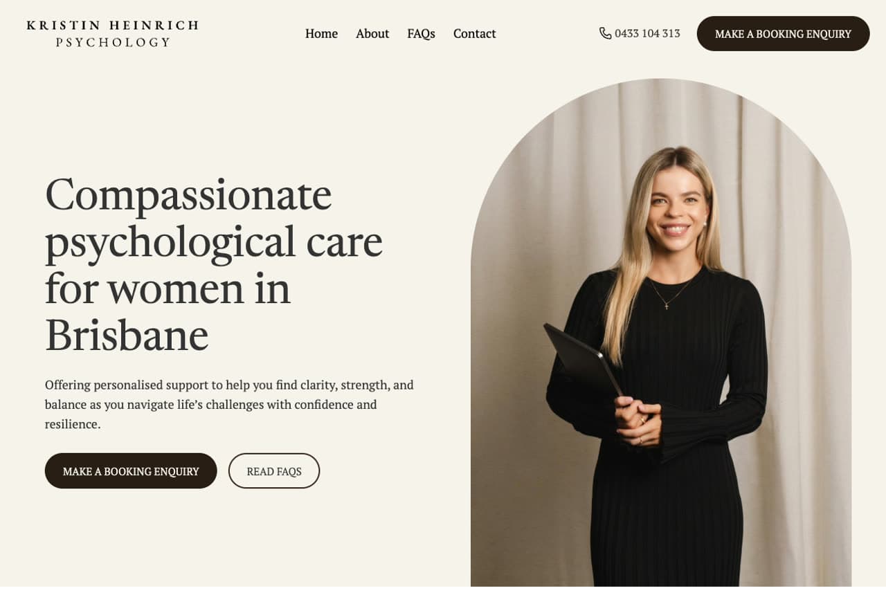
Kristin Heinrich Psychology: One person, one sentence, one portrait
Kristin Heinrich Psychology is the solo-practitioner site done with total economy: a warm beige ground, a serif headline that names the client in eight words — 'Compassionate psychological care for women in Brisbane' — and an arch-cropped portrait of Kristin in a black dress against a linen curtain, looking directly at the visitor. Two buttons, dark and outlined: make a booking enquiry, read FAQs. Nothing competes. The beige-and-dark-brown palette reads as expensive stationery rather than a clinic, which is precisely the point for a practice serving women through grief, cancer care and chronic pain. Kristin demonstrates the solo formula: say who you help, show your face, offer two calm next steps, stop.
Opens a similar Zarla design you can make yours.
marzano.com.au
- Performance Psychology
- Confident
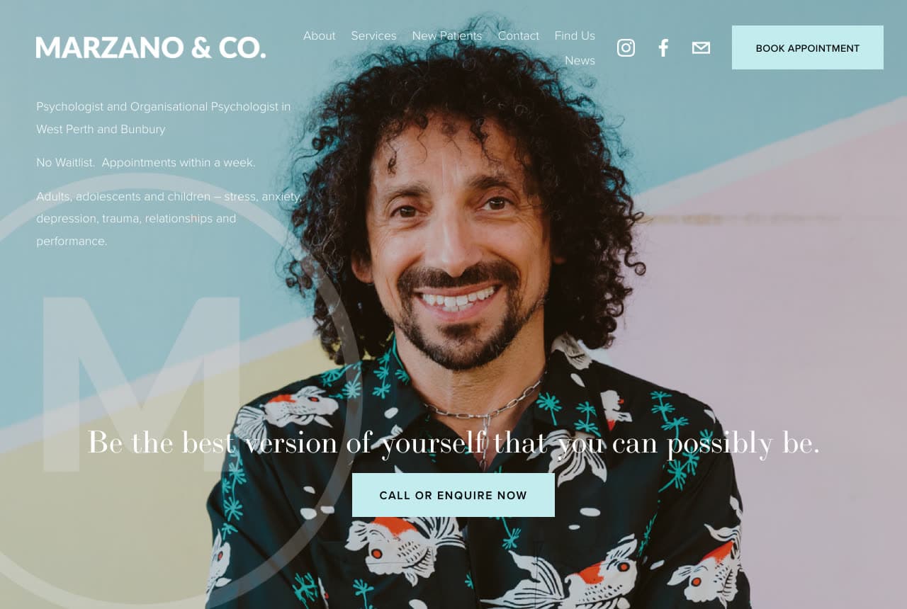
Marzano & Co: A portrait and a promise of performance
Marzano & Co puts the psychologist himself in the hero: a large portrait — curly hair, a patterned shirt, a broad smile — against a pale sky-blue-and-blush field, with a faint 'M' monogram behind him and one line of white serif across the image: 'Be the best version of yourself that you can possibly be.' The small copy in the corner does the positioning (psychologist and organizational psychologist in West Perth and Bunbury; no waitlist, appointments within a week; adults, adolescents and children; stress, anxiety, depression, trauma, relationships and performance), and a single pale-teal button says 'Call or Enquire Now'. The word 'performance' and the confident portrait reframe therapy as coaching for people who would never search 'therapy'. Marzano's move — look like the coach they'd hire, not the clinic they'd avoid — is the whole strategy.
Opens a similar Zarla design you can make yours.
everbetherapy.com
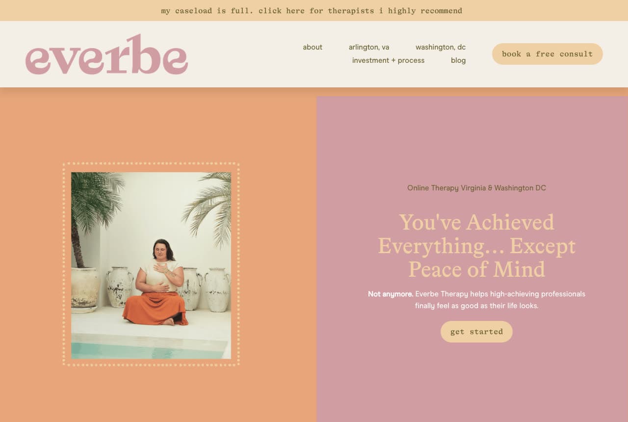
Ever Be Therapy: The headline that names the high achiever's secret
Ever Be Therapy uses a palette nobody expects from a therapist — olive green up top, dusty pink below, a lowercase script wordmark — and a headline that lands like a friend's observation: 'You've Achieved Everything… Except Peace of Mind.' The supporting line finishes the thought for high-achieving professionals who want to 'feel as good as their life looks', and the only button says 'get started' in lowercase. A framed photograph of the therapist seated in a pale room sits like a print on a wall. Even the honesty is on-brand: a thin strip above the nav says the caseload is full and links to recommended colleagues. Ever Be proves a therapy site can look like a lifestyle brand and lose none of its credibility.
Opens a similar Zarla design you can make yours.
northcurrentadhdtherapy.com
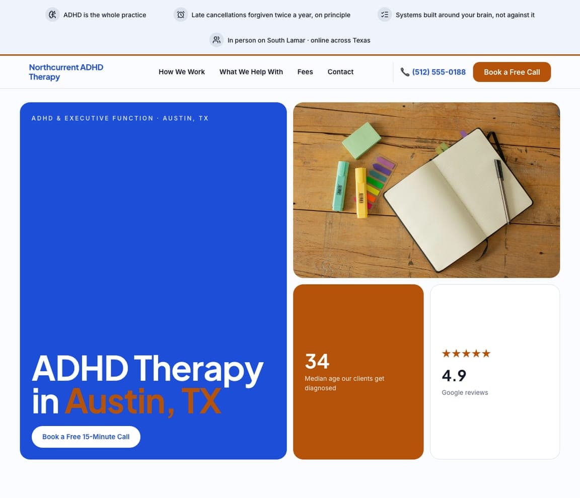
Northcurrent ADHD Therapy: A bento hero built around one diagnosis
Northcurrent ADHD Therapy is the specialist practice as a tiled dashboard: a cobalt tile carrying the headline 'ADHD Therapy in Austin, TX', a desk photo, an orange tile with a single number — 34, the median age its clients get diagnosed — and a 4.9-star reviews tile. The trust chips are written for the exact reader ('ADHD is the whole practice', 'Late cancellations forgiven twice a year', 'Systems built around your brain, not against it'), and the layout itself — clear boxes, one idea per tile — is a small demonstration of executive-function friendliness. Northcurrent is cloneable for any single-condition practice: swap the number and the chips, keep the structure that makes a scattered visitor feel organized.
meridianonlinetherapy.com
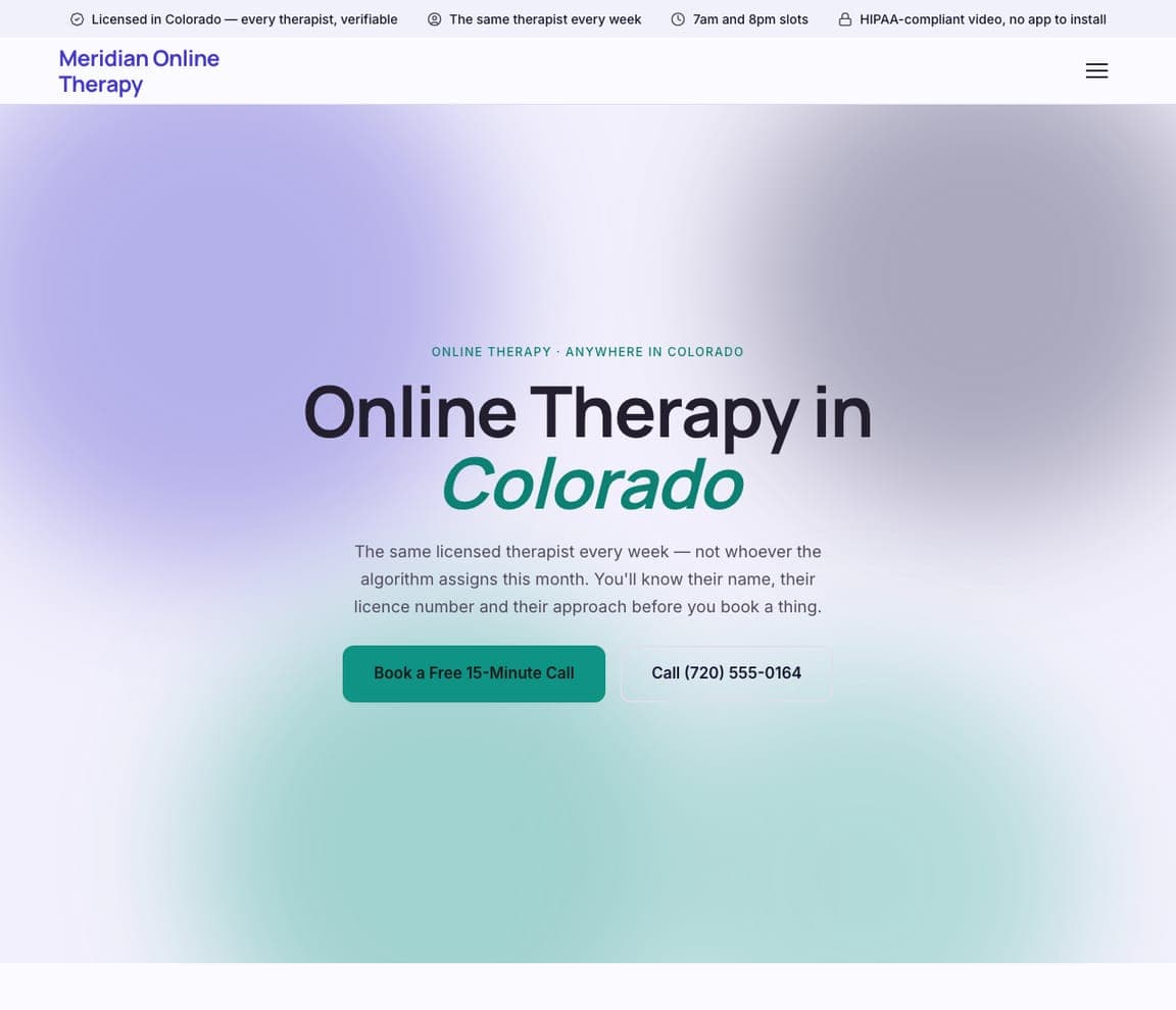
Meridian Online Therapy: Calm gradient, one honest differentiator
Meridian Online Therapy makes virtual care feel personal on a soft lavender-to-blue gradient: 'Online Therapy in Colorado' with the state in italic green, and a promise that names the fear of app-based therapy directly — 'The same licensed therapist every week — not whichever the algorithm assigns this month.' A green 'Book a Free 15-Minute Call' sits beside a phone number, and the trust chips cover the practical questions (licensed in Colorado, 7am and 8pm slots, HIPAA-compliant video). No photography at all; the gradient and the sentence carry it. Meridian is the buildable version of the telehealth practice that competes with the big platforms on the one thing they can't offer — continuity.
hollowfieldgriefcounseling.com
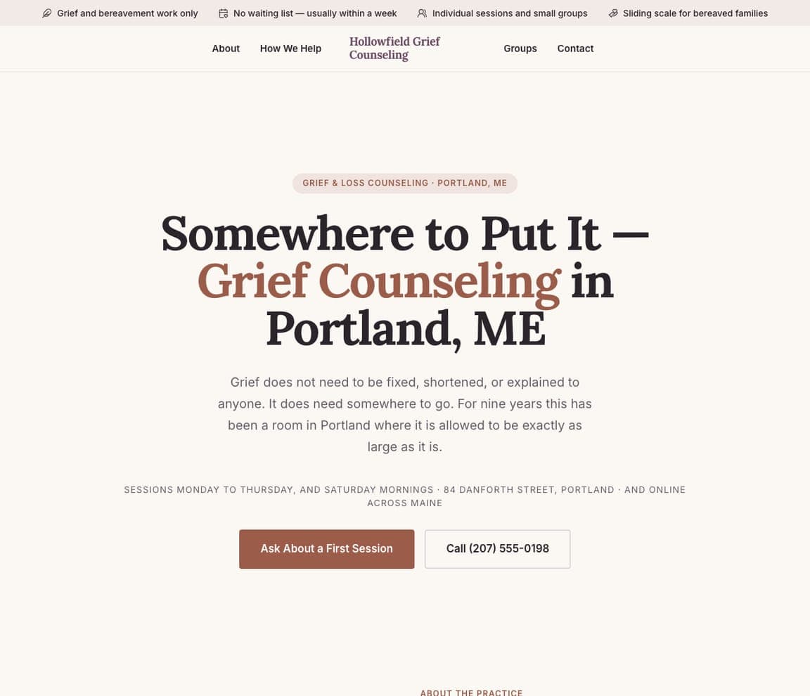
Hollowfield Grief Counseling: Permission, written in serif
Hollowfield Grief Counseling opens with a headline that is itself a kind of counsel — 'Somewhere to Put It — Grief Counseling in Portland, ME' — set in a warm serif on cream, and a paragraph that gives permission rather than promises: 'Grief does not need to be fixed, shortened, or explained to anyone.' The practical lines follow in small caps (sessions Monday to Thursday, the street address, online across Maine), then one dark-red button, 'Ask About a First Session', phrased as a question rather than a booking. Trust chips say the hard things gently: grief and bereavement work only, no waiting list, sliding scale for bereaved families. Hollowfield is the template for any practice whose clients need to be met, not sold to.
loudquietteentherapy.com
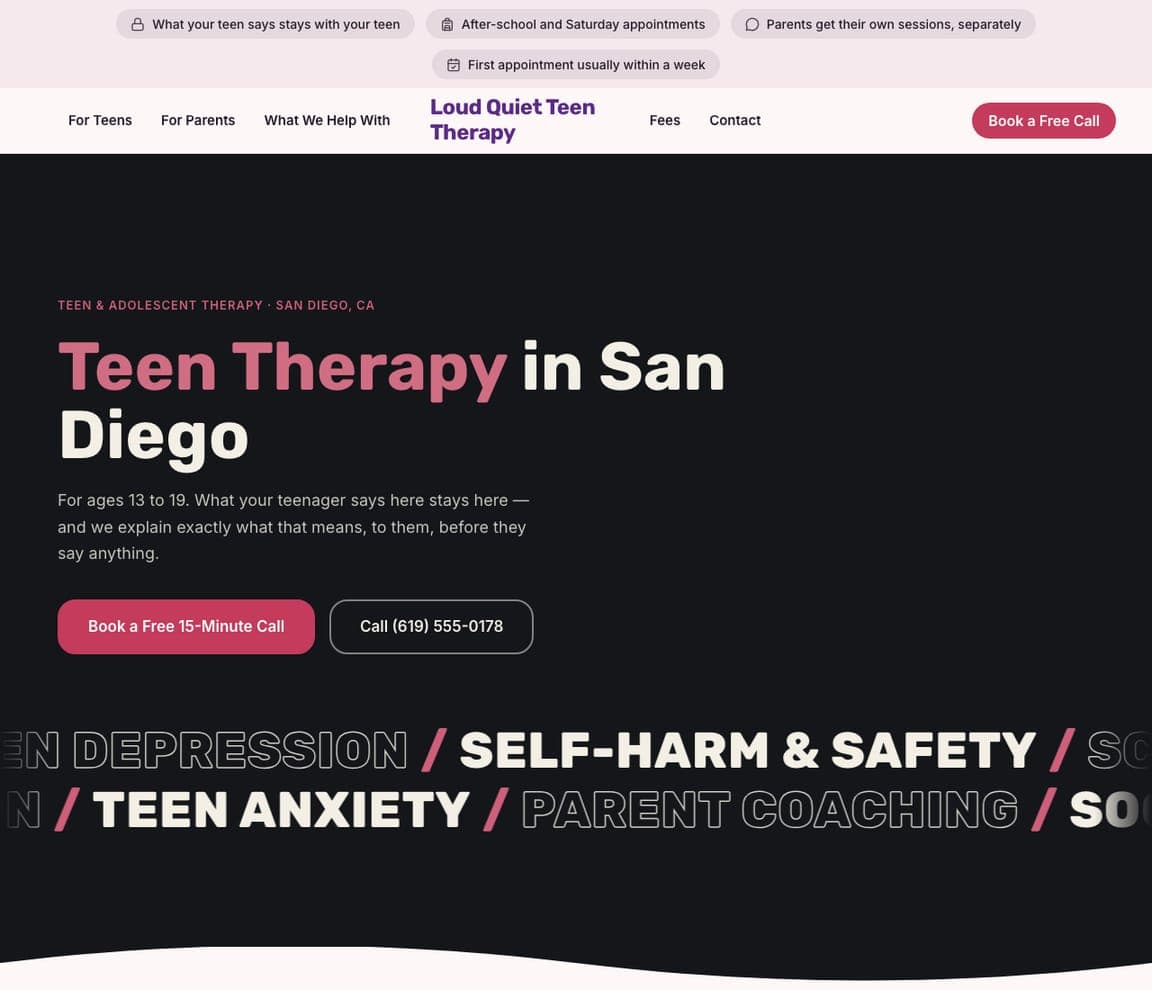
Loud Quiet Teen Therapy: Dark mode for the teenager, chips for the parent
Loud Quiet Teen Therapy is designed for two readers at once: the teenager, who gets a charcoal page, a pink-accented headline — 'Teen Therapy in San Diego' — and a scrolling neon marquee of the real topics (teen depression, self-harm & safety, school, teen anxiety, parent coaching); and the parent, who gets the trust chips ('Nobody in the room is the identified problem', 'Evening and Saturday slots — the whole family works', 'One parent, one teenager, or all three'). The copy speaks to the 13-to-19-year-old directly: 'we'll explain exactly what that means, to them, before they say anything.' Loud Quiet shows a therapy site can look like something a teenager wouldn't be embarrassed to open, while still reassuring the adult paying for it.


