Inspiration · Tutoring

The Best Tutoring Website Examples, Explained

Looking for tutoring website examples? These 9 are the best we could find — standout real tutoring sites plus designs you can build with Zarla — and each comes with a breakdown of the specific design move that makes it work. Find a look you love and you can build a site in that exact style, free, in about 30 seconds.

Real sites + designs you can build with Zarla — free to build and preview, no credit card

What makes a great tutoring website

The best tutoring websites share a few moves: they earn trust fast, lead with strong visuals of the work, point to one clear action, and match the design to how their customers decide. Each example below calls out the specific choice worth stealing for your own tutoring website.

Pegasus Tutors website — Premium Tutoring design example
Real site · London, UK
  • Premium Tutoring
  • Cinematic
  • Black + gold

Pegasus Tutors: Cinema where the category expects clipart

Pegasus Tutors opens like a film: a child with binoculars in a golden field, 'Fuelling curious minds. Inspiring incredible futures.' in spaced uppercase, and a gold pegasus mark on deep near-black. Nothing about it says worksheets — it sells wonder, which is precisely what premium London parents are buying when they hire a private tutor. Note what's missing: no price, no subject grid, no urgency. The restraint is the positioning; scarcity and taste signal a waiting list, not a marketplace. The gold-on-dark palette carries through to the centered logo reveal below the fold, letterhead-grade. When your customer is choosing between you and an agency charging half, look like the one that costs more.

  • Aspirational photography sells wonder, not worksheets
  • No price, no grid — restraint reads as waiting-list demand
  • Gold-on-dark palette holds from hero to logo reveal

Steal this: Sell the outcome parents imagine, not the sessions you deliver. One aspirational image beats a subject grid.

Wyzant website — Tutor Marketplace design example
Real site · Chicago, IL
  • Tutor Marketplace
  • App-Like
  • Warm neutrals

Wyzant: A headline that rotates through subjects

Wyzant's hero does something quietly clever: 'Trust the nation's largest network for [Chemistry] tutors' — with the subject word cycling and highlighted, so every visitor eventually sees their own need named. Under it, a search box plus trending chips (Algebra, LSAT, MCAT) make the first step typing, and the proof stack is platform-scale: 4 million five-star reviews, 65,000 tutors, a 'Good Fit Guarantee' that de-risks the first hour. Then the university logo bar — MIT, Harvard, Juilliard, Caltech — borrows institutional credibility the way trades sites borrow van wraps. A solo tutor can't post those numbers, but can steal the structure: name the subject, promise the fit, guarantee the first session.

  • Rotating subject word — every visitor sees their need named
  • 'Good Fit Guarantee' de-risks the first booked hour
  • University logo bar borrows institutional trust

Steal this: Guarantee the first session ('the right fit, or it's free'). It converts the parents still comparing tabs.

Bonjour Tutors website — Language Tutoring design example
Real site · Canada (online)
  • Language Tutoring
  • Warm
  • Red + navy

Bonjour Tutors: One subject, owned completely

Bonjour Tutors proves the riches in niches: it does French tutoring for Canadian students, and nothing else — so every element compounds. The headline promises 'real school progress,' the body names the exact anxiety (small gaps accumulate, confidence drops, participation gets harder), and circular stat badges — 50k+ lessons, 5,000+ Canadian families, 100% online — quantify a track record inside the niche rather than across a vague catalog. Google and Trustpilot ratings sit side by side with the actual averages written out. The red-and-navy palette even nods French without costume. Specialists get to write copy this precise because they only serve one customer; that precision is what a 40-subject generalist can never match.

  • Single-subject focus makes every stat compound
  • Names the parent's actual anxiety, not 'quality education'
  • Dual review platforms with real averages written out

Steal this: Niche down on the homepage even if you tutor everything — the specialist page converts the specialist search.

Revolution Prep website — Test Prep design example
Real site · Santa Monica, CA
  • Test Prep
  • Corporate
  • Orange + blue

Revolution Prep: Program cards that sell three ways to buy

Revolution Prep leads with a duotone student portrait against a bold orange circle — 'Unleashing the brilliance within every student' — but the conversion engine is the card row beneath: Academic Private Tutoring, Test Prep Private Tutoring, Group Test Prep, each with its grade range, pitch, and checkmarked inclusions. It's productized tutoring — three clear SKUs instead of an open-ended 'contact us to discuss' — and it lets a parent self-select by budget and goal without a phone call. The graded color coding (blue, teal, green) makes the tiers scannable in a second. Tutoring businesses underprice and overexplain; packaging the service like software, with names and grade bands, fixes both at once.

  • Three named programs beat one vague 'services' page
  • Grade bands + checkmark inclusions enable self-selection
  • Duotone + orange circle gives corporate polish personality
Tutorful website — Tutor Platform design example
Real site · Sheffield, UK
  • Tutor Platform
  • Friendly
  • Mint + white

Tutorful: The product demo lives in the hero

Tutorful shows the marketplace working before you've scrolled: a phone mockup with a real chat thread ('Hello! My name is Joe and...') sits beside tutor photos labelled with names — Mr. Khan, Mrs. Wilson, Ms. Ayres — while a search pill reads 'Maths.' You understand the entire product in one glance: search a subject, meet a person, start talking. The mint-green palette and rounded type keep it friendly where education brands drift institutional, the Trustpilot 'Excellent' rating anchors the header, and an 'As featured in' bar (Guardian, BBC, Telegraph) closes the credibility loop. Showing the interface is the most honest kind of proof a service marketplace can offer — screenshots don't exaggerate.

  • Chat mockup + named tutors demo the product in one glance
  • Mint palette keeps education friendly, not institutional
  • Press logo bar + Trustpilot close the credibility loop
Japanese Tutor NZ website — Language Tutor design example
Real site · Auckland, NZ
  • Language Tutor
  • Minimal
  • Rust + cream

Japanese Tutor NZ: A hero photo that teaches the subject

Japanese Tutor NZ makes one image do the cultural work: a rust-orange photograph of layered timber architecture — instantly Japanese without a single cliché cherry blossom — under spaced serif type reading 'Japanese Tutor NZ.' The restraint continues below: generous white space, a centered paragraph explaining online and in-person lessons from a Japanese-born tutor, and a single quiet outlined button. For a solo practitioner, this is the template to envy — no stats to fake, no team to photograph, just a considered aesthetic that mirrors the subject being taught. The design itself argues the tutor's fluency in the culture, which is exactly the credential a language student is shopping for.

  • Architecture photo signals Japan without the clichés
  • White space + serif restraint mirrors the subject's aesthetic
  • One quiet CTA fits a solo tutor's considered brand
The Tutorverse website — Test Prep design example
Real site · New York, NY
  • Test Prep
  • App-Like

The Tutorverse: Route by test, not by subject

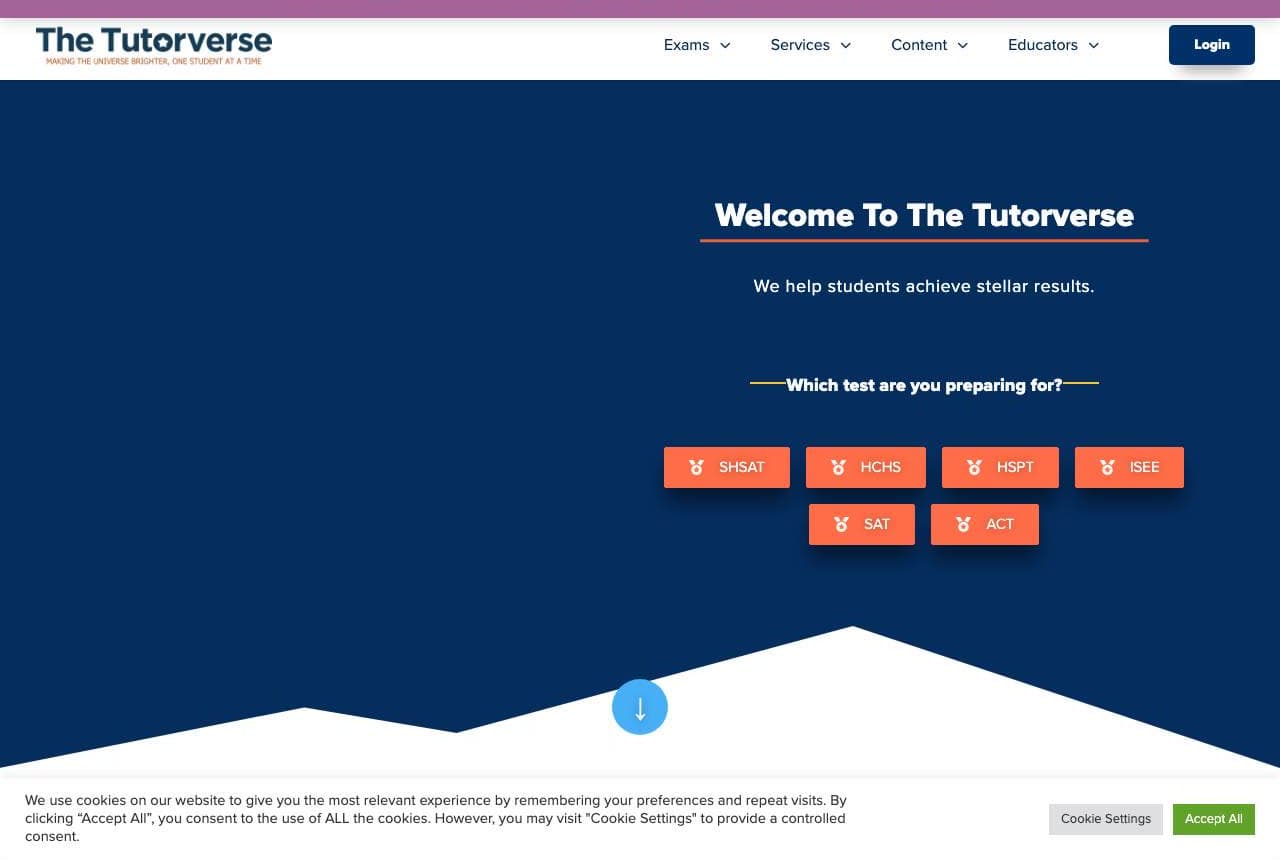
The Tutorverse asks one question in its navy hero — 'Which test are you preparing for?' — and answers it with a row of clickable chips: SHSAT, HCHS, HSPT, ISEE, SAT, ACT. That's information architecture as conversion strategy: NYC parents arrive knowing the acronym they're anxious about, and the site routes them in one tap instead of making them parse a services menu. The mountain-peak section divider gives the navy block a summit metaphor without saying it, and 'Our veteran educators guide students toward success' plus Google review cards handle trust below. When your customers search by a specific proper noun — a test, a district, an exam board — put those exact nouns on buttons.

MusicTutorOnline website — Music Tutoring design example
Real site · Online
  • Music Tutoring
  • Elegant

MusicTutorOnline: Serif elegance for a craft subject

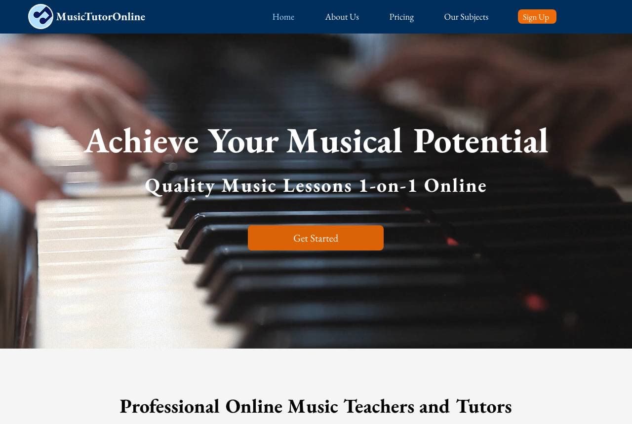
MusicTutorOnline treats music lessons with the visual respect of a conservatory: a full-bleed photograph of hands on piano keys, 'Achieve Your Musical Potential' in classical serif, and a single amber Get Started button. Below, the same search-first pattern the big marketplaces use — 'What do you want to learn?' with example prompts (Piano, Music Theory, ABRSM) — then subject cards with instrument icons. It's a small operation borrowing platform interaction patterns while keeping boutique art direction, and the combination works: the serif and the photography say craftsmanship, the search box says convenience. Niche tutoring vergers on two failure modes — looking amateur or looking corporate — and this threads both.

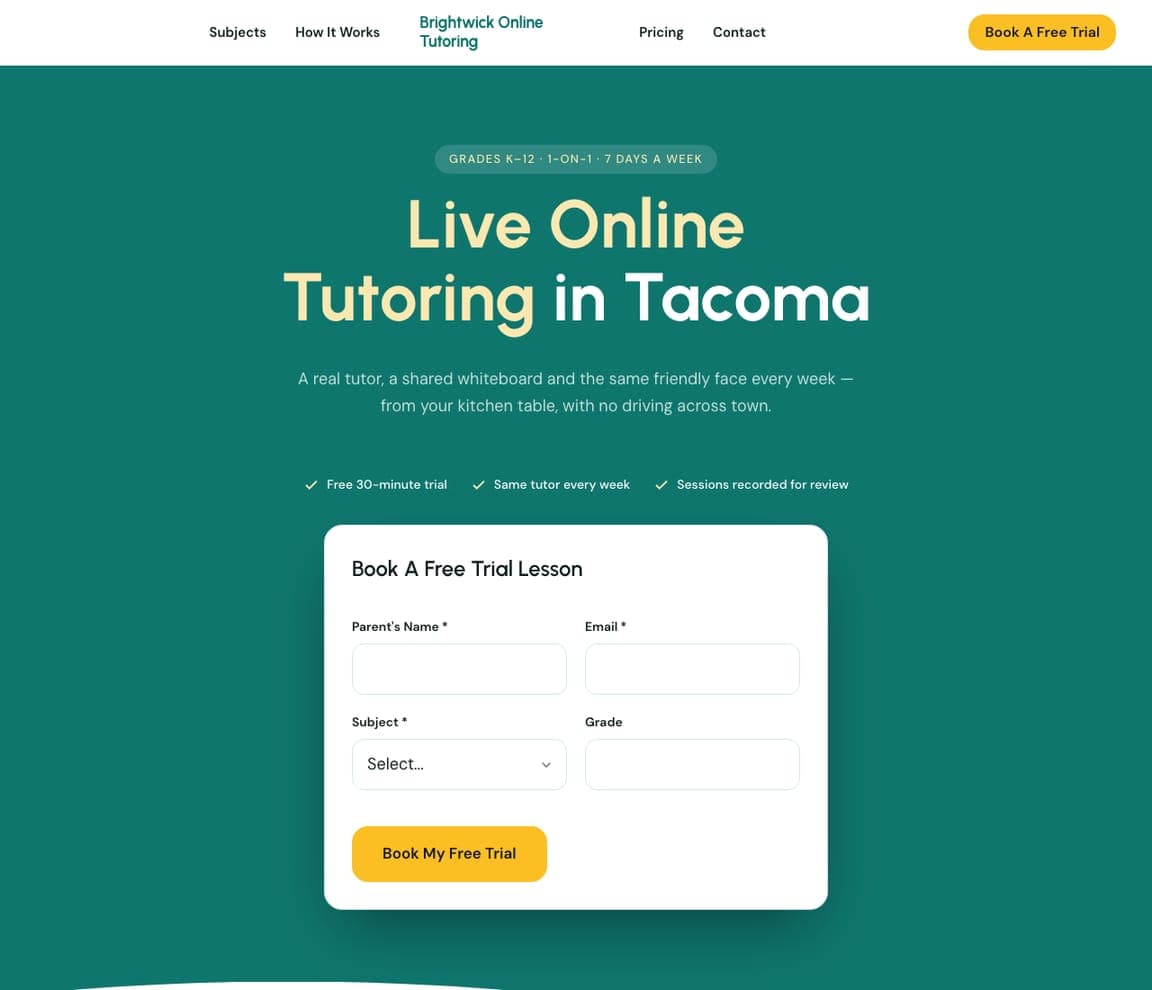
Lantern Learning — Tutoring Center website design you can build with Zarla
Build this with Zarla
  • Tutoring Center
  • Encouraging

Lantern Learning: Encouragement as the design language

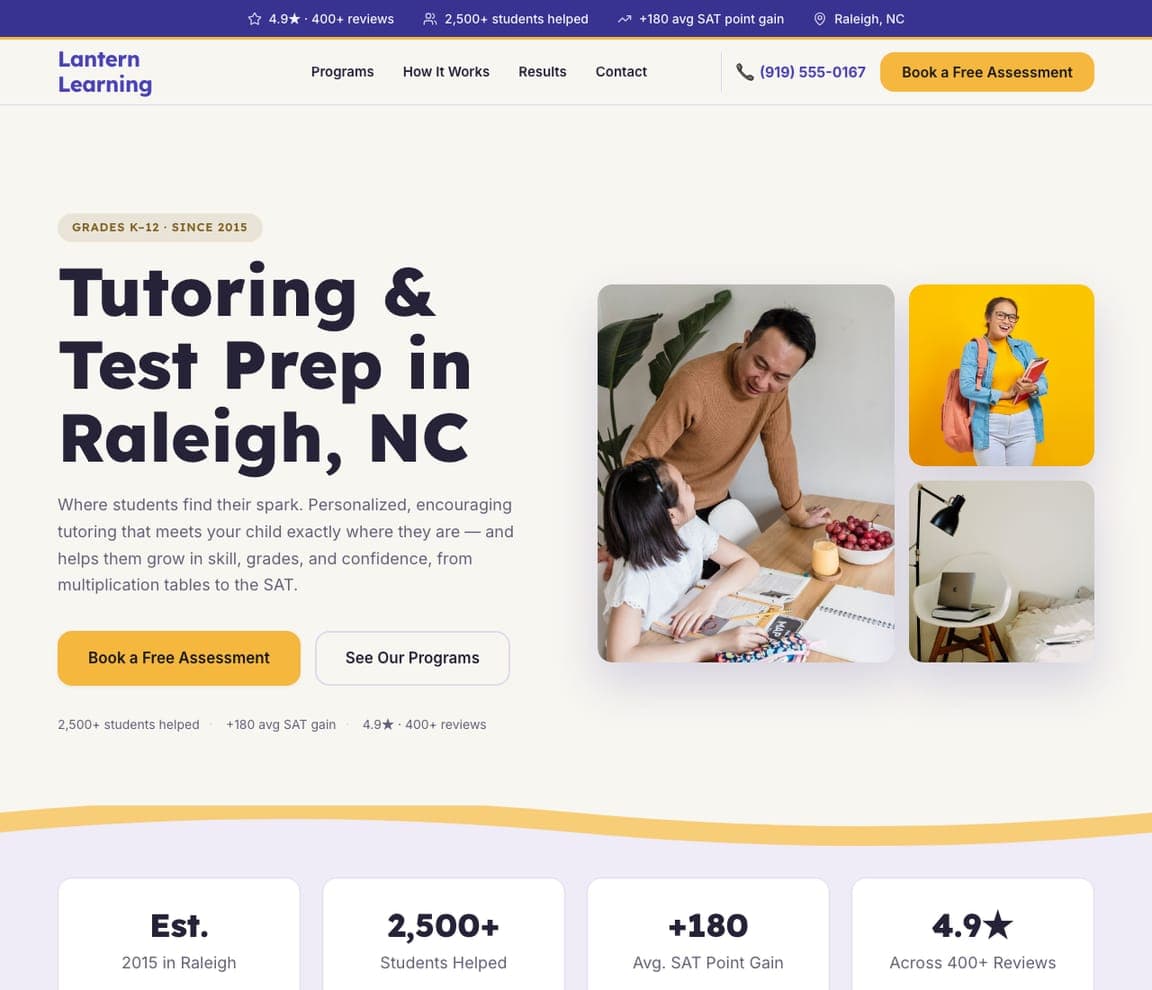
Lantern Learning is Zarla's tutoring template, and its image-collage hero makes the pitch parents actually respond to: 'Where Students Find Their Spark,' surrounded by a warm arrangement of real study moments rather than one posed classroom shot. The indigo-and-amber palette lands encouraging-but-serious — bright enough for a kid to like, credible enough for the parent writing the cheque — and the page structure mirrors what the best sites on this list do: a highlighted program menu, a how-it-works process, a results section, and a book-a-free-assessment form as the single ask. The free assessment is the right first product for any tutoring business; it converts anxiety into an appointment. Clone it and it's live in about 30 seconds.

See this template

Frequently asked

Where can I find good tutoring website examples?

Right here — this page curates tutoring website examples two ways: standout real businesses (each linked, so you can explore the live site) and professionally designed Zarla templates you can clone and make your own. Every example comes with a note on why the design works — trust signals, layout, calls to action — so you can copy the move, not just the look.

What makes a good tutoring website?

A good tutoring website earns trust in the first few seconds, leads with strong visuals of the work, gives visitors one obvious action, and loads fast on a phone. Every design below leads with proof and a single clear call to action rather than a wall of text.

How much does a tutoring website cost?

A custom tutoring website from a designer typically runs into the thousands up front, and template builders charge roughly $16–$30 per month. An AI builder generates a complete, editable design for free and only charges (on the Premium plan) when you publish to your own domain — so you can build and preview before spending anything.

Do I need a designer to build a tutoring website?

No. Several designs on this page were generated by Zarla and are fully editable — you describe your business and get a complete, professionally designed site in about 30 seconds, then refine it by chatting. Building and previewing is free; publishing to your own domain needs the Premium plan.

What pages does a tutoring website need?

Most tutoring businesses need just a few: a home page that proves trust and points to one clear action, an about page that puts a face to the business, a services or work page that shows what you do, and a contact page with a form and a phone number. Local businesses also benefit from location or service-area pages that help them show up in nearby searches.

How do I get more customers from my tutoring website?

Lead with proof in the first few seconds (reviews, real photos, results), make one action obvious on every screen (call, book, or enquire), and keep it fast on mobile — most visitors arrive on a phone. The designs above each do this differently, but they all earn trust early and remove friction from the next step.

You've seen what works. Now make it yours.

Describe your business and Zarla designs a complete, professional website in about 30 seconds — built to convert, just like the ones above.

Free to build and preview · no credit card · publish to your own domain on Premium